
BI dashboard development is the process of building a custom reporting tool that collects business data from different sources, turns it into clear charts and KPIs, and helps teams make faster decisions. It usually includes data integration, dashboard UX/UI design, frontend and backend development, user permissions, testing, and ongoing support.
Contents:
Quick Facts
| Question | Short Answer |
| Best for | Companies that need custom reporting, KPI tracking, and clearer decision-making across teams. |
| Typical timeline | 6-10 weeks for an MVP, 3-6+ months for an enterprise BI dashboard. |
| Core components | Data sources, data processing layer, visualization layer, dashboard UI, filters, and user access control. |
| Common tools | React, Vue, Python, FastAPI, Node.js, PostgreSQL, data warehouses, chart libraries, and cloud services. |
| Main risk | Building a good-looking dashboard on top of messy, inconsistent, or poorly defined data. |
Introduction
For those who prefer to listen rather than read, this article is also available as a podcast on Spotify.
At some point, almost every growing company has the same slightly annoying problem. There is data everywhere, but when someone asks a pretty simple question, like “How are we doing this month?”, the answer still takes two days, three people, and a spreadsheet with a name like final_final_v7.
I have seen this happen in SaaS teams, in healthcare products, in fintech, and even in small internal tools that were supposed to be “temporary.” Sales has one number. Finance has another. Product analytics says something else. Nobody is exactly wrong, but the whole picture is fuzzy.
That is where BI dashboard development starts to make sense. Not because dashboards are fashionable, but because people need one place where business data becomes readable. A good dashboard helps teams see what changed, what needs attention, and what can probably be ignored for now. And yes, that last part matters more than people admit.
Many teams first try generic reporting tools. Sometimes that is enough. But sooner or later, they hit limits: the KPIs are too specific, the UX feels clumsy, the data lives in odd internal systems, or different user roles need different views. This is when custom BI dashboards become a better fit.
In this guide, we will walk through what BI reporting dashboards are, how they work, what features actually matter, how the development process usually goes, and where projects can get messy. Because, honestly, dashboard projects can look simple from the outside. A few charts, a few filters, done. Then the real data arrives.
What Is a BI Dashboard?
A BI dashboard is a screen, or often a set of screens, that brings business data together and shows it in a way people can use. It is part of a broader business intelligence setup, which may include databases, APIs, pipelines, warehouses, analytics logic, and user permissions.
The job of the dashboard is simple to say and harder to do: help someone make a better decision faster.
For example, a founder may want to check revenue, churn, and customer acquisition in the morning before investor calls. A product manager may care about activation and feature adoption. A support lead may look at ticket volume and response time. Same company, same data universe, very different questions.
This is why business intelligence dashboard development is not just about drawing charts. The screen has to match the way people think at work. If users need to explain the dashboard to each other every time they open it, something is off.
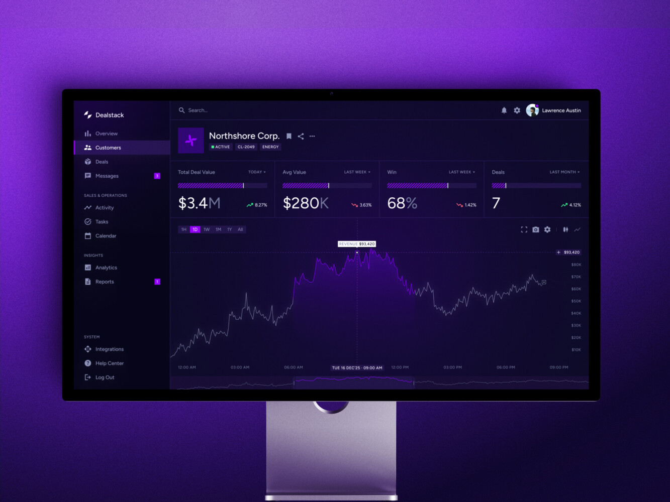
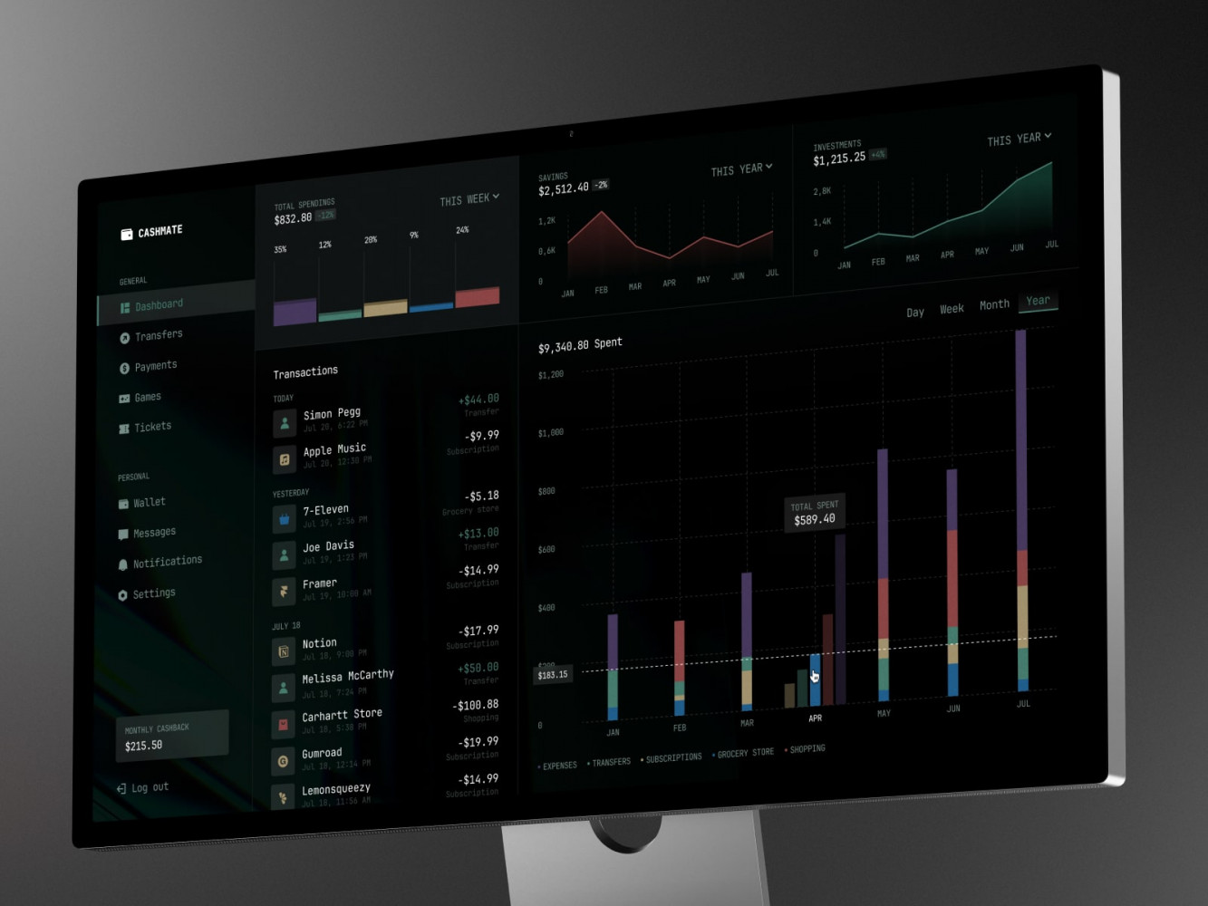
Sales Analytics Dashboard by Shakuro
Types of BI Dashboards
Operational dashboards are used for daily work. They show what is happening right now or close to right now: failed payments, delivery delays, open tickets, server errors, ad spend, inventory, appointments—you name it. These dashboards are usually checked often, sometimes several times a day.
Strategic dashboards are more high-level. Executives and department heads use them to watch long-term KPIs such as revenue, retention, margin, pipeline, or customer growth. They are less about panic and more about direction.
Analytical dashboards are for digging. They let users compare segments, filter by region or cohort, and look for reasons behind a change. Analysts love them. Product people love them too, when the interface does not fight back.
Core Components
Most dashboard systems have a few pieces under the hood.
First, there are data sources. These can be CRMs, ERPs, payment tools, product analytics platforms, marketing systems, spreadsheets, databases, and third-party APIs.
Then comes the data layer. This is where information is cleaned, joined, transformed, and prepared for reporting. In more serious setups, this often involves centralized data storage systems, such as a data warehouse.
After that, you have the visualization layer: charts, tables, heatmaps, scorecards, maps, and all the little UI elements that make data easier to read.
Finally, there is the dashboard UI itself. This includes layouts, filters, navigation, permissions, loading states, responsive behavior, export tools, and all the small interactions users notice only when they are missing.
Access control deserves its own mention. In enterprise BI dashboards, not everyone should see everything. Regional managers, executives, finance, and external partners may all need different levels of access. It is better to think about this early, not on Friday evening before launch.
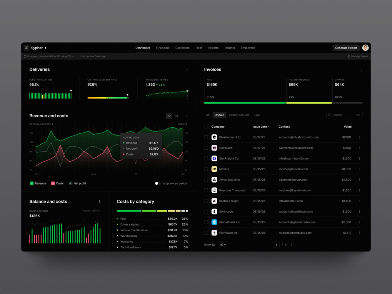
SaaS analytics platform by Shakuro
Key Features of BI Dashboards
Data Visualization
Data visualization looks like the fun part, and sometimes it is. But it is also where dashboards get weirdly confusing.
A chart can be technically correct and still useless. Too many colors. Labels nobody understands. A pie chart where a table would do. Or my personal favorite: a dashboard that looks impressive in a meeting but answers no actual question.
Good BI dashboard design starts with the user asking, “What am I supposed to learn here?” Line charts are good for trends. Bar charts help with comparison. Tables are still great when people need exact values. Heatmaps are handy for spotting concentration or trouble areas.
It sounds basic, but basic is often what saves the product. Clear visual hierarchy, readable labels, enough white space, and sensible grouping usually beat clever decoration. This is why UI/UX design matters so much in dashboard work.
Customizable Dashboards
Different teams look at the same business from different angles. A CFO, sales manager, product owner, and customer success lead may all care about revenue, but they do not need the same screen.
Custom BI dashboards let users save views, move widgets, pick date ranges, or choose the metrics they check most often. That sounds good, doesn’t it? It is, but only up to a point. Too much customization can turn the product into a pile of settings.
In my experience, role-based views are often the best option for growing teams. Give each role a smart default view, then allow a bit of personal adjustment. People get flexibility without having to build their dashboard from scratch.
KPI Tracking
KPIs are the reason the dashboard exists. If they are vague, the whole thing becomes decoration.
A useful dashboard shows key metrics clearly: current value, previous period, target, change over time, and maybe a little context. Did revenue drop because churn increased, because fewer leads came in, or because one large account moved to next month? The dashboard may not answer everything, but it should point people in the right direction.
For a BI reporting dashboard, metric definitions are a big deal. “Active user” can mean three different things in one company. “Revenue” can be booked, billed, collected, recurring, gross, net, or some very special internal version that only two people understand. Sorting this out is not glamorous work. It is also the work that makes the dashboard trustworthy.
Data Filtering and Drill-Down
Static dashboards are fine for status checks. But real work usually starts when someone says, “Wait, what happens if we look only at enterprise clients?” or “Can we see this by region?”
Filters and drill-downs let users move from the headline number into the details. Date range, product, region, traffic source, account type, cohort, department, and user role are common filters. Drill-down can open a table, a second chart, or a page focused on one metric.
The important thing is not to overwhelm people. If every widget has ten filters and three hidden menus, users get tired fast. A dashboard should invite exploration, not make people feel like they are configuring a flight simulator.
Integration with Data Sources
This is the part that often decides whether the dashboard succeeds.
It is not enough to build a nice frontend if the data arrives late, duplicated, or half broken. Dashboards usually need to connect to databases, APIs, third-party tools, internal admin systems, and sometimes old spreadsheets that everyone quietly depends on.
That is why dashboard projects often overlap with data integration systems. The prettier the interface, the more obvious bad data becomes. Users trust a simple table with accurate numbers more than a gorgeous chart that seems suspicious.
SaaS marketing dashboard by Conceptzilla
BI Dashboard Development Process
1. Business Requirements and KPI Definition
Before anyone picks React, Python, or a chart library, the team needs to understand the business questions.
Who uses the dashboard? What decisions do they make? Which metrics matter? How often should the numbers update? What should happen when a metric changes? These questions sound plain, but they save a lot of trouble later.
This stage usually includes interviews with stakeholders, review of existing reports, KPI mapping, and user role planning. It is also the moment to find naming conflicts. If marketing and finance use the same word for different things, fix that first. Otherwise, the dashboard will simply make the disagreement more visible.
2. UX/UI Design for BI Dashboards
Dashboard UX is mostly about what to show first, what to hide, and how to make the next click obvious.
A good screen does not ask users to scan fifteen widgets before finding the important one. It puts the main signal up front, groups related metrics, and gives enough context without turning into a wall of data.
Designers often start with wireframes or clickable prototypes. This is useful because stakeholders can react to structure before anyone spends time building complex components. It is much easier to move a KPI card in a prototype than to rebuild a finished analytics page.
And one more point for BI dashboard design: empty states matter. So do loading states. In real dashboards, data fails, filters return nothing, charts take a second to load, and users need to know what is happening.
3. Choosing the Technology Stack
The stack depends on the product, not the other way around.
For frontend work, React and Vue are common choices. React is especially popular for dashboards because component-based architecture works well for reusable cards, filters, tables, and chart blocks. If the dashboard is part of a larger web product, frontend development and React development experience becomes very relevant.
On the backend, teams may use Node.js, Python, FastAPI, or other frameworks to handle APIs, authentication, data access, and business logic. For storage, PostgreSQL may be enough for smaller systems. Larger analytics products may need a data warehouse, optimized reporting tables, or separate analytics databases.
Infrastructure can include Docker, Kubernetes, scheduled jobs, queues, monitoring, and cloud services. It depends. A small internal dashboard should not be built like a huge enterprise analytics platform. That sounds obvious, but teams overbuild things all the time.
4. Data Integration and Modeling
This is where the less glamorous work lives.
Data needs to be pulled from sources, cleaned, matched, and shaped for reporting. Fields may have different names. Customer IDs may not match. Dates may use different time zones. Some records will be missing. Some will be duplicated. It is a little annoying, but you get used to it over time.
For dashboards connected to data storage systems, modeling matters a lot. Operational databases are built for transactions, not always for analytics. So the team may create reporting tables, aggregated views, cached queries, or warehouse models that make the dashboard faster and more stable.
If this layer is rushed, users will feel it. They may not know why the chart loads slowly or why numbers do not match last month’s report, but they will stop trusting the product.
5. Visualization Layer Development
Once the data is ready, BI dashboard developers build the actual views: charts, tables, widgets, filters, legends, comparison states, drill-downs, and exports.
This sounds straightforward until the edge cases arrive. Long category names break labels. A chart with three data points looks empty. A chart with three thousand points makes the browser sweat. Colors that looked fine in Figma fail contrast checks. A stakeholder asks for Excel export because, well, people still love Excel.
Data visualization dashboard development needs patience. Good engineers tune performance, handle empty and error states, keep charts accessible, and make sure the interface still works on smaller screens. The small details add up.
6. Testing and Validation
Testing a dashboard is not only about buttons and layout. The numbers need testing too.
Teams should check filters, permissions, responsiveness, loading behavior, browser support, exports, and edge cases. But they also need to validate KPIs against known sources. If the dashboard says one thing and the finance report says another, users will notice. They always do.
It helps to test with realistic data. Sample data is usually too clean. Real data has long names, missing values, strange categories, and historical surprises from 2019 that nobody wants to talk about but the chart still has to handle.
7. Deployment and Maintenance
Launch is not the end of the work.
APIs change. Product events get renamed. Teams request new filters. Someone realizes the “monthly active customer” metric should exclude test accounts. It happens.
Maintenance includes monitoring, bug fixes, performance tuning, security updates, data checks, and product improvements. For business-critical dashboards, support services should be part of the plan from the beginning. A dashboard that people rely on cannot be treated like a one-off page.
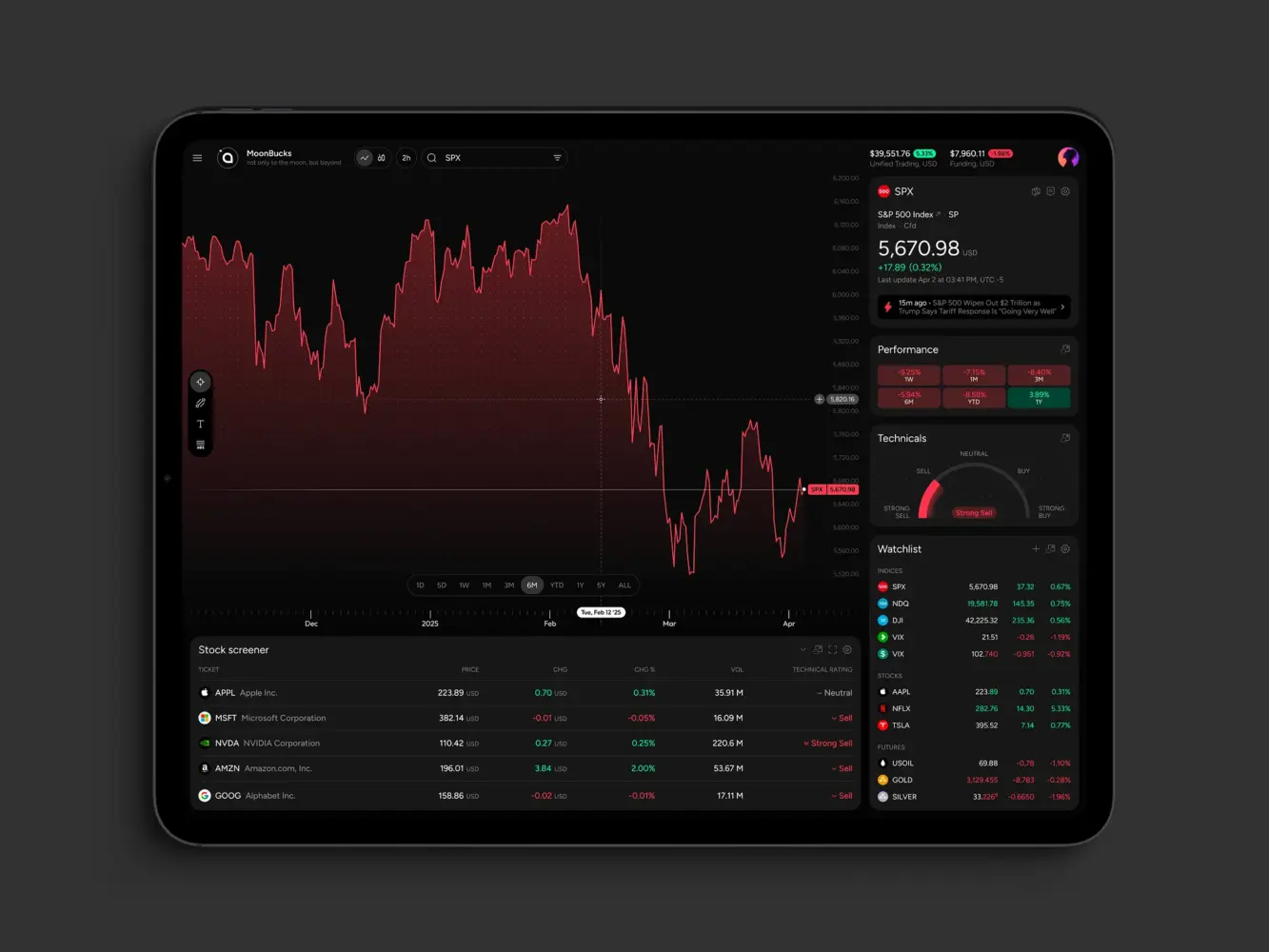
Financial Market Trading Analytics Tool Dashboard by Shakuro
Cost of BI Dashboard Development
The cost depends on how much the dashboard has to do.
| Type | Approximate cost | Best for | Must-have features | Typical team size | Timeline |
| MVP BI dashboard | $25,000-$60,000 | Startups, internal teams, early SaaS products, or companies testing whether a custom dashboard is worth building | 1-2 data sources, core KPI cards, basic charts, date filters, simple user roles, responsive web UI, export to CSV or Excel, basic QA and deployment | 3-5 people: product manager, UI/UX designer, frontend developer, backend/data developer, QA engineer part-time | 6-10 weeks |
| Business BI dashboard | $60,000-$120,000 | Growing companies that need reliable reporting across several teams | 3-5 data sources, custom dashboards, advanced filters, drill-down views, role-based access, scheduled reports, performance tuning | 5-7 people | 2-4 months |
| Enterprise BI dashboard | $100,000-$300,000+ | Larger companies, multi-department analytics systems, fintech, healthcare, SaaS platforms, and products with complex permissions or heavy data flows | Multiple integrations, role-based access, custom dashboards, advanced filtering and drill-down, real-time or near-real-time updates, audit logs, admin panel, data validation, performance optimization, monitoring, support plan | 6-10+ people: product manager, business analyst, UI/UX designer, frontend developers, backend developers, data engineer, DevOps engineer, QA engineers | 3-6+ months |
| Embedded analytics / SaaS dashboard | Custom range | SaaS products that need analytics inside the customer-facing product | Multi-tenant architecture, customer-specific dashboards, usage analytics, embedded charts, white-labeling, permissions, scalable APIs | 6-10+ people | 3-6+ months |
A simple BI reporting dashboard might use one or two data sources, a handful of KPIs, standard charts, and basic filters. That can be enough for an MVP, a department report, or a proof of concept.
An enterprise system is a different story. It may include many integrations, strict permissions, real-time updates, custom charting, admin tools, exports, audit logs, multi-tenant architecture, and ongoing support. The project may also require backend work, data pipelines, and a wider business intelligence software development effort around the dashboard itself.
The biggest cost drivers are usually data complexity, number of dashboards, real-time requirements, customization, and compliance. Custom analytics dashboards can be built in phases, though. In fact, that is often healthier. Start with the metrics people need every week, release the first version, watch how users behave, and then add depth.
What affects cost?
- Number of data sources
- Real-time updates
- Permissions and user roles
- Custom UI and dashboard design
- Data cleanup and modeling
- Compliance requirements
- Third-party and internal system integrations
Common Challenges in BI Dashboard Development
Data inconsistency is probably the classic problem. Different tools store the same thing in different ways. Names do not match. IDs are missing. It is normal, but it has to be handled.
Poor UX is another common issue. Dashboards tend to grow by request. One person asks for a chart, another asks for a filter, and suddenly the screen looks like a control panel nobody wants to touch.
Performance can hurt too. Users expect filters to work quickly, even on large datasets. Sometimes that means caching, pre-aggregation, pagination, or optimized database queries. Sometimes it means telling stakeholders that a live chart with millions of points is not the best idea.
Integration complexity also sneaks up on teams. APIs have limits. External systems change. Real-time analytics systems need careful decisions about speed, accuracy, and cost.
Security should be discussed early. Dashboards may show financial data, customer records, healthcare information, or fintech metrics. Access control, audit trails, encryption, and compliance are not little extras. They shape the architecture.
Finance Management Web Dashboard by Conceptzilla
Our Experience in Dashboard and Data Platform Development
Shakuro works with web platforms, SaaS products, AI tools, frontend-heavy applications, and UX-driven systems. Dashboard work sits right between these areas. It needs engineering, yes, but it also needs product sense and a very practical eye for interface clarity.
The ZAD case study is a close example from the fintech side. ZAD is a Shariah-compliant mobile investment platform that combines robo-advisor and trading features. The product had to make portfolio data, stock pages, watchlists, orders, risk profiling, and market discovery feel understandable for everyday users. That is exactly the kind of challenge dashboard teams run into: complex financial information has to stay clear, calm, and usable.
Symbolik Social is relevant from both analytics and product architecture angles. Symbolik is an institutional-grade financial analytics and knowledge platform, and the project included advanced charting, watchlists, financial discussions, real-time interactions, and third-party integrations. For a BI product, this kind of work matters because users are not just looking at numbers. They are comparing assets, following updates, sharing context, and trying to make sense of dense information without getting lost.
For dashboard and data platform projects, Shakuro can connect web development, frontend development, Python development, FastAPI development, and product design work. This is especially useful for SaaS, fintech, healthcare, and e-commerce products where analytics is part of everyday workflow.
Owari dashboard by Shakuro

Why Work with a BI Dashboard Development Company
Some teams can build dashboards in-house, and that is perfectly fine. If you already have strong product, design, frontend, backend, and data people available, you may not need much outside help.
But many companies have a gap somewhere. The data team can prepare metrics but not build a polished UI. The product team knows what users need but does not have frontend capacity. Or the engineering team can build the platform, but nobody has time to untangle all the KPI definitions.
Experienced BI dashboard developers can help with that. They bring structure to the early decisions, design views that people can actually use, connect awkward data sources, and build frontend architecture that can grow past the first release.
The real goal is not just to ship a dashboard. It is to ship one that people trust. Because if users do not trust the numbers or cannot find what they need, they will go back to spreadsheets. Quietly. Immediately.
Final Thoughts
The path from data to decisions sounds neat on paper: collect data, visualize it, act on the insight. In real life, it is messier.
The data has gaps. People define metrics differently. Users want more detail and less clutter at the same time. Stakeholders change their minds after seeing the first prototype. This is all normal.
A good dashboard works because it respects that reality. It gives teams clear metrics, useful filters, readable visuals, and enough context to make decisions without asking five follow-up questions every time.
If you are planning to dive into business intelligence dashboard development, start with the boring questions. Which decisions should this support? Who will use it? Which numbers must be trusted? Where does the data come from? What happens when something looks wrong?
Answer those first. Then build. You agree, that sounds less exciting than picking charts, but it really helps.
If you need help turning business data into a practical analytics product, we can help design and build a BI dashboard around your users, systems, and decision-making process.
Logistic Company Dashboard by Conceptzilla
FAQ
What does BI dashboard development include?
It usually includes KPI definition, data integration, UX/UI design, frontend development, backend APIs, access control, testing, deployment, and maintenance. In plain words, it is the work of turning business data into screens people can actually use.
How is a BI dashboard different from a report?
A report is often static. Someone exports it, sends it, and by tomorrow part of it may already be old. A BI dashboard is usually interactive and updated more often, so users can filter data, compare segments, and follow KPIs without waiting for a new file.
How long does it take to build a BI dashboard?
A focused internal dashboard can take several weeks if the data is ready and the requirements are clear. A larger platform with many integrations, custom roles, real-time updates, and advanced visualizations can take several months. Data cleanup is often the surprise part of the schedule.
What technologies are used for BI dashboards?
The usual choices are React or Vue for the front end, Node.js or Python for the back end, FastAPI for APIs, PostgreSQL or an analytics database for storage, and a cloud infrastructure for deployment.
The best stack depends on how much data you have, your security needs, any integrations, and how often the dashboard needs to update. How do you ensure dashboard data is accurate. Start with shared metric definitions. Then validate data against source systems, test transformations, monitor pipelines, and review edge cases with stakeholders. It is not glamorous, but it prevents a lot of awkward meetings later.
How do you make sure dashboard data is accurate?
Start with shared metric definitions. Then validate data against source systems, test transformations, monitor pipelines, and review edge cases with stakeholders. It is not glamorous, but it prevents a lot of awkward meetings later.
Can BI dashboards support real-time analytics?
Sure, but not every metric needs to be real time. Some numbers can refresh every hour, and still be perfectly usable. Real time dashboards may require streaming pipelines, caching, event processing, and additional monitoring, so it is worth being selective about where real time really matters.