
Quick Facts
| Question | Answer |
| Best for | Teams that need to turn business, product, financial, operational, or customer data into clear decisions. Especially useful for SaaS, fintech, marketplaces, healthcare, logistics, and enterprise reporting. |
| Typical timeline | A simple dashboard MVP may take 6-10 weeks. A middle-grade analytics platform can take 3-5 months. Enterprise or AI-enhanced platforms often take 6+ months. |
| Core components | Data sources, ETL/ELT pipelines, storage or warehouse, semantic/metrics layer, dashboard UI, charts, filters, permissions, alerts, exports, and monitoring. |
| Tools | Power BI, Tableau, Qlik, Looker, Apache Superset, Metabase, D3.js, Recharts, Highcharts, Snowflake, BigQuery, dbt, Airflow, and custom React dashboards. |
| Main risk | Building attractive dashboards on top of messy data, unclear KPI definitions, weak permissions, or slow pipelines. The interface may look good, but users will not trust it. |
Introduction: Why Data Visualization Platforms Matter Now
Most teams are not short on data anymore. That is almost funny, because a few years ago everyone was chasing “more data” as if volume alone would fix decision-making. Now product teams have event streams, sales teams have CRM exports, finance teams have forecasting models, support teams have ticket histories, and leadership still ends up asking, “So, what are we actually seeing here?”
Contents:
That is where data visualization platforms start to matter.
Not because charts are pretty. Some are, sure. But the real value is much more ordinary and much more useful: a platform helps people understand what is happening without digging through five spreadsheets, three dashboards, and a Slack thread from last Tuesday. Good data visualization tools reduce friction between a question and a decision. They make messy business reality a little easier to read.
In my experience, the teams that get the most value from analytics are rarely the ones with the fanciest dashboard wall. They are the ones where people trust the numbers, understand the context, and know what to do next. That sounds obvious, but it is surprisingly hard to achieve.
Key takeaways:
- Data visualization platforms are not just about prettier charts. Their real job is to turn scattered, messy data into decisions people can trust.
- Ready-made BI tools work well for standard internal reporting. Custom development makes more sense when analytics are part of the product, data is sensitive, workflows are unusual, or licensing costs get too high.
- UX matters as much as architecture. A good analytics product avoids “chart walls,” uses clear hierarchy, supports drill-downs, explains empty states, and shows the right view for each user role.
- The cost depends mostly on integrations, data quality, real-time needs, custom UI, permissions, AI features, and ongoing support.
What Is a Data Visualization Platform?
A data visualization platform is software that connects to data sources, prepares and models that data, turns metrics into visual formats, and helps users explore what they are seeing. In plain English, it is the layer between raw data and a useful business conversation.
It may pull data from product databases, CRMs, ERPs, payment systems, marketing tools, spreadsheets, APIs, or event streams. Then it organizes that data into metrics, charts, tables, maps, filters, reports, alerts, or embedded dashboards.
People often use several terms almost interchangeably: charting tools, BI platforms, dashboard software, embedded analytics, reporting systems, and custom analytics products. They overlap, but they are not quite the same thing.
A simple charting tool can help you build a graph. A BI product can help analysts prepare reports and dashboards. A custom platform can support a very specific workflow, like risk analysis inside a fintech product or operational monitoring inside a logistics system. The difference is not only technical. It is about who uses the system, what decisions they need to make, and how much control the business needs over the experience.
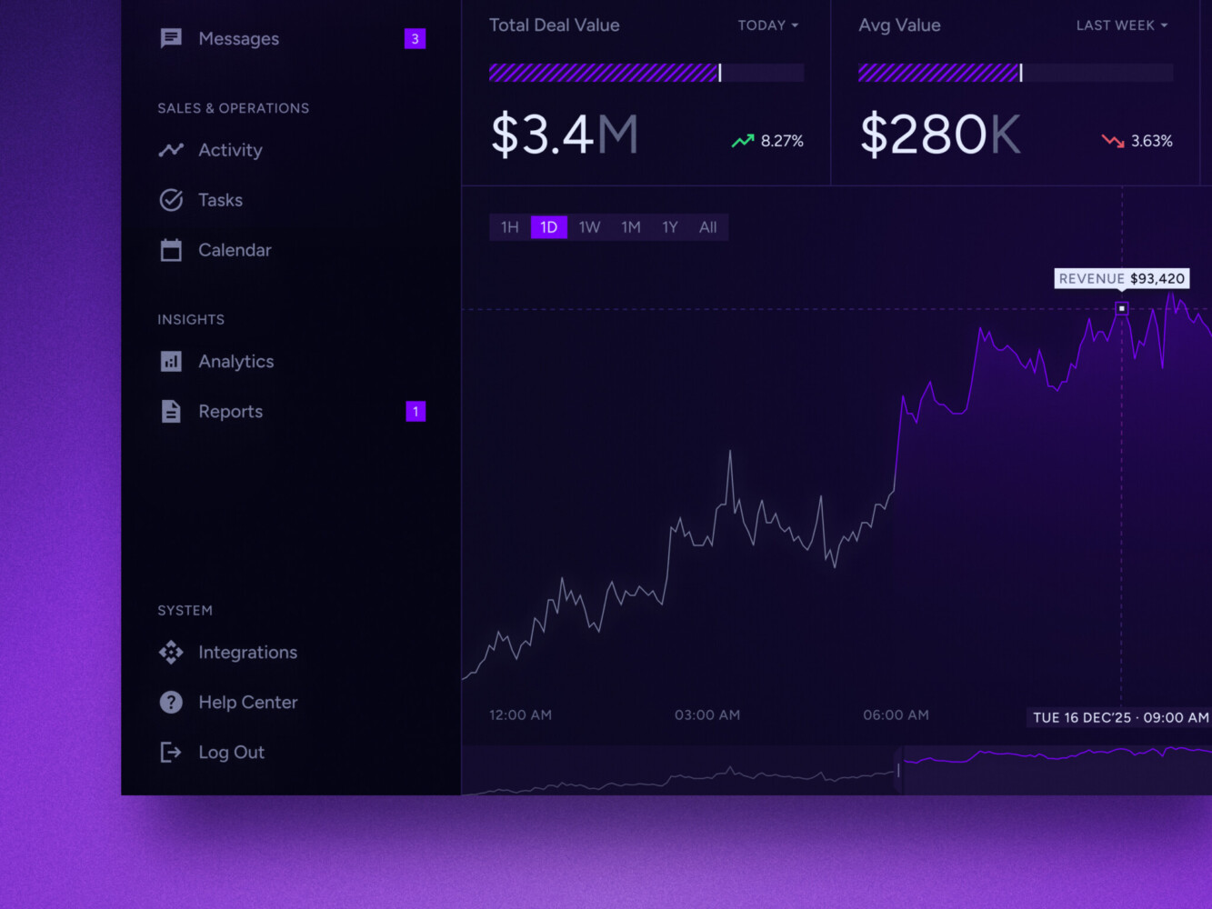
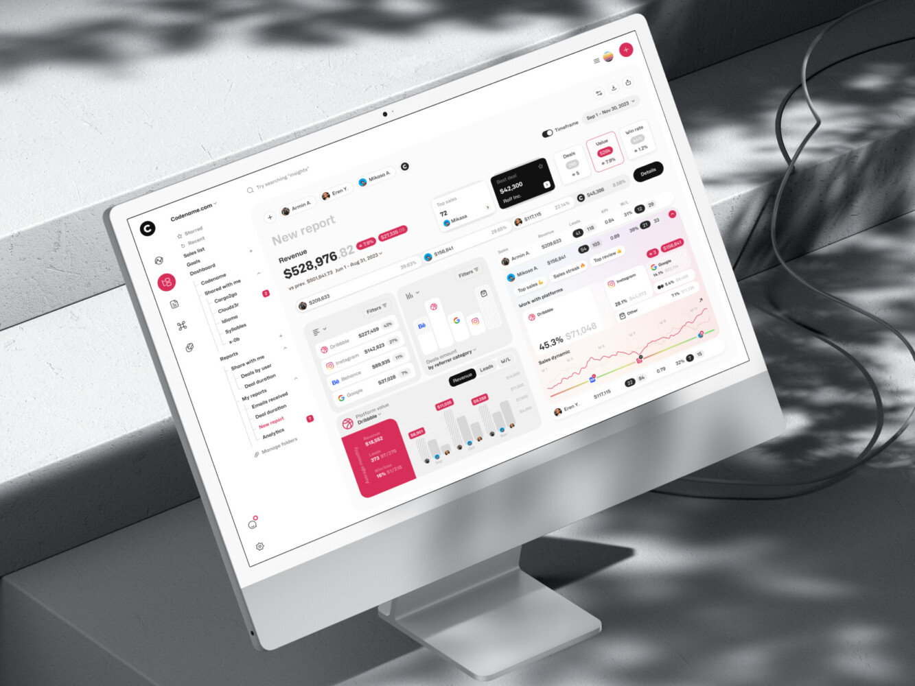
Real-time data dashboard by Shakuro
Common Types of Data Visualization Platforms
Self-Service BI Platforms
Self-service BI platforms are the familiar names: Power BI, Tableau, Qlik, Looker-style tools, and similar products. They are usually used by analysts, operations teams, finance departments, marketing teams, and managers who need internal reporting.
The good part is speed. A company can connect data, build dashboards, and start sharing reports without building everything from scratch. The slightly less good part is that these tools still need data modeling discipline. Give people twenty slightly different “revenue” definitions and the dashboard will not save them. It may actually make the argument more colorful.
Embedded Analytics Platforms
Embedded analytics puts dashboards and data exploration inside another product. Think SaaS admin panels, fintech apps, marketplaces, healthcare portals, logistics platforms, or customer-facing reporting modules.
This is a different design problem from internal BI. Users do not want to feel like they have been dropped into a separate analytics product. They want insights in the same place where they already work. A seller wants marketplace performance. A clinic manager wants patient flow metrics. A customer success team wants account health. The visualization should feel native to the workflow.
Enterprise Analytics Platforms
Enterprise data visualization platforms are built for larger organizations with many teams, user roles, data sources, compliance needs, and governance rules. They usually need SSO, role-based access control, row-level security, audit logs, shared metric definitions, permission workflows, and performance tuning.
The boring parts matter here. Actually, they matter a lot. Nobody gets excited about access policies during the first demo, but six months later, when a regional manager can only see the right slice of revenue data and the legal team is calm, everyone appreciates the work.
AI-Assisted Analytics Platforms
AI data visualization platforms add natural-language questions, automated summaries, chart suggestions, anomaly detection, forecasting, and narrative explanations. This is where the market has been moving fast.
Microsoft has been expanding Copilot in Power BI, including report summaries and conversational experiences. Tableau Pulse focuses on personalized insights, plain-language explanations, guided exploration, and proactive metric monitoring. Qlik Answers brings natural-language interaction to structured and unstructured data, with explainability and source visibility as part of the experience.
That sounds good, doesn’t it? It is. But there is a catch. AI can make analytics feel easier, but it cannot magically repair vague KPI definitions, broken pipelines, or inconsistent permissions. If the data foundation is weak, AI mostly helps you find the cracks faster.
Interactive Analytics Platforms
Interactive data visualization platforms are designed for exploration, not just viewing. They include drill-downs, filters, scenario views, maps, timelines, live charts, comparison states, annotations, and sometimes collaborative analysis.
The point is to let users move from “what happened?” to “why did it happen?” without opening a ticket for the analytics team every time. A good interactive dashboard feels a little like a conversation. You click, narrow, compare, zoom out, and suddenly the pattern becomes clearer.
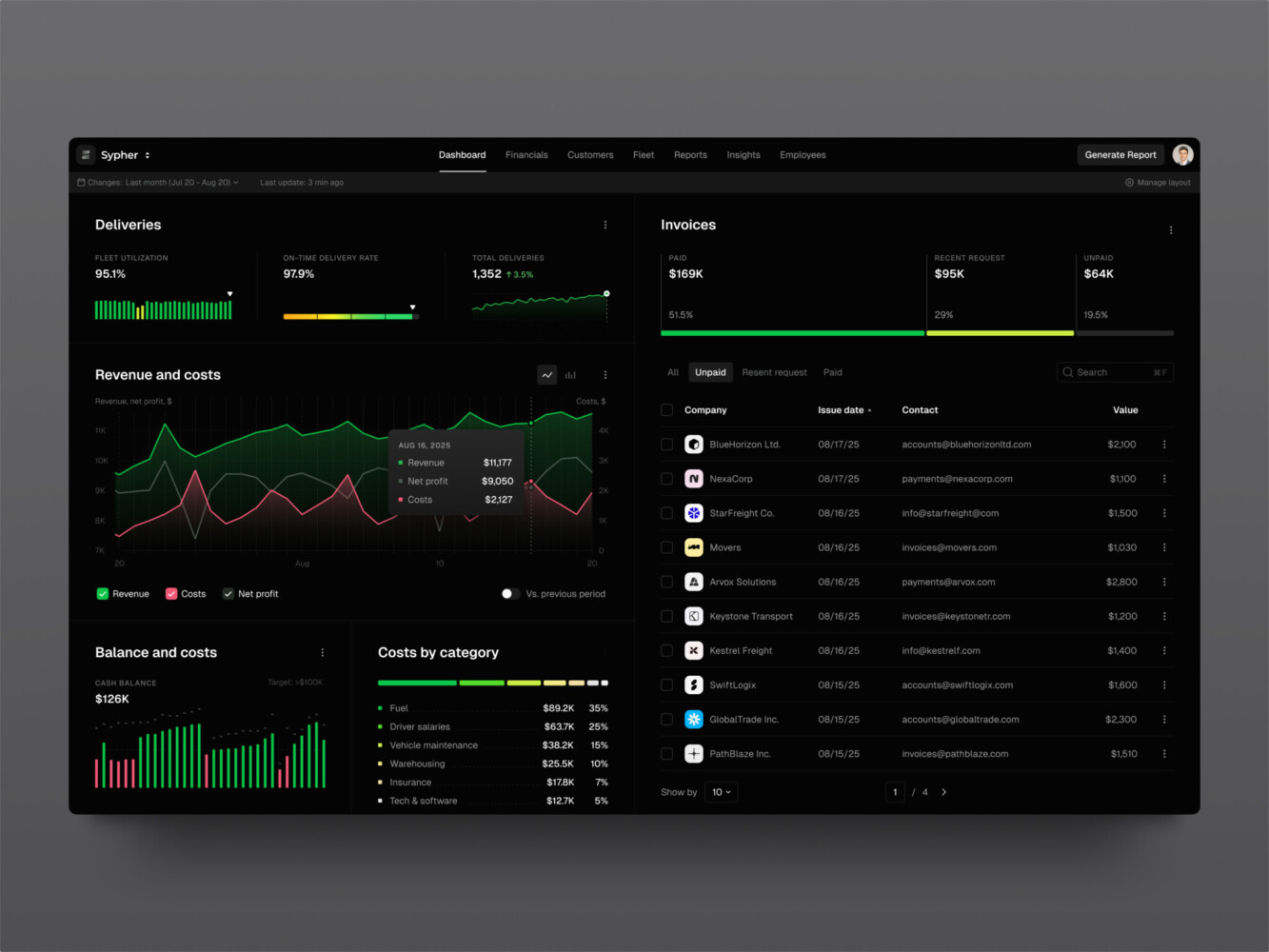
SaaS analytics platform by Shakuro
Key Features to Look for in Data Visualization Software
The feature list can get long quickly, so it helps to start with the basics.
First, look at data connectors. A platform should connect to the systems your business actually uses, not only the clean examples from the sales deck. Databases, APIs, CRMs, payment tools, spreadsheets, warehouses, and event streams all bring different quirks.
Then comes data modeling. This is where metrics are defined, relationships are clarified, and raw data becomes something people can trust. It is not glamorous work. I know. But without it, even the best dashboard builder turns into a paintbrush for confusion.
You also need a practical dashboard builder, chart library, filters, drill-downs, real-time or near-real-time updates where needed, alerts, collaboration tools, export options, mobile responsiveness, and role-based permissions. For enterprise or customer-facing products, audit trails and white-label or embedded options may be just as important as the charts themselves.
One small thing I always watch for: empty states. When there is no data yet, does the interface explain what is missing? Or does it just show a lonely blank chart? These little moments tell you whether the product was designed for real use or only for a demo with perfect data.
Data Visualization Platforms vs. Charting Tools: What Is the Difference?
The line between them can be fuzzy, but here is a useful way to think about it.
Data visualization tools usually help create charts, reports, or dashboards. A platform goes further. It handles ingestion, modeling, governance, permissions, scalability, workflows, integrations, and sometimes embedded product experiences.
| Option | Best for | Struggles with |
| Charting tool | Creating specific visualizations in an app, report, or web page | Data prep, permissions, governance, business workflows |
| BI platform | Internal dashboards, analyst workflows, recurring reporting | Deep product integration, highly custom UX, complex embedded use cases |
| Custom platform | Specific business processes, industry workflows, branded analytics, unusual data models | Higher upfront cost and more responsibility for maintenance |
| Embedded analytics module | Customer-facing dashboards inside SaaS or operational products | Needs careful UX, permissions, performance, and support planning |
There is no moral victory in choosing the most complex option. Sometimes a ready-made BI product is exactly right. Sometimes a custom build saves money and headaches later. The trick is being honest about what users need to do with the data.
When a Ready-Made Platform Is Enough and When Custom Development Makes Sense
A ready-made platform is often enough when your needs are close to standard reporting: sales dashboards, finance summaries, marketing performance, product usage, support analytics, or leadership reports. If your data sources are common, your permission model is manageable, and your users are mostly internal, it can be the best option.
Custom development starts to make sense when the analytics experience is part of the product, not just a back-office report. It also becomes more attractive when you have unusual integrations, sensitive data, industry-specific compliance, custom workflows, special UI requirements, heavy embedding needs, or licensing costs that keep creeping up.
I have seen teams cling to a ready-made tool because it was “faster,” then spend months fighting with workarounds. I have also seen teams build custom dashboards when a standard BI product would have been perfectly fine. Both mistakes feel expensive in different ways.
Ask a few blunt questions:
- Who will use the platform every week?
- What decision should they make after looking at it?
- How sensitive is the data?
- How many sources need to be connected?
- Does the dashboard need to live inside a product?
- How much control do you need over design, permissions, and performance?
- Will AI features actually support decisions, or are they just nice to mention in a roadmap?
If the answers point toward a custom analytics product, a team like Shakuro can help with the full path: product discovery, UI/UX design, dashboard development, SaaS architecture, AI features, frontend engineering, and long-term support.
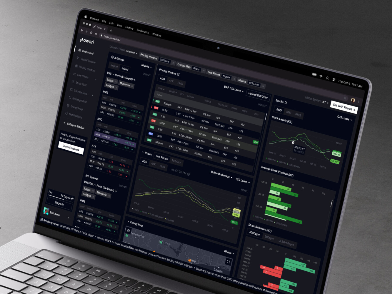
Owari dashboard by Shakuro
Architecture of Modern Analytics Products
Modern data visualization solutions are more than a frontend with charts. The architecture usually has several layers, and each one affects trust.
Data Sources
The source layer may include product databases, CRMs, ERPs, payment systems, IoT devices, spreadsheets, third-party APIs, support tools, event streams, and old internal systems nobody wants to touch but everyone still depends on. You know the ones.
Ingestion and Processing
Data has to move from those sources into a usable form. That can mean ETL or ELT pipelines, validation, deduplication, transformation, enrichment, and semantic modeling. This layer decides whether “active customer” means the same thing in product, finance, and marketing.
Storage and Analytics
Most serious platforms need a warehouse, lakehouse, cache, metrics layer, or some combination of those. The goal is not only storage. It is fast, consistent analysis at the scale your users expect.
Frontend
The frontend includes dashboards, chart components, tables, maps, filters, search, loading states, export flows, and responsive behavior. It also includes accessibility, which is easy to overlook until someone cannot read a low-contrast chart or use a filter without a mouse.
Security
Security sits across the whole system: SSO, RBAC, row-level security, encryption, audit logs, compliance controls, and safe handling of exports. In analytics, a small permission mistake can become a very awkward meeting.
How AI Is Changing Data Visualization Platforms
AI is changing the way people ask questions of data. Instead of navigating a report tree or building filters manually, users can ask something like, “Why did churn rise in the Northeast last month?” or “Summarize the biggest changes in this report.”
The useful AI features tend to fall into a few groups:
- Natural-language queries for business users who do not know SQL.
- AI-generated summaries for reports, dashboards, and metric changes.
- Automated chart recommendations.
- Anomaly detection that points out unusual spikes or drops.
- Forecasting and predictive analytics.
- Narrative insights that explain possible drivers.
- Assistant-style workflows that help users explore, compare, and act.
AI data visualization platforms can save time, especially for people who need quick orientation before a meeting. But again, the unglamorous foundation matters. The model needs clean definitions. Users need the right permissions. The system should show where an answer came from. Otherwise, people may get a polished paragraph that sounds confident and is quietly wrong. That is worse than a confusing chart, honestly, because it feels easier to trust.
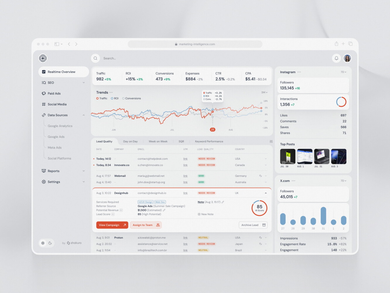
SaaS marketing dashboard by Conceptzilla
UX Principles for Exploratory Dashboards
The first rule is simple: avoid chart walls.
A chart wall happens when every metric gets its own tile, every tile gets a chart, and the user has to decode the whole thing like a control panel in an old science-fiction movie. It looks impressive for about ten seconds. Then it becomes tiring.
Good UX starts with hierarchy. What should the user notice first? What is supporting context? What is only needed when something looks unusual? Progressive disclosure helps here. Show the main signal first, then let users drill into details.
Role-based views also matter. A CFO, operations manager, support lead, and customer success rep may all care about the same business, but they do not need the same first screen. Give each role the view that matches their decisions.
Color logic should be boring in the best way. Green should not mean “good” in one chart and “completed” in another unless that difference is very clear. Legends should be close to the chart. Filters should show active states. Empty states should help. Loading states should not make people wonder whether the system froze.
And if AI insights are part of the interface, explainability becomes a UX feature. Users need to understand the source, confidence, and limits of a generated insight. A small “based on these metrics” note can prevent a lot of confusion.
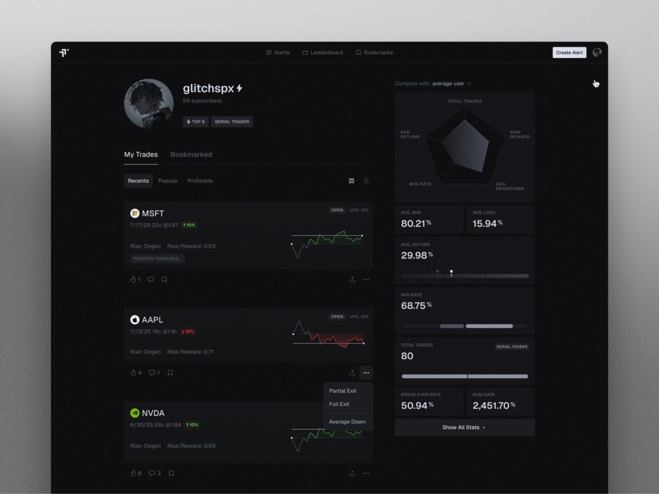
Shakuro’s TraderTale work is a nice example of this thinking in a fintech context. The product uses portfolio highlights, advanced stats, alerts, user profiles, leaderboards, and responsive data visualization to turn trading behavior into something users can compare and understand. Symbolik Social is another relevant case: a financial analytics and collaboration platform for market professionals, where charting and discussion had to live together without wasting space.
Development Process for a Custom Data Visualization Platform
A custom platform should not start with chart types. It should start with decisions.
1. Discovery
Figure out who the users are, what they need to decide, which KPIs matter, which data sources are involved, and what compliance limits exist. This stage can feel slow, but it prevents the classic “beautiful dashboard, wrong problem” situation.
2. Data Audit
Check data quality, ownership, gaps, refresh frequency, definitions, and source reliability. This is where teams often discover that the hard part is not the interface. It is the business logic hiding under the interface.
3. UX/UI Design
Design workflows, dashboards, visual hierarchy, interaction models, responsive layouts, and the visual system. For embedded analytics, this stage also decides how the experience fits into the product around it.
4. Architecture Planning
Plan pipelines, APIs, storage, caching, permissions, authentication, scalability, and monitoring. The architecture should match the expected load, not the dream version of the company three years from now, unless that growth is genuinely planned.
5. MVP Development
Build the core dashboards, integrations, authentication, reporting flows, and user roles. A good MVP gives users enough value to test real behavior, not just admire a prototype.
6. AI and Advanced Analytics
Add AI only where it supports real decisions. Summaries, anomaly detection, forecasting, recommendations, and natural-language queries can be useful. But adding AI to a weak dashboard is like adding a smart speaker to a room with no electricity. Nice object, wrong problem.
7. Testing
Test data accuracy, performance, security, usability, accessibility, and edge cases. Data accuracy deserves special attention. If users catch one obvious mistake, they may stop trusting the whole platform.
8. Launch and Iteration
After launch, track adoption, user feedback, slow queries, export behavior, misunderstood metrics, and requests for new data sources. Analytics products are never really “done.” They mature with the business.
Marketing analytics dashboard by Shakuro
Cost of Building Custom Analytics Software
Costs vary a lot, but broad ranges can help with planning.
| Type | Approx. cost range | Best for | What’s usually included |
| Internal dashboard MVP | $25,000-$60,000 | Small teams, internal reporting, early analytics validation | 1-3 data sources, basic dashboards, standard charts, simple filters, user login, manual or scheduled refreshes |
| Middle-grade analytics platform | $60,000-$150,000 | SaaS products, embedded analytics, growing teams with more complex reporting needs | Multiple integrations, custom UI, role-based access, reports/exporting, alerts, responsive dashboards, better performance tuning |
| Enterprise analytics platform | $150,000-$400,000+ | Large companies, regulated industries, multi-team analytics, complex data environments | Advanced permissions, SSO, audit logs, row-level security, data warehouse/lakehouse setup, high-volume processing, compliance support, AI or predictive features if needed |
A simple internal dashboard MVP may start around $25,000 to $60,000 if the data sources are limited and the interface is straightforward. An embedded SaaS analytics module often lands somewhere between $60,000 and $150,000, depending on permissions, UI complexity, reporting, and integrations.
An enterprise analytics platform can move into the $150,000 to $400,000+ range. The higher end usually includes multiple business units, complex access rules, high data volume, performance tuning, audit requirements, and long-term support. AI-enhanced platforms can add another layer of cost because they need semantic models, prompt flows, evaluation, security controls, and sometimes model integration work.
The biggest cost drivers are usually:
- Number and complexity of integrations.
- Data quality and transformation work.
- Real-time or near-real-time requirements.
- Custom UI and embedded product workflows.
- Permission depth and compliance needs.
- AI features and explainability.
- Ongoing maintenance, monitoring, and support.
Licensing matters too. A ready-made BI platform may look cheaper at first, and often it is. But for a large user base or customer-facing embedded analytics, license costs can become a real line item. It is worth doing the math early.
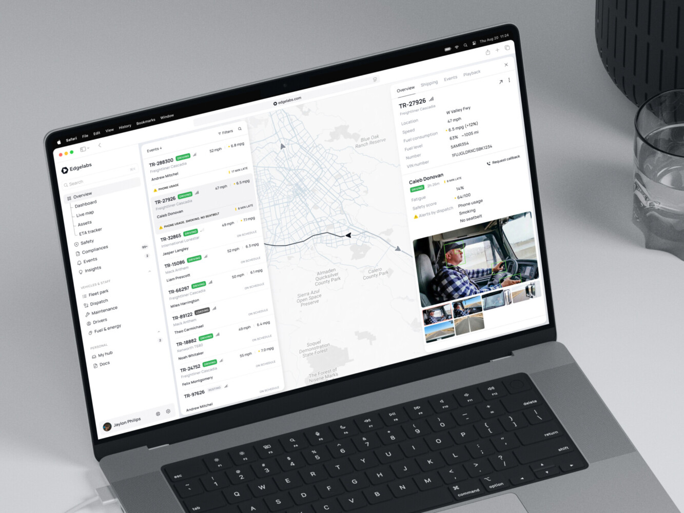
Telematics Dashboard by Shakuro
Common Challenges in Data Visualization Platform Development
Messy data is the obvious one. Duplicate records, missing fields, inconsistent names, old spreadsheets, and vague definitions can slow the whole project.
Unclear KPIs are just as dangerous. If stakeholders disagree on what “conversion,” “active user,” or “net revenue” means, the dashboard becomes a negotiation arena. Not ideal.
Performance can also surprise people. A dashboard that loads quickly with sample data may crawl once it connects to real volumes. Caching, pre-aggregation, query planning, and frontend rendering choices all matter.
Then there is chart density. Everyone wants their metric on the first screen. Nobody wants to remove anything. This is where product judgment has to be a little firm, because too many charts can make a platform feel less useful, not more.
Permissions get complicated fast, especially in enterprise and embedded contexts. Integration fragility is another quiet risk. APIs change, data schemas shift, exports break, and suddenly a trusted dashboard looks suspicious.
AI adds its own problems: explainability, hallucination risk, source tracing, privacy, and user expectations. People may expect the assistant to “know” things the platform has never been given. That is a recipe for disappointment unless the product sets clear boundaries.
Our Experience with Data-Heavy Products
Shakuro has worked on products where data is the product experience. We help you transform raw numbers into glanceable, complex insights. The design has to respect the data and the humans reading it. Both sides count.
We build custom analytics, SaaS dashboards, fintech tools, AI analytics products, embedded reporting modules, and other data-heavy solutions for different industries. While creating interactive data visualization platforms, we follow user-centered design principles, that’s why our solutions help people achieve their goals.

Here are some examples from our portfolio:
TraderTale is a fintech platform that turns trading performance into reputation. The interface includes trading profiles, alerts, leaderboards, portfolio highlights, advanced stats, and visual comparison tools. What stands out is that the data is not dumped onto the screen. It is shaped into a story about skill, consistency, and progress.
Symbolik Social sits in a different but related space. It brings financial analytics and collaboration together for market professionals, with charting, analysis tools, and social interaction in one environment. That mix is harder than it sounds, because analysts need dense information, but social products also need clarity and flow. Give too much interface noise and people stop contributing. That’s why we stroke a balance between UI looks and data representation.
For companies building custom analytics, SaaS dashboards, fintech tools, AI analytics products, or embedded reporting modules, that kind of experience matters.
TraderTale: Social Platform for Traders by Shakuro
Final Thoughts: Choose the Platform Around the Decision, Not the Chart
The best data visualization platforms are not just prettier dashboards. They connect trustworthy data, thoughtful UX, scalable architecture, useful governance, and the right level of interactivity or AI.
So before choosing a vendor or starting custom development, ask what decision the platform should help people make. Not the chart you want. Not all competitor screenshots look good. What decision?
That question keeps the project grounded. It helps you choose between ready-made tools, enterprise BI, embedded analytics, and custom development. It also keeps AI in its proper place: helpful when it clarifies and risky when it hides weak foundations behind fluent text.
If your team is planning a custom analytics product, embedded dashboard, or AI-driven visualization platform, Shakuro can help shape the product, design the experience, build the architecture, and keep improving it after launch.
FAQ
What are analytics platforms for visual data?
Data visualization platforms are software systems that connect to data sources, organize and model data, and turn metrics into dashboards, charts, reports, maps, alerts, or interactive views. They help teams understand business, product, financial, operational, or customer data faster.
What is the difference between charting tools and BI platforms?
Data visualization tools usually focus on creating charts or reports. BI platforms go further by supporting data connectors, modeling, dashboards, governance, permissions, sharing, and recurring reporting. Custom platforms can go even further by matching a specific product workflow or industry need.
What are the best data visualization platforms for enterprises?
The best choice depends on data maturity, security needs, team size, budget, and existing systems. Power BI, Tableau, Qlik, Looker, and similar BI products are common enterprise choices. For companies with unusual workflows, embedded customer-facing analytics, or strict customization needs, a custom platform may be the better option.
How much does custom analytics software cost?
A simple MVP may cost around $25,000 to $60,000. An embedded analytics module can range from $60,000 to $150,000. A larger enterprise or AI-enhanced platform may cost $150,000 to $400,000 or more. Integrations, data volume, permissions, AI features, compliance, and ongoing support all affect the final price.
How can AI improve data visualization?
AI can help users ask natural-language questions, summarize dashboards, detect anomalies, recommend charts, forecast trends, and explain metric changes. It works best when the underlying data models, permissions, and business definitions are clean. Without that foundation, AI may produce confident answers that still need a careful human check.