
For those who prefer to listen rather than read, this article is also available as a podcast on Spotify.
Contents:
Introduction
Today, a SaaS dashboard is basically the central nervous system of a business. It’s where the rubber meets the road. You’ve got transactions flowing in, user behavior data piling up, and operational metrics ticking over every second. If you can’t see it all in one place, you’re flying blind. And nobody wants to fly blind, especially when money is on the line.
That’s why more and more teams are building custom dashboards because fragmented tools just don’t cut it at scale. You need a single source of truth. Something that ties the billing status to the user’s actual activity in real-time. Something that lets you spot a churn risk before the customer even hits the cancel button.
First, we’ll break down how SaaS dashboard development actually works under the hood. We’ll look at the key components for AI-powered analytics platforms—the architecture that keeps things from falling apart when traffic spikes. I’ll share some thoughts on the development process too, including which technologies are worth your time and which ones are just hype. And yeah, we’ll talk about the challenges, too.
What is a SaaS Dashboard?
If you ask five different people, you’ll probably get five different answers. But at its core, it’s a control panel. A single interface that pulls together disparate strands of data and makes them readable. Actionable.
It’s an aggregation engine. Your financial data is everywhere. It’s in your payment gateway, your bank accounts, your subscription management tool, maybe even some legacy ERP system that nobody likes to touch. A good SaaS analytics dashboard sucks all that in, processes it, and spits out a coherent story. It turns noise into signal.
When we’re talking about financial data, the stakes are obviously higher. You can’t have “approximate” numbers when money is involved.
Let’s look at how this plays out in specific areas, because the requirements change depending on what you’re trying to do.
Take trading systems, for instance. If you’re building a platform that handles trades, for example, crypto, stocks, or even just high-volume digital goods, the dashboard needs to be fast. Like, really fast. Latency here is a loss of money. The dashboard has to process transactions in near real-time, showing open orders, execution status, and portfolio value without lagging. If the data is even a few seconds old, it’s useless.
Payment systems depend on reliability and clarity. You need to see who paid, who didn’t, and why. Failed payments need to be flagged immediately. Recurring revenue metrics (MRR, ARR) need to be accurate down to the cent. The dashboard for SaaS here acts as a ledger that’s actually easy to read. It helps finance teams reconcile accounts without spending three days in Excel hell. If the numbers on the dashboard don’t match the bank statement, you’ve got a problem.
Risk management is another beast entirely. Here, your solution is a watchdog. It’s looking for anomalies. Strange spikes in usage. Multiple failed login attempts from weird IP addresses. Unusual transaction patterns that might suggest fraud. The dashboard needs to surface these risks before they become disasters. That requires some serious backend processing power, sifting through logs and user behavior data to find the needles in the haystack.
And finally, analytics. The broad view. How are users engaging with the product? Where are they dropping off? What features are driving upgrades? This is where the dashboard supports decision-making. Product managers live here. They need to see trends over time, cohort analyses, and retention rates. The data doesn’t need to be millisecond-perfect, but it does need to be consistent and comprehensive.
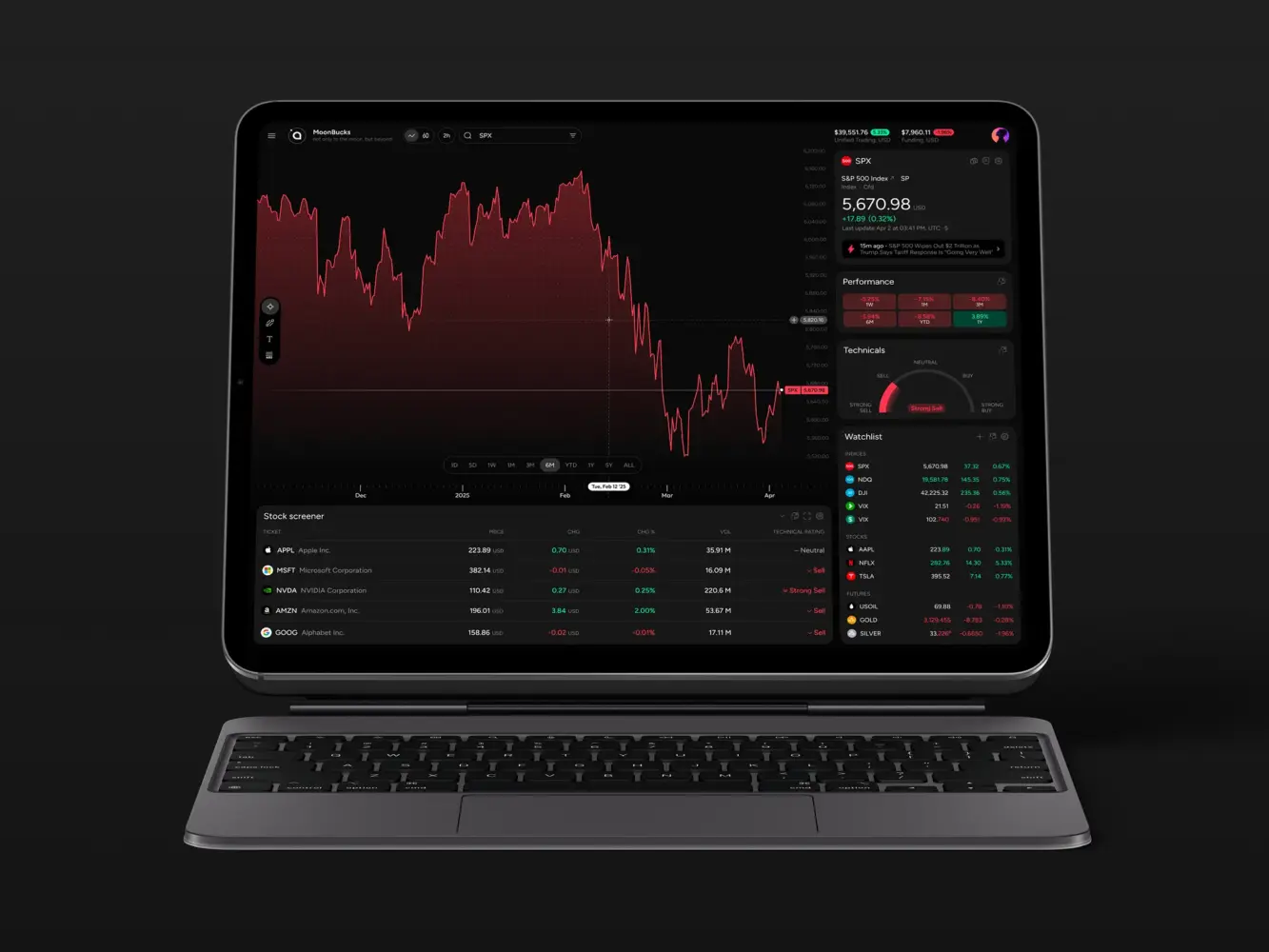
Financial Market Trading Analytics Tool Dashboard Design by Shakuro
Types of SaaS Dashboards
It’s tempting to think of a real-time SaaS dashboard as a monolithic thing. You know, one big screen with lots of graphs. But in reality, they’re pretty diverse. Different problems require different views. If you try to build one dashboard to rule them all, you usually end up with a cluttered mess that nobody uses.
From what I’ve seen in the field, most fall into a few distinct buckets.
1. Strategic Dashboards
These are for the high-level view. Think CEO, VP of Sales, maybe the Board of Directors. They don’t care about individual transaction IDs or server load times. They want to know: Are we growing? Are we profitable? What’s the churn rate looking like this quarter?
These dashboards aggregate data, like real-time updates and trends. The key here is clarity. One glance should tell you if the business is healthy or if there’s a fire somewhere.
2. Operational Dashboards
Now we’re getting into the weeds. These SaaS analytics dashboards are for the people keeping the lights on. Customer support teams, DevOps engineers, and operations managers. They need real-time or near-real-time data.
For support, it might be: How many tickets are open right now? What’s the average wait time? For DevOps, it’s: Is the API latency spiking? Are any services down?
These dashboards are tactical. They help you react now. If a metric goes red, you jump into action. They’re often more detailed and can be a bit noisier because you need that granularity to diagnose issues.
3. Analytical Dashboards
This is where the product managers and data analysts live. These are for exploring. You’re drilling down past generic numbers. Why did churn spike in November? Was it a specific cohort? A specific feature change?
These dashboards need to be flexible. They help you filter, segment, and compare things. For example, you can start with a broad view of user engagement and then narrow it down to people accessed certain features. With this tool, you ask questions and find answers in the data.
4. Transactional Dashboards
These are a little more special, but they’re very important for fintech or e-commerce. When you build such a dashboard, you focus on money or goods, such as the payment status, invoices, subscriptions, and so on.
The main qualities here are accuracy and state. Did the payment go through? Is the invoice sent? Is the subscription active or paused? The data infrastructure systems show the current state of individual entities. You need to trust these numbers implicitly.
5. Hybrid Dashboards
Most modern SaaS products end up with a mix of these. You might have a main homepage that’s strategic (high-level metrics) but with tabs or sections that dive into operational or analytical details.
The trick is not to overwhelm the user. You layer the information. Start high-level, then let the user drill down if they need to.
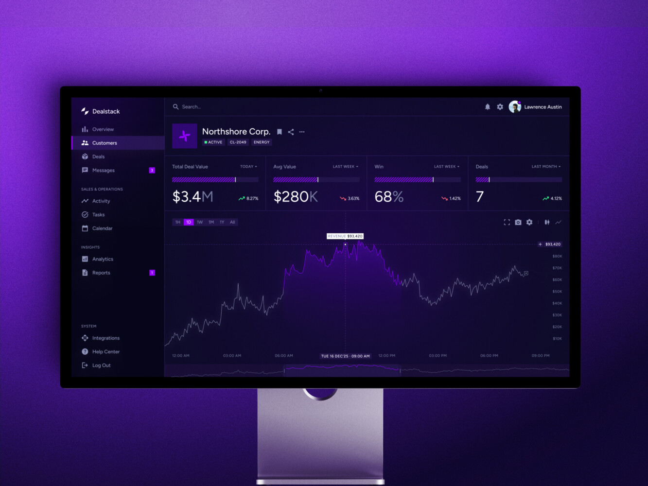
Sales Analytics Dashboard by Shakuro
Core Components
1. The Data Sources (The Raw Stuff)
This is where it all starts. Your data is born in your application, your payment processor (like Stripe or Braintree), your CRM, maybe even third-party APIs.
These sources are messy because they speak different languages. One sends JSON, another sends XML, another just dumps CSVs into an S3 bucket. The first job of your real-time SaaS dashboard is just knowing where everything lives. It sounds simple, but keeping track of schema changes across five different services? That’s a full-time job sometimes.
2. The Ingestion & Processing Layer (The Plumbing)
You can’t just query your production database directly for every dashboard request. Well, you can, but please don’t. You’ll kill your app.
So, you need a way to get data out of those sources and into a format that’s easy to analyze.
This is where ETL (Extract, Transform, Load) or ELT pipelines come in. You extract the data, clean it up, and load it into a place optimized for reading.
Quite often, people think, “Oh, I’ll just write a SQL query.” But when you’re dealing with millions of rows, you need aggregation. You need to pre-calculate sums, averages, and counts. If you’re doing this on the fly for every user request, you’re going to have a bad time.
3. The Storage Engine (The Warehouse)
Once the data is cleaned, where does it live? You usually don’t want it in your primary PostgreSQL or MySQL instance. Those are great for transactions, but terrible for heavy analytical queries.
This is where data warehouses come in. Snowflake, BigQuery, Redshift, ClickHouse. These databases scan huge amounts of info quickly. They use a certain type of storage, which means they’re really fast at saying, “Give me the sum of all invoices from last month,” but maybe slower at updating a single user’s email. Choosing the right one depends on your scale and budget. ClickHouse is amazing for real-time stuff, while BigQuery is great if you’re already in the Google ecosystem.
4. The API Layer (The Bridge)
Now you have clean data in a warehouse. How does the frontend get it? You need an API.
However, a simple REST endpoint won’t cut. For SaaS dashboard development, you often need GraphQL or APIs for special analytics that make everything more flexible. The frontend might say, “I need revenue by country for the last 30 days,” and the API translates that into a query for the warehouse.
Security is huge here. You need to make sure User A can’t see User B’s data. Row-level security is a must. I’ve seen teams forget this until late in the game, and then they have to refactor everything. Not fun.
5. The Frontend Visualization (The Face)
Finally, the part everyone sees. This is where you use libraries like Recharts, Chart.js, D3.js, or heavier tools like Tableau Embedded.
But the visualization library is the easiest part. The hard part is state management. Handling loading states, error states, empty states. What happens if the query takes 10 seconds? Do you show a spinner? A skeleton screen? How do you handle caching on the client side so you’re not refetching the same data every time the user clicks a tab?
Also, responsiveness. Dashboards look great on a 27-inch monitor. They often look terrible on a laptop or mobile. You have to design for both.
6. The Caching Layer (The Speed Boost)
I’m adding this as a separate point because it’s critical. Even with a good warehouse, queries can be slow. You need caching. Redis or Memcached are your friends here.
If ten users ask for the same “Monthly Revenue” chart, you shouldn’t hit the warehouse ten times. You calculate it once, cache it for a few minutes, and serve it to everyone else. It saves money and makes the app feel snappy. But you have to balance freshness with speed. How stale can the data be before it’s a problem? That’s a product decision, not just a technical one.
Sales Tracking SRM Dashboard UI/UX Design by Shakuro
Key Features of SaaS Dashboards
1. Real-time (or Near Real-time) Data Updates
Nobody wants to hit a “Refresh” button in 2026. It feels archaic. Users expect data in a dashboard for SaaS to flow. If a new transaction comes in, they want to see that number tick up. Now, true real-time is hard.
WebSockets are great, but they can be heavy on the server if you’re pushing updates to thousands of clients simultaneously.
Often, “near real-time” is enough. Polling every 30 seconds? Maybe. Or using Server-Sent Events (SSE) for a lighter-weight solution. The key for real-time analytics systems is perceived speed. If the user sees a little animation when the data updates, it feels alive. If the data is static, they start wondering if the app is broken.
2. Deep Interactivity and Drill-Downs
Static charts are boring. And honestly, not that useful. A good SaaS analytics dashboard lets you click. You see a spike in churn? Click it. What caused it? Was it a specific plan? A specific region? You should be able to drill down from the high-level metric into the granular details without leaving the page.
This requires smart state management on the frontend. You’re essentially navigating a tree of data. Parent node -> Child node -> Leaf node. If the transition is janky or slow, you lose the user’s train of thought. Smooth animations help here. It’s a small detail, but it makes a huge difference in how “premium” the product feels.
3. Customization and Personalization
One size fits nobody. The CEO wants different metrics than the Support Lead. Even within the same role, people have different preferences. Some like dark mode. Some want compact views; others want spacious layouts.
Allowing users to drag and drop widgets, hide charts they don’t care about, or save custom views is a game-changer. It makes the dashboard feel like their tool. It increases engagement because they’ve invested time in setting it up. Plus, it reduces cognitive load. They only see what’s relevant to them.
4. Smart Filtering and Segmentation
Data without context is just noise. You need robust filtering. Date ranges are obvious (Last 7 days, Last Month, YTD). But go deeper. Filter by user cohort, subscription tier, geographic location, device type, etc.
Make the filters persistent. If I filter by “Enterprise Plan” and then switch from the “Revenue” tab to the “Users” tab, keep that filter active. Nothing is more annoying than having to re-select your filters every time you click a new menu item. It’s a small UX thing, but it shows you’ve thought about the workflow.
5. Export and Reporting Capabilities
Yeah, I know. We’re trying to move away from Excel. But finance teams love their spreadsheets. Marketing teams love their PDFs.
With dashboard development for SaaS, you need to let users get the data out. CSV exports are standard. PDF reports for monthly summaries are nice. Maybe even scheduled email reports? “Hey, here’s your weekly summary.”
The trick for data integration systems is making sure the exported data matches what’s on the screen. Discrepancies here destroy credibility instantly. If the dashboard says $10k and the CSV says $9.8k, you’ve got a problem. Ensure your export logic uses the same underlying queries as the visualization.
6. Alerts and Notifications
Don’t make users stare at the screen waiting for something to go wrong. Proactive alerts are key. If revenue drops by 10% compared to last week, send a Slack notification. If server latency spikes, send an email. Let the dashboard come to them.
But be careful. Alert fatigue is real. If you ping them for every tiny fluctuation, they’ll mute you. Make the alerts smart. Threshold-based with anomaly detection. Only bother them when it actually matters.
7. Performance and Loading States
I mentioned this before, but it’s worth repeating. A slow dashboard is a dead dashboard.
Use skeleton screens while data loads. Don’t just show a blank white space. Give the user a visual cue that something is happening. And optimize your queries. If a chart takes 5 seconds to load, consider pre-aggregating that data. Or lazy-loading charts that are off-screen.
Perceived performance is just as important as actual performance. If the UI feels responsive, users are more forgiving of slight delays in data fetching.
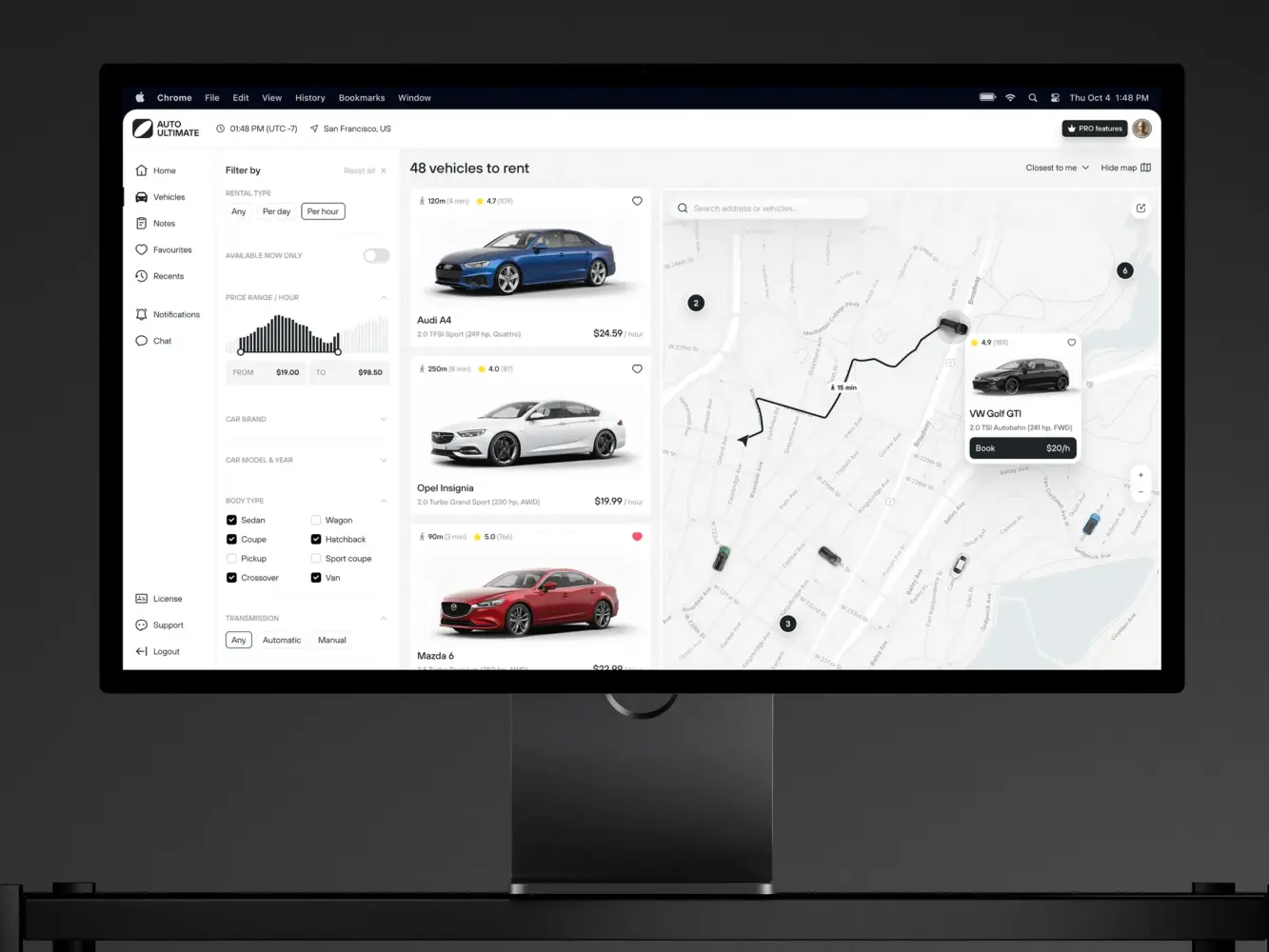
Dashboard Design For a Car Rental Service by Shakuro
SaaS Dashboard Development Process
1. Define the “Why” and the “Who”
Before writing a single line of SQL or JavaScript, sit down with your stakeholders. And I mean really sit down.
Ask them: What decision are you trying to make with this dashboard? If the answer is “I want to see everything,” you’re in trouble. You need to narrow it down. Is it for monitoring health? For spotting sales trends?
Identify the primary user persona. Is it the CTO? The Head of Sales? The Customer Support Lead? Their needs are vastly different. The CTO cares about latency and error rates. The Head of Sales cares about MRR and churn. Don’t try to build one dashboard for both. Build two views, or two separate dashboards.
2. Audit Your Data Sources
This is the unglamorous but critical part. Map out where the data lives. Is it in your main Postgres database? Is it in Stripe? Is it in Mixpanel? Do you have access to the APIs? Are there rate limits?
Check the data quality. Is it clean? Are there null values? Inconsistent formats? If the source data is garbage, your dashboard will be garbage. Garbage in, garbage out. It’s a cliché because it’s true.
3. Design the Data Model (The Schema)
Now that you know what data you have and what you need, figure out how to structure it.
You probably don’t want to query your raw transactional tables directly. You’ll want to create aggregated tables. Maybe a daily revenue table. Or a user activity summary table.
During SaaS dashboard development, think about the grain of your data. Do you need second-by-second precision? Or is daily enough? The finer the grain, the more storage and processing power you need. Balance accuracy with performance.
This is also where you decide on your aggregation logic. How do you define “churn”? Is it when a subscription cancels? Or when a user hasn’t logged in for 30 days? Get these definitions locked down early. If you change them later, you’ll have to recalculate historical data, which is a pain.
4. Prototype the UI/UX
Don’t code yet. Sketch the interface out. Use Figma, or even pen and paper.
Layout matters. Put the most important metrics at the top left. That’s where the eye goes first. Group related charts together. Don’t scatter revenue metrics across three different tabs.
Think about the flow. If you click on a bar in the “Revenue by Country” chart, what happens? Does it filter the rest of the dashboard? Does it open a modal? Map out these interactions.
Get feedback on the prototype from your actual users. Do they understand what the charts mean? Is the terminology clear? You’d be surprised how often “ARR” and “MRR” get confused by people outside of finance.
5. Build the Backend Pipeline
Now you can start coding. Start with the data pipeline. Set up your ETL/ELT processes. Move the data from your sources to your warehouse. Then shape it according to the idea you designed in the previous steps.
Build your API endpoints. Make sure they’re secure. Implement row-level security if you’re dealing with multi-tenant data. You don’t want Company A seeing Company B’s revenue. Test the performance. Run the queries with large datasets. If they’re slow, optimize them. Add indexes, pre-aggregate more data, and consider caching.
If we’re speaking about tools, then the most popular ones for dashboard development for SaaS in terms of backend are Node.js and Python with FastAPI. When it comes to databases, PostgreSQL and MongoDB are the most common choices. If you need containerization and orchestration, you can check out Docker and Kubernetes.
6. Develop the Frontend
Finally, the visible part. Choose your visualization library. Keep it simple. Don’t use 3D pie charts unless you have a very good reason (you probably don’t).
When we work on the frontend, we usually take advantage of React or Vue. These instruments help us focus on responsiveness. Anyways, make sure it works on different screen sizes. Implement the interactivity. The drill-downs, the filters, the tooltips.
Handle the edge cases. What does the dashboard look like with no data? What does it look like when the API is down? Error states are part of the UX too.
7. Test, Iterate, and Launch
Test with real data. Staging environments rarely mimic the complexity of production data.
Get a small group of users to try it out and watch them use it. Where do they get stuck? What questions do they ask?
Be prepared to tweak. You’ll likely find that some charts are useless and others are missing key details. That’s normal. Dashboards are living products. They evolve as the business evolves.
And one last thing: document your metrics. Create a “data dictionary.” Explain what each metric means, how it’s calculated, and where the data comes from. This saves countless hours of confusion later on. When someone asks, “Why does this number look wrong?” you can point to the documentation instead of spending three days debugging.

Doctor’s Dashboard Design Concept by Shakuro
SaaS Dashboard Development Cost
Building such a solution isn’t cheap. And I don’t just mean the developer salaries, though those are significant. I’m talking about the hidden costs. The infrastructure bills that creep up on you. The maintenance overhead.
So, what drives the cost?
Key Factors That Impact Costs
Data Complexity and Volume
This is the biggest variable. If you’re pulling data from one source and displaying simple counts, it’s cheap. But if you’re aggregating millions of rows from five different sources, transforming them, and serving them in real-time? That’s expensive.
More data means more storage. More processing power. More complex ETL pipelines. And frankly, more engineering time to make sure it doesn’t break.
Real-time Requirements
Do you need data to update every second? Or is once an hour enough? Real-time is hard. It requires WebSockets, streaming databases (like Kafka or Kinesis), and careful optimization to prevent server overload. The infrastructure costs for real-time systems can be 5-10x higher than batch-processed systems. And the development time? Double it, at least.
Customization vs. Off-the-Shelf
Are you building from scratch or using a tool like Tableau, Looker, or PowerBI embedded in your app?
Custom dashboard development gives you total control but costs a fortune in dev time. Embedded tools are faster to implement but come with licensing fees and limited customization. You might save on initial development but pay more in monthly subscriptions. It’s a trade-off.
Security and Compliance
If you’re handling financial data or PII (Personally Identifiable Information), you need robust security. Encryption at rest and in transit. Row-level security. Audit logs. GDPR compliance.
This isn’t optional. And it adds weeks to the development timeline. You need senior engineers who know what they’re doing. You can’t cut corners here.
Maintenance and Iteration
A dashboard is never “done.” Data sources change. APIs update. Business metrics evolve.
You need to budget for ongoing maintenance. Who fixes it when Stripe changes their API? Who updates the charts when the product team adds a new feature? If you don’t plan for this, your dashboard will rot within six months.
Two Common Development Scenarios
To give you a concrete idea, let’s look at two typical scenarios.
Scenario 1: The MVP Dashboard
Your goal here is to prove the value. Get something usable in front of users quickly. That’s why the scope is rather small and consists of 3-5 key metrics. For example, Total Revenue, Active Users, Churn Rate.
The data can be updated every 24 hours with batch processing from one source. No custom filtering or drill-downs, just basic charts (line, bar, pie). To build it, you will need a lightweight framework (e.g., React + Chart.js) and a simple backend API.
It will take you around 4-6 weeks. As for the costs, plan for approximately $15,000 – $30,000. The team can include a full-stack developer and a part-time designer.
The only thing is, this MVP dashboard for SaaS will likely need a rewrite when you grow.
Scenario 2: The Enterprise Dashboard
If we take an enterprise scenario, then it will require you to scale and handle complex analytics, real-time data, and multiple user roles.
So, the scope is massive: you have 20+ metrics across multiple modules. For example, Finance, Operations, User Engagement. There are multiple data sources (Database, Stripe, Salesforce, Third-party APIs). Of course, you will need advanced features like drill-downs, custom filters, saved views, exports, etc. Not to mention role-based access control.
With all comprehensive testing and documentation, it will take you at least 3 to 6 months. The expenses might be around $100,000 – $250,000+. The team consists of a product manager, UI/UX designer, 2 backend engineers, a frontend engineer, and a data engineer.
If you go with the MVP approach, you will incur technical debt. You’ll likely have to rebuild parts of it later. That’s okay. It’s a strategic choice. But don’t pretend it’s free.
If you go with the Enterprise approach, you’re paying upfront to avoid that pain later. But you risk overbuilding. Building features nobody uses.
My advice? Start somewhere in the middle. Build a solid foundation. Don’t skimp on the data pipeline. But keep the frontend simple. Add complexity as you learn what your users actually need.
Management Dashboard by Shakuro
Common Challenges in SaaS Dashboard Development
The “Real-Time” Trap
Everyone wants real-time data. “Live updates!” “Instant insights!” But do you actually need it?
True real-time is expensive and complex. If you’re pushing updates via WebSockets to 10,000 concurrent users, your server costs will skyrocket. And if your data source (like Stripe or a legacy SQL db) only updates every few minutes, “real-time” is a lie anyway.
Many teams burn months trying to build analytics dashboards for metrics that only change once a day. It’s a waste. Be honest about your latency requirements. Sometimes, “fresh enough” (like 5-minute delays) is perfectly fine and saves you a ton of engineering pain.
Data Consistency Nightmares
The dashboard says revenue is $100,000. The finance team’s Excel sheet says $98,500. Who is right? Panic ensues.
Usually, it’s because of different definitions. Does “revenue” include tax? Does it include refunds? Is it recognized when the invoice is sent or when the payment clears?
If you don’t define these metrics rigorously upfront, you’ll spend forever arguing about numbers instead of acting on them. And once trust is lost, it’s hard to get back. Users will stop believing the dashboard. They’ll go back to their spreadsheets. Game over.
You need a single source of truth. A “data dictionary” that everyone agrees on. And you need to stick to it.
Performance at Scale
It works fine with 100 users. It works fine with 1,000. Then you hit 10,000. Suddenly, queries that took 200ms now take 10 seconds. The SaaS analytics dashboard hangs. Spinners everywhere. Users leave.
This happens because you didn’t plan for aggregation. You’re querying raw rows instead of pre-calculated summaries. Or you’re missing indexes. Or your cache strategy is non-existent.
Scaling is more than adding more servers. You have to do smart data modeling. You need to think about how your queries will perform when the data volume grows 10x or 100x. If you don’t, you’ll be refactoring under pressure while your customers are angry.
Multi-Tenancy and Security
In dashboard development for SaaS, you’re serving multiple companies (tenants) from the same application. You must ensure that Company A never sees Company B’s data.
This sounds obvious, but it’s tricky. You need row-level security in your database. You need to pass tenant IDs through every layer of your stack—from the frontend request to the API to the SQL query. Miss one spot? Data leak. Lawsuit. Reputation destroyed.
It adds complexity to every query. You need robust automated tests to ensure isolation. It’s not glamorous work, but it’s critical.
UI Clutter and Cognitive Overload
Just because you can show 50 charts doesn’t mean you should. Users don’t know where to look. They get analysis paralysis.
SaaS UI dashboard design is about subtraction. What can you remove? What’s the one thing the user needs to see first? Hierarchy matters. Big numbers at the top. Detailed charts below. Contextual filters on the side.
If everything is important, nothing is important. Don’t just dump data on the screen.

Dashboard for Satellite Monitoring and Management by Shakuro
Our Experience in Fintech and SaaS Dashboard Development
You might be wondering, “Why should I listen to these guys?” Fair question. There are a thousand agencies out there claiming they can build anything. But we’ve been in the trenches. We’re not just theorists. We’ve built this stuff over and over again.
At Shakuro, we’ve spent more than 19 years helping startups and established companies launch SaaS products that actually stick. And a huge part of that are dashboards. From simple admin panels to complex, real-time analytics engines handling millions of data points.
Frontend-Heavy Applications
We specialize in building rich, interactive frontends using modern frameworks like React, Vue, and Next.js. But apart from the looks, we also pay attention to performance. We know how to keep the UI snappy even when you’re loading massive datasets. We use techniques like virtualization, lazy loading, and smart caching to make sure the experience feels instant.
Analytics Dashboards
This is our bread and butter. We’ve built dashboards for fintech, healthtech, e-commerce, you name it. We understand the nuances of different data types. The need for precision. The importance of real-time updates.
We don’t just slap charts on a page. We think about the story the data tells. How do you visualize churn so it’s actionable? How do you show revenue trends without clutter? We know how to handle drill-downs, filters, and exports so they feel natural, not tacked on.
Scalable SaaS Systems
A pretty dashboard is useless if the backend collapses under pressure. Our dashboard developers build for scale from day one. We design architectures that can handle growth. We use cloud-native technologies (AWS, GCP, Azure) to ensure reliability.
We build secure, isolated environments for each user. Row-level security is standard practice for us. You sleep better knowing your data is safe.
UX-Driven Products
We believe that UX is how a dashboard for SaaS actually works. We spend time understanding your users. Their workflows. Their pain points. We prototype. We test. We iterate.
We bring that empathy to every project. We fight for simplicity. We push back on feature creep. Because a dashboard that does everything poorly is worse than one that does three things perfectly.
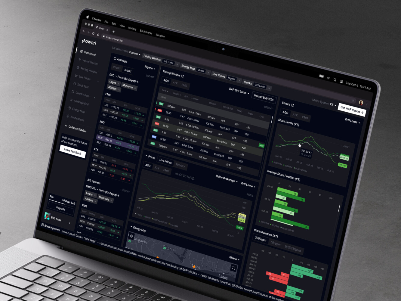
Owari
Owari is a digital trading platform that automates brokers’ labor. For this product, we created an intuitive, glanceable dashboard with real-time algorithms.
Our team focused on representing heavy data in a simplified way. Still, we kept in mind that Owari was planning to scale, so we integrated scalability on day one. We used custom frontend and backend with Webflow instruments to deliver a responsive dashboard. With its helps, users could track trends and prices in real time, as well as browse country data, vessels, cargos, etc.
As a result, the SaaS UI dashboard design provides all the essentials for professionals in a clear and convenient way.
Symbolik
For Symbolik, a well-known financial analytics tool from Tom DeMark, we built Symbolik Chart as a part of our services. Using WebSockets and RabbitMQ for real-time updates, our dashboard developers created a reliable and high-performing solution.
We integrated customization with various indicators, comparison of multiple assets, and insight sharing. All in one tool. At the same time, the designers created a logical structure so that users have everything at their fingertips. This approach impacts decision-making.
The Symbolik Chart has become an important tool in the Symbolik product, helping traders manage their assets.
Owari Dashboard by Shakuro

Why Work with a SaaS Dashboard Development Company
You’ve got your dev team. They’re smart. They know your codebase. Why hand over the keys to strangers? It feels like losing control. And honestly, for a lot of things, you should keep it in-house. But dashboards are a different beast.
They’ve Seen This Movie Before
Experienced dashboard developers have built dozens or even hundreds of these things. They know the pitfalls. They know how to structure a data pipeline so it doesn’t choke on Black Friday traffic.
Your internal team might be learning these lessons for the first time. That’s fine, but it’s expensive. You’re paying for their learning curve. A specialist brings that knowledge on day one. They don’t need to figure out how to handle real-time WebSockets; they’ve already solved that problem for five other clients.
Speed to Market
Because they have pre-built components, templates, and best practices, they can move fast.
What might take your team three months to architect and build from scratch, a specialized agency might deliver in four weeks.
In data dashboard development, speed is currency. Getting a functional, robust dashboard into your users’ hands quickly can mean the difference between closing an enterprise deal and losing it to a competitor who looks more polished.
Objective Perspective
When you’re deep in the weeds of your own product, it’s hard to see the forest for the trees. You might think a certain metric is crucial because you built the feature. But your users? They might not care.
An external team brings fresh eyes. They challenge your assumptions. “Why are you showing this?” “Is this actually useful?” They act as a product consultant, not just a coder. This objectivity can save you from building features nobody wants.
Freeing Up Your Core Team
Your best engineers should be working on your core product. The things that differentiate you. The things that drive innovation.
Do you really want your senior backend engineer spending three weeks debugging a caching issue for a chart? Probably not.
By offloading the dashboard development, you let your team focus on what they do best. You avoid context switching. You keep your roadmap on track.
Long-Term Maintainability
Specialized firms build for scale. They document their code. They set up proper CI/CD pipelines for data updates. They think about maintenance from day one.
Internal “side projects” often lack this rigor. They become spaghetti code. Hard to update. Hard to debug.
A professional build is cleaner. It’s easier for your internal team to take over later if they choose to. Or you can keep the agency on a retainer for updates. Either way, you’re starting with a solid foundation, not a house of cards.
If you’re an early-stage startup with zero revenue, maybe you DIY it. Keep it simple. Use a no-code tool. But if you’re scaling? If you’re landing enterprise clients who demand sophisticated analytics? If your internal team is already stretched thin? Then bringing in dashboard developers is a no-brainer. It’s an investment in credibility.
Terraview Dashboard Design Concept by Shakuro
Final Thoughts
A dashboard is trust, clarity, and the difference between guessing and knowing. When your users can log in and instantly see the health of their business, you’re providing peace of mind.
If you’re diving into data dashboard development, don’t wing it. Here’s the playbook, stripped down:
- Start with the “Why.” Don’t build features; solve problems. Know who your user is and what decision they need to make.
- Respect the data. Audit your sources. Clean your pipelines. Define your metrics rigorously. If the data is wrong, nothing else matters.
- Architect for scale. Don’t query your production DB directly. Use a warehouse. Aggregate early. Cache aggressively. Think about what happens when you have 10x the data.
- Design for clarity. Less is more. Hierarchy matters. Make it interactive, but don’t clutter the screen.
- Iterate. Launch an MVP. Get feedback. Fix the broken bits. Add complexity only when necessary.
Whether you build it in-house with a dedicated team or you bring in specialists to fast-track the process, just start. Start small. Ready to build something that actually matters? Let’s get to work.