We treat design like decoration. Like putting a nice coat of paint on a house. But if the door doesn’t open smoothly, does the paint color really matter?
For founders and product managers, this is the silent killer. You can have the best marketing funnel in the world, but if the first ten minutes of using your app feel like wading through molasses, you’re burning cash. It’s frustrating, right? You build something to solve a problem, but the interface creates a new one.
So, how do you fix your SaaS UX design? How do you move from “pretty screens” to UX that actually sticks?
It’s about reducing friction. It’s about understanding that every click is a small ask of your user’s patience. In my experience, the products that win aren’t always the most feature-rich. They’re the ones that feel effortless. The ones where you don’t have to think.
Let’s talk about how to get there. Because if you’re tired of watching good leads slip away, this might be the shift you need.
What Is SaaS Product Design?
SaaS product design is the planning and shaping of a subscription software experience. It includes user flows, information architecture, interface design, onboarding, dashboards, role management, billing logic, product states, and the design system underneath all of it.
Put more plainly, it is how the product works and feels when someone is trying to get their job done.
This is different from designing a marketing website. A website might need to explain, persuade, and convert. A SaaS product needs to be used repeatedly. Sometimes daily. Sometimes by tired people who just want to export a report before lunch.
That little detail changes everything.
The product has to support new users, advanced users, admins, managers, finance teams, customer success people, and occasionally the person who inherited the account from someone who left the company two years ago. They open settings and hope nothing breaks.
That is why UX design for SaaS cannot be treated as a one-time visual task. It is a product discipline. The designer has to understand user goals, business logic, technical constraints, and what happens when the product scales.
SaaS UX Design vs SaaS UI Design
People often use UX and UI together, and honestly, that is fine in casual conversation. But when you are planning a product, the difference matters.
UX is about structure and behavior. Can users find what they need? Do they understand what to do next? Is onboarding too long? Are permissions clear? Does the dashboard answer real questions, or is it just full of charts because charts look serious?
UI is about the visible interface. Layout, typography, buttons, cards, forms, states, components, spacing, color, and motion. SaaS UI design gives the product its visual clarity and polish.
The two are tangled together. A beautiful interface with weak UX still frustrates people. A smart workflow with messy UI feels unreliable. Nobody wants to trust a business-critical tool that looks like it was assembled during a late-night panic.
So, yes, SaaS UI/UX design is partly about making screens look good. But it is also about helping users feel oriented. There is a quiet emotional side to this. When software feels clear, people relax a little. When it feels chaotic, they start wondering what else is broken.
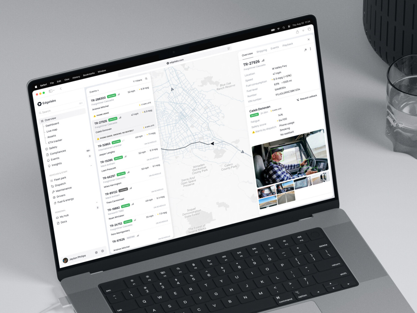
Telematics Dashboard by Shakuro
Why UX Matters for SaaS Growth and Retention
SaaS teams talk about growth all the time: acquisition, activation, retention, expansion. Fair enough. But UX sits underneath a surprising amount of that.
If onboarding is confusing, activation drops. If core workflows take too many steps, people avoid them. If reporting is hard to read, managers do not trust the tool. If settings are scary, admins contact support for every tiny change.
And support tickets are not just annoying. They are signals. Sometimes they say, “The user did not read the docs.” More often than teams want to admit, they say, “The product did not explain itself.”
Good SaaS UX design can really help here. It can reduce time-to-value, make features easier to discover, and give users small moments of confidence. A clear empty state, for example, can do more than fill blank space. It can tell someone what happened, why it matters, and what they can do next.
For SaaS products, the metrics to watch are practical ones: activation rate, onboarding completion, task success, churn, feature adoption, support volume, retention, expansion revenue, and active usage. Not every design change will move all of them. That would be too neat. But thoughtful design gives the product a better chance.
Core SaaS UX Design Patterns to Get Right
Some patterns show up again and again in SaaS products. They look simple from the outside. Then you start designing them, and suddenly there are ten edge cases hiding under the table.
Onboarding and First-Run Experience
The first session should not feel like homework. Ask only for what you need. Show progress where it helps. Let people skip nonessential steps. And do not explain every feature before the user has any reason to care.
The best onboarding usually gets users to one meaningful result quickly. A dashboard with sample data. A first imported contact. A connected integration. A created project. Something that says, “Okay, I see it.”
Dashboards and Analytics Views
Dashboards are where SaaS products often get noisy. Teams want to show everything because everything feels important internally.
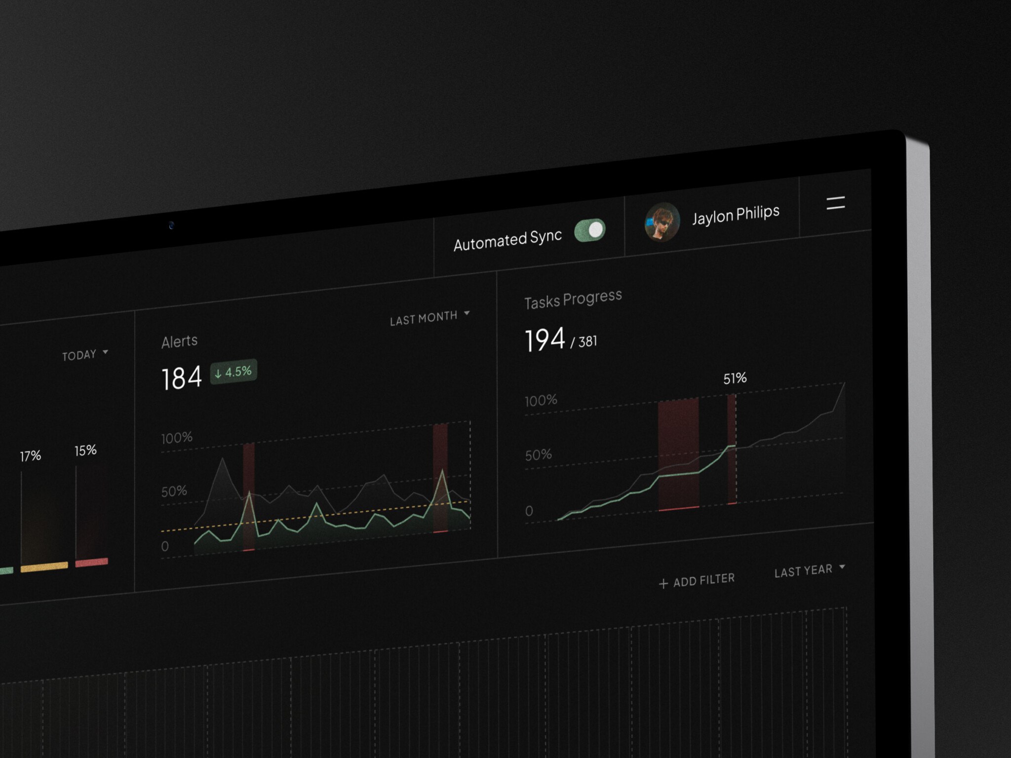
But users do not need everything at once. They need hierarchy. What changed? What needs attention? What can wait? SaaS UX design patterns for dashboards should focus on scanning, comparison, filters, and trust. If users misread a chart, the interface has failed even if the data is technically correct.
Navigation for Growing Feature Sets
Early SaaS navigation is easy. Five items, maybe six. Then the product grows, and suddenly the sidebar becomes a storage closet.
A good navigation system needs room to evolve. Group related tasks. Separate admin and user workflows. Use plain labels. Avoid clever names unless the product has earned them. Nobody wants to guess where billing lives.
User Roles, Teams, and Permissions
Permissions are not glamorous, but they matter a lot in B2B products. People need to know who can see, edit, approve, export, invite, and delete. The interface should make access feel predictable, especially for admins.
For UI/UX design for B2B SaaS, this is one of those areas where clarity beats cleverness every time.
Subscription, Billing, and Upgrade Flows
Billing design has to be calm. Users should understand what plan they are on, what limits apply, what happens when they upgrade, and whether they are about to charge the company card.
Tiny uncertainty here creates big friction. Nobody wants to accidentally start a procurement drama.
Integrations and Settings
Integrations are powerful, but they can become messy fast. Show status clearly. Give useful error messages. Explain what data is shared. Offer test actions when possible.
Settings need the same care. They are often where products dump complexity. A little structure goes a long way.
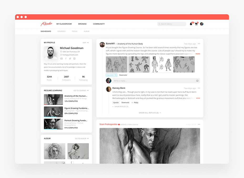
Proko platform by Shakuro
How to Design a SaaS Product Step by Step
There is no single perfect process. Teams are different, budgets are different, and sometimes a founder needs an MVP yesterday. Still, most healthy projects pass through a few recognizable stages.
1. Discovery and Product Strategy
Start with the problem, not the interface. Who is the product for? What job are they trying to do? What is painful now? What would make them switch from their current workaround?
This stage is also where business goals meet product reality. A subscription product needs more than a nice first impression. It needs reasons to stay.
2. User Research and Journey Mapping
Talk to users if you can. Watch how they work. Look at support tickets, sales calls, onboarding notes, churn reasons, and analytics. The truth is often scattered across teams.
In SaaS UI/UX design, journey mapping helps you see where people get stuck. Sometimes the problem is not a screen. It is a handoff between two roles, a missing notification, or a report that nobody trusts.
3. Information Architecture and Core Workflows
Before designing polished screens, decide how the product is organized. What are the main objects? Projects, accounts, reports, users, campaigns, documents? How do they relate?
This is the part people want to rush, and I get it. Boxes and flows do not feel as exciting as UI. But rushed structure tends to come back later as confusion.
4. Wireframes and Prototypes
Wireframes let you test the bones of the product before investing in detailed visuals. Prototypes help teams feel the flow. They also expose awkward moments, like a form that asks for information the user does not have yet.
5. UI Design and Design System
The SaaS UI design should make the product easier to read and use. Strong hierarchy, consistent components, accessible contrast, clear states, and responsive layouts all matter.
A design system is especially useful when the product will keep growing. Without it, teams slowly invent five kinds of dropdowns and twelve button styles. It is a little annoying to clean up later, and by “a little” I mean very.
6. Usability Testing and Design QA
Testing does not have to be fancy. Put a prototype in front of people and ask them to complete real tasks. Watch where they pause. The pause is usually the interesting part.
Design QA also matters before launch. Check spacing, responsive behavior, empty states, loading states, errors, disabled buttons, long names, weird permissions, and all the small things users absolutely will find.
7. Developer Handoff and Post-Launch Iteration
SaaS UX/UI design and development works best when designers and developers stay close. Handoff is not throwing a Figma file over a wall. It is agreement on behavior, states, components, edge cases, and priorities.
After launch, use real product data. Where do users drop off? Which features are ignored? What do people search for in help docs? The product will tell you what hurts, if you listen.
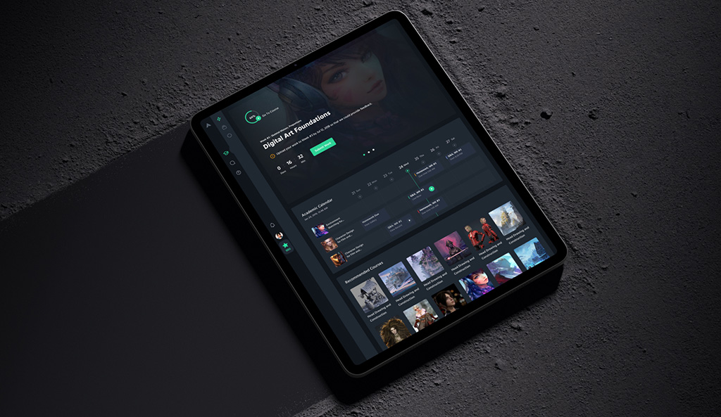
CGMA platform by Shakuro
SaaS UI/UX Design Services: What Should Be Included?
If you are hiring help, SaaS UI/UX design services should include more than pretty screens.
At a minimum, look for discovery, UX audit or research, user flows, wireframes, prototypes, visual design, responsive layouts, design system work, accessibility checks, usability testing, and developer-ready documentation.
For a SaaS product, I would also ask how the team handles dashboards, complex forms, roles and permissions, integrations, billing flows, and post-launch improvements. Those are the places where product design stops being theoretical.
Our UI/UX service, for example, includes discovery and research, prototyping, UI/UX design, production-ready delivery, testing, design QA, post-launch UX improvements, and design system scaling. That mix is useful because SaaS products do not stand still. They keep changing, and the design has to keep up without turning into soup.
SaaS Product Design Cost and Timeline
Cost is always the slightly uncomfortable part of the conversation. But it is better to talk about it plainly.
For smaller design work, a focused design concept may start around $3,000. A landing page or UI update can sit around $5,000 to $10,000. A complete mobile or web app UI/UX design often ranges from $20,000 to $50,000. Large enterprise products with custom systems, deeper research, and complex workflows can go above $100,000.
Those numbers are useful as a rough map. Not a promise, of course. The actual price depends on scope.
The main cost drivers are usually the number of user roles, dashboard complexity, integrations, responsive requirements, research depth, design system size, compliance needs, and how much testing is needed. A simple MVP and a multi-tenant enterprise platform are not the same beast. They should not be estimated like they are.
Timeline works the same way. A quick UI refresh may take a couple of weeks. A full SaaS product can take months, especially if discovery, prototyping, testing, and development support are included.
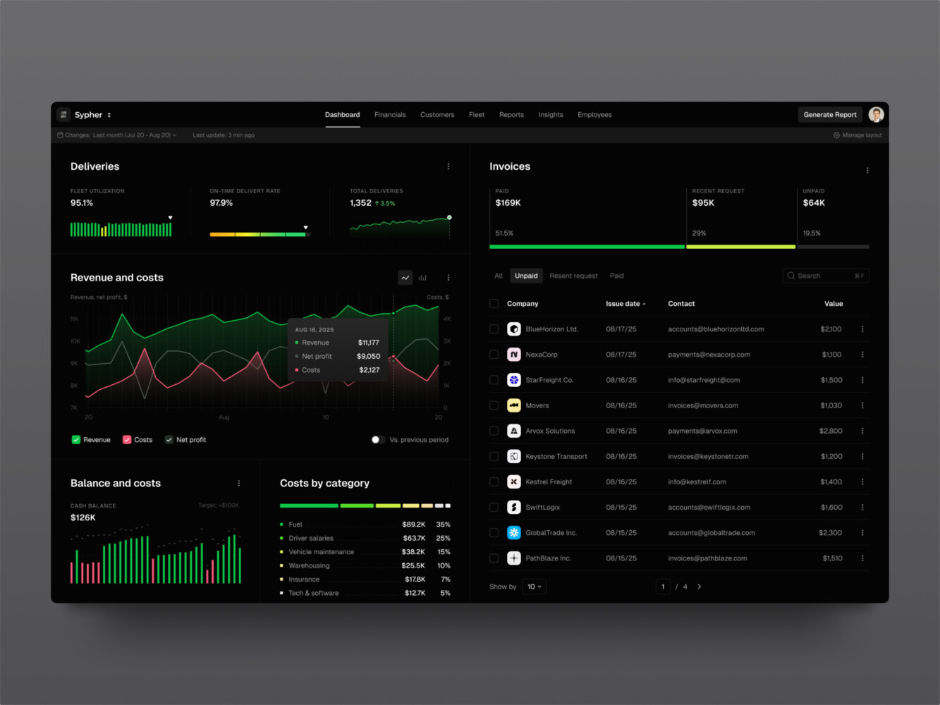
SaaS analytics platform by Shakuro
Common SaaS Product Design Mistakes
One common mistake in SaaS UX design is explaining too much at the wrong time. Product tours often mean well, but users do not remember ten tooltips before they have context. Show guidance when it is needed.
Another mistake is dashboard overload. More charts do not automatically mean more insight. Sometimes they just mean more squinting.
Teams also underestimate empty states. A blank screen can feel broken. A good empty state gives users a next step and reduces that tiny moment of panic.
Permissions get messy too. If admins cannot understand access rules, they become nervous. Nervous admins slow adoption.
And then there is inconsistency. A product with mismatched components feels harder to trust, even when the backend is solid. Users may not say, “This design system lacks coherence.” They will just say the product feels clunky.
Our Experience in SaaS Product Design
Owari is a good example of SaaS product design with real complexity behind it. It is a digital platform for West African oil and gas markets, built for traders, brokers, and analysts who need to work with serious data. The product includes dashboards, stock levels, country data, vessel tracking, energy maps, complex tables, and data visualization.
What stands out is the focus on clarity. In a data-heavy product, visual hierarchy is not a nice extra. It is part of the product’s value. If the user makes decisions from the interface, the interface has to be readable, fast, and trustworthy.
The point is not that every SaaS product should look like this example. It is that good design responds to the actual product situation. Dense trading data needs one kind of UX. A social investment platform needs another. Sounds obvious, but it is easy to forget when everyone is looking at the same inspiration boards.
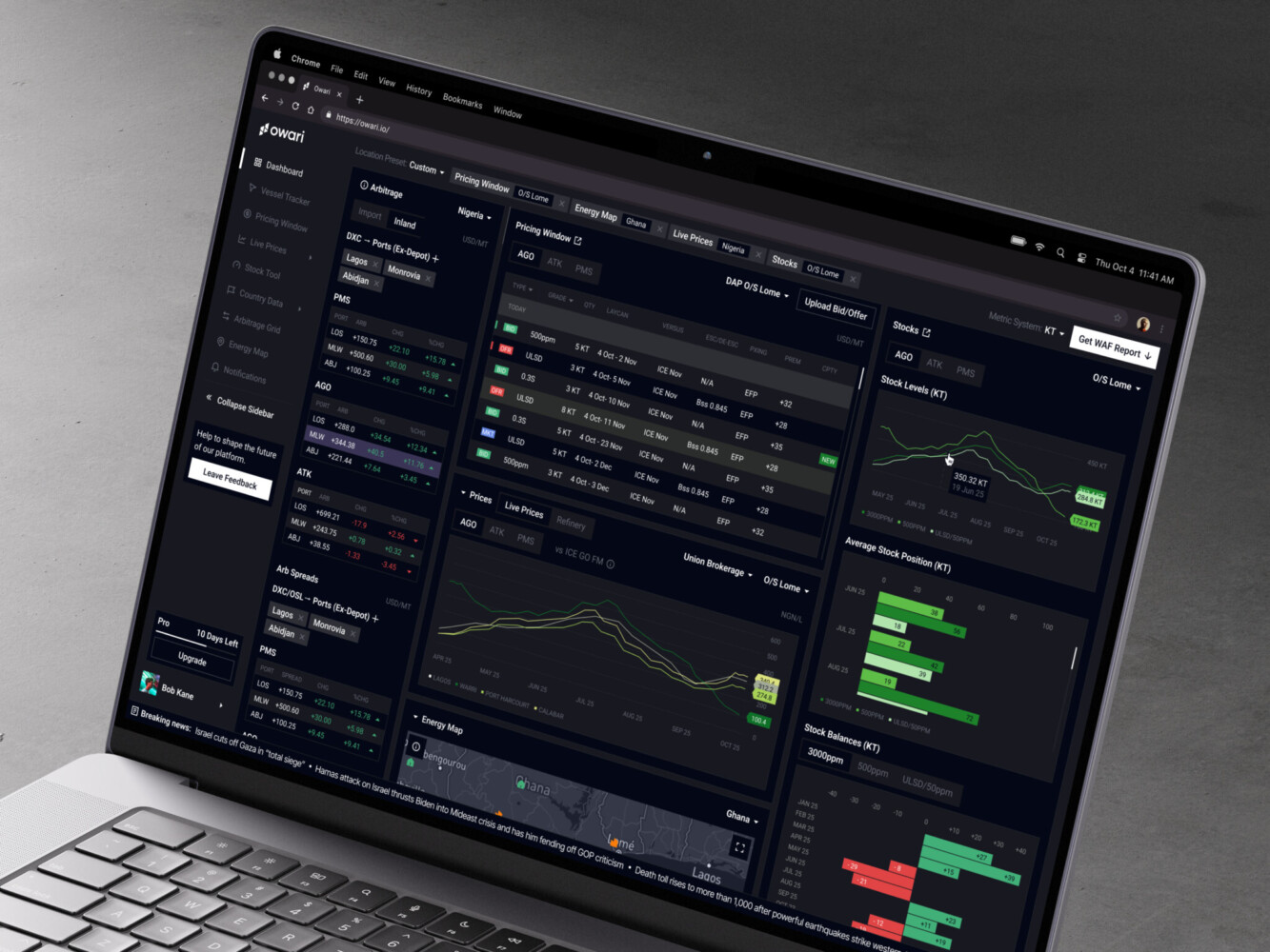
Owari dashboard by Shakuro
Final Thoughts
SaaS product design is not just about making software look polished. It is about helping people understand what the product does, get value from it quickly, and keep trusting it as their needs grow.
If there is one practical takeaway, it is this: design the product around repeated use, not the first screenshot. The screenshot matters, sure. But retention lives in the boring places too: settings, permissions, empty states, filters, billing, loading screens, error messages.
That might not sound glamorous. But it is where a lot of SaaS products become good.
If your product is starting to feel harder to use as it grows, a UX audit or focused redesign can be a sensible next step. Not because everything needs to be reinvented. Often, the best option is just making the important things clearer.
FAQ
What is SaaS UX Design?
SaaS UX design is the process of shaping how users move through and use a subscription software product. It covers onboarding, navigation, workflows, dashboards, permissions, settings, feedback, and other parts of the experience that affect adoption and retention.
How is SaaS Product Design Different From Web Design?
Web design usually focuses on presenting information and converting visitors. SaaS product design focuses on repeated product use. It has to support users after signup, often across complex tasks, multiple roles, subscriptions, integrations, and changing product needs.
What UX Patterns Matter Most for B2B SaaS?
The most important patterns are clear onboarding, role-based permissions, useful dashboards, strong navigation, predictable settings, good empty states, integration status, billing clarity, and accessible interface states. Not flashy, maybe, but very important.
How Much Does SaaS UI/UX Design Cost?
It depends on scope. A small design concept can start around $3,000, a landing page or UI update may cost $5,000 to $10,000, and a full mobile or web app UI/UX design often ranges from $20,000 to $50,000. Enterprise SaaS products can go above $100,000.
When Should a SaaS Company Redesign Its Product?
A redesign makes sense when users struggle to onboard, support tickets repeat the same UX issues, feature adoption is low, the product has outgrown its navigation, or the interface no longer supports the business model. Sometimes a full redesign is needed. Other times, a careful cleanup is enough.
Related reading
- SaaS Analytics Platform Development: How to Build Scalable Data-Driven SaaS Products
- Web Platform UX: How to Design Web Apps People Can Actually Use
- SaaS MVP Development: How to Build, Launch, and Scale a Product Users Actually Need
- SaaS Automation Tools: Features, Use Cases, Costs, and How to Build One