
What is design? Most people think that design is about making things look pretty – a decoration. Art. But design is as much an art as it is a science. Cold and calculated process. Sometimes the detriment of pretty. Yet, the design is not allowed to fail. Design is for everyone and no one in particular. Website and mobile app design, as well as design in general, is a complex yet subtle process, it’s more than making things pretty.
Contents:
Humans speak through languages and things speak through design. It seems today that nobody claims to speak a foreign language they haven’t studied but everybody thinks they know design.
Let’s dive in and try to understand – Why is design important?
The many-sided nature of design
In simple and brief words, a design is a plan to make something.
“Design is a plan for arranging elements in such a way as best to accomplish a particular purpose.”
― Charles Eames, American designer, architect, and filmmaker
The design meaning depends on the context and can also refer to a variety of other things. Design is the creation of an experience. It’s also the process of the said creation and how well it’s organized. On top of that, design is the result, i.e. the things we see, hear, and feel.
The meaning is so multifaceted, to the point that you can no longer say if a universal design definition is possible at all. You can, however, try to look at the sum of the parts to come up with a more realistic picture. So, Charles Eames said that design is all about purpose.
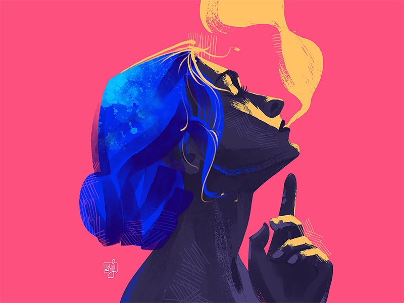
fantasizing… by SAM JI
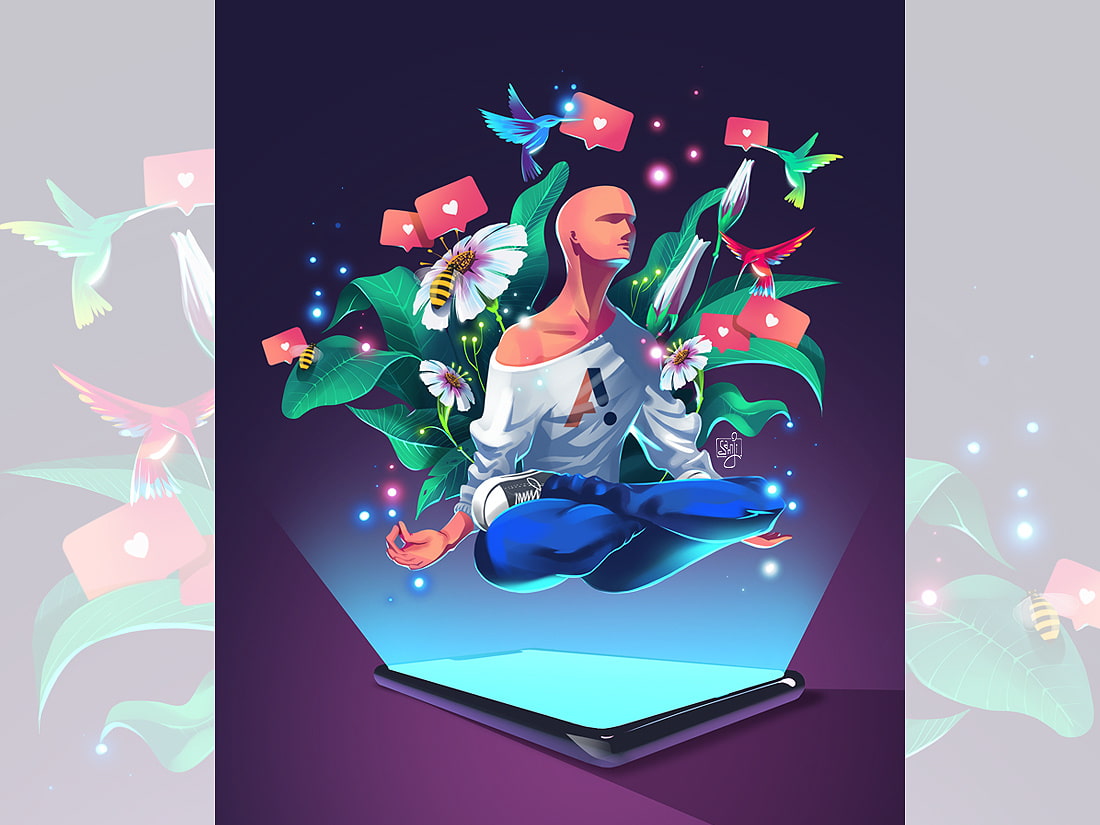
The purpose of design
Every type of design exists to solve problems. To see the problem and find a solution, designers rely on data. So the toolset of the designer is based on research, not prettification.
Your design doesn’t have to be original
It’s a common misconception that novelties and hype in design will sell a product. The only reason conventional and textbook design patterns exist is because they are tested, proven, and they work. According to Jakob’s Law of Internet User Experience, users spend most of their time on other sites, so it makes perfect sense to design for patterns for which users are accustomed.
We only implement new approaches if we are 100% positive they are better than the existing ones. This alone comes from a great deal of research.
The great design solution you are looking for is out there.
The real challenge is to find it.
Every time you make a user think through an ‘innovative’ navigation pattern or an unorthodox menu placement, it’s a chance to lose them. Not because they are dumb but because we gravitate to familiar things more than we do to the unknown. If we do go for it though, we make sure everything about the new design is bulletproof.
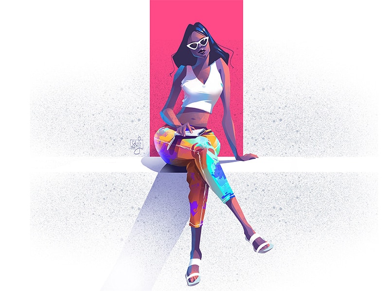
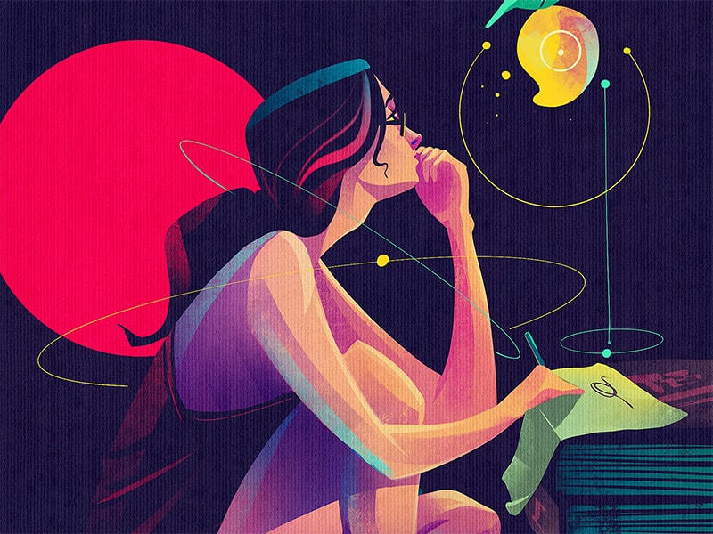
Attitude by SAM JI
Designers are not like their users
Everybody has biases and it’s okay. Cognitive biases reduce the load and help us stay sane. That being said, it’s important to know whether your bias is damaging your design work.
Designers and owners know their product inside out. Their bias is called the Curse of Knowledge. It’s when you find it extremely difficult to think about problems from the perspective of lesser-informed people. On top of that, your goals are entirely different from those of the people you are building for.
People want to get things done, not listen about how cool you are.
What makes us different? If you are reading this, you are top of the food chain when it comes to computers. Most people are not and they don’t care. They don’t know what it takes to build a digital product just like we don’t know what it takes for our computers to work off the power line. Everybody knows something no one else does.
Oddly enough, the more employees a design company has, the stronger their detachment from real users. No matter how good they think they are. Ask Google about Buzz.
That is why it’s vital for design agencies to keep it humble and always research their users, study their goals and pains. The more we know about our users, the less biased we are. Eventually, people will have their own habits and biases about our product. But we have got to convert them first.
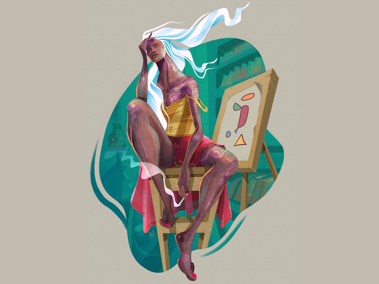
Submerged thoughts by SAM JI
UX design is more than just about usability
Usability is about making a product for people to accomplish their goals. UX design is a lot more robust than just that. It brings delight and meaning to ordinary things. Good UX design matters because it makes every step enjoyable, even the negative ones. If there is no network connection, the website should not die. If a page doesn’t exist, the 404 should not be a bummer. That’s a UX design job. It goes further beyond the familiar definition of user experience.
Here are some important UX design principles:
- Good design will crack you up. User satisfaction is no longer a goal. It’s a default every design solution should be in line with. However, the fun and delight are the goals. The hard sell times are past. Modern design seduces and brings pleasure.
- Good design will eat your money and make you feel good about it. Practical value is only a part of what people are willing to pay for. Another part is happiness. If your design makes people feel good, they will forgive you for technical issues and bad updates. How to make them happy? Be genuine and honest about your work. Listen. Change.
- Good design feels like a person. For people to care, they have to empathize with something. If a product is designed in a way that favors everything, it favors nothing. You make a social impact by having a strong distinctive voice, promoting the right kind of values, and identifying with your audience. No matter what type of business you do, there has to be a human side to it.
- Good design has meaning. Meaning connects people with objects. If that connection is meaningful, it will stay for years. The design should empower people to establish the connections they need to feel free, capable, and enlighted.
cover art by SAM JI
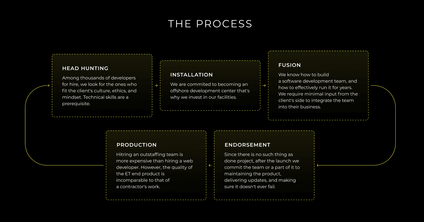
Design is not a stage of the project
What is design for deep tech circles? There is an idea that it is a time in the project when they draw sketches of the interfaces. It is not. Design starts when the owner first puts together the image of the product and ends when the project is done which is never done.
The choice of a business model can’t rely on the goals of the owners. There might be a natural talent and an insane gut feeling but it would be foolish to rest on them.
Knowledge of how the product could fit into people’s lives is UX. Knowledge of how to implement it is UI.
UX does not result in UI. It penetrates production, testing, analytics, support, and updates that follow the creation of just interfaces. Those who realize that a designer is more than just a pencil, end up with a consistent and reliable product as opposed to a patchwork of narrow tasks.
A business owner shouldn’t be surprised when no other than a designer will start asking them about their business strategy. In fact, a designer will only be drawing the UIs for 12.5% of the time they’ll be involved in the project.
cover art by SAM JI
Eye candy design works
It might appear that design, especially the digital one, takes itself too seriously. Indeed, there are usability geeks who don’t believe in the impact of design. They exemplify it by the unattractive likes of Reddit and Craigslist.
Design is no place for extremities. When there’s looks not backed by proper functionality, it’s empty. When it’s just handy and useful, there’s no emotion tied to it and it is also bad. To find the balance between usability and aesthetics, we need to know how attention works and what makes something perceived as beautiful.
To reach more people, your expertise has to spread thin and let emotions onboard users. The visual design drives emotion.
This is how web design works. The vibe of a website decides whether a person will stay and discover the features. Design is engineering in the sense that we know how to engineer delight. Through visual design, we bring meaning to ordinary things and help people find value.
An illustration is a shell for something that it represents on a deeper level. When we designed a professional platform for architects, we created an animation of elements that mimics the behavior of a construction site.
It might look subtle and may not seem worth the struggle at the early stages of design like wireframing and prototyping. But it’s important for a designer to keep in mind the image of the finished product. More so, the way you visually present your digital product says a lot about the brand in general.
No matter how good the service, if it doesn’t care for itself, neither will the people.
For skeptics, no attractive things don’t work better but they are always worth a try. Beautifully designed products get half of their credibility because of the visual appeal. It’s the developer’s job to pull the rest of the features to that level. Most people think if it looks good, it has to work well as well.
“Usability is not everything. If usability engineers designed a nightclub, it would be clean, quiet, brightly lit, with lots of places to sit down, plenty of bartenders, menus written in 18-point sans-serif, and easy-to-find bathrooms. But nobody would be there. They would all be down the street at Coyote Ugly pouring beer on each other.”
– Joel Spolsky
This is the impact of design. How the product looks while working is a game-changer.
closer view by SAM JI
Simple vs minimal in design
If you make a rating of comments on Dribbble, the ones that feature the words ‘clean’ and ‘simple’ will be well ahead of the rest. Simplicity has long become one of the staples in design. Because of that, there appeared a bunch of false beliefs that use the term ‘simplicity’ with regard to things that end up being far from simple. So what design is simple and what is minimal?
It’s important to know the distinction between the two UX design principles:
-
Simplicity is a reduced complexity
-
Minimalism is a reduced quantity
The practice of reducing and decluttering is a discipline of its own. To know what to reduce means to have confidence there will be no tension put on a user as the result of our design experiments. It’s called friction. Every design decision we make has to reduce friction. Sometimes it coerces designers into minimalism, hence the thriving trend for minimalism in web and app design. But it’s important to know where to stop.
Reducing the volume of text on buttons means substituting it with icons. But how universal are the icons? Are you 100% confident your mute icon is unambiguous and won’t mean radar to some? The Floppy Disk “Save” Icon is starting to lose a whole generation of people who have never seen one in real life.
Minimal interface design is not purpose-driven. It’s a style. Simplicity comes from our understanding of the experience no matter how many elements of design UI has.
The design has to be visible first so that it won’t do harm. The notorious hamburger menu has taken a beating but made its way into the designers’ minds and earned respect. What this shows is you can’t force minimalism and count on simplicity.
All Adobe products are insanely non-minimalistic. At the same time, they are perfectly clear in terms of performance and functionality. You can research the interface and make it simple, yours. But you can’t make yours something that’s not there.
To demonstrate the magnitude of the issue with simplicity and minimalism, let us bring Nielsen Norman Group’s UX case study of Tesla Model S’ 17-inch screen car interface. The main idea is that by mounting this tablet-like device on the dashboard, Tesla tapped into a realm of drivelessness and made the experience way more simple. They minimized the driver’s input but created a new pattern of behavior that might appear dangerous.
Take lane assistance. It minimizes the driver’s efforts to change lanes on one hand and dissolves their attention on the other. An engineer’s urge to minimize the pattern might cost someone their life.
Designers have to step in and take responsibility for the mental state we put people in with our products.
If it’s driving, we can’t simplify it and give people a full sense of security because. We can’t know all the possible outcomes of all the possible scenarios. Let people stay in charge, but make the experience clear and enjoyable.
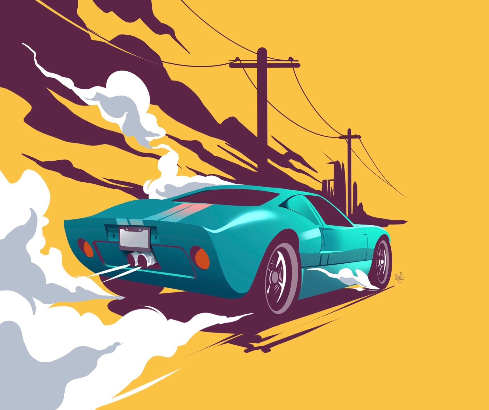
Vintage wheels by SAM JI
User interface design
A user interface is the main touchpoint of a designed product and a user. The UI design is about providing a user with the simplest and most efficient way to interact with a product. In that sense, a designer has to be well aware of the following design thinking process steps:
- Condition or where the UI exists.
- Content or what the UI looks like.
- Context or who operates the UI.
Understanding each of these three gives a designer the most important tools to build a visual solution for any type of product.
To become visual, elements have to be designed. Those which are visible by nature, need design even more.
The UI has several fundamental elements of design that all have to be addressed with high-level awareness.
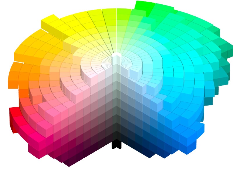
Color in design
What most people and, sadly, many designers know about color does not do it enough justice. Color is the first thing we’d notice but the last we’d understand. Colors can’t be explained and described unless seen. They can’t be changed but can be learned and used. This is how nature communicates with you, and that is why color is so important in design. Ben Hersh wrote a great guide to color in design, you might want to check it out to better understand the question.
“Colors are powerful symbols by which you live or die; they’re worth paying attention to.”
– Ben Hersh
Psychology separates color studies into a standalone discipline. Marketers know the basics of color theory in design and use it to stimulate people’s sense of security, alert, and so on. Designers use color to speak instead of words. Yet, colors don’t exist outside our consciousness.
Before the age of digital screens, people used colors as attributes of physical objects. That’s why there are so many color names attached to the toponyms (names of places). Like umber named after the soil in the Italian region of Umbria and turquoise from the French for “Turkish”. To become a recognized color, it had to exist in the real world.
As our understanding of color grew stronger, color theories began to pop out attempting to define, systemize, and classify colors.
From the Middle Ages to the 1970s’ advent of HSL and HSV color models, all the exploration and discovery lead us to the three colors: red, green, and blue.
Out of the combinations of these three, you can get virtually any color. However, this is the set we decide to stick to today. It has been different before and it might change in the future. There is no such thing as primary colors apart from those we decide to consider as such.
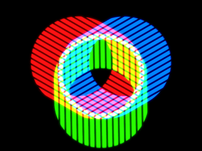
Prism by Jack Sabbath
We differentiate the current color models depending on the media they will be displayed on and the purpose of the visual presentation. We might leave out some colors which are not visible on the screens or include those which are not visible by the eye. Modern color technology is controlled by mathematics. But the problem is the variability of conditions under which we see these colors.
A modern color theory puts our brain in charge of our color perception depending on the context and looks to find the schemes and methods of producing colors accordingly.
“The color spaces we can see look more like psychedelic pinecones.”
– Ben Hersh
For a designer, to know color means to be able to mathematically select the colors and have the choice backed up by data. At the same time, we as designers have to be keenly aware of how colors are perceived in different cultures and how that perception changes over time.
Colors are the products of physics and mathematics but also intuitive and elusive enough to never let us rest.
Typography in design
Another thing that pops up every time there’s a talk about digital product content is typography. Technically, being just a shell for the meaning, it sometimes can be as significant as the meaning itself. Because if it doesn’t represent that meaning in good fashion, it will go unnoticed.
Text is the strongest medium of information. It might not be so much in terms of emotive response but definitely is in terms of being informative. Text is delivered by means of fonts, or typefaces, in general – typography.
Certain things only exist in one representation – text.
Typography is a design patrimony. Like any other design-specific method, typography is purpose-driven but also aesthetic. As a functional element, typography in the UI is used to guide people, invoke an action, and help them through the entire experience. That’s about the headings, titles, text in menus, buttons, CTAs, and so on.
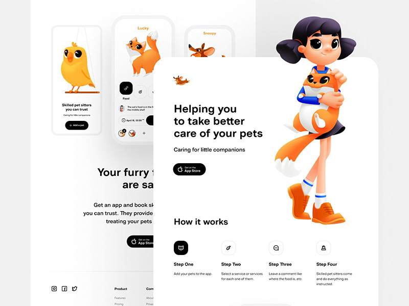
Pet Care Website by Shakuro
When it comes to typography as an aesthetic element in web design, we implacably steer towards branding. Words express individuality which is the core of identity. Designers can boost that individuality through the usage of typefaces to reflect the unique character of a brand.
Typography as part of branding helps the product stand out.
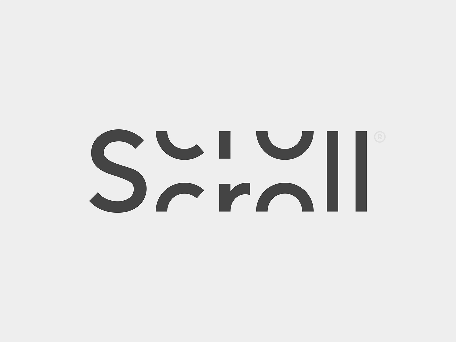
Scroll by Yoga Perdana
Icons in design
Because nobody has time. We have lists everywhere. Lists are how we make sense of the abundance around us. We list foods, apps, TV channels, even friends of Facebook. This helps us structure the information and memorize it better. No wonder lists have made their way into web design where everything can be categorized. That’s how features, services, advantages, and payment plans started being aligned in lists.
Turned out, lists are good for structuring but do no good in the visual aspect.
For a list to become an attention anchor, it has to have a visual element to it. Compare the classic heading-text combo and an icon-heading-text combo:
![]()
Designers give icons a chance to give a quick snapshot of what the point is about. In this case, icons are Metaphoric Substances. This is the least icons can do. In fact, you can encode a lot of information in them in the context where the estate is a factor.
MaRc – Diner List Component by Paarth Desai
Game designers took it even further and created systems of logically-connected icons representing different in-game assets. This is called Visual Synonymity.
Rank System by 60.o
There is a fine line between icons that convey a design meaning covering all bases in case the textual meaning is missed and pure decorative-functioning icons. We make sure icons work in the first place, which means they motivate a user to do what we expect from them.
Ideally, icons should work the way emojis do – as a universal language flexible enough to deliver any message cross-culturally and obvious enough to leave no second guesses 💡
Animation in design
Every physical object moves. They might be still technically, but in relation to the environment, they all move. As the Sun goes over a stone in the woods, the game of light and shadows enlivens the dead stone.
Our eyes and brain are designed to capture movement because it bears a lot of information. It’d be a shame to leave it unaccounted for.
Motion is the first thing we see in the product along with color, images, and typography. These four are the main contributors to the brand’s/product’s personality. It’s important for a product to have a stance on how it’s elements move and what stands behind that movement. But first, why animation is important in UX design:
- Illustrative. It can demonstrate the functionality or help understand it better.
- Amusing. Value can be expressed in many ways. Positivity is one of them.
- Familiar. We expect certain reactions from certain actions. Animation familiarizes.
- Engaging. We tend to follow patterns and animation is a great source of those.
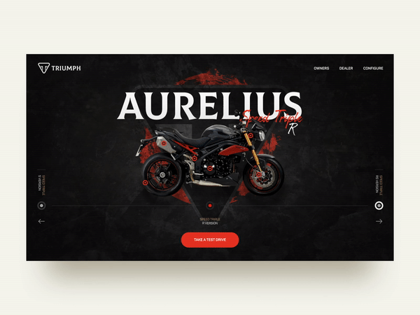
Triumph Motorcycle Shop Animation by Shakuro
The reason to animate the interface depends on the goal of that specific interaction. Let’s take engaging a user and directing their attention. Since movement is something we instantly see, it makes sense to use animation for things like banner ads and spams. Ads aren’t expected to sell the product, as much as they hunt for views. A view is a sell and they will get it from you by using cheap tricks. Banner ads animation is definitely a cheap trick that works.
What are the principles of design in animation?
The principle itself is innocent though. More so, if we use animation to direct users in a way that helps them, the same banner ad principles might contribute to a good UX. For example, a file sending gone wrong does not have to be a pop-up with an error code or a “whoops” type message. We can attract attention to this by using a meaningful motion graphic.
Mail Warning Icon Animation by Ömer Korkmaz
This animation won’t get you confused about the success of your sending and will make sure you address the issue whatever that is. At the same time, it won’t be too intimidating because the animation is done in a friendly way.
Animation magnifies the satisfaction you get from successfully performing a task. The more complex the task, the more rewarding it should be. Motion is how we convey the mood and the attitude of a product to the user’s actions.
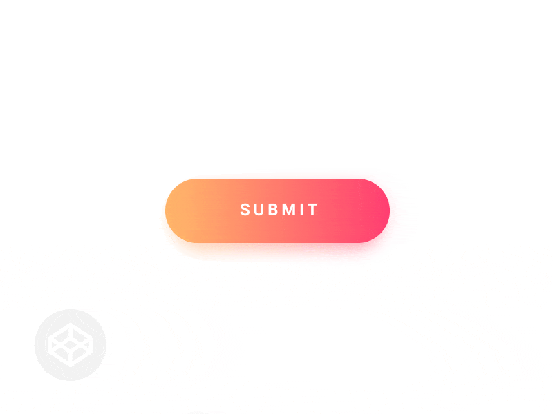
Submit Button by Claudio Scotto
Such animation can cover up the time needed to complete the technical request or form submission. The spinning bubble ensures there is work going on and appeals to our natural feeling of completion.
Most web processes have designated patterns that people recognize and expect. At the same time, with a variety of devices and screen media, it’s extremely challenging to maintain the same behavior with a lesser estate. This means we have to divide certain processes into comprehensible bits while mapping the entire progress.
This is how Google addresses a rather complicated and long process of copying information to Pixel phones.
![]()
Since this is a phone, you won’t be able to just switch to a different tab and keep yourself busy with something else. Still, you have to know what exactly is happening and why it is important.
The animation is a huge part of modern UI/UX design and we are just getting started with it. It’s a natural process of evolution that will ultimately make all animation meaningful and purposeful, forever cutting the ties to decoration. Added complexity will be replaced with modalities and subtle messages a well-thought-out animation certainly brings.
UX writing
UX writing is a process of creating copy for user interfaces. Some of you might be surprised to see writing listed among the fundamental aspects of interface design. However, writing is the most important accomplishment in human history. We are surrounded by products that are just the recreation of someone’s ideas. Sometimes those ideas are centuries old. Ideas travel by words.
The reason why animal life is finite is the inability to pass the experience of one animal to another after it. As humans, we can do this.
We pass knowledge and multiply it. This is called collective thinking and it has writing in its core.
Words are how we think and define the world around us. Words are human experience coded in something massive and yet extremely fluid – the language. The design relies on such elements and shares a long and dramatic history with writing.
Just like designers build a collection of methods, principles, and tools, they tend to do the same with a vocabulary used in interfaces. Indeed, some companies have style guides. Then there are acknowledged guides like the Chicago Manual of Style, Microsoft Manual of Style, and Associated Press Manual. They contain general recommendations for writers and designers working on specific things – documents, guides, and other user-facing assets. They teach design thinking process steps and put a lid on the actual voice of the product.
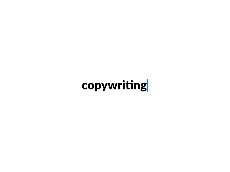
Copywriting Keynote by Larissa Herbst
Design values individuality equally to usefulness. Tech culture took away individuality in writing only leaving it to the creative sphere. However, if the design speaks to the emotive perception, writing has to follow.
This is how UX writing was born. At some point, designers started using a specific vernacular to name the UI elements. Good or bad, they were authentic bits of text, specific for the product. We call it microcopy and it works like a regular copy with a tweak. The tweak is that even though the text is clear and simple, you can’t reuse it for another product. It won’t feel right, like something is missing. That something is context. Microcopy says things differently and exudes topicality.
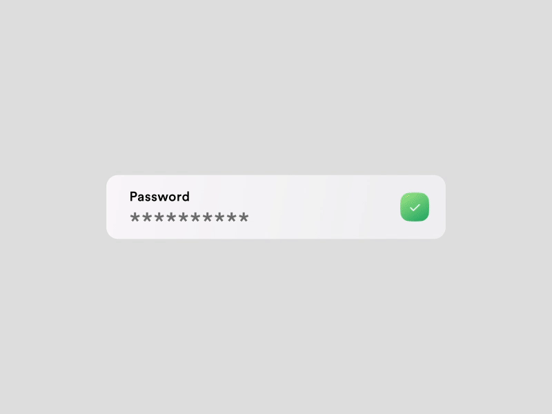
Password Input + Microcopy by Mauricio Bucardo
All of a sudden the unification everybody was going for gave way to individuality through one of the best ways to pass information – words. Because words matter.
Some designers went astray and became… UX writers. And they started approaching writing with all their knowledge and skills of visual influence. The UX writing principles quickly found their form in a pyramid.
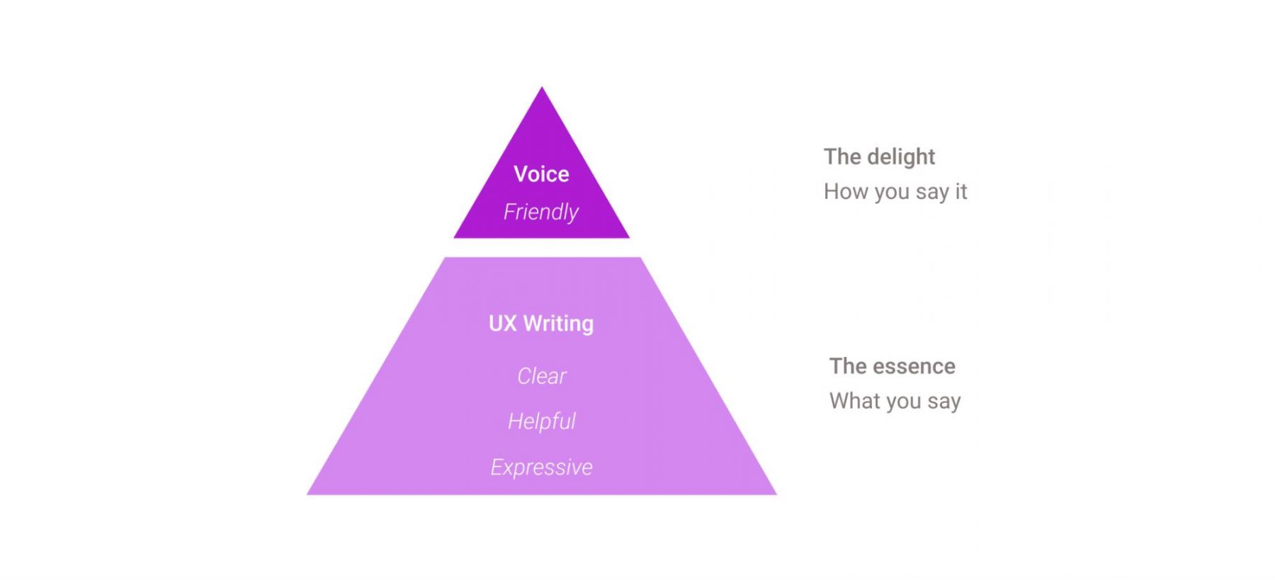
There are two layers. UX writing does not have to be personal. The essence of the product can be fulfilled by the UX writing principles alone. If it is clear, it’s helpful and if it helps, it becomes significant. The top layer is what UX writing is amplified by – the socially pleasing brand voice.
On paper, it’s quite simple but how do you put it to practice with real words and real problems?
Why we need design
Why do we use design in our everyday lives? As has been said at the beginning of this article, the meaning of design is basically about planning the most optimal way to reach a certain goal. From this perspective, everything that surrounds us is the result of design, and we design one thing or another every day, be it your breakfast or a complex report needed for your job. It’s something that is always around us holding everything together. Design is important in life because it’s an incredibly powerful force, forever changing and being changed.
Web and app design is about business goals at its heart. The value of good design is the heightened chances of success. It matters because, without an adequate design survey, every business venture is a shot in the dark. Maybe you get lucky, maybe you don’t. Professional web and app design give a company’s customers a better experience, and that’s what matters. Entrepreneurs are proud of their businesses, so why not make them perform even better, reflecting the companies’ personalities?
A good design can make people trust you more, alter customer perception, make you memorable, get your message across, make your product work to the fullest, and shine. A great one can do even more.
* * *
What is design? Every professional and author, every team, and every company has its own design definition and understanding of what it does and what it’s all about. Each of them addresses the question of the meaning of design very differently.
But it seems that it all comes down to the simple fact that the meaning of design however it may vary depending on different projects, fields, and theories is not about beautification as such, but more of solving the specific tasks and making the lives of users better, clearer, more enjoyable.
Need a meaningful design for your app or website? Contact us and let’s work together on future projects.
The article was originally published in January 2020 and was updated in September 2023 to make it more relevant and comprehensive.