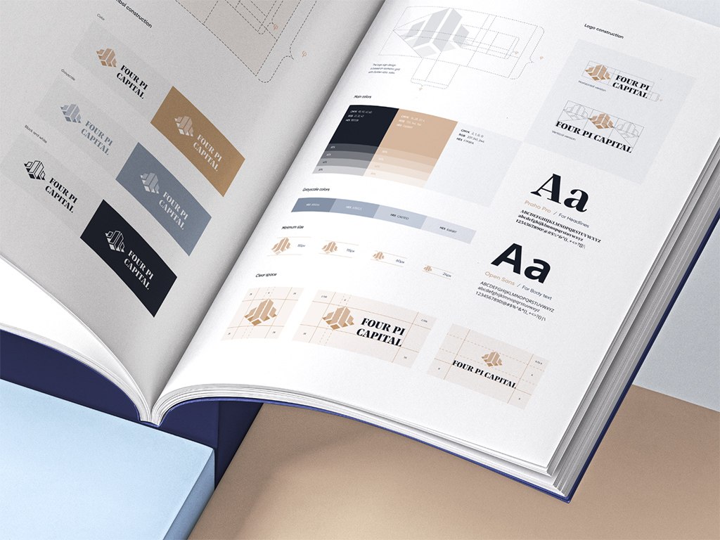
Icon design trends move in two directions: clean minimalism and abstract geometry for clarity, and 3D forms, Art Deco details, grainy textures, and animated microinteractions for character. Whatever the style, an icon still has to be instantly recognizable, consistent with the rest of the set, and readable at any size.
Icons guide users through an interface and connect your brand with your audience, so in UI/UX design they carry more weight than their size suggests. Outdated or confusing icons add friction and frustration to the user experience, which is why UI/UX designers and startups follow how icon styles change.
This article covers seven icon design trends: minimalism, three-dimensional forms and realism, abstraction and geometry, microinteractions and animations, Art Deco, organic and sustainable motifs, and grainy aesthetics. After that, we go through icon design best practices, including accessibility and consistency across platforms, and the role of icons in branding.
Icon design trends for 2024
Minimalism
And yet again, minimalism continues to be a dominant trend in design. In 2024, expect to see icons stripped down to their essentials. Clean lines, simple shapes, and a focus on functionality are the hallmarks of minimalistic style. This trend offers clarity and a timeless appeal, ensuring your designs won’t look dated.
The style continues to be a versatile choice for mobile UI design because of its simplicity and clarity. It fits perfectly in various parts of the interface. You can use the minimalistic style for primary navigation options, such as home, search, settings, or profile. These icons can replace or complement text labels, saving screen space and providing a clean and intuitive interface.
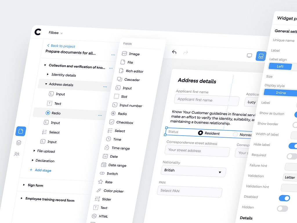
Minimalistic icons in Clients Portal Constructor by Conceptzilla
Three-dimensional forms & realism
It might be not surprising: 3D is making a comeback. These icons bring depth and realism to your user interface, creating a more immersive experience. Consider using this 2024 design trend when you want to add a touch of sophistication, a touch of elegance, and depth to your product’s design.
It suits the main functions or features on your app’s home screen. They make the most important actions pop and give users a visually engaging entry point to your application. However, when using 3D in graphic design, it’s important to maintain a balance between realism and usability. Ensure that the icons do not hinder the overall user experience by being overly complex or distracting.
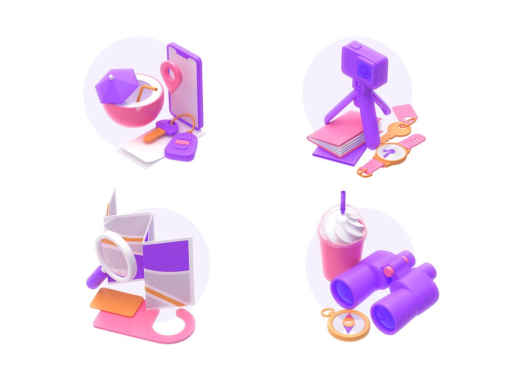
3D Icons For a Travel App by Shakuro
Abstractionism & geometry
Breaking away from traditional representations, abstract and geometric elements offer creative freedom. This style uses shapes, patterns, and colors to convey concepts, allowing you to establish unique visual identities. Abstract icons can be a great choice for companies looking to stand out in crowded markets.
The icon design trend offers a modern and visually appealing aesthetic. Use abstract or geometric shapes as alternatives or complements to text labels in the navigation bar. They can help users quickly identify and access different sections or features of your app.
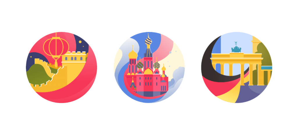
Geometrical forms in Language Dashboard Mobile App by Conceptzilla
Microinteractions & animations
Adding interactivity through microinteractions and animated icons is a trend that’s gaining momentum in 2024. They respond to user actions, providing subtle feedback that enhances the user experience. Incorporating these dynamic elements can make your product more engaging and memorable.
Opt for animations to guide your clients through onboarding processes or to welcome them to your app. Animated elements can make the introduction more engaging and informative. Alternatively, you can add microinteractions and animations in buttons and call-to-action elements. For instance, animate a “Submit” button when a user completes a form, providing visual feedback that their action was successful.
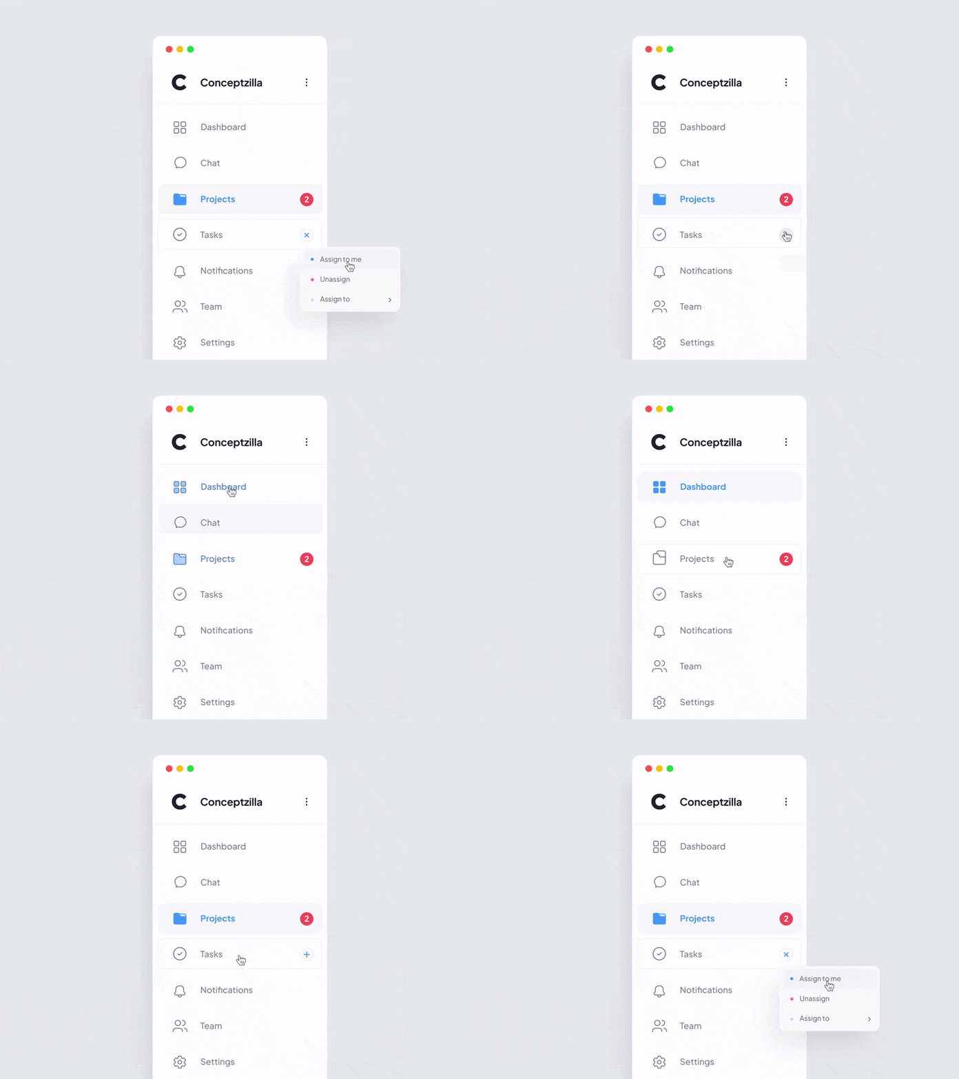
Sidebar Microinteractions by Conceptzilla
Art Deco
The timeless elegance of Art Deco is making its way into icon design. The bold lines, geometric patterns, and luxurious color schemes of Art Deco can bring a touch of sophistication to your startup’s visual identity.
Use it as a decorative element in headers and titles to add a touch of sophistication to the overall design. For example, include an Art Deco-inspired divider between sections of a news app. Also, you can incorporate Art Deco into your app’s branding elements, such as the logo, splash screen, or banners.
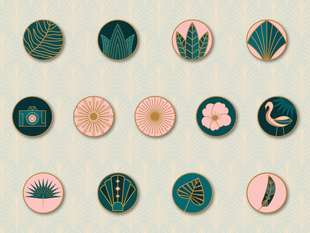
Tropical Art Deco Logo Set by Lily Liseno
Organic & sustainable
In an era of heightened environmental awareness, elements reflecting organic and sustainable themes are gaining popularity. That’s why using designs that incorporate natural elements like leaves, trees, or eco-friendly symbols is a trend. You can showcase your startup’s commitment to sustainability and state that your product aligns with eco-friendly or environmentally conscious values.
If your app offers eco-friendly products or services, use organic icons to highlight them. For example, add a leaf or tree symbol to denote eco-friendly products in an e-commerce app. Use sustainable visuals to provide information about the environmental impact of products or services. Also, these elements can indicate whether a product is recyclable, made from renewable materials, or energy-efficient.
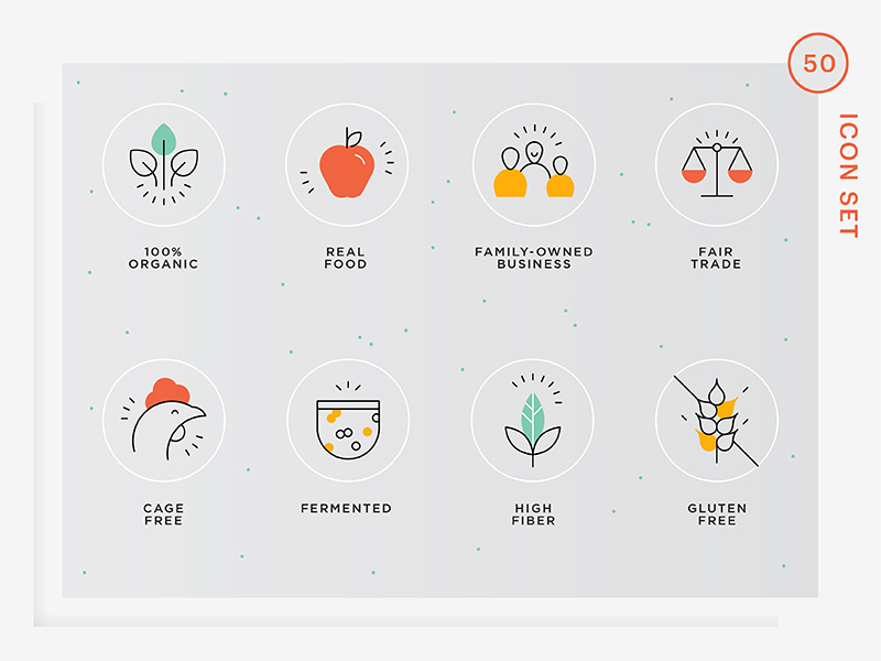
Natural Food Icons by Vineta Rendon
Grainy aesthetics
This trend of 2024 is characterized by its textured and vintage appearance. The grainy aesthetic, reminiscent of old film or vintage photographs, is making a comeback. They add character and nostalgia to your designs, making them stand out in a sea of polished designs. The style is especially effective when targeting users who appreciate a nostalgic or vintage visual style.
Implement grainy aesthetic icons for album or folder categories within image galleries, making them visually appealing and reminiscent of physical photo albums. Plus, with this trend, you can represent camera modes, settings, and filters in camera apps, enhancing the retro and artistic character.
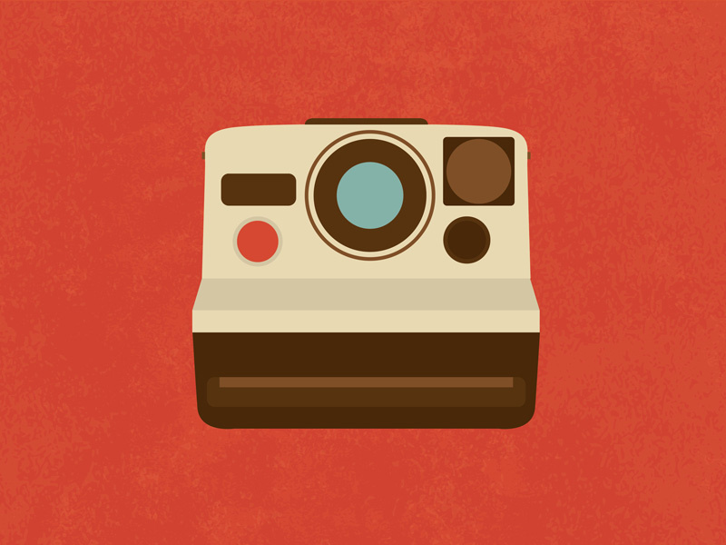
Retro camera icon by Vilmos Varga
Icon design best practices
Now that we’ve explored these exciting trends, let’s discuss some useful tips for creating effective visuals.
- Keep it simple: Avoid clutter and unnecessary details;
- Prioritize clarity: All elements should be instantly recognizable and understandable;
- Focus on consistency: Maintain a consistent design language across all your sets;
- Conduct scalability test: Ensure your designs look good at various sizes;
- Seek user feedback: Listen to your users’ opinions to refine your concepts.
Accessibility considerations
Design with accessibility in mind. Ensure that your visuals are perceivable and usable by all, including individuals with disabilities. For example, avoid overly complex or detailed designs that may be difficult to discern, especially for individuals with visual impairments. Moreover, try conveying information with shape, texture, or labels to ensure that colorblind users can interpret the icon’s meaning.
Since hyper-personalization is a hot trend, think about allowing people to customize the appearance of icons, such as size, color, or style, to better suit their individual needs and preferences.
Consistency across platforms and devices
People use your application on different devices. That’s why your icon set should look and function consistently on every platform. Test the designs on various screen sizes and resolutions to guarantee a seamless user experience, even for individuals with visual impairments.
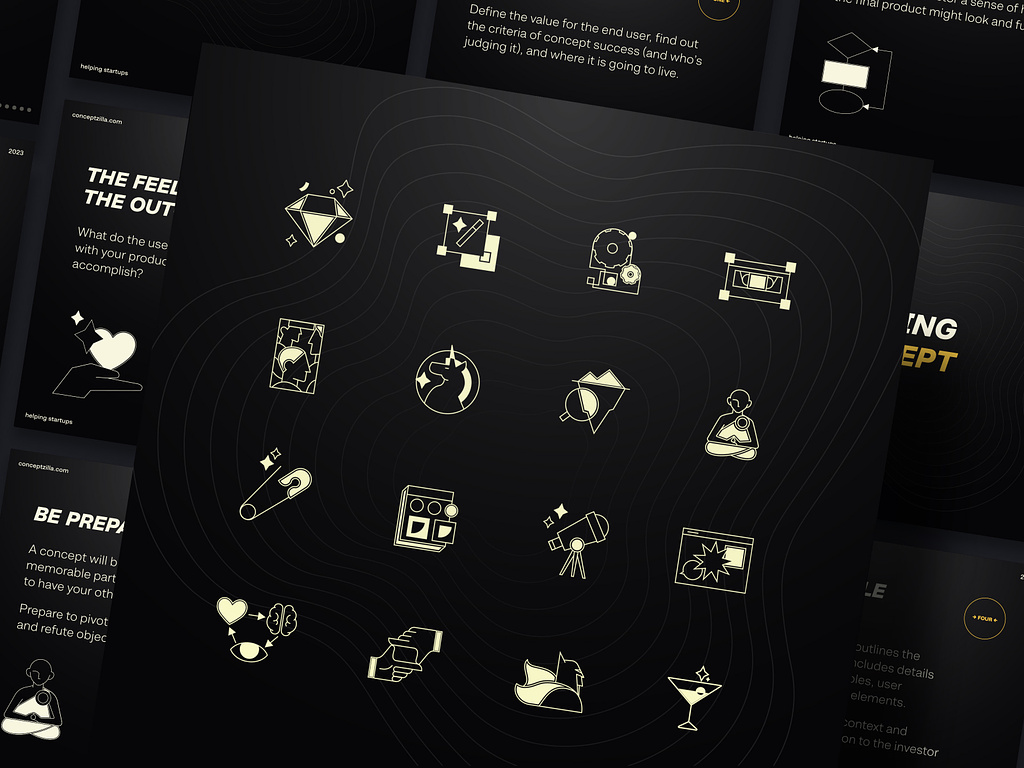
Icons for branding case by Shakuro
The role of icons in branding
Icons are not just functional; they’re also a powerful branding tool. They simplify complex ideas or concepts into a compact visual form, making them instantly identifiable. This recognition helps your users associate the icon with the brand, even at a glance. Think about the iconic Apple logo or the Twitter bird – these symbols instantly evoke brand recognition.
Also, by paying attention to small details, you can make a brand more accessible to a global audience. Universal symbols transcend language barriers, so it is easier for people from different cultures and backgrounds to understand and engage with the product.
With the latest design trends at your disposal, you make your brand stand out in a crowded marketplace. A unique and distinctive style sets it apart from competitors and makes it more memorable to your consumers.
FAQ
What are the main icon design trends?
The main icon design trends are minimalism, three-dimensional forms and realism, abstract and geometric shapes, microinteractions and animated icons, Art Deco, organic and sustainable motifs, and grainy aesthetics. Minimalism remains the dominant one: icons stripped down to clean lines and simple shapes offer clarity and a timeless appeal, so they won’t look dated as quickly as more decorative styles.
Are 3D icons a good choice for an app interface?
3D icons work well for the main functions or features on an app’s home screen: they make the most important actions pop and give users a visually engaging entry point. For primary navigation, minimalistic icons are usually a better fit. With 3D, keep a balance between realism and usability so the icons don’t become overly complex or distracting.
What makes a good icon design?
A good icon is simple, clear, and consistent. Avoid clutter and unnecessary details, make sure every element is instantly recognizable, and keep one design language across the whole set. Test how the icons look at various sizes and on different screens and resolutions, and refine the concepts based on user feedback.
How do you make icons accessible?
Avoid overly complex or detailed designs that are hard to discern for people with visual impairments. Don’t rely on color alone: convey meaning with shape, texture, or labels so that colorblind users can interpret the icon. You can also let people customize the size, color, or style of icons to suit their individual needs and preferences.
Where should you use animated icons?
Animated icons and microinteractions work best where they give feedback or guide the user. Use them in onboarding and welcome screens to make the introduction more engaging, and in buttons and call-to-action elements. For example, animate a “Submit” button when a user completes a form to show that the action was successful.
Why are icons important for branding?
Icons simplify complex ideas into a compact visual form that people recognize at a glance and associate with the brand, as with the Apple logo or the Twitter bird. Universal symbols also transcend language barriers, which makes a product easier to understand for people from different cultures, and a distinctive icon style helps a brand stand out in a crowded market.
Conclusion
Icon design is a pivotal aspect of your startup’s visual identity and user experience. Staying informed about the latest tendencies can help your business remain competitive in 2024 and beyond.
So it’s time to embrace change, experiment with these trends, and design visuals that resonate with your audience. By doing so, you’ll not only strengthen your digital services but also establish a strong and memorable brand presence.
Do you need meaningful branding and eye-catching designs for your product? Contact us and let’s work together on your next project.
Related reading