
Remember the last time you went for a walk and got lost? How did I get here? What’s the way back? A downfall of confusion and irritation rushed down your veins while you were looking for a GPS signal. The same feeling we have when we use mobile applications with strange layouts and navigation UX. Hmm, I was looking for the Settings section, where do I click now? What is this screen?
Contents:
Mobile navigation is like a compass that guides users through the digital realm. It has become a paramount aspect of every successful application or website because without proper guidance people will wander endlessly through frames. Which results in immediate de-installation of the product. Still, designing a perfect app layout and navigation design with an ever-expanding landscape of devices, operating systems, and user expectations is near impossible.
Yet you can get closer to perfection. Prepare to uncover the secrets of effective guidance, including intuitive gestures, thoughtful visual cues, and strategic information architecture. Discover how to optimize screen real estate, embrace minimalist design, and harness the power of microinteractions to create memorable user experiences that keep clients happily sailing along.
Key takeaways
- Well-designed UX increases conversion and overall satisfaction of the users
- Follow design trends like simplifications, adding gestures, voice UI, etc.
- Analyze people’s goals and flows to create a more efficient UI
- Colors and accessibility are important parts of UX navigation
- Leverage various UX patterns to increase engagement
Why Convenient App Layout and Navigation Design are Crucial
In my experience, good navigation is invisible. Without noticing, you just go where you want to go. Like walking through a house where all the doors are exactly where you expect them to be. Bad navigation, though? It’s like walking into walls. Over and over.
Think about the thumb zone. Yeah, that’s a real thing. Most of us hold our phones with one hand, scrolling with our thumb. If the most important buttons are stuck in the top corners, you’re basically asking for a gymnastics routine just to check your cart. I’ve seen apps do this. They put the “Buy Now” button way up there. Why? Who knows. Maybe the designer has really long thumbs. But for the rest of us, it’s a hassle.
If I land on a site and the menu is a mess—links overlapping, text too small to tap, or worse, a hamburger menu that doesn’t even look like a button—I’m out. I’m gone. There are a million other options. I’m not going to fight for my right to shop. That sounds harsh, maybe, but it’s true. We’re impatient. We’re distracted. We’re standing in line at the grocery store or waiting for a bus. We don’t have the mental energy to solve a puzzle just to read an article.
Good UX says, “I know you’re busy. Here’s what you need.” Bad UX says, “Look at how cool this animation is while you wait ten seconds to load the homepage.”
Also, let’s talk about consistency. It’s annoying when every app reinvents the wheel. Sometimes the back button is an arrow. Sometimes it’s the word “Back.” Sometimes it’s just swiping from the edge. If you’re building an app, please, just follow the conventions. Don’t try to be too unique with the basics. People have muscle memory. They’ve learned how phones work. Fighting that learning curve is usually a losing battle.
So, yeah. Navigation isn’t just a technical requirement. It’s the difference between a user staying because they’re happy, or leaving because they’re frustrated. It’s subtle, sure. But you feel it. Every single time you pick up your device.
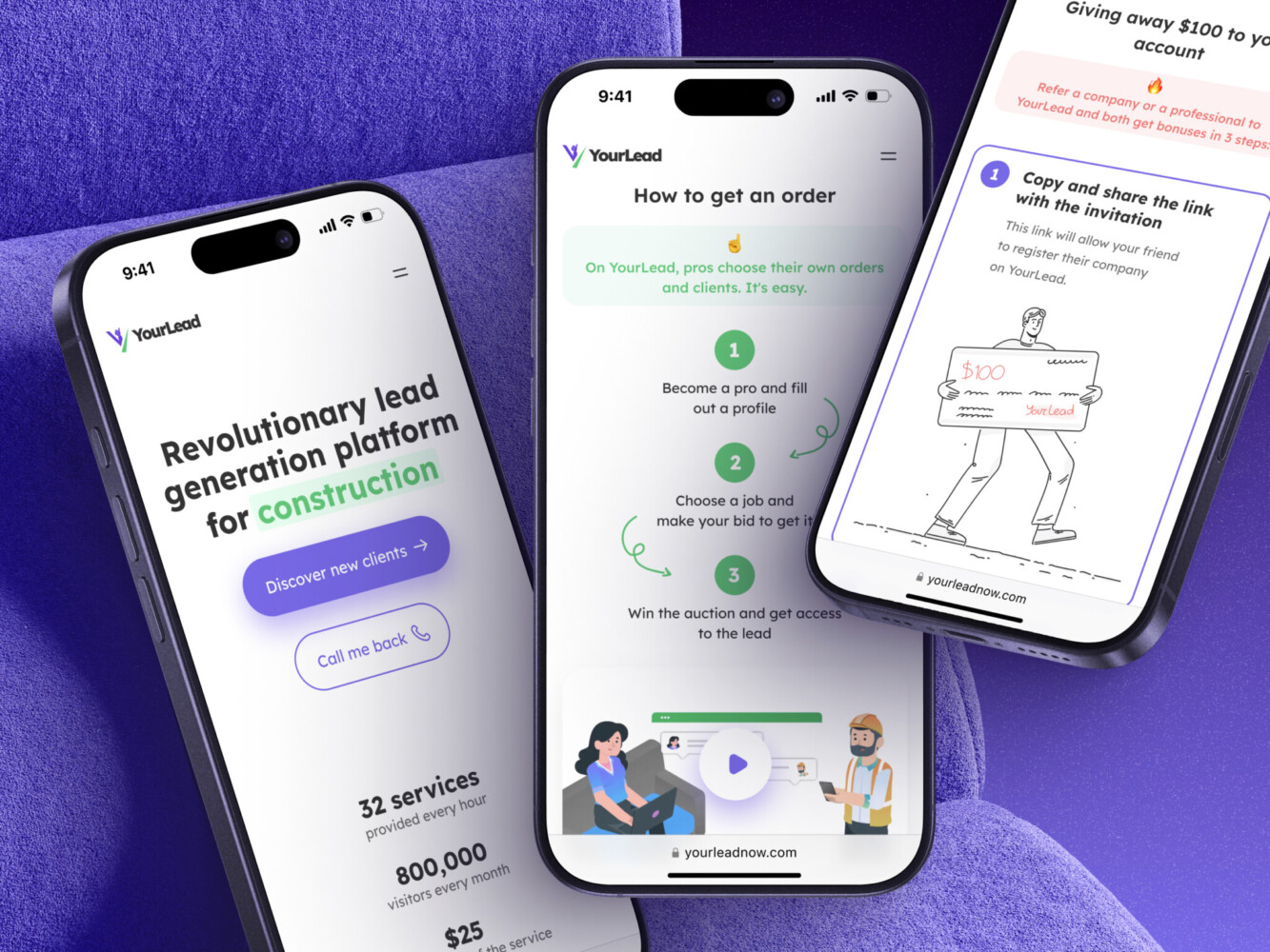
Mobile App for Construction Lead Generation Platform by Shakuro
7 Design Trends in Mobile Navigation UX
Before diving into the details, let’s take a quick look at the tendencies shaping the landscape. UX design is a constantly evolving field, and new practices emerge over time, changing our attitude to the long-present rules. So what gave you power yesterday, will be confusing for the people of today. Think about it as if you have to use an old Nokia cell phone to order a pizza. It will work but not as great as a smartphone with a Doordash app.
In recent years, we have witnessed several notable trends:
Simplification of Labels
Sometimes, removing them entirely. Just icons. Now, this is risky. I still get confused by that one icon that looks like a heart but means “save for later” vs “like.” But designers are betting on our familiarity. They’re trusting that we know what a magnifying glass means. It cleans up the interface, sure. Makes it look sleek. But if you guess wrong, you’re stuck. It’s a trade-off. Aesthetics vs. clarity. I think we’re leaning too hard into aesthetics sometimes.
Gestures
Big time. Swipe to go back. Swipe to delete. Swipe to archive. It’s becoming the default language of mobile. I caught myself trying to swipe left on a desktop website the other day. Muscle memory is real. The trend is moving away from visible buttons for every little action and towards intuitive movements. It feels more fluid. More like handling a physical object than clicking a digital link. There is adownside of this trend, though. Discoverability. If everything is hidden behind a swipe or a long-press, how do new users find out? You can’t see a gesture. You have to learn it. I’ve seen some apps add little tooltips or animations to teach you, which is nice. But it adds friction. “Wait, I have to hold this button for two seconds?” It breaks the flow.
Voice Navigation
Voice navigation is creeping back in app layout and navigation design. Not like the old Siri days where you’d shout at your phone. But more integrated. Like, typing in a search bar and having the keyboard suggest voice input prominently. Or using voice commands to navigate deep menus. “Show me my past orders from last December.” Boom. Done. No tapping through five layers of menus. It’s still a bit hit-or-miss, depending on your accent or background noise, but it’s getting better. Really helps when you’re driving or cooking.
Personalization
The navigation isn’t static anymore. Some apps change what’s in the bottom bar based on what you use most. If you always check your balance, that becomes a primary tab. If you never look at “Community,” it disappears. It’s smart, but also a little creepy? Like, the app is watching you. Which it is. But if it saves me two taps, I’ll allow it. For now.
Bottom Navigation Bars
Together with a thumb-friendly design, consider placing menus or key actions at the bottom of the screen due to its ease of reach. You’ve probably noticed the bottom navigation bar is basically king now. Like, everywhere. The old “hamburger menu” in the top corner? It’s not dead, but it’s definitely taking a backseat. Or rather, it’s being pushed down. I see a lot of apps moving those secondary links to the bottom sheet or keeping them tucked away, while the primary stuff—Home, Search, Profile, Cart—sits right at the bottom. It just makes sense. Your thumb lives there. Why fight biology?
Floating Action Buttons (FAB)
The rise of the “floating” action button or the dynamic island integration. Especially on iPhones. Apple’s Dynamic Island is changing how we think about navigation. Instead of tapping a tab to see if your food order is ready, the info just floats there. It’s contextual. It’s proactive. And honestly? It’s kind of brilliant. It reduces the need to navigate at all because the app brings the status to you. Less clicking, more knowing.
Hamburger Menus
Despite some debates about their effectiveness, this element is still commonly used for mobile navigation. It’s not a surprise, because, with them, you can hide less frequently touched options behind a menu icon, reducing clutter on the main screen.
You don’t need to cramp all the design trends into your application. It’s better to pick a couple of them that suits your concept and integrate them into the project step-by-step without spreading your effort thin.
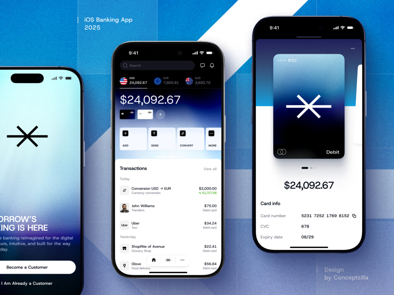
Mobile banking app by Conceptzilla
How to Create App Layout and Navigation Design
To create a remarkable mobile navigation UX, you need to establish clear goals and criteria for your team’s success. You can’t craft a good map without knowing where to go, right? So here are the key steps for you to consider:
- Define the purpose: understand the primary purpose of your mobile application. Is it an e-commerce app, a social media platform, an e-learning portal, or something else? This will help you determine the main objectives of your navigation system.
- Identify user personas: define your target audience and try creating user personas. It is an archetypal representation of a client in design thinking. These images are derived from the needs, goals, and observed behavior patterns of a particular user segment to create a fictitious representation of a potential customer. To build a persona, consider demographics, possible behaviors, preferences, and goals. This will help you align your navigation UX with the needs of your users.
- Determine people’s goals: discover the primary tasks or actions that your clients are likely to perform within your mobile app. For example, making a purchase, finding information, connecting with friends, or accessing specific features. These user goals will help you build suitable structures and paths.
- Analyze user flows: study potential competitors, then map out the typical user flows within the applications. This way, you will understand the different paths people might take to accomplish their goals. You will be surprised at how many routes people might find or expect. As a result, you will identify key entry points and ensure smooth navigation between different sections.
- Prioritization of content and features: think about the most essential content and features of your app. Determine what should be easily accessible from the navigation menu and what can be placed in secondary menus or submenus. Then prioritize the content based on people’s needs and frequency of use.
- Consider navigation patterns: explore different patterns such as bottom navigation bars, tab bars, hamburger menus, or gestures. Choose patterns that suit your app’s content structure and align with user expectations.
- Keep it simple and intuitive: aim for simplicity and clarity in your navigation design. Avoid overwhelming users with too many options or complex hierarchies. Use familiar iconography, labels, and terminology to make navigation intuitive and easy to understand.
- Conduct user testing and feedback: test your navigation design with real users and gather feedback. Observe how people interact with your app and identify any pain points or confusion. Once you get enough insights, iterate your design.
- Measure success metrics: define success metrics that align with your app’s goals. These could include metrics like task completion rates, time spent on key features, or user satisfaction ratings. Continuously measure and analyze these numbers to refine your navigation UX over time.
By following these steps, you can gain a better understanding of your goals and criteria before designing a mobile navigation UX. This way, you will avoid falling into pitfalls along the way. Just remember to iterate and evolve your concept based on user feedback and data-driven insights.
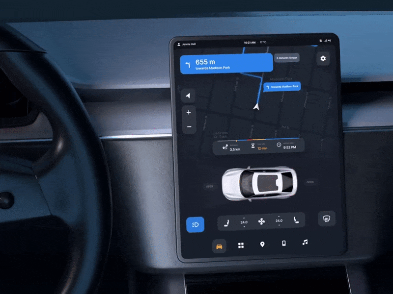
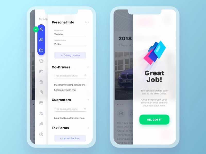
Car UI Dashboard by Conceptzilla
How to Design the Perfect Structure
Once you’ve set the goals and marked the path, time to get to the actual app layout and navigation design. Crafting an effective structure is also crucial, as it lays the solid foundation for an exceptional mobile UX. Consider the following aspects when designing the layout:
Features that Aid Navigation
Options like search, filters, and sorting are essential — they are perfect shortcuts. You need to not only incorporate these features but place them in UI strategically. The search functionality and sorting features at the top of the screen will help people quickly find items in an online shop without browsing hundreds of other things. If you place them somewhere else, they will interfere with the bottom navigation bar or floating actions.
Information architecture
Define a clear and logical information architecture for your mobile app. Otherwise, people will likely be overwhelmed or confused. Browse through your content and features, then organize them into categories and subcategories based on their relationship and hierarchy. It’s better to make important information glanceable and place it higher than other items. For instance, card balance, number of items in the cart, time, distance, etc.
If you have lots of statistics, pack them into diagrams with additional numbers available in a draggable overlay or another frame. Moreover, you need to remember that your target audience is not a group of geniuses: they don’t have the time or knowledge to figure everything out. Use familiar terminology with simple language, and avoid creating deep or complex navigation structures.
Cohesive Flow
Remember the GPS tracker I mentioned in the beginning? Well, people need an easy way to switch between frames without using such a “tracker”. Map out a logical flow for your mobile app, ensuring that users can navigate seamlessly between different sections. Organize content hierarchically, with primary sections easily accessible from the main navigation menu.
Color and Other Visuals
Colors are beacons for our eyes in this world and the main transmitters of information. That’s why you need to pay attention to the color scheme you pick. Too much color can be overwhelming while too little of it will make UI look bland and raw. So leverage color and visual cues to guide users and differentiate navigation elements. Use contrasting colors for active or selected items and employ subtle animations for visual feedback.
However, be careful and remember about sufficient contrast for legibility, especially if your target audience includes elderly people or people with special powers. Otherwise, they won’t be able to use your product at all. When designing, take advantage of W3C accessibility guidelines and services like Coolors. Go for white or subtle backgrounds with drops of color in the most important parts of the interface. Remember, that when it comes to actual UI, convenience and ease of use stand above the beauty.
Visibility and Consistency
Make sure your navigation elements are visible and have the same style throughout the app. Use familiar UI patterns and placements to avoid confusing people. For instance, apply persistent navigation elements like bottom navigation bars or sticky headers to provide constant access to key sections.
To avoid possible mistakes or confusion, create a UI kit with all the colors and fonts used in the project as well as elements. You can reuse them without accidentally breaking the visual consistency. What’s more, this will help you support the product’s branding style.
If you are short on time and don’t want to create unique elements for mobile navigation, consider opting for standard components from official Human Interface Guidelines (iOS) and Material Design Guidelines (Android). On one hand, these elements are pretty common, so people will instantly grasp their meaning. On the other hand, they are standard, so they will reduce the creativity levels. So your app won’t stand out visually among the competitors.
Contextual Awareness
Context plays a vital role in app layout and navigation design: it enriches the experience and adds new meanings to the options. You will enhance the navigation experience if you use contextual cues. Display relevant information and navigation options based on the user’s current location or task. For example, show features related to the current context within a specific option or section.
Feedback and Affordance
To establish a connection between the user and your application, provide visual feedback to people when they interact with navigation elements. Use animations, micro-interactions, color changes, or haptic feedback to indicate button presses, transitions, or loading states. Ensure that interactive elements have clear affordance to indicate their clickability or tappability. This way, your potential clients will have an emotional bond with your product and enjoy using it.
Remember that designing a perfect navigation structure is an iterative process. Continuously gather user feedback, analyze user behavior, and make improvements based on data-driven insights to create a seamless and intuitive mobile navigation UX.
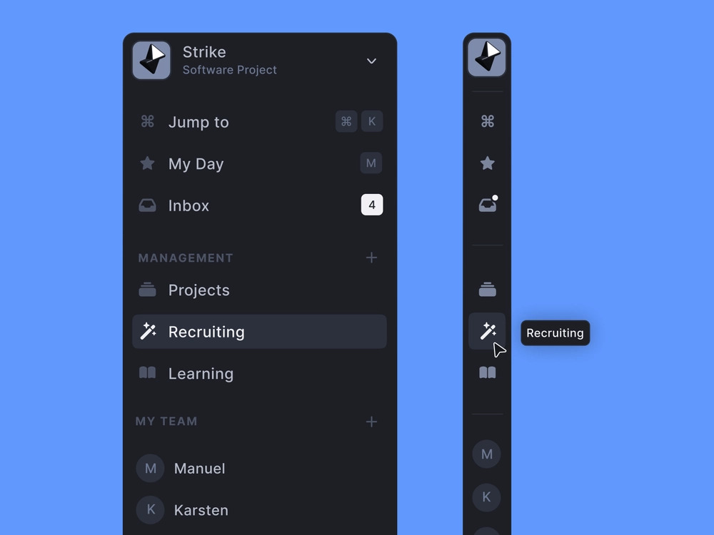
Sidebar Navigation by Johannes Gerber
Adding Final Touches
After planning and creating the concept, there is the last stage: optimizing the route which involves refining the experience and ensuring ease of use. Here is what your team can do to polish the result:
- Keep enhancing the overall user experience: focus on delivering a delightful experience by implementing design principles such as consistency, accessibility, simplicity, and clarity. Consistent visual language and interaction patterns help users navigate effortlessly. There is no perfection, so always look for various opportunities to improve the concept.
- Minimize the need for manual input: reduce friction by minimizing manual input requirements. Take advantage of autofill functionality, provide pre-populated forms, and offer smart suggestions to expedite the navigation process. For instance, you can include a voice assistant or chatbot that will serve as a shortcut to other frames.
- Explore different testing approaches: apart from standard practices, employ A/B testing to evaluate alternative navigation designs and gather quantitative data on user preferences. Additionally, conduct usability testing with real users from the target audience to gain insights and identify pain points in the navigation flow. Observe how people navigate through your app and see if there is any confusion. You will be amazed at the ways your clients expect and discover. Iterate your design based on the insights gained from testing.
Top Mobile Navigation UX Patterns
Instead of reinventing the wheel, you can use standard layouts for building app layout and navigation design:
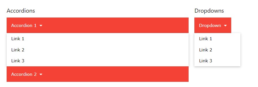
Accordion Navigation
It is a common strategy that works well for multiple levels of navigation. It allows users to open and collapse menus, making it suitable for browsing through different layers of content. The advantage of this element is its ability to squeeze the navigation cake in a compact and organized manner. Don’t mix it with the dropdown menu: the accordion will push down the content, while the dropdown lays over the content.
Billboard Pattern
This one involves displaying important mobile navigation items more prominently. The pattern highlights the most crucial or frequently used items, making them more visible, so it’s easier for users to access them. Take advantage of this UX pattern for improved visibility and quick access to essential navigation options.
Slide-in menus: they are commonly used for mobile navigation when there are numerous sub-items. It involves a comprehensive menu of options that slide in horizontally from the side. The point is that they allow for a larger number of navigation options to be displayed. Especially if you have limited screen space.
Get Wheels. Application Page by Yaro Zubko
Scrollable Navigation
It allows users to view navigation options in a continuous, scrollable list or menu. With this system, people can scroll directly to a certain feature and quickly find what they are looking for. Leverage such navigation to break up large menus into easily accessible sections and create an intuitive and engaging user experience.
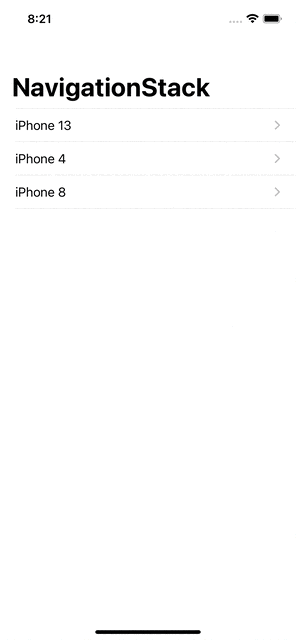
Navigation Stack
This is a pattern where you stack previous sections under each other like a breadcrumb trail. It allows people to move back through the navigation levels. So they have a clearer sense of their path and can backtrack easily. Use a navigation stack to enhance the flow and enable the users to go back effortlessly.
Large clickable cards and bottom sheets: these elements improve navigation speed by displaying options immediately. Thanks to the size, they offer a touch-friendly interface for easy interaction. Remember the thumb-friendly design? Bottom sheets are all about that. What’s more, you can utilize available screen space effectively. At the same time, large cards work perfectly for people with special powers and make the info glanceable.
Summing It Up
Mobile navigation UX is a really complex sphere that plays a pivotal role in shaping user experiences and driving success for apps and websites. By understanding your goals, designing a robust structure, and adding final touches that enhance the overall experience, you can create a seamless and intuitive navigation system. Remember to prioritize user-centered design principles, leverage visual cues effectively, and iterate through testing and optimization. By perfecting your app layout and navigation design, you will significantly improve user satisfaction, engagement, and conversions.
Want to make your app or website a user magnet, setting you apart from the competition in today’s mobile-first world? Reach out to our team and let’s build a versatile product with a polished UI/UX.
* * *
This article was originally published in June 2023 and was updated in April 2026 to make it more relevant and comprehensive.