
Font psychology studies how typefaces influence the way people perceive a product. Each font has a personality, and its shape (light or bold, rounded or angular, condensed or extended, lowercase or uppercase) triggers associations that users transfer to your brand. In UX, it helps you pick fonts that match the product’s message and guide users through the interface.
The effect goes beyond taste. In 1989, the British Psychological Society showed various typefaces to subjects, and they agreed on which qualities, like heavy, fast, or soft, each shape had. For a website or mobile app, type is part of a well-thought-out UX, like the color palette or button layout, yet many beginner designers neglect it.
Below, we explain how font psychology influences UI/UX design, what font personality is, which popular typefaces improve UX, and the best ways to implement font psychology in your interface.
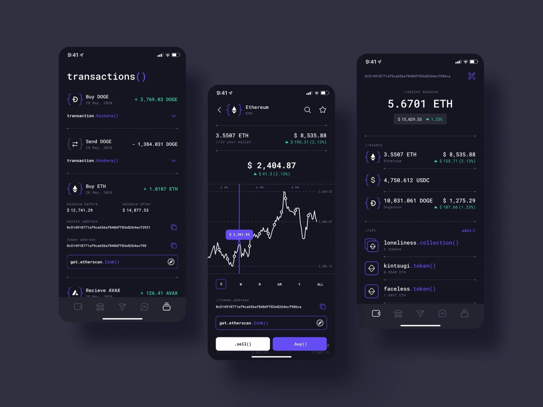
Conceptzilla picked the font that resembles a programming code
How does font psychology influence UI/UX design?
We perceive information through various channels: speech, touch, scents, eyesight, etc. However, for centuries, writing was and still is a primary tool to keep and show data. Psychology studies how people process information, including written sources. That’s why it’s also connected to typography. A typed caption has all characteristics of information kept on paper, including different ways of perceiving its looks.
The psychology of font analyzes how people feel and react to fonts and what emotions they experience. The results are important not just for science but can play a major role in marketing or sales.
Fonts we use and read every day resemble objects from the world around us, which also influences perception. Each time we read a text on a website or mobile app, we will look for visual resemblances and traits. For example:
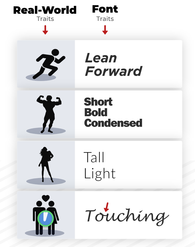
Illustration by Nick Kolenda
When reading a caption, we also rely on an associative network. It means when we think about things, we also consider concepts related to them. For instance, if you see a makeup company logo written in a tall and thin font, you will perceive its visual traits. Then the associations will kick in. ‘Tall’ and ‘thin’ are usually connected with the beauty industry. So, this company really creates some products related to makeup or skincare. The same idea works well in advertising, where you pick up product traits through looks and typeface shapes.
What is font personality?
Based on various visual traits and characteristics, each font suits a certain goal. Even typefaces that are hard to read have their own significant role. According to font psychology, they help us remember written information better. The harder we have to think, the deeper that info goes in our brains. Since we have to concentrate, we are also more focused on the text and do not react to minor distractions. Surely, if a caption is impossible to read, this concept will not work. At the same time, people do not enjoy reading texts with lower readability. It’s not surprising because they have to bend their mind.
People process fonts with high readability faster, however, they tend to forget such information quicker. So it’s better to use easy-to-grasp captions in app or website development where fast decision-making is more important than learning new facts.
The typeface shape evokes certain emotions in our brains. Some are considered more masculine, others — more feminine, each with its own character. Let’s see how font personalities influence our perception of products.
Light and bold
We often see light, thin typefaces as gentle, delicate, and feminine. They are associated with beauty because most of the modern body standards worship tall and thin figures.
Bold fonts feel assertive, solid, fundamental, and full of strength. Their shapes resemble a bulky athlete’s body and are closer to masculinity.
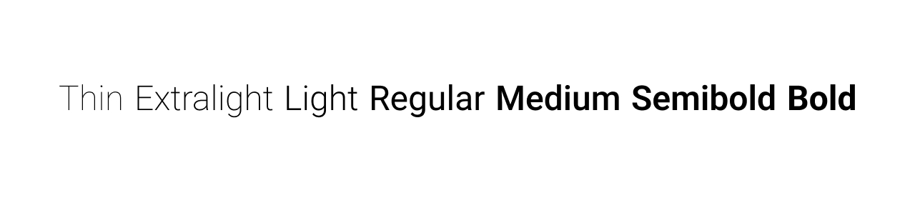
Roboto font: from light to bold variants
From the font psychology perspective, it’s better to use light typefaces for the beauty industry products or brands, while bold fonts work better in sports, machinery, and other industries.
Rounded and angular
People have preferred rounded shapes over others since childhood. In 2011, scientists conducted an eye-tracking study where 5-year-olds were choosing between contoured and straight lines. Most kids picked rounded lines. Nowadays, this concept follows us everywhere: cars, buildings, smartphones, logos, etc.
Sharpened and angular typefaces are easy to spot, however, they are full of tension, danger, and thrills. Extensive usage can create discomfort or push away people.

Typo Grotesk Rounded vs. New Rocker
If your product is connected with comfort, children, and food, bold-rounded fonts will be the best choice for branding strategy. Edgy fonts are more applicable to UI/UX design aimed at subcultures and teenagers. Alternatively, you can use them if you need a concept for extreme sports or activities — something related to danger and adrenaline.
Condensed and extended
Condensed fonts have less space between the letters, so it’s not surprising that we associate them with tightness, tension, and limited space. Since they have low readability, it’s better not to overuse them in the designs. Pair such fonts with standard typefaces in headings or subheadings. One can also apply this font if there is a small workspace.

Muhaqu Regular vs Monument Extended
Extended fonts give us vibes of freedom, uniqueness, vastness, and even relaxation. We can feel how the caption starts ‘breathing’ once styled into these typefaces. However, they are hungry for free space, so a designer should be careful not to overload the text visually. People usually use extended fonts in small doses for branding in the sports sphere to increase positiveness.
Lowercase and uppercase
Lowercase typefaces are closely connected with compassion, safety, and coziness. That’s why companies apply such fonts in designs for care products or services. Still, lowercase is hard to read when casting a quick glance. According to NNgroup studies, they require 26% more time to grasp than uppercases. So it should be used for mobile apps or websites where people actually need and have time to pay attention to the content.

Centralia and Jumbox fonts comparison
When people type in uppercase, they shout and let out all their emotions. The fonts have a similar idea — they demonstrate power, dominance, and inner strength. They are the best fonts for branding if a company wants to highlight its influence and stand out from the crowd.
Both these typefaces can be mixed together to achieve more impact without losing readability. This controversy over heights will definitely attract attention to the desired parts of the interface. It’s also a great idea for posters or headers. Note that the rest of the text should look standard, otherwise, people will simply get lost, not knowing where to look first.
Popular typefaces for UX improvement
Let’s take a look at the most popular typefaces one can use to create an easy-to-read and convenient interface.
Serif
Serif fonts hint at history, rich experience, elegance, and authority. Some typefaces like Times New Roman are similar to the old typewriters, so they highlight this trait even more. This is the reason why famous institutions such as New York Times are still using Times New Roman. As a result, serif is a perfect way to showcase the retro style. However, the such font also has a practical value: it has higher readability at smaller scales.
The word serif is actually related to small strokes that are attached to letters. A well-known theory says they are decorative elements that developed from small scribbles left by quills on paper. Now they are an essential part of the letters.
Sans serif
While serif fonts bring the old stories back, sans serifs look into the future and are closely connected to modern typefaces. They became popular in 1928 when the Futura typeface started to widespread around the world. Soon, it was accompanied by Helvetica and others.
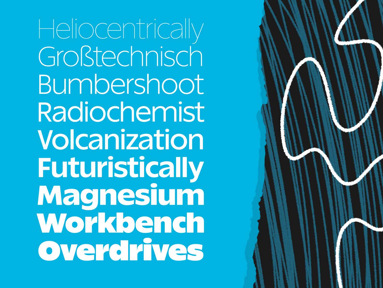
Really Sans by Riley Cran
Since these fonts are opposite to serifs, they are looser and easy-going. That’s why they are often used in creating e-commerce websites, SaaS, and web platforms to attract potential clients with friendly looks. They are also one of the best mobile app fonts where the screen resolution is limited. The only exception is the Arial family, which is intended to work as a body copy, taking up lots of space.
Decorative or display
These are the best fonts for logos, headlines, or titles. It includes slab serifs, handwritten fonts, scripts, monospaced, and others.
If you want to create a cozy-feeling brand with a personal touch, this is a go-to option. Handwriting fonts are different from script ones: they have more vivid and free strokes, while scripts are closer to calligraphy.
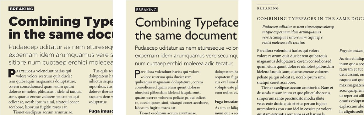
Serif and sans serif fonts can be mixed together and work well, you just need to find the right combination. Here are three examples from Adobe showing the combination variants:
Best ways to implement font psychology into UI/UX
A primary task for a mobile app or a website is to make a person take certain actions: purchase goods, buy subscriptions, spread the company’s influence, etc. At the same time, the process should be useful and convenient for people.
A well-designed UX will complement your marketing strategy. It’s one of the key things to victory. If people can’t use your product due to an incoherent interface, no cutting-edge toolkits and features will be able to retain them for long.
When working and testing the product, UI/UX designers should remember that potential users will not be working with their creation in a quiet, isolated room. That’s why they need to arrange the interface to get all the attention, even in distracting environments like city streets or buzzing offices.
So, how can you enhance UX with shape and color psychology?
Use large fonts if the information is glanceable. People don’t want to squint every time they need to get important data. This is crucial for a target audience older than 60-65+ years old because they tend to have bad eyesight. For the same reason, applying lowercase for such captions is unwise: the users won’t be able to see them without extra effort.
Apply wide font variants for headings in applications with high data density. Condensed fonts will drastically reduce readability and, thus, overall convenience.
When using small-sized fonts, avoid all lowercase. This is vital for fonts with small X-height. If you neglect this advice, the caption legibility will be very low.
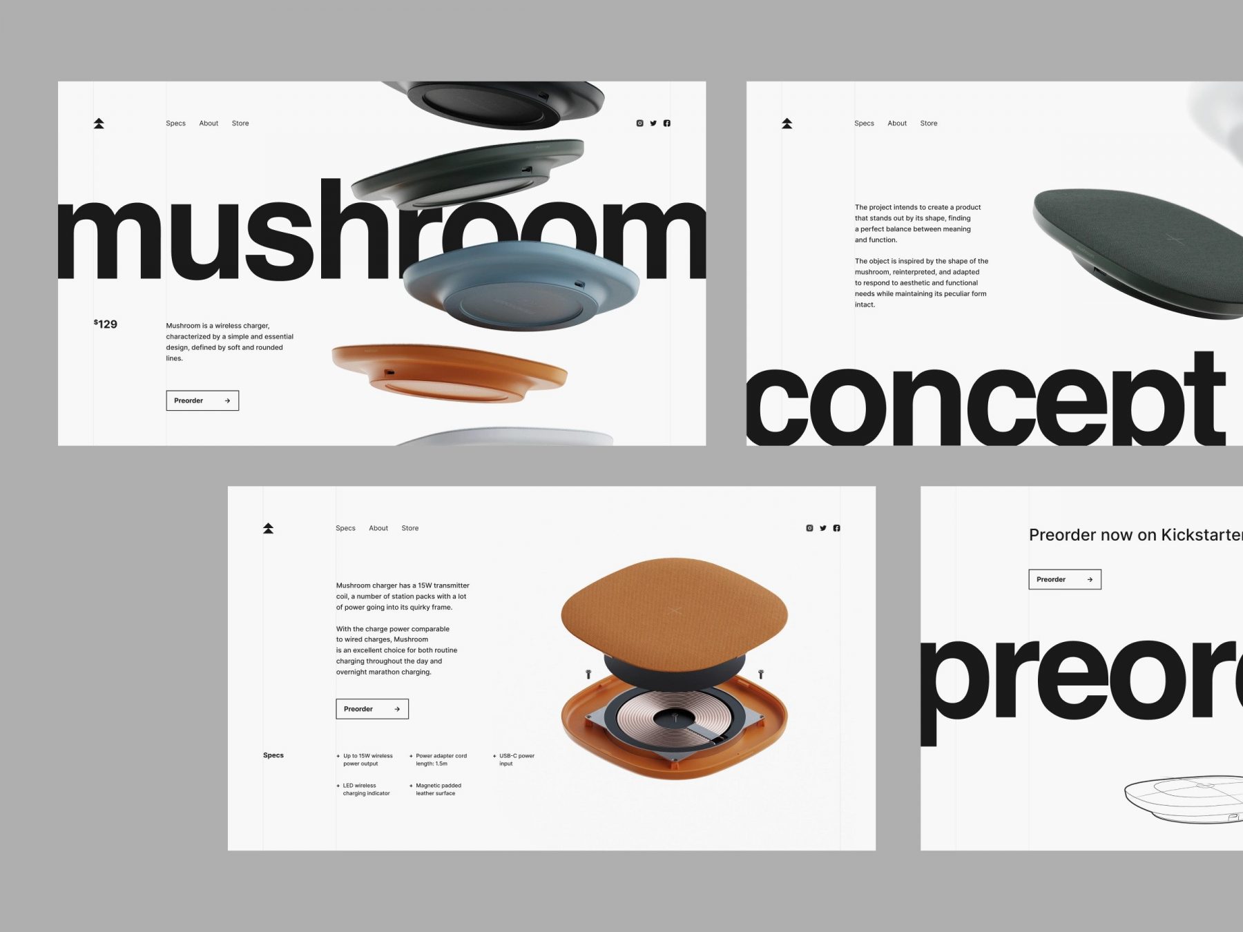
Limit your typeface pool to 2-3 for one product. Experimenting is fun and all, however, consistency is better for UX design. A pair of well-combined fonts is more than enough to create contrast. Keep in mind those chosen categories should fit the product branding.
Wireless Charger Landing Page by Conceptzilla
Stick to left text alignment. Left-aligned text is considered to be friendlier and easier to read than justified one. However, beware of large rags and balance the column edges to create enough white space.
Follow visual hierarchy. People need to understand where to look at a glance. Create a solid page structure by varying text size, color, and space. A hint — the primary information should be the largest, while secondary data should go down in size.
Check font availability on different platforms. If you develop a cross-platform application, find out if the typefaces you picked are available on all target devices or browsers. When it comes to the best fonts for web design across a vast range of platforms, system or widely-used typefaces are the safest bet.
FAQ
What is font psychology?
Font psychology is a design science that studies how various fonts influence people’s perception. Fonts resemble objects from the world around us, and readers rely on an associative network: a tall, thin logo font, for example, suggests the beauty industry. Each typeface has a personality and evokes certain emotions, so if fonts contradict the company’s overall strategy, the UX design will not work.
What emotions do different font styles evoke?
Light, thin fonts feel gentle and delicate and suit beauty brands, while bold ones feel assertive and solid, fitting sports and machinery. Rounded shapes feel comfortable and friendly, and angular ones bring tension and thrills. Condensed fonts suggest tightness, extended ones freedom. Lowercase feels cozy and safe, and uppercase shows power and dominance.
What is the difference between serif and sans serif fonts in UX?
Serif fonts hint at history, experience, elegance, and authority, which is why institutions like the New York Times still use Times New Roman, and they read well at smaller scales. Sans serif fonts look modern, loose, and easy-going, so they are common in e-commerce, SaaS, and web platforms, and they work well in mobile apps where screen resolution is limited.
How many fonts should a website or app use?
Limit your typeface pool to 2–3 fonts for one product. Experimenting is fun, but consistency is better for UX, and a pair of well-combined fonts is enough to create contrast. Make sure the chosen font categories fit the product branding, and if you build a cross-platform app, check that the typefaces are available on all target devices and browsers.
Are hard-to-read fonts ever a good choice?
Sometimes. According to font psychology, text that is harder to read is remembered better, because people have to concentrate on it. But people don’t enjoy reading low-readability text, and fonts that are easy to read are processed faster. That makes readable fonts the better choice in apps and websites where fast decisions matter more than learning new facts.
Which fonts work best for glanceable information?
Use large fonts for information people need at a glance, which matters most for users older than 60–65, who tend to have bad eyesight. Avoid all-lowercase captions there: according to NNgroup studies, lowercase text takes 26% more time to grasp than uppercase. In apps with high data density, use wide font variants for headings, since condensed fonts reduce readability.
Summing it up
Many experienced designers use typography and font psychology tricks to improve mobile and web interfaces. In terms of navigation, well-picked typefaces serve as beacons on the way to the final goal. They are also powerful marketing tools to convey the product’s message and attract potential clients. With bold and tall fonts, your creation will make a name for itself, while with thin and handwritten variants, it will become an elegant piece of art attracting all the attention.
A meaningful UI/UX design requires a certain strategy and lots of knowledge in the spheres of marketing, font psychology, development, and others. Contact our team if you want a one-of-a-kind approach based on the best and most popular practices.
Related reading