What do you think about the phrase “beautiful design”? Do you like it, don’t care or does it make you wince?
Contents:
For many, “beautiful” is a derogatory term, whether because it doesn’t go with their personality, or like with some of the designers, they sometimes become coarsened by their professions and find this word trite and shallow. People have been arguing about the notion of beauty throughout their history and aren’t likely to stop doing it any time soon. Beauty vs function in design is one of the most perpetual controversial subjects ever. Some say that the design should be beautiful, while others insist that its primary goal is to be functional.
How do we decide what’s beautiful and what’s not? Is beauty really in the eye of the beholder or is it something deeply inherent in our species? Can aesthetics be a part of utility without contradicting it? Let’s find out more about beauty and aesthetics in design and whether this aesthetics/utility controversy at all makes sense.
What is aesthetics
The Merriam-Webster dictionary defines aesthetics as
“a particular theory or conception of beauty or art: a particular taste for or approach to what is pleasing to the senses and especially sight”.
Abstracting from the theory, in day-to-day life, something aesthetic means something like a combination of things that are pleasing to look at.
In nature, graphic expressiveness is often realized with the help of light and shadow. Photographers make use of it adding their knowledge about frame composition.
With regard to design, beauty as we see it is based on proportions or composition ratios (like the golden ratio, for example), color combinations, and graphic expressiveness. It relates to any object.
Aesthetics is not just about what we see, humans are primarily visual beings, so we’ll focus on the sense of sight. So everything that corresponds to certain parameters, we consider as beautiful, in art as in everyday life.
But where does this appreciation of certain forms and combinations come from? Some are based on cultural experiences, but a lot originate from physiology.
Biological origins of beauty
Beauty is in the brain of the beholder. At least, that’s what neuroaesthetics says — a relatively new scientific discipline at the junction of neurobiology, art, and psychology, that has received its formal definition in 2002.
Semir Zeki is the Professor of Neuroaesthetics at University College London, who has been studying how the brain perceives beauty for many years. According to his studies, the concept of beauty developed long before our species appeared, millions of years ago. Due to nature’s reward system, animals began to feel a sense of satisfaction from what they saw. The basic quality of beauty from the point of view of neurobiology is that it should create a sense of reward. Give pleasure. Admiring an attractive face, a picturesque sunset or a magnificent building creates a chemical reward in the brain. The area of the cortex, whose activity is associated with the perception of beauty, is generally activated every time we enjoy it, whether this beauty is of visual, musical, cognitive, or even mathematical origin, in contrast to Aristotle’s view that the perception of beauty varies with different objects (or types of art) in which it is found.
Professor Zeki claims that in order for someone or something to be considered beautiful, its visual parameters must fit into narrow frames. We inherit the concept of the structure of the face and body biologically. With artistic beauty, it’s more complex, though it basically comes down to the idea that different cultures also have some similarities due to basic biology.
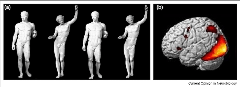
Image: semanticscholar.org
Denis Dutton, who was the Professor of Philosophy at the University of Canterbury in Christchurch, New Zealand, had even bolder views on the biological nature of perceiving beauty. His Darwinian theory of beauty claims that art, music, and other manifestations of beauty don’t depend on the individual characteristics of perception but are an integral part of human nature. A sense of beauty, coupled with pleasure and acuteness of experiences, lies in the sphere of evolutionary development. Beauty is an adaptation mechanism that we develop and strengthen by creating and enjoying works of art.
Professor Dutton stated that though it is widely believed that the earliest works of art were cave paintings (approximately 32,000 years old), in reality, artistic skills are much older. He referred to the so-called Acheulean axes, the oldest stone tools (about 1.76 million years old), that Homo Erectus made even before they knew how to speak.

Photo by Didier Descouens
The number of axes found suggests that they could not be used for hunting. The blades of some axes don’t have traces of use or they are too large to be used for their intended purpose. These facts, and their elegant symmetrical shape and fine materials lead to the most evident conclusion — they are the earliest known works of art, that can inspire even today.
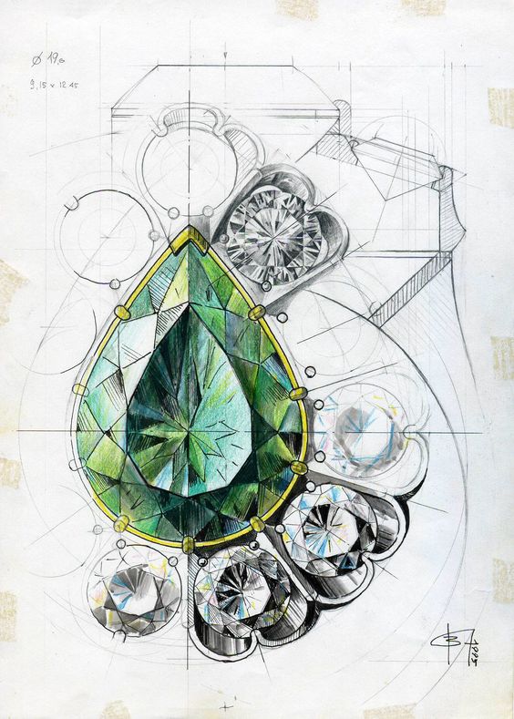
Jewelry sketch by Vlad Glynin

WATERDROP – Homage to “The Dark Forest” by zaoeyo (Xiaolin Zeng)
The Darwinian aspect of this theory lies in the fact that similar to the peacock’s tail beauty, the ability to masterfully execute such tools meant additional advantage in the process of sexual selection.
Stefan Sagmeister: In defense of beauty
Beauty is one of the UI/UX design trends. History knows cases when the subjective aesthetics of design were opposed to its functionality. This happened in the late 19th-early 20th century primarily in graphic design, architecture, and interior design. Functionalism in architecture was born whose main idea was that the form of an object should strictly obey its function. All decorations that don’t serve any immediate purpose must be removed. It was born as a result of changes in building techniques, new types of buildings required, and changing cultural ideals. Technologies and mass production played their role too. This aesthetic approach has had a major impact on today’s world. To point out, the concept of beauty was at some point despised.
Whether beauty needs to be defended is open to debate, but if we were to name a person who’s well-known for it, it would be Stefan Sagmeister — a New York-based graphic designer, storyteller, and typographer. After studying the subject of happiness, he decided to tackle the subject of beauty.
Some of his ideas are:
Beauty is natural for people of all time periods
People adorned their surroundings living in caves and castles. In Gothic, Renaissance, and Baroque eras — always and everywhere. It’s only in the 20th century that they’ve decided to seriously doubt it in exchange for function. Modernists build houses with functionality in mind and avoid ornamentation, but people who live in these houses start decorating them immediately.
Beauty improves living standards
Beautiful architecture reduces the crime rate and raises the level of happiness. Life can be destructive for the psyche in places that lack beauty. Semir Zeki would say that this happens because where there is no beauty, there is no encouragement.
People usually agree on what is beautiful and what’s not
People en masse favor the same colors and the same shapes. Most can recognize the harmonious works of acknowledged artists among fakes. Even mentally disabled people show the same results.
Lack of beauty = indifference
As a rule, no one makes ugly things on purpose. They are done as a result of indifference. To carry on with a theme of living standards, people litter more in ugly places, because they don’t care. In beautiful places, they take pictures and behave better.
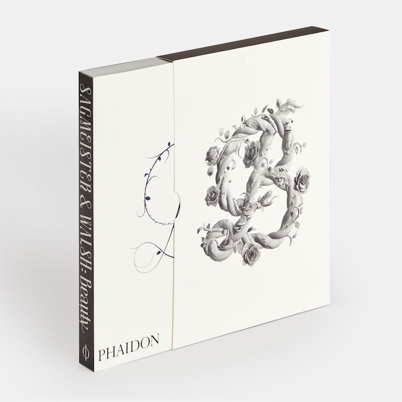
“Sagmeister & Walsh: Beauty”. A book by Stefan Sagmeister and another world-renowned designer — Jessica Walsh. Do you have a copy?
Aesthetics in design: Practical use
This is where the line between aesthetics and utility becomes blurred. Beauty is more than just a superficial strategy: it has a pervasive influence on our lives, stimulating our senses, and ultimately making the world a better place.
The value of beauty and the Halo effect
According to the paper by Ines Schindler, a senior research fellow at the Max-Planck Institute for Empirical Aesthetics, beauty is something that we seek for its own sake. The act of admiring the aesthetics is emotionally fulfilling and gives us pleasure, thus becoming an ultimate goal instead of being just a side order.
What’s more, the so-called Halo effect makes it difficult to separate the content of a work from its form. The Halo effect is a cognitive bias that in simple words means that what is beautiful seems also interesting, good, and usable.

Abyss — Company Brand Identity by Shakuro
Beauty captivates
Aesthetic experience is similar to the concept of flow, stated in his work by Mihaly Csikszentmihalyi, a Hungarian-American psychologist. When people marvel at somebody or something, they immerse themselves in the process, with a strong attachment to the person or object that fascinates them. For example, the most favorite shade of my favorite color is cornflower blue:

Photo by Peter Pieras from Pixabay
So any product featuring a similar shade immediately attracts my attention and I stop to get my dose of endorphins:

Tweeq Mobile App Onboarding by Shakuro
It’s subjective, of course, but often culture-based. The power of color associations can be used to a designer’s advantage.
Beauty in simplicity
People prefer things that are easy to understand. According to the study by Rolf Reber, the Professor of Psychology at the University of Oslo, aesthetic pleasure can be derived from the perceiver’s ease of processing. In other words, the easier something can be processed, the more welcome it becomes to a person. This idea explains why a complex idea presented in an accessible way can give a feeling of aesthetic pleasure.
Moreover, even the captivating effect of the golden ratio is perhaps can be explained by the sensation of simplicity it gives to an onlooker.

Finance Management Mobile App by Conceptzilla
Beauty is changeable
Although our attitude to beauty is integrated into us as a species, in more detailed respect, people tend to disagree about much of what they find beautiful or ugly. Sometimes something too beautiful is perceived as ugly and vice-versa, like with the case of Barocco and brutalism style usage in web design.
As suggested in the research by Haiyang Yang of the Johns Hopkins University, USA, and Leonard Lee of the National University of Singapore, these preferences may be changing constantly in response to the media and popular culture.
Combining aesthetics and functionality
Design is not art. The design’s main task is to make something usable when the functional task comes first, and the aesthetics are secondary. Design should solve the problem for which it is created. The function is first defined by the purpose of an object, and the aesthetics depend on the function. If you are creating a website, then its readability and usability are more important than what style it’s made. Because there are a lot of styles.
The utility is expected to come by default. You can’t impress people with something that just works fine. Perhaps, this is why they are craving something that differentiates. Like beauty. It’s possible to combine the best sides of both at the same time. These are not mutually exclusive things. When the design is done right, you don’t have to choose between aesthetics and functionality. Great designers see an object and find the fitting aesthetics that accentuate its value.
This is an ordinary IKEA Upplaga mug that you can buy for $2.99:

Image: ikea.com
Despite the famous simple and utilitarian Scandinavian design of all things IKEA, the company frequently uses some ornamentation in their designs. Like this cup, made in retro style with “unnecessary” handle elements and soft shapes. Many people would prefer this design instead of something strictly functional, deriving pleasure from using it. This way the beauty becomes the function.
Sometimes, it’s curiously vice-versa, when the function becomes the beauty, like with transparent watches:
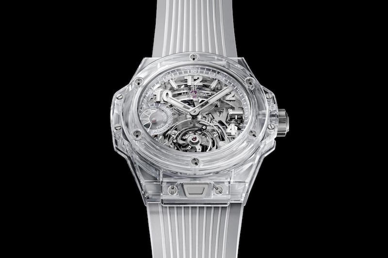
Hublot Big Bang Tourbillon Power Reserve 5 Days Sapphire. It costs a bit more than $2.99.
Image: hublot.com
* * *
Great design makes the function so obvious that you cannot imagine an item made in another form, like a wheel, for example, that for this reason doesn’t need to be reinvented. It’s very functional and has the most universally liked round form, with aesthetics emerging from the functions of the object. In the case of apps and websites, it is applicable as UI/UX design, that it is so clear and user-friendly, that it makes the site or app look nice(r).
Combining utility and aesthetics in design can be very difficult. There are countless groups of people and taste preferences. That’s why there are no ready-made perfect solutions in design. That’s why it is so important to be in the know of recent design trends and skillfully apply them in your works (or not, if it’s not required). But the result is worth it.
Do you want to create an aesthetically pleasing design that actually works? Contact us and let’s build your next project together!
