As a web designer, you know the frustration of putting in countless hours perfecting a website design, only to see lackluster conversion rates. But what if we told you that the key to unlocking higher conversions could be as simple as choosing the right color scheme?
Contents:
75% of people evaluate businesses’ trustworthiness based on their website design, according to Stanford web credibility research. Moreover, a staggering 93% of consumers focus on visual appearance when making the final decision in favor of a certain product.
In this article, we delve into the fascinating world of website color psychology and how it can significantly impact website conversion rates. Say goodbye to guesswork and hello to strategic design decisions that will truly make a difference. Keep reading to discover how your color choices can transform your designs, and branding strategy, driving real results.
How colors can drive brand awareness
Using a signature color can dramatically increase the recognition of your brand among competitors.
It is remarkable, but customers are more likely to forget brand names rather than their colors. Nature tweaked our senses specifically to pay the most attention to colors, which are followed by shapes, symbols, and words.
In the modern world, it would be really hard to find a person who would not point out Coca-Cola among its competitors. This brand has many traits that make it stand out in the market, including the bottle shape or logo’s font, but above all – its signature shade of red.
The same can be said about Ford’s notorious blue oval or those shining golden arches of McDonald’s.

Coca-Cola’s signature red color – you’ll know it when you see it
Some would say all these brands have been out there for quite a while, and today it is almost impossible to create such an impact on brand recognition using colors alone.
But take a look at this inspiring example of CD Project Red, a Polish game development studio behind the “Cyberpunk 2077.” It created a memorable brand based on a specific color scheme that managed to set it apart from other sci-fi franchises like Tron, Blade Runner, and The Matrix.
Speaking at the games conference Digital Dragons, the project’s lead environment artist Michał Janiszewski shared that the game artists were using Coca-Cola as a reference. “The yellow color is pretty much the same thing. It is conveying the information, it is simple to remember,” said Janiszewski.

Cyberpunk 2077 official wallpaper
The success behind this choice was so vast that the influence of “cyberpunk yellow” on the mass culture somewhat went out of control. Companies that operate far from the gaming industry like apparel manufacturers and food delivery services started using a similar neon yellow in their color schemes hoping to benefit from its cultural impact and increase website conversion.
Color theory 101
Now, it is time to reveal the secrets of website color theory: how designers and artists choose colors to create stunning and emotional images that imprint in people’s minds. They use an astonishing combination of art and science to create color harmony.
Color wheel basics
The invention of the color theory dates back to 1666 when Isaac Newton mapped the visible spectrum on a wheel. Painters, designers, VFX artists, and anyone who deals with visuals use it to summon particular emotions and feelings from the audience.
The color wheel shows the existing colors and depicts relationships between them. With its help, you can pick the best colors for a business website and locate which combinations create the most eye-pleasing effect when put next to each other.
The color wheel demonstrates the 12 main colors which are red, blue, yellow, green, orange, violet, blue-green, yellow-green, yellow-orange, red-orange, red-violet, and blue-violet.

Color wheel by tomboy-fashion.com
These colors in the center of the wheel are called primary colors. In the RYB color wheel, those are red, yellow, and blue. When you mix any two primary colors, you get secondary colors, which are green, orange, and violet.
By combining one of the primary colors with one of the secondary ones, you will get tertiary colors. Among them are yellow-orange, yellow-green, red-orange, red-violet, blue-green, and blue-violet. This way, you can build a color theory quick reference sheet.
Apart from screening Dribble in search of inspiration, web designers use a slew of online services to streamline their work and pick good website colors. They are extremely useful and simple to work with:
Color terminology explained
The world of color, art, and design may only seem chaotic. In reality, it follows a set of pretty strict rules and has a technical language. Learning some basic terminology before tapping into the color theory for websites might be extremely helpful when it comes to describing your requests to the design unit.
- Hue. Artists and designers often use this term interchangeably when they mean the term “color.” While the latter is used to describe all colors in general, including black, grey, and white, the term ”hue” refers to one of the primary or secondary colors on the color wheel as the base of the color we see.
- Tint. Use this term when you need to describe a hue with white added to it. Tints may range from a slightly paler version of a given hue to almost completely white with a dash of color.
- Shade. The opposite of tint, if short. This term represents a hue when you add different amounts of black to it. Imagine how the colors in the room become darker and darker when you start dimming the lights. Different shades of a hue may vary from a slightly darker version to almost black.
- Tone. The effect of a “tone” represents variations of a certain hue but instead of adding pure white or black, you add a combination of two colors. Which is any grayscale color, excluding pure white or black.
- Color temperature: warm vs cool. Simply put, it refers to “warm” colors like red, orange, and yellow and combinations of these colors and their hues. Warm colors are typically associated with sunshine, energy, and heat. “Cool” colors presented by blue, green, and light purple, refer to freshness and chill.
What is color psychology in web design and why is it important
Before going further with your website’s color scheme, you need to decide what core message you want to communicate to your customers. Several factors affect the way people perceive colors when it comes to marketing. Individual preferences, cultural differences, and the market you are trying to enter – all matter if you want to make colors drive the overall website conversion.
There is no one-size-fits-all answer on what particular colors to use, which is why gathering some background information at this point is a must. The tips below will give you some solid ground to kick off your research and help you align your business idea with a preferred color combination.

Illustration by ParallelBranding
Blue – calm, stable, and trustworthy
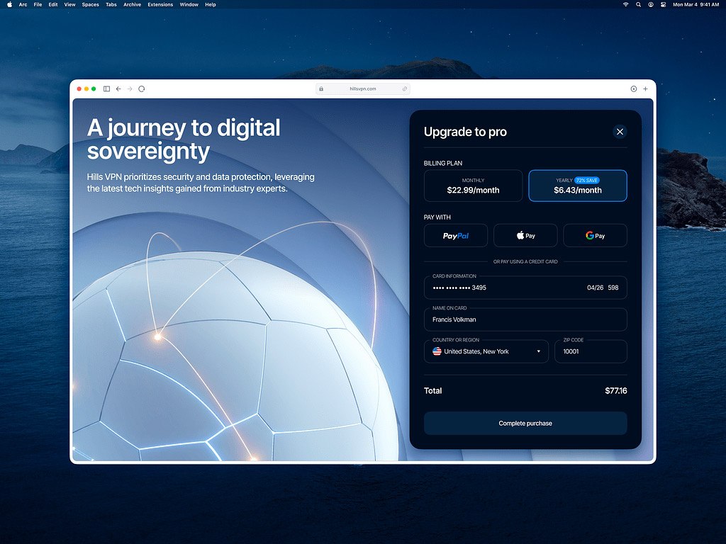
It is hard to find a more widespread color used in design than blue. The color of the sky and ocean symbolizes stability, trust, and the capability of withstanding any obstacles. That is why so many financial and technological brands love using it in their branding and website design.
Red – fast, motivating, and thrilling
Red is the most visible color on the spectrum. It urges immediate response, increases your heart rate, and activates the pituitary gland. Why is red a bad color? Sometimes, it can be overstimulating so it is recommended to use it in small doses.
Yellow – happy, optimistic, and engaging
If you ask people around you to name a color of joy and optimism, most of them would say that it is yellow. As an accent color, yellow is a good website color for grabbing people’s attention and creating a sense of urgency.
Orange – fun, active, and lively
When you need to combine the explosive energy of red with a cheer of yellow, orange would most likely be your choice. It is full of life and evokes excitement. It is widely popular among kids, but incorporating it into your website should be done with precision and caution.
Pink – light, sensitive, and caring
Color psychology in web design has different meanings. While in the US market pink is associated with femininity, in Japan it is the color of sakura blossoms, which delivers a contrasting message. Lighter tints of pink can refer to something delicate and fragile, while more intense tones will be more emotional, even euphoric.
Purple – wise, mysterious, and distinguished
Purple embraces the power of red with the calm strength of blue. While signifying creativity and luxury, purple also can be extremely polarizing. It tends to draw female customers but at the same time, almost instantly repelling the male audience. That is why integrate it in small drops. The use of color in web design: sophistication, mystery, luxury, and wisdom.
Green – healthy, sustainable, and organic
Green is a synonym for health, growth, and freshness. It combines the calming effect of blue and the energetic qualities of yellow. Green is also one of the great website colors that can dramatically change its meaning depending on the tint, shade, or tone you are using – from affluence to serenity.
Brown – robust, durable, and simple
Brown is all about being as much down-to-earth as possible. Use this color in your brand identity with caution, since many people associate it with dirt. Which is not necessarily bad, especially if you promote outdoor and off-road brands.
Black – elegant, powerful, and strong
Black is one of the most popular colors among luxury brands. Black can be formal, edgy, traditional, and innovative. Such an array of conflicting associations makes black one of the best colors for website design.
White – pure, minimalist, and clean
White is probably one of the most important colors in web design. This color gives your users visual breathing to absorb the information you want to present. In case pure white seems too cold and strict, you may use pale tints of warmer colors like ivory that grant the same visual benefits.
Grey and silver – practical, neutral, technological
Grey, which is a mixture of black and white, is associated with metal, innovation, and science. Depending on the proportion of the parenting colors, gray can adopt different features of both.
Color combinations for boosting website conversion
- Red and white: This classic combination is not only striking but also conveys a sense of urgency and importance. Red is known to grab attention and evoke feelings of excitement and energy, making it ideal for call-to-action buttons or sale notifications. When paired with white, a symbol of purity and simplicity, this combination creates a visually appealing contrast that guides users’ focus and encourages action.

Red and white in Construction Company Website by Conceptzilla
- Blue and yellow: Blue is often associated with trust, reliability, and professionalism, making it a popular choice for corporate websites. When complemented with yellow, a color that conveys warmth, positivity, and optimism, this combination creates a harmonious blend of stability and friendliness. It is perfect for brands looking to establish credibility while maintaining a welcoming and approachable aesthetic.
- Green and gray: Green symbolizes growth, health, and nature, making it a versatile choice for websites related to sustainability, wellness, or eco-friendly products. When paired with gray, a color that exudes sophistication and neutrality, this combination conveys a sense of balance and calmness. It is well-suited for brands seeking to portray an environmentally conscious image while maintaining a sense of professionalism.
- Purple and gold: Purple is often associated with luxury, creativity, and wisdom, making it a captivating choice for brands looking to convey elegance and sophistication. When paired with gold, a color that represents wealth, success, and prestige, this combination exudes opulence and exclusivity. It is perfect for high-end brands or luxury products seeking to appeal to discerning customers.
How to use the color wheel to choose the right color scheme?
A color wheel is a tool that has proven to be very useful for combining colors, without any knowledge about color or fashion. This will allow you to build a website that matches your primary brand colors by selecting contrasting or harmonious colors to deliver the desired effect.

Color schemes by amberddesign.com
Analogous scheme
Analogous color combinations represent the colors located close to each other on the color wheel. Such color schemes represent serenity and a sense of control. According to web design colors psychology, you can use them to demonstrate expertise and confirm your leading positions in the market.
This combination can work well when you want to create a harmonious website design or you want your brand to be associated with a certain color. Businesses often use it to highlight a marketing campaign or promote a particular product line.
Complimentary schemes
Complimentary combinations represent colors resting on the color wheel’s opposite parts. They provide the highest contrast level and make your design bold or help certain elements stand out.
Use complementary colors in web design to highlight important elements like a CTA button. Such color schemes trigger different types of photoreceptors in the eye which makes our brain consider them vibrant and pleasing.
Split-complimentary scheme
Split-complimentary combination rests on the same principles that the complimentary scheme does but instead of just one color on the opposite side of the color wheel, it offers to use two – each from either side of it. You have more flexibility than with a complementary scheme, balancing the base color with both warm and cool hues.
Triadic scheme
The apex of the split-complimentary color combo would be the triadic combination. The colors in triadic combinations are located equally spaced from each other on the color wheel forming an equilateral triangle.
Even when toned down or tinted, a triadic color scheme can be vibrant. For the same reason, you have to be very careful when applying triadic colors on websites since they may easily turn from energetic to adolescent and amateur.
Square and tetrahedral schemes
Similar to triadic, colors in the square combination are located at an equal distance on the color wheel. However, now, there are four of them, instead of three. Tetrahedral and square color schemes represent combinations of two pairs of complementary colors.
With these schemes, your design will surely stand out among competitors. Especially if “standing out” means being the brightest and the most cheerful company on the market. Beware of becoming too overwhelming – your users still need to see that CTA button.
Best practices in color psychology for web design
By utilizing the power of color you can not only raise brand awareness and improve your website conversion but also control user emotions and change their perception. However, the wrong usage of color may be counterproductive, and finding the right balance is vital.
Mind the context
The purpose of an element on your website will give you a hint on which color scheme to use. The colors that create contrast from the main colors of your brand perform better for CTA buttons. Use them to motivate visitors to leave their contact details, sign up for an e-mail newsletter, or perform any other target action.
Streamline customer journey
Use web design color theory to help users easily identify the primary and secondary information on your website. The color scheme should navigate each customer’s journey through the content by highlighting the information and elements you want users to interact with.
Difference between light & dark UI
While the debates over which interface is better, light or dark, have finally started to calm down, you might find it beneficial to use the best of both worlds.
White or light-themed interfaces, as mentioned before, provide users with the necessary visual space to perceive the information. They also give better readability when you want users to grasp everything you put on your website or company’s blog.
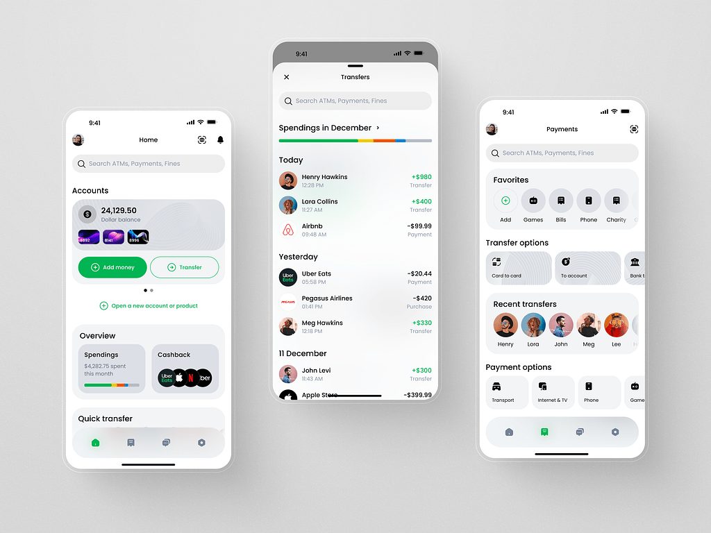
Light mode for a Finance Management Mobile App by Shakuro
Black or dark-themed interfaces, on the other hand, work well with bright text colors and create a sense of professionalism and luxury. They also provide better UX when operating in a dark environment and reduce battery consumption on mobile devices. Reading lots of text information on a black background, however, may be less comfortable.
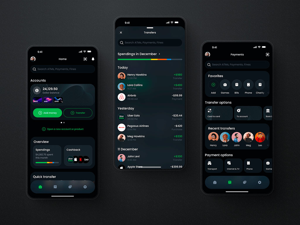
Dark mode for a Finance Management Mobile App by Shakuro
Do not overload your website with colors
You don’t want users’ eyes to go all over the page filled with flashing neon signs like the streets of Las Veras at night. Your mission is to create contrast and make people want to click that CTA button – not irritate them.
The optimal color scheme features three or four elements:
- Primary color works as a beacon that makes the most important content visible and attractive.
- Secondary color should work well with the primary one. You might need it to highlight some other information and create bullet points.
- Accent color serves as a contrasting primary color that draws the visitor’s attention to the key elements of the website like CTA buttons.
- Background color is the base of your website. It should work well with all the other colors you choose.
If you struggle with finding an optimal balance, just try following the classic 60-30-10 rule. It is quite eye-catching and works just fine for both room decorations and website layouts. Use 60% of the dominant color, 30% of the secondary color, and 10% to accentuate.
Test different color schemes
Upgrading the color palette of your website will help you improve the website conversion and retention rates. The truth, however, is that all brands, websites, and audiences they target are different. Moreover, regions, cultures, and markets also impact how people react to certain colors.
That is why it is so important to run A/B tests on different color schemes and all the main elements you want to change. Hubspot, for instance, found out that red CTA buttons outperform green ones. But for many other businesses, it did not work out. How will it end up for your website? Tests will show.
Use the psychology of color in design
To sum up the facts, there is no such thing as a good or bad color combination in web design. Colors can invoke strong emotions, inspire visitors to complete their customer journey and boost your conversion beyond limits. But colors need context.
This context should align with the message your brand is trying to communicate. Remember, your website has only a snap-of-a-finger timespan to capture visitors’ attention. Not to mention that it has to be filled with persuasive and engaging content to convert leads into actual clients. As it is said, you never get a second chance to make a first impression.
You need to be sure it is positioned in the right place and backed by relevant content. Shakuro’s experience in website building shows that good design does not just paint a nice-looking picture – it pays off with leads. And some leads may attract thousands, if not hundreds of thousands, of dollars.
Contact us now to get a flawless website that suits your business goals and adheres to color theory for web design. The team behind Shakuro has more than 15 years of experience in building websites and creating state-of-the-art identities for the world’s leading brands.
The article was originally published in June 2022 and was updated in May 2024 to make it more relevant and comprehensive.