
My best friend and I were Harry Potter fans when we were teenagers. We would spend hours exploring J.K.Rowling’s old interactive Flash website with quirky web design. Fellow Potterheads should remember it well, for those not acquainted with the subject, its homepage looked like this:
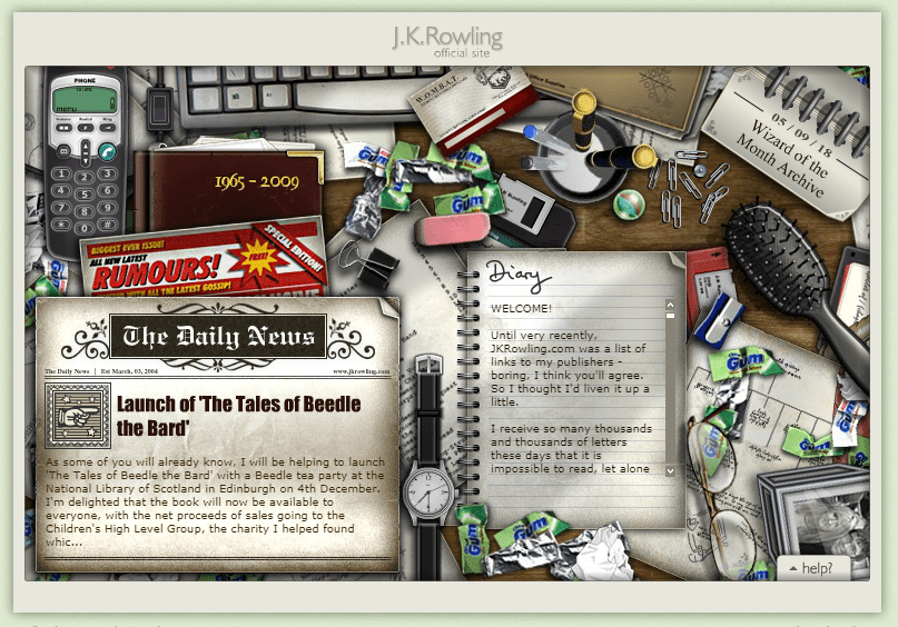
It was full of puzzles and tidbits of hidden information for fans like sneak peeks at the next books. To access it we were supposed to solve puzzles like dialing a certain number on the phone, using the eraser in some particular way, messing with the hairbrush, etc. And not only on the homepage, oh no. The site was full of riddles, some of which were pretty hard. The easter eggs were being discovered by people from all over the world trying things and posting results. Fan forums were crazy. THAT. WAS. INSANE.
Some people call the Flash era the Wild West of web design. But for me as a kid the internet was more like a Pandora-esque jungle full of breathtaking wonders. Yes, Flash had various issues with responsiveness, security, SEO, proprietorship, you name it. But one thing is true: a lot of designers made websites with Flash purely for the sake of excitement. They weren’t created to achieve some business objectives like selling web-developer online courses or whatever, and they rarely resembled each other.
More than ten years later, I see that that today’s trend is to replace everything chaotic with something smooth and functional. Every so often people ask me why logos, fonts, graphic designs, and web designs are becoming so alike. “Yeah, sure, these sites look good! But… Not great. Sort of same-looking. Have designers forgotten how to be creative even for their own sites’ sakes? Why all the copy-paste?”
Contents:
some beautiful agency sites. but we may be approaching a singularity in the design of ourselves. pic.twitter.com/ZgvdrMLS81
— Tim Caynes (@timcaynes) January 12, 2015
Let’s see why modern websites look similar today (or do they?) and why it’s actually a way it should be.
Homogenization of web design
Many of today’s websites look like twins (or, at least cousins). Here’s a hero image area with 2-3 large sliding images with, a call to action in the center and three columns below. Seems like today’s web design lacks variety. It oftentimes looks bland and is getting too safe and lazy. It makes things simpler, sure, but where is the art?
Instead, we are witnessing the corporatization of web design. The web is dominated by big corporations. Do not stand out, simply inform and clinch the deal.
Aesthetically, it means less individualism, more of whatever the current trends may be. Modern design is cut out for sales. It is made with regard to the latest market research and design deliverables like usability-test reports, wireframes and prototypes, site maps, personas, and flowcharts. Micro-brands mimic huge corporations in order to remain modern. Essentially, it resembles some kind of cargo-cult attitude.
In terms of redesign, companies often choose the designs not on the merit of their usability, but on their hotness and stylishness. It’s a matter of trends.
Take the current minimalistic trend, for example:
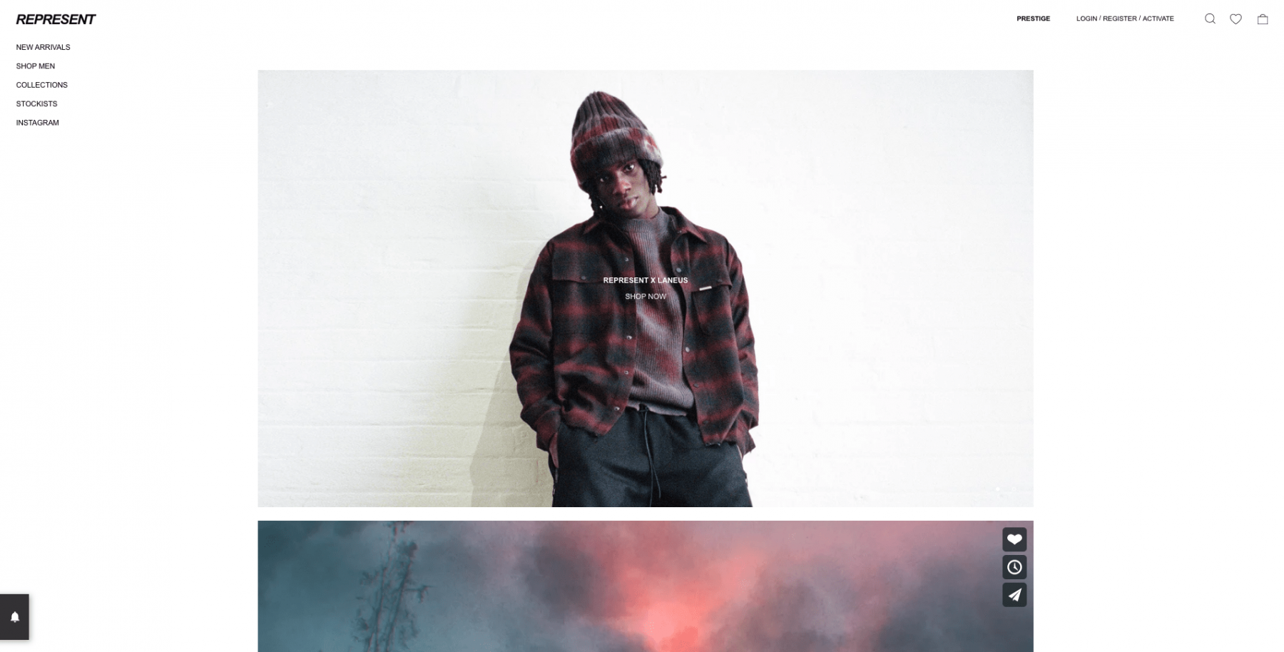
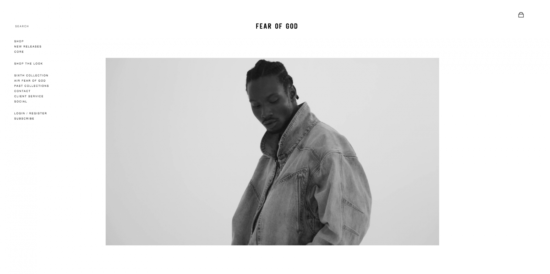
Fear of God fashion brand. Notice any similarities?
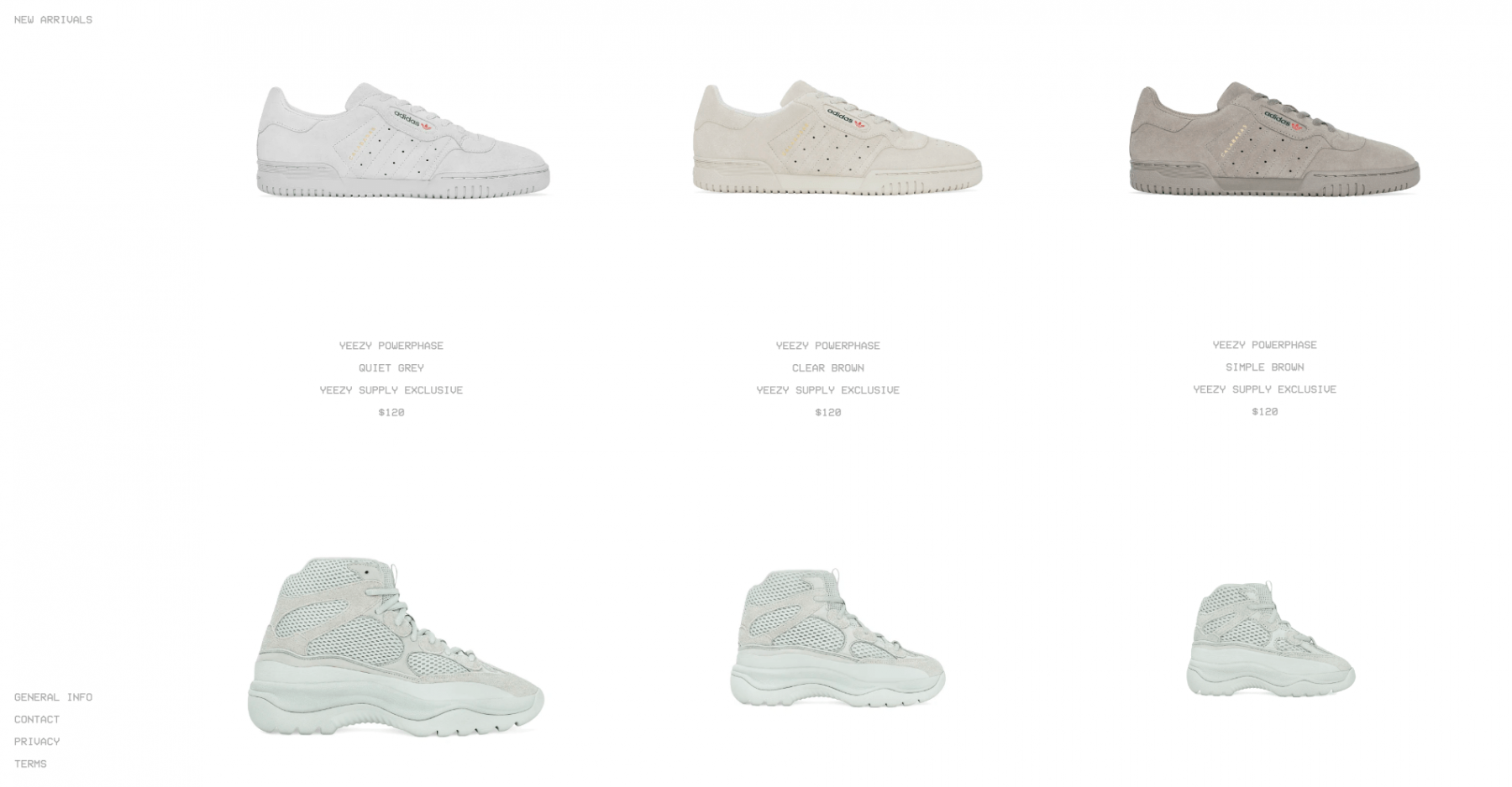
Kanye West takes it further with his absurdly minimalistic Yeezy fashion brand’s site. This is the homepage, by the way.
Designers’ artistic aspirations can get stifled by the business necessities. But it becomes a bigger problem when this blandness starts to permeate the whole design language, even creeping into projects that don’t share the same limitations. There is a danger that designers will turn into the agents of this sameness everywhere.
The fact that they make the majority of websites with the same instruments doesn’t mean they should be identical. All humans are basically physically identical, yet human diversity is staggering.
And don’t forget the “e” pic.twitter.com/H0hZbjNKOp
— Salamíncel (@brashangg) February 14, 2018
Why this has been happening
Everything happens for a reason. If we pay it some thought, we’ll discover that this tendency to homogeneity is not at all surprising.
-
A need for a responsive web design
Before, mobile websites were sometimes even supposed to look distinct from the desktop ones, but now the necessity to keep the general style consistent gives UI designers an opportunity to finish the project faster. If a site needs to work well on a desktop, tablet, and phone (and they all do in 2019), that suggests a responsive web design, which is very time-consuming to build without any frameworks.
-
Frameworks like Bootstrap, Foundation, UIkit, etc.
Tried and tested experiments have led to commonly used frameworks that meet most navigation and usability requirements. Among the most used web frameworks is Bootstrap. It consists of a library of frequently used code to build themes and websites in general. It’s so popular that it gives the modern web a distinct “bootstrappy” look I mentioned earlier: navigation up top, a slider with 2–6 big pics, 3 boxes and a plain footer.
-
SEO
This fundamental aspect determines the modern website design. Google drives traffic to your site, and it needs to find things easily. It expects a certain structure and content-arrangement for websites to get indexed. So the search engines are fundamentally removing excess creativity.
-
Budget constraints
One reason to rule them all. Economic viability seems to sum up all the other factors. Reinventing the wheel is fun, but expensive and timewasting. In fact, the majority of site budgets don’t have the capacity for much experimentation. Managers in design studios see no reason in making the development prices higher. They aim to reach even more people on much smaller budgets.
— JoRoan Lazaro (@JoRoan) December 13, 2018
Websites are supposed to look similar
Do you feel as sad as the author of the tweet above? If you do, consider this for a moment: what if those changes were made to make the brand names more readable on the mobile screens? If a website looks impressive, that’s great, but it’s not its main objective.
Today’s web design companies focus their attention not on the bells and whistles, but on the convenience for a user. The best website design is simple and functional. Nielsen Norman Group even includes simplicity in its definition of UX. Emotions can always be incorporated into advertising campaigns.
Experimentations and trips to the Imaginationland are amazing for art. But design is not art.
“Art is to be free. Design is to fix.”
-Kanye West
The main purpose of art is to be the expression of the artist’s creativity. Any other down-to-earth reasons are optional. In fact, anything can be an art, and anything can be a design, it depends. A piece of clothes is a very sensible thing by itself. But a dress can be art when its only mission is to express its maker’s creativity. We’ve all seen examples of unwearable haute-couture kind of clothes, like this:
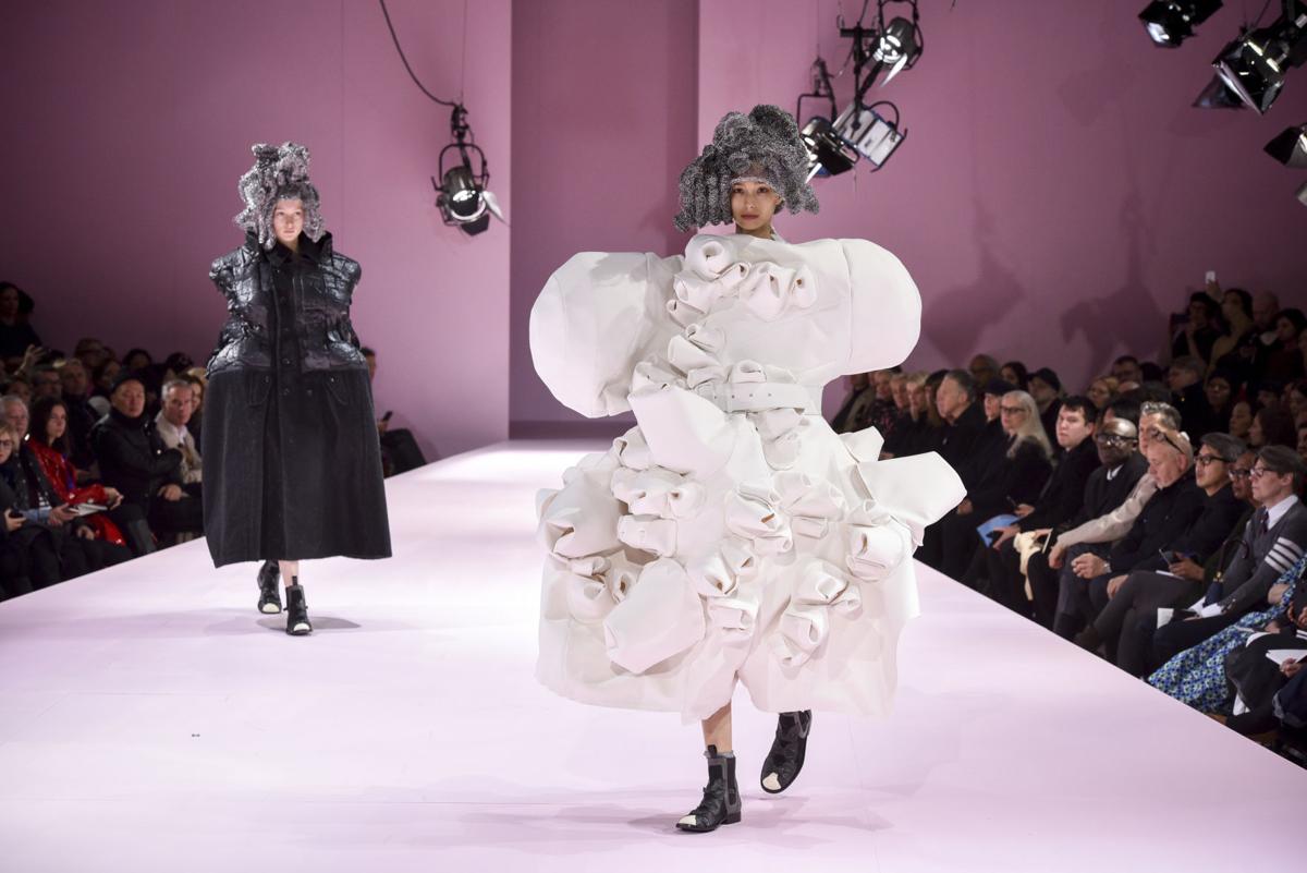
Comme des Garçons Fall 2017 Ready-to-Wear Collection
I don’t condemn it in any way, it’s a perfect expression of personal creativity. These seemingly ridiculous clothes establish the trends and define the boundaries where everyday fashion develops. But it doesn’t solve the problem at hand.
Brands that aim at rationality simplify their designs. Design, in general, fades into the background and makes websites more friendly, open and simple.
A site should require the smallest amount of time possible for a user to get acquainted with. It takes 15 seconds for a user to get frustrated with a website and leave it forever. Ideally, an interface should be intuitive. No time to learn how it works – need to go now! So, sometimes websites with similar functionalities copy the design from each other. And why shouldn’t they? If a person has already developed particular neural connections by using AppStore, then it makes no sense to force them to learn our new “creative” design — it’s easier and more reasonable to follow the guidelines. The user will be grateful for having a single design system on different websites and applications.
So it’s not a cargo-cult approach after all. It’s more of the union of the best practices selected by studying statistics. Moreover, according to the theory of good web design, your website is supposed to look like the competitors’ ones.
As Jakob’s law of web design says,
“Users spend most of their time on other sites. This means that users prefer your site to work the same way as all the other sites they already know.”
We can’t imagine our lives without the internet. We have basically optimized it for our purposes. Web page design and corporate identity fade into the background, these are no longer brand-building components. Now the brand’s face is its product, its micro-positioning here and now. Corporate identity, web design, and apps should not distract a person from a product or service. This is just a shell, an interface that becomes transparent so that nothing prevents you from enjoying your favorite food in Uber Eats, games in AppStore, and clothes in Gap.
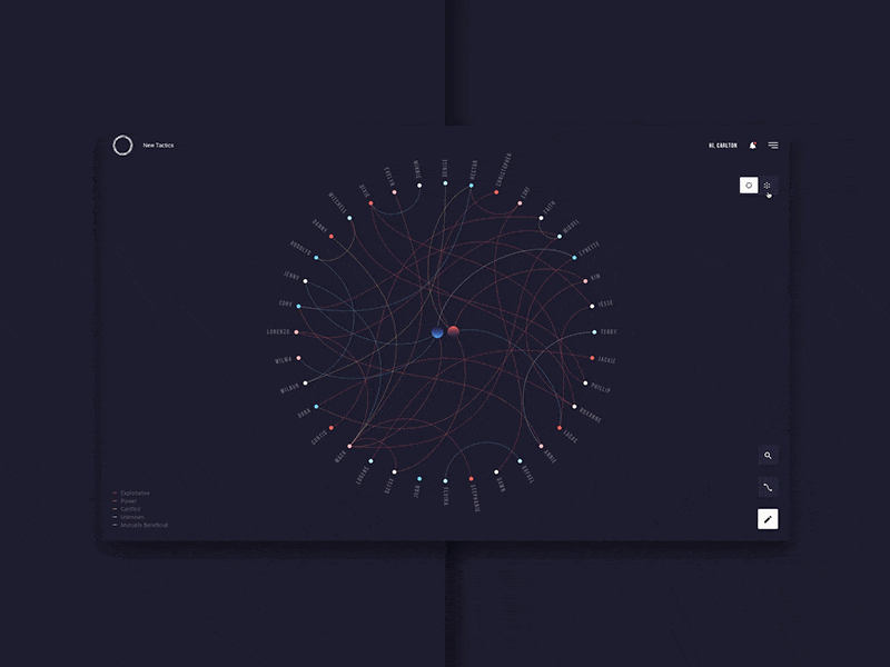
New Tactics – Sneak Peak by Quintin Lodge. This looks interesting. But it cannot be applied to the majority of websites.
Conclusion
Ultimately, we are witnessing evolution in action. Numerous website designs have been tested, and what we are working with now are the most efficient ones.
99% of the websites are functional. Excessive creativity might help produce in a site that is aesthetically interesting but less productive as a business tool. All these innovative, cutting-edge efforts to create immersive emotional experiences can prevent people from achieving their aim: to buy, to read, to watch, to find, etc. So to complain that today’s websites look dull would be getting it wrong.
However, a standard familiar layout doesn’t mean the end result would be devoid of creativity. There is always room for it. What I like about web design and development is that if you desire to create something new, you totally can. Strive to a style where neither the visual part, nor readability, nor user convenience suffers.
Architectural Platform Home Animation by Shakuro. Unusual floor-by-floor animation of the building highlights the website’s subject.