As a UI/UX designer or a startup founder, you’re likely acutely aware of the countless challenges that come with this task. How do you create an experience that captivates users and enhances their learning journey? How can you balance functionality with aesthetics, ensuring your app is both intuitive and visually appealing?
Contents:
Let’s discuss why educational app design is essential and what practices you can follow to deliver a smooth experience to your students. Whether you’re just starting or looking to refine your existing product, this comprehensive guide will provide you with actionable tips and inspiration to overcome common pitfalls.
Benefits of responsive e-learning app design
Firstly, why do you need a functional design in the app where people study focusing on educational materials, not visuals? Well, you hit two birds with one stone, significantly enhancing both the user experience and the overall effectiveness of the learning process.
Here are some key advantages:
- Improved user engagement: A well-designed application captures users’ attention and keeps them engaged. Intuitive navigation and a responsive layout ensure learners can focus on the content rather than struggling with the interface.
- Enhanced learning outcomes: Functional design promotes better learning by making content more accessible and easier to understand. Features like interactive quizzes, gamification, and visual aids can reinforce concepts and help users retain information.
- Scalability and flexibility: A solid foundation allows for easy updates and scalability. As your user base grows or educational content evolves, a functional design simplifies the integration of new features and adaptation to changing needs.
- Accessibility: Inclusive design embraces diverse learning styles and needs. With features like adjustable text size, voiceovers, and alternative formats, you ensure that individuals with disabilities and varying educational backgrounds can use your product.
- Increased user satisfaction: When users find a learning app design easy to navigate and visually appealing, they are more likely to enjoy their educational experience. Satisfaction leads to positive reviews, recommendations, and increased user retention.
- Better analytics and feedback mechanisms: A responsive design incorporates analytics tools to track user progress and engagement. With these insights, you can refine your content and improve the overall user experience based on real feedback.
- Competitive advantage: A layout resolving major pain points sets your product apart in a crowded market. You attract more people and build a loyal customer base.
- Streamlined learning paths: A thoughtfully created user journey guides learners through content in a structured manner. Clear pathways, milestones, and reminders enhance understanding and help users stay motivated.
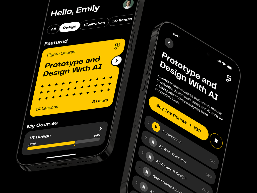
AI E-learning Mobile App by Shakuro
Types of e-learning apps
E-learning applications are not only a useful tool that simplifies the lives of students and teachers and satisfies the need for education in a convenient way, but they also present a tremendous set of business opportunities. The tricky part of education app design is to devise an experience that solves a problem, inspires, and captivates. Also, pick the product type that suits your target audience and fits into the market niche.
There are various types of e-learning apps, each designed to serve different educational needs and preferences:
- Learning Management Systems (LMS): With these platforms, you create and manage educational courses or training programs. They provide tools for tracking progress, administering tests, and managing user registrations. Examples include Moodle and Blackboard.
- MOOCs (Massive Open Online Courses): These apps offer large-scale courses that are open to anyone, providing a range of subjects with video lectures, reading materials, and discussion forums. For instance, Coursera and edX.
- Mobile Learning App: Designed specifically for mobile devices, they allow users to learn on the go. These products often include bite-sized lessons that can be accessed at any time. Check out Duolingo and Khan Academy as competitors.
- Corporate Training Apps: These are tailored for professional development within organizations. The e-learning app design focuses on employee training, skills enhancement, and compliance education. The potential rivals are LinkedIn Learning and Udemy for Business.
- Language Learning Apps: Focused on teaching languages, these applications often include interactive lessons, quizzes, and conversation practice. The famous ones are Babbel, Duolingo, and Rosetta Stone.
- Gamified Learning Apps: These apps use game elements to enhance the learning experience. They leverage rewards, challenges, and levels to motivate users. Take a look at Kahoot! and Quizlet.
- Exam Preparation Apps: They help students prepare for exams by offering practice questions, study guides, and performance analytics. Examples include Magoosh and TestPrep.
- Flashcard Apps: Utilizing flashcards for memorization and quick revision, apps like Anki and Cram create digital flashcards or access shared decks.
- Virtual Classrooms: These platforms facilitate live teaching sessions through video conferencing and real-time interactions between instructors and students. Check out Zoom for Education and Google Classroom.
- Subject-Specific Apps: Targeting specific subjects, these apps provide specialized content such as mathematics, science, or history. For instance, Photomath for math concepts.
Each type caters to specific learning objectives and user preferences, ultimately enhancing the educational experience across diverse audiences. So, if you know the pain points of your audience, you can find the right cure for them.
How to design mobile apps for learning
Educational app design involves a structured approach where you calculate each step.
- Define objectives and target audience
Start with deciding on the target group. Are they teens preparing for the exams? Are they company workers leveling up their skills? Then, identify the primary goals and understand the target audience’s needs, preferences, and characteristics. This way, your content will be relevant to the people’s demands.
- Conduct research and competitive analysis
Examine potential rivals to find their strengths and weaknesses. You can improve these features in your product and tempt users to your side. Also, analyze their clients’ feedback on app stores to understand what works well and where enhancements can be made.
- Develop a content strategy
Outline the content type, such as videos, quizzes, articles, and interactive activities. It should align with the learning objectives and engage users. To achieve that, make sure the content is diverse.
- Create wireframes and prototypes
Once you have the plan, switch to e-learning UI design. Start with low-fidelity wireframes to visualize the app’s layout and user interface. Then turn them into prototypes to test the user experience and navigation flow before finalizing the design.
- Develop the app
Build the educational app using the latest technologies and frameworks. Take advantage of Agile methodologies and opt for the MVP version to save resources.
- Test and iterate
During e-learning app development, conduct usability testing with real users to gather feedback on the app’s functionality and design. Then make necessary adjustments and improvements to the build.
- Launch and market the app
Once the product is polished and tested, launch it on relevant app stores. Develop a marketing strategy to promote it and attract users.
- Monitor performance and gather feedback
Post-launch, track user engagement and performance metrics. Continuously collect feedback to identify areas for enhancement and regular updates.
- Update, scale, and improve
Based on insights and technological advancements, regularly update the app to enhance performance, add new content, and keep the learning experience fresh.
Best practices for educational app design
Designing effective e-learning apps involves a combination of pedagogical principles, user experience design, and technical considerations. Here are the principles you should follow when working on your project:
Design based on user psychology
When you research the target audience and their preferences, you can rely on using personas and studying similar apps.
However, while some of your target audience’s specificities may differ greatly, psychological principles are the same for the majority of people. You can leverage that in educational app development to create an engaging product.
For example, think about it as a person’s new habit. To achieve that effect, you need to design simple experiences, give incentives, add microsessions, insert triggers, and play on FOMO (Fear of Missing Out). Major social media apps use the last trick often.
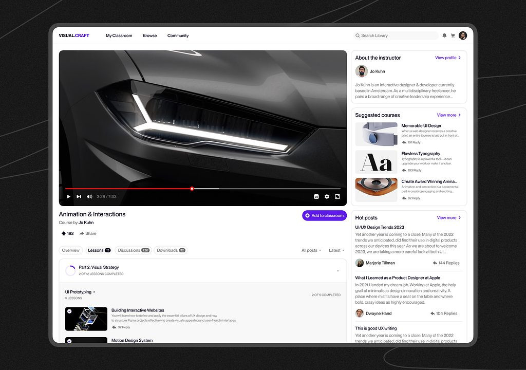
E-learning Education Web Platform by Conceptzilla
Design for perspective
In developing educational apps, add progress indicators at every step. Psychologically, a person needs to understand the educational path: at what point they are situated at the moment, and what awaits them in the future. Such indicators keep students focused, prepare them for the next lessons, and allow them to complete the course on time. They also provide a sense of achievement and encourage them to keep using the app. If the process is unclear, they may become confused and disappointed, giving up the product altogether.
If you design for e-learning, show students:
- How many steps they have made;
- How many course materials are still there to accomplish;
- How much time is left until the end of the lesson;
- How much time has passed since they started.
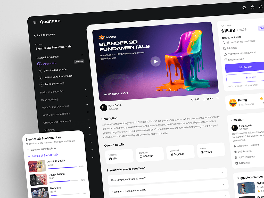
Online Education Web Platform by Conceptzilla
Design for educators
Not every teacher is experienced with smart algorithms or other cutting-edge technologies. So if you offer such educators pro-level features without traditional alternatives, they can meet them at a dagger point. As a result, the teachers will spend a lot of time figuring them out or won’t use these options at all.
To avoid such consequences, implement some familiar concepts in your educational app design. That way, people won’t be overwhelmed with new tech and focus on teaching instead. Gradually, they will digitize and simplify the educational process. For example, traditional writing tools can be added along with AI-powered ones. Let teachers discover the new possibilities and help them with onboarding, small popups, and suggestions.

Proko platform by Shakuro
Design for the right age
Users vary greatly in age—from toddlers to elderly people. When creating content for your app, you need to pay attention to how people of that age perceive information.
For instance, if your product is aimed at toddlers, integrate more gamification to keep children engaged. The educational content consists of simple puzzles, songs, stories, etc.
An app for grown-ups has a different impression. When building the learning app design for the Proko and CGMA art learning platforms, we focused on clean, professional-looking, and minimalistic design. They offered well-structured information, detailed courses, video lessons, and more.
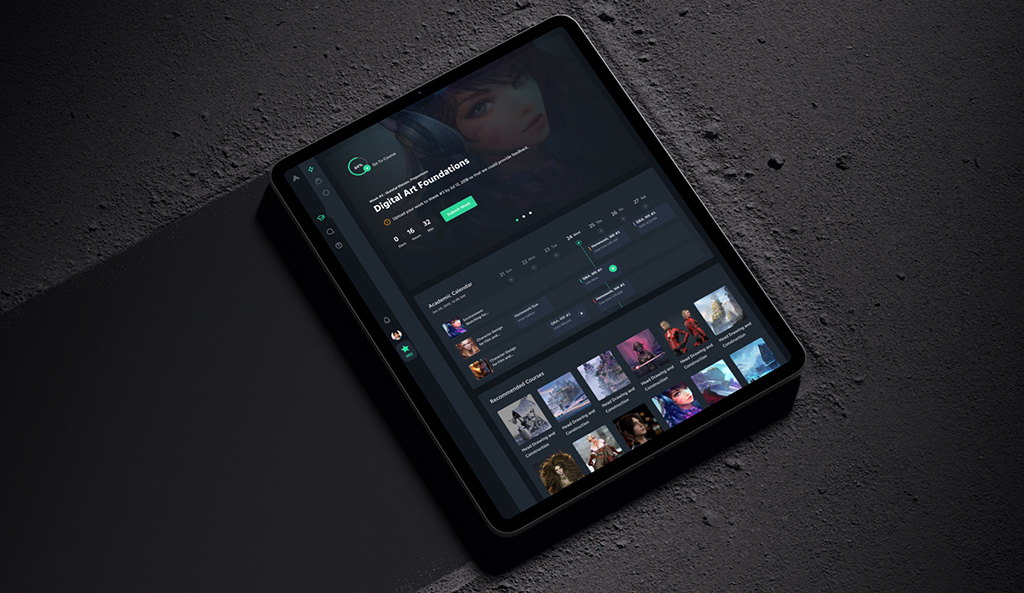
CGMA platform by Shakuro
Design for microlearning
Traditional education doesn’t cut it when it comes to the realities of modern life. There are more than 7 billion smartphone users. The average American uses their smartphone for at least 5 hours and 24 minutes daily.
This type of target audience prefers to study in short bursts on the go, between other activities like eating or jogging. People are less likely to spend hours on the phone diligently following the curriculum.
According to a study published in the Journal of Applied Psychology, microlearning is 17% more efficient than traditional classroom training. The ability to choose your time and place for studying is so attractive. That’s why adjust your e-learning app design for microlearning. Add small instructional videos, flashcards, mini-training quizzes, etc.
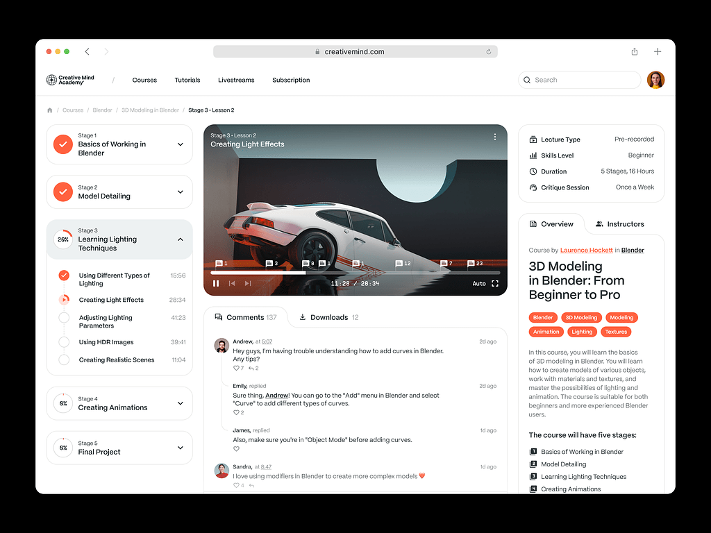
Online Courses Platform Website by Shakuro
Design for minimalism
While using web-based educational platforms, many people prefer them to be packed with as much functionality as possible, the situation is different with mobile solutions where the screens are too small to conveniently hold too many options. This way a feature that was praised on the web becomes a drawback in the case of mobile apps. Hick’s Law explains why too much choice can be a bad thing after all.
So it’s best to minimize your ideas and while not banishing the spectrum of features altogether, limit them to a certain number of essentials present at one time. Less functionality in one go means simpler interfaces with straightforward navigation from one lesson to another.
It’s important to strike a balance between the number of features and usability. Minimalism is reigning today so use it to your advantage.
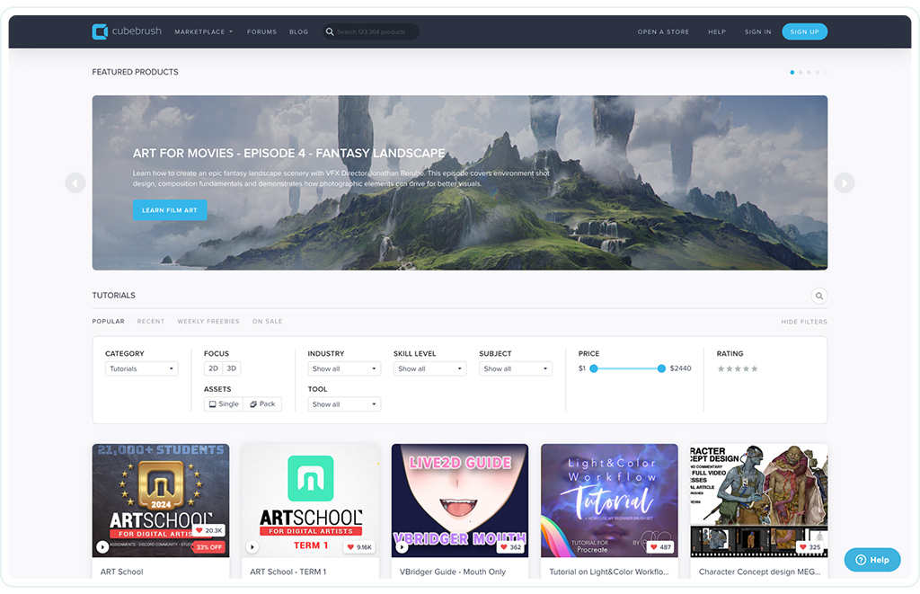
Cubebrush platform by Shakuro
Designing for clarity and convenience
The e-learning app design, no matter how many features it has, can be obvious and understandable to a designer but completely impenetrable to a user, especially to one who is not used to it at all. That’s why it is best to distinguish between which features and learning materials are necessary and which are superfluous and can be put away for the time being.
Make your app clear:
- Provide instructions on how to use your app.
- Keep all the navigational elements consistent throughout the app.
- Make sure that users understand the course objectives.
- Break the learning material down into blocks.
Designing an e-learning solution for mobile, it’s important to concentrate on presenting the key features and content without adding too much noise that can potentially distract users from pursuing their objectives. Even if an app is for kids.
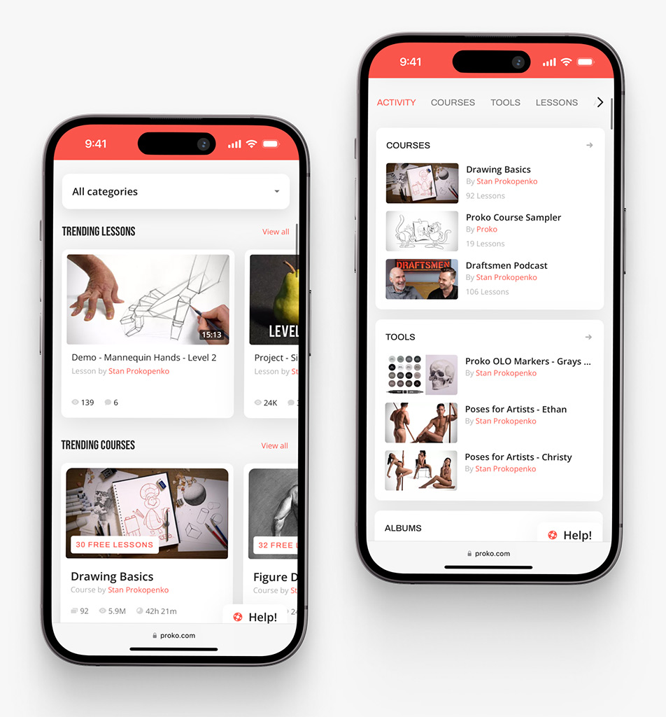
Proko app on mobile by Shakuro
Design for efficiency
The ultimate goal of every design is to strengthen the user service and highlight its features, dealing with the pain points and contributing to achievements. Educational apps are no exception to this rule.
Structure information in a way that it could be easily reached which is vital for e-learning apps used by working professionals, like encyclopedias for interns and doctors. Otherwise, while being top-notch from the UI perspective, an app might lack efficiency resulting in people losing their time trying to make heads or tails of using your app, so they would be less likely to keep it on their phones and will sooner look for an analog made by your competitor who has taken it into account.
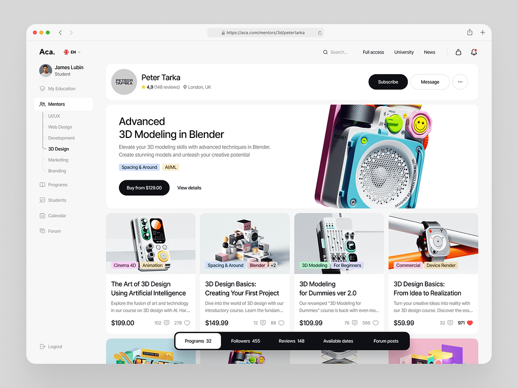
Online Courses Platform Website Dashboard by Shakuro
Design for a gaming experience
Although teachers continuously seek new approaches, it is largely agreed that today’s schools face major problems around student motivation and engagement.
In e-learning app design, you can harness gamification techniques to make the product more enjoyable, even in environments that may seem unsuitable for such an approach, like medical learning apps.
To drive people’s motivation and willingness to continue learning, e-learning platforms with gamification techniques use virtual rewards such as:
- badges;
- points;
- payments;
- discounts;
- “free” gifts;
- status indicators;
- achievement data;
- progress bars;
- level up, and many others.
Basically, such a method calls into play both your instincts and the rational part of the brain. It causes feel-good chemical reactions, thus, making the person want to complete more gamified lessons.
A successful example of an e-learning application with gamification elements is Duolingo, an American language-learning mobile app. Launched in 2011, the app has evolved into a solid language assistant platform. All thanks to a combination of fun and learning through artificial intelligence algorithms, animations, sound effects, a community of students, push notifications, chatbots, and other techniques.
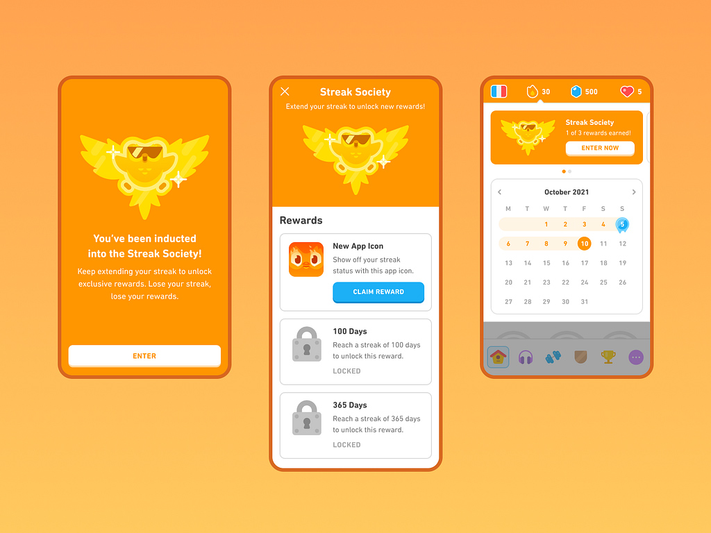
Gamification in Duolingo
With the average attention span of an adult of just eight seconds, such an approach eliminates the drawbacks of traditional education like becoming bored to tears or having to explore dry information for hours.
If you plan to create a gamified app for your business, then here are some facts for you. Tech giant IBM saved nearly $200 million by abandoning traditional training in favor of e-learning. More than 40% of Fortune 500 companies deploy technology to train their staff. Over 60% of companies, in general, use educational apps and programs to close the skill gap, according to the e-learning platform Udemy.
What’s more is that 42% of companies say their revenue increased once they implemented e-learning, with the revenue generated per employee rising by 26%. The average price for an online course is $177, while the development of an online course costs between $144 and $11,000.
Researchers project that by 2026, the online course industry will be worth $374 billion. While this figure may seem huge, it is hardly surprising, given that once people were allowed to work from home, most of them did not want to get back to the office.
Design with PBL-elements
When a teacher recognizes and celebrates your progress, it makes a positive impact on your performance. Give off good vibes by gamifying the metrics by using points, badges, and leaderboards. You can do it by rewarding people for the goals met, tracking their engagement (such as user logins or the time spent on a task completion), giving feedback, introducing contests, displaying scores and rankings in real time to create friendly competition, giving achievement badges, and a slew of other features.
Design based on your competitors
Researching your competitors is vital as you can find well-designed solutions and use or even improve them.
Even designing an app for the subcategory where there are already a lot of popular apps, it’s possible to create something that would stand out. You can do it by learning from your rivals (and reviews on the products) and analyzing where they succeed and where they fall flat. However, don’t pick every nice move: consider your product’s philosophy, branding, and positioning.
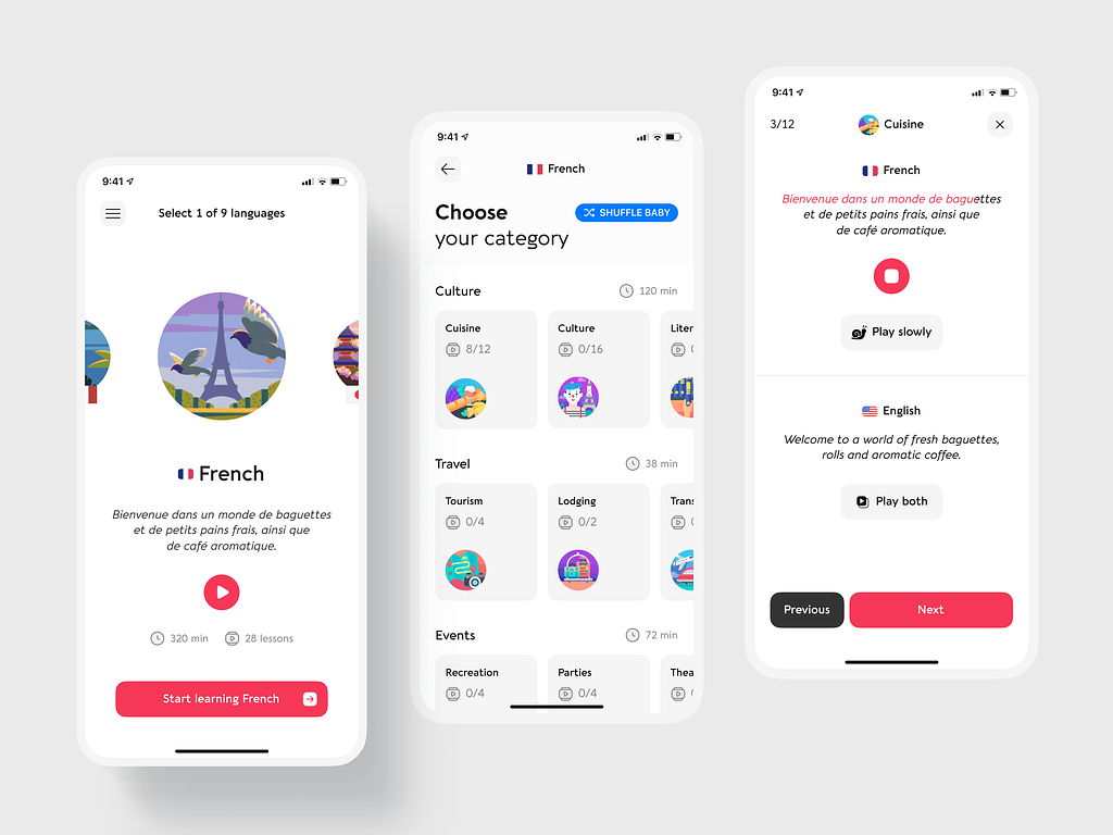
Language Dashboard Mobile App by Conceptzilla
Learning app design trends
Apart from psychology and gamification, you can leverage the latest trends. With this combination, you have higher chances of winning users’ hearts.
- Personalization: Adaptive learning technologies allow you to tailor content based on individual learner preferences, progress, and learning styles. This includes personalized learning pathways, recommendations, and dynamic assessments.
- AR and VR: These immersive technologies create interactive and engaging learning experiences. They can provide simulations and hands-on practice in a safe environment.
- Social learning features: Incorporating social elements like forums, discussion boards, and chat functionalities fosters communication. Peer learning and collaboration can enhance understanding and motivate students.
- Responsive design and accessibility: Your app should be mobile-friendly and accessible to users with disabilities. E-learning UI design leverages W3C’s practices and focuses on creating intuitive interfaces that are easy to navigate across various devices and for diverse user needs.
- AI and machine learning: AI-driven features, such as chatbots for instant support and intelligent content recommendations, enhance the learning experience by providing real-time assistance and personalized learning suggestions.
- Content curation and user-generated content: Allow users to curate and create content. This feature boosts engagement and broadens the course’s variety. What’s more, it increases a sense of community and enhances learning through peer contributions.
- Offline accessibility: Some users have limited connectivity. They need offline access to courses to keep using your product, otherwise you lose a part of your audience.
- Focus on well-being: Include features like mindfulness exercises, breaks, and feedback on user stress levels to contribute to a holistic learning experience.
In conclusion
E-learning apps are changing the way education works. All you have to do is adapt to these changes and offer suitable educational services to your target audience. Also, consider adding the latest trends to stay ahead of the competitors.
Every e-learning app design has to be unique to appeal to the audience so that people can relate to the app. Contact us, and we’ll guide you every step of the way.
* * *
This article was originally published in October 2021 and was updated in December 2024 to make it more relevant and comprehensive.

