
For those who prefer to listen rather than read, this article is also available as a podcast on Spotify.
Contents:
Most founders recognize this moment instantly. The product is finally gaining traction. Traffic is growing. Marketing experiments are working. New features are shipping faster. And suddenly, the website—the very thing that was supposed to support growth—starts getting in the way.
Pages become difficult to update. Conversion rates stall. Performance drops. SEO issues appear. What once felt like a “clean MVP site” quietly turns into a fragile structure no one wants to touch.
This is one of the most common patterns in web design for startups. Early websites are often built to launch, not to last. They are designed around today’s needs: a homepage, a few product sections, maybe a blog. But they are rarely designed around what happens next—new user segments, new funnels, new features, new markets, new content velocity.
At the beginning, this is invisible. The site works. It looks fine. It converts “well enough.” So teams move on.
Then growth starts.
Marketing needs landing pages quickly. Sales needs flexible product sections. SEO requires structural changes. The product team wants tighter integration between the website and the app. Every small update becomes a workaround. Every redesign becomes a debate. The website slowly turns into technical debt.
This is also the stage where founders begin re-thinking ownership and structure—whether the site should stay internal or whether outside expertise is needed to support growth. Also at this stage, teams start comparing in-house design vs external agencies.
The core problem is not visual design. It is an architectural design.
Most startup websites break under growth because they were never designed as evolving systems. They were designed as static marketing pages. No clear content model. No scalable component logic. No thought about how the site would behave when the product doubled in complexity.
A website that scales with your product has to be treated like a product surface, not a one-off launch asset. It needs structure, rules, and flexibility. Without that foundation, every new stage of growth forces a rebuild—instead of supporting momentum.
That is why designing a website that scales with your product is not a “future optimization.” For startups, it is part of survival.
What “Scalable Web Design” Actually Means for Startups
When founders hear “scalable web design for startups”, they often picture technical complexity: heavier frameworks, more integrations, bigger infrastructure. In reality, scalability in web design is almost the opposite.
Scale does not mean building more. It means building in a way that does not break when more is required.
A scalable startup website is not the one with the most features. It is the one that can absorb change: new positioning, new audiences, new pages, new flows, new product directions—without forcing a redesign every six months.
When creating a website design for early-stage startups, this distinction matters. Because growth rarely follows the plan the first website was designed for.

Website Design for an AI-Driven Fashion Platform by Shakuro
Designing for the Next Stage, Not Just the MVP
Most startup websites are built around the MVP. One product. One audience. One story.
But websites are rarely used only by users.
They are used by investors evaluating traction. By candidates deciding whether to join. By partners validating credibility. By early customers trying to understand what exactly is being built.
As soon as fundraising begins, the website becomes part of due diligence. It needs to support clearer narratives, product segmentation, traction signals, and trust layers.
When sales efforts start, it must handle landing pages, solution pages, use-case differentiation, and lead flows.
When hiring accelerates, it suddenly becomes an employer brand platform.
When go-to-market strategies evolve, messaging shifts. Positioning sharpens. ICPs change.
Designing only for the MVP freezes the site in a moment that the company is actively trying to outgrow.
Scalable web design for startups means intentionally designing for the next version of the company: a site structure that can support multiple products, layered messaging, expanding content, and new conversion paths without architectural rework.
This does not require predicting the future in detail. It requires accepting that the future will be different—and building the website to move with it.
Flexibility Without Overengineering
There is a common mistake at this point: trying to future-proof everything.
Over-abstracted design systems. Overbuilt CMS logic. Complex component libraries no one can maintain. The website becomes difficult before it ever becomes useful.
Scalable design is not about adding layers. It is about removing friction.
A flexible website is one where new pages can be created without design breaks. Where sections can be rearranged without custom layouts. Where content teams are not dependent on developers for routine updates. Where design patterns are consistent enough to grow, but not rigid enough to trap.
Avoiding design debt early is not about shipping slower. It is about shipping simpler structures that are intentionally reusable.
Clear page hierarchies. Modular sections. Predictable content models. A design language that can stretch without losing coherence.
This is what allows a startup website to grow quietly in the background—while the team focuses on product, traction, and revenue instead of redesign cycles.
The Core Goals of a Startup Website at Different Stages
One of the reasons startup websites fail to scale is that they are often designed around a single moment in time.
But a startup website does not serve one fixed role. Its purpose changes as the company moves from idea to product, from product to traction, and from traction to scale.
Scalable web design for startups starts with acknowledging that each stage brings different priorities—and that the website must evolve without losing structural integrity.
Pre-Seed and MVP Stage
Clarity, validation, credibility.
At the earliest stage, the website’s primary job is not persuasion. It is understanding.
Visitors should quickly grasp what the product is, who it is for, and why it exists. Confusion is far more damaging than imperfect visuals.
At this stage, scalable design means:
- Clear positioning and problem definition
- A simple, focused structure
- Fast iteration on messaging
- Enough credibility to support early conversations
The site often supports founder-led sales, early partnerships, and first fundraising discussions. It does not need breadth. It needs sharpness.
What matters most is that the site is easy to adjust as feedback arrives—because the first real users almost always reshape the narrative.
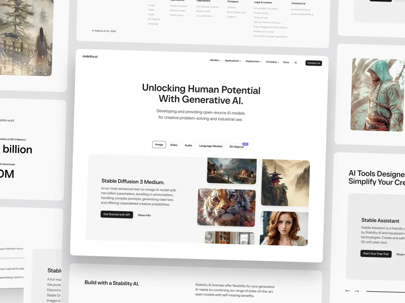
Website for Stability AI by Shakuro
Post-Seed and Early Traction
Messaging depth, conversion paths, proof.
Once traction begins, the website becomes a growth tool.
New audiences appear. Use cases diversify. Objections become clearer. Marketing channels multiply.
Now the website must handle:
- More detailed product explanations
- Segmented messaging for different users
- Structured conversion paths
- Social proof, cases, and validation assets
- Content expansion for SEO and demand capture
This is where many early sites start to fracture. Pages get added without structure. Design patterns drift. Performance and clarity suffer.
Scalable design at this stage means evolving from “a site” into “a system.” One that can support consistent expansion without constant redesign.
This is also the phase where teams begin to think more seriously about long-term ownership, maintainability, and expertise—and where questions around long-term web design partners become operational rather than theoretical. That strategic shift naturally fits into the broader decision-making process.
Scale-Up Stage
Systems, consistency, expansion.
At scale, the website is no longer a marketing asset. It is infrastructure.
It supports multiple teams. Multiple markets. Multiple products. Multiple funnels. It often becomes tightly connected with analytics, CRM systems, content operations, and product experiences.
Design goals shift toward:
- System consistency across large surfaces
- Governance of components and content
- Performance at scale
- Brand control across growing teams
- Expansion into new verticals and geographies
Here, scalable web design is less about pages and more about rules: how layouts are built, how components are reused, how new sections are introduced, how brand integrity is maintained as dozens of people touch the system.
The strongest startup websites at this stage do not feel “bigger.” They feel more coherent—because scalability was built into their foundations.
UX Patterns That Help Startup Websites Scale
Scalable web design for startups is not a philosophy. It shows up in very specific structural decisions.
The way information is organized.
The way pages are assembled.
The way design rules are enforced.
These patterns determine whether a website grows through calm iteration — or through painful rebuilds.
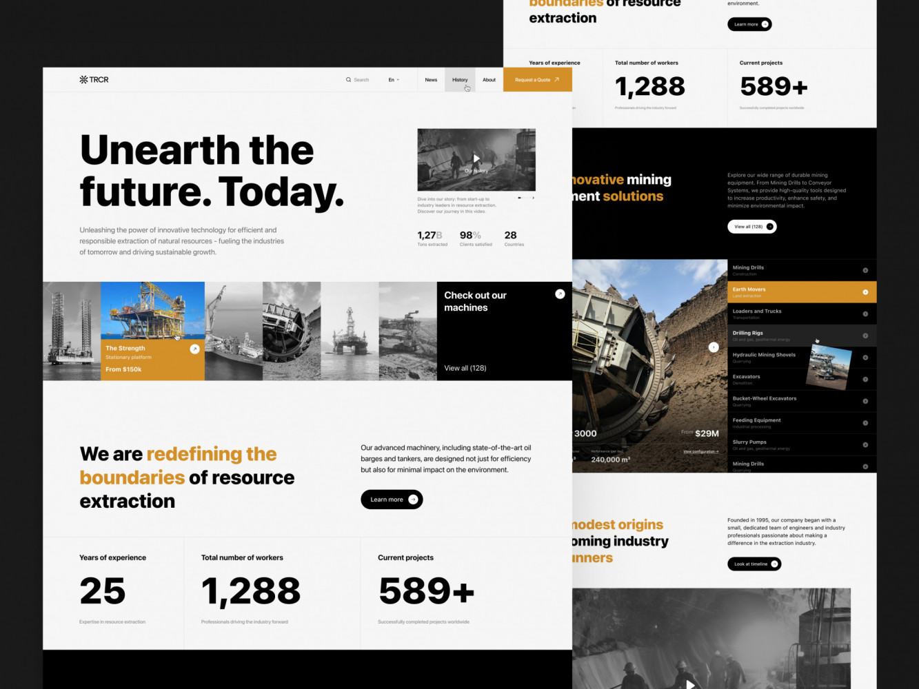
Website Design for Mining Company by
Shakuro
Clear Information Hierarchy
One of the earliest breaking points in startup websites is messaging.
New features appear. New audiences emerge. New objections surface. And suddenly, the homepage that once felt “clear enough” turns into a crowded compromise.
A scalable UX structure starts with hierarchy before aesthetics.
That means defining, early on:
- What is core versus supporting
- What belongs globally versus locally
- What must stay stable versus what can change
A strong information hierarchy allows new layers of messaging to be added without rewriting the entire site. Product pages can expand without bloating the homepage. Use cases can grow without collapsing navigation. Content depth can increase without confusing first-time visitors.
Practically, this shows up as:
- Clear separation between brand, product, solution, and resource layers
- Predictable page templates
- Consistent priority of headlines, subheads, and proof points
- Navigation built around future expansion, not just current pages
When hierarchy is right, growth becomes additive—not disruptive.
Modular Page Structure
Scalable startup websites are assembled, not drawn.
Instead of designing each page as a custom layout, scalable teams work with reusable sections: hero blocks, problem sections, feature grids, comparison tables, testimonial bands, CTAs, content modules.
These sections are not visual decorations. They are functional building blocks.
A modular structure allows teams to:
- Launch new pages quickly
- Test messaging without redesign
- Support multiple funnels
- Localize or segment content
- Maintain consistency across growth
It also dramatically reduces long-term cost. Designers are not reinventing layouts. Developers are not rebuilding components. Marketers are not trapped in rigid templates.
The goal is not uniformity. The goal is controlled flexibility: layouts that can shift, reorder, expand, and recombine without breaking the system.
This is one of the most overlooked foundations of web design for startups—and one of the most impactful.
Design Systems Lite (Not Enterprise Overkill)
Many startups hear “design system” and either ignore it completely—or attempt to build something meant for a 500-person organization.
Neither scales.
A scalable startup website design needs a lightweight system: a small set of rules, components, and constraints that guide growth without slowing it.
This usually includes:
- A defined type scale and spacing logic
- Core layout patterns
- A controlled color and UI palette
- Reusable UI and content components
- Clear usage principles
Not documentation-heavy bureaucracy. Operational clarity.
A “design system lite” allows new pages, sections, and features to appear without visual drift. It protects the product and brand while still allowing speed.
The moment design decisions live only in people’s heads, scalability disappears. The moment they are formalized just enough, momentum becomes sustainable.

Music Streaming Website by Shakuro
Conversion-Focused Design for Startup Growth
For startups, a website is not a brand poster. It is part of the product’s growth mechanics.
If it does not turn visitors into users, leads, or conversations, it does not scale—no matter how good it looks.
Founders usually feel this shift very clearly. At first, the site just needs to exist. Then it needs to explain. Very quickly after that, it is expected to perform. Traffic starts coming from ads, content, partnerships, outbound, communities. And the question stops being “Does the site look okay?” and becomes “Why are people not taking the next step?”
When it comes to startup web design best practices are the ones that help the design stop being visual and become operational.
Designing for Early Conversions
In the early stages, conversion goals are usually limited and very concrete: a waitlist signup, a demo request, an account creation, an email subscription.
What makes them difficult is not volume. It is trust.
Most early visitors do not know your brand. They do not understand your product category. They often do not fully recognize their own problem yet. The website’s job is to carry that entire cognitive load.
This is less about clever UX patterns and more about basic questions being answered without friction:
- Who is this for?
- What does it replace or improve?
- Why should I care right now?
- What happens if I click this button?
Pages that convert early tend to be structurally simple. They guide attention. They sequence information. They do not try to say everything at once. They remove reasons to hesitate.
Teams that work seriously on this stage usually realize very quickly that layout, copy, performance, and flow cannot be separated. They all shape behavior. This is also the point where discussions about conversion-focused web design start to show up inside product and growth teams.
A scalable approach here means building pages that can change without breaking: headlines that can be tested, sections that can be replaced, flows that can evolve without redesigning the whole site.
Avoiding Conversion Friction as Traffic Grows
Early on, almost any working site feels acceptable.
A few confusing sections. An awkward form. A slow page.
It does not hurt much when only a few hundred people are coming.
Growth changes that.
As soon as traffic becomes consistent, small issues stop being cosmetic. They become losses. People drop before understanding the offer. They abandon forms. They misinterpret the product. They never reach the pages that matter.
What worked for early adopters often fails with broader audiences.
This is where many startup websites quietly fall behind the product. Features improve. Positioning matures. Marketing gets sharper. The site stays structurally the same.
Scalable conversion design is mostly about discipline. Clear paths. Fewer competing actions. Predictable layouts. Pages that load fast and behave the same way across the site. A system where improvements accumulate instead of colliding.
When this work is done early, growth feels like optimization. When it is not, growth turns into a redesign project.
Performance, SEO, and Technical Foundations for Scale
Early on, technical quality rarely feels urgent.
The site loads, pages open, Google indexes something. For a long time, that seems sufficient.
The problem is that performance and SEO debt behave differently from visual or messaging issues. They compound quietly. And by the time they are visible in metrics, fixing them usually means rebuilding parts of the site rather than improving them.
When designing a website for a startup, treat performance and structure as foundations, not polish.
Page Speed and Core Web Vitals
When a startup is small, speed problems hide easily.
Traffic is low. Campaigns are limited. Users are motivated. A slow page is tolerated because the product is new, interesting, or niche.
Later, none of that applies.
As acquisition scales, performance starts affecting everything: ad efficiency, search visibility, bounce rates, signup completion, even perceived product quality. A site that “felt fine” suddenly becomes one of the biggest growth constraints.
What makes this expensive is not optimization itself. It is architecture.
If layout logic is tangled, media handling is inconsistent, components are bloated, and scripts are layered without discipline, improving performance often means undoing months or years of decisions.
The shift usually happens when performance problems show up in metrics: higher bounce rates, weaker campaigns, rising acquisition costs. From there, page speed is no longer an optimization task—it becomes a growth constraint.
Scalable sites treat speed as a design constraint from the start: controlled layouts, predictable components, responsible media usage, and clear ownership over what runs on the page.
That makes improvement incremental instead of disruptive.

Team Management UI Design Сoncept by Shakuro
SEO-Friendly Structure from Day One
SEO problems at scale are rarely about keywords. They are about structure.
When early websites are built without a clear information model, content grows sideways. Blogs become dumping grounds. Product pages blur. Use cases overlap. Navigation turns into a list instead of a system.
Search engines struggle with that, but so do users.
An SEO-friendly foundation is mostly an architectural decision:
- clear separation of page types
- logical URL structures
- predictable internal linking
- space for content expansion
- navigation that can grow without rework
This allows a site to move from a few marketing pages to dozens of product, solution, and content surfaces without losing coherence.
When this work is done early, SEO becomes an additive process. You publish, connect, and refine.
When it is skipped, SEO becomes a migration project.
And migrations are almost always more expensive than designing the structure correctly the first time.
Common Startup Web Design Mistakes
After working with enough early-stage teams, patterns become hard to ignore.
Most startup websites don’t fail because of bad taste. They fail because they are designed around short-term moments instead of long-term use. The same few decisions show up again and again—and they almost always slow growth later.
Designing Only for Investors
One of the most common traps in startup website design is building a site primarily for pitch decks.
The homepage reads well to other founders. The visuals impress at demo days. The story sounds good in fundraising meetings.
Real users, however, are rarely the same audience.
When a website is designed mainly to signal ambition instead of solving understanding, it often becomes vague. Big promises replace clear explanations. Vision displaces utility. The product hides behind language that feels “strategic” but answers very few real questions.
This works in rooms. It works much less on landing pages.
Websites that scale tend to be grounded. They prioritize clarity over storytelling and usage over aspiration. They help people quickly see whether the product fits—even if that means some visitors self-select out.
That honesty almost always converts better in the long run.
Hardcoding Everything
Another expensive early decision is freezing the site into the codebase.
Every text change becomes a deployment. Every new page requires development. Every marketing experiment competes with product priorities.
At first, this feels fine. The site is small. The team is fast. Changes are rare.
Growth flips that.
Suddenly, the website needs to move weekly. Campaigns launch. Pages multiply. Content expands. And what used to be “clean” becomes a bottleneck.
Scalable websites separate structure from content early. They allow non-technical teams to work within clear boundaries. They reserve engineering time for system improvements, not for replacing sentences.
Hardcoding everything does not keep a site simple. It only delays its complexity until the worst possible moment.
Ignoring Future Content and Product Pages
Many early sites are designed as if they will never grow.
There is a homepage. An “about” page. A product page. Maybe a blog.
Then features multiply. Solutions diversify. Industries appear. Documentation becomes necessary. SEO becomes a real channel. And there is nowhere for any of it to go.
Navigation breaks first. Then URLs. Then internal linking. Then consistency.
Designing for future content is not about filling empty pages. It is about leaving structural space: page types that can repeat, hierarchies that can extend, patterns that can host things not yet defined.
The websites that age well usually look slightly “too structured” at the beginning.
That structure is what allows them to grow without being rebuilt.
When Startups Should Redesign (And When They Shouldn’t)
Redesigns are often triggered by external moments like funding rounds, brand updates, or shifts in positioning, and they are frequently treated as natural milestones. In reality, many redesigns are reactive projects rather than strategic ones. They consume time, redirect focus, and often replace visible problems without addressing the structural reasons those problems appeared in the first place.
A scalable startup website is not built by resisting change, but by understanding its nature. Some changes require a new foundation. Many others can and should be handled through iteration. Knowing the difference is what prevents teams from rebuilding when they could be improving.
Signals a Redesign Is Needed
Some problems cannot be fixed incrementally.
A redesign becomes reasonable when the website is actively blocking growth, not merely lagging behind aesthetics.
Common signals include:
- The structure no longer matches the product (new products, new audiences, new use cases that cannot be expressed clearly).
- Pages require constant custom work to support basic needs.
- Performance issues are systemic, not local.
- Navigation and content models collapse under expansion.
- Teams avoid touching the site because changes are risky.
These are not visual complaints. They are operational ones.
At this point, teams often also face broader brand and positioning shifts. That combination is what usually pushes redesigns from “nice to have” into “necessary.” This is usually where website rebranding and rebuilding start to overlap with real UX risk—especially when structure, traffic, and existing user flows are already in place.
A redesign makes sense when it simplifies the future, not when it repaints the past.
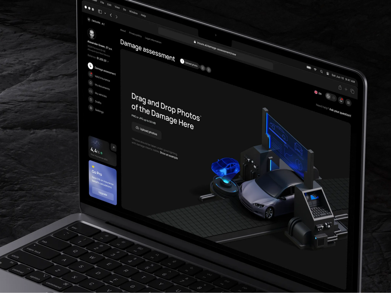
AI Insurance Design Concept by Shakuro
When Iteration Beats Redesign
Much more often, websites do not need to be replaced. They need to be corrected.
Conversion paths can be clarified. Navigation can be adjusted. Sections can be modularized. Performance can be improved. Content models can be cleaned up. Design systems can be tightened.
None of this requires throwing away the site.
Iteration is usually the smarter option when:
- The structure is mostly sound.
- Problems are localized to specific flows or page types.
- Growth goals are changing faster than design can be rebuilt.
- Teams need momentum more than novelty.
Iterative work keeps history. It preserves what already converts. It allows learning to compound instead of resetting every time a new round or strategy arrives.
For startups, this often matters more than a fresh visual layer.
How to Approach Web Design as a Startup Founder
For founders, the website quietly becomes a convergence point.
- Product cares about accuracy.
- Marketing needs speed.
- Sales wants proof.
- Hiring needs story.
- Engineering needs limits.
Without clear ownership, the site turns into a compromise. With too much founder involvement in execution, it becomes a bottleneck.
Approaching web design at the founder level is less about taste and more about responsibility.
What to Delegate vs What to Control
Founders rarely add the most value by adjusting layouts or debating button styles. But stepping away completely is just as risky.
The useful split is between direction and construction.
Founders are in the best position to define:
- who the product is really for
- what problem it truly solves
- how it should be understood
- what must be trusted
- what the company refuses to be
These decisions shape every page. If they are weak, no design system compensates.
Execution benefits from specialists. Structure, layout logic, CMS modeling, performance decisions, component systems, accessibility, and iteration processes are crafts. They require focus and repetition.
The common mistake is controlling the wrong layer. Founders tweak wording while architecture drifts. They approve visuals while systems silently harden.
A healthier model is to own intent and delegate implementation.
This becomes especially important once the website starts influencing revenue, hiring, and product onboarding. At that point, clarity around what to delegate and what to control is not a management preference. It is an operational necessity.
Final Takeaway: Design for Momentum, Not Perfection
Most startups don’t get blocked because their first website wasn’t perfect.
They get blocked because it becomes rigid.
Pages are hard to create. Updates depend on developers. Structure no longer reflects the product. Small changes feel risky. Over time, the site stops supporting growth and starts consuming it.
That is the real danger. Not visual mediocrity, but loss of flexibility.
Scalable web design for startups is not about predicting everything in advance. It is about making sure today’s decisions don’t make tomorrow’s changes expensive. Clear structure, reusable logic, and space for content and positioning to evolve quietly determine whether a site grows with the company or gets replaced by it.
Momentum is not created by polish. It is protected by systems that allow teams to keep moving.
Scalable Design Protects Your Growth Velocity
As products evolve, the companies that move fastest are rarely the ones with the boldest visuals. They are the ones whose systems allow them to act.
Their websites do not become projects. They remain tools.
That is what scalable web design for startups protects: not consistency for its own sake, but velocity.
If you are approaching your first serious site—or feeling the limits of the one you have—this is the moment to think less about how it looks today and more about how it will behave several stages from now.
If you need experienced support at this point, web design for startups is exactly where Shakuro works—helping teams build websites that can evolve alongside the product instead of being replaced by it.
The right website will not create growth. But it can protect the speed at which growth happens.
And that difference compounds.