
For those who prefer to listen rather than read, this article is also available as a podcast on Spotify.
Contents:
The logo’s fresh, the color palette’s locked in, and everyone’s buzzing about the new brand voice. Until you realize the website still looks like it’s stuck in 2019. Suddenly, what started as a shiny rebrand turns into a UX minefield.
Many startups pour months and serious budget into rebranding website design, only to watch their bounce rate spike and sign-ups flatline. Why? Because they treated the website like a billboard instead of a conversation. Sure, it looks different, but does it still work for the people actually using it?
Well, the goal of rebranding is to stay recognizable to your users while evolving your story. And that balance is delicate. Tilt too far toward flashy design, and you lose trust. Play it too safe, and the rebrand feels half-hearted.
If you’re knee-deep in rebranding website user experience or just starting to think about it, this article’s for you. We’ll walk through the real risks, share what actually moves the needle, and how to avoid that sinking feeling when your beautiful new site confuses your best customers.
Why Website Redesigns During Rebranding Can Fail
It often feels like a fresh start. But when that excitement spills over into the website redesign without enough guardrails, things can go sideways fast. Teams pour energy into fonts, gradients, and micro-interactions, and then realize that they’ve broken something fundamental in the user journey.
So why do these redesigns stumble? It’s rarely about bad taste or lazy concepts. More often, it’s a mix of misaligned priorities, rushed decisions, and assumptions that “everyone will just figure it out.” The usual suspects are:
- Prioritizing aesthetics over function
Look, a sleek new interface is great, until your users can’t find the pricing page or your contact form vanishes behind three layers of animation. In the rush to “look different,” teams sometimes forget that familiarity is a feature. People build mental maps of your site. Rip those up without warning, and you’ll pay for it in support tickets and lost conversions.
- Treating the website as a brand brochure, not a product
Your site is often your #1 sales channel, onboarding tool, and customer service desk rolled into one. Yet when rebranding website design, marketing might take full control while product and support get sidelined. If your CMO hasn’t talked to your head of CX or your lead engineer before locking the sitemap, you’re already skating on thin ice.
- Ignoring existing user behavior
If 70% of your trial sign-ups come from a specific CTA in the footer, maybe don’t tuck it into a hamburger menu “for minimalism.” Too often, redesigns are based on what feels right internally rather than what works for real users. Heatmaps, session recordings, even old-school A/B tests keep you honest.
- Overestimating how much change users will tolerate
Yes, the old logo was dated. Yes, the purple-to-orange gradient was a choice. But your long-time customers associate that with reliability. A total website redesign during rebranding can feel like walking into your favorite coffee shop and finding it’s now a neon-lit juice bar.
- Poor handoffs between brand and dev teams
When brand guidelines aren’t translated into clear, developer-friendly specs, the result is inconsistency, broken components, and mobile views that look like they were designed in the dark. A rebrand should clarify your message, not confuse your audience. As for your your website, it’s the place where that promise meets reality.
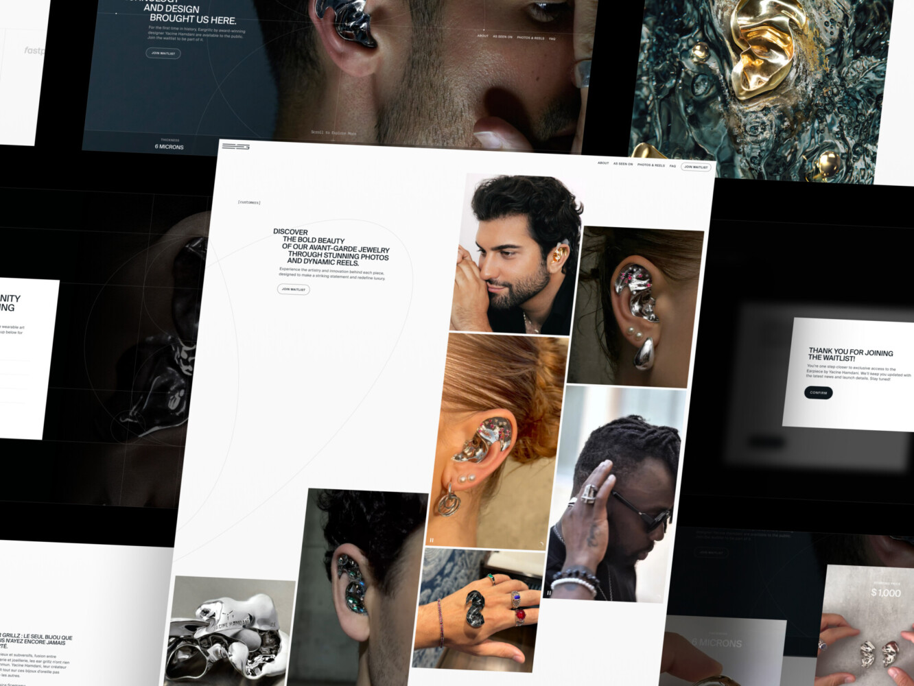
Landing Page for Avant-Garde Jewelry Product by Shakuro
The Unique UX Risks of Website Redesigns During Rebranding
Rebranding and UX overhaul is more than slapping on a new logo and calling it a day. It’s a high-wire act, especially when you’ve already got users who know your product, trust your flow, and expect things to work a certain way. Tweak too much, and you risk throwing them off balance. Ignore the old too completely, and you might lose the very thing that made your brand stick in the first place.
Breaking User Expectations
For example, suddenly the “Transfer Money” button is gone in your favorite bank app. You’d panic, right? That’s the emotional whiplash users feel when a familiar interface vanishes overnight. During a rebrand, it’s tempting to “clean things up” or “simplify the experience,” but if you remove or relocate core actions without warning or testing, you’re sabotaging.
Existing users have built mental shortcuts. They don’t read every label; they recognize shapes, colors, positions. Change those too drastically, and even loyal customers might bounce, thinking, “Did they change their offering?” or “Is this even the same company?”
Losing Brand Identity in the Design Process
On the flip side, there are other UX risks during website redesign. For instance, the danger of chasing “fresh” so hard that you end up with something generic. You swap out your quirky, slightly imperfect illustrations for sleek, corporate-style vectors and suddenly, you sound like everyone else. Ironically, you rebranded to stand out, but your site now blends into the noise.
Brand identity is tonal, behavioral, and emotional. If your old site felt human, helpful, maybe even a little playful, and your new one feels sterile and transactional, you haven’t evolved your brand. You’ve erased it. And your audience notices: they might not say it outright, but they’ll feel it in their gut: “This doesn’t feel like them anymore.”
Diluting UX Consistency Across the Brand
Your visual identity and your UX patterns need to speak the same language. If your brand voice is warm and conversational, but your UI is cold, rigid, and full of jargon, you create cognitive dissonance. Users get mixed signals. Are you friendly or formal? Approachable or authoritative?
Consistency is more than just the same hex code everywhere. It’s ensuring that every interaction, like hover states, error messages, form flows, reflects the same personality and values your brand promises elsewhere. When marketing rolls out a bold new campaign saying “We’re here for you,” but your support widget takes three clicks and a captcha to open? That’s a broken promise.
So yeah, what’s at stake is trust. Recognition. Emotional continuity. Rebranding and UX changes should deepen your relationship with users. Your website is the frontline of that relationship. Handle it like the living, breathing part of your brand that it is.
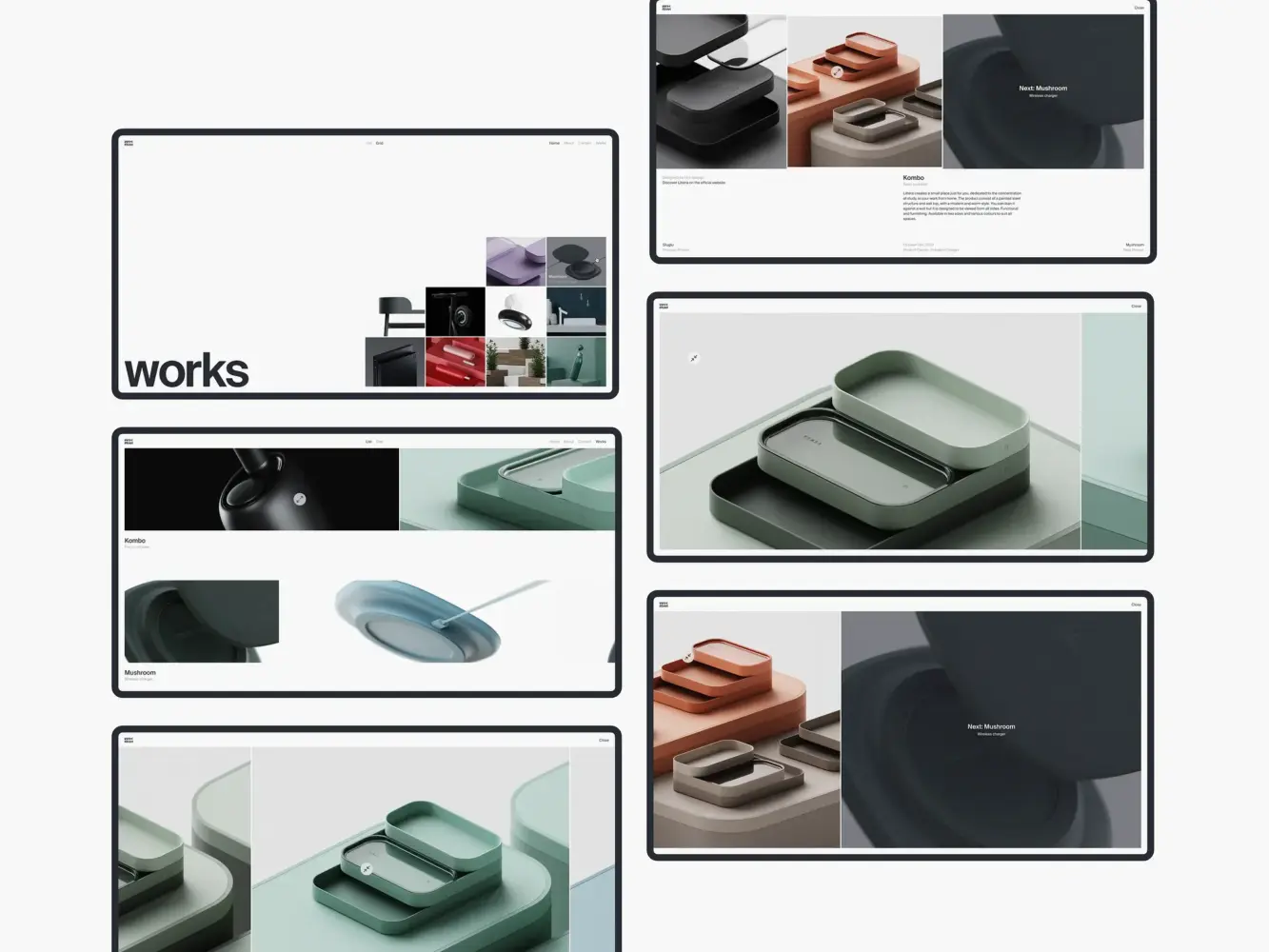
Website Design Animation for Industrial Designer Mirko Romanelli by Shakuro
Best Practices for Mitigating UX Risks During Rebranding
If you’ve decided to rebrand, that means your website’s getting a glow-up too. But before you hand off mood boards to designers or start mocking up hero sections, there’s prep work that’ll save you headaches and churn down the line. And it starts long before the first pixel gets moved.
Start with a Comprehensive User Research Phase
I know, user research sounds like something you “do later” when things go wrong. But if you skip this step, you’re designing in the dark.
Dig into existing behavior: Where do users drop off? What language do they use in support tickets? What features do they rely on daily? Talking to them is even better. A handful of quick interviews with power users can reveal more than months of internal debate.
Don’t assume you know what’s working, though. Measure it. Ask about it. Watch it. Because redesigning without this context is like renovating a house while the family’s still living in it, blindfolded.
Define Clear Brand Guidelines for the Design Team
“Make it pop” isn’t a design direction. Neither is “more premium.” Yet teams spin wheels for weeks because brand guidelines were vague, inconsistent, or nonexistent beyond a logo file and a Pantone swatch.
Website redesign best practices suggest creating certain guidelines. They should cover more than colors and fonts. They need to answer:
- How does our brand sound in microcopy? (Is “Oops!” okay, or do we say “We encountered an error”?)
- What’s our approach to whitespace and density? (Airy and calm vs. dense and action-oriented send very different signals.)
- How do we handle interactive states? (Does a button feel snappy or smooth? Playful or serious?)
Give your designers and developers a shared playbook. That way, when someone’s tweaking a form field at 2 a.m., they’re aligning. And by the way, include examples of what not to do.
Prioritize User Journey Mapping and Consistency
Teams often focus on individual pages but forget how those pages connect. A user experience your site as a path. And if that path suddenly takes a sharp turn during a rebrand, they’ll bail.
Map out your core journeys before you redesign: sign-up, onboarding, checkout, support access. Then ask:
- Does the new design make these paths clearer or longer?
- Are key actions still visible at the right moments?
- Do transitions between states (success messages, errors) feel cohesive with the new brand?
One of the website redesign best practices is to run a side-by-side comparison. Put the old flow next to the new one and walk through it like a skeptical user. Would you get stuck? Would you wonder if you’re still in the same product?
Remember: consistency is about predictability. Users don’t need every screen to look identical, they need to feel like they’re in the same trusted environment, even as things evolve.
A successful rebrand + redesign should reflect how well you carry your users through the change without losing them along the way. Do the groundwork, keep the human in the loop, and treat your website like the living interface it is.
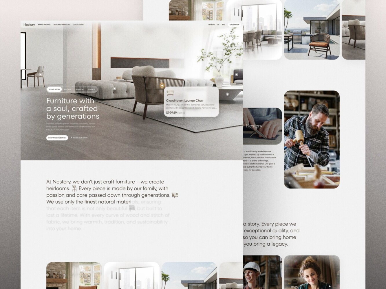
E-Commerce Website Design by Shakuro
How to Align Rebranding with Business Growth Through UX
Rebranding is a strategic move, often tied to a bigger shift: entering a new market, targeting a different customer segment, or scaling beyond your early adopters. But if your website redesign doesn’t actively support that business pivot, you’re basically shouting your new message into a void. Worse, you might confuse the very people you’re trying to grow with.
The key is to turn rebranding and UX into a growth lever. Every scroll, click, and micro-interaction should echo your new direction and drive measurable outcomes. Here’s how to make that happen without losing your soul or your conversion rate.
Ensure the New Brand Positioning Reflects User Needs
When a rebrand is based solely on internal aspirations but ignores what users actually care about, it is doomed to feel hollow. Your new positioning has to land in real human terms and your website is where that translation happens.
Say you’re shifting from “affordable tool for solopreneurs” to “scalable platform for mid-market teams.” It means your homepage can’t lead with “Get started free in 30 seconds” anymore. It needs to speak to procurement concerns, team onboarding, security—things your new audience actually worries about.
At Shakuro, we nail this by weaving user research directly into the brand narrative. We don’t just ask, “What do we want to say?” We ask, “What does our target customer need to hear right now to believe we’re the right fit?” The result is messaging that feels both fresh and deeply relevant because it is built on actual pain points.
For example, when rebranding website design for Select, we used this approach for attracting new users and retaining existing ones. The team balanced the looks so that they align with the revamped guidelines and yet still remain familiar. No alienating.
Anyway, your site should behave like a new brand. If your values now include “clarity” or “empowerment,” that shows up in simplified navigation, transparent pricing, or contextual help.
Conversion-Centered Design Within the Rebranding Process
In reality, no one cares how beautiful your new gradient is if they can’t figure out how to book a demo. A rebrand is the perfect moment to clean up conversion leaks but only if you treat design and growth as partners.
That means embedding conversion principles into your visual identity from day one. For example:
- Trust signals. Recognizable logos of clients or clear security badges should feel native to the new aesthetic.
- Primary actions (CTAs, sign-up flows) need visual hierarchy that aligns with brand energy. For instance, bold if you’re confident or calm if you’re premium, but never hidden behind “minimalist” restraint.
- Microcopy should reflect your brand voice and reduce friction. “Start your journey” might sound poetic, but “Get your free trial” converts better, unless your data says otherwise.
And don’t forget long-term engagement. The goal is to keep people around. You need to think about how post-conversion experiences, like onboarding emails, dashboard tooltips, even error messages, carry the same tone and clarity as your new site. Consistency here builds familiarity, which builds retention. Small UX tweaks aligned with brand messaging can move revenue needles more than you’d think.
At the end of the day, your website redesign during rebranding should feel like evolution. The site is the bridge between who you were and who you’re becoming, with your users walking across it every single day. Make sure it’s solid, clear, and pointed in the right direction.
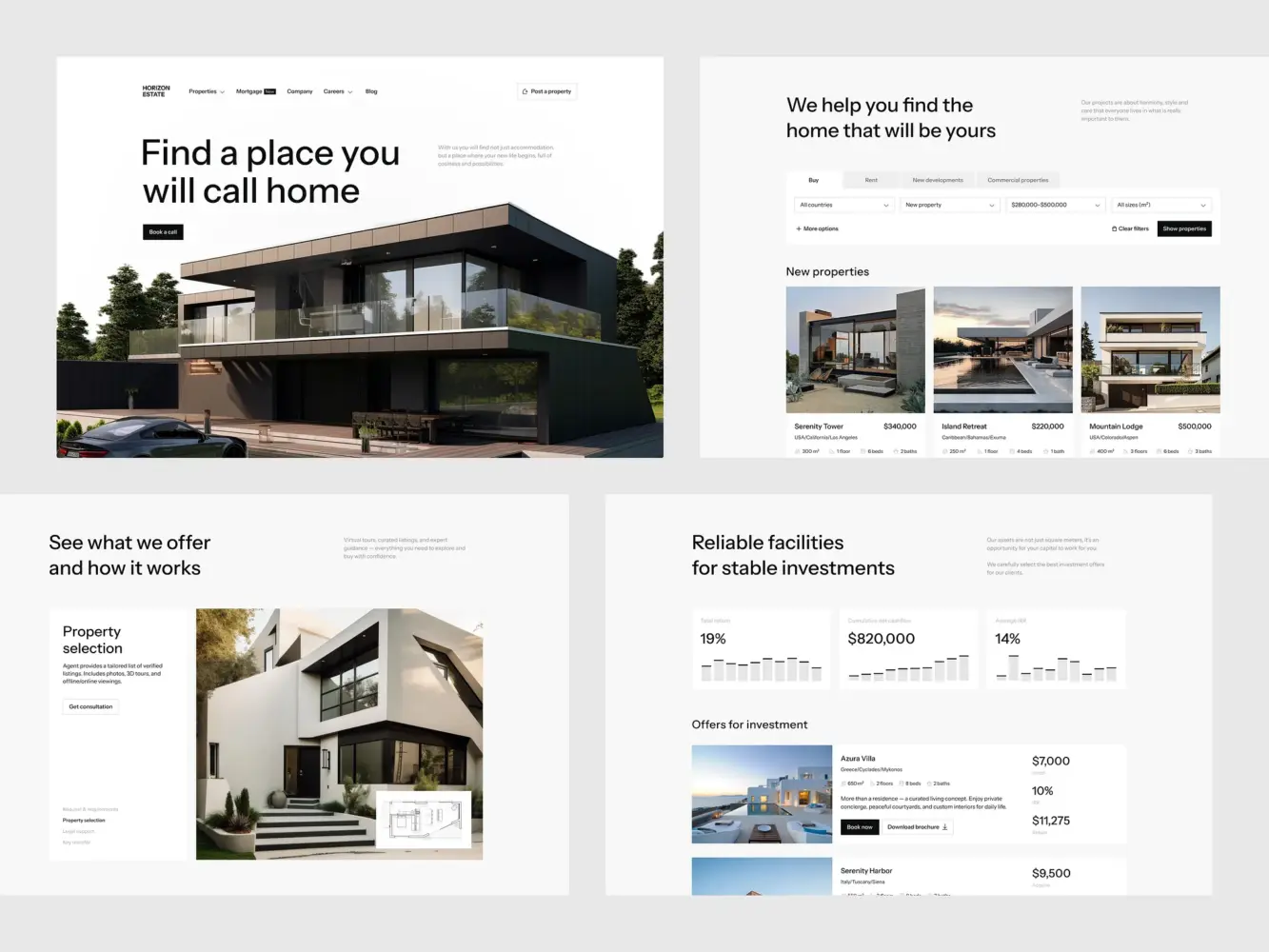
Real Estate Website Design by Shakuro
The Role of Stakeholder Collaboration During the Redesign Process
The most beautiful redesign in the world won’t save you if your marketing team is working off last quarter’s brand deck, your product team hasn’t seen the new user flows, and engineering just got handed a Figma file labeled “final_final_v4_really.” That’s what happens when stakeholder collaboration gets treated like a nice-to-have instead of the backbone of the whole process.
Rebranding website design is a relay race where everyone’s holding the baton at some point and if one person drops it, the whole launch stumbles. So how do you keep everyone moving in the same direction without endless Slack threads and meeting fatigue?
The Importance of Cross-Department Collaboration
Each team sees the website through a different lens:
- Marketing cares about messaging, perception, and lead gen.
- Product worries about feature discoverability, onboarding, and retention.
- Engineering needs clarity, feasibility, and performance guardrails.
- Brand/design is focused on cohesion, emotion, and visual storytelling.
And guess what? They’re all right. The magic happens when these perspectives don’t compete but combine.
Quite often, the fix is not having more meetings but having shared context. For example, a single source of truth (like a living brand + UX playbook) that everyone can reference. Kickoff sessions where engineers ask, “How will this animation affect load time?” and marketers ask, “Does this CTA reflect our new value prop?” That kind of cross-pollination prevents costly rework later.
By the way, founders and execs, your role in overcoming design and rebranding challenges is more than pixels micromanagement. It’s to clarify priorities. Is speed more important than polish right now? Is consistency across mobile and desktop non-negotiable? Make those calls early, then trust your teams to execute.
Continuous Feedback Loops and Iterations
No one gets it perfect on the first try. Not even Apple. So instead of waiting until “the big reveal,” bake in regular check-ins before things get too far down the line.
Like lightweight design reviews every 1–2 weeks to ask:
- “Does this flow still support our Q3 conversion goal?”
- “Will this new navigation confuse existing users?”
- “Can we actually build this without blowing the timeline?”
They’re alignment moments. And they work best when they’re inclusive but focused. Invite the right people, share prototypes early, and encourage feedback framed around user impact or business goals. See the difference between “I don’t like blue” vs. “Our research shows blue CTAs underperform for our audience”?
A successful rebrand-driven redesign doesn’t happen in silos. It happens in the messy, productive space where marketing, product, design, and dev actually talk to each other.
How to Prevent User Confusion During a Rebrand
Cchange is hard, even when it’s good. Your users might say they want a fresh look, but if they log in one morning and can’t find their account settings or the button they click every day has vanished into a dropdown menu, you’re gonna hear about it fast.
The goal of rebranding website design is to reassure people that you’re evolving with them, not away from them. So how do you roll out a new identity without making your best customers feel like they’ve walked into the wrong building?
Retain Key UX Elements for Familiarity
Not everything needs to be “new and improved.” Sometimes, the smartest move is to leave well enough alone, especially when it comes to core interactions.
Ask yourself: What are the 3–5 things users do most often on your site? Sign up? Upload files? Check analytics? If those workflows are working, don’t overhaul them just because the new brand uses rounded corners instead of sharp ones. Instead, refresh them. Keep the same structure, location, and logic but dress them in your new visual language.
Teams often get so excited about a “cleaner” layout that they hide the main navigation behind a hamburger menu “for mobile-first minimalism.” The problem is, their desktop-heavy user base suddenly can’t find anything.
The fix to this is testing. I mean, keeping the old nav for existing users during a phased rollout, track behavior, and only introduce changes once the new version is proved to not hurt task completion.
Familiarity = trust. Trust = retention. Don’t sacrifice one for the sake of aesthetics.
Provide Clear Communication About Changes
People tolerate change way better when they understand why it’s happening. A silent rebrand feels like a bait-and-switch. But a thoughtful heads-up? That builds goodwill.
So, as a part of website redesign best practices, tell your users what’s going on and more importantly, what’s in it for them. Not “We’ve updated our logo!” but “We’ve refreshed our platform to make it easier for you to [solve X problem], starting with a cleaner dashboard and faster access to your reports.”
You can do this in low-friction ways:
- A subtle banner on launch day (“Hey, we’ve made some updates, here’s what’s new”)
- A short email from the CEO or product lead explaining the shift. Bonus points if it includes a real human reason, like “You told us the old layout felt cluttered, and we listened.”
- In-app tooltips or guided tours for key changes. Keep them skippable, though, nobody likes being forced through a tutorial.
And by the way, if you’re sunsetting a feature or changing a workflow significantly, give advance notice. Even two weeks’ warning lets power users adjust.
Website Design for Consulting Firm by Conceptzilla
How to Manage Expectations Throughout the Rebranding Redesign
Website redesign during rebranding often starts with a burst of energy and a mood board full of aspirational screenshots. But somewhere between the kickoff meeting and launch day, things can get messy. Scope creeps, teams burn out, and stakeholders ask, “Wait, why are we doing this again?” That’s usually a sign one thing was missing from the start: clear expectations.
If you don’t define what success actually looks like and how you’ll measure it, you’re flying blind. And no amount of beautiful visuals will save you if your bounce rate spikes or trial sign-ups tank. So before you dive into color palettes or font pairings, ground your redesign in real business outcomes.
Define KPIs for UX Success (Not Just Visuals)
“It looks more modern” isn’t a KPI. Neither is “the CEO likes it.” If you want your redesign to move the needle, tie it to metrics that matter to your business and your users.
Start by asking: What should this redesign help us achieve? Then map those goals to specific, trackable indicators:
- Top of funnel: Are you trying to increase organic traffic or reduce bounce rate? Track landing page engagement, time on page, scroll depth.
- Mid-funnel: Is the goal smoother onboarding? Watch drop-off rates during sign-up or first-use flows.
- Bottom of funnel: Aiming for more demos or paid conversions? Monitor CTA click-through rates, form completion, and checkout success.
- Long-term: Want to boost retention? Look at repeat visits, feature adoption, or NPS changes post-launch.
Don’t wait until launch to check if it worked. Set baseline metrics before you change a single pixel. That way, you’re learning.
Set Realistic Timelines for Implementation
It’s tempting to say, “We’ll launch in six weeks!”, especially when leadership is eager. But rushing a redesign during a rebrand is like repainting a plane mid-flight.
A thoughtful timeline accounts for more than just rebranding and UX and dev hours. It includes:
- Research & discovery (even if it’s just a week of reviewing analytics and talking to support)
- Content migration (yes, someone has to update 200 old blog meta descriptions)
- QA across devices and user roles (your sales team’s view ≠ your end user’s view)
- Buffer time (because something will break, for instance, a third-party script, a font load, a CMS quirk)
If you insist on a four-week turnaround, skip user testing, assume all copy would “just fit,” and launch on schedule, you might spend the next three weeks patching broken forms and confused customers. Four weeks can easily turn into ten weeks. With more stress, more bugs, and less confidence.
Instead, break the project into phases:
- Foundation (research, brand alignment, journey mapping)
- Design & validation (wireframes → high-fi → usability checks)
- Build & test (dev + QA + internal dogfooding)
- Launch & learn (phased rollout, monitoring, iteration)
At the same time, communicate these stages clearly—what success looks like at each step. That way, when marketing asks, “Can we push launch up by two weeks?” you can point to the QA phase and say, “Only if we’re okay with shipping known bugs.”
Managing expectations is about channeling enthusiasm. When everyone agrees upfront on why you’re redesigning, how you’ll know it worked, and how long it’ll really take, you turn chaos into collaboration.
Landing Page Design for a Pharmacology and Medical Provider by Shakuro
Final Takeaway: Redesign with Purpose, Not Just Aesthetics
The main goal of rebranding website design is making it work better for your users, your brand, and your bottom line.
A Successful Rebranding Redesign is About Enhancing User Experience, Not Just Reworking the Visuals
Too many teams treat the homepage like a canvas and forget it’s actually a conversation. They obsess over gradients, drop shadows, and animated logos while ignoring the fact that their core user flow just got three steps longer. And sure, the new version might win a design award but if sign-ups drop or support tickets spike, was it really a win?
The truth is great rebrands refocus. They use the momentum of change to sharpen the connection between who you are, what you offer, and how real people experience it. Every button, every headline, every micro-interaction should serve that alignment.
Before you approve that final mockup, ask yourself:
- Does this help our users do what they came here to do—faster, clearer, with more confidence?
- Does it reflect not just our new logo, but our new promise?
- And most importantly, does it move us closer to our business goals, or just make us feel like we’ve “done something”?
In the end, your users don’t care how many hours you spent debating sans-serif vs. serif. They care whether your site helps them succeed. While your business cares whether that success turns into retention, revenue, and trust.
So redesign with purpose and strategy, wrapped in empathy, backed by data, and built to last longer than the next brand cycle. To deliver that level of empathy and industry insights, you need an experienced web design agency. We will help you with website redesign during rebranding and align it with your new brand.