
For those who prefer to listen rather than read, this article is also available as a podcast on Spotify.
Contents:
How many times have you stared at your analytics dashboard, wondering why your beautifully designed website isn’t actually selling anything? You poured your heart into building a product people might love, but visitors just bounce. Where is the mistake, then?
The thing is, you might be missing the concept of a conversion-focused web design. It’s the difference between a site that happens to exist and one that quietly, consistently turns visitors into paying customers without you having to burn cash on ads that barely break even. For startuppers like you, who are juggling a hundred things and watching every dollar, that’s crucial.
Read further, and I’ll explain that key difference and the mechanics behind this design and share some tips on how to create one without breaking the bank.
Why Most Websites Underperform Despite Good Traffic
You’ve got traffic. People are clicking, landing, and scrolling, but they make no sign-ups or purchases. Just a slow leak of potential customers vanishing into the void.
Well, traffic doesn’t pay the bills, unlike conversions. Web design impacts on revenue, however, way too many startups treat their website like a billboard instead of a salesperson. Sure, it looks clean, uses the right shade of indigo, and maybe even won a micro-award on Dribbble. But if it’s not guiding people toward a decision, it’s just digital furniture.
Some teams pour thousands into SEO and paid ads, only to send that hard-earned traffic to a homepage that asks visitors to figure out why they should care. In fact, most underperforming sites fail because they’re built around what the founder wants to say, not what the user needs to hear to feel safe clicking “Buy” or “Sign up.”
It’s easy to blame the traffic quality or the market or even the product. But ask yourself: if 500 visitors land on your pricing page and only 2 convert, is it really the visitors’ fault? Or is your site just not doing its job?
By the way, you can easily check whether your design is actually working, beyond “bounce rate went down,” by measuring ROI and other metrics.
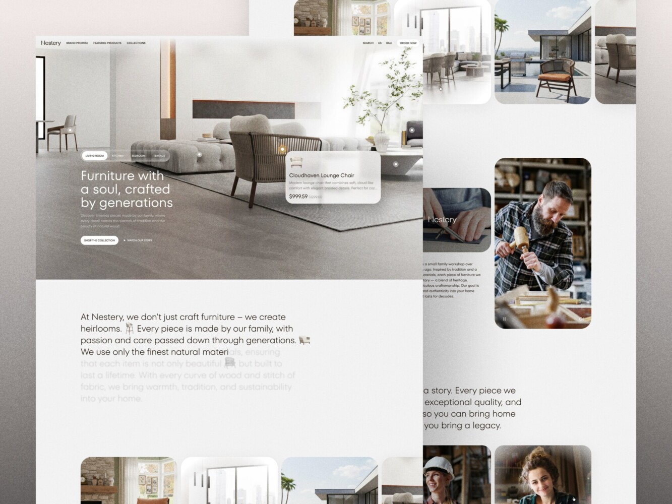
E-Commerce Website Design by Shakuro
What Conversion-Focused Web Design Actually Means
Conversion-Focused ≠ Aggressive or Manipulative
Yes, it’s not pressuring people or playing tricks on them. If your idea of “optimizing for conversions” involves fake scarcity timers, auto-playing videos with loud CTAs, or pop-ups that take three clicks to close, you’re doing it wrong. That stuff might jack up short-term metrics, but it erodes trust, and trust is the one thing you can’t A/B test your way back into once it’s gone.
Real conversion-driven design is quieter, smarter, and kind of human. It’s based on clarity, relevance, and intent alignment. Does your visitor land on your page and instantly get what you do, who it’s for, and what to do next? Do they feel like you understand their problem and that you’re not just trying to extract their email before they bounce?
The truth is, the most effective pages often feel like a calm, helpful conversation and not a sales ambush. They answer objections before they form. They make next steps obvious without being pushy. They earn the click.
Design as a Decision Architecture
Your website is a decision-making environment. Every pixel, word, and whitespace serves a role in guiding attention, reducing doubt, and smoothing the path toward a choice.
Each layer has a certain goal:
- Layout decides what your visitor sees first and what they never see at all.
- Visual hierarchy tells their eyes where to go next: headline → benefit → social proof → CTA.
- UX micro-details, like form length, button contrast, or even the tone, can tip someone from “maybe” to “yes” or “nope.”
For example, many companies just slap “Learn more” with the same size, color, and weight as their primary CTA. No wonder conversions are going to be flat. Visitors literally can’t tell which action matters more. And I’ll dwell on the mistakes a bit later.
So, web design for user retention structures the behavior. It removes cognitive load so people don’t have to work hard to understand what you offer or whether it’s for them. When you do that well, people feel helped.
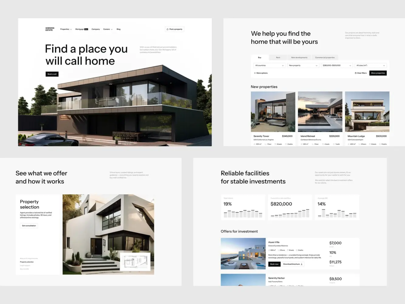
Real Estate Website Design by Shakuro
The Direct Link Between Web Design and Revenue
Reducing Friction In Key Conversion Paths
In reality, your revenue lives in the moments right before someone says “yes.” Far too often, that “yes” gets lost because of tiny, fixable friction points.
During conversion optimization through design, take your sign-up form. If it asks for a company name, phone number, and use case before someone’s even tried your product, you’re filtering out curious users instead of qualifying serious ones. Simply switching from a 6-field form to a 2-field one (“email + password”) and gathering the rest later, once trust is built, can increase the trial starts.
Or take a closer look at your demo request page. If it’s buried under three layers of navigation, uses jargon like “schedule a discovery call,” or makes people guess what happens next, you’ll bleed qualified leads. A simple “See how it works in 10 minutes” label over a clean calendar embed can be the difference between a booked slot and a closed tab.
Same goes for pricing pages. When your plans are vague (“Starter,” “Pro,” “Enterprise” with no clear difference), or if you hide your prices behind a “Contact Sales” wall when you’re a self-serve product, you’re forcing people to do mental math you should’ve done for them.
Improving User Confidence and Trust Signals
People buy from people they trust, even if that “person” is a well-crafted interface. Trust is hard to build, however, you can create a solid foundation with consistency, proof, and predictability.
For example, UX design for conversions attracts through:
- Showing real customer logos next to specific results
- Using consistent button styles and language across your site so users never wonder, “Is this safe to click?”
- Displaying security badges where they matter, like next to your payment form
If you’re creating web designs for a high-stakes space like fintech, health, or legal tech, this is even more critical. You have to balance compliance, clarity, and conversion in sensitive verticals. One moment of doubt, and you’re out.

E-Commerce Website Design by Shakuro
How Web Design Impacts User Retention (Not Just First Conversion)
First Experience Sets Retention Expectations
Your user’s first interaction with your product often happens before they even log in. It starts the second they land on your site from an ad, a tweet, or a friend’s recommendation. That moment quietly sets the bar for everything that comes after.
If your homepage is vague, your sign-up flow feels like a tax form, or your onboarding page dumps a wall of text before letting them do anything, you’re planting a seed: “This is going to be a chore.” That seed clearly won’t grow into web design for user retention.
A clean path in the first session would be clear value upfront → effortless sign-up → immediate “aha!” That’s the foundation of long-term retention. People stick around when their early experience matches the promise they were sold.
Your website is the first chapter of your user’s story with you. Get it wrong, and even the best product won’t save you.
UX Consistency Across Touchpoints
Retention crumbles when users feel like they’ve been handed off from one team to another, like your marketing site, product UI, and support portal were built by strangers. For example, your landing page uses friendly, jargon-free language, but inside the product, every label reads like an engineering spec. It makes users question whether you actually understand them or if you just know how to sell.
Consistency is the cornerstone of conversion-focused web design. Continuity of promise, tone, and usability from the first ad impression all the way through to their 10th support ticket. When every touchpoint feels like it belongs to the same thoughtful system, people relax. They trust you’ll keep delivering. It turns one-time users into loyal customers.
I get you, it’s tempting to outsource your site to a dev team and your product to engineers and assume it’ll “just work.” But the retention leaks happen through the seams between. You have to draw the line on control vs. delegation, carefully picking decisions you need to own to keep the experience cohesive and revenue sticky.
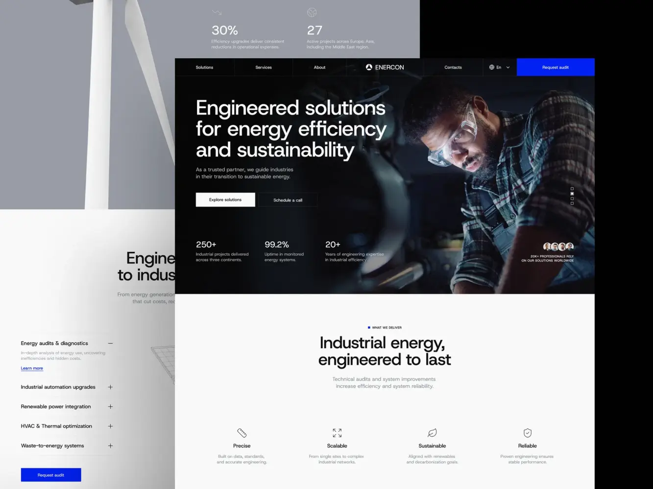
Industrial Company Website Design by Shakuro
Conversion-Focused UX Patterns That Actually Work
Clear Value Hierarchy Above the Fold
Your visitor starts at the top 600 pixels of your page. If they don’t grasp what you do, who it’s for, and what to do next in under five seconds, you’ve already lost momentum.
What you need for web design and conversions is ruthless prioritization. The headline should answer the visitor’s silent question: “Is this for me?”
For instance, “Helping e-commerce brands recover 15% of abandoned carts automatically.” Then, reinforce it fast with a short subhead that states the core benefit, a visual that shows the outcome, or one primary CTA that matches the user’s likely intent.
Make your promise clear, credible, and actionable, so people instantly understand whether the product is worth their time.
Intent-Based Page Structure
Treating all pages equally is a fast track to mediocre conversions. Each of them should have a clear purpose and support conversion optimization through design. Match the structure to the job the page needs to do, not your brand guidelines.
Your homepage is for awareness and orientation, because it helps visitors self-identify (“Yep, I’m a SaaS founder with churn issues”) and choose their path. Your pricing page is for comparison and validation. It makes plans scannable, highlights the recommended option, and answers “What’s included?” without a scroll marathon. As for your case study page, it is for de-risking: show results, name names, and mirror the reader’s industry or pain point.
Progressive Disclosure and Micro-Conversions
Filling out a six-step onboarding flow is far from exciting. But they will click “Next” if each step feels light, relevant, and like it’s getting them closer to value.
That’s progressive disclosure: only ask for what you need right now, and reveal complexity only when it’s useful. For instance, Slack doesn’t ask for your team size, industry, and use case on sign-up. It lets you in, shows you an empty channel, and gently guides you to invite teammates after you’ve sent your first message.
Same with forms:
- Start with email → confirm it works → then ask for name → then company
- Use inline validation (not “Error: Invalid email” after submission)
- Break long processes into clear stages with progress indicators
Small, low-friction actions that build momentum also impact web design and conversions. Like, “Watch a 90-second demo” instead of “Book a call” or “Try this feature” inside the product before upgrading.
These touches keep people moving forward instead of freezing at the finish line. Remember that nobody converts in a single heroic leap.
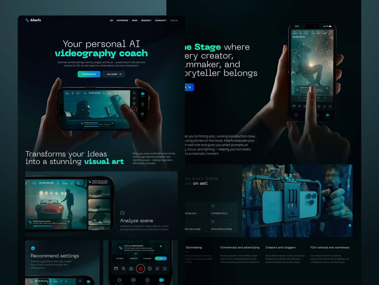
Landing Page for AI Video Production Platform by Shakuro
Why CRO Starts With Design (Not A/B Testing)
Testing a Broken UX Doesn’t Fix the Problem
A/B testing is powerful, sure, but only after you’ve got a solid foundation. Testing on top of a shaky design is like renovating a house with a leaky base. It might look nicer for a week, but the real issue is still rotting underneath.
In reality, teams that fix core UX issues before launching into CRO see 3–5x higher lift from their experiments. The reason is, when the baseline experience makes sense, every tweak actually means something.
Design as the Foundation for CRO
Web design is the stage, and CRO is the performance. You wouldn’t expect a brilliant actor to shine on a cluttered, poorly lit set with no clear entrance or exit. Same goes for your users.
Conversion-focused web design creates clarity, intent alignment, and a logical flow. When you do run an A/B test, you’re measuring real behavioral shifts. Is the new headline working better? Great, but only if the rest of the page isn’t sabotaging it with mixed signals, visual chaos, or dead ends.
For example, a clean, focused layout makes it obvious what’s being tested, so your results aren’t muddied by distraction. At the same time, a strong information hierarchy ensures your CTA isn’t fighting for attention against three other “primary” actions.
In short: design sets the ceiling, and CRO helps you reach it. If you’re still in the “throw experiments at the wall” phase, it might be time to zoom out. So fix the flow first, clarify the message, remove the friction, and then optimize.
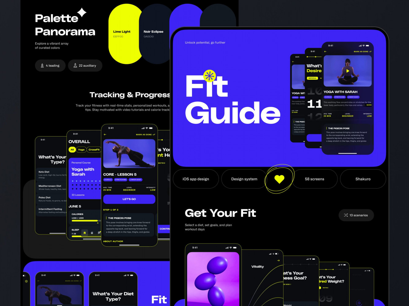
Website Design for a Yoga & Wellness Platform by Shakuro
Conversion-Focused Design Across Growth Stages
Early-Stage Products: Clarity Over Cleverness
When you’re just getting off the ground, one of the biggest conversion killers for you is ambiguity.
In most cases, early visitors ask, “Do you even get my problem?” If your homepage reads like an internal roadmap (“AI-powered, blockchain-ready, cloud-native synergy engine”) instead of a human promise (“Stop losing trial users and see who’s about to churn before they leave”), you’re already losing.
At this stage, conversion-driven web design focuses on validation through clarity. Every element should answer the question: What do you do? Or Who is it for? No “innovative solutions for tomorrow’s challenges.”
In the early days, your site is a hypothesis-testing machine. Does this message resonate? Does this flow feel worth the risk? If people aren’t converting, the reason is they likely never understood it enough to try. So keep it simple: make the next step obvious and treat every bounce as a signal.
Scaling SaaS and B2B Products: Precision Over Volume
Once you’ve got product-market fit and real usage, the game changes. Now it’s about getting the right ones, fast, and guiding them efficiently through increasingly complex journeys.
In terms of SaaS and B2B, UX design for conversions becomes more surgical:
- Segmented landing pages: A CFO cares about ROI and compliance; an engineer cares about API docs and uptime. Same product, different paths.
- Trial and demo flows that adapt based on firmographics or behavior (for instance, auto-suggesting a workflow based on company size)
- Multi-step funnels where each page has one job: pricing → use-case alignment → security reassurance → handoff to sales
At scale, friction is expensive. Every extra click, every unclear label, and every mismatched expectation leaks high-value leads. Since your audience is more diverse (startups vs. enterprises, marketers vs. IT admins), your design can’t be one-size-fits-all. It needs context-aware guidance.
So while early-stage design shouts, “Hey, this stuff is for you!”, conversion-driven web design whispers, “We know exactly what you need, and here’s how to get it without wasting your time.”
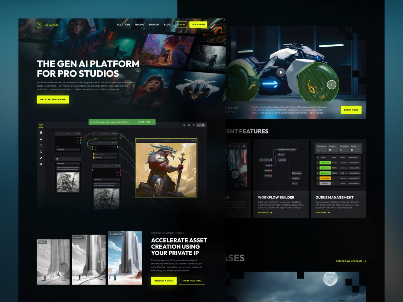
Landing Page Redesign for Creative Production by Shakuro
Common Design Mistakes That Kill Conversions
Overdesign Without Strategy
You want your site to feel premium. Sleek animations, custom micro-interactions, and maybe a glass-morphism nav bar that shimmers like a crypto whitepaper. But style without strategy, however mind-blowing it might be, is just noise.
Startups spend months on “brand-forward” designs that look stunning in Figma but leave real users confused. Like a hero section with a looping video background that takes 8 seconds to load and says nothing about what the product actually does.
Fancy ≠ functional. In terms of web design and conversions, clarity always beats creativity. If your design doesn’t serve a clear behavioral goal like reducing doubt or guiding attention, it’s not helping. It’s just decoration that doesn’t pay the bills.
Too Many CTAs, No Clear Path
Ever landed on a page that’s shouting at you from five different directions? “Sign up!”, “Book a demo!”, “Download the guide!”, etc. Yeah, you’ve just entered the decision paralysis zone. When every section has its own primary CTA, none of them are primary. Users freeze and scroll past everything or even leave.
Conversion-focused web design means you should have a path. What’s the one thing you want this visitor to do based on where they are in their journey? If they’re on a feature page, maybe it’s “See it in action.” If they’re on pricing, it’s “Start free trial.”
Pick one goal per page and make that CTA visually dominant. Tuck secondary actions lower or label them clearly as alternatives.
Ignoring Performance and Speed
A quiet killer that doesn’t show up in heatmaps: your site is too slow.
You can have the clearest copy, the perfect CTA, and social proof from NASA but if your page takes 4 seconds to load, nearly half your visitors are already gone. And it’s not just bounce rates: slow pages erode trust. People assume your product is sluggish, your tech is outdated, or you don’t care about their time.
Speed is a conversion lever. Every extra second of load time chips away at confidence, especially on pricing, signup, or payment pages. If you haven’t checked your Core Web Vitals lately, or worse, if you’ve never heard of them, it’s time. Together with speed and revenue, they impact the final result greatly.
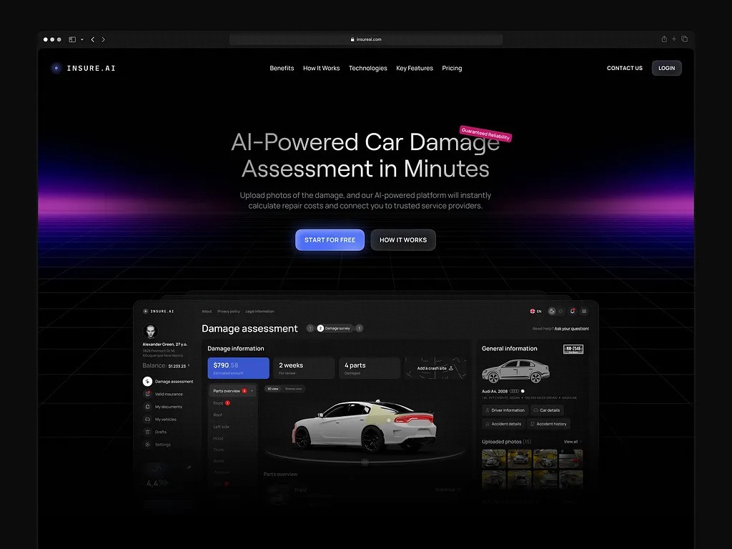
Automotive AI Insurance Website Design by Shakuro
How to Evaluate If Your Web Design Is Conversion-Focused
This type of design actively helps the right people say yes without confusion, friction, or second-guessing. But how do you know if yours is doing that?
Too many founders assume, “Well, we have a CTA, so we’re good.” Nope. A red button doesn’t make a page conversion-focused any more than a steering wheel makes a car safe. You need brakes, signals, and a working engine too.
The real test should show how it performs in the wild with real humans who are busy, skeptical, and scrolling on their phones at 11 p.m. So before you run another A/B test or hire a “CRO expert,” ask yourself: Does my site pass the “so what?” test at every step? If not, your design might be beautiful, but it’s not converting.
Quick Practical Checklist: Is Your Design Actually Built for Conversions?
Here is a short checklist to help you identify whether you’ve set up web design for user retention. Ideally, check both mobile and desktop.
✅ Above-the-fold clarity
In under five seconds, can a stranger tell:
- What do you do?
- Who is the product for?
- What to do next?
✅ One primary goal per page
- Is there one dominant CTA that matches the page’s intent?
- Are secondary actions (like “Watch demo”) clearly secondary and not competing?
✅ Friction audit on key paths
- Can someone sign up/start a trial in ≤ 30 seconds?
- Are forms asking only for what’s absolutely necessary right now?
- Is pricing visible (if you’re self-serve)? Or is it hidden behind “Contact Sales”?
✅ Trust isn’t an afterthought
- Do you show real proof where doubt lives? (for example, security badges near payment, customer logos near pricing)
- Is your language consistent, jargon-free, and human on your site and in your product?
✅ Performance isn’t ignored
- Does your page load in under 2.5 seconds on mobile?
- Do buttons respond instantly when tapped?
✅ No dead ends or mystery doors
- If someone clicks “Features,” do they see benefits clearly and not just a list?
- If they click “Pricing,” can they compare plans without scrolling endlessly?
✅ It aligns with actual user behavior
- Are you solving for what users care about or what your team thinks sounds impressive?
- Have you watched real session recordings to see where people hesitate or rage-click?
If you’re scoring “meh” on half of these, don’t panic. Most sites do, especially early on. Fixing even 2–3 of these can move the needle more than months of tweaking button colors.
Final Takeaway: Revenue Is a UX Outcome
Conversion-Focused Design Is a Growth Multiplier
Apart from a sales or marketing outcome, revenue is a UX outcome.
You can have the best product in the world with the smartest pricing and the perfect ICP. But if your website makes people pause, scroll past, or second-guess, none of it matters. Because growth happens in those quiet, split-second moments when someone decides, “Yeah, I’ll give this a shot.” The clarity, the flow, and the trust you build before asking for anything turn traffic into trials, trials into customers, and customers into raving fans who stick around for years.
In other words, conversion-driven web design is a force multiplier on your ad spend, your sales team’s time, and your product’s potential.
So stop treating web design as a “nice-to-have” polish phase. Start treating it as your silent revenue engine that you polish with smart, human-centered design choices.
Go build a site that performs and attracts. The revenue will follow.