For those who prefer to listen rather than read, this article is also available as a podcast on Spotify.
Contents:
Most companies don’t sit down and make a deliberate choice. They go with the agency that looks convincing.
A clean portfolio, a few trendy case studies, familiar visuals. It feels like a safe bet. Visual quality is easy to assess, especially for non-designers, so it naturally becomes the deciding factor. The problem is that visual appeal says very little about how a website will perform once real users start interacting with it.
Many agencies are set up to deliver finished screens and move on. Their responsibility ends at launch. What happens next—how users navigate the site, where they drop off, whether pages convert, how the structure affects SEO—is often treated as someone else’s problem. From the agency’s point of view, the work is done. From the business’s point of view, the hard part is just beginning.
There is also a difference in how “good work” is defined. For a short engagement, success means meeting deadlines and matching the approved design. For a product team, success looks very different: higher conversion rates, fewer support requests, faster iterations, and the ability to add new features without rethinking the entire interface. Agencies that are not used to long-term partnerships rarely design with these realities in mind.
Design decisions also don’t exist in isolation. Seemingly small choices—menu structure, page hierarchy, reusable components—have long-term consequences. They affect how search engines read the site, how marketing funnels perform, and how much effort future changes will require. When these things are overlooked early, teams usually pay for it later with redesigns, slow development, or declining results.
That’s why the question of whether in-house or agency design actually supports growth matters more than it seems at first glance. The real issue is not who can produce better-looking screens, but who can help the product evolve over time without constant resets.
Choosing a web design agency based mainly on how polished their work looks is understandable. It’s also one of the most common reasons companies end up redesigning the same product again and again instead of moving it forward.
The Real Job of a Web Design Agency (Hint: It’s Not “Design”)
When people say a website has “good design,” they almost always mean the same thing: it looks nice. Clean layouts, modern fonts, maybe a few subtle animations. That’s not wrong, but it misses the point. A web design agency that only focuses on visuals is doing a small part of the job and ignoring the part that actually matters once the product is live.
The real job of a web design agency is to help a product work and keep working as the business grows. That means thinking beyond individual pages and treating design as something that supports everyday use, future changes, and real business goals. When design is treated as a finishing touch, it usually becomes a problem later on.
Design as a Growth System, Not a Visual Layer
In real products, design is never “done.” It either holds up under change, or it starts falling apart.
UX decides whether people can figure things out without effort. CRO is about whether the product actually leads users to take meaningful actions. Performance affects how fast pages load and how forgiving the site is on weaker connections. Accessibility is about whether different users can use the product at all, not just whether it looks good in ideal conditions. Scalability determines whether new features can be added without redesigning half the interface.
None of this shows up in a screenshot. But this is where design proves its value. Small decisions—how navigation is structured, how components are reused, how content is prioritized—have a long tail. A growth-focused agency pays attention to these things because they know the product will change, and the design has to change with it.
Why Visual-Only Agencies Fail at Scale
Visual-first agencies usually do fine at the start. They help launch quickly and make the product look presentable. That’s often enough for an early release.
The problems show up later. Without product thinking, design choices are made one screen at a time. There’s no clear link to business goals, no feedback from real usage, and no plan for what happens when new features are added. Over time, changes get harder. Screens start to feel patched together. Teams avoid touching the design because everything is fragile.
Another issue is the lack of measurement. If design is judged only by whether stakeholders like it, there’s no warning when users start struggling. Conversions drop, people get lost, performance degrades—but nothing changes because the interface still looks “fine.”
That’s why many products look polished and still struggle to grow. The design was created to impress at launch, not to support years of changes. A strong web design agency treats design as something closer to structure than decoration and plans for the long term from the start.
7 Criteria to Evaluate a Web Design Agency for Growth
This is usually where the real differences show up. Some agencies know exactly how they work and why. Others rely on polished presentations and hope that’s enough. If you’re choosing a partner for growth, not just a launch, details matter more than promises.
Here’s what is actually worth looking at.
1. Product and UX Thinking
The easiest way to spot a strong agency is to listen to how they explain their decisions.
Good teams don’t hide behind design terms. They can explain what they did and why in plain language: what users need to see first, what can wait, and what was intentionally left out. They’re also comfortable saying no when something looks interesting but would cause problems later.
If every explanation sounds like a case-study headline, it usually means the thinking never went very deep.
A good example of this in practice is our work with Spektral, a network of digital production studios. The task wasn’t just to “design a website.” The site had to represent a distributed team of studios working together, and it needed to do that without overexplaining or adding noise.
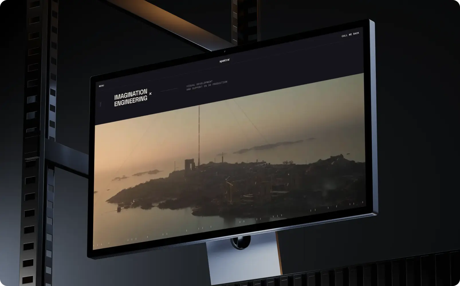
Website Design for Spektral by Shakuro
Before moving to visuals, we spent time understanding how their work is structured: how projects move between teams, how they present themselves to clients, and what information actually matters at the decision stage. That affected everything from navigation to content order.
The visual style came later. The sci-fi direction wasn’t chosen to stand out for its own sake. It supported the idea of technical production combined with creative work. The interface itself stayed simple. Pages were built around clear sections and repeatable layouts so the site wouldn’t fall apart as content grew.
There were ideas we didn’t use. Some looked good in isolation but added friction or distracted from the main message. Leaving those out was as important as what made it into the final version.
That’s what product and UX thinking looks like in real work: making decisions based on how the product is used and how it will need to change, not on how impressive something looks in a presentation.
2. Conversion and Funnel Awareness
Good design starts with a clear idea of what success looks like.
Strong agencies ask practical questions early: What should users do here? What action actually matters? Where do people usually hesitate or drop off? Demo requests, trials, repeat visits—these things influence structure far more than visual style.
When design ignores the funnel, the site often looks fine but doesn’t move the needle. That’s when how conversion-focused design impacts revenue and retention becomes painfully relevant.
3. Experience With Scaling Products
Design that works at the beginning often doesn’t survive growth. And teams that have been through that phase usually recognize the warning signs early.
When a product is small, a lot of things can be improvised. Pages can be simple, flows can be linear, and technical limits don’t feel urgent. But as features pile up and the audience grows, early shortcuts start getting in the way. Layouts become hard to extend, navigation turns confusing, and every new feature feels like it’s being squeezed into a space that wasn’t meant for it.
Agencies that have worked with products over several years tend to think differently. They assume the product will change. That’s why they lean toward reusable components, flexible layouts, and fewer assumptions about how things will stay “forever.”
A clear example of this is our work with Proko, an art education platform that started as a relatively simple content site and grew into a full-scale e-learning and community product.
When Proko came to us, the existing website was limited. It worked for hosting videos, but it couldn’t support what the platform was becoming: a large learning environment with social features, payments, progress tracking, and a growing international audience. The challenge wasn’t just to redesign pages — it was to rebuild the product so it could keep expanding without collapsing under its own weight.
From a UX and design perspective, that meant planning for scale early. User flows had to support people returning to lessons, interacting with instructors, commenting, following others, and picking up where they left off. Content had to stay central, even as more features were added around it. Gamification and social elements had to feel integrated, not bolted on.
A lot of the work was about restraint. Keeping layouts simple so they could absorb new features later. Making navigation predictable. Designing systems that could handle more users, more content, and more interactions without becoming overwhelming. The mobile version needed the same flexibility, with even less space to work with.
Projects like Proko show why experience with scaling matters. If all an agency has done is early-stage work, they often design as if the product will stay small. That works for a while—until it doesn’t. Teams that have seen products grow know where things usually break, and they design to avoid those problems before they appear.
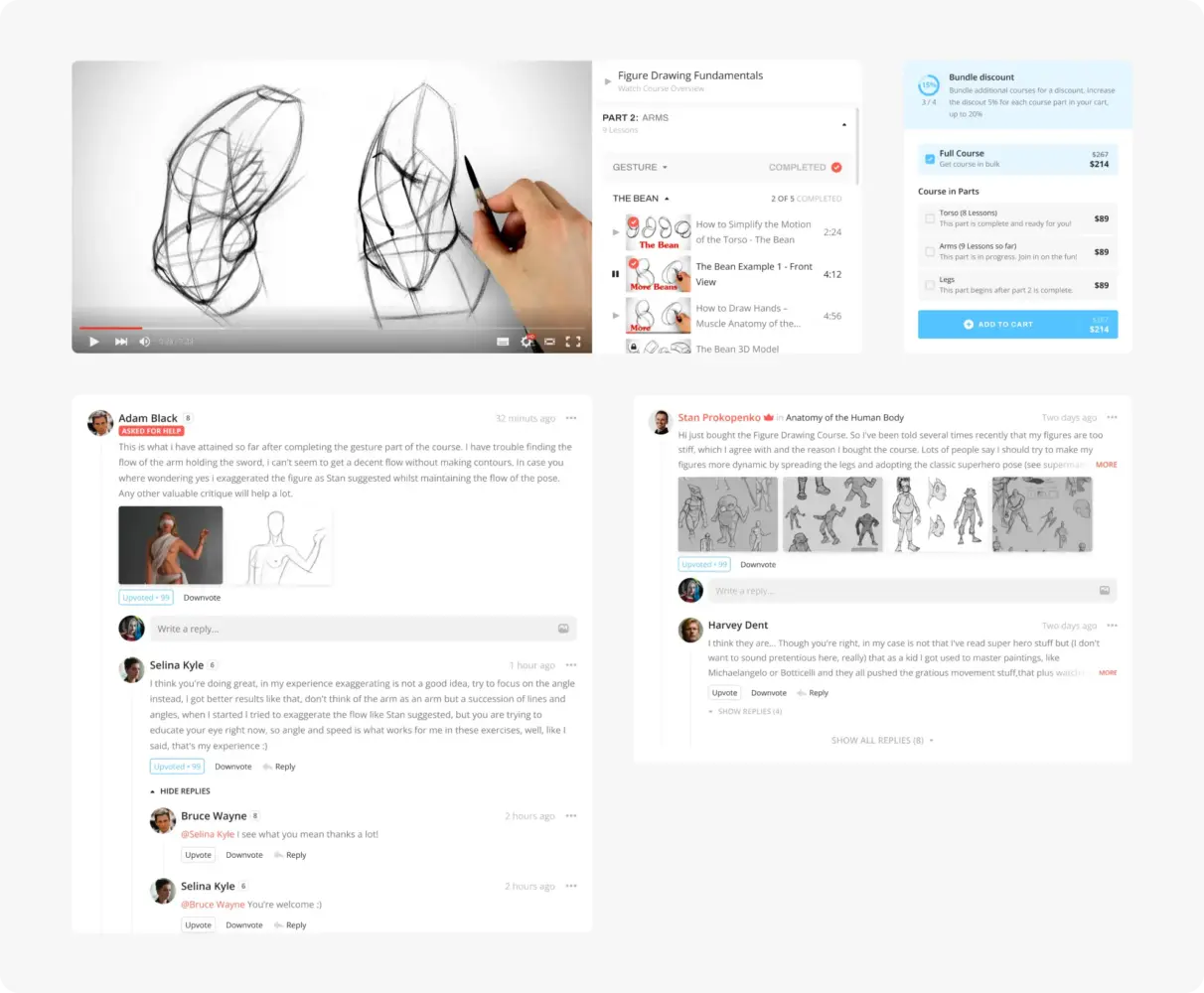
Website Design Concept for Proko by Shakuro
4. Ability to Design for Performance and SEO
Performance issues rarely come out of nowhere.
They’re often the result of design choices: heavy layouts, unclear hierarchy, oversized visuals, or unnecessary complexity. Agencies that understand this don’t treat speed or SEO as “engineering problems.” They design pages that are easier to load, easier to scan, and easier to index.
That’s why how design affects page speed and Core Web Vitals should already be part of the discussion, not an afterthought.
5. Strong Design-to-Development Handoff
If a design only works in a design tool, it’s not finished.
Good agencies think about implementation while they design. Their components are consistent, their layouts are realistic, and their files are structured in a way developers can actually use. The design survives real-world constraints instead of falling apart the moment requirements change.
When this is ignored, teams often realize too late that projects start failing after design approval, not before.
6. Process Transparency and Collaboration
Products change. Priorities shift. Feedback happens.
Agencies that can handle growth are usually very clear about how they work. They explain how feedback is collected, how decisions are made, and what happens when something needs to change. They stay in touch instead of going quiet and resurfacing with a “final” version.
If the process feels confusing from the start, it usually doesn’t get better later.
7. Clear Growth Metrics and ROI Thinking
At some point, design has to be evaluated by outcomes.
Agencies that think long term don’t stop at whether something was approved. They talk about what should improve after launch: conversions, engagement, clarity, speed of iteration. The exact metrics can be refined later, but the mindset needs to be there early.
Without it, design turns into opinion. With it, measuring the real ROI of web design becomes possible.
Taken together, these criteria help answer a simple question: is this agency built to support a product as it grows, or just to deliver something that looks good once and move on.
Red Flags That Signal an Agency Is Not Growth-Oriented
By the time you’re talking to agencies, most of them will sound confident. That’s expected. The challenge is spotting the signals that tell you whether the team is thinking about long-term results or just the next delivery. These red flags tend to show up early if you know what to look for.
No Questions About Business or Users
If the agency jumps straight into visuals without asking how the business works, that’s a problem.
A growth-oriented team wants context. They ask who the users are, what problems they’re trying to solve, how the product makes money, and where it struggles today. If those questions never come up, design decisions will be based on assumptions. That usually leads to work that looks polished but doesn’t fit how the product is actually used.
When an agency doesn’t show curiosity about users or business goals, it’s often because they don’t plan to take responsibility for results.
Portfolio-Only Selling
A strong portfolio is important, but it shouldn’t be the whole pitch.
When an agency relies almost entirely on screenshots and visual comparisons, it’s often a sign that outcomes are not part of the conversation. You hear a lot about style, trends, and awards, but very little about what changed after launch or what problems were solved.
Growth-focused agencies use their portfolio differently. They explain what they were trying to achieve, what didn’t work at first, and how the product evolved. If the story stops at “here’s how it looked,” that’s a warning sign.
No Mention of Metrics, CRO, or Performance
If performance, conversions, or measurement never come up, assume they’re not part of the process.
Design that supports growth is tied to observable results. Even if exact numbers are defined later, the agency should talk about how success is evaluated and what signals matter. When these topics are missing, design feedback usually turns into personal preference instead of evidence.
An agency that avoids metrics may still deliver attractive work, but it rarely helps a product move forward in a meaningful way.
How to Choose Based on Your Product Stage
The biggest mistake is assuming one agency fits every phase. Products change. The kind of help you need at the start is not the same help you need once users, features, and internal teams multiply.
Choosing well means being honest about where you are right now.
Early-Stage Startups
Early on, the main problem is speed.
You’re still figuring things out. Features change, positioning shifts, and feedback arrives late or contradicts itself. Design at this stage shouldn’t try to be perfect. It should help you launch, test, and adjust without wasting time or budget.
Agencies that work well with early-stage teams don’t overthink things. They focus on essentials, help shape an MVP, and accept that many decisions are temporary. They don’t demand full clarity upfront, because they know it usually doesn’t exist yet.
This is why web design for startups is a specific skillset—it’s about moving fast without creating a mess you’ll regret later.
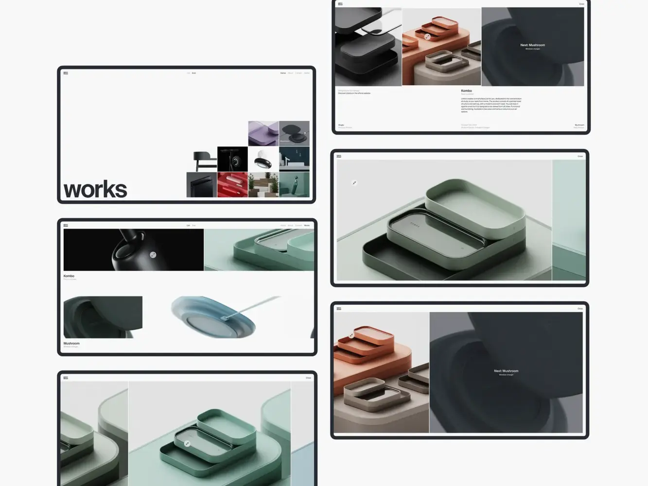
Website Design Animation for Industrial Designer Mirko Romanelli by Shakuro
Scaling SaaS and B2B Products
Once the product has traction, speed stops being the main issue. Structure becomes the problem.
Now you have real users, multiple flows, onboarding, demos, trials, and returning customers. Design decisions start affecting sales, support, and development velocity. Small inconsistencies add up quickly.
At this stage, design has to hold everything together. Patterns need to repeat. Components need to be reusable. New features shouldn’t feel like they were added as an afterthought. If the design isn’t systematic, every update becomes harder than it should be.
Agencies experienced in web design for SaaS and B2B products usually handle this stage better because they’ve seen what breaks when systems aren’t in place.
Choosing based on product stage isn’t about lowering expectations. It’s about not asking a team to solve problems they’re not set up to handle—and not paying for the wrong kind of expertise at the wrong time.
Industry Experience Matters More Than You Think
Teams often underestimate how much time and money is lost when an agency doesn’t understand the product space they’re working in.
From the outside, design can look universal. In practice, context shows up very quickly. Agencies that already know your industry don’t need long explanations or repeated corrections. They understand typical user behavior, common constraints, and where mistakes tend to be costly. That saves time early and prevents expensive fixes later.
When that context is missing, the issues usually appear gradually. Extra revision rounds. Interfaces that technically work but don’t fit real workflows. Design decisions that seem fine until someone realizes they don’t match how the product is actually used. None of this feels dramatic at first, but it adds up.
SaaS, Fintech, and Data-Heavy Products
Products built around data leave very little room for guesswork.
Dashboards, permissions, user roles, alerts, and onboarding flows all depend on clarity. You can’t hide complexity behind visual polish. Users need to understand what they’re seeing and what action they can take next, often on a daily basis.
This is exactly the kind of challenge we dealt with on TraderTale, a fintech platform where trading performance becomes a public reputation. The product combines real financial data with game-like progression: levels, rankings, alerts, and user profiles built around consistency and behavior, not just profit.
The task wasn’t to make the platform look flashy. It was to organize dense financial data in a way that stayed credible, readable, and useful, while still making progress visible and motivating. We kept the core logic intact, simplified how data is presented, and layered progress indicators on top so users could clearly see growth without losing trust in the numbers.
Things like the leaderboard, alert feeds, and user profiles had to work both as analytical tools and as engagement drivers. That balance only works when you’re used to designing systems people return to every day, not one-off marketing pages.
Without experience in SaaS or fintech, complexity like this is often underestimated. Interfaces get crowded, flows break under real usage, and small changes turn into large redesigns because nothing was structured for growth in the first place.
TraderTale: Social Platform for Traders by Shakuro
Regulated and Trust-Driven Industries
In regulated or trust-driven industries, design mistakes are harder to undo.
Users pay attention to details: wording, structure, consistency, and signals of reliability. Compliance rules, data handling requirements, and legal constraints shape what’s possible. Ignoring these early almost always leads to rework later.
On fintech products like TraderTale, credibility matters as much as usability. Visual decisions can’t undermine trust in the data. Game mechanics need to feel earned, not gimmicky. Even color choices, typography, and feedback states play a role in whether users take the product seriously.
Agencies with experience in these environments already know where the boundaries are. They don’t propose ideas that will later be blocked by compliance or raise red flags with users. They design within constraints instead of discovering them halfway through the project.
That’s why experience in B2B and trust-driven web design often saves time and budget in the long run. Fewer ideas are thrown out, fewer iterations are wasted, and decisions move forward instead of looping.
Industry experience doesn’t replace good design thinking, but it removes friction. When an agency understands the space you’re in, the work stays focused on solving real problems, not learning the basics the hard way.
Questions You Should Ask Before Hiring a Web Design Agency
These questions aren’t meant to trick anyone. They’re there to help you understand how the agency thinks once the work actually starts. You don’t need long speeches in response. Short, clear answers are usually the most telling.
Use this as a quick, practical checklist.
How do you approach conversions?
Listen to how concrete the answer is. Do they mention specific actions users should take, like sign-ups, demos, or repeat visits? Or do they stay at a high level and talk only about “engagement” or “brand feel”? Strong answers are usually grounded in real user paths and trade-offs.
How do you validate UX decisions?
Good teams don’t rely purely on taste. They should be able to explain how they check their assumptions, whether through feedback, basic testing, analytics, or iteration after launch. Even simple validation beats “we just know this works.”
How do you measure success after launch?
This question separates short-term work from long-term thinking. If success ends with design approval, that’s a red flag. Look for answers that mention what they watch after release: changes in behavior, conversions, friction points, or signals that something needs adjustment.
How do you collaborate with developers?
Design rarely survives contact with reality without close coordination. The agency should be comfortable talking about handoff, technical constraints, and compromises. If developers sound like an afterthought, implementation problems usually aren’t far behind.
You’re not looking for perfect answers. You’re looking for honest ones. Teams that are used to ongoing work tend to speak plainly and without defensiveness. If the answers feel vague or overly rehearsed, that’s usually worth noting.
Final Advice: Choose for the Next 2–3 Years, Not the Next Launch
It’s easy to focus on the launch. That’s when everything is visible: deadlines, approvals, screenshots, stakeholder feedback. But most design problems don’t show up at launch. They show up later, when the product starts changing and the original decisions no longer fit.
A website or product interface isn’t something you finish and forget. You’ll be adding pages, adjusting flows, changing messaging, shipping new features. If the design wasn’t built with that in mind, even small updates start taking more time than they should. Over a couple of years, that cost adds up.
Growth Comes From Systems, Not Screens
Screens age fast. Products don’t.
What really supports growth is not how individual pages look, but how everything fits together. Can you add a new section without reworking the navigation? Can a new feature reuse existing patterns instead of introducing exceptions? Can the product evolve without needing a redesign every year?
Agencies that focus only on screens tend to optimize for approval. The work looks good, gets signed off, and that’s the end of it. Agencies that think in systems care about what happens next—when real users start using the product, when priorities shift, and when changes become unavoidable.
If you’re choosing a partner, think beyond the next release. Ask whether the agency can support steady work over the next few years without constantly undoing earlier decisions.
That’s the idea behind web design built for long-term product growth.
A good agency doesn’t just help you ship something once. It helps you keep moving forward without turning every change into a redesign.