
For those who prefer to listen rather than read, this article is also available as a podcast on Spotify.
Contents:
Many beautifully designed landing pages still underperform. Even if they have captivating visuals, slick copy, or perfect CTA button colors. You can rack your brain over it, but the reason is usually simple: web design page speed.
If your site takes forever to load or janks around when someone tries to click something, the beauty doesn’t matter. People bounce fast. However, performance isn’t a “dev problem” alone. It’s baked into every design decision: image choices, layout structure, mobile navigation, etc. It also impacts Google’s Core Web Vitals, which are no more abstract SEO checkboxes but real signals that reflect actual user frustration.
Still, you don’t need to become a frontend engineer overnight. Understanding how design choices directly impact speed, user experience, and ultimately revenue is worth a few minutes of your time.
Stick around. I’ll walk through web design and performance: what actually moves the needle, what’s overhyped, and how to talk to your design and dev teams in a way that gets results without slowing down your next big launch.
Why Page Speed Is a Revenue Metric (Not a Technical One)
Apart from being a tech metric, page speed impacts revenue.
You could have the most compelling offer, the clearest value prop, and a killer ad campaign driving traffic to your site. But what if your homepage takes more than 3 seconds to load? Roughly half of those visitors are already gone with no pitch heard, no demo booked, and no sale made. They’re not coming back.
That’s because speed shapes perception before your message even has a chance to land. Slow sites feel outdated, untrustworthy, or just plain broken, even if they’re not. In today’s attention economy, “feels broken” is the same as is broken.
Google’s Core Web Vitals didn’t invent this reality. They just gave us a way to measure what users have always felt. Every extra millisecond adds friction. It kills momentum, especially at the top of the funnel where intent is high but patience is low.
However, for web design and performance, you don’t need to sacrifice aesthetics. In fact, the most effective websites treat performance as part of the user experience. If your site is slow, this impacts UX, and, therefore, people leave and avoid spending money. So, yes, conversion-focused web design impacts revenue and user retention.
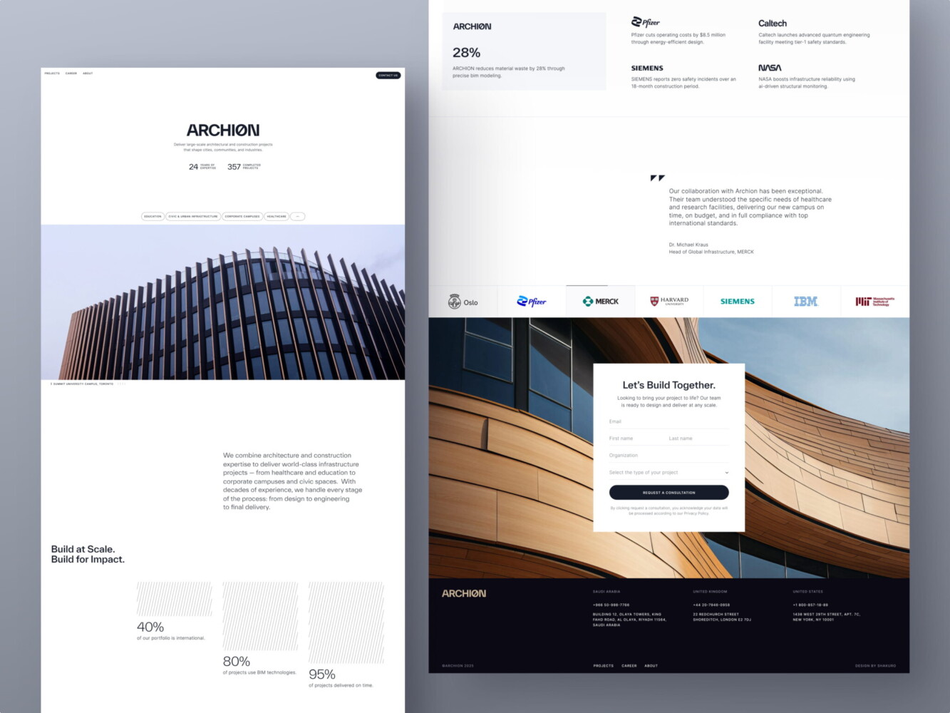
Web Design for Architectural Company by Conceptzilla
What Core Web Vitals Actually Measure (In Plain English)
Core Web Vitals are just Google’s way of measuring how your site feels to real people.
You don’t need to be an engineer to get this. In fact, if you’ve ever tapped a button on your phone and nothing happened, or scrolled down only to have the page suddenly jump because an image loaded late, you’ve already experienced bad Core Web Vitals firsthand.
LCP—How Fast Users See Value
Largest Contentful Paint really just asks, “When does the main thing load?”
Is it the hero headline? A product image? A sign-up form? Whatever’s most important above the fold, Google wants to know how quickly it shows up. If users stare at a blank screen or a spinning loader for more than 2.5 seconds, they start wondering if your site even works. And in many cases, they’ll just leave.
INP—How Responsive the Page Feels
Input Delay used to be called FID, but Google switched to Interaction to Next Paint (INP) because it better captures the full experience. Basically, these web design Core Web Vitals mean, “When I click or tap something, does it actually do what I expect right away?”
If someone taps “Add to Cart” and nothing happens for half a second. Or worse, the whole page freezes. It feels broken, disrupting trust. And again, people don’t wait around to find out if it’ll recover.
By the way, this gets way worse on mid-tier phones, which are what most of your audience probably use, especially outside major cities.
CLS—How Stable the Layout Is
Cumulative Layout Shift sounds technical, but it’s just about whether stuff jumps around while the page loads.
You’re about to click “Download Guide,” and suddenly an ad pops in above it, shoving the button down. You misclick, land on some sketchy third-party site, and now you’re annoyed. That’s a high CLS score that absolutely tanks conversions.
So, these metrics aren’t about ticking boxes for SEO. Core Web Vitals and conversions are closely related. With them, you can make sure your site doesn’t frustrate, confuse, or lose people before they even get to your message. If you’re running a business, that’s your bottom line.

3D Production Studio Website Design Shakuro
How Web Design Decisions Break Core Web Vitals
A lot of Core Web Vitals issues start in Figma.
We’ve all been there. A designer drops a gorgeous mockup with a full-screen video background, buttery-smooth scroll animations, and a carousel that “really brings the story to life.” It looks stunning in presentation mode. But when it hits real devices, especially on spotty 4G or a three-year-old Android, the experience crumbles. Suddenly, the dev team gets blamed for “slow performance,” even though they were handed a blueprint that was never built for speed.
Page speed optimization through design depends on every visual and interaction choice you make upfront. When design and engineering aren’t collaborating on trade-offs from day one, you’re basically choosing aesthetics over revenue.
Heavy Visuals and Overdesigned Layouts
A cinematic hero video? It might look premium, but it can easily add 5–10 MB of dead weight before your headline even loads. Same goes for high-res hero images that aren’t properly compressed or served in modern formats like WebP. And those “delightful” entrance animations often block the main thread, delaying interactivity.
Layout Shifts Caused by Poor Design Planning
Ever seen text suddenly jump down the page because a custom font finally loaded? Or a CTA button vanishes mid-click because an ad slot resized? It’s CLS that is almost always a design-system issue.
Designers often specify fonts like “Inter” or “Clash Grotesk” without considering fallbacks or font-display strategies. Devs can mitigate this, sure, but only if they know it’s a priority. Same with dynamic components: if your design includes auto-expanding sections, sticky headers, or late-loading testimonials, someone needs to plan for their space before they load. Otherwise, the page jolts like a subway braking too hard.
UX Patterns That Increase JavaScript Load
Carousels. Exit-intent popups. Embedded Calendly widgets. Social proof tickers that “update in real time.” These feel like small additions, but each one piles on third-party scripts that chew up CPU, delay interactivity, and inflate INP scores.
Worse, many of these are added late in the process, after the core experience is already built, as “quick wins” for marketing. But nothing kills responsiveness faster than five different tracking scripts fighting over the same thread.
None of this means a performance-focused web design has to be boring. You absolutely can have rich, engaging experiences and great performance. But it requires designers to ask, “How will this impact load time and interactivity?” just as often as devs ask, “How will this render on a slow device?”
If your site feels sluggish or unpredictable, it doesn’t matter how beautiful it is. Users will just go somewhere that works.
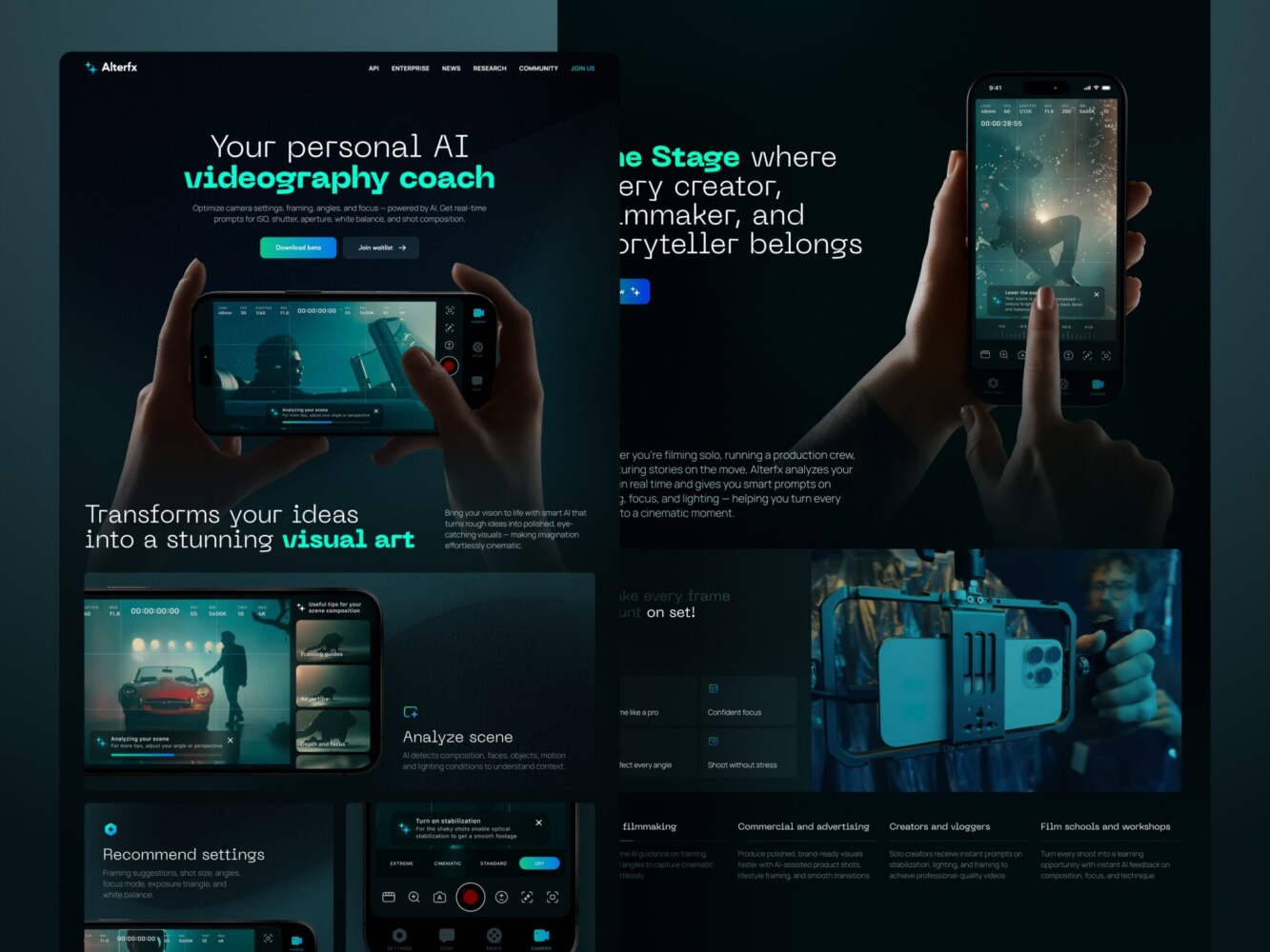
Landing Page for AI Video Production Platform by Shakuro
The Direct Link Between Performance and Conversions
You’ve probably heard the stat: “A 1-second delay can drop conversions by 7%.” Sounds dramatic, right? This number is what actually happens when real people hit your site and decide, in under three seconds, whether you’re worth their time.
Speed shapes behavior. And behavior drives revenue.
Faster Pages Reduce Drop-Off
You have your own habits. You click a link. The page starts loading, and nothing happens. No visual feedback. No headline. Just a blank screen or a spinning wheel. What do you do? If you’re like most people, you hit back. Maybe you try once more. But what if the web design page speed is still slow? You’re gone, probably to a competitor who loads instantly.
That first impression determines whether your site feels alive. When users don’t have to wait, they stay. And when they stay, they scroll, read, and convert.
Performance Builds Trust (Especially for B2B and SaaS)
In consumer e-commerce, speed might mean grabbing a pair of sneakers before someone else does. But in B2B or SaaS, speed signals competence.
If your pricing page stutters when someone tries to expand a plan, or your demo request form lags after they type their email, it feels risky. Like, “If their website can’t handle a simple interaction, how will their platform handle our enterprise data?”
For B2B and SaaS teams especially, this is where smart UX patterns make all the difference. Things like progressive disclosure, skeleton loaders, and performance-aware component architecture can keep things feeling instant, even on complex pages. With smart UX patterns, you can drive demos and trials.
It sounds irrational, but it’s human. We equate smoothness with reliability. A fast, stable site reads as professional, well-resourced, and user-respectful. A janky one, even if it’s functionally sound, feels amateurish. And in high-consideration purchases (think $10K+ annual contracts), that perception gap is everything.
There is no need to strip your site down to bare HTML. You just need to design with intent, prioritizing what users need to see and do first and deferring the rest.
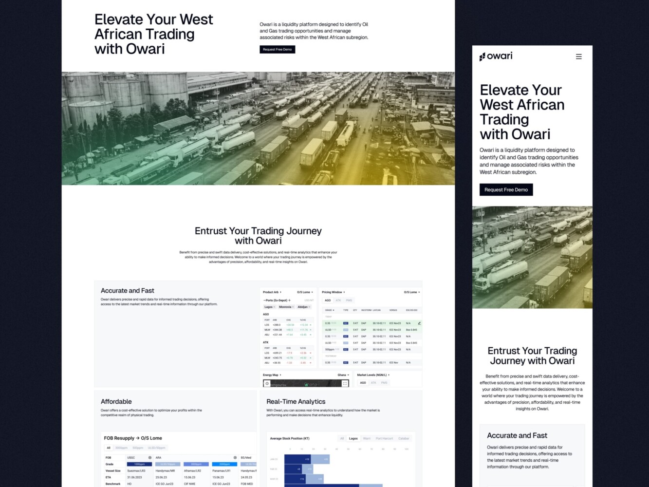
Web Design for Oil and Gas Trading Platform by Shakuro
Performance-First Web Design Principles
Design for Progressive Loading
Instead of waiting for everything to load before showing anything, think: What’s the absolute minimum a user needs to understand they’re in the right place?
That’s your critical content, usually a headline, a primary CTA, and maybe a key visual. Load that first. Everything else, like animations, testimonials, secondary nav, or fancy gradients, can come later.
In performance-focused web design, this means designing with “skeleton states” or low-fidelity placeholders. Many teams use blurred image previews or gray blocks that snap into place once assets load. It feels faster because the user gets immediate feedback: “Yes, something’s happening.”
If your hero section relies on a 3MB background image, ask yourself: does it really add value, or is it just decoration? Often, a solid color or subtle gradient delivers the same mood with 1/100th the weight.
Reduce Visual and Interaction Complexity
More layers ≠ better UX. In fact, every extra hover effect, dropdown menu, or animated transition adds cognitive load and technical debt.
Simplify your visual hierarchy. Use contrast, spacing, and typography to guide attention instead of parallax scrolls or floating buttons that chase the cursor. Fewer moving parts mean fewer things that can break, delay, or confuse.
For example, you have a mega-menu with nested flyouts, live usage stats, and a search bar—all in the header. It looks “powerful,” but on mobile, it might take 2.3 seconds just to open, at best. You have to cut it down, obviously, to get conversions up.
Design With Real Devices and Networks in Mind
“Mobile-first” shouldn’t just mean “smaller screen.” It should mean “designed for a $200 Android phone on a shaky 3G connection in a coffee shop.” That’s who a huge chunk of your audience actually is, even if your office runs on M3 Max MacBooks and fiber internet.
So, when doing page speed optimization through design, test your mockups under real conditions. Use Chrome DevTools’ throttling, sure, but better yet, grab an old phone, turn off Wi-Fi, and try to complete your core flow. Can you read the headline? Tap the button? Submit the form without rage-clicking? If not, go back. Maybe that custom font isn’t worth the layout shift. Maybe that auto-playing testimonial video should be a static quote with a play button.
Performance-focused web design is based on respect for your users’ time, attention, and devices. When you bake that mindset into your process, speed stops being a dev bottleneck and starts becoming a competitive advantage.
For example, the Proko case from our portfolio. It’s an art educational platform with mobile and web versions. Students barely have time to wait for page loading. Also, few of them have high-end PCs or smartphones. So when designing the layout, we had to pay attention to performance and speed. Both versions turned out lightweight, with clear navigation.
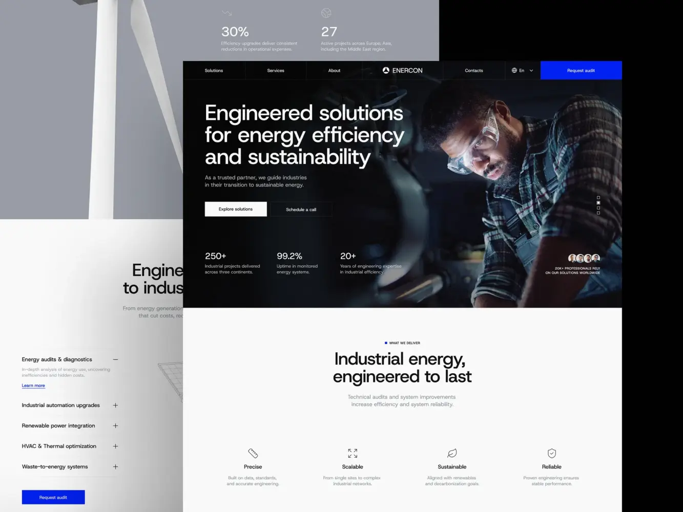
Industrial Company Website Design by Shakuro
Common Design Mistakes That Kill Performance
Designing for Dribbble, Not for Users
We’ve all scrolled through those impossibly smooth micro-interactions: buttons that morph into loaders, cards that float in with physics-based bounce, and full-page transitions that feel like a movie. They’re stunning. They get saved, shared, and admired. But most of them add zero business value and often hurt the experience they’re meant to “enhance.”
Designing for users means asking: Does this help someone understand, decide, or act faster? If not, it’s just decoration.
Ignoring Mobile Constraints
“Mobile-responsive” doesn’t mean “squished desktop.” Yet so many designs treat mobile as an afterthought: same assets, same interactions, just smaller.
But mobile comes with more than a smaller screen. It has slower CPUs, spotty networks, limited battery, and fingers instead of precision cursors. A 4MB hero image might load instantly on your office Wi-Fi, but on a train in rural Ohio, it turns into a blank screen for 6 seconds.
The same goes for tap targets. Some CTA buttons are so close together that users accidentally trigger a chat widget instead of submitting a form. It’s clearly a design failure.
Real mobile-first design means making intentional trade-offs: simpler layouts, system fonts over custom ones, and static images over autoplay videos. This way, you’re prioritizing usability, a part of web design impact on conversions.
Treating Performance as a Post-Launch Fix
We’ll say things like, “We’ll optimize performance later,” or “Let’s get it live first, then tweak the speed.”
But by then, it’s too late. The architecture is set. The heavy assets are baked in. The third-party scripts are embedded everywhere. Now you’re asking developers to “fix” something that was never designed to be fast in the first place.
Performance is a constraint you design within, like brand colors or copy tone. The best teams bake it into their definition of “done.” No component ships unless it meets basic LCP and INP thresholds. No animation gets approved unless it’s non-blocking.
Users don’t care how hard you worked on that gradient mesh background. They care if the page works. And if it doesn’t, they’ll assume the rest of your product is just as fragile.
So yeah, it’s humbling to admit that some of our “best” designs were actually working against us. But now you can make them truly better.
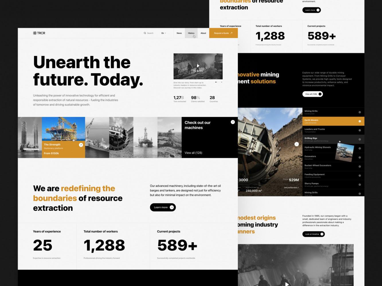
Website Design for Mining Company by Shakuro
How to Balance Visual Quality and Speed
When Visual Impact Is Worth the Cost
Some moments genuinely justify a heavier lift. Like a flagship product launch where the hero experience is the message—a luxury brand unveiling a new watch, or a creative studio showing off a campaign. In those cases, a carefully optimized video background, a custom typeface, or a subtle scroll-driven narrative might actually move the needle by building emotional resonance.
But it only works if:
- The asset is highly intentional (not just “because it looks cool”).
- It’s rigorously optimized (compressed, lazy-loaded, served in modern formats).
- And it doesn’t block core interactions (the CTA still loads fast, even if the video lags behind).
Our team nails this by treating rich media like a spotlight: used sparingly, only where it truly elevates the story. The rest of the site stays lean, so the one “wow” moment lands without dragging down the whole web design and performance.
Take the Mirko Romanelli website we’ve created. Mirko is a minimalistic product and industrial designer, so the site has to be creative, showcasing his works in the best way. Animations, interactions, effects, graphics, etc. At the same time, it has to run smoothly since any lags will disrupt the first impression about Mirko’s work. The result is a nice combo of aesthetics and performance.
When Speed Must Win
Now, flip the script. Is your goal sign-ups, demo requests, or e-commerce checkouts? Then speed almost always wins.
At that point, users are there to do something. Every extra second, every layout shift, and every unresponsive button chips away at their willingness to follow through.
Ask yourself:
- Is this user in a high-intent, task-oriented flow? → Prioritize speed.
- Are they on mobile or a low-end device? → Prioritize speed.
- Is this page tied directly to revenue (pricing, checkout, trial)? → Prioritize speed.
In these cases, even small delays compound. A 200 ms lag on a “Start Free Trial” button might seem negligible, but across thousands of visitors, it can mean dozens of lost conversions.
A Simple Decision Framework
Before approving any visual element, run it through this quick filter:
- Does this directly support the primary user action on this page?
- Can we deliver the same feeling with a lighter alternative? (for instance, CSS gradient instead of an image)
- What’s the performance budget for this section?
To get good web design page speed, you just need shared awareness between design and product. It’s a balance of delegating and controlling, where you break down every decision. Which ones deserve your attention, and which ones can you safely trust your team to handle?
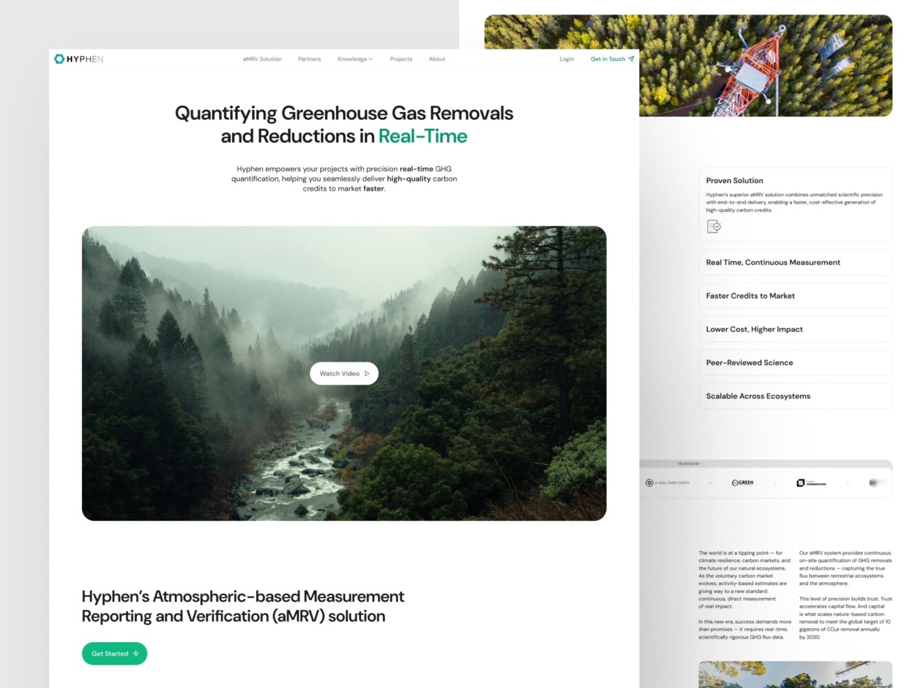
Design for a Carbon Measurement and Verification Company by Shakuro
How to Audit Your Website’s Performance From a Design Perspective
As a founder, product lead, or marketer, you can run a surprisingly effective “design-first” performance audit in under 10 minutes. No terminal required. Just your eyes, a phone, and a little curiosity.
✅ Are key messages visible within 2 seconds?
Open your page on a mid-tier phone or use Chrome DevTools with “Slow 3G” and “4x CPU slowdown” enabled. Start the reload. Now, watch the first 2 seconds like a hawk.
- Can you read your main headline?
- Is the primary CTA visible and tappable?
- Do you instantly understand what this page is for?
If the answer is “no” or “barely,” you’ve got an LCP problem. That means real users are bouncing before they even get your message.
Fix tip: Push non-critical content (testimonials, footer links, and secondary features) below the fold or load them later. Make sure your hero text renders with system fonts or properly loaded web fonts. This way, you do page speed optimization through design.
✅ Do layouts shift during load?
Watch the page as it loads. Does anything jump?
- Does a headline suddenly drop down because a font loads late?
- Does a button move after an image pops in?
- Does an ad or embed shove your form out of the way?
If you flinch or have to re-aim your finger, that’s CLS and it’s costing you trust (and conversions).
Fix tip: Always reserve space for images, videos, and dynamic components using aspect ratio boxes or min-height. Use font-display: swap so text shows immediately in a fallback font while your custom one loads.
✅ Are visuals optimized for purpose, not decoration?
Go through every image, video, icon set, and background element. Ask:
- Does this directly support the user’s goal? (e.g., a product screenshot = yes; a mood-board-style stock photo = maybe not)
- Could this be simpler? (SVG instead of PNG, CSS gradient instead of an image, static instead of animated)
- Is it sized and formatted for the device it’s shown on? (No 4000px-wide hero images on mobile.)
✅Bonus: tap everything.
On your phone, try to complete your core flow: sign up, request a demo, start a trial.
- Do buttons respond instantly?
- Do forms feel snappy?
- Or do you find yourself tapping twice, waiting, or getting frustrated?
If it feels sluggish, your INP score is probably suffering, even if the page “looks” done. It will definitely impact web design Core Web Vitals.
Final Takeaway: Performance Is a UX Decision
Faster websites load quicker and convert better. By design.
There is no algorithmic trick for high web design page speed. But speed is user experience. When your page loads fast, people stay. When interactions feel instant, people trust you. When nothing jumps or stalls, people take action. In business, it’s the difference between a landing page that hums and one that hemorrhages leads.
Too many teams treat performance as a technical cleanup task: “We’ll fix it after launch.” But by then, the damage is done. The bounce rate is baked in. The lost trials are gone. The perception of your brand is already set.
So performance starts with design. Every image you choose, every animation you approve, every layout you ship—it all adds up to either friction or flow. Your users feel it before they even read your headline.
If you’re serious about growth, stop treating speed as a dev ticket. Start treating it as a core part of your product strategy. The fastest path to more demos, more sign-ups, and more revenue is a website that works the moment someone lands on it.
We help you build such a website, as high performance is one of our top priorities, together with UX and looks. Reach out to us, and let’s start creating your next website.