
For those who prefer to listen rather than read, this article is also available as a podcast on Spotify.
Contents:
You’ve poured months into building your product and nailed the core logic and maybe even got your first paying customers. But then someone visits your site and bounces in 10 seconds flat. Kinda daunting, huh?
The thing is, your website is your first sales rep, your always-on demo, and often the only impression you get to make. And if web design for B2B saas is confusing, slow, or feels generic, you’re leaving money on the table. Like, a lot of it.
Maybe you’re thinking, “But we’re not selling shoes, so we don’t need flashy design.” Fair point, however, clarity is design. Helping a busy operations manager instantly grasp how your tool saves them 20 hours a month is UX.
Honestly, most founders either overthink web design (“Do we need animations? Micro-interactions?”) or underthink it (“Just slap up some copy and a CTA”). The sweet spot’s somewhere in between and way more practical than you’d think.
In this article, I’ll walk you through what actually matters in B2B saas website design that converts. Below you will find tips, guides, and common mistakes to avoid.
Why Most B2B SaaS Websites Don’t Convert Qualified Leads
Traffic’s pouring in. Ads are humming. SEO’s finally kicking in. Great, right? Except your pipeline’s still dry.
You’re getting visits, but there are no qualified leads. Or even worse: you get demos booked by folks who clearly don’t fit your ICP, waste your sales team’s time, and ghost after the first call. Meanwhile, the actual decision-makers scroll past and never look back.
The problem usually isn’t the product. It’s that the website talks at the wrong person or talks in riddles. B2B buyers aren’t browsing for fun. They’re under pressure, short on time, and scanning for proof you understand their world. If they don’t see it in the first 5 seconds, they are gone.
Quite often SaaS UX design patterns are built for the team that made them, not the people who’ll buy them. You’ll see pages loaded with feature lists, vague value props like “streamline your workflow,” and CTAs that say “Get Started” when what the visitor really needs is “See how teams cut onboarding time by 40%.”
That’s why conversion-focused web design directly shapes your revenue trajectory and even impacts retention. If your site overpromises or confuses expectations, churn starts before onboarding even begins.
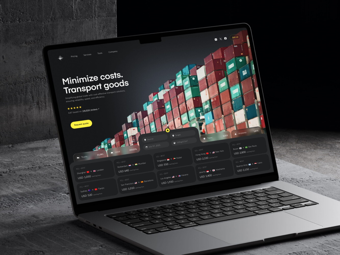
Landing Page Design for Logistics Company by Conceptzilla
What Makes B2B SaaS Website Design Different
Designing such a site is far from building a Shopify store or a DTC landing page. You’re not trying to trigger an impulse buy with a flashy discount banner. The game here is slower, heavier, and way more nuanced.
Most founders underestimate this at first. They treat their homepage like it’s 2014 again and wonder why enterprise prospects don’t bite. But the decisions don’t happen in a vacuum. They’re rarely solo calls.
Longer Sales Cycles, Higher Stakes
We’re talking weeks or months of evaluation instead of minutes. Your buyer might be a mid-level ops manager who discovered you, but they’ll need to convince their director, get legal to sign off, and maybe even loop in IT for security reviews. Each of those people cares about something different: ROI for finance, ease of integration for engineering, and compliance for legal.
Since the contract value is often substantial, the perceived risk is high. No one wants to be the person who championed a tool that flopped six months in. So trust is the gatekeeper. If your site feels vague, overly salesy, or generic, that trust evaporates before the first email is even sent.
Website as a Sales Enablement Tool
By the time a prospect books a demo, they’ve usually already done half the research. They’ve read your case studies or noticed you don’t have any, checked if you serve their industry, scanned your pricing page for hidden traps, and even Googled “alternatives.”
If your site hasn’t done the heavy lifting before that call, for example, hasn’t answered the hard questions, shown social proof from similar companies, or clarified how you’re different, you’re forcing your sales team to start from zero. That’s exhausting and, to be honest, expensive.
A well-created web design for B2B SaaS prepares the leads. It arms champions with the info they need to sell internally. It preempts objections. It builds confidence so that when your rep finally hops on Zoom, they’re having a strategic conversation.
That shift from brochure to enablement engine is what separates websites that generate pipeline from those that just collect pixels.
UX Patterns That Increase Demo Requests
In reality, you need more right people clicking “Book a demo.” Their evaluation starts the second they land on your page, way before they hit your CTA button.
SaaS UX design patterns that consistently drive qualified demo requests all do a few things differently. They reduce friction, build relevance fast, and guide visitors toward the right next step.
Clear ICP-Focused Messaging Above the Fold
If someone from your ideal customer profile lands on your homepage, they should instantly feel seen. Not in a creepy “we tracked you” way, though. I mean, in an “oh wow, this was made for people like me” way.
So drop the headline like “Powerful workflow automation for modern teams.” Who’s “modern”? What kind of teams? It should be something like, “Help HR ops leaders cut onboarding time in half without engineering support.” Specific, role-based, and pain-focused.
For example, when designing a site for Mantis, we created defined messages, such as “Connected camera solutions for all vehicle types” and “Multi-camera solutions. Any vehicle. Any industry.” So a manager looking for telematics services instantly understands the message. No need to scroll endlessly to find a list of supported vehicles.
That’s why, remember, above the fold is attention. In B2B, attention is scarce. You’ve got maybe 3–5 seconds to signal: You’re in the right place. If you waste it on vague fluff or internal jargon, you’ve already lost.
Intent-Based CTAs (Not “Contact Us”)
“Contact Us” is the black hole if you want a SaaS web design for conversions. It says nothing, promises less, and makes your visitor do all the work.
Instead, match your CTA to where they are in their journey. Are they early-stage, just exploring? Offer a short product tour or a use-case guide. Mid-funnel, comparing vendors? Push them toward a personalized demo. Ready to buy but need pricing clarity? Link to a transparent pricing page with optional add-ons.
Stop forcing enterprise buyers into a free trial. If your product requires setup, training, or integration, a trial feels like a trap. They’ll bounce. A 15-minute demo with a solutions engineer? That’s respect for their time.
The best sites use dynamic CTAs based on traffic source or behavior, but even static ones can be smarter. “See how [Industry] teams use [Product]” converts better than “Get Started” every time because it’s contextual.
Progressive Disclosure of Complexity
Your product might be deeply technical. But your homepage shouldn’t read like an API doc.
Early-stage visitors don’t need to know about webhooks, role-based permissions, or SOC 2 compliance upfront. They need to understand why they should care. Save the deep specs for later pages like pricing, security, and integrations—where motivated visitors will seek them out.
Just like in a conversation, you don’t lead with your résumé. You start with common ground. Same here, you hook them with outcome-focused simplicity, then peel back layers as their interest grows.
If you’re wondering how to structure this flow without guessing, it’s worth remembering: conversion rate optimization (CRO) starts with web design. You can tweak the button colors all day, but if your B2B SaaS landing page design doesn’t align with how buyers actually think and move, you’re polishing the deck chairs.
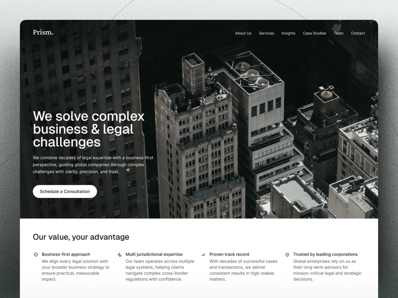
Website Design for Consulting Firm by Conceptzilla
UX Patterns That Improve Trial Signups and Activation
Setting the Right Expectations Before Signup
Before someone even types their email, they should know exactly what they’re signing up for and whether it’s actually for them.
Too many trial pages say, “Try free for 14 days!” with zero context. But a finance ops manager at a 200-person company doesn’t want the same experience as a solo founder tinkering on a side project. If your product needs integration, team setup, or domain verification, hiding that until after signup is a recipe for frustration and support tickets.
Instead, use the pre-signup moment in your SaaS trial signup UX to qualify and educate. A short blurb like “Best for revenue teams using Salesforce. You’ll connect your CRM in <5 mins and see your first forecast within 24 hours.”
That blurb does three things:
- Filters out folks who don’t fit
- Sets a clear success milestone (“see your first forecast”)
- Reduces post-signup anxiety (“Oh, I am in the right place.”)
Reducing Friction in Trial Entry
Every extra field you add is a silent killer. Do you really need company size, job title, industry, and phone number just to start a trial? Or are you collecting data for your CRM while pretending it’s “to personalize the experience”?
In B2B, you often need some info but ask for it progressively. Start with email. Maybe confirm the role if it changes the onboarding flow. Then defer the rest until activation or Day 2.
While building a SaaS web design for conversions, avoid multi-step modals that feel like tax forms. If your trial requires a credit card upfront, at least explain why: “We require a card to prevent bot abuse, but you won’t be charged until Day 15.” Transparency builds trust. By the way, demanding a credit card upfront tanks conversions unless you’re targeting enterprise.
Remember: trial entry is the first real interaction with your product’s UX. If it feels clunky, slow, or confusing, users assume the whole product is that way even if it’s not. That’s why SaaS demo conversion optimization requires making sure the right people start the journey ready to succeed.
Trust and Credibility Signals That Matter in B2B SaaS
Picking a startup with a half-baked site always feels risky. Even if your tech is 10x better, if your site looks like it was slapped together over a weekend, buyers hesitate. No, people don’t doubt your code; they just doubt your seriousness.
Design, in this context, becomes trust infrastructure. It signals stability, competence, and relevance without saying a word.
Social Proof That Speaks to Decision-Makers
Anyone can slap a few brand icons below the fold. What actually moves the needle is social proof that resonates with the specific person reading it.
A CFO doesn’t care that “[Company] uses us.” They care that “[Company] reduced SaaS spend by 32% in Q3.” An engineering lead wants to know how you integrate with their technology stack rather than just that you’re “trusted by innovators.”
So go beyond logos. Case studies should mirror your buyer’s world: same industry, similar team size, and comparable pain points. Kudos to you if you name names. For instance, “How [Name], Director of RevOps at [Company], cut onboarding time from 2 weeks to 2 days.” ”.
Metrics matter too, but only if they’re believable. “99.9% uptime” is table stakes. “Customers see ROI in 45 days or less with 87% hitting full adoption within 60” feels concrete. Specificity builds credibility.
We applied this methodology when building SaaS UX design patterns for Hyphen. Our designers prepared animated illustrations showing how the solution works, what the steps are, and what it measures. There are clear statistics, like “reducing instrumentation costs by over 80%.”
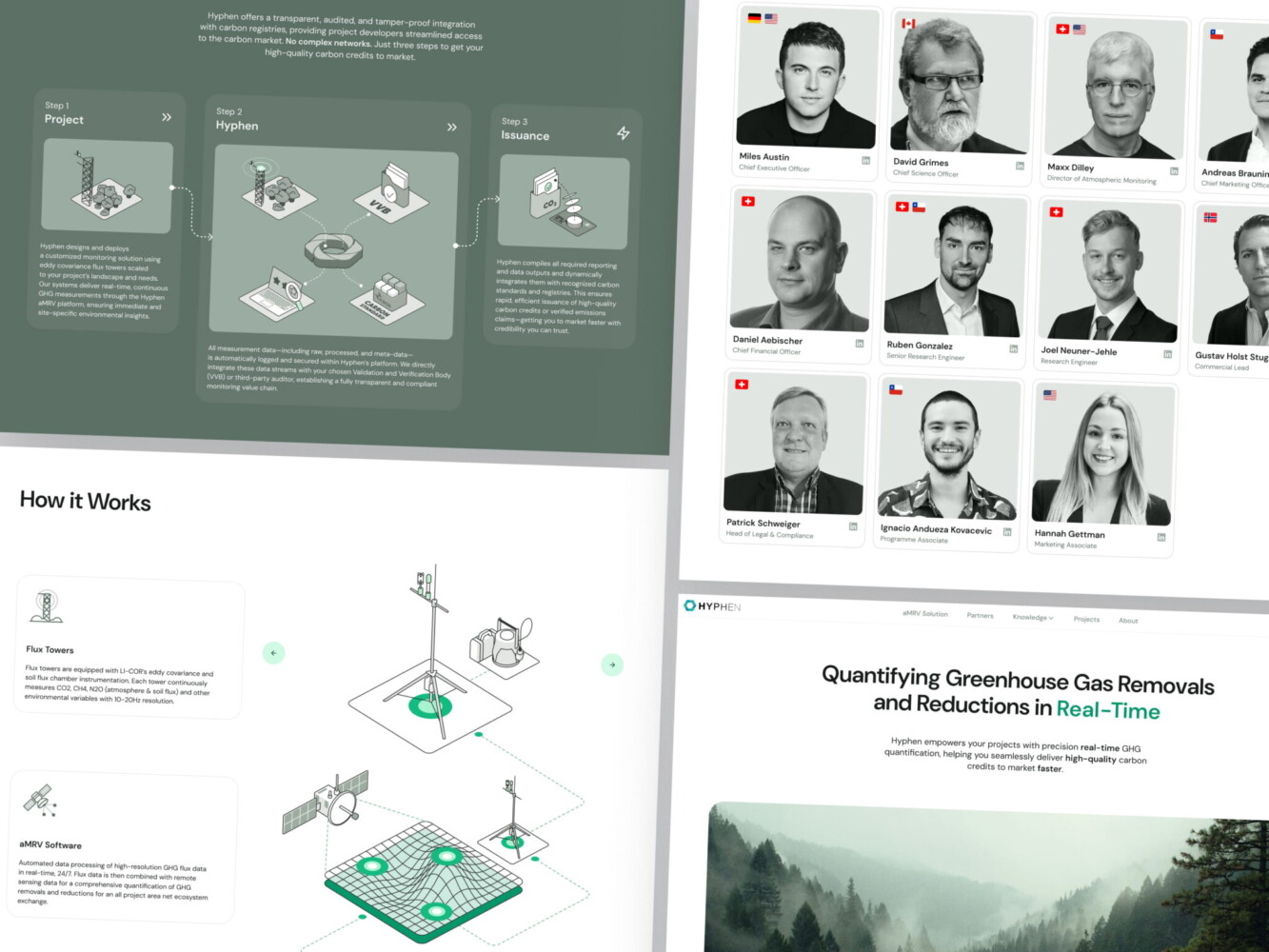
Hypen web design by Shakuro
Design Consistency Across Marketing and Product
Your website can be all clean lines, confident messaging, and smooth animations, but when the user logs into your app and it’s cluttered, the first one doesn’t matter. That disconnect screams “two different teams, zero alignment.” And subconsciously, it makes people wonder: If they couldn’t even sync their design systems, how reliable is their roadmap?
Having the same shade of blue everywhere doesn’t mean you have consistency. It means tone, interaction patterns, and even microcopy. If your site says “effortless automation,” your onboarding shouldn’t require three manual CSV uploads and a Slack thread with support. You don’t need to design every button, but you do need to ensure the experience feels like one cohesive story.
Performance, Speed, and UX in SaaS Funnels
I mean the actual speed and smoothness of your marketing site, pricing page, or trial flow. If your homepage takes 4 seconds to load, you’re filtering out your best-fit buyers.
You see, enterprise folks are often on corporate networks with aggressive firewalls and legacy browsers. Remote teams in Europe or APAC might be hitting your US-hosted site across a slow pipe. When your demo request form stutters or your pricing calculator lags, they won’t wait. They’ll assume your product is slow too and bounce.
Page Speed Impact on Demo and Trial Conversions
Google’s data shows that as page load time goes from 1s to 3s, bounce probability jumps by 32%. At 5 seconds, you’ve lost half your audience. It’s worse for action-heavy pages, like trial signup or demo booking, where every extra second chips away at intent.
For example, when your “Get Started” page is loading 3.8s on average because you have an unoptimized hero video and three analytics scripts firing at once, no wonder your trial conversion rate is stuck. After trimming assets, lazy-loading non-critical elements, and switching to a lighter form embed, load time will drop.
So yeah, design choices directly affect load times, Core Web Vitals, and, ultimately, revenue. That “cool” animated background might be costing you six figures a year.
UX Debt That Slows Down Growth
The debt in web design for B2B SaaS starts small. You add a new pricing tier. Tweak your navigation for a webinar campaign. Throw in a temporary banner for a funding announcement. Nothing crazy. But over time, these little patches pile up: navigation gets messy, CTAs contradict each other, and mobile breaks in weird places.
At first, it’s fine because you’re moving fast. But once you hit $2M+ ARR and start scaling outbound or running paid campaigns, that accumulated mess starts dragging down performance. Visitors get confused. Sales complains prospects “didn’t understand the offering.” Support tickets spike about broken flows.
It’s invisible until it’s expensive to fix. Companies spend months optimizing ad copy and landing pages, only to realize their real bottleneck was a clunky, inconsistent trial flow built six iterations ago.
Scaling exposes every shortcut you took in UX. And unlike code debt, UX debt erodes trust. A slightly slow page feels like a hiccup. A confusing, inconsistent experience feels like chaos, and nobody buys from chaos.
AI-Driven Medtech Website Design by Shakuro
Common B2B SaaS Web Design Mistakes
Generic Messaging for Multiple ICPs
You’ve probably done this: your B2B SaaS landing page design serves both mid-market ops teams and enterprise security folks, so you write copy that tries to cover both. The result is a vague headline like “Secure, scalable solutions for modern businesses.”
Sounds safe. Converts nobody.
The problem is that you’re forcing them to share the same front door. A compliance officer at a bank doesn’t care about the same outcomes as a growth marketer at a Series B startup. When your messaging is watered down to “work for everyone,” it resonates with no one.
Better approach is to either create dedicated landing experiences (even if just via dynamic content or separate paths) or lead with your strongest segment and tuck secondary audiences deeper in the site. Clarity beats coverage every time.
Too Many CTAs, No Clear Path
Ever landed on a B2B homepage and felt overwhelmed? “Book a demo!” “Start free trial!” “Talk to sales!” “Download the guide!” “Watch the video!” “Join our webinar!” It’s like walking into a store where five employees yell different offers at you the second you walk in.
In B2B, your visitor is already doing heavy mental lifting. Don’t make them guess what to do next. For SaaS trial signup UX, Pick one primary action per page based on intent. If they’re on your pricing page, the CTA should probably be “Start trial” or “Talk to sales.” Guide people toward the right next step, not just any next step.
Overdesign Without Funnel Strategy
This one stings because it comes from a good place. You want your site to feel premium, modern, differentiated. So you invest in custom animations, micro-interactions, and a full-motion hero section.
But if those flourishes don’t serve your funnel, if they slow down load time, distract from key messages, or make mobile navigation a nightmare. They’re sabotaging your brand.
Great approach in web design for B2B SaaS is about removing friction, building trust, and moving the right people forward quietly, efficiently, and consistently. Sometimes the most powerful design choice is cutting the noise so your message and offer can finally be heard.
How SaaS Companies Should Approach Web Design
If you’re running a B2B SaaS company, especially in the early or growth stage, it’s time to stop thinking of your website as a “marketing project” and start treating it like core infrastructure. It’s one of the few assets that touches every part of your business: acquisition, sales, onboarding, and even customer retention.
But too often, web design gets siloed. Marketing picks a template, throws some copy on it, and calls it done. Meanwhile, sales is fielding confused prospects who “didn’t understand what we do,” and product wonders why trial activation is so low. Sound familiar?
Here’s how to approach web design differently.
Aligning Web Design With Sales and Product
Your website shouldn’t be built in a vacuum by marketers alone. It needs input and alignment from sales and product from day one.
Sales knows exactly what objections come up in demos. Product knows which features actually drive “aha!” moments. And marketing knows how to translate that into clear, compelling messaging.
At a minimum, loop in your sales lead before rewriting your homepage. Ask: What questions do prospects have before they book a call? What makes them hesitate? Then bake those answers into your site before they ever talk to a human.
Same with product: if your onboarding flow hinges on connecting to Slack or importing a CSV, your SaaS trial signup UX should set that expectation upfront. No surprises.
Many teams hold monthly “funnel syncs” where marketing, sales, and product review top drop-off points together. As a result, the websites work because they reflect how real buyers actually move through your world.
Iterating Based on Funnel Data
Your website is a living system. And like any system, it needs tuning.
Forget waiting for a “full redesign” every 18 months. Start small. Track where people drop off: maybe it’s your pricing page, maybe it’s the demo form. Then test one thing: clearer labels, fewer fields, or a stronger headline. Measure the impact and repeat.
And if you’re considering bringing in outside help because, let’s be honest, most founders can’t do this alone, choose partners who think like growth collaborators. Look for agencies that ask about your funnel metrics, talk to your sales team, and care about long-term impact over flashy deliverables.
In the end, B2B SaaS website design should be a coherent, trustworthy, and efficient path from first click to first value.
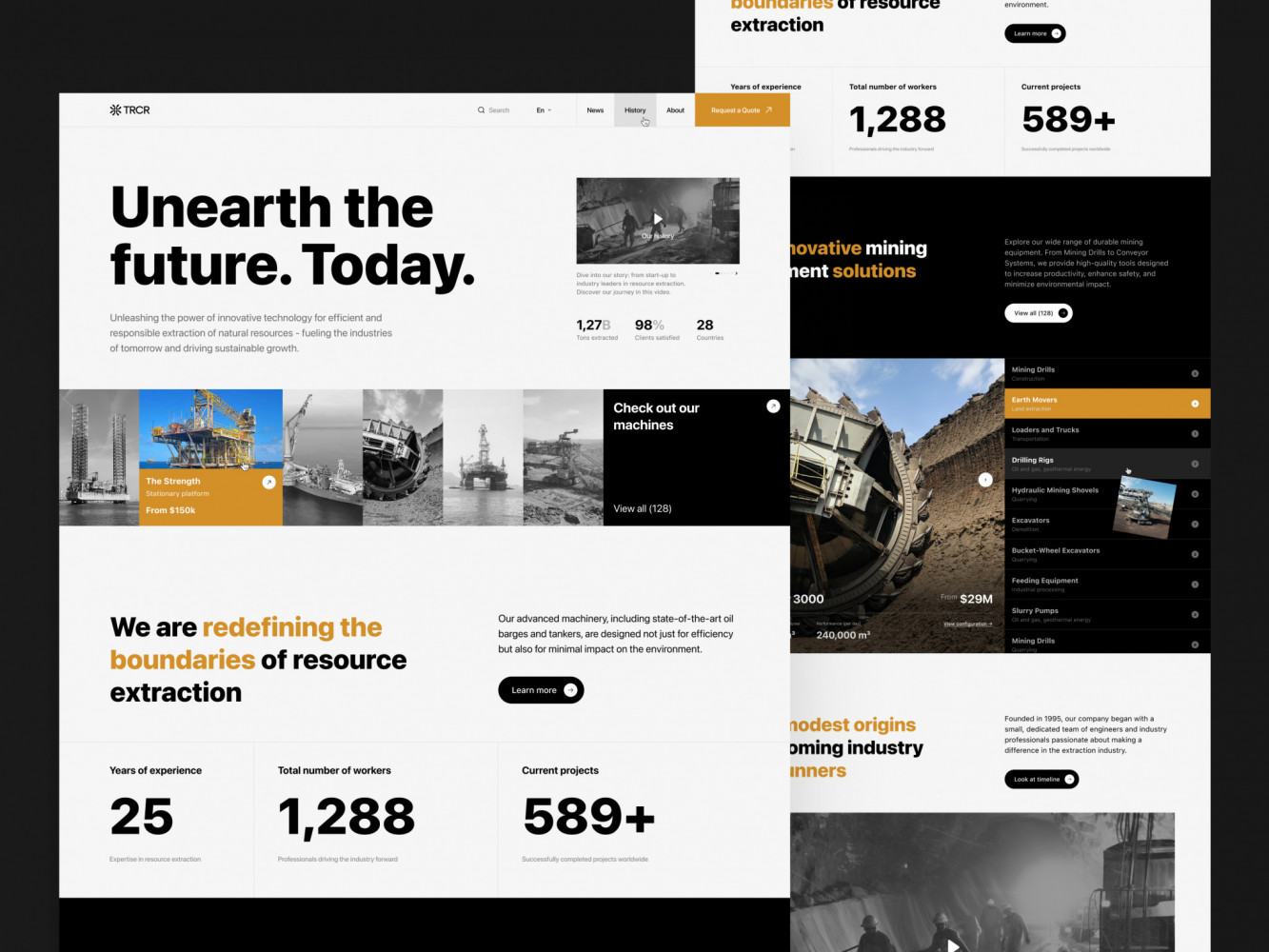
Website Design for Mining Company by Shakuro
Final Takeaway: In B2B SaaS, UX Drives Pipeline Quality
Your UX shapes how people feel about your product, and it also shapes who raises their hand in the first place.
Great design makes the right people feel understood, reducing the mental effort it takes to say “yes,” and quietly filtering out mismatches before they waste your sales team’s time.
Design That Drives Demos Is Design That Understands Buyers
When your homepage speaks directly to a RevOps manager’s daily frustration in real outcomes, you get better demos. Prospects show up already aligned with your value proposition. They ask sharper questions. They move faster.
That’s because you built a mirror that reflects your buyer’s world back at them so clearly, they can’t help but lean in. It shows up in your metrics with shorter sales cycles, higher trial-to-paid conversion, and lower churn.
UX, in this context, is a revenue multiplier. Every second shaved off load time, every ambiguous phrase replaced with plain language, and every CTA tuned to actual intent compounds into real business outcomes.
So if you’re still treating web design for B2B SaaS as a “nice-to-have” or a one-time launch task, you’re leaving money and momentum on the table.
Companies that get measurable results design experiences that sell themselves. And that starts long before the demo call. It starts the moment someone lands on your site and thinks, “Finally, someone gets it.” To build such a website, reach out to us. Let’s create a functional and responsive site that attracts qualified leads.