
For those who prefer to listen rather than read, this article is also available as a podcast on Spotify.
Contents:
Fintech products live in a very different reality from most websites. They are not there just to present a service or support a marketing funnel. They work with money, identity, and personal financial behavior. That alone changes the role of design. In fintech, UX is not decoration and not a final “layer.” It directly affects how safe a product feels, how clearly it communicates responsibility, and whether a user is willing to take the next step.
Generic design patterns are usually built for speed and universality. They aim to work “well enough” across industries. Fintech rarely has that luxury. Here, design decisions sit between business goals, regulatory pressure, and real financial risk. A signup flow for a media platform can afford to be playful and stripped down. A signup flow for a fintech product has to support verification, permissions, disclosures, and edge cases that most products never touch. These requirements change everything: how pages are structured, how forms are built, how errors are shown, and how content is layered.
There is also a different emotional baseline. People don’t explore fintech products casually. They evaluate them. They scan for signs of legitimacy. They hesitate when something looks unclear or inconsistent. Small details that might go unnoticed elsewhere—wording, spacing, loading behavior, the way data is presented—can quietly determine whether a product feels reliable or risky. Good fintech UX design works to remove uncertainty before the user can articulate it. This is why interface quality in fintech is closely tied to business outcomes. Clear flows, predictable interactions, and understandable data presentation are not aesthetic choices; they shape how effectively a product supports revenue growth and long-term user retention.
For fintech products, special UX design is therefore not about adding complexity or visual flair. It is about building interfaces that can carry legal weight, operational complexity, and human anxiety at the same time. That is why fintech website design cannot be reduced to industry-agnostic templates. It requires a separate way of thinking about structure, content, and interaction from the very beginning.
The Role of Trust in Fintech Web Design
In fintech, trust is not a branding layer. It is the foundation of every meaningful interaction. Before a user explores features, compares plans, or even reads product descriptions, they are already asking a quieter question: “Is this safe?” If a fintech product fails to answer that question quickly and consistently, no amount of functionality or marketing investment will compensate for it.
Unlike many digital products, fintech platforms rarely benefit from curiosity-driven behavior. Users arrive with caution. They are about to connect bank accounts, upload documents, move money, or rely on the product’s calculations. Every screen, transition, and message either reduces that internal resistance or reinforces it. Web design becomes one of the primary tools through which a fintech company earns the right to continue the conversation.
Why Trust Is Critical in Financial Products
Financial products operate in a high-stakes environment by default. The user is exposed to real consequences: financial loss, data misuse, regulatory complications, and long-term impact on personal security. This changes how people read interfaces. They are more attentive to inconsistencies, more sensitive to ambiguity, and less tolerant of friction that feels unjustified.
Hesitation is a natural part of fintech UX. It appears when a form asks for personal data, when a dashboard displays balances, or when a platform requests access to external accounts. Design cannot remove that hesitation entirely, but it can guide it. Clear structure, predictable flows, and precise language help users understand what is happening and why. When this understanding is missing, even technically correct products feel unsafe.
Trust in fintech is therefore built less through claims and more through experience. Users judge credibility through how calmly a product behaves: whether it explains processes, whether it anticipates doubts, whether it treats errors and edge cases with care. These are not visual preferences. They are signals of operational maturity.
Key Trust Signals in Fintech Design
Trust signals in fintech website design rarely work in isolation. They reinforce one another across visual, structural, and content layers.
Security markers are one of the most explicit elements. Compliance badges, encryption notices, regulatory references, and clear privacy communication reassure users that the product operates within recognized standards. However, these elements only work when they are placed into a coherent design system. A security certification on a chaotic or outdated interface does little to increase confidence.
Professional design execution is itself a trust signal. Visual consistency, restrained color usage, readable typography, and disciplined layouts communicate stability. They suggest that the company invests in details, maintains its product, and understands the seriousness of its domain. In fintech, “simple” design is rarely minimal. It is controlled.
Social proof also plays a quiet but important role. Case studies, institutional partnerships, client logos, and real product narratives help shift perception from abstraction to reality. They show that other organizations and users have already passed the trust threshold. When integrated naturally, these elements support credibility without turning the interface into a sales pitch.
Finally, trust is reinforced by how clearly responsibility is reflected in the interface. When a fintech website shows who controls what, how decisions are structured, and where human oversight exists, it becomes easier for users to place confidence in the product. This is closely connected to how teams define ownership inside the product itself, including what founders should control as fintech platforms scale.
At this point, it helps to look at how trust-oriented design works in a real financial product environment.
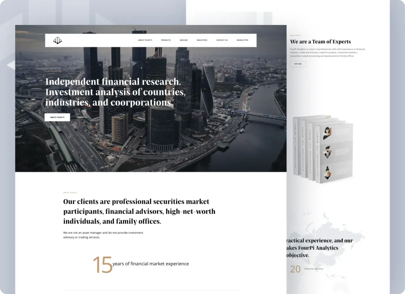
Independent Financial Analysis Company Web Design by Shakuro
Four Pi Capital is an independent financial analysis company working with financial advisors, high-net-worth individuals, and family offices. Their value is not a platform feature set. It is judgment. Interpretation. Long-term analytical credibility. Which means their digital presence had to carry a very different kind of responsibility than a typical marketing website.
The central challenge was not visibility, but legitimacy. Four Pi is not a bank, not a brokerage, and not a product vendor. Its positioning depends on perceived objectivity. The website and identity system therefore had to communicate independence, analytical depth, and distance from commercial bias before a single report was opened.
Much of the work focused on how authority is expressed through structure rather than claims. The site was designed to make the firm’s methodology, people, and areas of expertise immediately legible. Information was layered deliberately. Nothing important was hidden behind branding. Nothing promotional was allowed to overpower substance.
Visual restraint played a large role. Light themes, disciplined typography, and a measured layout rhythm were used to create a reading environment rather than a marketing surface. Reports, illustrations, and brand materials were treated as part of the experience, not decoration — reinforcing the idea that insight is the product.
Even the identity system followed the same logic. The logo and visual language were built around the firm’s internal structure and analytical nature, rather than external trends. This consistency across digital presence, reports, and physical materials created a sense of continuity that is critical in finance: the feeling that the company operates from a stable internal logic, not from positioning tactics.
Four Pi Capital is a good example of how fintech and financial brands earn trust long before users interact with any tools. When the interface, content hierarchy, and visual discipline all point in the same direction, credibility stops being something a company has to explain. It becomes something users quietly register.
In fintech, trust is not won through persuasion. It is built through design systems that consistently demonstrate clarity, restraint, and accountability.
UX Patterns That Increase Trust in Fintech Products
In fintech, trust rarely comes from what a product says about itself. It comes from how the product behaves. From the small, repeated moments where the interface proves that it is predictable, careful, and built with real financial situations in mind. Users don’t consciously audit these moments, but they feel them. Over time, those impressions accumulate into confidence.
What follows are not decorative ideas. These are UX patterns that show up again and again in fintech products that users come back to.
Transparent Communication of Security Measures
Most fintech products fail at security communication in one of two ways. They either hide it in legal language that no one reads, or they exaggerate it in a way that feels performative. Trust grows somewhere in between.
Good security UX makes protection visible at the exact moments when users are about to take a risk. When logging in. When connecting an account. When entering personal or financial data. That visibility should feel supportive, not alarming.
Calls to action matter more than they seem. “Continue” or “Submit” tell users nothing. “Verify identity” or “Connect bank account” reduce uncertainty because they describe the action in plain terms. People are calmer when they know what they are agreeing to.
Badges, certificates, and encryption notes work only when the rest of the interface deserves them. On a messy or outdated site, they look like stickers. On a calm, structured interface, they quietly reinforce credibility.
Short explanations often do more than full policies. A sentence that tells users why information is requested and how it is handled removes far more doubt than a link to a long compliance document. The UX task is not to impress. It is to make the process feel understandable.
Minimalist Design and Clear Navigation
When money is involved, visual overload quickly turns into mistrust.
Crowded screens, heavy dashboards, and competing elements force users to work harder just to understand where they are. That effort is rarely interpreted as “powerful.” More often, it feels risky.
Fintech minimalism is not about white space trends. It is about reducing the number of decisions a user has to make at once. A good fintech screen usually has a clear focal point. One main action. One primary piece of information. Everything else supports that.
Navigation plays a similar role. People don’t think in terms of product architecture. They think in goals: check a balance, review activity, move money, change access. When navigation mirrors those mental models, products feel intuitive. When it mirrors internal structure, products feel opaque.
Consistency is a quiet trust builder. When layouts behave the same way, when actions are placed where users expect them, when visual language is stable, users stop scanning and start acting. That shift—from caution to intent—is one of the clearest signs that trust is forming.

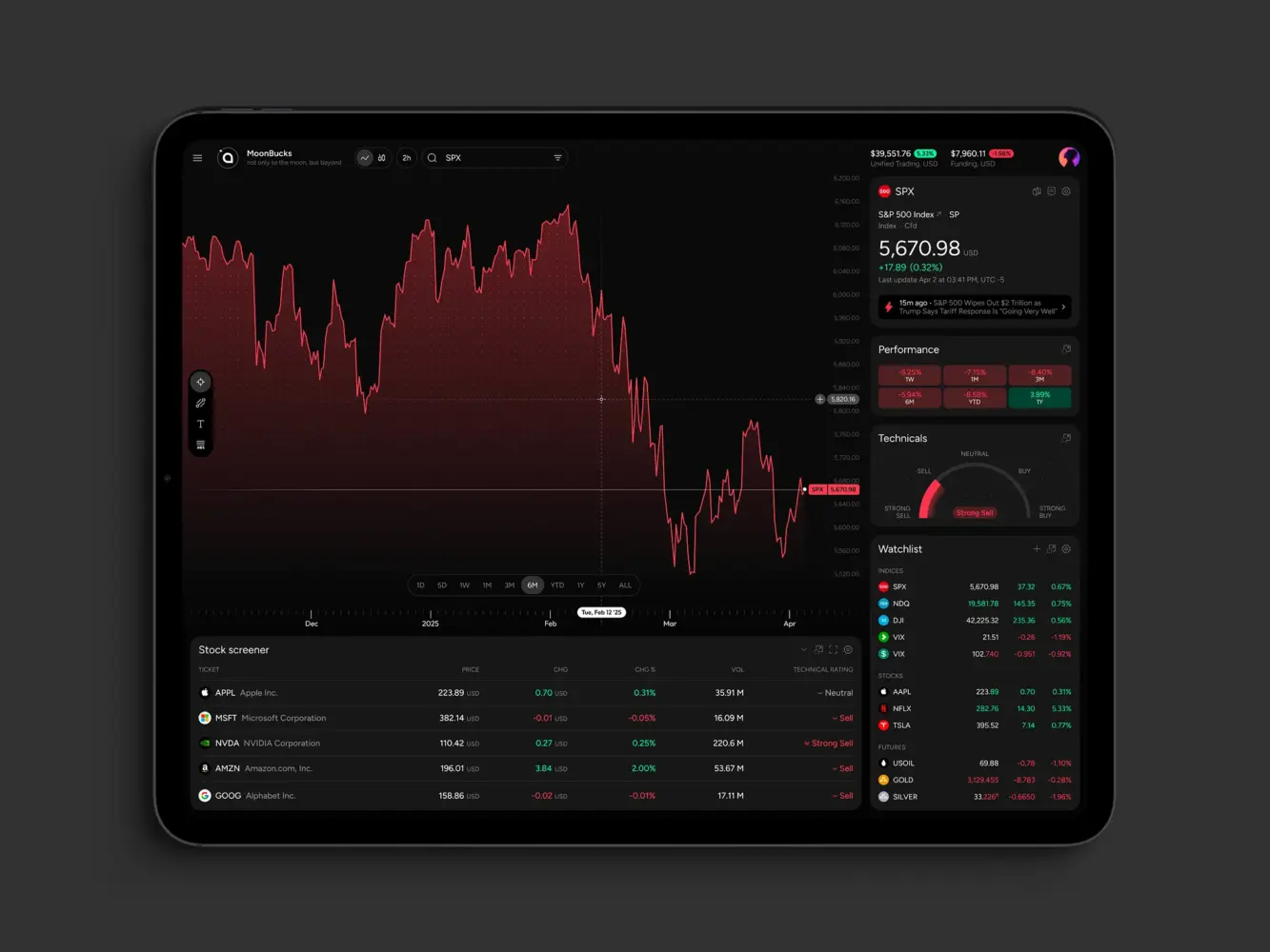
Real-Time Predictive Analytics Dashboard Design by Shakuro
Real-Time Data Accuracy and Transparency
Numbers are the product in fintech. And numbers are unforgiving.
Users might tolerate slow animations or imperfect layouts. They will not tolerate uncertainty around balances, transactions, or statuses. If something looks wrong, or unclear, or delayed without explanation, confidence collapses almost instantly.
Good fintech UX makes system behavior visible. If a transaction is processing, users should see that. If data is syncing, they should understand it. If a value changed, they should be able to trace it.
Problems rarely come from delays themselves. They come from silent delays. From numbers that freeze. From states that are not labeled. From dashboards that update without context.
Strong fintech interfaces explain themselves. They show progress. They differentiate between pending and final. They provide histories that let users reconstruct what happened. These details don’t feel like features, but they shape whether a product feels dependable.
Trust in fintech is rarely created by a single screen or message. It grows when the product consistently behaves in ways that make sense. When users stop double-checking. When they stop hesitating. When the interface becomes something they rely on instead of something they evaluate.
Compliance and Regulatory Considerations in Fintech Web Design
Fintech products don’t get the luxury of separating “design” from “regulation.” Almost every meaningful user flow is shaped by legal requirements long before visual style is discussed. Identity checks, consent, transaction monitoring, and disclosures are not external obligations. They are part of how the product works.
This is why fintech UX often feels heavier than in other industries. Not because teams want more steps, but because the product carries legal responsibility. The real design challenge is not how to remove compliance, but how to make it live inside the experience without turning every interaction into a legal encounter.
When this translation is done poorly, users feel blocked, tested, or vaguely threatened. When it is done well, regulation becomes something users accept as a sign of seriousness and protection.
Designing for Financial Regulations (KYC, AML)
KYC and AML are among the first moments when a fintech product either gains credibility or loses it.
From a user’s point of view, these steps are intrusive by nature. They involve documents, personal details, sometimes even financial history. People are willing to go through that process, but only if the product behaves in a way that feels deliberate and respectful.
Good fintech products treat verification as a process, not as a gate. They explain what is happening. They show progress. They avoid vague instructions. If a document is required, users are told exactly what qualifies. If a review is underway, users see that it is underway.
What matters most is not visual polish, but behavioral clarity. Silence, unexplained delays, or generic error messages quickly create suspicion. Clear status messages, visible steps, and specific guidance do the opposite. They make the system feel accountable.
This is also where trust and security perception are formed. When data collection feels structured and intentional, users interpret it as protection. When it feels messy or rushed, they interpret it as risk. The regulation is the same. The experience is not.
Financial Market Trading Analytics Tool Dashboard by Shakuro
Balancing User Experience with Compliance Constraints
One of the most damaging habits in fintech design is treating legal requirements as something that gets added after the interface is finished. This is how products end up with disruptive pop-ups, unreadable blocks of text, and consent screens that feel detached from what the user is actually trying to do.
Stronger products design compliance into the flow from the beginning. Disclosures appear where decisions are made. Legal explanations are written for screens, not copied from documents. Important information is separated, structured, and readable instead of buried.
This does not mean hiding obligations or softening risk. It means respecting attention. Users should be able to understand what they are agreeing to without being forced out of context.
There is also a practical side to this balance. Verification services, monitoring tools, and consent systems add technical weight. When they are poorly integrated, products slow down. Forms lag. Onboarding feels unstable. And instability is one of the fastest ways to lose confidence. This is where regulatory UX quietly intersects with page speed performance, because responsiveness is part of how users judge whether a fintech product is reliable.
The fintech products that handle compliance well don’t try to make it invisible. They make it coherent. They build it into the structure of the experience so that legal responsibility feels like part of the product’s integrity, not an obstacle placed in the user’s way.
How Fintech UX Affects Conversion and Retention
In fintech, UX is one of the few areas where product decisions show up very quickly in metrics. You see it in abandoned onboarding flows, half-finished verifications, support tickets about “missing” money, and users who register but never complete a first action. These are not marketing problems. They almost always experience problems.
People don’t usually leave fintech products because they are bored. They leave because something feels unclear, slow, or risky. The interface either carries them through that moment or gives them a reason to stop. That is why UX in fintech is tied so closely to conversion and retention. It shapes whether users move forward at all, and whether they are willing to come back.
Reducing Friction in Financial Transactions
Most fintech conversions are not one decision. They are a chain of them.
Create an account. Confirm an email. Upload a document. Connect a bank. Approve a transaction.
Each step adds weight. And with each step, the product has another chance to lose the user.
Good UX does not try to pretend those steps don’t exist. It makes them easier to complete and harder to misunderstand.
Forms are where many products quietly fail. Vague labels, confusing validation, or unclear requirements turn simple actions into stop points. When users have to guess how to format a field or why something was rejected, trust erodes fast.
Speed matters for the same reason. When a financial action is in progress, silence feels dangerous. Users want to know that something is happening and what stage it is in. Even a short delay feels longer when money is involved. Clear progress states and immediate feedback reduce the urge to refresh, resubmit, or leave.
Payments and transfers are where UX has the least room for error. If a product makes people hesitate at the moment of sending money, conversions fall and repeat usage rarely follows. Predictable steps, visible security cues, and unmistakable confirmations don’t just make transactions easier. They make them emotionally safer.
In fintech, friction is rarely about effort alone. It is about uncertainty.
The Role of UX in Customer Retention
Retention in fintech is built slowly. And it is lost quietly.
Most users don’t wake up and decide to churn. They drift. They stop checking balances. They delay actions. They begin to rely on another tool instead.
UX plays a large role in whether that drift happens.
Early experience sets the tone. Products that walk users through their first meaningful actions, explain what they are seeing, and show them how to get value reduce the sense of “figuring things out alone.” When users feel oriented early, they are more forgiving later.
Everyday experience matters even more. Clear dashboards, understandable numbers, and predictable navigation remove small irritations that accumulate over time. Each moment where the product answers a question without sending the user to support strengthens the habit of using it.
Re-engagement is also shaped inside the product. How insights are surfaced, how unfinished actions are presented, how changes are communicated — these things decide whether users return because the product feels useful, or only when something goes wrong.
Strong fintech UX does not feel impressive. It feels dependable. When users stop double-checking and start relying, conversion stabilizes and retention stops being something that has to be constantly repaired.
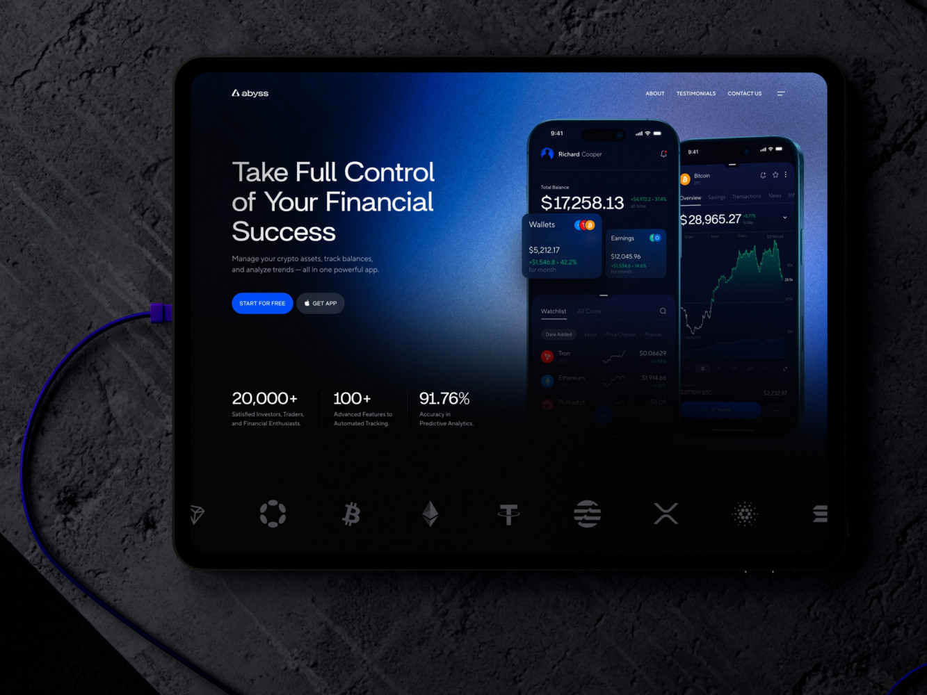
Landing Page Design for Crypto Exchange Platform by Shakuro
The Balance Between Innovation and Regulation in Fintech Web Design
Every fintech product lives between two very different forces. One pushes toward speed, simplicity, and new ways of doing familiar financial things. The other moves carefully, is written in legal language, and rarely changes quickly. Web design for fintech products ends up sitting right in the middle.
This is where many fintech products either stall or burn out. Some teams chase innovation so aggressively that compliance becomes something to patch in later. Others design so cautiously around regulation that the product starts to feel like a digital version of paperwork. Neither path produces strong, scalable platforms.
The real work happens in the space between. Where design supports progress without pretending the rules don’t exist.
Staying Ahead of the Curve While Being Compliant
The fintech products that move fastest are often the ones that take regulation most seriously.
Not because they love constraints, but because they build around them instead of reacting to them. When compliance is treated as a late-stage requirement, every new feature becomes painful. Flows have to be rebuilt. Interfaces grow heavier. Design slows down.
More durable products start from the opposite direction. They invest early in stable foundations: onboarding structures, consent models, verification logic, and data handling patterns that are meant to last. Once those pieces are clear and reliable, teams gain freedom on top of them.
From a web design point of view, this usually means deciding very deliberately what should not change often, and what can. Identity and security flows stay familiar. Legal structures remain consistent. Around those anchors, teams test new layouts, new guidance patterns, new ways of presenting information and supporting decisions.
This kind of innovation feels quieter, but it compounds. Users don’t have to relearn the product. Trust is not reset every release. The interface evolves without breaking the mental model people already have.
Future-oriented fintech UX is less about surprise and more about continuity. New features make sense because the product still behaves like itself. New services fit because the structure was designed to grow.
In fintech, the products that keep moving are rarely the ones that try to outsmart regulation. They are the ones that design with the expectation that it will keep changing — and build systems that can change with it.
How to Ensure Your Fintech Website Is Future-Proof
Most fintech websites are built around the product as it exists today. The problem is that fintech products rarely stay in one shape for long.
New features appear. New compliance layers are added. Markets expand. Positioning shifts. What once worked cleanly starts to feel tight. And suddenly the website that supported growth becomes one of the things slowing it down.
A future-proof fintech website is not one that predicts trends. It is one that can change without falling apart.
UX Systems That Evolve With Your Product
The biggest difference between fragile fintech websites and durable ones is structure.
When pages are designed one by one, growth turns into a patchwork. New features don’t quite fit. New disclosures don’t quite belong anywhere. Navigation gets heavier. Content piles up. Over time, even simple updates become risky.
Stronger fintech sites are built from systems. Reusable blocks. Stable layout logic. Clear rules for how new elements are introduced. Not because it looks cleaner, but because it gives teams somewhere to put things when the product evolves.
Good systems allow onboarding to expand without being redesigned. They allow dashboards to accept new data without becoming unreadable. They allow legal content to grow without swallowing the interface.
This kind of structure also matters commercially. As fintech products mature, websites often have to support new acquisition models: partnerships, institutional clients, longer sales cycles. When the foundation is solid, teams can introduce new flows, pages, and narratives that support B2B demos without turning the site into a collection of disconnected sections.
In practice, this is what makes the difference between a site that ages and a site that develops.
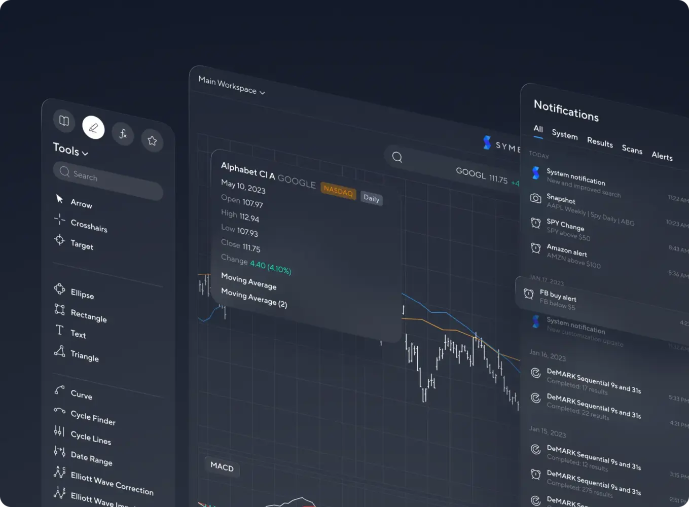
Professional Trading Analysis Platform Design by Shakuro
A good example of what long-term structure looks like in practice is Symbolik—a professional trading analysis platform built around Tom DeMark’s market methodology.
Symbolik was never a single interface problem. It was an ecosystem: a charting platform traders use to make real decisions, a growing social layer, and a brand environment that needed to evolve alongside a technically complex product. The work wasn’t about refreshing a site. It was about rebuilding the product’s design foundation so it could keep growing without becoming fragmented.
The charting workspace sat at the center of everything. This is where users spend most of their time, and where even small UX issues become expensive. The redesign focused on clarity, structural logic, and internal consistency—not as aesthetic goals, but as conditions for expansion. New tools, indicators, and features were expected to arrive. The interface had to be able to accept them.
Instead of designing pages, the work concentrated on systems: how components behave, how information scales, how patterns repeat, and how new parts of the platform plug into what already exists. Brand elements, product UI, and platform logic were treated as one evolving environment.
Symbolik is the kind of product that changes while people are using it. That only works when structure comes before decoration. When web design for financial services is built as product infrastructure, not as a layer on top of it, growth stops being a redesign problem and becomes a controlled process.
Continuous User Feedback and Iteration
No fintech website stays relevant just because it was well designed once.
Financial products change too quickly. Regulation shifts. User expectations adapt to other tools. What felt clear two years ago may quietly become confusing.
This is why real user feedback matters so much in fintech. Not opinion. Not internal reviews. Actual observation of how people move through the site, where they hesitate, what they misread, and where they stop.
Fintech usability problems often don’t announce themselves. People rarely complain that a verification step felt wrong. They abandon it. They rarely explain that a dashboard confused them. They stop using it.
Regular testing exposes these weak points early, while they are still easy to fix. It is especially important around regulated flows, where teams are often too close to the logic to see how it looks from the outside.
Iteration is also what keeps fintech websites aligned with compliance. As wording needs to change, as steps are added, as responsibilities shift, sites that are already built to evolve absorb these updates without trauma.
Future-proof fintech websites are not the most dramatic ones. They are the ones that quietly adjust. They change often, but never radically. They improve without forcing users to relearn the product.
In fintech, that kind of continuity is what allows both trust and growth to compound.
Final Takeaway: Trust and UX Are Your Fintech Product’s Currency
Fintech products don’t compete only on features. They compete on credibility.
Most platforms today can offer similar functions: transfers, cards, dashboards, analytics, automation. What users actually compare is how safe, clear, and reliable those functions feel. Whether the product behaves in a way that makes them comfortable linking accounts, relying on balances, and returning week after week.
This is why trust-focused fintech web design is not a secondary concern and not a surface-level investment. It becomes part of the product’s value. It shapes whether people are willing to start, whether they finish what they begin, and whether they stay.
Over time, trust compounds. And fintech UX design is the mechanism through which that trust is either built or quietly lost.
How Web Design Becomes a Differentiator in Fintech
There is a visible difference between fintech products that look good and fintech products that feel solid.
Design that only focuses on visuals can attract attention. Design that focuses on behavior builds confidence. The second is what supports real growth.
Products that win in fintech are rarely the flashiest. They are the ones that feel controlled. Interfaces where actions make sense. Where numbers are understandable. Where processes are explained. Where nothing important feels hidden or unstable.
This is where website design becomes a competitive advantage. Not as branding, but as product infrastructure. When UX supports trust, compliance, clarity, and scale at the same time, it stops being an expense and starts functioning as a growth system.
This is also where experience across complex digital products matters. Fintech surfaces edge cases that only teams familiar with high-stakes platforms, regulated environments, and data-heavy systems tend to anticipate. Shakuro brings that kind of broad product experience into fintech work, applying patterns learned from building complex web platforms to financial products where trust, stability, and clarity are non-negotiable.
If your current website was built around presentation rather than product reality, it may already be limiting how your fintech platform is perceived and adopted. Working with a team focused on fintech web design allows you to address structure, behavior, and trust together instead of retrofitting them later.
In fintech, trust is not messaging. It is an experience. And UX is where that experience is shaped.