In the competitive landscape of fintech, the pressure to deliver an engaging and user-friendly app has never been greater. You are often caught in a whirlwind of challenges — balancing innovative features with the need for compliance, ensuring security without compromising usability, and creating visually appealing designs that resonate with users from diverse backgrounds. As the demand for seamless digital financial solutions grows, so does the expectation for a flawless user experience.
Contents:
But how do you navigate these complexities? How to create a fintech app that meets regulatory standards and captivates users? In this article, we will uncover the top practices in fintech app design, equipping you with strategies to overcome common hurdles and elevate your product. Read on to unlock the secrets to designing an application that stands out and delivers exceptional value to your users.
Why design is important for financial apps
There is the classic Stanford Web Credibility Project — a study conducted by the team from Stanford University Persuasive Technology Lab that wants to find out what factors make people believe in the content they see on the web, and what motivates and influences them. One of the most important ones is the design with 46.1% of respondents highlighting its influence on their decisions.
So, having a responsive and easy-to-use design for your fintech app is crucial. Here are a few more reasons for you to consider spending resources on UI/UX design:
- User Trust and Credibility
An aesthetically pleasing and professionally designed app instills confidence in your target audience. And users need to feel secure and confident when they work with sensitive financial information.
- Enhanced Usability
When designing a financial app, you often need to present complex information and functionalities in a glanceable way. A well-thought-out design simplifies navigation and enhances user experience. Users understand features quickly and perform transactions without confusion, reducing frustration and abandonment rates.
- User Engagement
Engaging designs not only attract people but also keep them coming back. Think about incorporating appealing visuals, personalized dashboards, and gamified elements to create a more compelling experience. This will motivate the users to interact more frequently with the app.
- Differentiation in a Crowded Market
With numerous financial apps available, standing out is essential. A unique and sophisticated design can serve as a differentiator, setting your app apart from competitors. Even if you lack some pro features, users might choose your product because of a delightful visual and functional experience.
- Accessibility
To embrace a larger audience, your financial app needs to be accessible to all users, including those with disabilities. Following design principles that prioritize inclusivity allows everyone to interact with the app without barriers, ultimately expanding your user base.
- Clear Communication
Financial information can be intricate. Effective design communicates data clearly and concisely, using visual hierarchies, icons, and infographics. This not only aids understanding but also empowers users to make informed financial decisions.
- User Retention and Loyalty
A seamless and enjoyable experience fosters user loyalty. When people feel comfortable using your app, they are more likely to stick with it over time and recommend it to others — crucial for growth in the competitive fintech space.
Investing in thoughtful design for financial apps is not just about aesthetics; it’s about enhancing user experience, building trust, and ultimately driving business success. In a world where finance meets technology, exceptional design is a powerful tool for creating lasting relationships with users.
Let’s look at the techniques that can be of service based on our experience as a mobile app development company.

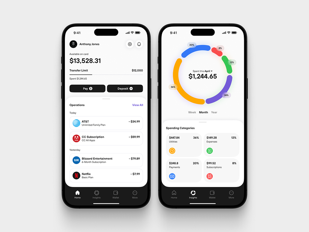
Finance Management Mobile App Design by Conceptzilla
How to design personal finance apps: Best practices
What factors do users take into account when deciding on which app for personal finance to use and which not to? There are a lot of them: from how clear the onboarding is to what extent the developers are open to feedback. The main ones are:
- Ease of data entry
- Accounting flexibility
- Joint/family accounting feature
- Debt control
- How detailed the reports are and how they look
- Availability of backup
- Synchronization between different devices.
With a thought-out finance mobile app design, you can leverage these factors and conquer the place in the app store charts. Now, let’s switch to the best practices to design a fintech app.
Keeping the functionality rich (without overdoing it)
For any product to be successful, it has to have a substantial user base. For that, it has to offer something that addresses a user’s pain points and makes their lives considerably better.
What functions to choose and how to make your solution unique depends on your target audience and the results of your market research where you study users’ needs, wants, and preferences and your competitors.
This is where we come to the first rule: user-centric design. You need to prioritize features that solve real problems and enhance the user experience. Conduct the target audience research and feedback sessions to identify essential functions. Also, a wise move is to research your competitors, pick crucial features, and implement them in a better way.
However, do not rush to integrate all the cool features you find. You will disperse your resources with quality going down drastically. Instead, start with core functionalities that provide immediate value, then gradually introduce additional features that complement the main offerings. Even though a rare person is going to use all functions at once, the important thing is that if the need arises in the future, they wouldn’t have to start over with another finance management app.
You can also consider modular features that users can opt into. This allows each person to customize their experience, choosing only what they need without cluttering the app.
Focusing on security
Security is an aspect that is omnipresent at every stage of personal finance app development.
You’ll have to bombard your users with several personal questions and ask them for permission to access some very sensitive information, so pay attention to how you are going to do it and what you are going to do with this data afterward.
One other thing is that it’s vital to provide a quality level of safety from a technical standpoint and show users that you did. Design elements should communicate security. Let them know that you have taken all the necessary precautions and that you care, otherwise, they wouldn’t even know it in the first place. Use familiar security symbols (like padlocks) and clear language to reassure users that their data is protected.
For example, if there are additional log-ins required that may hamper the smoothness of the process, tell users why things are as they are and how it’s going to help them feel safer and more secure in the future. During onboarding, educate users and highlight security features and best practices, such as using strong passwords or enabling two-factor authentication (2FA).
Provide notifications about every important event so that they won’t feel left alone. Ease their anxiety. When security-related issues arise (e.g., login failures), provide clear, friendly error messages. Avoid technical jargon and guide users on how to resolve issues without causing frustration. With the right respectful copy that shows the advantages, you can turn anything in your favor.
Generally speaking, avoid making security feel cumbersome, which can deter users from using important features..
Maintaining simplicity and actionability
Detail overload is a classic scourge of financial products. Either way, there is going to be a lot of data in your app, it’s a feature of any financial product, and it’s inevitable.
The point is in how you arrange it. It’s very easy to create something packed with data to the brim and thus succumb to the usual pitfalls and make users feel uncomfortable. A tiny mobile screen doesn’t help with the arrangement at all. A lush dashboard that looks great in a web interface is totally off the mark on a mobile screen.
A well-designed finance app looks minimalistic and straightforward, making its user feel like everything is OK, and that finance management is simple too. Complexity is exactly what people try to avoid in their day-to-day routines. However, minimalism is not about flat colors and shapes, it’s more about how you structure information in your product. Best finance apps have everything at the tips of your fingers.
Simplify forms by reducing the number of fields and using smart defaults or auto-fill options. Group related information together to enhance readability and ease of completion.
The same goes for navigation. Implement intuitive navigation that allows users to find what they need quickly. Leverage familiar icons and labels, and ensure that critical actions are one tap away.
Make everything meaningful. If your personal budget app can do a thing, even a complex one, there’s no value in it until it means something to a user. What’s more, apart from being simple and meaningful, the budgeting app you develop would look better if it presents data in actionable formats, i.e. telling users what to do next.
Successful financial projects guide their users from beginning to end. It’s advisable to provide helpful and informative onboarding while developing a personal finance app and even a training session. Think about video games and how everything is based on progression. First, you learn how to move, then how to solve quests. Present information and features in the same way in your app. Show only the necessary options at first, revealing additional details as users engage further, thus preventing cognitive overload.
The real-life case example is the Solio app: it’s aimed at amateur traders, so we strived to create an easy-to-use design with numerous integrations and automation. We had to pack robust functionality and complicated infrastructure into a familiar interface and mechanics.

Solio home screen by Shakuro
One of our solutions was changing the Home layout. Dashboards appear on the home tab of Korean stock trading applications, showing that analytical functions are an inherent element of them. However, this sort of data presentation is too sophisticated for novices and non-essential for advanced users. Instead, we stressed the balance and individual performance of the client’s stocks.
Combating the lack of motivation
Managing finances is the dullest everyday aspect of them all. People aren’t usually excited about these things and may have trouble with their motivation. That’s why you have a task to make the product look more welcoming, and the user experience more enjoyable to give people a reason to return.
A part of mobile app design for a finance app is using the power of positive reinforcement. Tell people when a decision helped them save money, and make them feel proud. Try to turn it into a new healthy habit that people would stick to with the help of your application as a helper and guide. People prefer to use things that make them feel great about themselves.
Add goals and objectives to your money management app. Today’s culture is all goal-oriented, we are used to them from childhood and continue to set them for ourselves later in life and receive positive emotions upon their achievement. Analyzing the spending is just the beginning.
Introduce gamification features such as badges, points, and rewards for completing tasks. These elements can make financial tasks more engaging and provide users with immediate gratification. At the same time, there is a thin line: the finances are a serious matter. Don’t turn something that people’s lives depend on into a complete game. Users should remain conscious about what exactly they do with their money, what the consequences might be, and how it can affect them.
Choosing the right colors
Financial app developers prefer to use a deep color palette to convey important actions and information by associating them with color hierarchy.
For example, using a variety of different shades of color you can show what data is of more importance or is a part of another entity. Different colors mark the nature of the message, for instance, applying orange for warnings and blue for reminders. Develop a primary color palette complemented by secondary colors that can be used for accents. This approach allows flexibility while maintaining a unified look.
Colors can say a lot about your product without you even knowing it. The right palette can enhance user engagement, build trust, and effectively communicate the brand’s values. It’s habitual to use the following colors for financial products:
- – Trust and Security: Blue is often associated with trust, calmness, and reliability, making it a popular choice for fintech applications. It conveys professionalism and promotes user confidence.
- – Energy and Action: Red can evoke feelings of urgency and energy. Use it sparingly for alerts or calls to action, ensuring it stands out without overwhelming users.
- – Growth and Prosperity: Green symbolizes growth, wealth, and balance. It’s frequently used in financial applications to represent prosperity and financial health.
Gradients are still popular. UI/UX designers use them because of their ability to add more depth to flat design and heighten the level of creativity and appeal. The abundance of techniques and richness of UI will psychologically make users want to explore your app more.
When developing a palette, think about people with visual impairments or color blindness – it will help you reach a wider audience. Ensure a high contrast ratio between text and background colors for readability. Also, opt for color combinations that are distinguishable for all users. Utilizing texture or symbols alongside color can enhance clarity.
If you plan to conquer the worldwide market, be aware of cultural differences in color perception. For example, while white signifies purity in many cultures, it may represent mourning in others. Understand your target audience and adapt color choices accordingly.
When working on the Zad mobile investment platform, our designer team familiarized themselves with the tenets of Shariah law, because the app is aimed at the Middle East. So both UI/UX design and financial features had to be Shariah-compliant.

ZAD app by Shakuro
Customizing and personalizing
Customization means letting users leverage your app the way they would prefer to. This includes not just day or night theme, but also budget details, limits, field names, etc.
You can use cutting-edge technologies like AI, machine learning, and other automation options to offer personal recommendations, insights, and alerts. Tailored tips based on the user’s spending habits helped them stay engaged. Also, when working on the onboarding process, try adapting it to the user’s financial situation and goals, making the app feel more relevant and motivating right from the start.
Challenges in fintech app design
- Regulatory Compliance
Navigating the complex landscape of regulations is critical, especially if you go for the worldwide market. You must work closely with legal teams to ensure that the app adheres to financial regulations, data protection laws, and anti-money laundering (AML) requirements.
- Security Concerns
User trust is paramount in the financial industry. Fintech apps must incorporate robust security features, including encryption, two-factor authentication, and secure payment processes while maintaining a seamless user experience.
- UX Complexity
In fintech app development, you often deal with data-heavy layouts. Creating a user-friendly interface that simplifies complex data and provides rich functionality can be challenging.
- Accessibility and Inclusivity
Designers need to ensure the app is accessible to a diverse user base, including those with disabilities or varying levels of tech-savviness. This involves creating intuitive navigation and accommodating different language preferences.
- Transparency
Building user trust requires transparency in all dealings. Find ways to communicate complex financial concepts in clear, understandable terms, ensuring that users feel informed about their decisions.
- Mobile Optimization
The global mobile user base is expected to reach 7.49 billion by 2025. As many people rely on mobile devices for financial transactions, ensuring the app is fully optimized for mobile experiences across various screen sizes and operating systems is essential.
- Continuous Updates and Iteration
The fintech sector is evolving rapidly. To stay with the flow, you need to release continuous updates and iterations of the app to incorporate new features, enhancements, and compliance changes based on user feedback and emerging technologies.
Trends in fintech app design
To win a place under the sun, it’s wise to follow the latest trends in the financial industry. Using the engaging design + trendy features combo, you will for sure attract your target audience. Here is what you can implement:
Artificial Intelligence and robo-advisors
According to McKinsey, AI adoption in various businesses spiked to 72% this year, meaning it is a must-have in a fintech app. Just like we said earlier, smart algorithms can analyze lots of data and provide personalized recommendations for each unique user. What’s more, it can assess the creditworthiness of applicants. This leads to more accurate risk assessments and smarter lending decisions, reducing the risk of defaults.
In investment strategies, AI analyzes market trends and data at lightning speed, facilitating algorithmic trading. This technology allows for the execution of trades based on pre-set criteria, maximizing investment opportunities.
Alternatively, you can leverage AI-powered chatbots to offer instant assistance to users. They handle common inquiries, troubleshoot issues, and guide people through complex processes, improving overall customer experience.
Open Banking
Open banking is a transformative trend in the financial technology sector that allows third-party developers to access banking data through Application Programming Interfaces (APIs). This approach is reshaping how consumers and businesses interact with financial services.
With open banking, users can view all their financial accounts in one place. This aggregation allows for better financial management, offering insights into spending habits, savings goals, and investment opportunities. It facilitates faster and more secure payment methods.
De-Fi
Decentralized Finance (DeFi) is an emerging trend within the fintech landscape that leverages blockchain technology to recreate and enhance traditional financial services in a decentralized manner. It aims to make financial systems more open, transparent, and accessible to everyone, removing intermediaries like banks and financial institutions.
DeFi applications utilize smart contracts—self-executing contracts with the terms of the agreement directly written into code. This eliminates the need for intermediaries, helps automate processes, and enhances security and efficiency.
Proptech
Proptech, short for property technology, encompasses a variety of digital solutions and platforms aimed at improving the way we buy, sell, manage, and invest in properties. Blockchain is increasingly being utilized in Proptech for recording property transactions, ensuring transparency, and reducing fraud. It can also streamline processes related to title transfers and lease agreements.
Conclusion
Financial fitness starts with being aware of how much you have and how much you (are going to) spend. The ability to handle and understand financial flow is paramount for any person who wants to keep and multiply. However, discipline and diligence are not so easily found nowadays. The good news is that budgeting apps can do it for you with relative ease.
Design trends change over time so be ready to use the emerging ones in the future to keep your product’s quality. Although there are things that are always welcome in apps for finance management: intuitive interface, flexible settings, and decent functionality of the free version.
We can help you create a personal finance app like this. Contact us and let’s work on your next product together.
* * *
This article was originally published in January 2021 and was updated in August 2024 to make it more relevant and comprehensive.

