
For those who prefer to listen rather than read, this article is also available as a podcast on Spotify.
Contents:
For a long time, a responsive website was enough for most online stores. If it worked well on a phone and didn’t break during checkout, nobody worried about much else. That assumption is slowly disappearing. For many brands today, the phone is where the real relationship with the customer lives.
A mobile app changes how often people return. Once it’s installed, the store stops being something users look up and becomes something they open. That sounds like a small shift, but it has very real consequences for retention. Fewer steps between “I need this again” and a purchase usually means more repeat orders.
There’s also a practical business angle. Websites depend heavily on search, ads, or reminders from outside channels. Apps don’t remove those completely, but they reduce the reliance. You get a direct line back to people who already chose to stay close to the brand.
The Mobile Shopping Boom
E-commerce mobile app development didn’t take off in one dramatic wave. It crept up over the years as smartphones became the default device for everyday things. First browsing moved to mobile, then product research, and eventually purchases followed.
What changed along the way was user behavior. People don’t sit down for long shopping sessions as often anymore. Instead, they interact in short bursts—checking something on the way somewhere, revisiting a saved product later, finishing a purchase when it feels convenient. These fragmented sessions add up.
This pattern favors stores that are easy to return to. If reopening the shop takes effort, people postpone it. If it’s one tap and everything is still there, they continue where they left off. That dynamic alone explains why many growing brands start thinking seriously about mobile app development for e-commerce once repeat customers become a meaningful part of revenue.
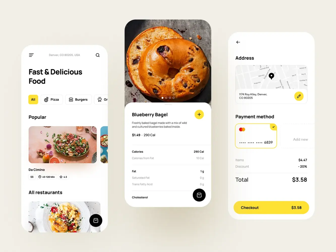
Food Delivery App by Shakuro
Mobile Apps vs Mobile Websites: Why Apps Win
Mobile websites still carry a lot of weight. They’re accessible, searchable, and often the first touchpoint. But familiarity changes expectations. Once someone buys more than once, convenience starts to matter more than accessibility.
Apps tend to feel more stable in everyday use. They open quicker, keep users signed in, and don’t rely as much on perfect connectivity. The experience is simply more consistent. That consistency builds trust in small, almost invisible ways.
Continuity is another difference. In an app, browsing history, saved items, and preferences usually stay intact. Returning users don’t have to rebuild context every time. That makes follow-up actions—reorders, wishlist purchases, finishing abandoned carts—noticeably easier.
Speed plays into this more than most teams expect. On mobile, even small delays feel bigger. If product pages hesitate or checkout drags, people drop off without much hesitation. That’s why experienced teams treat mobile app performance optimization as groundwork, not polish.
There’s also a behavioral shift after installation. Customers stop treating the store as a place they occasionally visit and start treating it as something that’s just there when needed. In e-commerce, that change alone often justifies the move to an app.
Key Features Every E-Commerce Mobile App Must Have
Once you get past the “we need an app” phase, the next trap is overbuilding it. Teams often try to pack everything in from day one—loyalty systems, social layers, complex personalization. Most of that can wait. The apps that age well usually start with a tight core and expand later.
There are a few features that consistently show up in mobile app development for e-commerce. Not flashy ones—just the things users actually rely on.
Cinema Booking Ticket Mobile App by Shakuro
1. Easy-to-Navigate Product Catalog
If something goes wrong here, nothing else really saves the experience. The catalog is where people spend most of their time, so it has to feel obvious.
Users shouldn’t have to learn how your store works. Categories should make sense at a glance. Filters should behave predictably. Search should tolerate imperfect queries. The less thinking required, the longer people stay in browsing mode.
Product pages follow the same logic. Price, sizes, availability, delivery info—all of it should be visible without digging. When basic details are hidden behind tabs or collapsible blocks, users bounce faster than teams expect.
Good catalog UX doesn’t look impressive in demos, but it shows up clearly in metrics. When navigation is clean, people view more products, and that alone moves conversion.
2. Secure Payment Integration
Checkout is where hesitation shows up. You can get everything else right and still lose the sale here.
In practice, “secure” often means “familiar.” People trust payment methods they already use elsewhere. Supporting Apple Pay, Google Pay, and strong local options usually matters more than inventing new flows.
The process itself should stay short. Fewer steps, fewer surprises. Unexpected redirects or extra verification layers tend to kill momentum, especially on mobile where attention is fragile.
There’s also a psychological layer. Most users won’t evaluate technical security, but they instantly notice friction. A checkout that feels calm and predictable builds more trust than any visible security badge.
3. Personalized User Experience
As soon as the catalog grows, relevance becomes the real challenge. Endless lists stop working, especially on smaller screens. People expect the app to help them narrow things down.
At the simplest level, this means remembering behavior. Recently viewed products, smarter sorting, recommendations that aren’t random. Even small touches make the app feel more responsive.
More advanced setups lean on machine learning, but it doesn’t have to start there. Many teams begin with basic behavioral logic and layer in smarter models later. The real shift is moving from a static storefront to something that adapts over time. As products evolve, this direction becomes harder to ignore—especially in integrating AI and machine learning into mobile apps.
The main thing is not overdoing it. Personalization should make the app feel intuitive, not unpredictable.
4. Push Notifications for Customer Retargeting
Push is one of the few built-in advantages apps have. It’s also one of the easiest things to ruin.
When it works, it feels helpful. Order updates, delivery progress, back-in-stock alerts—these make sense and rarely get disabled. They tie directly to user intent.
Where teams go wrong is volume. Generic promos and constant reminders train users to mute notifications altogether. Once that happens, it’s hard to win attention back.
The better approach is restraint. Fewer messages, better timing. Notifications should feel like nudges, not broadcasts. In mature apps, push becomes less about marketing blasts and more about staying quietly useful in the background.
Design Considerations for Mobile E-Commerce Apps
In e-commerce app design, problems rarely fail loudly—they slip through. A screen feels slightly crowded, a button sits in the wrong place, a step takes longer than expected—and people just stop. They don’t complain, they leave. That’s why most UX gains come from removing small points of friction rather than introducing big visual ideas.
The apps that convert well usually feel calm. Nothing fights for attention, nothing feels heavy, and moving forward never requires effort. When the interface stays out of the way, people keep going.
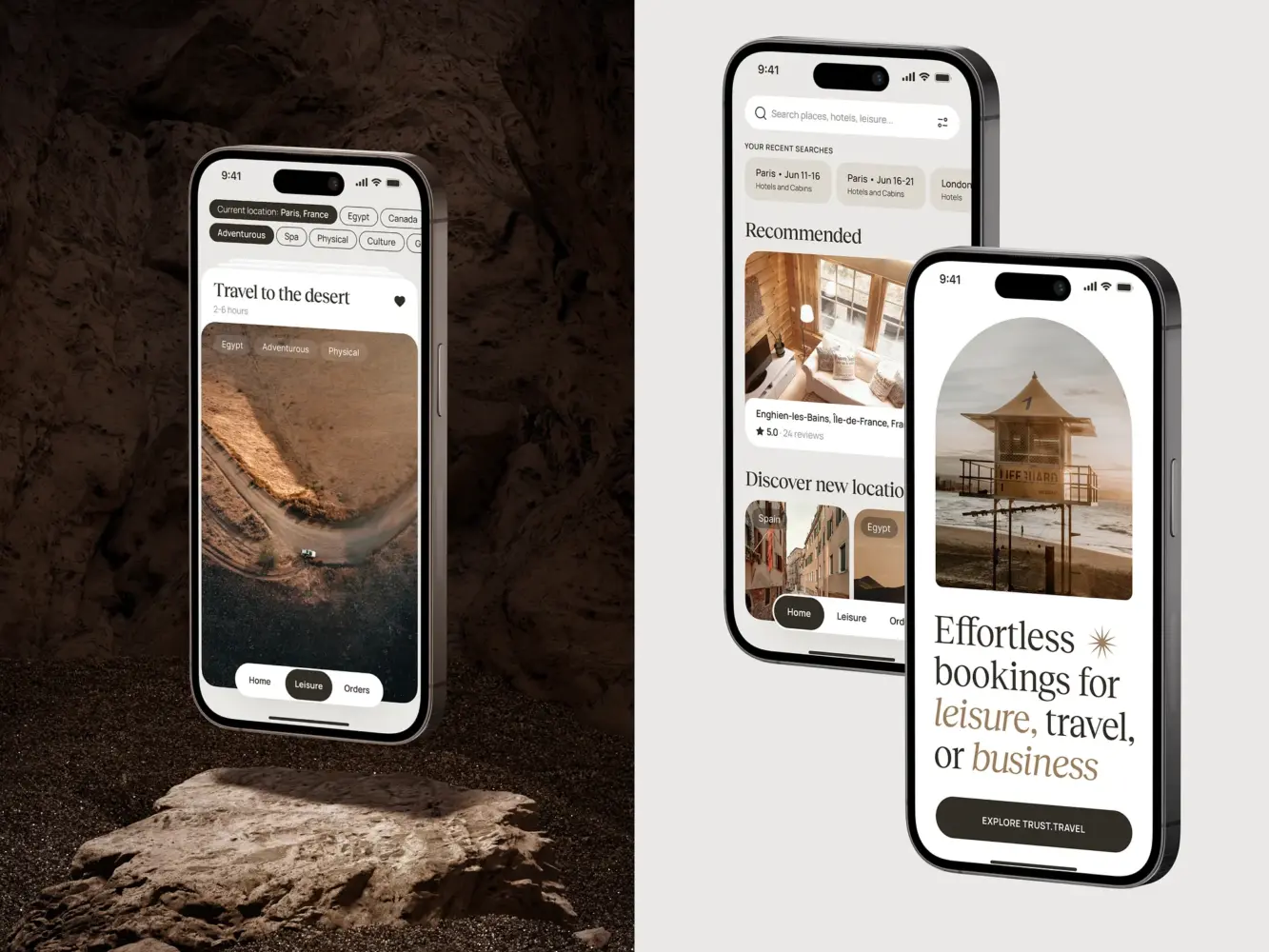
Travel Booking Mobile App Design by Shakuro
1. Mobile-First Design
Mobile app development for online stores means accepting constraints early. A phone screen doesn’t forgive excess. If too much is happening at once, the experience immediately feels tense.
Strong mobile interfaces tend to look slightly underdesigned at first glance. More space, fewer competing elements, clearer structure. That restraint is usually intentional. When users don’t have to decode the screen, they move faster.
Touch changes the rules as well. Buttons need breathing room, scrolling should feel natural, and interactions should tolerate imprecision. What looks fine on a large monitor can feel frustrating on a phone within seconds.
Teams that genuinely start from mobile app often end up with cleaner products overall. Not because they simplify for aesthetics, but because constraints force sharper decisions.
2. Streamlined Checkout Process
Checkout is where design stops being theoretical. Every extra second, every unnecessary tap shows up in conversion.
The strongest flows feel uneventful. A clear sequence, no dead ends, no moments where users wonder what just happened. If someone has decided to buy, the interface shouldn’t slow them down.
Typing is the biggest source of friction here. Long forms and awkward validation break momentum fast. Autofill, fewer fields, and predictable steps do more for conversion than most visual tweaks.
There’s also a subtle shift that happens in good apps: the UI gets quieter near checkout. Less noise, fewer distractions, more focus. Many teams eventually notice that refining this part of the flow moves revenue more than large redesigns—the same idea that comes up often when discussing conversion-focused product design in practice.
3. High-Quality Product Images and Descriptions
On mobile, visuals carry a lot of responsibility. Without the ability to touch the product, people rely heavily on what they see.
Clear, zoomable images help reduce hesitation. Close-up details, different angles, real-life context—all of that builds confidence. Weak visuals do the opposite. Even good products feel questionable when photos look flat or compressed.
Descriptions play a quieter role but matter just as much. The key is clarity. Materials, sizing, compatibility—the details people look for when they’re close to buying. Dense text blocks rarely work well on small screens, so structure becomes part of usability.
When images and descriptions are handled well, users spend less time second-guessing. They understand what they’re buying, and decisions come easier. In mobile app development, that usually translates directly into better conversion and fewer returns.
How to Ensure Fast and Secure E-Commerce Mobile Apps
In mobile shopping app development, speed and security shape how the app feels more than people realize. Users don’t usually analyze either one, but they react to both immediately. If something loads slowly, the whole product starts to feel shaky. If anything around payments feels strange, trust drops fast.
Neither of these areas is very visible when done right. They only stand out when something breaks. That’s why teams that take mobile seriously deal with them early, not after launch. Here are some of the best practices for mobile e-commerce apps.
Optimizing for Speed and Load Time
On mobile, delays feel heavier. A second or two might not sound like much, but during browsing it’s enough to interrupt the flow. People rarely wait to understand why something is slow—they just move on.
Speed isn’t only about raw numbers. It’s more about rhythm. Screens opening without hesitation, scrolling that doesn’t stutter, transitions that feel instant. When that rhythm holds, the app feels dependable. When it doesn’t, users notice right away.
A lot of slowdowns come from familiar places. Oversized product images, too many things loading at once, screens trying to do more than they should. Often it’s not one big issue, but a handful of small ones stacking together.
Teams that care about performance tend to stay conservative here. Load what’s needed first, push the rest back, keep screens lighter than they look in design files. The goal isn’t technical elegance—it’s keeping users moving without pauses.
Securing User Data and Payments
Security behaves differently. If speed affects comfort, security affects trust.
In mobile app development for e-commerce, most of the heavy lifting still comes from fundamentals. Encrypted connections, reliable payment gateways, careful handling of personal data. These aren’t advanced features, but skipping them isn’t an option.
What matters just as much is how security feels. People don’t inspect protocols, but they pick up on signals. Recognizable payment methods, straightforward checkout, no unexpected redirects—all of that builds quiet confidence.
There’s also a balance to get right. Too little protection is obvious, but too many verification steps can feel just as wrong. When payment flows become tense or confusing, users start doubting the whole experience.
As apps grow, security usually grows with them. What starts as basic protection turns into broader work around data storage, permissions, and compliance. On paper, security sounds straightforward. In production, it rarely is—which is why mobile app security and protecting user data is worth understanding early.
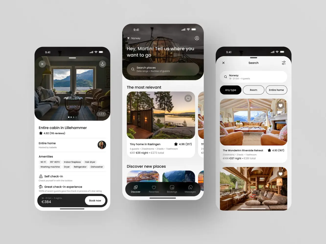
Mobile Booking App Design by Shakuro
How Shakuro Delivers Tailored E-Commerce Mobile Solutions
E-commerce apps tend to look similar on the surface, but the differences show up once you get into real usage. The way people browse clothing is not how they buy electronics. Service-based products behave differently again. When those differences are ignored, apps start feeling generic very quickly.
Teams that spend a lot of time in commerce usually stop thinking in terms of “one good structure.” Instead, the focus shifts to fit—how the app reflects the product and the buying behavior around it.
Industry-Specific Customization
Shakuro’s work in e-commerce mobile app development is built around that idea. Each project starts with how customers actually interact with the product, not with a preset layout.
In fashion, browsing tends to lead the experience. Strong visuals, fluid category transitions, and fast product previews matter more than deep technical filters. Electronics apps often flip that balance. Comparison becomes central, so specs, structured product pages, and filtering logic need more attention.
Service-based commerce usually lands somewhere else entirely. Booking flows, availability logic, or mixed product-service journeys introduce different constraints. Treating those cases like a standard storefront usually creates friction later.
Adapting the structure early makes the final product feel more natural. Users don’t notice “customization” as a feature, but they feel when an app aligns with how they already shop.
Proven Success Stories in E-Commerce App Development
Across different projects, the improvements that matter most are rarely dramatic. Clearer navigation, faster product discovery, fewer interruptions during checkout—small shifts that compound once real users start moving through the app.
That kind of work tends to show up in practical metrics. People spend more time browsing, return more often, and finish purchases with fewer drop-offs. Retention usually improves when the app becomes a comfortable place to come back to, not just a transactional tool.
Take Lonely Walls. It started as an idea for a niche art marketplace, but the real challenge was making three different groups coexist in one product—artists, venues, and collectors. The solution wasn’t just a storefront. The app leaned heavily on discovery: map-based browsing, artwork-first presentation, and structured exhibition flows that helped people trust the process. After launch, it turned into a living ecosystem with real exhibitions happening through the platform.
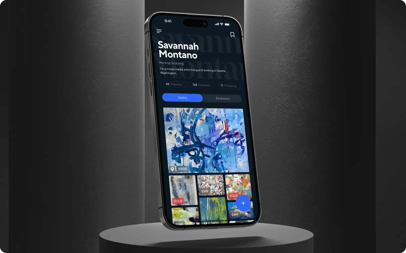
Fine art marketplace and artist networking app by Shakuro
Then there’s Cubebrush, a marketplace for digital artists selling resources for games and media. Here the problem was less about complexity and more about clarity. The product needed to work both for buyers and creators running their own shops. The focus stayed on speed, legibility, and structure—keeping the interface simple while supporting a growing catalog. Over time, it became a go-to platform for a lot of artists working in games and entertainment.
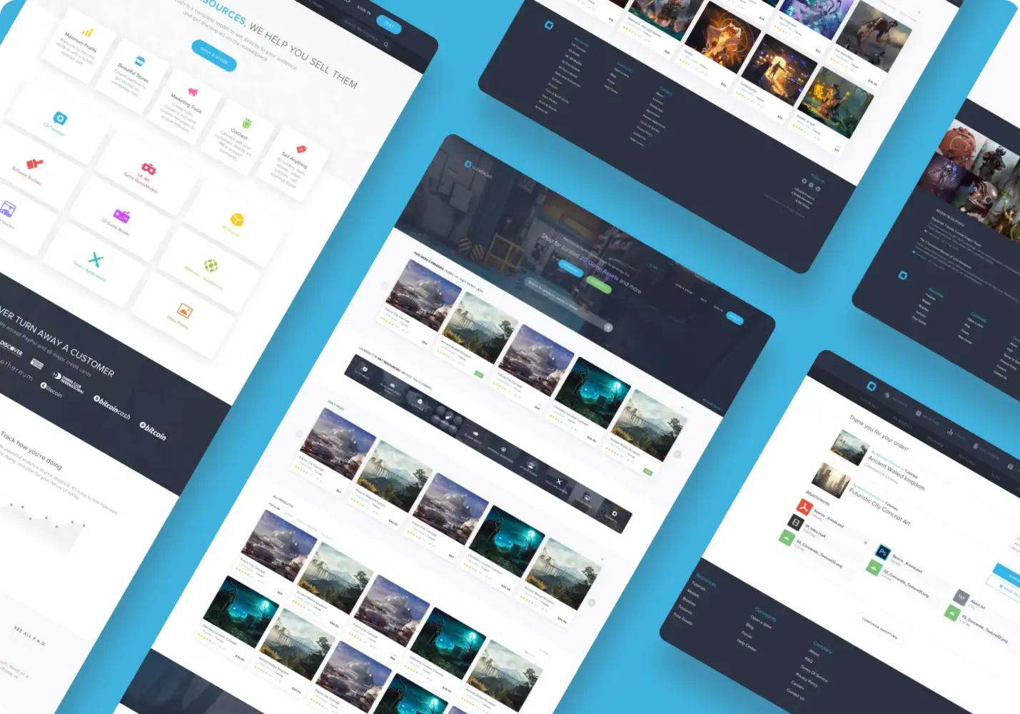
Digital artist marketplace design by Shakuro
From the business side, the value builds gradually. Better engagement inside the app reduces pressure on constant acquisition. Returning users start carrying more of the growth. Over time, that changes how the product scales.
If you’re considering a custom commerce app and want to see how tailored builds differ from generic solutions, you can explore Shakuro’s approach to e-commerce mobile app development.