The most popular app category is Games, while Health & Fitness barely makes it to the top 10. The timers for the healthcare industry are tough, but they give a lot of opportunities to introduce a new financially rewarding and meaningful healthcare solution to the mobile app market, directly affecting people’s health behavior, and helping them make their lives easier and more enjoyable.
Contents:
For that, you need an app with great functionality because a product is worthless when it doesn’t deliver. But this functionality has to be presented by something that has the power to bring it forth — design. A good healthcare app design highlights the most important details of a medical app, guides users through it, and suggests what to do next, resulting in necessary action. An app can become an effective lead-generation tool and a company’s main product by itself. For a product connected with health and/or medicine, UI/UX design is even more significant.
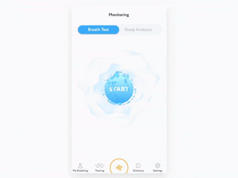
Breath monitoring app by George Frigo
In this article, which can be of use to designers as well as business owners, we are going to look at how some of the best practices of healthcare app design can make a difference. If you are interested in other aspects of app development as well, you can get a lot more information on the overall process of creating a mHealth app in our healthcare app development guide.
Types of healthcare applications
It’s worth noting that the “healthcare app” is a multifaceted concept that encompasses a multitude of health- and medicine-related digital products.
There are many types of healthcare apps, including and not limited to:
- Applications for remote patient consultation by healthcare professionals (telemedicine).
- Applications for patient interaction with their electronic medical records (EMR).
- Applications for the recording and management of a patient’s vital signs.
- Apps to remind patients of when to take medications, exercise, etc.
- Apps for medical calculations.
- Reference apps containing medical information.
- Applications for fitness and sport.
- Healthy lifestyle and wellness applications (daily water intake, sleep management, etc).
It may seem like it’s too broad a subject (compare a calorie counter app to a medical education solution, for example), but there are some common design practices that can make any mHealth app more effective, giving people the means to get what they want.
Medical App by Victor Nikitin
How to design mobile apps for healthcare
Even when an app is not a business’ main product, it can be of immense value. For example, if it’s an accompanying app for a medical office, it can take a load off personnel’s shoulders providing information and services for customers in their stead. If a health app IS a primary product, like in the case of fitness or meditation apps, then there’s even more at stake. Sometimes the deficiencies in health app design are the reason why people quit using this or that app altogether.
To avoid it, take a look at some of the best practices of healthcare app design and how they help to make apps focused, intuitive, and fast.
Research — the first step to success
Before prototyping an app interface, you need to understand who your target audience is and what are their geographical, socio-demographic, and psychological characteristics, as no product can cater to everyone. The interests and capabilities of users determine how they interact with an application. So answering the following questions will help:
Who is your target audience?
What do they like?
What apps do they use every day?
For what purpose?
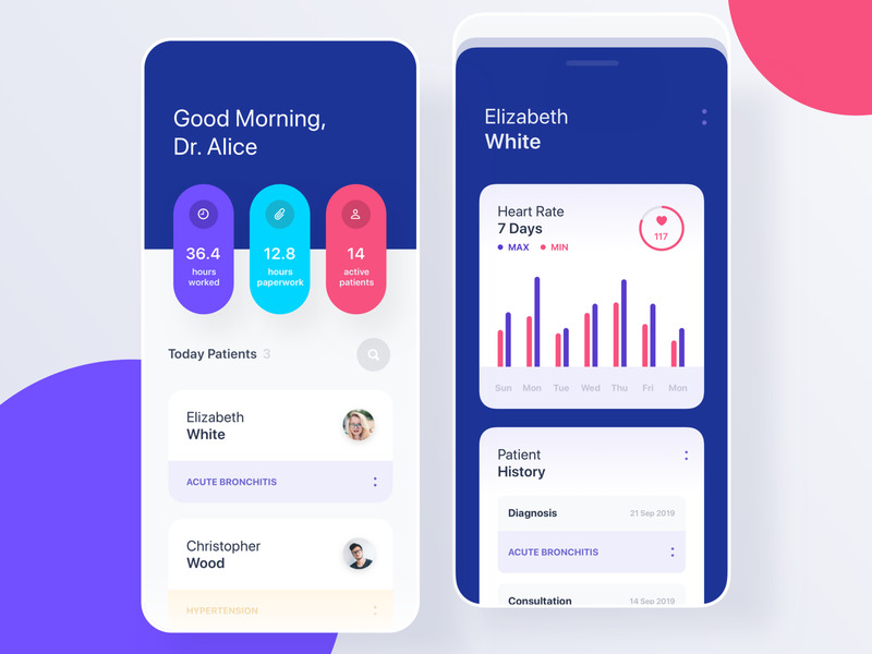
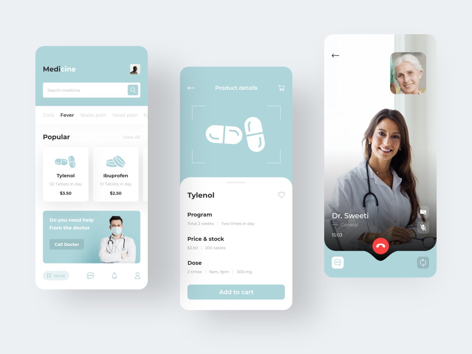
In general, healthcare applications are used either by patients or by doctors, (if we count users of lifestyle apps as patients too). The needs of these two categories differ in terms of functionality and UI design. Thus, medical personnel usually need to quickly find some item of data: EHR/EMR, medication specifications, recommendations for diagnostics and therapy, reference materials, etc. Patients, however, need to interact with as little information as possible given in simple and understandable terms. Many members of this group are older people or have some kind of specific disability. Only after conducting proper research and making corresponding conclusions do designers proceed to the actual process of healthcare app design.
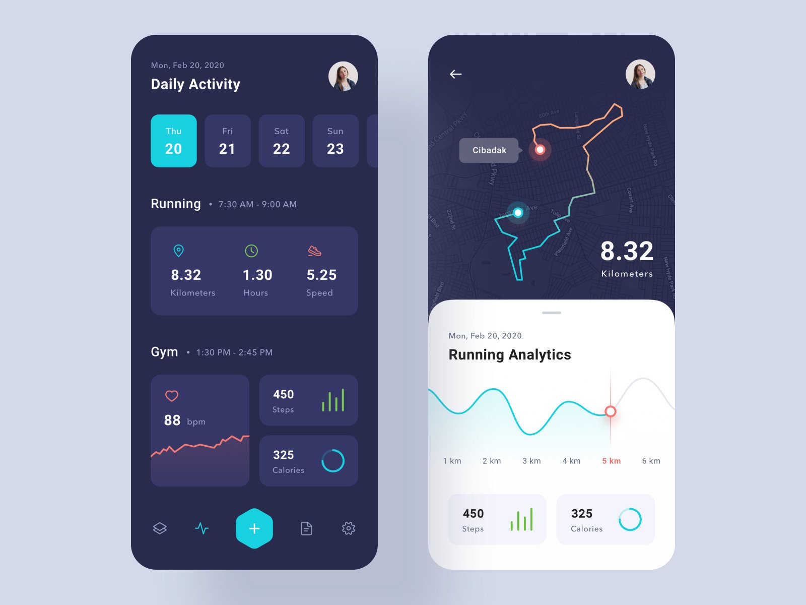
Health management application by Chahua
Simplicity and clarity in every single case
Medicine is a complicated discipline for an ordinary person. The good idea is to make the design of a healthcare app contrastingly simple to calm users and keep them focused.
“Complexity is your enemy. Any fool can make something complicated. It is hard to keep things simple.”
— Richard Branson
There’s no point in making a medical UI too detailed in an effort to make an impression and look important. It’s better when the interface and logic are easy to understand, even if an app is intended for medical personnel (without inappropriate condescending, of course).
Designing a healthcare UI, providing an instructive onboarding, and making the interface intuitively understandable. Otherwise, users may get frustrated with their experience even before they get to the main point of an app. Both parties, doctors and patients, will appreciate it if it is clear and minimalistic. That way, you won’t have to make people study how to use your app, even if it’s a solution for medical establishments and people there are used to that kind of thing. Help users discover features at a steady rate. Give instructions gradually, using the principle of progressive disclosure. Start with onboarding and divide each action in your app into small manageable bits, providing instructions with tips one at a time.
Use the right colors (more on it further). Limit the amount of information that a user has to put in by utilizing passive inputs and autocomplete, adjusting the keyboard, and dynamically validating field values. There’s more on form design in this article. All medical information must be provided by specialists with the appropriate education and expertise. Otherwise, the content will be either incomplete or contain errors that are unacceptable in this business.
Medical app for Doctors by yurig
F is for Functionality (and Features)
Ideally, design and functionality should work together. A good design is something that solves users’ problems and deals with their pain points, so fitting a definition in the case of healthcare apps.
The type of features and capabilities of a healthcare app depends on its purpose and target audience. For example, medical center apps need a personal account where patients would view records of their visits, recommendations, and appointments. A telemedicine app is useless without secure and encrypted video conferencing and communication features. A medication app relies on thought-out and helpful notifications.
The home screen is the place for the main functions of an app. Answer this question: why does somebody use your application (or a similar one)? If a person visits an app to record or receive some information, contact a doctor, check on their progress, etc., this functionality should be located right on the main screen. The important thing, echoing the previous point, is to avoid clutter when too much functionality is present at once. Admittedly, it happens much more often with older apps that sometimes drift in their focus and keep adding new and new features until the moment when only the super-users can make some sense of it. Taking Pareto’s principle, 80% of users tend to use no more than 20% of the options. Prioritize, determine which features are most important to users.
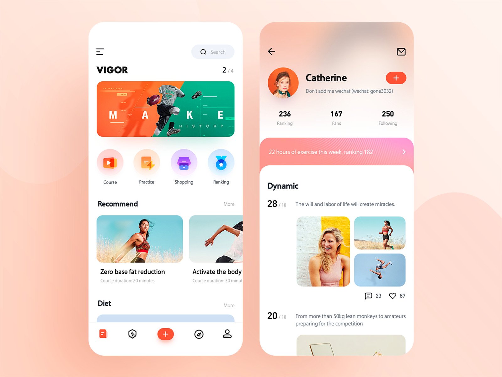
Medicine App by Manoj Dalvadi
Navigation. Explore and enjoy
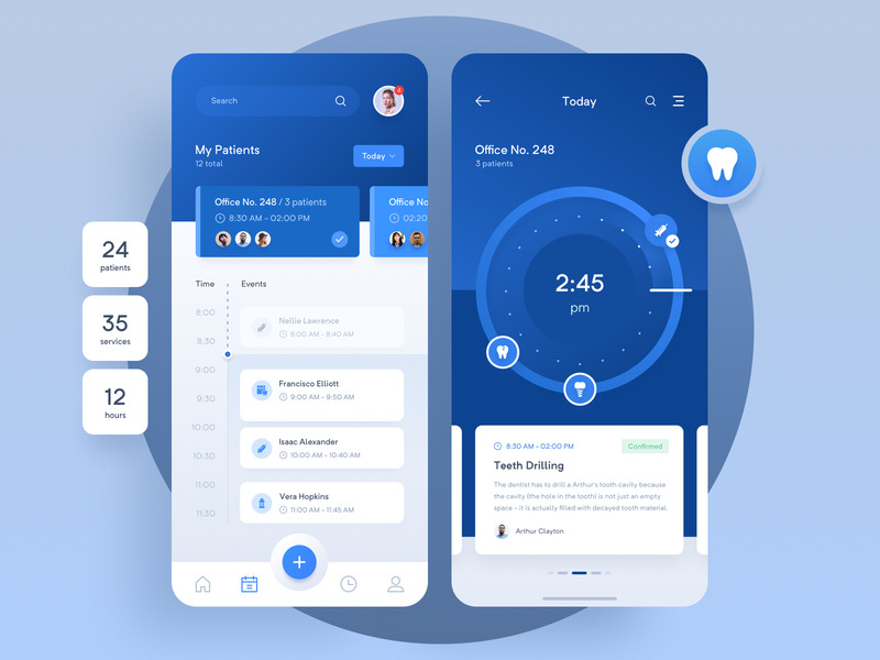
A clear navigational structure is a must for an effective healthcare app and a backbone of user interface design for healthcare applications. Without it, an app would never be widely adopted. Adequate navigation means speed and ease of use, and thus value from the user’s perspective. A medical professional needs a quick-working app because too much of their time gets spent on dealing with EHR (electronic health records) already.
The survey conducted on behalf of Stanford Medicine found that 62% of the time devoted by a doctor to each patient is being spent in the EHR. If an app for medical personnel is not quick enough, there’s no point in it. A patient wouldn’t be too happy with confusing navigation too, even if their task is not vital at the moment. Important information should be on the surface with details available upon request. There is the 3-click rule saying that the system should be designed so that any information could be available in three transitions. Adopt standard app navigation components: hamburger menu, tab bar, or navigation drawer.
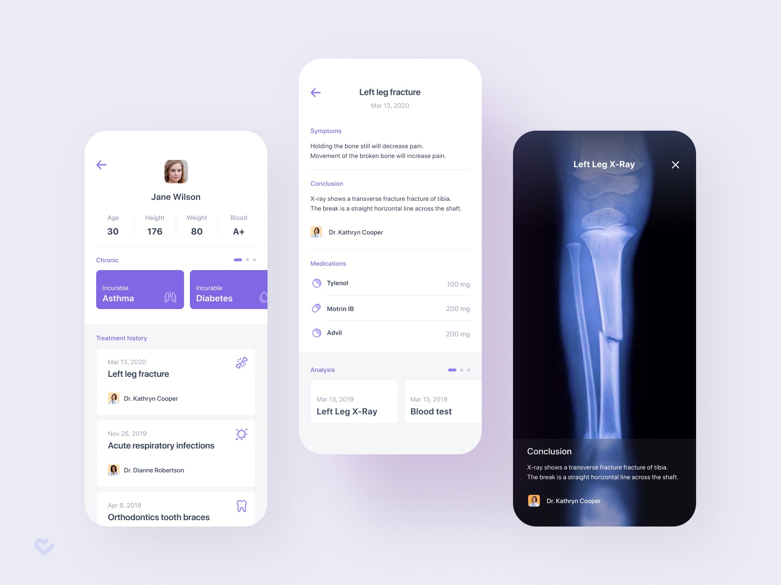
Medical App by Alex Samofalov
The choice of colors
Generally speaking, the color choice for an app depends on the target audience and the app’s theme. You can get some information on the subject in this article. The healthcare app design is usually done in neutral shades with the prevalence of cold-toned blue and green colors, with white as the background in the majority of cases. Designers do so to achieve certain results: make use of the common association of soothing pastel colors with the healthcare industry, ease anxiety, and add credibility. Bright red or yellow are much rarer in medical app UI designs.
Pharmagy – Medical App 👩⚕️ by Adam Sokołowski
However, bearing in mind the versatility of medical software, there are no particular restrictions in terms of the choice of colors. The main idea is that the overall look of an app should create a positive impression and not cause feelings of worry, fear, or other undesirable emotions. For example, a fitness app design looks nice and classy done in darker shades:
Health & Workout App – UI Design by Saepul Rohman
Or in bright colors to add some energy:
Mobile Fitness App by Michal Parulski
In pursuit of personalization
The personalization of mobile applications is one of the most marked design trends of recent years. Certain functionality gets adapted to a certain user pattern, and the system suggests actions that a person could perform next, which otherwise might get overlooked. The goal of such techniques is to help a user to solve their problem with the help of an application quicker. For this to happen, it is necessary to identify and analyze user patterns, as well as to track their changes. Just like every person has a unique state of health, so they expect the mobile apps they use to provide an equally unique experience. Even outside the healthcare industry, 33% of customers will abandon business relationships because of insufficient personalization.
There are many customization options you can use in healthcare design solutions: color themes, notifications, interactive elements, the use of AI to create personalized recommendations, and more.
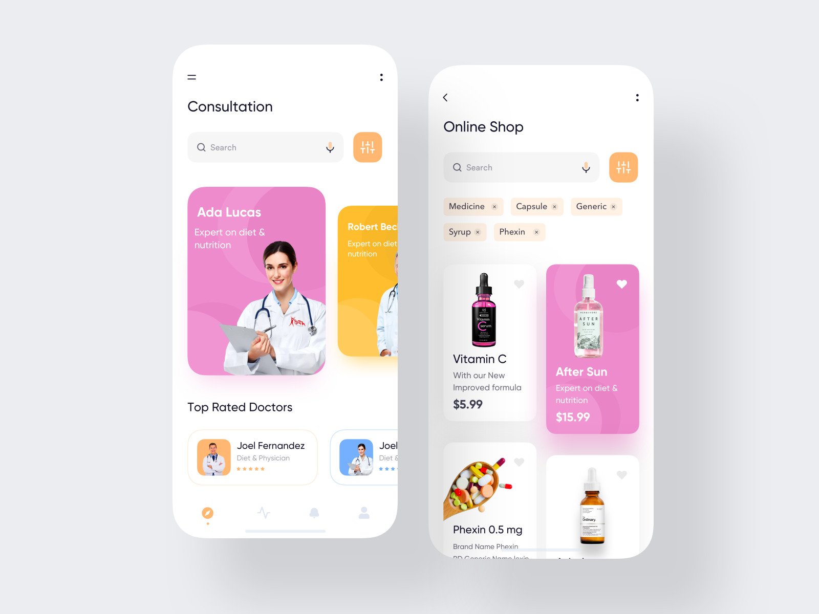
Online Consultation App by Jawad
Accessibility is an even greater must
Accessible UI design is important for every app, but it’s especially important for medical apps. Mobile healthcare solutions are meant to be used by people with different visual and hearing abilities, ages, and physical and psychological characteristics. The main function of healthcare app design is to make an app accessible to each potential user. Consider the limitations that they might have, and try to overcome their negative impact. For example, people with motion sickness won’t appreciate too many animations. It doesn’t mean that there should be only two colors in a medical user interface design and all the texts should be huge, but it does mean that a designer will face a bit of a challenge. In regard to a healthcare app, perhaps more than usual.
But accessibility is an extra opportunity, not a burden. Start with WC3’s Web Content Accessibility Guidelines, check out our article on design accessibility, and use color blindness simulators like this one. Needless to say, use the mobile accessibility best practices: put the main elements in a thumb zone, and don’t forget about the option to change the view to horizontal mode, make the texts larger, and so on.
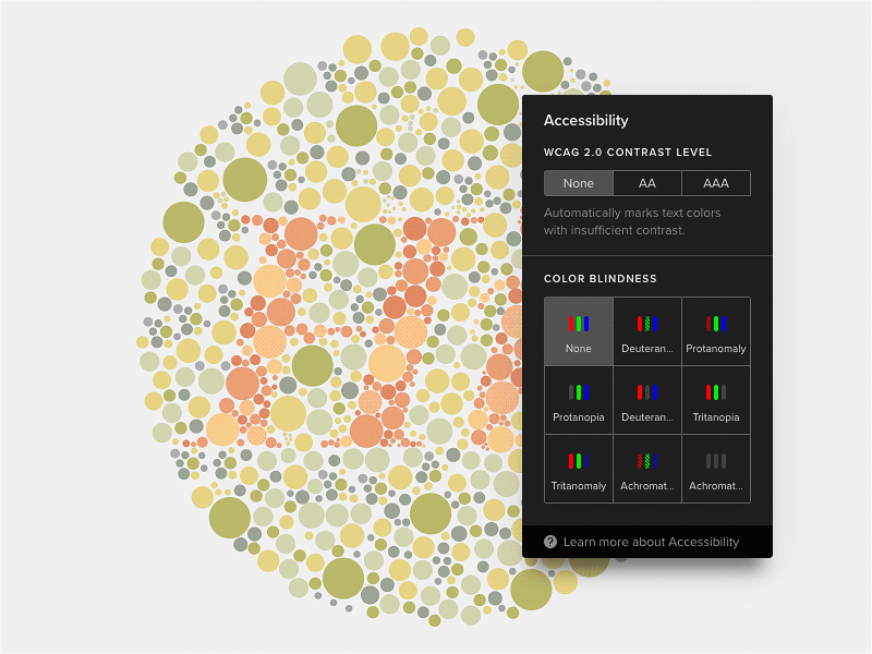
Contrast Analyzer and Color Blindness Simulator by keithar
The power of a positive attitude
Medicine is not only complex, but it’s also usually intimidating if only a bit. The clever idea is to make your app look like it has nothing to do with medicine at all. It would take the stereotypical pressure of the app and make the experience more enjoyable. Along with using soothing colors (if they suit the purpose), implement uplifting motivational messages, funny pictures, bright-colored accents, or other elements at different stages of a user’s journey through an app. Images and icons in healthcare user interface design should always evoke only positive, pleasant emotions and create a feeling of painlessness and safety.
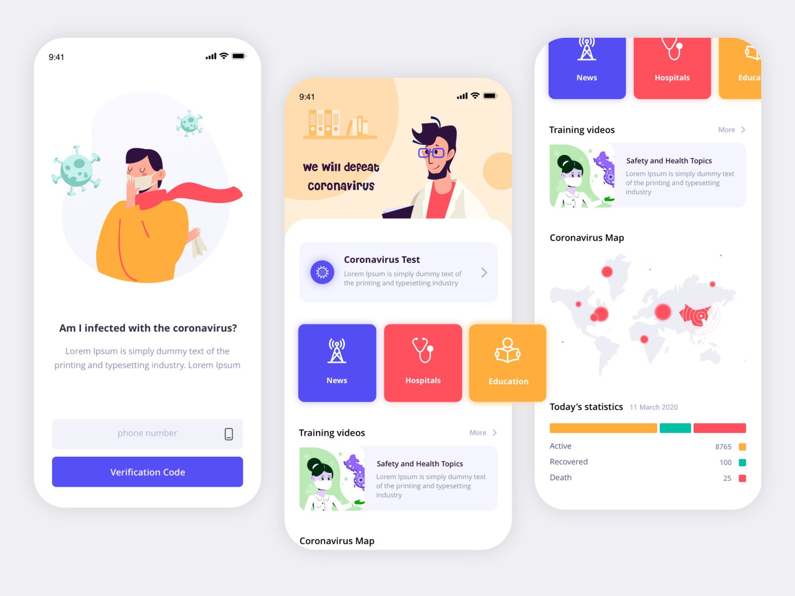
Coronavirus APP by Mahdieh Khalili
The mistake of making it look like a website
When there’s already an existing website, business owners and even designers might be tempted to “borrow” some solutions from a web version of a product. Whereas copying from the web is likely to result in users refusing to use an app. For example, when we were redesigning the app for the SELECT VIP membership club, we had to deal with this exact problem. The user’s interaction with a mobile device is different from a desktop one. The screen of a mobile device is smaller than the screen of a monitor or laptop. And the way of interacting with digital devices is different from working on a computer — on mobile, we do everything with finger movements and are reluctant to enter long texts while expecting the system to work faster.
More generally, although the navigation in an app is important too, for mobile it’s more about focusing on interaction design. In the majority of cases, people use websites to acquire information and apps to get the job done. Moreover, apps are integrated with smartphone features like accelerometer and camera which makes the app user interface design vary from the web one.
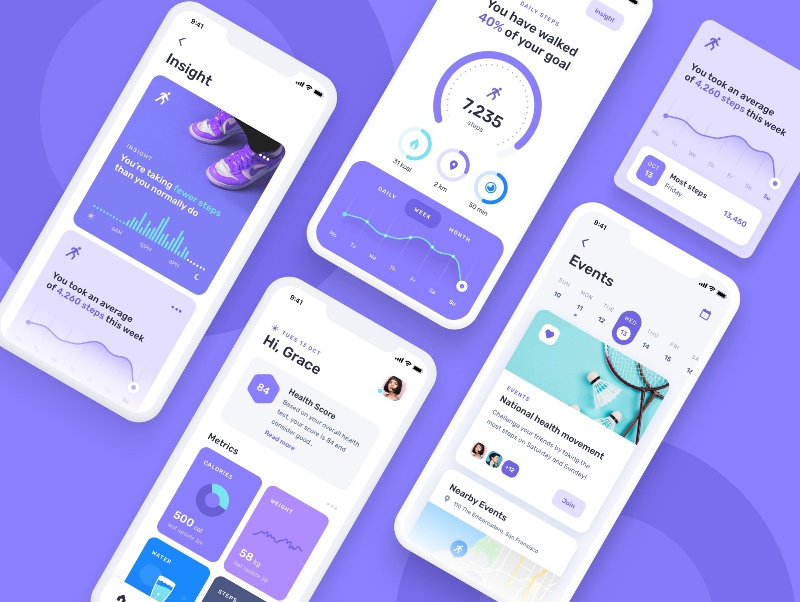
Health fitness mobile app by Grace Saraswati
Too much of a good thing
It’s important to maintain the balance of attractive and functional. A healthcare app has to be quick and not distract users from its content. Look through the points above and make sure you didn’t exceed the limits. Graphical elements, animation included, should always fulfill their purpose, i.e. for data entry, and to illustrate the micro-interactions of a user with a system, and not be added just to make an app look good. Do not overuse gradients and shadows, focus a user’s attention only on the main information. Use only one font, you can vary it by changing the size and other characteristics — italic, bold. Use simple color schemes for a clearer brand message and better navigation.
Health & Activity Tracking Interaction by Dibbendo Pranto
To copy or not to copy
You might think at one point or another whether you should just take some successful competitor app and make a copy of it. Well, if it works… Right? On the one hand, it’s not wise to copy other products because their design might easily be inadequate. You can end up gathering your rival’s mistakes that will impede the working of an app in the future.
On the other hand, you should definitely make an analysis of other apps, having conducted competitor research. An app should be relevant to users’ previous experiences with other applications. If this is not the case and you add up too much originality, the application will seem annoying, and users will not put up with a design where “everything is wrong”. Apple and Google have Human Interface Guidelines and Material Design for that.
“Users spend most of their time on other sites.” (Jacob’s Law)
It’s necessary to design based on the specifics of your brand, services, and products. For example, a fitness app is very different from a medical calculator. A design must fully comply with the requirements of the target audience, the specifics, and the subject of an app.
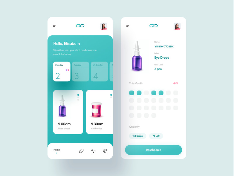
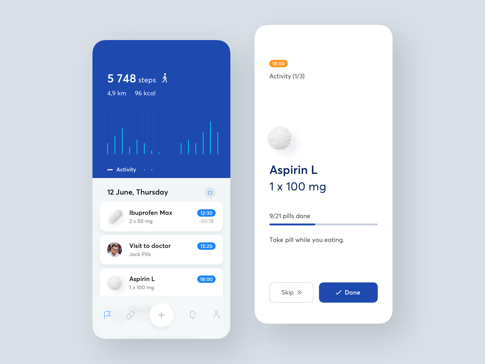
Medicine Reminder by Martyna Zielińska
Usability testing
Last but least, it’s important to remember that each designer can consider this or that decision to be very reasonable and effective. They may become so convinced in the consistency of an app’s architecture and navigation, of thoughtful design, and most importantly, of practical value that they simply forget about testing. With practice, a designer can improve their empathy level and feel the clients’ needs better. But in fact, this insidious trap can bring a lot of negativity to an app.
Conclusions can only be drawn after analyzing the data related to user interaction with the interface of an application. Testing will help get feedback in a timely manner, work out all the behavior scenarios in the application, and check the interaction patterns. Active user involvement is the key to success. Choose a relevant testing audience that is as close to the target audience as possible in age, occupation, geographical location, gender, cultural and religious background, etc. The closer — the better. Make them perform the major functions of your app and gather feedback.
Medical App – Patient card by Alex Samofalov
In conclusion
Design is not about the colors and fonts, but the ability to bring value and solve business problems, including the usage of colors and fonts along the way. Health is a sensitive and challenging subject that needs special attention. Designers are constantly trying to balance the extremely high safety and usability requirements of medical applications with the aesthetics of their interfaces.
Choosing a mobile app developer, business owners have their work cut out for them since a good medical app should not contain mistakes, must meet the needs of the target audience, and have competent content and design. Thought-out healthcare UX and UI design is an excellent tool for engaging users in a mobile application with the help of a simple and intuitive interface, convenient functionality, and positive emotions that it gives. We hope that the above tips about healthcare app design will help you minimize errors and optimize the design of your app so that it attracts as many loyal users as possible.
Do you want to create a versatile healthcare app? Contact us and let us build an eye-catching project based on the latest trends.