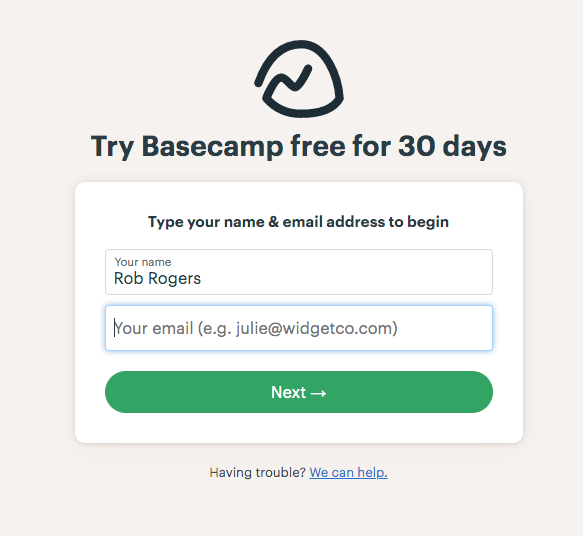
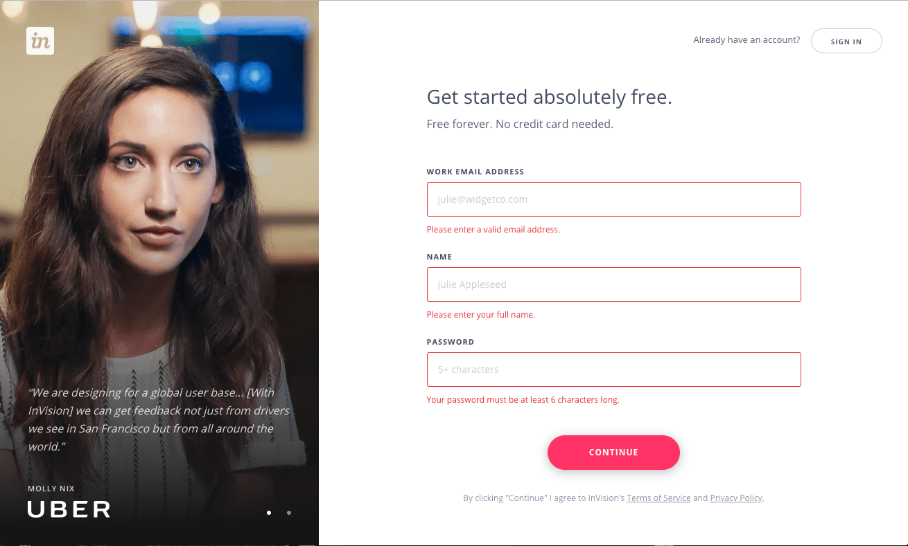
A web form is any area on the site where you enter information. That is, when you sign-in or sign-up, make an order, enter payment data, leave feedback, get in contact, etc. Oh, and when you Google something, you use a web form as well.
The better your web form design is the more effective your website will be. Forms basically connect potential customers with your business.
Clutch reports that 86% of people successfully interact with web forms on a weekly basis. Yet, many analytical studies show that among the most frequent reasons to leave the website is the inability or unwillingness to understand a form. It’s calculated that about 80% of people abandon a form after beginning to fill it out.
Contents:
“It’s very easy to create a form. The hard part is getting people to actually fill it out.”
– Leeyen Rogers, vice president of marketing at JotForm
So what are the web forms best practices? The key is to keep in mind that your clients are real people who deserve to have clear and effective communication. Following these 10 simple and reasonable web form design principles will help you create useful and comprehensible forms.

Checkout flow by Shakuro
General advice on web form design
As my teammates UI/UX designers say, even following a few simple rules can make your web form design look professional, and what’s more important, functional.
- Leave space between the various form elements as this way it’s much easier to navigate.
- Avoid tiny details and unreadable fonts.
- Highlight or find another way to mark a field where a cursor is located.

Cosmic Sign Up by Elena Sinianskaya
1. Forgo web forms altogether
That’s right, first of all, ask yourself: is the form really necessary in your particular case?
For example, when I’m asked to complete a 15 or even 10 question customer survey on my recent experience with staying in a hotel or making a purchase in a clothes store, I may get desperate even before completion. So I almost always stay away from those things.
Before creating a form, verify that it’s needed. People, as a rule, are reluctant to leave personal information or just feel bored or lazy. Often they submit online forms only when they have some kind of a problem.
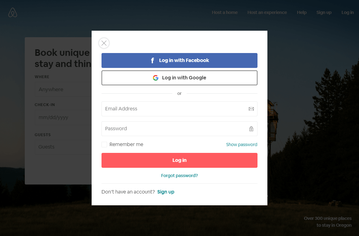
If your business allows it, consider social login, that is, letting people sign-up through their Google or social media accounts on Facebook or Twitter. It’s easy and convenient for users, as the majority of them are displeased with having to create new accounts on various websites.
2. Give people a reason to finish your form
People need to know what’s in there for them. Describe the benefits that users will receive: this can be creating a personal account, the possibility of making purchases, a 30-day free trial period, etc. Add a call to action or show that the whole process will take no more than a couple of minutes. This is especially true for bulky forms for loan and credit card applications, etc.
3. Follow the guidelines
Back in the school days one of my friends got a C for her population distribution report. She painted the less populated areas with the deepest shades contrary to the usual practice of using the palest shades for this case.
Most users already have an idea of how web forms look, so most often they expect to see a form consisting of a set of the same components. Stick to the expected website form design functionality. Excess creativity can be confusing and scare customers away.
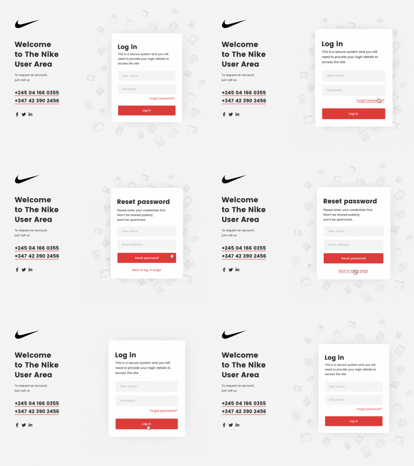
Log-in Interaction Animation by Shakuro
4. Ask only what is necessary
French mathematician Blaise Pascal once famously said: “I would have written a shorter letter, but I did not have the time”.
Writing concisely can be tricky but it’s absolutely necessary in the case of web form design. Make the list too long and you spoil your efforts. The fact is, every additional question reduces conversion rates by roughly 7%. Best practices dictate that users will tolerate between 5-7 form fields, as mentioned in the research by Eloqua.
Make clear what fields are the required ones. This is usually done with an asterisk. It’s a very common and effective practice. If you wish, you can add some descriptive text, for example: “Required fields marked with an *asterisk”. Alternatively, if almost every field on your form is required, then mark only the optional ones.
Use visual constraints, show people the approximate length of the expected data. Baymard study suggests that users get confused if a field seems to have a wrong length for their input.
Then again, I don’t mean to say that you should shy away from the longer forms. They have one big advantage. People who are prepared to fill them in are more engaged than those who have done the shorter ones.
“A shorter form usually means more people will be willing to fill it out, so you’ll generate more leads. But the quality of the leads will be higher when visitors are willing to complete more form fields and provide you with more information about themselves.”
– Pamela Vaughan, Principal Marketing Manager at HubSpot
5. Pre-fill the blanks and use autocomplete function
The main difficulty in filling in web forms is to enter data in the appropriate format. The label usually copes with this problem. Even so, the percentage of errors is still high. To minimize this problem, use pre-filled fields that serve as a kind of example.
See that your visitors don’t have to enter any special characters like $ or @ and present the data in the correct format automatically.
Autocomplete, in turn, helps to prevent common typos and improve UX. To give an example, it can be tiresome to fill in the address-related fields in a registration form. An autocomplete address tool with geolocation function allows users to enter their address quicker than regular input fields.
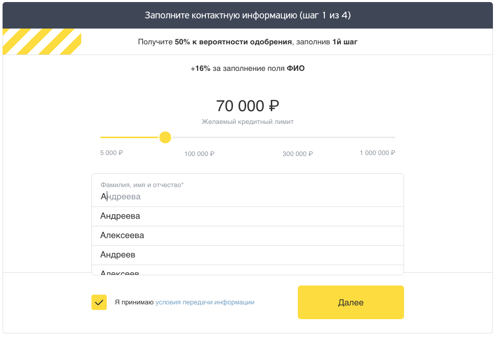
By the way, not just fields like country or zip code can be prefilled. Russian Tinkoff bank has an exceptional credit card web form, where they even autocomplete the first and last name fields. Now that’s impressive.
6. Use multi-step forms and conditional logic
People don’t like huge forms, they are psychologically exhausting and lead to cognitive overload. Try to create the illusion that your form is short by asking the questions one at a time like in the example below. This way it would look less overwhelming. Ask the most sensitive questions like a telephone number on the final step when users get more comfortable with your form.
Another great idea is using conditional logic, when the next answer “branches” from the previous one, like on flowcharts, allowing your site’s users to access different sections based on their answers. For example, if I choose the “Dogs” option on a pet food website, I won’t have to see the other ones’ details at all.
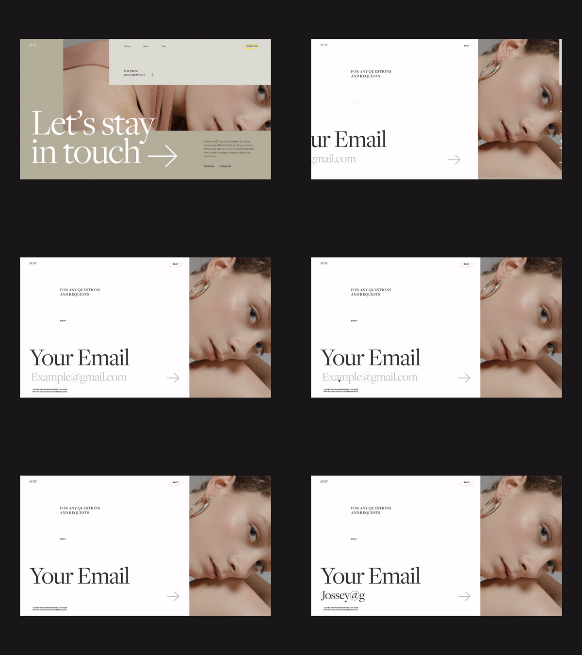
AVST Contacts Form Animation by Zhenya Rynzhuk
7. Place the labels close to the fields
It helps to speed up form filling by reducing the number of eye movements to a minimum. That is, users won’t have to move their eyes in a zig-zag fashion. For the same reason, it’s better to arrange a form into one column rather than two.
For longer forms, group questions according to their main idea and entitle the blocks.
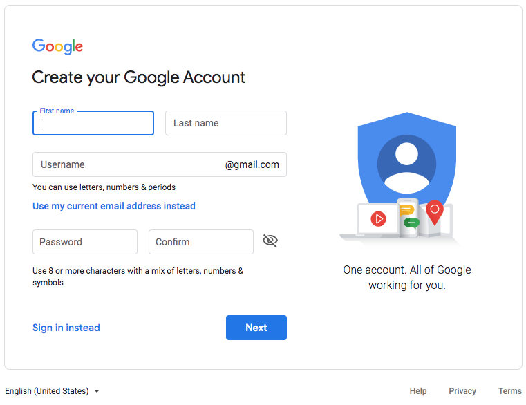
Note that one “Full name” field is better than two “First name” and “Last name” fields, it reduces the number of required fields at once.
8. Provide clear field names and error messages
Field names and explanations must be clear and understandable. Indicate what kind of data is required with an appropriate field label. This will minimize the chance of error. Use nouns that describe the field’s subject, for example: “Name”. It’ better to avoid verb-noun compositions such as “Enter a name.” Excessive information and visual noise impair perception.
The same goes for errors. Always make absolutely clear at what step en error occurred and what it means. Don’t just indicate “Error”, clarify. Also, if an error is detected, the cursor should automatically move to the error field. This option will help users correct the data quickly and without too much hassle.
Still better, use inline validation with real-time feedback immediately after answering. To implement this method, you need to use a specific Ajax technology for web interface development that provides an ability to make dynamic requests to the server without a visible update to the web page. Using this tool allows users to correct the data in real-time. It’s much more convenient in comparison with the necessity to correct the errors after hitting the Submit button.
9. Save the data
Save user cache data. Not everybody finishes filling out forms, especially the longer ones, in one go. Save the data for the users to continue filling out a form later. It’s especially useful for phones, where the process has a greater possibility to be interrupted by a call or a message.
Generally, try to avoid any Reset or Clear options. They can result in users inadvertently deleting all the information. However, you can use it in forms that handle particularly sensitive finance-related data. You can add a Cancel button to help people who want to abandon a form with deleting all the entered information. But see to it that the Confirm button is considerably more highlighted than the Cancel one.
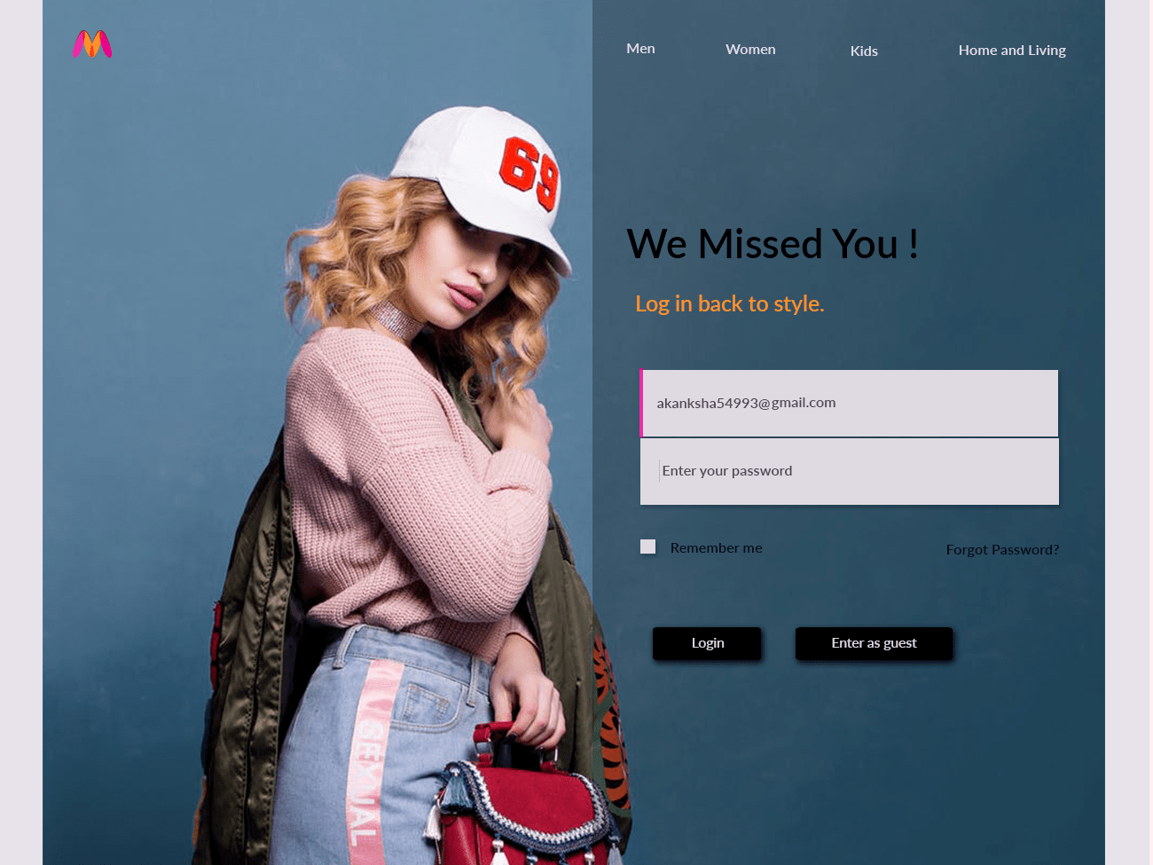
Welcome Back Form For E-commerce website by Mili Biswas
10. Pay attention to privacy
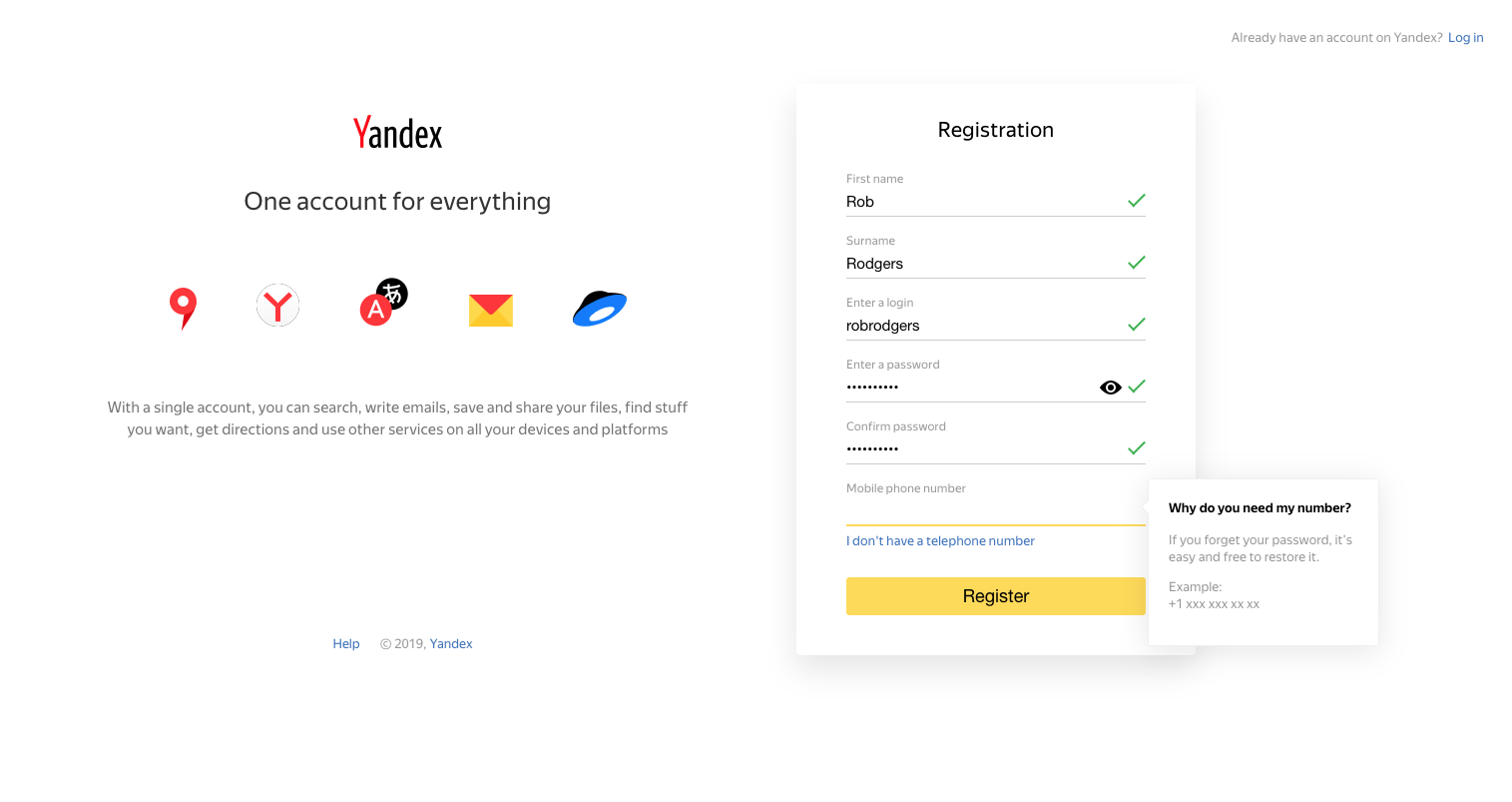
Tell users about your plans to use their data. Many people are hesitant about leaving their contact details, especially phone numbers.
Customers trust companies that guarantee the confidentiality of personal data. Users won’t leave you their phone numbers, addresses, and other personal information if they are not sure that their data will not fall into the hands of third parties.
Additional: tips for mobile devices and form accessibility
Today, about 70% of internet users access web resources from mobile devices. If the form isn’t correctly displayed on smartphones and tablets, no one will fill it in, and there is a risk that clients will abandon your website for good.
In addition to what has already been said, phone users will appreciate an adaptive keyboard to appear automatically upon request in the input field. It’s so simple yet now and again I get irritated by the designers that don’t take care of this issue.
Along with that, there’s another aspect of making great modern web forms. Make them accessible, so they wouldn’t be a source of confusion for people with physical impairments.
For example, it might be a good idea not to lean on colors too heavily, as about one of twelve men has some degree of color blindness. Instead, you can use texts or icons.
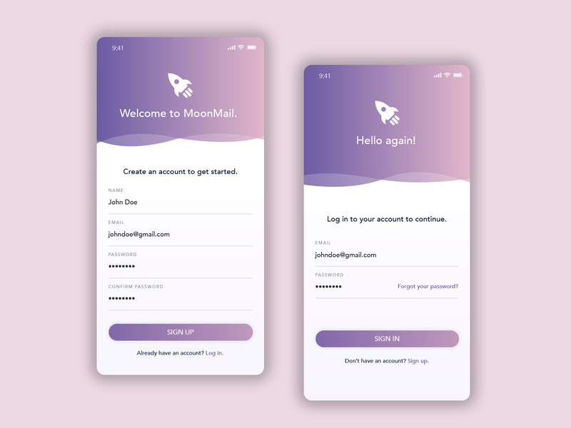
Sign Up Form – Daily UI by Alysha McDowell
What’s in the future: AI-based conversational interfaces
There’s news that AI solutions are to take the place of web forms in the future. The idea is that they have many advantages over web forms, making AI a better alternative. And I can well imagine it! It’s certainly more comfortable from the UX perspective: you just speak and Alexa or Siri does everything for you, you don’t have to deal with a form for yourself.
AI is one of the main digital trends nowadays. Conversational interfaces have the power to be highly adjustable to users’ needs which means their anticipated popularity in the future.

VoiceBanking App – Interaction by Drod
Conclusion
There are many techniques to increase site conversion. A good web form design plays an important role in this matter.
No modern website can do without web forms. They are your information-gathering instruments. Without them, it’s impossible to get any customer data like emails, order information, payment details, etc. In a word, no leads, and no sales.
Statistics say that three-quarters of companies use web forms to generate leads, with about half of them naming website forms as their primary tool for this.
If you have noticed that your web forms on your site are not comfortable enough for users at the moment, and due to this you’re losing traffic, then it’s a signal to work on the problem. Analyze the specifics and try to optimize your forms accordingly. Even the slightest changes matter. For example, Expedia removed the “Company” field from their booking form and their annual revenue increased $12 million.

