Do colors increase website conversions? Well, yes and no. They do, but not directly and not by themselves. The answer is a bit more complicated and controversial than a simple “yes” or “no”.
Color psychology is a complex and fascinating subject, especially color in design. It can indeed serve as an excellent marketing tool if used right. Using subconscious associations, colors can form either a positive or a negative attitude towards a brand or a product. 75% of consumers admit that they judge businesses’ credibility based on their website design. And it takes only a few seconds for a person to evaluate the site and decide whether to use it or not. If a designer chooses the website colors correctly, a user will remain, and thus, the colors will affect the conversion rate and lower the price of the lead.
But what colors are the best for websites? Color theory is an immense subject. We’ll touch on some features and insights of color theory and ways it applies to web design.
Contents:
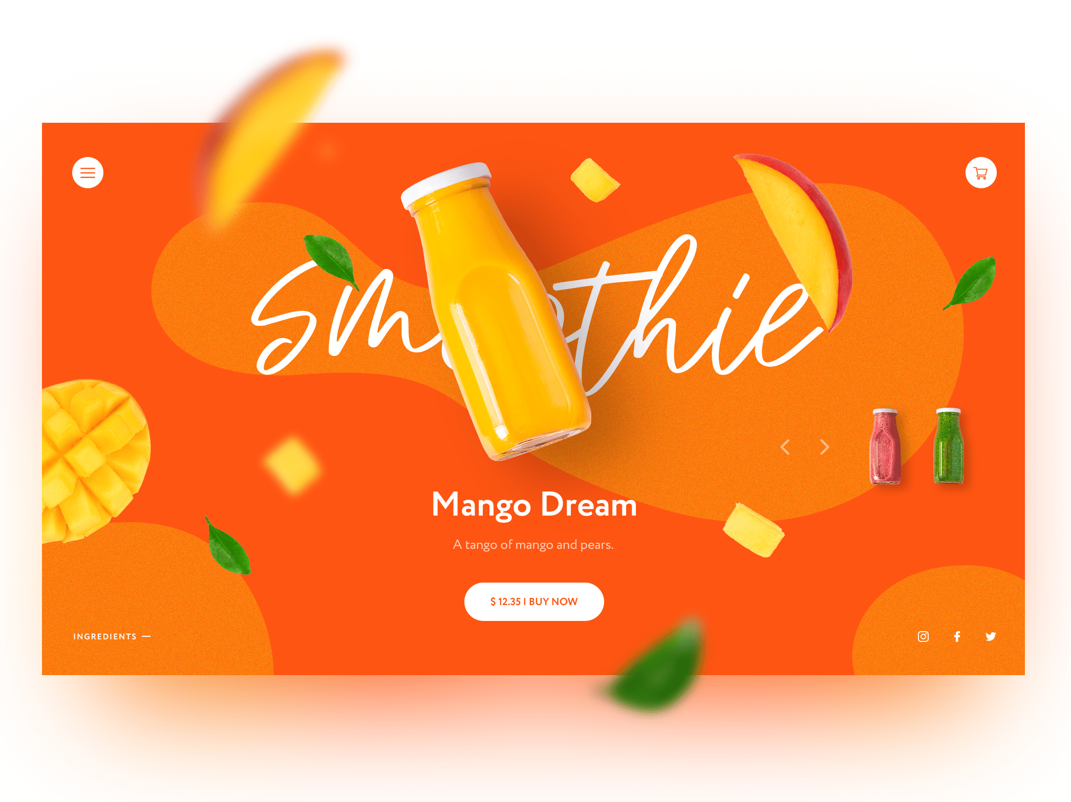
Smoothie Store Homepage Concept by Kris Anfalova for Shakuro
Color and emotions
Colors as we see them, do not exist in nature. What is color? It’s a product of the human brain processing the information that comes to us through the eyes in the form of a light wave. Light waves have different lengths, depending on which a particular color is formed.
The psychology of color states that colors and emotions are very closely interconnected. Color is a property of specific materials, objects, and phenomena, it doesn’t exist in a vacuum. That is why every person has an emotional connection with a specific color. Naturally, any web designer wants to capitalize on this emotional connection.
“Colors, like features, follow the changes of the emotions.”
-Pablo Picasso
However, users rarely notice and evaluate the exact colors of individual parts of the website. Colors affect them subconsciously. After experiencing some kind of emotion, users perform certain actions like clicking the buttons. And colors of pages and various elements play a huge role in all this.
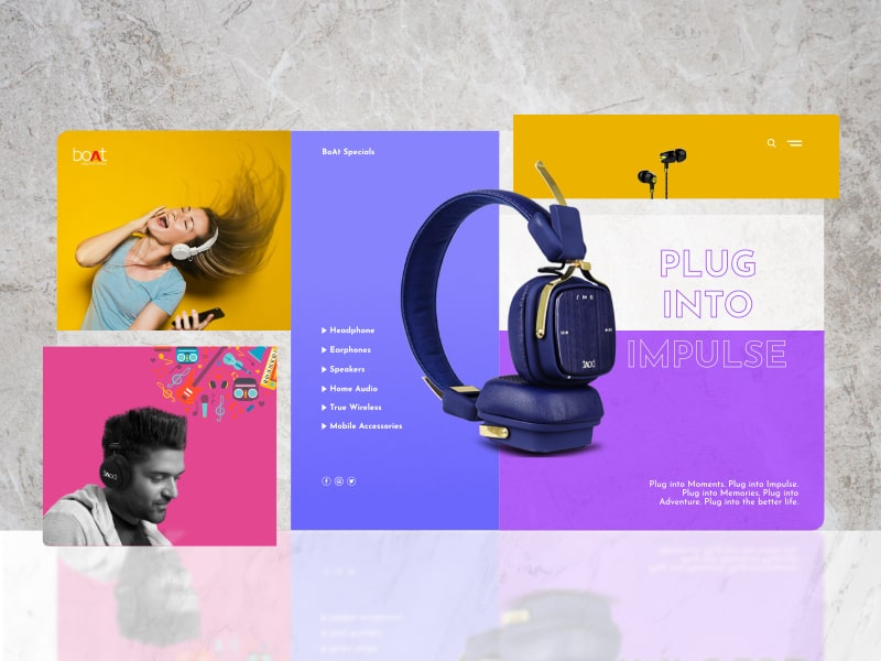
BoAt by Ajmal Sainudeen
Basics of color theory
Knowledge of how to use colors in web design is not inborn. Color theorists have formulated rules that you follow when choosing the colors that match.
Various color theories using the color wheels started appearing in 17-18 centuries originating from both physics and mysticism. Today the science of colors includes a lot of such color wheels, so you can choose the one you like the best to determine colors that go together.
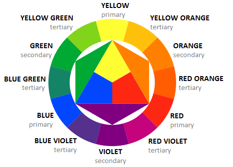
Image credit: tomboy-fashion.com
This classic color wheel helps to select a good combination of colors and is divided into 12 parts:
- Primary colors are yellow, blue and red.
- Secondary colors are orange, green and violet.
- Between the primary and secondary shades, there are tertiary colors (called by the name of the primary and secondary types of colors), like yellow-green or red-violet.
But how does this wonderful circle work? It’s simple: you just apply one of the canonical color schemes. There are six of them:
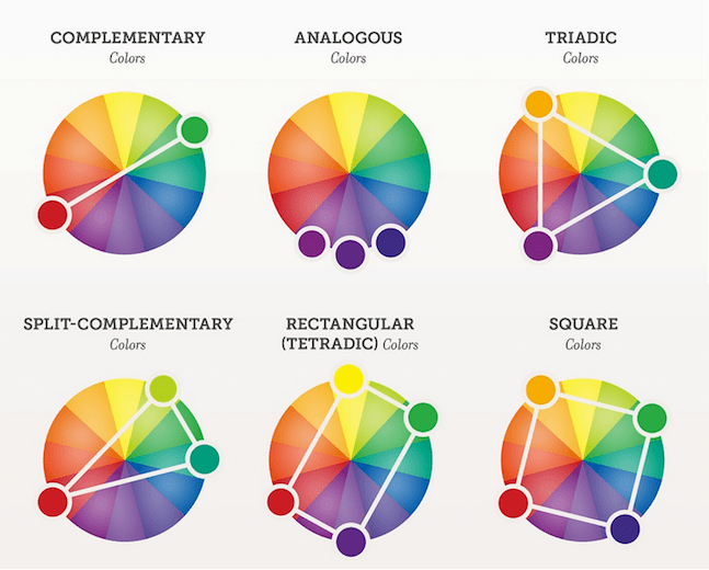
Image credit: amberddesign.com
But the most common are:
- Analogous – a combination of three neighboring sectors. A soft and pleasant combination of colors often found in nature.
- Complementary – a combination of two opposite sectors. Complementary colors are contrasting colors that are located at opposite ends of the color wheel. By the way, the most overused combination of colors used for movie posters – orange and blue – is complimentary.
I was left utterly confused by this trilogy pic.twitter.com/w6iF9D9ujy
— Olly Gibbs (@OllyGibbs) December 29, 2019
- Triadic – three equidistant sectors. For such a color scheme, it’s often recommended to choose one main color, and leave the other two for emphasis.
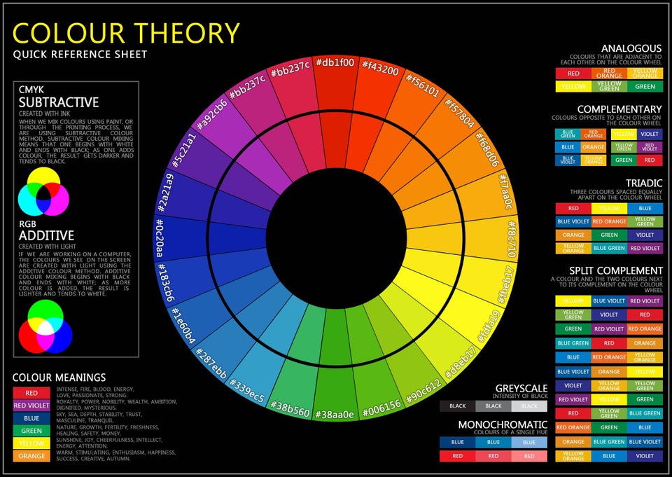
Here’s a quick reference sheet on color theory from Reddit (there’s a high-res version).
To simplify their job, web designers use various online services for creating color schemes for websites like:
- Color Hunt
- Paletton
- Colormind
- ColorSpace.
- or just use the palettes of works they like on Dribbble.
What should influence your website color choice
-
Corporate identity
The choice of colors for the website is a difficult and responsible task. Do not approach it solely using your or your client’s preferences.
The base should be the existing identity of the company if it has strong positions on the market (when the logo or brand is familiar to many people). In this case, the dominant colors of the site should be the corporate ones.

DJI Website Redesign Concept by Shakuro
-
Target audience
Choosing the best color combination for a website is a question of understanding the psychological aspects of how colors are perceived by various groups of people, and what are the common associations.
For example:
- The best colors for kids’ websites are bright, contrasting and positive
- For the sites with the target audience of women the nice choice is soft and bright colors
- The websites for men are often dark or neutral-looking.
Color preferences are also affected by education, culture, religion, life experience, etc.
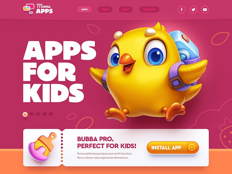
Apps for kids! by Mike | Creative Mints
-
Theme
Imagine that a website is dedicated to landscape design or gardening. Then there most certainly will be a lot of green color, firmly associated with nature and plant life.
If the content of the website is somehow related to water (like sea voyages or aquariums), the most likely color will be blue. By contrast, blue is the worst color choice for the food-related websites, it’s unappetizing.
my professor stopped eating m&m’s because they added the color blue
— Sahar (@spartysahari) September 19, 2011
What kind of food is bright-blue anyway?
Yellow is close to gold. It’s sometimes used by financial-related organizations.
And so on, more details in the paragraph below.

Renewable Energy Landing Page by Shakuro
How we perceive colors
Psychologists have studied the effect of colors on our perception and came to a set of conclusions beneficial for marketing and advertising.
These apply mostly to Western countries. Colors may have different connotations in different countries.
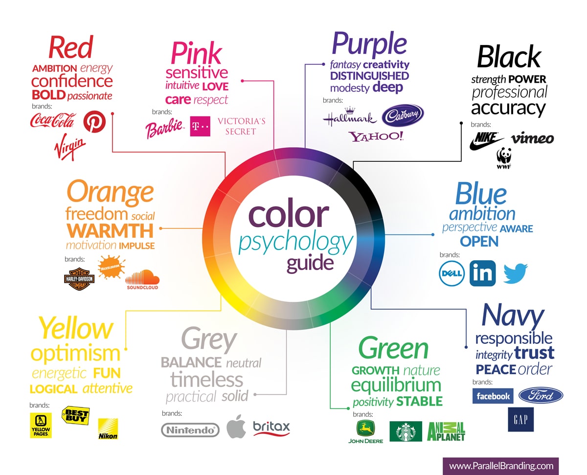
- Yellow is associated with joy, optimism and a feeling of enthusiasm. It attracts attention.
- Blue means calmness, stability, trust, and strength.
- Red increases appetite, it’s often used in the food industry. It’s attractive, it builds up the excitement. But if you overdo it, it looks aggressive.
- Green is associated with success and health. It also calms and relaxes.
- Violet gives a feeling of respect, freedom, and creativity.
- Orange is for friendliness, success, a feeling of warmth and a surge of energy.
- White or silver symbolizes purity and safety.
- Black is associated with security, strength, and authority.
The best colors for backgrounds
Light vs dark interface battle was one of the buzzwords of 2019 and it’s far from being over.
- The light background provides better readability in most cases, except for the yellow and pastel colors. Dark font colors on a white or light background is a classic. A good background has little to no bright and eye-catching elements.
- The dark background works well with the very bright or white text color. However, reading a lot of small text on a dark background is difficult. It’s less recommendable as the main background color.
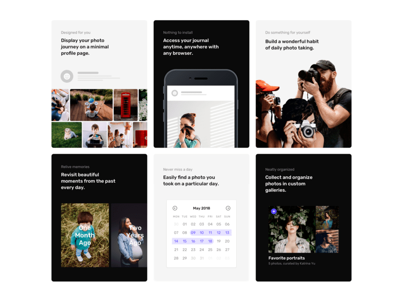
Features Section by Pawel Kadysz
Best colors for CTAs
Which button color has the highest conversion? There is no best color for a CTA button. The beginner designer or marketer might answer “red” or “blue”, whereas the best answer is “the contrasting one”.
Users don’t read all the text on a website, they skim. What happens during a quick look? The user’s attention is fixed on bright “catchy” elements. Using the right colors to attract attention will attract users who don’t read the text.
It doesn’t really matter what color your call to action buttons are. The main rules are:
- a CTA color needs to pop
- it should be on-brand
- it should be consistent.
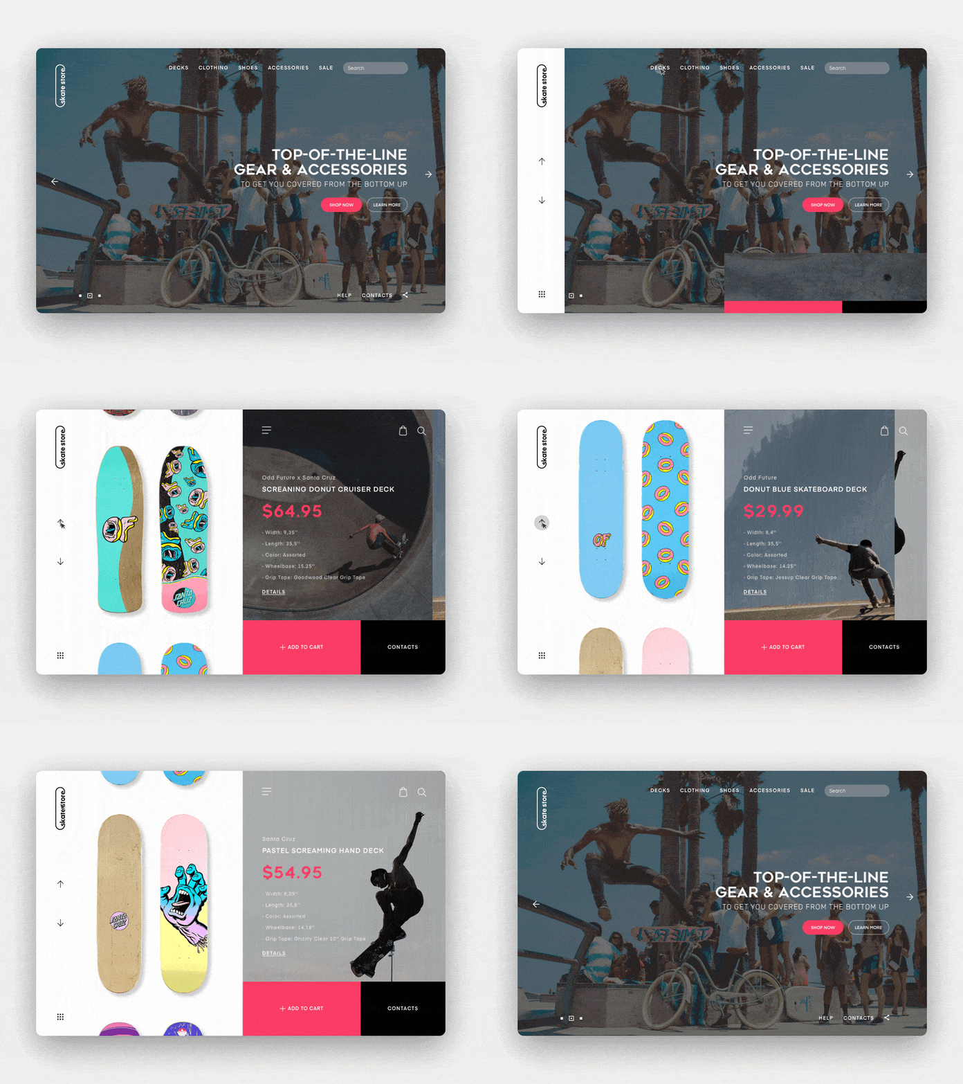
Skate Shop Deck Selection Concept by Shakuro
Go with simple
Color scheme affects the usability of the site. It controls the user’s attention but too much color at once is tiring for the eyes and psyche.
A website design made with a wide variety of colors is perceived as difficult and even repulsive. However, if there are very few colors, the site may look monotonous, and the user’s attention will be scattered.
The optimal palette consists of 3-4 colors:
- Primary. The base color that highlights the main content.
- Optional. The color for highlighting secondary information, that fits well with the primary one.
- Background. A calm shade on which the primary and secondary colors are not lost.
- Accent. A contrasting primary color that draws the visitor’s attention to the key elements of the website.
Follow the classic 60-30-10 decor rule, it’s also great for a website layout.
In short: 60% of the dominant color, 30% of the secondary and 10% to accentuate. This balance is comfortable for the human eye.

Web Development Agency Landing Page by Shakuro
Accessibility
Let’s take red and green, for example. When I hear that it’s a bad color combination, I don’t agree with that. After all, it’s nice and common in nature.
Right until the point when these colors are used in web design together.
Doesn’t it look beautiful?

Image credit: Unsplash
Well,

It hurts to look at this picture. What’s more, red-and-green becomes the bigger problem, when the matter concerns web accessibility.
According to Colour Blind Awareness, approximately 1 in 12 men and 1 in 200 women in the world suffer from some kind of color blindness.
The most frequent form of color blindness is deuteranopia. This is exactly when the green and the red look very similar. This is how the pic above looks like for a person with deuteranopia:

Digital accessibility isn’t just about red and green, and it’s not just about colors. But paying attention to the issue of colors at least will benefit your website and society. Start with WC3’s Web Content Accessibility Guidelines.
A/B-test various colors
You may start wanting to change something on your website, but how do you know that this change will be for the best? What if it’s better not to change anything?
For example, you have a yellow Add to Cart button on your website. You see that on other sites the button is usually blue.
The most useful option is to perform A / B testing. You create two versions of your website: one with the old button (yellow), the other with a new one (blue).
Next, you direct half of the traffic to the old version of the site, and the other half to the new one.
As a result, you are able to see what page gives more conversions and choose the best option.
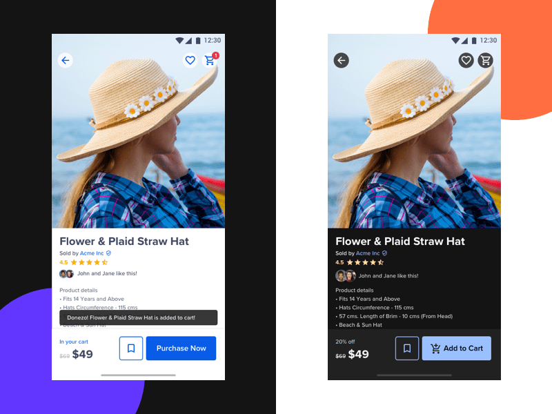
E-Commerce A/B Tests: Light and Dark Mode by Swapnil Borkar
Color is a subjective thing
Near the end of the article, I want to stress one thing: color is a subjective thing.
If it weren’t so, then colors wouldn’t have different connotations in different countries, as I have mentioned earlier.
In Japan, India, and China the white color traditionally is associated with mourning. Red is for love and life.
Black is death and evil for us, but not in the Middle East. There it means femininity, a happy marriage, and family happiness.
Globalization plays its role, but traditions may still be very strong in some parts of the world.

Indian wedding dress.
Image credit:
Abhinav Mishra
Associations accepted in society are purely man-made. It’s not like pink is inherently for girls and blue is for boys. Until the 19th century, it was the other way around.
Blue is for trustworthiness. How trustworthy is Facebook nowadays?
Even one particular person can feel differently towards some color based on their emotional state. Today I like yellow. Tomorrow I feel unwell and it seems painfully bright to me.
What causes strong emotions in some, affects others in a completely different way. Sometimes this happens because of personal preferences, sometimes it’s due to cultural characteristics.
Meet the Green Lady of Brooklyn. I find her adorable! We come from the same culture, but I perceive the shade of color she particularly likes as somewhat poisonous.
And how about you?
The bottom line
No color is better. No color gives 100% conversion. There are too many variables. Colors do not exist by themselves. They are a good helper for conveying emotions, but they themselves do not convey anything. There are no bad colors. Only bad color combinations and only in this or that respect.
Apart from making a call to action blue or red, you should think about its shape, placement, and copy.
I believe that all colors are psychologically neutral, you just use them in accordance with a particular subject or association. This can be helpful and beneficial. Use the tips above and test, test, test.
