
Design is a chance to make a good first impression for an e-commerce website. It has a direct effect on how much time users are going to spend there and how much they are going to buy. It shows like no other how important all the design aspects are: from the beautiful UI to the elaborate UX. With e-commerce website design, it’s not just about how the website looks but how it works.
Contents:
In addition to the carefully planned marketing strategy, it’s necessary to pack it into an attractive and usable wrap using ecommerce design best practices. It takes just a few seconds for a person to decide whether or not they should stay. In a competitive field of e-commerce, the website is a tool to showcase users the value of products and to keep them engaged. There must be a reason for people to use a particular website, and the design can become this reason.
Having said that, until recently, only 64% of small businesses in the US had a website. This number is rising with every passing month, as more and more businesses recognize the importance of having a website. The situation with COVID-19 coronavirus only intensified it. Online shopping has skyrocketed and business owners can’t ignore it any longer. This is why it’s important to know how to design good e-commerce websites that sell. Let’s look at the main factors to consider when designing an e-commerce website.
Key takeaways
- Use high-quality photos and videos so shoppers can judge products well.
- Make navigation, filtering, and search easy to use.
- Keep a clear visual hierarchy so the most important actions stand out.
- Favor simplicity and readability over flashy complexity.
- Add personality without hurting usability.
Ecommerce Design Best Practices
1. Use Quality Photos and Videos
Having no opportunity to appreciate the products IRL, their photo and video representations are everything a visitor has to rely on. This is a point where the offline-stores have an undeniable advantage.
At least, for now. That is why for modern e-commerce website design it’s vital that photos and videos should be of quality. The better this representation is, the more users will like the particular online store. This includes high-res photos, 360-degree views, 3D-models, and videos.
The recent article by the Baymard Institute states that the quarter of e-commerce websites still don’t have product images of sufficient quality. This leads to page abandonment. First, because people feel weird having to scrutinize over pixelated photos. Secondly, because low-quality photos spoil the impression made by the products. However fine the products are, bad photos will make them look equally bad.
Also, people feel that low-quality photos signify that a store doesn’t care about making an effort to sell, so they are likely to go search for another one that respects them more.
Another thing that’s becoming the new norm is the ability to zoom photos. The main idea is to have a satisfactory level of zoom to let users get all the necessary information.
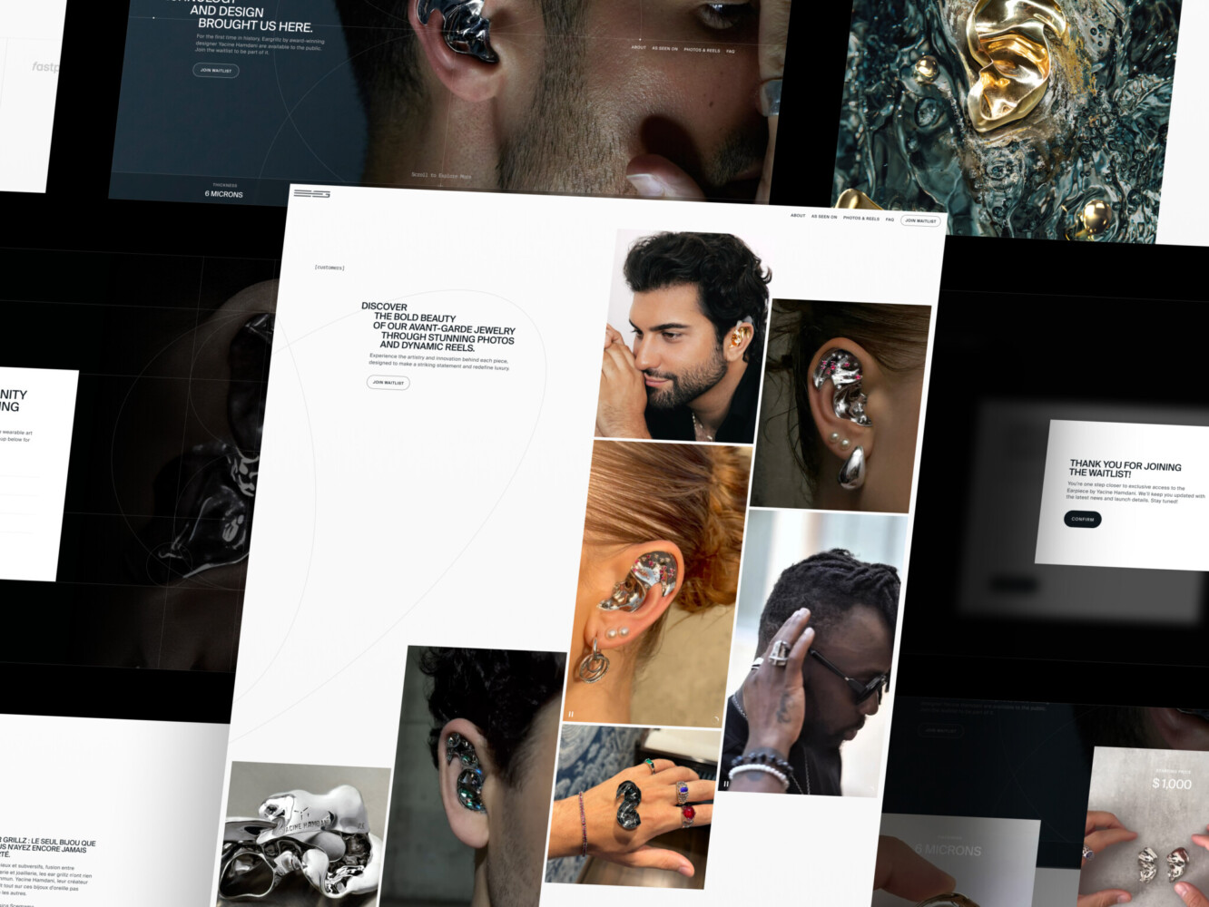
Landing Page for Avant-Garde Jewelry Product by Shakuro
2. Add Convenient Navigation, Filtering, and Search
Convenience is the main reason why people shop online. How much will a user buy if they feel uncomfortable? The major UX design trend of today is to create websites that make life easier for consumers and smoothly take them to the most important step — a purchase or other targeted action (leaving contact details, registering, and so on). To achieve this, a designer must think through every little detail.
According to ecommerce design best practices, everything should be logical and flow from one point to another so that the user does not rush about the website, but follow an easy structure and navigate through the pages. Menu —> product page —> cart —> and back. To achieve this, professionals in e-commerce design and development companies make user journey maps and test various options. As a result, the most optimal ones get selected.
- The brand logo should lead to the homepage and always remain in sight, no matter how deep the user goes.
- The catalog helps users switch to the correct category of products and find what they need.
- Breadcrumbs allow users to return to several hierarchical positions and thus expand the search field.
- Filtering allows excluding unnecessary items from massive search results and leads consumers from the homepage to the product page.
- The search bar lets users quickly find a particular item or category. It should be prominent and easy to find.
However, when designing an e-commerce website one important consideration should be to remember about the context or the store’s theme. For example, for a furniture store with 100K items, the main thing is not how nice the elements look, but how convenient the search and navigation functions are. Whereas, for the antics store with 100 products on display, the design comes first. You can try out some website navigation trends (keeping the website easy-to-use), and remove the search bar altogether.

Space 3D Model Store Slider Animation by Shakuro. This is where it’s possible to try out something sophisticated.
3. Put Emphasis and Maintain the Visual Hierarchy
Continuing with the subject of structure and smooth shopping flow. The most important information blocks should be located at the top of the page. For example, on almost every online store homepage, you can see the following elements that help understand what the website is about:
- logo and name in the header
- search bar
- navigation menu
- contacts
- A hero image or a slider
- an area with the main content
- footer.
A design that sells features a clear visual hierarchy. A simple structure and understandable visual hierarchy help visitors navigate the online store.
Due to the selection of CTAs a person immediately sees where to click to go to the desired section, and where there is just some text with useful information. When you give some extra visual attention (with the help of colors or typography) to your sale or latest products section this can act as a trigger for customers and give a sense of urgency.
What’s more, in the Western world, a person would follow the F and Z reading patterns while scanning a page. But thanks to the principles of visual hierarchyand ecommerce design best practices, a designer has the power to change this flow and guide the user to the focal points of the website to a goal.
E-Commerce Website Design by Shakuro
4. Stick to Simplicity and Appeal to the Wider Audience
An e-commerce website should be easy to browse and easy to digest. A website doesn’t have to have a dramatic design to be engaging. What makes a good e-commerce website design is the minimalism and the cleanness that make a website look refined and favor the products.
Everything should be on purpose, with nothing to distract the user from the content. It’s especially important to avoid overloading with information the websites offering a wide range of products. The best e-commerce design is light and spacious.
“Perfection is achieved, not when there is nothing more to add, but when there is nothing left to take away.”
-Antoine de Saint-Exupéry
There is also a risk that the user will not accept fresh ideas or innovative options when it comes to e-commerce websites. The more complex the design of the online store, the greater the chance that the buyer will not understand or appreciate it. It’s better to choose the proven patterns that have been tested on other sites.
A lot of white space, no more than three colors per page, pure tones and shades, simple and readable fonts — this is what distinguishes the websites that sell. This is necessary so that the buyer sees the forest behind the trees and the most useful information would not get lost behind the flashy design.
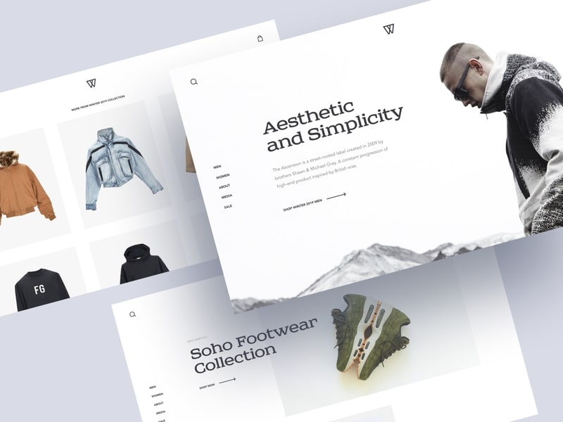
Street Fashion Store Concept by Shakuro makes use of visual simplicity.
5. Add Some Beauty and Personality
This point may seem to contradict the previous one, but it doesn’t. 38% of users leave a website if they find the layout unattractive. Attractiveness is a subjective thing, but the main idea is that just because a website is simple doesn’t mean it should be devoid of beauty and personality.
One of the things to consider when designing an e-commerce website is to find a balance between aesthetics and usefulness. In a situation where there are lots of websites selling (practically) the same stuff, it’s not enough to provide a competitive price. The best e-commerce website design captivates.
An average consumer is… Well, a consumer. They don’t read all the texts. And sometimes they even aren’t sure what particular item to choose. They just “need a hairdryer”. So they come to the page without understanding much about hairdryers, and this is where the design steps in.
How convenient the page is, how accessible and clear everything is, how prominent are the CTAs and how simple and convenient the purchasing process. If they like it, they buy it. If they don’t, they leave for another website or change their mind. The actual product is secondary in this scenario.
How to design an e-commerce website without making it too flashy but keeping it creative and emotional?
- Imagery should not only be consistent with the brand but be relatable to the user and create an emotional connection.
- Colors play into emotions psychologically, evoking particular feelings, and set the tone of the website.
- Copy needs to be made in a certain tone of voice that can be different: professional, humorous, friendly, surprising, empathetic, depending on the target audience.
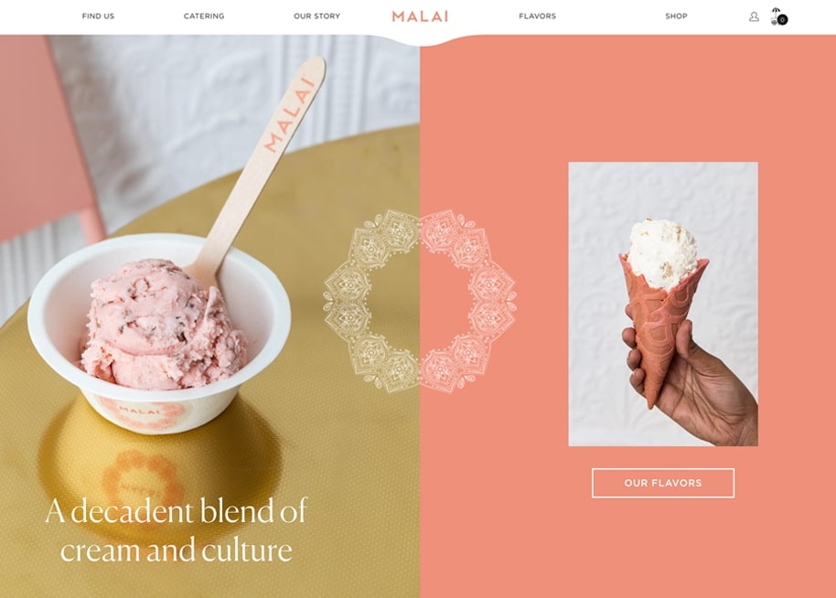
This example uses all the elements, especially colors and imagery, to deliver a sense of warmness, coziness, and sweetness.
6. Keep it Consistent and Branded
A website design should correspond with the products, reflect them, complement the brand, create a unique feeling for the products. An e-commerce website is a major part of a brand’s identity and it’s a designer’s job to convey the attributes and values they want the products to embody.
Users remember the branded design. To stand out from the crowd, a unique identity is a prerequisite. The concept of corporate identity includes a logo, slogan, corporate fonts, and colors. So make sure to use the same fonts, colors and general design patterns throughout the website to make users recognize and remember the brand. Presenting a brand consistently across all platforms can increase revenue by up to 23%.

E-Commerce Website Design by Shakuro
7. Make it Responsive
79% of smartphone users have made a purchase online using their mobile devices in the last 6 months. That is, more than three-quarters of online shoppers would go to online stores nowadays.
If an e-commerce website is not optimized for mobile devices, then when visiting such a store using a smartphone, all the interface elements and texts will look too small. It would be inconvenient for a person to use the website.
The necessity of having a mobile version of a website nowadays is not for discussion. If a website doesn’t have a responsive version, users won’t be able to properly view or interact with it, which will cause them to abandon a store in favor of another.
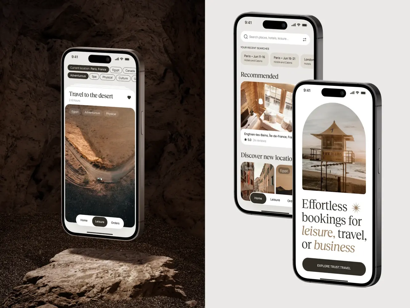
Travel Booking Mobile App Design by Shakuro
8. Provide Multiple Ways to Get in Touch
Customers will sooner click the ‘Order’ button if they are sure about the ways to get in touch in case they run into any issues.
- Add a contact page with an e-mail, a phone number, and a physical store location
- place links to social media profiles
- add a FAQ page.
Live chats. People don’t always buy what they came for. Most often they leave with what they have been sold. This golden rule is as old as the world, but nonetheless, it works very well in the e-commerce world.
According to ecommerce design best practices, it is also important for potential buyers to understand that there is somebody on the website. The easiest way to show this is to enable a live chat to help customers find and select the right products and increase the average check by offering extra services and products.
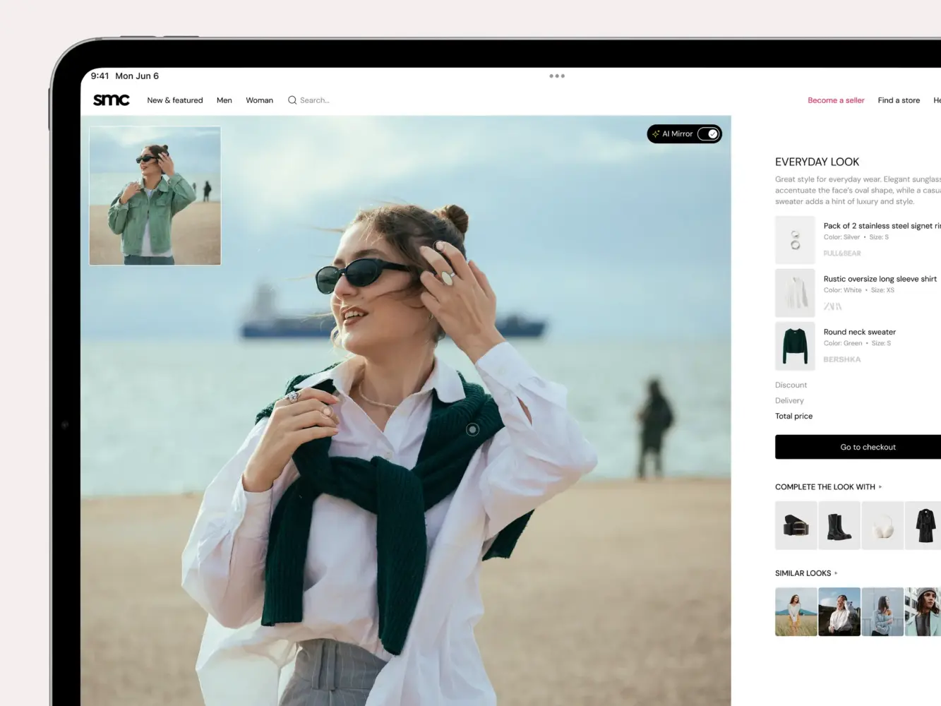
Website Design for an AI-Driven Fashion Platform by Shakuro
9. Add Social Proof
Even if a company is an honest one, it doesn’t mean that customers think the same. One effective way to gain customer confidence is to use social proof. In can be:
- Customer reviews
- Awards
- Mentions in the press
- Entertaining information about the company.
But don’t add it all at once. Many companies bombard their websites with social evidence, and sometimes it looks a bit self-righteous. Consider the most important and more appropriate evidence. Put yourself in the shoes of a customer and think about what they might want to find on a website that is yet unknown to them.
Design for a Supplements and Accessories Brand by Conceptzilla
-
Add Trust Signals and Clear Policies
Add trust and security signals, such as clear payment security badges, return policies, and privacy reassurance. This builds trust with your users naturally, so they become more loyal to your brand. They also experience positive emotions and feel more secure when using your product.

Summing it up
Let’s recap ecommerce design best practices:
- Use quality photos and videos.
- Add convenient navigation, filtering, and search.
- Put emphasis and maintain the visual hierarchy.
- Stick to simplicity and appeal to the wider audience.
- Add some beauty and personality.
- Keep consistency and branding.
- Make it responsive.
- Provide multiple ways to get in touch.
- Add social proof.
-
Add trust signals and clear policies.
The aim of every online store is to sell, and a good e-commerce website design helps it with that. Find inspiration in real life, so any modification should be based on the functional requirements. Most often they are aimed at extracting the maximum possible profit.
Ready to create a web design for your solution using these ecommerce design best practices? Contact us and let’s build a convenient place for digital services together.
* * *
This article about finance app development was originally published in April 2020 and was updated in May 2026 to make it more relevant and comprehensive.