This is a complete e-commerce website development guide. Here you’ll find all you need to create your website for selling on the internet. You get a detailed checklist, examples, and a method to create your website that is based on extensive experience in developing e-commerce websites. Reading this guide is like getting a 5-hour consultation with an experienced developer.
In addition, we provide an e-commerce website development cost breakdown, relevant for 2026. Let’s dive into the idea of creating a website step by step to get a trendy and functional online place for generating tons of sales.
Contents:
Key Takeaways
- Choosing between a platform and custom development often looks like a simple launch decision. In reality, the consequences show up later — usually when something needs to change and the system turns out to be harder to modify than expected.
- Stores that perform well rarely depend on clever tricks. More often, they rely on predictable structure, checkout that doesn’t slow people down, and integrations that continue working when traffic grows.
- By 2026, many teams are adding automation and AI tools for very practical reasons. Routine work accumulates, catalogs expand, and sooner or later manual processes stop keeping up.
E-Commerce Website Development: Short Answer
E-commerce website development means designing and building an online store that can handle product pages, checkout, payments, shipping, inventory, customer accounts, analytics, and marketing tools. A small store can often start with Shopify, WooCommerce, or another ready-made platform. A growing business may need custom e-commerce development when the store requires unique checkout logic, complex integrations, AI-powered search, personalized recommendations, or a headless architecture.
The right approach depends on your catalog size, business model, budget, timeline, integrations, and how much flexibility you will need after launch.
How to develop an e-commerce website: first stages
It is crucial for creating any website to start the work with a clear vision of design style, business logic, and strong website architecture. With these three main points established, the code can be organized instinctively and simply.
In deciding the way to develop your website, you need to dig into the purchasing process and get inside your business logic to realize it effortlessly online. This will save you time and decrease the cost of developing an e-commerce website.
“Business logic – in computer software, business logic is the part of the program that encodes the real-world business rules that determine how data can be created, stored, and changed.” – Wikipedia
Choose a way of website development for e-commerce
There are two major options to develop an e-commerce website. Each of them requires a completely different approach. In the first case, we collect many ready-made components and plugins, and in the second we code ourselves.
#1 Website builders
These websites are created using WordPress, Shopify, OpenCart, Shopware, WooCommerce, PrestaShop, Magento, BigCommerce, etc.
- Advantages: e-commerce website development on WordPress and other platforms is not limited in capabilities. You can even use e-commerce templates. This is the internal site engine, to which the front end is already connected. There are also thousands of ready-made plugins for everything e-commerce related, from Delivery options to SEO. You can integrate any functions with the site yourself.
- Disadvantages: e-commerce website development platforms are suitable for those who are okay with the platform’s template flow. By choosing platform-based website development, on WordPress or another platform, you agree to a specific scenario flow, which you cannot change or remove. There are difficulties in super complex solutions or interfaces.
- Cost: $10,000+
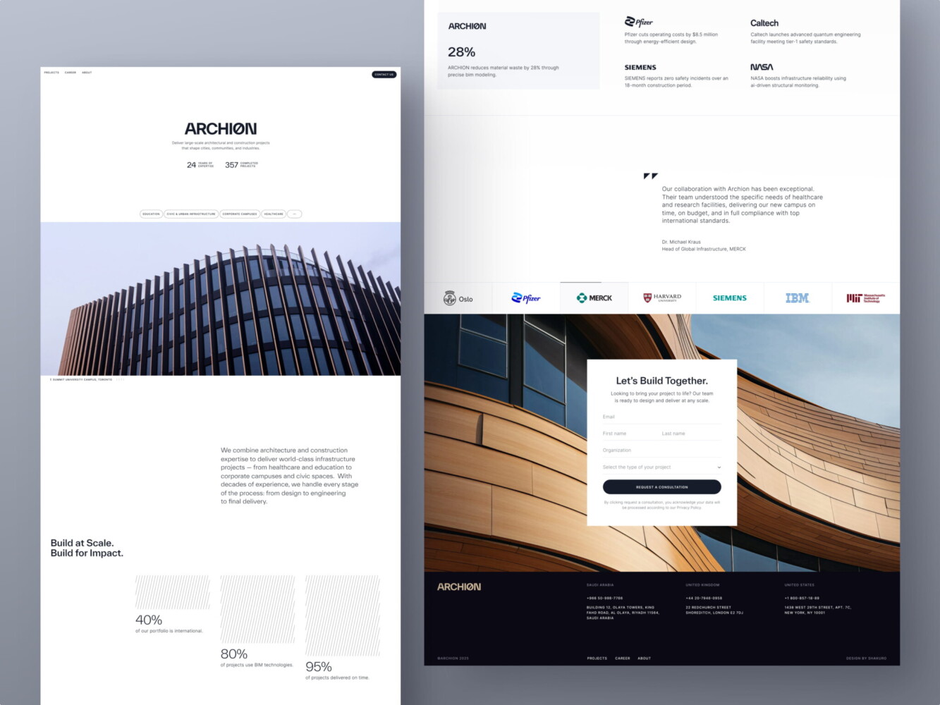
Design for Construction Lead Generation Platform by Shakuro
#2 Custom websites
These are built by e-commerce websites development companies from the beginning to the end.
- Advantages: you can implement any function and feature, even the most extraordinary and exclusive. If there are any complex unique solutions, then it is better to create a design layout and build a custom website from scratch.
- Disadvantages: custom e-commerce website development is a long and expensive process.
- Cost: $50,000+
In almost 99 of 100 cases, you’ll need to change the structure and architecture of basic website platform templates. Especially when it comes to the main page or product pages – they are rarely a perfect match for the idea of your project. Each business is unique in its way, and many pages of the site require a custom approach. Professional developers will get over it with ease.
When Custom E-Commerce Development Makes Sense
A ready-made e-commerce platform is often enough for a small store with standard product pages, checkout, shipping, and payment flows. It helps launch faster and keeps the initial budget lower.
Custom e-commerce development starts to make more sense when the store needs logic that standard templates cannot handle well. This usually happens when the business has complex pricing, product configuration, subscriptions, marketplace features, regional catalogs, custom checkout, advanced search, loyalty programs, or deep integrations with ERP, CRM, warehouse, or analytics tools.
Custom development is also useful when the storefront experience is part of the brand. If the website needs unusual product presentation, strong mobile UX, high performance, or a headless setup, the frontend and backend should be planned together from the start.
If your store needs more than a standard platform flow, our web development team can help you choose the right architecture before development starts.
Formulate a work statement for a website development
Launching an e-commerce website seems simple. Find a platform, add product descriptions, prices, images, and that’s it, right? Far from it.
A cool, best-selling e-commerce website requires a great plan. That’s why it is crucial to formulate your requirements for the website. You can plan it while taking a consultation with a developer team representative. But it is more efficient to have it ready beforehand. Think through all the details to find the best solution for the online implementation. We propose to make at least wireframes. This is a schematic skeleton of the entire website, showing all the user flows.

Website development structure by Shakuro
Here is a list of questions for a website development brief for you to think about before developing an e-commerce website. Download and fill it in while formulating a work statement for your e-commerce website development.
E-commerce website development costs and checklist
Top points to pay attention to while creating an online store with bestseller potential. In this part, we will provide a cost to develop e-commerce website elements.
#1 Check if the quality of content and the load speed is amazing
It takes about 0.05 seconds for users to form an opinion about your website.
First things first, your website designs and look of all media content can influence the first impression and the purchasing decision a lot. So, the loading speed and the quality of your designs must be on top.
Tip: Use the WebP.
It is a special image format that is about twice as efficient as JPEG or PNG. It allows automatic image processing, which helps increase the loading speed. Check some more options to speed up your website.
Cost: basic feature of a website developing
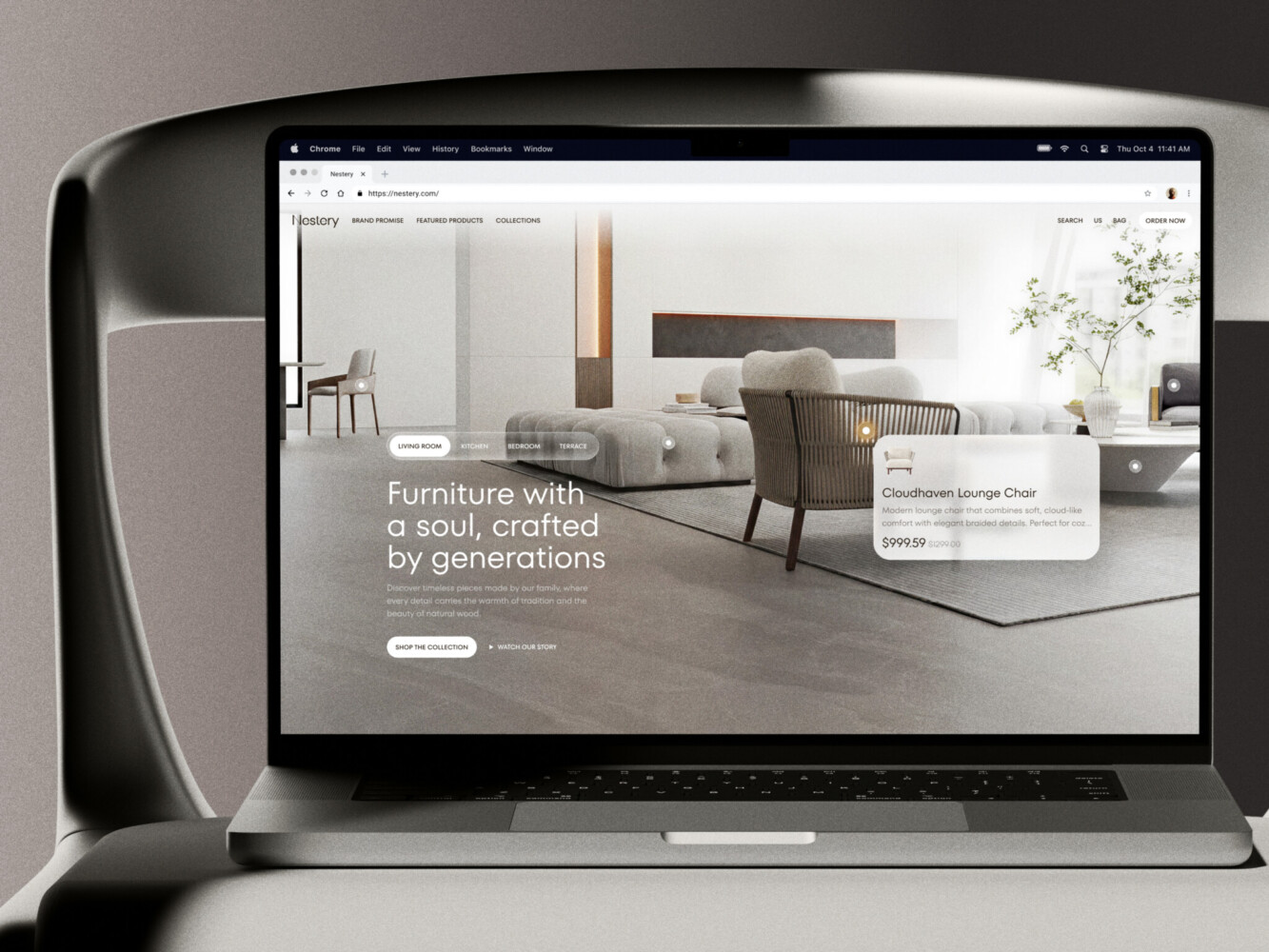
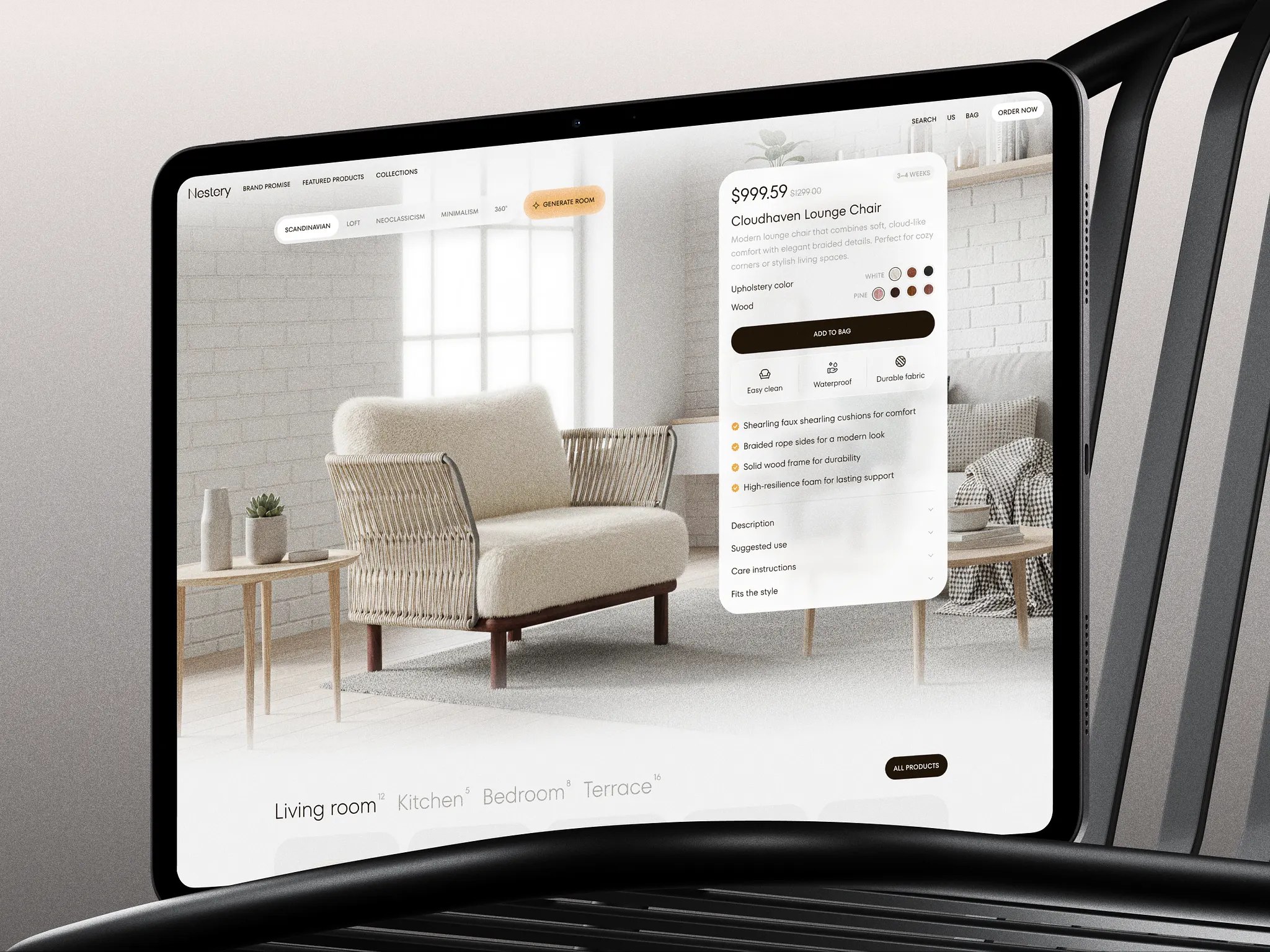
Ecommerce website by Shakuro
#2 Secure payment data and make users feel safe
26% of users say their credit card data has been stolen at least once. The main rule for data protection is not to store any payment information on your site – this is all done on the side of the payment processors. It makes no sense to build an integration with some banks, licenses, verifications, and certificates when you can provide security for the user by using third-party ready-made services. These payment services are responsible for the processing itself.
When a user wants to pay with a bank card, it will transfer to the bank’s page, and the bank will be responsible for the safety of the transaction. If everything is done according to coding standards, increase a chance of safe transactions. Developers perform only the initial security configuration, but you need to choose a professional and trustworthy team for that. You need to hire a development company that gets you right.
Cost: $300+ depending on the number of installed services
#3 Optimize payment options/checkout process and don’t let users abandon carts
Optimizing the payment options and checkout process can increase conversions by 33%. Here you need to apply your business logic to design a system and use best practices doing everything perfectly by the standards of the country where your buyers are located. Developers can either integrate any bank with your website to get payment, or, obviously, cooler, integrate any payment system, like PayPal inside your online store. The more options you have, the better you sell, as you widen your possible buyer audience.
If the standard checkout flow of the platform you choose for developing a website suits you, then you have a ready-made architectural project. Or you can make a custom checkout process. You want to smartly guide the user – if you show all 20 checkout fields on one page, they will leave the website, as it looks dull and difficult.
Tip: Don’t forget to add a guest checkout.
Don’t disappoint your customers with the absence of this option. Customers value the ability to pay without having to log in to your online store.
Cost: $300+, If custom checkout or payment integration, $1,000+
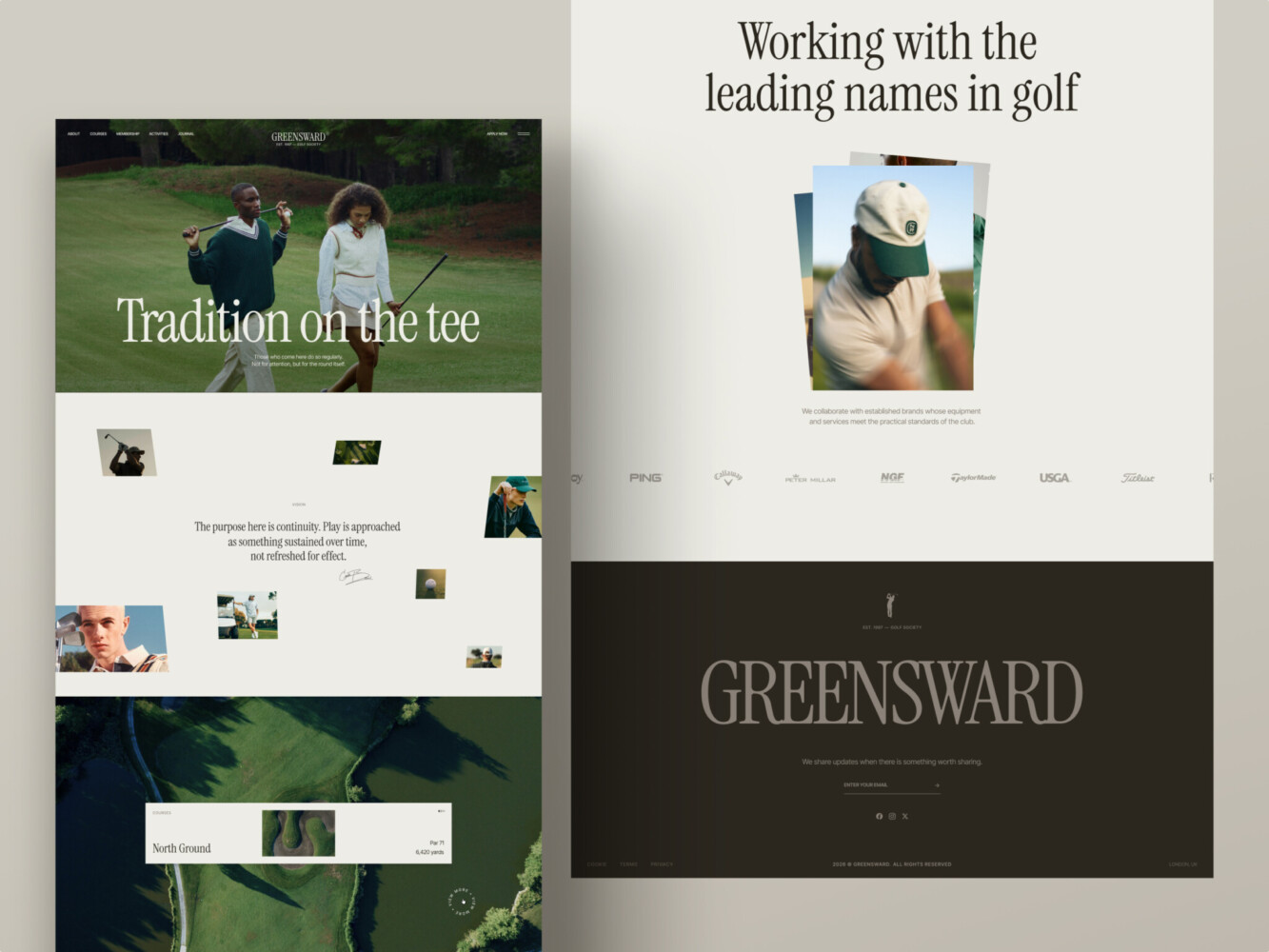
A website for a golf club by Shakuro
#4 Integrate ideal shipping services for your business to make a flawless sale
Keep in mind that this factor strongly affects your customer return percentage, as only 15% of customers are happy with the shipping speed they receive.
You can initially work with third-party shipping companies, and with an increase in the number of sales, you can spend money on developing a shipping solution of your own. Almost all popular delivery services have their website platform plugins.
Use advanced possibilities such as SMS notifications, creating a mobile application for your couriers, or you can adapt ready-made services to your needs. Study all services, choose the best ones for your business, or create a custom solution. It will often be more expensive, but in the long term it will pay off.
Cost: $600-800+ depending on the number of installed services.
Custom solution: $5,000+
#5 Drive sales across all devices and browsers
Think of mobile-first, as 54% of online activity is now done on portable devices. Boost your sales ten times with a responsive e-commerce website that works smoothly on desktop, tablet, mobile, and with all browsers. Most often this feature is included in the development process. For some things, it is not, such as an admin panel and a library with ready-made elements, plugins, and more. These may not be supported everywhere and need to be made responsive by developers as an advanced option.
It is essential to perform live interactive multi-browser testing. Emphasize this point when discussing an e-commerce website development service contractor. The development team will use the power of real machines running your website on various web browsers, web browsers and their versions, operating systems, devices, and resolutions. After checking how it’s running, they will fix all bugs.
Cost: $500+ for each new version of the website
Web Design for Architectural Company by Conceptzilla

E-commerce website UI examples: hot & new 2026 websites to learn from and get inspired
Let’s see how you can build an excellent e-commerce website development strategy and UI. And how it affects user behavior and sales efficiency. In this part of the guide, we will focus on the main features of these modern trending projects. Note that all these projects are custom software development.
The key to a great e-commerce website is leading the possible client to a sale. It is essential to understand the psychology behind your users’ decisions and create the ultimate brand experience. Read about design trends that make online shopping better in our other blog article.
Look at these examples of e-commerce web design. All of them have already taken their niches with great UI and are generating sales!
Shein: design with triggers
Let’s start with a project dedicated to women’s clothing, and one of the hyper-popular online stores in fast fashion. Shein website doesn’t look like a classic online store in this segment.
Its highlights are centered around improving sales performance. It includes the use of all the opportunities and psychological triggers leading the user towards a desire to purchase the goods. It does not concentrate on the exclusive presentation of branding. Furthermore, it is based on catching users’ attention and creating as many sales opportunities as possible. Here we can find trigger points for sales, such as:
The counter for a discount at the top is a very cool thing. Time limitation has proven to be the best trigger. Right on the main page, even without scrolling, we can count at least five variations of triggers for sale, which is probably the most important factor for an online clothing store.
10% off for the first purchase appears in three different places on the first screen of the main page, which increases attention to the offered discounts.

Shein website
Aesop: usable minimalism
Aesop cosmetics website differs from competitors in its absolute minimalism, smart usability, and uniqueness. Every element of the site immerses the buyer in the atmosphere of the brand. All actions on the site are as simple, one-dimensional, and pure as the product itself.
Product cards are one of the key elements of this e-commerce website. There’s no photo gallery here, only one photo where the product is simply photographed clearly from the front. One perfect photo is enough. The add-to-cart button also provides the price of the product, which is crazy simple, but a genius idea and a cool trigger.

Aesop website
Ok drugs: ambient design
This site is very funny and aims to relax the buyer. It creates an atmosphere of trust and understanding. Since these are cannabis gummies, the seller needed to maximize the feeling of a trustful relationship with the buyer. More tips on how to sell in e-commerce in our blog article.
There are a lot of elements that relax and make the buyer feel at home. Ironic funny elements, various colors, and shapes — they all say: “This is all a joke, this is not serious, this is an okay drug.” The website has the product cost explanation. It schematically shows how the price of the product is formed.

Ok Drugs website
Conclusion
Launching an e-commerce website usually isn’t the hardest step. The difficulty starts later — when orders increase, the catalog grows, and more integrations appear. That’s when weaknesses in the system begin to show.
Some projects move quickly at the beginning but become slower to maintain over time. Small changes take longer than expected, and new features feel risky. Other projects take more time early on but stay manageable as the store grows. In many cases, the difference traces back to early architectural decisions that seemed minor at the time.
If you’re planning a new store or redesigning an existing one, it’s worth pausing to think about how the system will behave a year from now, not just at launch. Many expensive rebuilds start with shortcuts that looked harmless early on. If you’d like to review your approach or discuss how the project might scale, reaching out to us can help clarify the direction before development moves too far.
FAQ
How much does e-commerce website development cost?
E-commerce website development cost depends on the platform, design complexity, number of pages, catalog size, checkout flow, integrations, payment methods, shipping logic, and custom features. A simple store costs less than a custom e-commerce platform with user accounts, subscriptions, AI search, ERP integration, or a headless setup.
How long does it take to build an e-commerce website?
A simple online store can take a few weeks. A custom e-commerce website usually takes a few months, especially if it includes custom design, complex checkout, integrations, migrations, or advanced admin features. The timeline depends on scope, content readiness, and technical complexity.
Is Shopify enough for an online store?
Shopify is often enough for small and medium online stores with standard product pages, checkout, payments, and shipping. You may need a custom solution if your store has complex business logic, unusual product flows, deep integrations, marketplace features, or a highly customized customer experience.
When do you need custom e-commerce development?
You need custom e-commerce development when templates and plugins start limiting the business. Common signs include complex pricing, subscriptions, regional catalogs, custom checkout, ERP or CRM integrations, marketplace logic, AI-powered search, or a need for stronger performance and flexibility.
What is headless commerce?
Headless commerce separates the frontend storefront from the backend commerce system. This lets teams design and update the customer experience more freely while keeping product, payment, order, and inventory logic in the backend. It is useful for brands that need flexibility, performance, and multiple sales channels.
Can AI improve an e-commerce website?
Yes. AI can improve product recommendations, search, personalization, customer support, product descriptions, fraud detection, analytics, and demand forecasting. It works best when the store has clean data, clear business goals, and the right safeguards for privacy, accuracy, and cost control.
* * *
This article about e-commerce website development was originally published in September 2017 and was updated in July 2026 to make it more relevant and comprehensive.