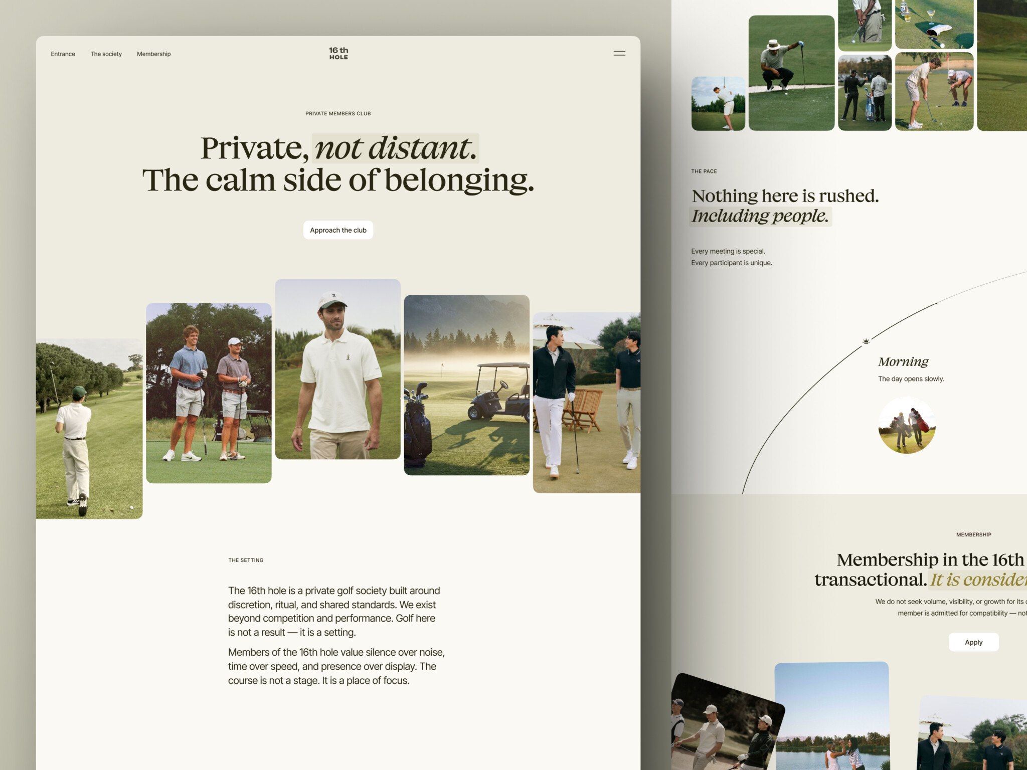
There are several reasons why users can quickly leave a website: page is not relevant to a user’s request, loading takes too much time, or there’s an error. But sometimes the low readability level of a page is enough, and this is the one reason often overlooked and neglected. Poor content readability means that even the best copy can’t succeed if it’s badly designed from the UX perspective.
At the same time, the problem of website readability may prove to be the easiest to deal with if you follow the guidelines. However “design-101” they may seem, it’s always useful to refresh your knowledge.
“Users won’t read web content unless the text is clear, the words and sentences are simple, and the information is easy to understand.” -Nielsen Norman Group
Let’s briefly cover the issue of readability vs legibility. Is there a difference? Legibility is about how a typeface looks and whether a particular character can be easily differentiated from another. Whereas readability refers to the layout of text and image blocks. So there is a difference. However, the majority of designers seem to use the term “readability” in its wider sense and apply it to the subject of fonts, page structure, content, colors, etc., so I too will continue along the same lines.
Let’s take a quick look at the main principles.
How to improve website readability: short answer
To improve website readability, use clear typography, enough spacing, strong color contrast, short paragraphs, descriptive headings, simple language, and mobile-friendly layouts. Readability is not only about making text look nice. It helps users understand your offer faster, complete forms with less friction, and make decisions without getting lost on the page.
1. Concentrate on typography
The right font
Which font is the best one is a question open for discussion. There’s no right answer. There is, however, a number of web-safe fonts that are preferable, including:
- Inter
- Manrope
- Geist
- DM Sans
- IBM Plex Sans
- system font stack
“Web-safe” means that these are the fonts that are pre-installed across all operating systems, including mobile, which ensures that your website appears exactly as you’ve intended it to be. However, web-safe fonts is not the only way, but you still need to keep an eye on loading, fallback, and performance.
As for the matter of serif vs sans serif fonts, it had traditionally been considered that serif fonts are for the printed materials, and sans serif ones are for the web, because letters with serifs sometimes got blurry on the screens. But due to the advancing quality of HD screens, it’s no longer an issue. Most fonts created by professional designers for large volumes of text do an excellent job, serif or not.
The main point is that it’s better not to overcomplicate things. Use a standard font as the main one. The more intricate ones are better suited for separate elements like headers. We are accustomed to standard fonts — they surround us everywhere. When a different font is suddenly used a lot, it might cause a slight rejection.
Font size
Some years ago, the most common website font size for texts was 12-14px — these values were considered optimal. Today, the rules of website typography are different. There are two main ways to specify font sizes:
- fixed value — today’s value gravitates towards 18-22px depending on a website and its audience, with 16px seeming to be the minimum (this font size is the default size for many browsers)
- percentage size indication — in this case, the font size is calculated by the browser depending on the specified system value.
It’s important to find a middle ground here. If the text is too large, it will take up too much space. Too small is also not an option since you have to strain your eyes to read it, which is tiresome. Besides, there’s a matter of web accessibility.
Line height
Line height (also called “leading” or “line space”) is the vertical distance between lines of text. It’s one of the key parameters that affect the perception of the text. It’s simple — the leading should be 1.5–1.8 times the size of the font.
That is, if the font size on your site is 16px, then the line height must be somewhere in the region between 24px and 29px.
Text markup and layout
In addition to the purely technical values of the size and line height, other parameters also affect the usability of the text.
Line length. The optimal line length is about 60–80 characters. If the line is longer, the reader might be forced to make too many eye movements and get tired faster.
Paragraph size. Try to place no more than 4–5 sentences in one paragraph. This will help your readers focus on the main point, and ease the perception of the entire text.
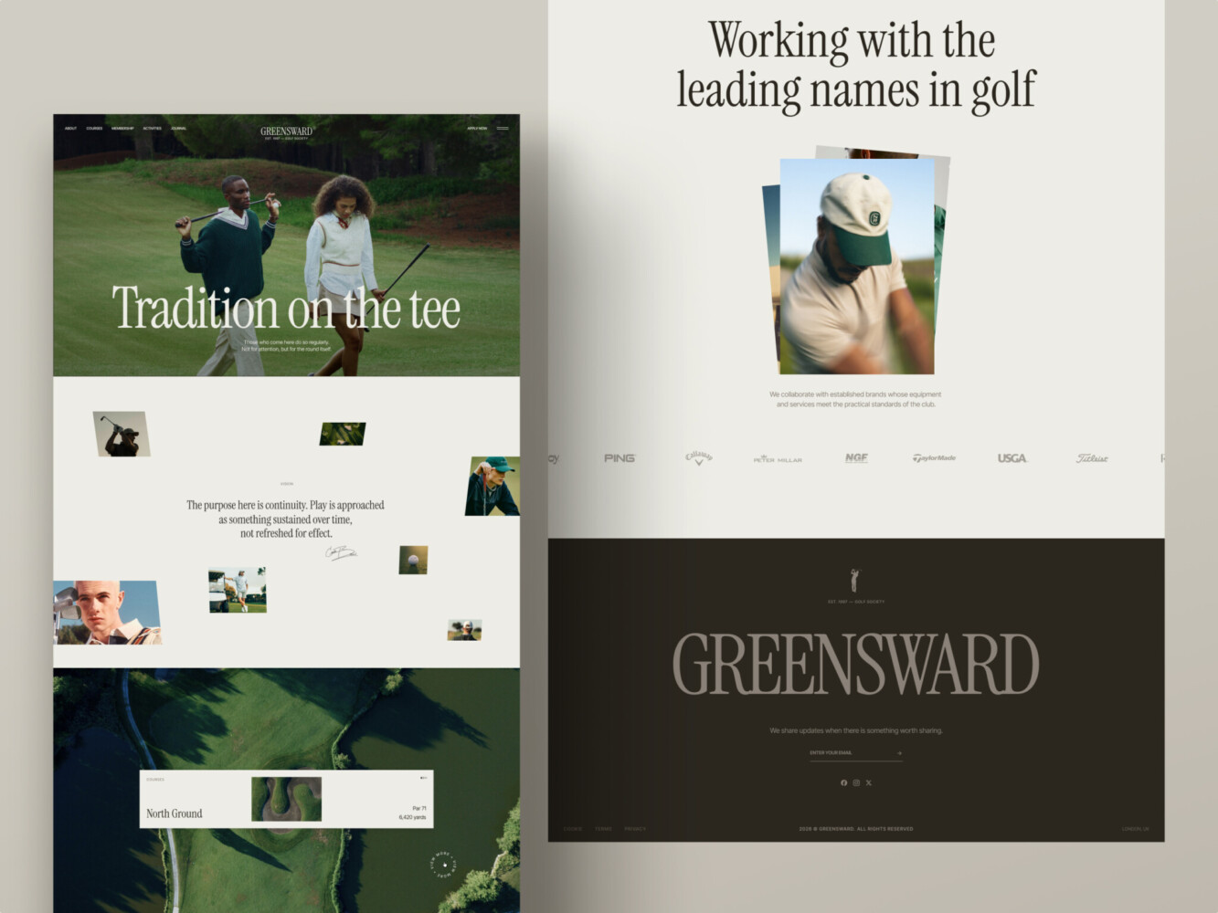
A website for a golf club by Shakuro
2. Use white space
In readability and UX, white space is an area not filled with any content, that can be white as well as any other color. White space is a wonderful thing helping to arrange the elements of website design in a clear and understandable way. Web design has come a long way from the maximum clutteredness of its early days to what we have today. We live in an era of white space and can see all the benefits that it gives.
It’s important to get rid of the idea that the whole space needs to be filled. Space needs to be used wisely. And that means letting it be empty sometimes. Empty space can have a powerful effect when it is used in such a way that it allows you to highlight content, increase readability and comprehension. It lets your design breathe.
3. Color contrast
The contrast ratio is the ratio of the font color to the background color.
According to WCAG 2.2 guidelines, the contrast between the text and the background should be at least 4.5:1 so that the text is legible and clear.
The contrast indicator can take values from 1:1 (no contrast) to 21:1 (maximum contrast — black on white). The mentioned manual puts forward the following requirements for text contrast:
- 3:1 — minimum contrast. Used for larger texts
- 4.5:1 — minimum contrast for text
- 7:1 — enhanced contrast for text
- 16px minimum for body text
- readable focus states
- zoom 125-200%
- not relying on color alone
- accessible links and buttons
- plain error messages
There are a lot of text contrast calculators on the web, for example, this one.
This is important because low contrast increases the strain on the eyes, and so, the perception of information gets deteriorated.
“Noisy” backgrounds — pictures instead of background — are also “heavier”. If an image as a background is still necessary, then the text on the page should be placed only in plain areas with high contrast ratio in relation to the text.
For more on how to use color in web design, read about color psychology and conversions.

E-Commerce Website Design by Shakuro
4. Keep it short and relevant
Usually, users read less than a third of the content on a page. They come to a website to find answers to their questions. They don’t intend to study large volumes of text.
When writing for the web, remember:
- user time is limited
- users need an answer to their question
- figurative speech and artistic style do not correspond to the goals and objectives of the user (except for resources dedicated to literature).
Readability and conversions
Readability affects more than blog posts. It also affects landing pages, pricing pages, forms, product pages, checkout flows, and SaaS dashboards. If users cannot quickly understand what the page says, they are less likely to sign up, book a call, buy a product, or finish a task.
For a service page, readable copy helps people understand the offer, proof, process, and next step. For an e-commerce page, it helps users compare products and complete checkout. For a SaaS dashboard, it helps teams scan data, labels, filters, and actions without slowing down.
A readable page does not mean a plain page. It means the design gives the text enough structure, contrast, and space to do its job.
If your website looks good but users still do not act, readability may be part of the problem. Our UI/UX design team can help review the page structure, copy hierarchy, and conversion flow.
Readability by page type
| Page type | What readability should support | What to check |
| Landing page | Fast understanding of the offer | H1, subheading, CTA, proof, section order |
| Service page | Trust and decision-making | Process, benefits, case studies, FAQ, CTA |
| SaaS dashboard | Fast scanning and task completion | Labels, tables, filters, errors, empty states |
| E-commerce page | Product comparison and checkout | Product text, price, specs, reviews, buttons |
| Blog article | Reading depth and scanning | Headings, paragraphs, lists, line length |
| Form or onboarding | Fewer mistakes and less friction | Field labels, helper text, errors, progress states |
5. Visual hierarchy in web design
People don’t read word-by-word, they scan. A person’s eyes move quickly through the text, grabbing familiar visual forms of words.
You can have a great design and a wonderful large print on your website. But if there’s too much text, few will have the desire to read it to the end. It’s extremely important to use other HTML elements like:
- Bold, italic, underlined, highlighted text
- Subheadings
- Paragraphs
- Lists
- Quotes
- Images
With the help of headers and subheaders of various levels, a web designer divides the text into blocks that are convenient for perceiving. This helps to quickly find out what the content is about. The hierarchy of headings and fonts simplify the understanding and speed up the perception of information.

6. Make text work on mobile
A page can look clear on desktop and still feel heavy on a phone. Mobile screens give users less space, shorter attention spans, and more chances to get distracted. This makes readability even more important.
If you want to enhance website readability on mobile, start with the basics: use a readable font size, keep line length short, and avoid dense paragraphs. Body text should not make users pinch, zoom, or rotate the screen. Headings should help people understand the page quickly, and buttons should be easy to tap without getting in the way of the text.
Also check how text behaves inside cards, menus, forms, tables, and pop-ups. These are the places where mobile readability often breaks first. A long label, small helper text, or crowded error message can make a simple task feel harder than it is.
Before launch, test important pages on real mobile devices. Look at the page while scrolling, filling out a form, opening the menu, and tapping a CTA. If users can understand the page without slowing down, the mobile reading experience is doing its job.
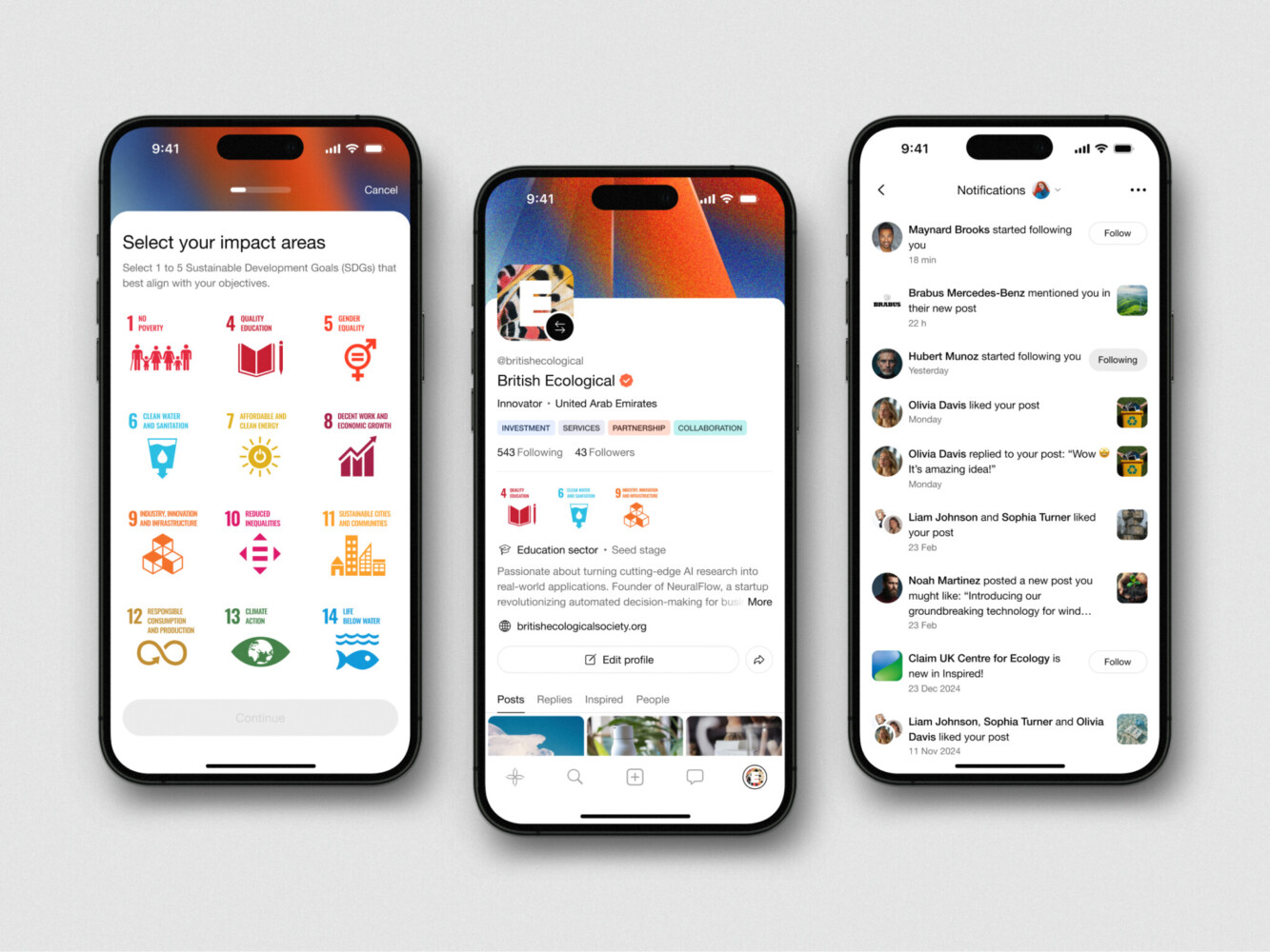
Mobile App Design for Inspired by Shakuro
7. Test readability in real user flows
Readability is not only about paragraphs and blog posts. It also affects the parts of a website where users make decisions: service pages, pricing sections, forms, checkout, onboarding, dashboards, and calls to action.
A page may look clean, but still fail if users cannot quickly understand what to do next. For example, unclear button text can reduce clicks. Long form labels can create mistakes. Dense pricing copy can slow down a decision. A dashboard with vague labels can make users doubt the data they are looking at.
To improve readability in UX flows, check each step from the user’s point of view. What do they need to know here? What action should they take? Is the most important information visible before the details? Are labels, helper text, errors, and CTAs clear enough?
Good readability makes the next step feel obvious. It helps users move through the page or product without rereading, guessing, or asking for help. Especially when it comes to website redesign.
Website readability checklist before launch
- Is the body text easy to read on mobile?
- Are paragraphs short enough to scan?
- Does every section have a clear heading?
- Is the contrast strong enough for normal and small text?
- Are links and buttons easy to recognize?
- Do forms have clear labels and error messages?
- Is important content visible without too much scrolling?
- Does the page still work at 125-150% zoom?
- Can users understand the next step without reading every word?
Summing it up
Website readability depends on many factors, ranging from the overall design of the site to the design of each individual article. It requires the combined efforts of designers and copywriters. Your website is easy to improve using these universal techniques, they are the distilled rules applicable to any type of content.
Make a habit of evaluating each web page and printed material in terms of readability. If you need help with enhancing your website readability or create a website from scratch, drop us a message. Let’s build a reliable and accessible solution.

E-Commerce Website Design by Shakuro
FAQ
What is website readability?
Website readability is how easy it is for users to read, scan, and understand content on a web page. It depends on typography, spacing, contrast, layout, content structure, and language clarity.
Why is readability important in web design?
Readability helps users understand a page faster and with less effort. If the text is hard to read, people may leave before they understand the offer, product, or next step.
What is the best font size for website readability?
For body text, 16px is usually the minimum. Many modern websites use 17-20px, depending on the font, layout, audience, and device. The text should be tested on both desktop and mobile.
How does readability affect conversion rate?
Readable pages make it easier for users to understand benefits, compare options, fill out forms, and click CTAs. Poor readability creates friction, which can reduce sign-ups, purchases, demo requests, or other conversions.
How do you improve readability on mobile?
Use a readable font size, short paragraphs, clear headings, enough spacing, strong contrast, and tap-friendly buttons. Also test forms, menus, cards, pop-ups, and CTAs on real mobile devices.
What is the difference between readability and legibility?
Legibility is about how easy individual letters and words are to recognize. Readability is broader: it covers how easy the whole text, layout, and page structure are to read and understand.
Related reading
- A Writer’s Guide To Typography
- Website Header Design: Best Practices & Examples
- Font Psychology Tricks To Enhance Your UX
* * *
This article was originally published in April 2020 and was updated in July 2026 to make it more relevant and comprehensive.