With 2025 just around the corner, the pressure to identify and adopt the right UI/UX design trends is more intense than ever. The stakes are high; choosing the wrong direction often leads to uninspired user experiences and missed opportunities in a competitive market.
Contents:
As you sift through a myriad of emerging trends, it’s easy to feel overwhelmed by the noise. Which innovations will truly resonate with users? Which trends are fleeting fads?
Together with the Shakuro designer team, we will cut through the clutter and highlight the ten most impactful trends in UX for 2025. By the end of the article, you’ll be better equipped to create engaging, user-centered designs that meet and exceed expectations.
10 UI/UX trends for 2025
Website builders taking over
Businesses are switching to website builders like Webflow. These solutions are obviously cheaper, and now they also offer a cutting-edge toolkit: AI assistants, Lottie and Spline support, CMS APIs, etc. In 2025, website builders will continue to gain users and become a website design trend. With their effectiveness and flexibility, the Overton window for custom web development is narrowing.
No-Code Development Platform by Shakuro
Artificial Intelligence becomes essential
AI evolves by leaps and bounds: Today, it helps automate processes and save budgets, such as graphics generation, prototype building, research conducting, etc. Tools like Relume.io or Otio.ai provide many laser-focused services on app design and development. Using Artificial Intelligence in creation processes is likely to become a UI design trend next year.
AI will be widely used in video generation. Recently, Sora showcased almost true-to-life quality during closed tests. Before that announcement, many companies rushed to be the first ones to create similar neural networks for video generation, with great results nevertheless. So lots of presentation assets will be AI-generated.
The same goes for other designs, like 3D texts. December was rich with announcements of AI generators showing amazing results in this field.
A new step in AI evolution
As a UX design trend, Artificial intelligence keeps evolving. So far, AI is only thinking and suggesting when resolving problems, but soon, it will be able to act. Sounds ominous but let us explain.
The “agentic” systems as McKinsey calls them have existed for years. These systems can interact independently in the digital space. However, injected with AI powers and NLP, “agents” are learning how to use online tools, collaborate, communicate with people, and plan their actions. In other words, AI-enabled agents can complete complex workflows with multiple steps. This speeds up design and development processes drastically, saving you both time and money.
For example, tools like Microsoft Copilot are already becoming more action-based. Soon, such smart agents will be a UI/UX design trend and as common as chatbots, helping you improve your services.
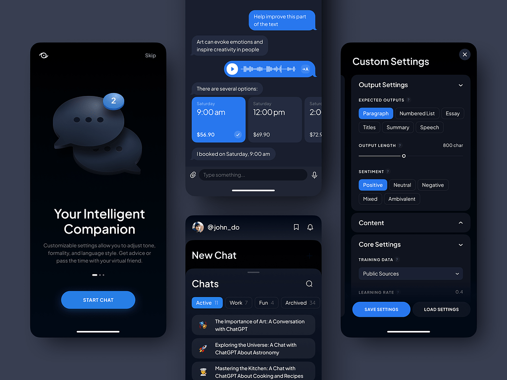
The AI Prompt Assistant by Conceptzilla
AR and VR still stand
Despite a decrease in sales last year, enterprise companies continue investing in immersive technologies. With these tools, businesses can expand the boundaries of the physical world and offer new opportunities for their customers.
Apple released the Vision Pro headset which spiked interest among users and other businesses. They began researching immersive experiences for e-commerce, interior design, e-learning, etc.
This UX design trend also supports other tendencies like glassmorphism and multi-layering. With the glassmorphism style, you can show the user that the object is superimposed and something else is behind it. So UI doesn’t completely overshadow the real space. Multi-layering gives you an endless workspace in immersive reality: you can open and attach multiple windows to different places—all in one app.
Financial analytics dashboard by Conceptzilla
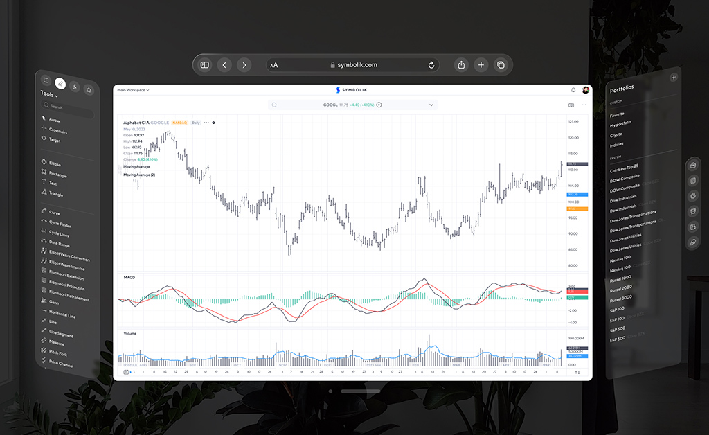
Enhanced connectivity
Technologies like satellite connections and 5G offer smoother interactions and real-time updates within mobile apps. Satellites can extend coverage to remote areas, ensuring accessibility where traditional networks may struggle.
Extended connectivity paves the way for applications in industries like agriculture, logistics, and emergency services, where traditional connectivity is unreliable. These UI/UX trends impact users’ lives offering more integrated and responsive smart solutions in everyday life.
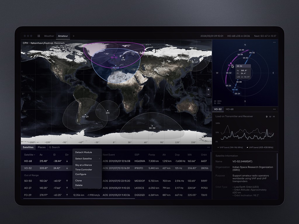
Dashboard Design for Satellite Monitoring by Shakuro
Silent authentication
The user verifies their identity with minimal or no active input from them. This method leverages various background technologies to reduce friction during the login or authentication process.
A UI/UX design agency can apply it to apps where security is crucial: banking apps, e-commerce, and social media platforms. You can implement it with biometric recognition (voice, fingerprint, face, etc), device recognition, or session tokens.
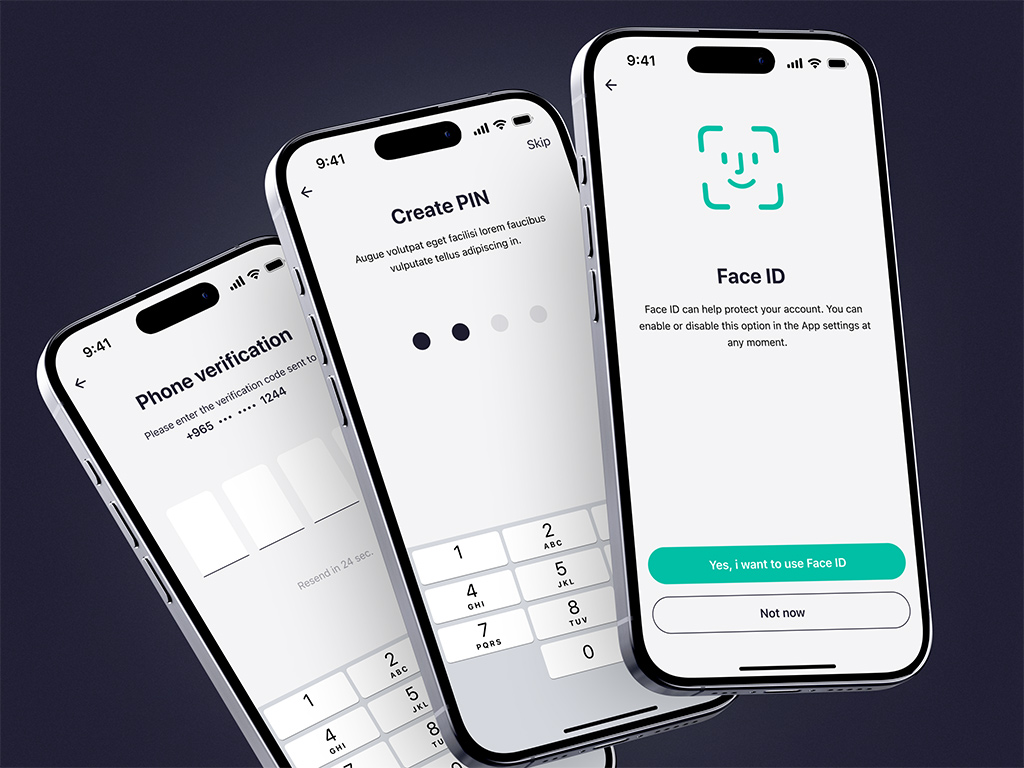
Silent authentication for ZAD app by Shakuro
Farewell to static websites
They are going to be rare species. Web development technologies set out on a path, with the position called “creative developer” turning into a popular and demanded thing for businesses.
A high level of interactivity is a 2025 website design trend, so next year will show an increase for that position.
The developers will start a competition—who has a cooler 3D donut spinning in the website banner with as little code as possible.
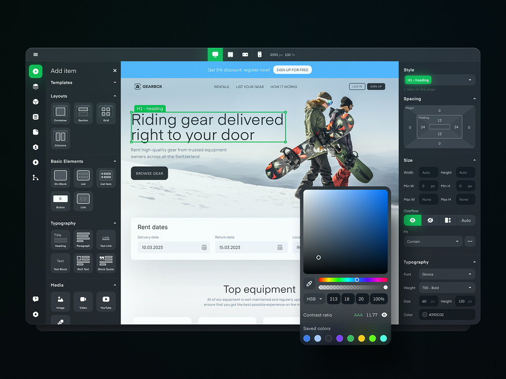
Market monopoly
Figma drove out all potential competitors. Some left the market quietly, and some like Framer dove into app development. Judging by their open positions, 2025 will be the herald of new features with a clear direction: designer + developer = one language.
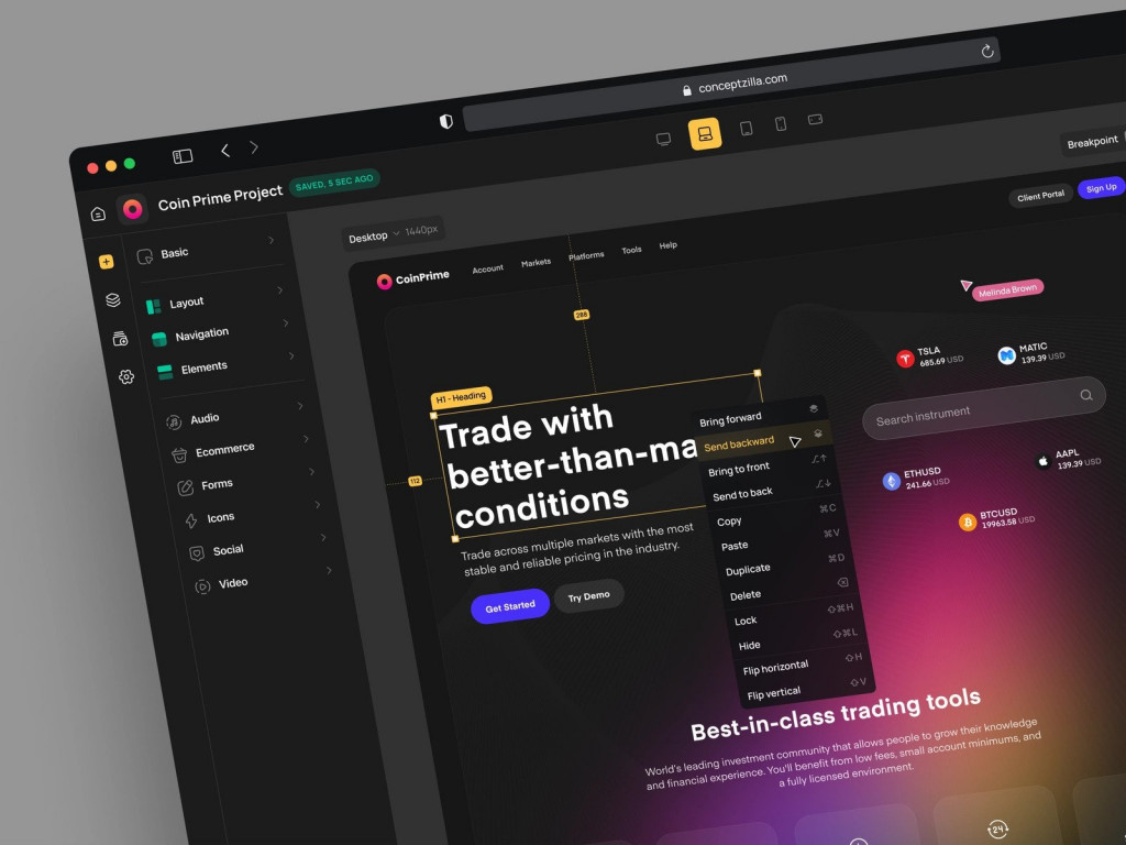
No Code Constructor Design Concept by Conceptzilla
Looks are still the same
UI/UX design trends have changed little in terms of aesthetics since industry giants have not released any ground-breaking changes. Good old visuals are still viable.
The tables may turn if Apple or Android releases an update with a fundamentally different design. Remember when Windows created an awkwardly-looking bento style? Or when Apple shifted from skewmorphism to flat? We are talking about that level of change.
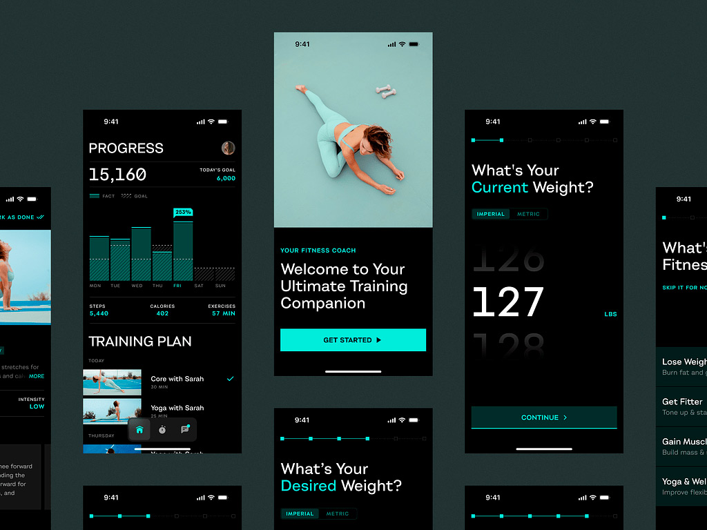
Mobile Sport App by Shakuro
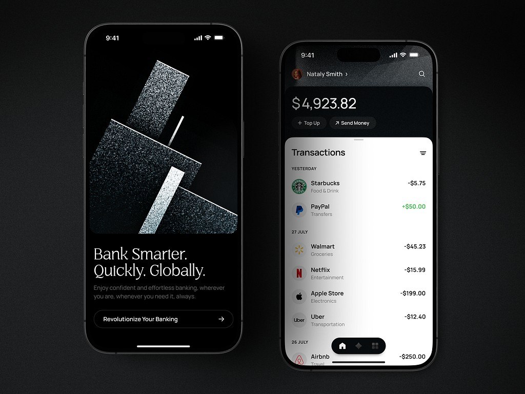
Dark mode is a must
People are focused on health and wellness, so offer more relevant options in your UI/UX design services. For example, dark mode. It has become a standard that reduces eye strain, especially in low-light environments, making it more comfortable for users to engage with the app for extended periods. The mode also improves accessibility for people with visual impairments or light sensitivity. For text-heavy applications, dark mode enhances readability by reducing glare and emphasizing content. This helps create a more inclusive experience for all users.
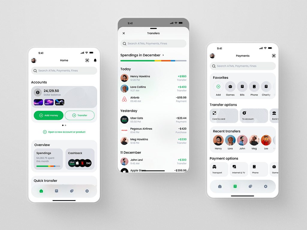
Light theme for a fintech app by Shakuro
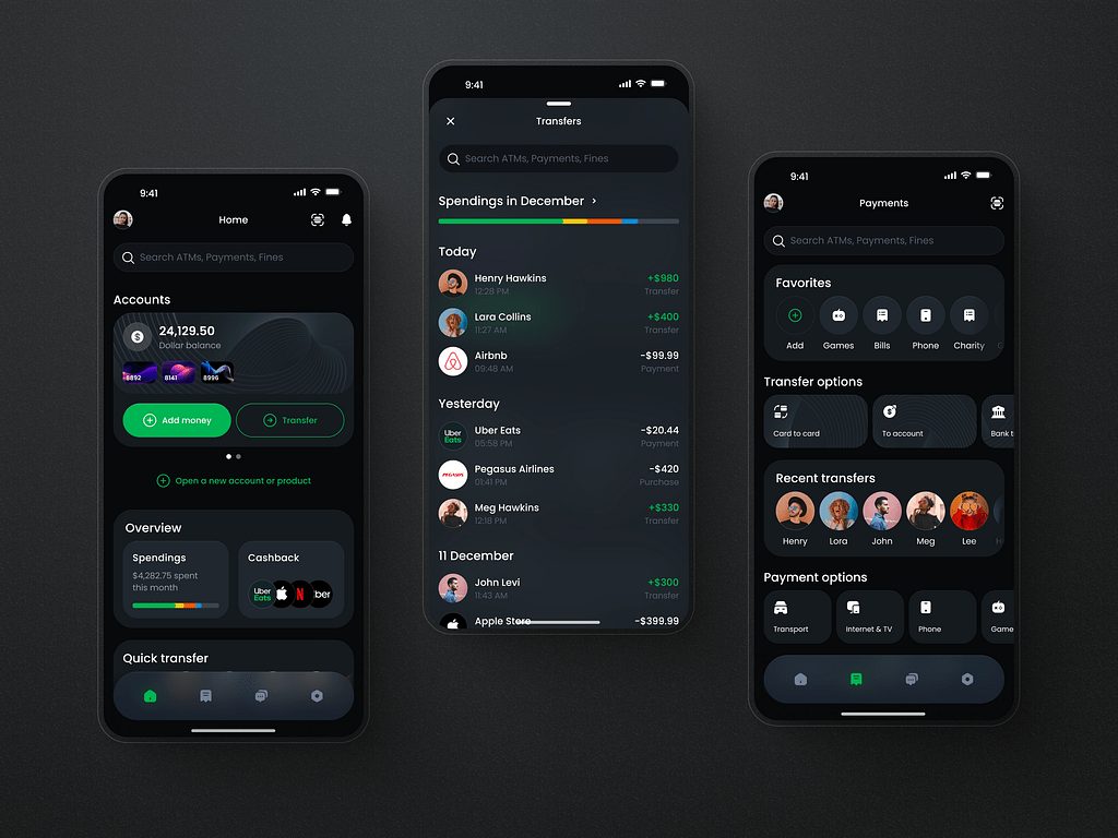
Dark theme for a fintech app by Shakuro
Leverage UI/UX trends for 2025
Trends in UX will continue to evolve, shaped by tech advancements, user expectations, and the digital landscape.
Artificial Intelligence is already changing many aspects of the design. It becomes essential to simplify and automate many tasks. With smart assistants, you can save time and effort by paying attention to more pressing issues. Take advantage of highly interactive designs and offer immersive, intuitive, and enjoyable experiences to your target audience.
Looking for a UI/UX design agency for your next project? We follow the latest trends and best industry practices. Contact us and let’s work together to create responsive designs.
Written by Mary Moore and the Shakuro Design team