A creative portfolio website for a world‑renowned photographer
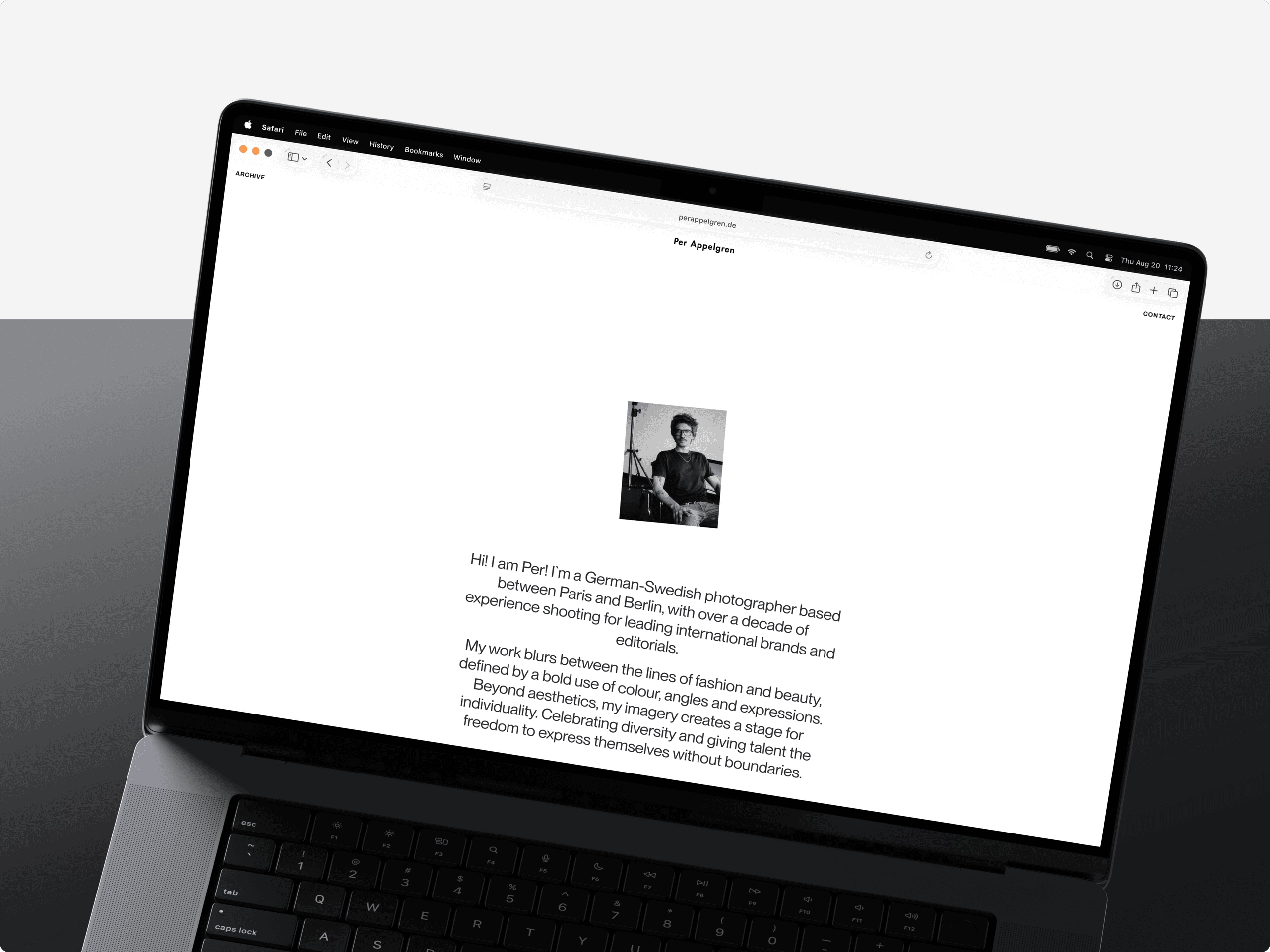
Per Appelgren is a German-Swedish fashion and beauty photographer working between Paris and Berlin. His editorial and commercial photography is known for expressive color, precise composition, and subjects with real character.
About the project
The project began with a simple question: how should Per’s work live online? We created a portfolio that gives the photography room to lead and makes an extensive archive easy to explore. The experience reflects Per’s creative perspective while staying clear and intuitive.
- Next.js App Router
- Three.js
- WebGL
- Sanity
- Vercel
Goals
The goal was to build a portfolio with the same confidence and personality as Per’s photography, while strengthening his presence online. Projects needed to unfold like editorial stories, and browsing had to stay smooth across desktop and mobile.
Key challenges
The main challenge was balancing creative expression with usability. Per’s projects vary widely in format, style, and composition. The system had to adapt to each body of work without forcing it into the same template. The interface also needed enough character to be memorable, without drawing attention away from the photography.
Design approach
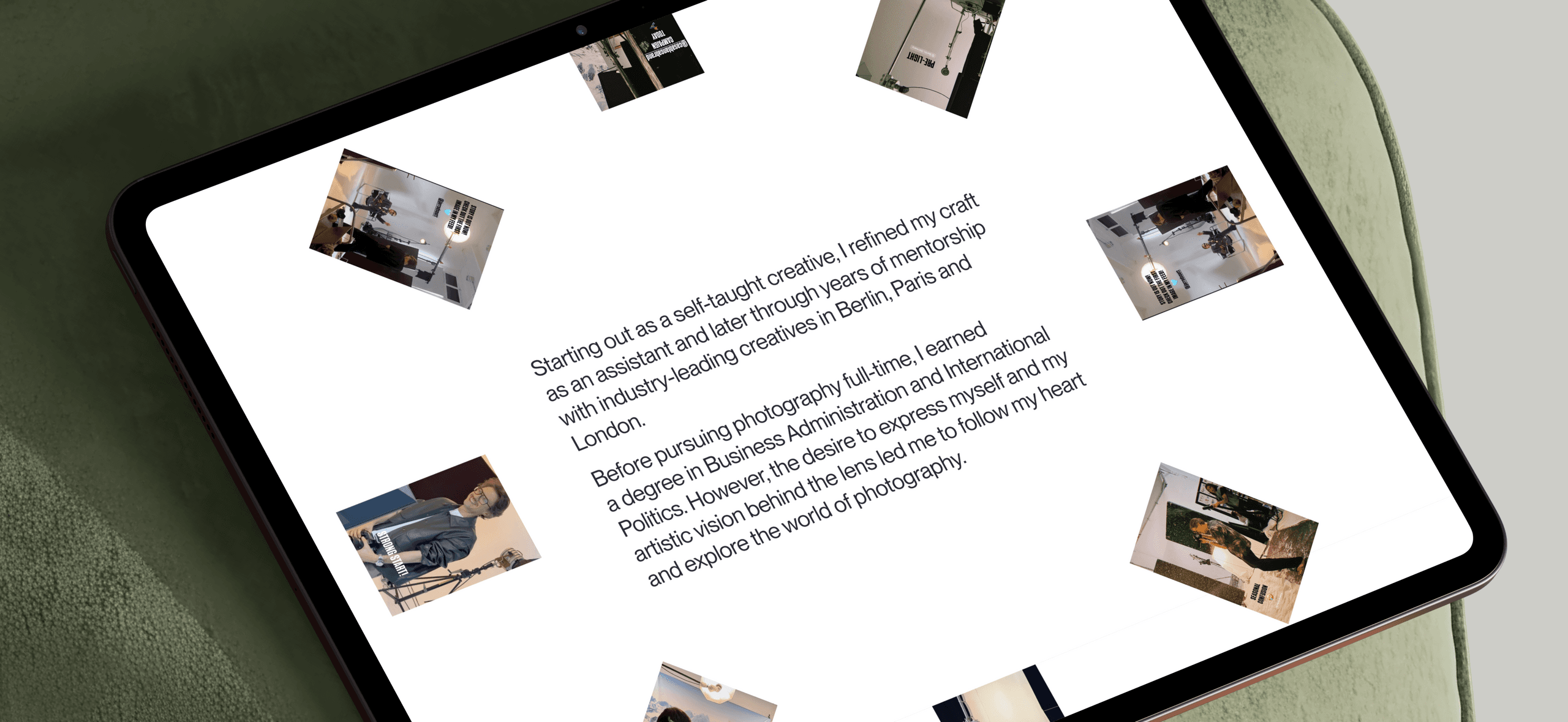
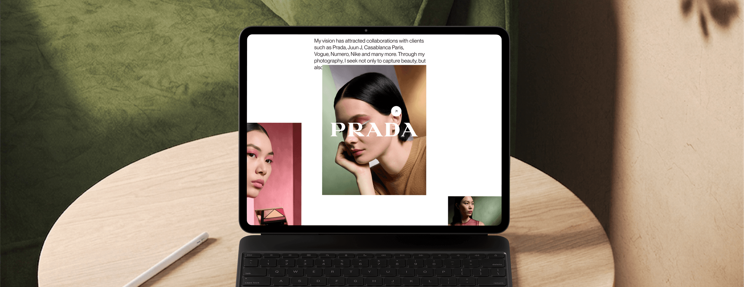
The website became an extension of Per’s visual identity. Large imagery, confident typography, and considered pacing shape the experience. The interface stays pared back, while composition, scale, contrast, and motion give it a recognizable character. Every design choice supports the photography instead of decorating the space around it.
The process
We began with a discovery session focused on Per’s work, personal brand, and the way he wanted to present himself online. These conversations became the foundation of the design brief. From there, we explored typography, composition, visual references, and interaction ideas through stylescapes. Once the direction was clear, we moved into interface design and development.
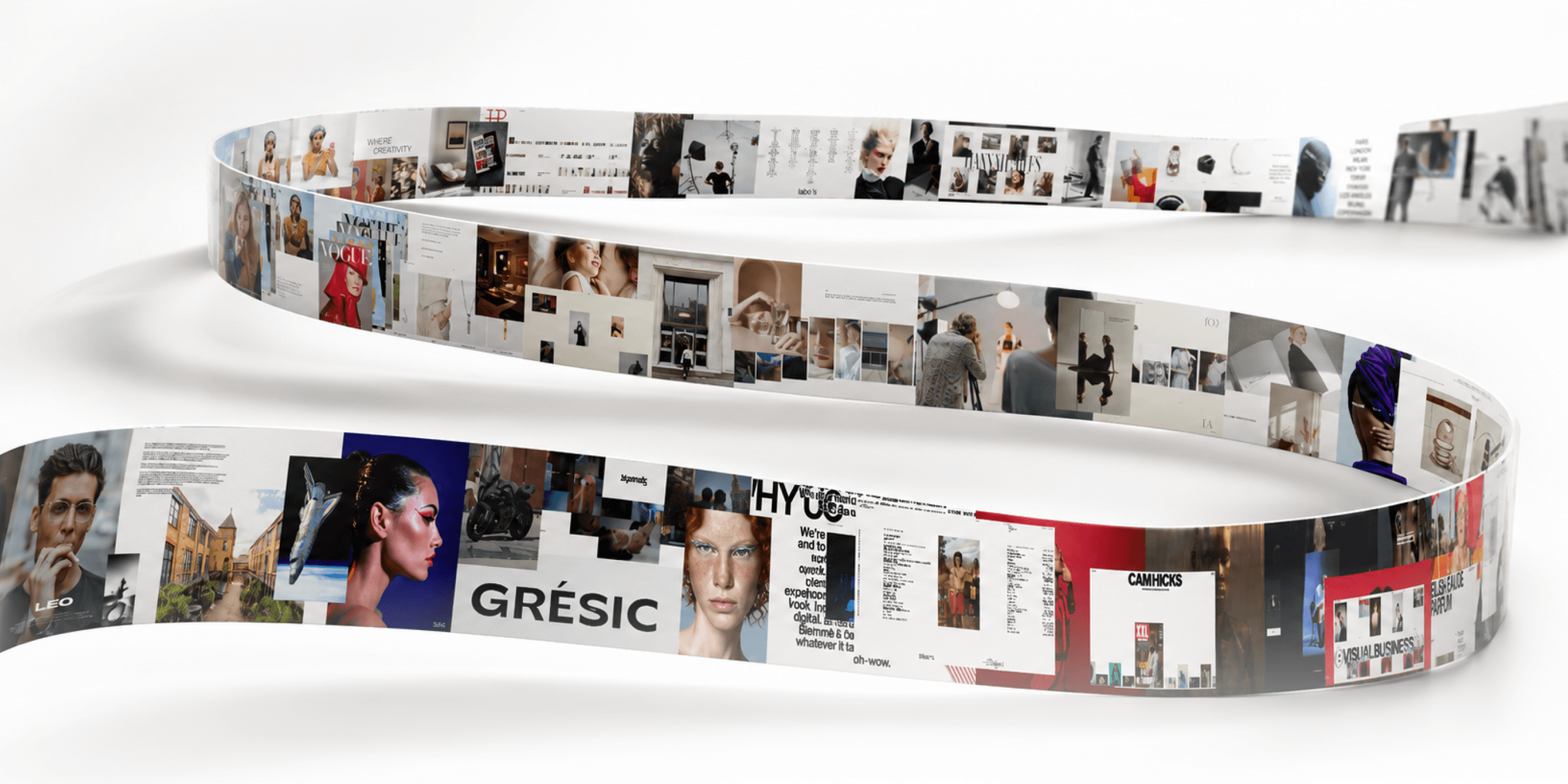
Stylescapes
Stylescapes helped us turn Per’s photography and creative perspective into a clear visual direction before working on the interface. They gave us a shared reference for typography, composition, contrast, and motion, making it easier to align on how the portfolio should look and behave.
Drafts
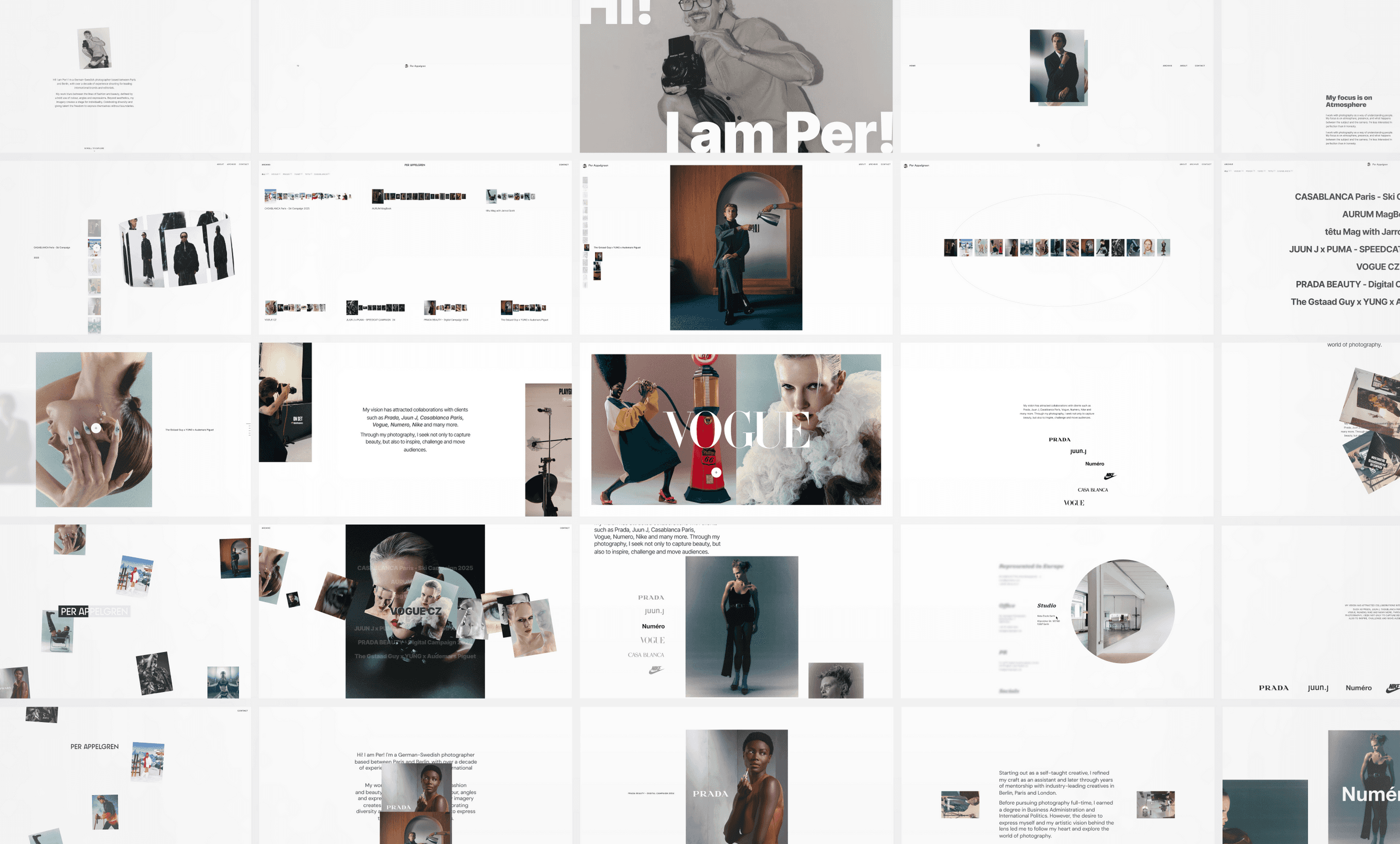
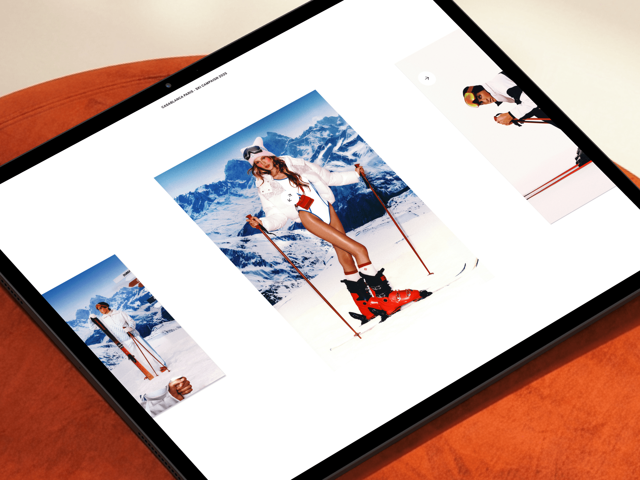
Early drafts gave us room to test different ways of presenting the work. We explored layouts, transitions, and interactions, then refined the ideas that worked well across different projects, formats, and screen sizes.
Visual identity
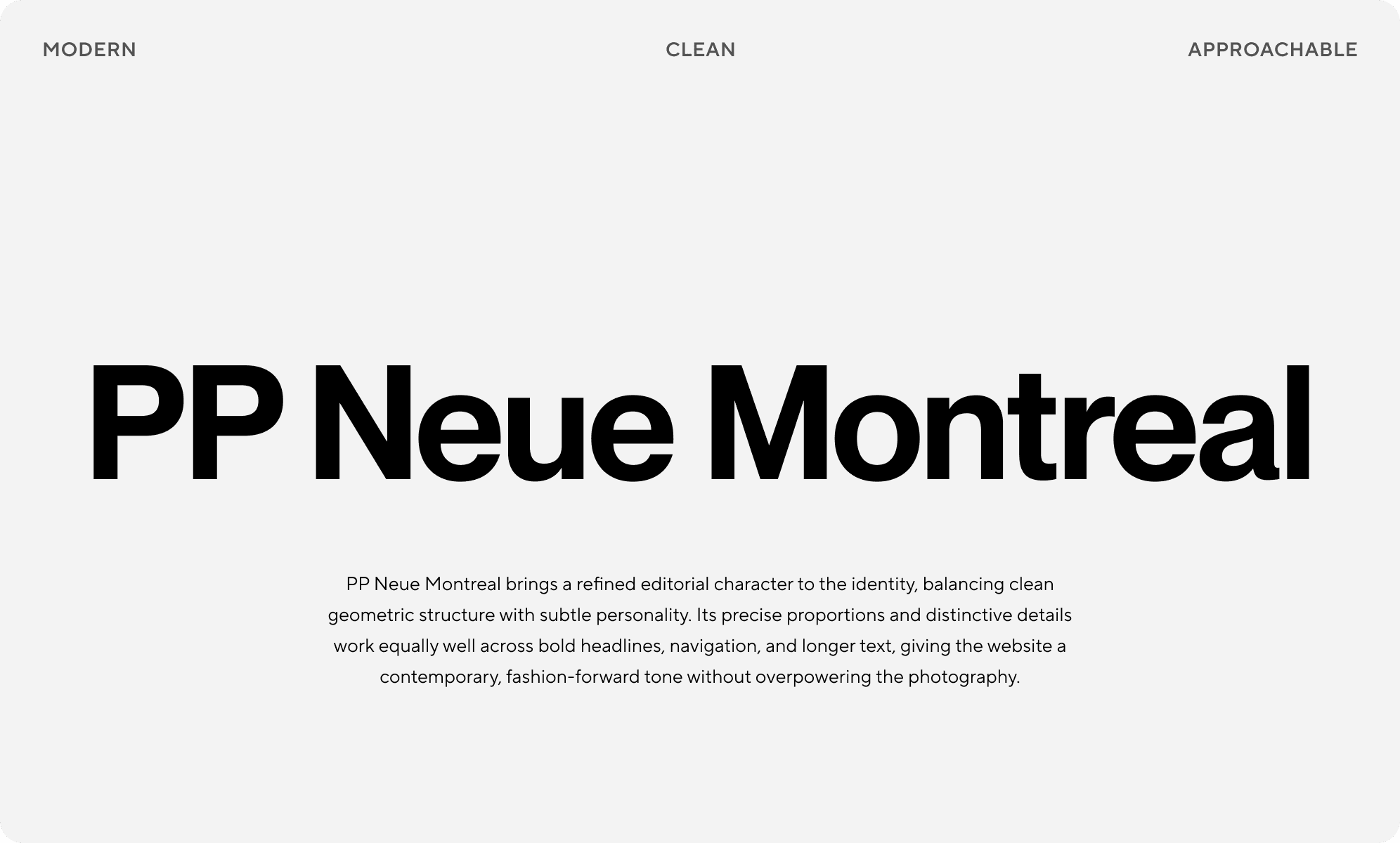
A monochrome foundation gives Per’s photography space to stand out. Bold typography, changes in scale, and carefully paced motion add character without making the interface feel busy. The result is minimal, but never anonymous.
UI/UX design
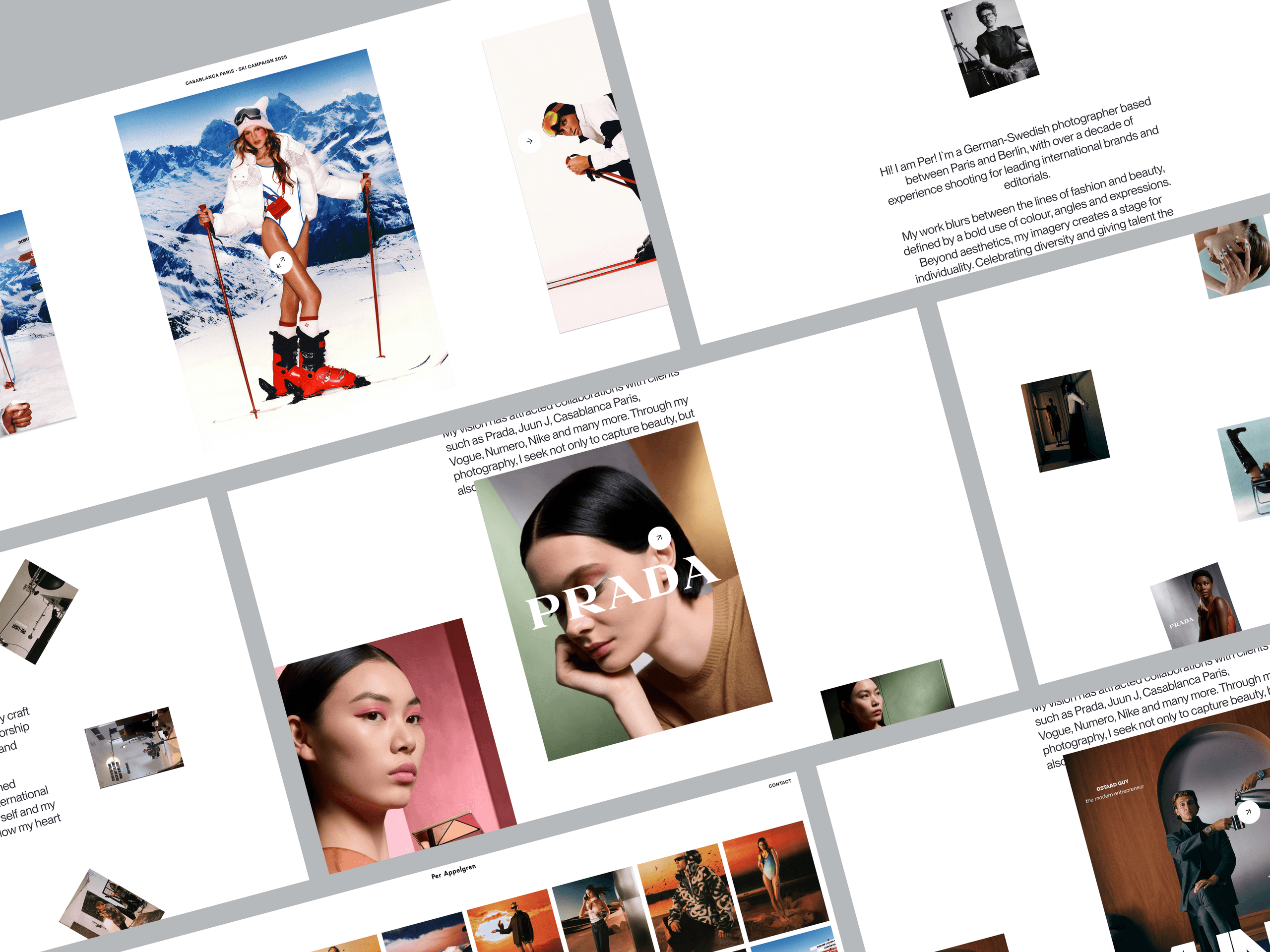
Per has a large and varied archive, so structure mattered.
Clear navigation and flexible layouts help visitors move between projects without losing context. Expressive compositions and interactions keep the experience personal, while familiar patterns make it easy to use.
Homepage
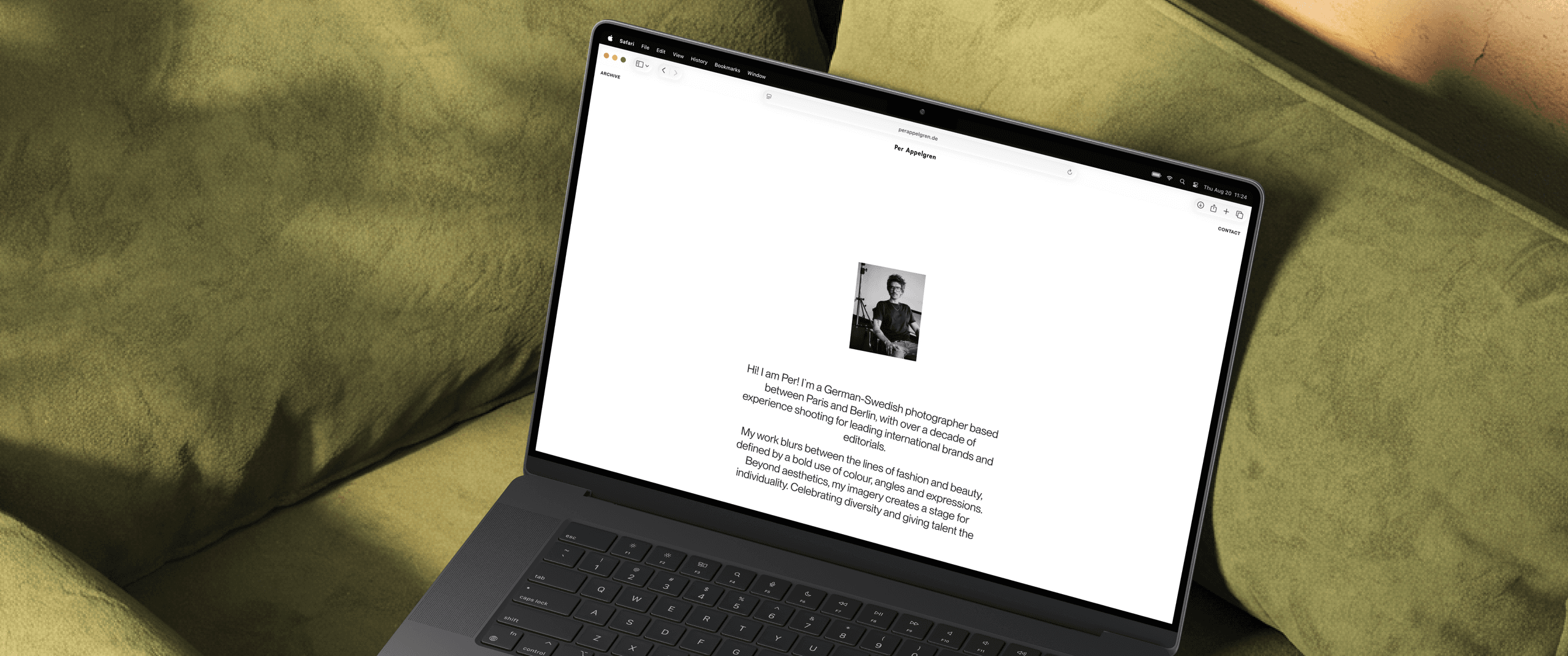
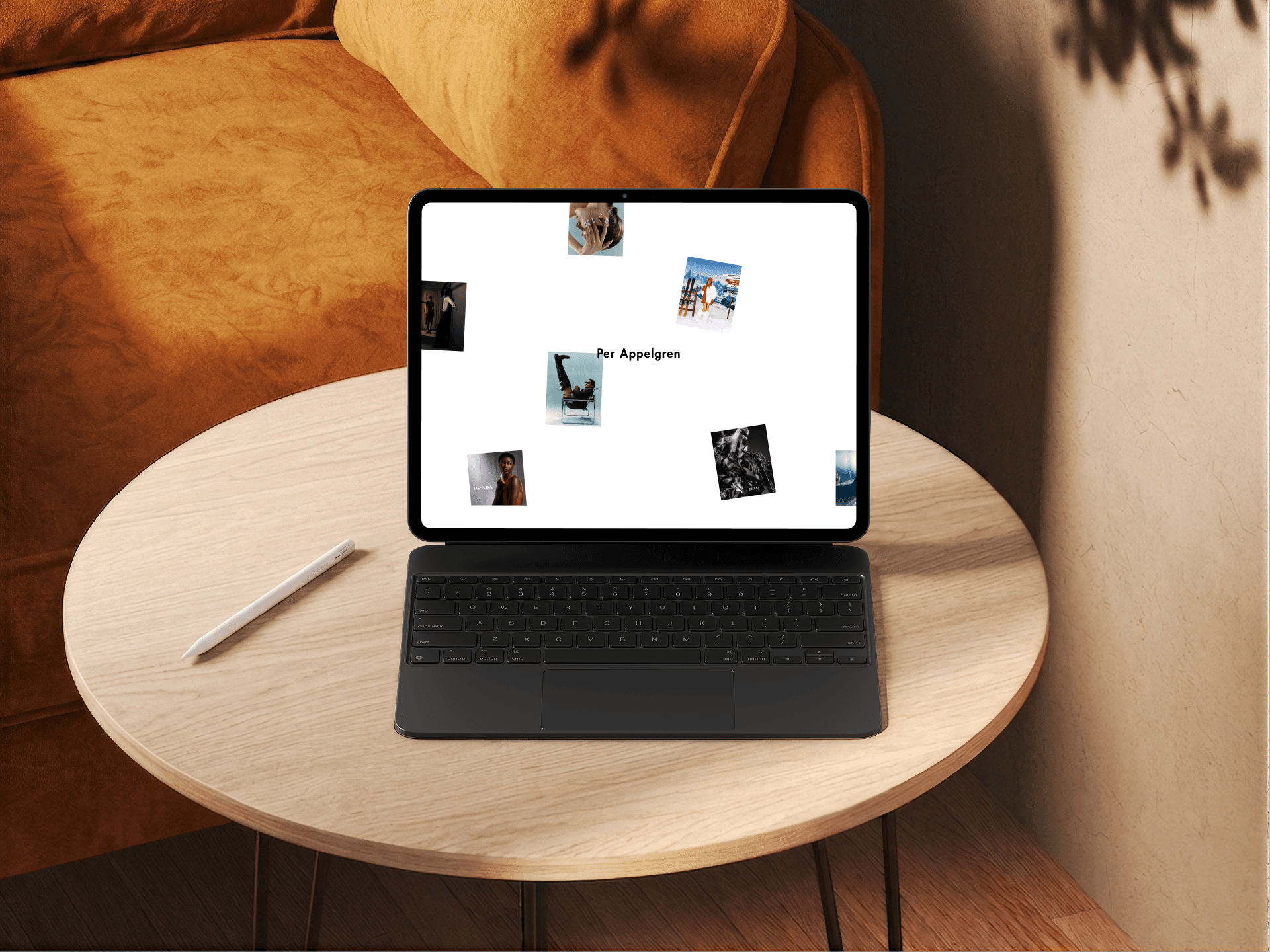
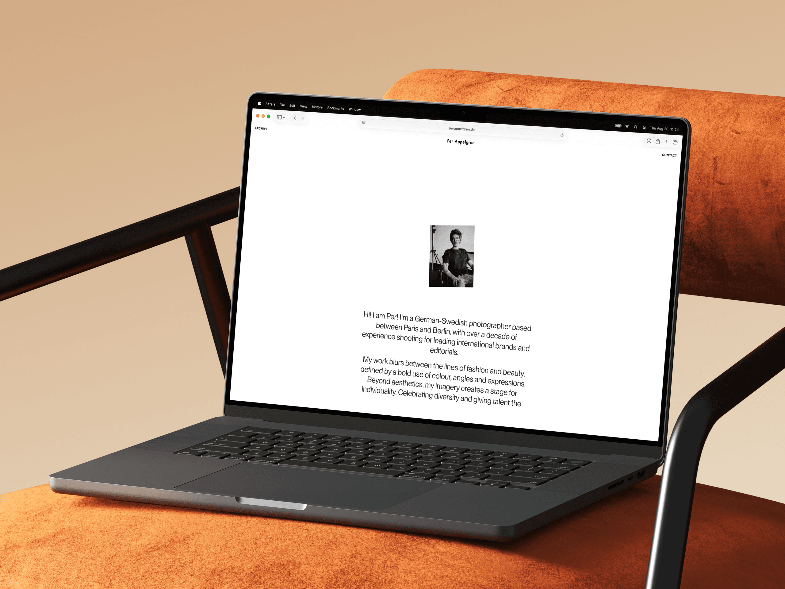
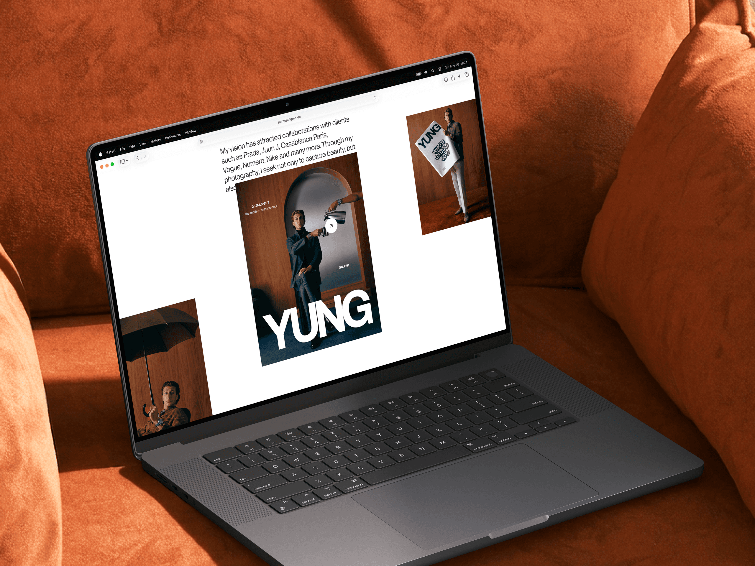
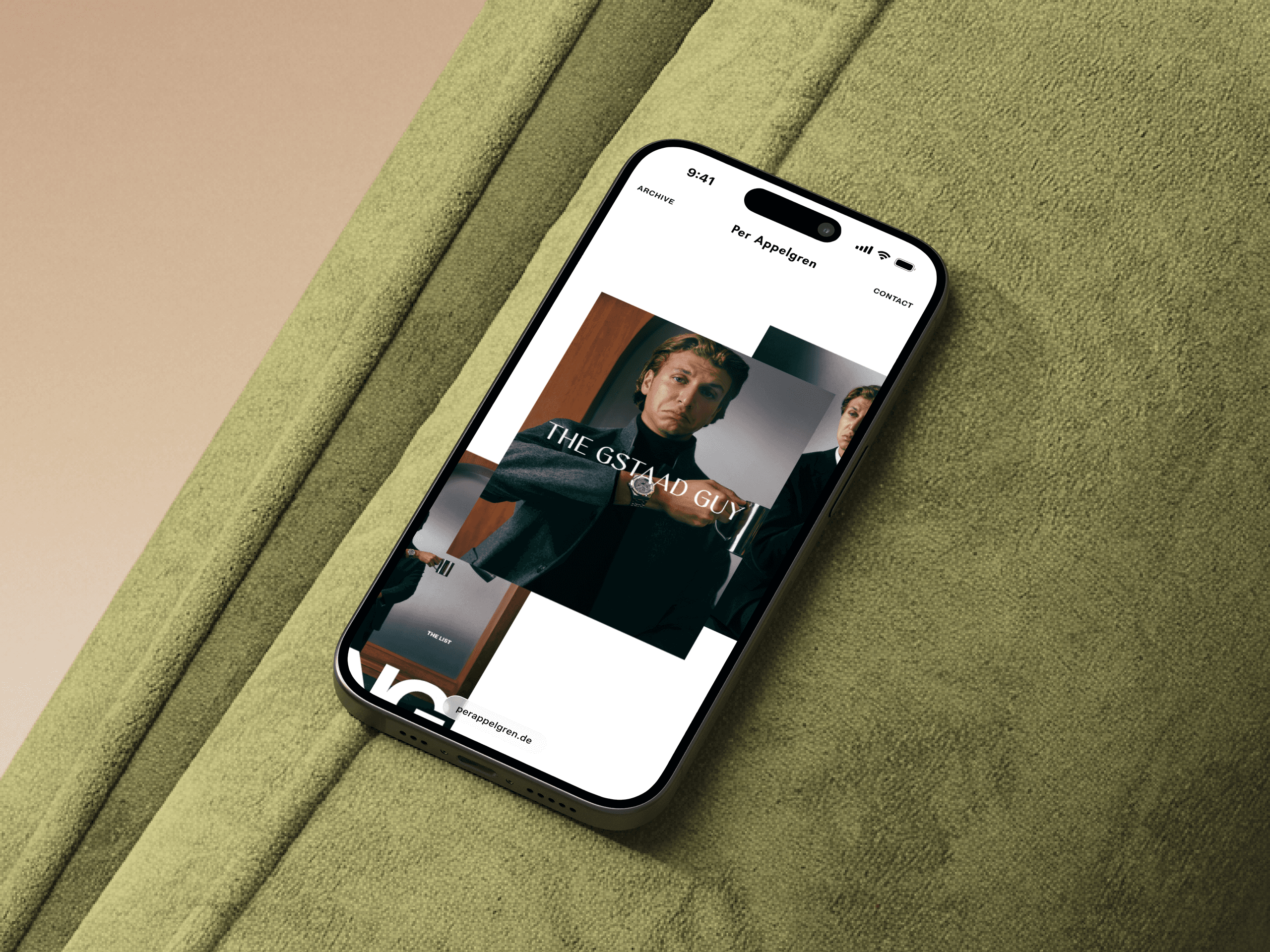
The homepage introduces both the photographer and the work. Large images, layered compositions, and purposeful animation offer a glimpse into Per’s personality and creative perspective. The page sets the pace for the rest of the portfolio without revealing everything at once.
Archive
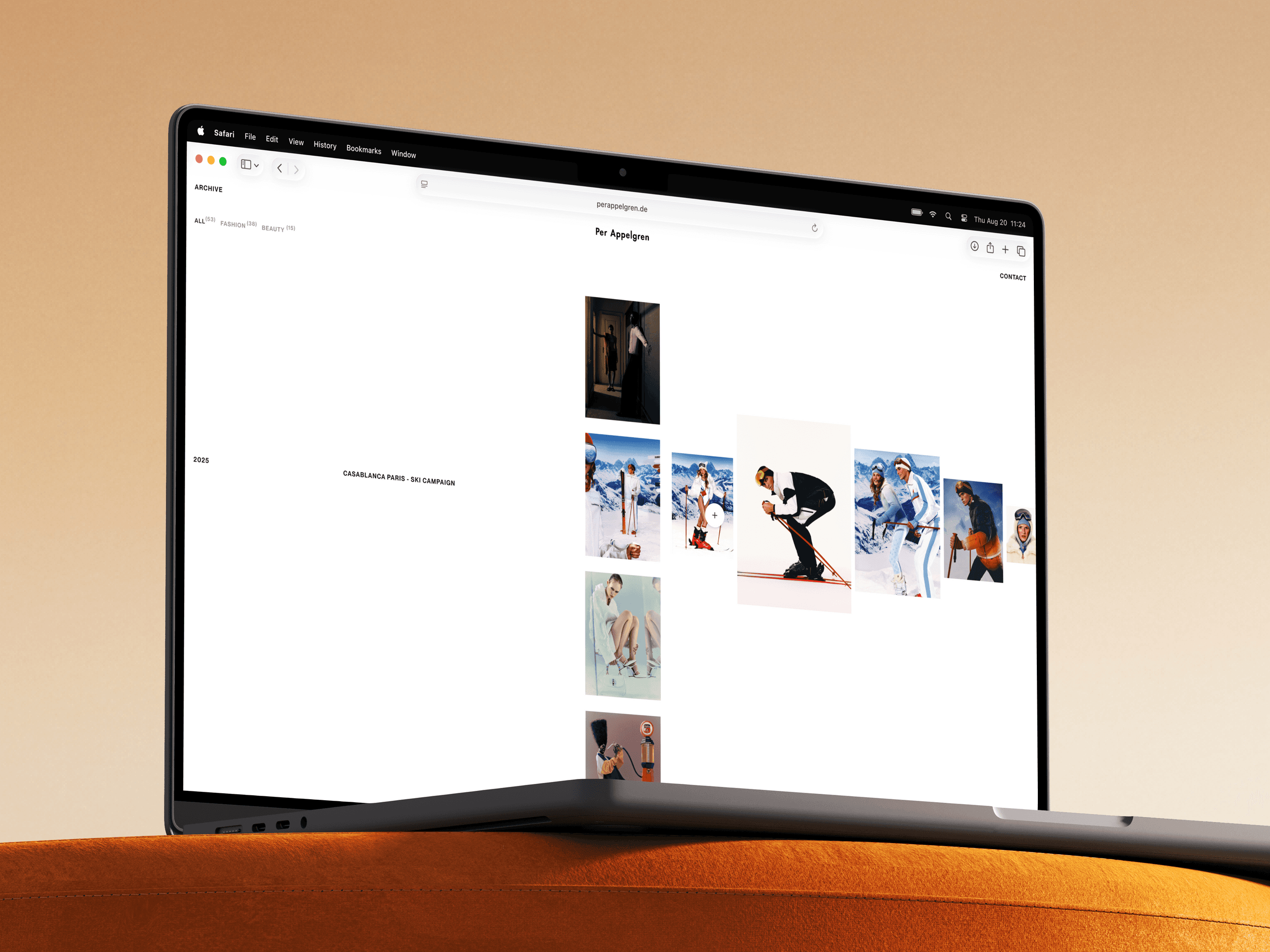
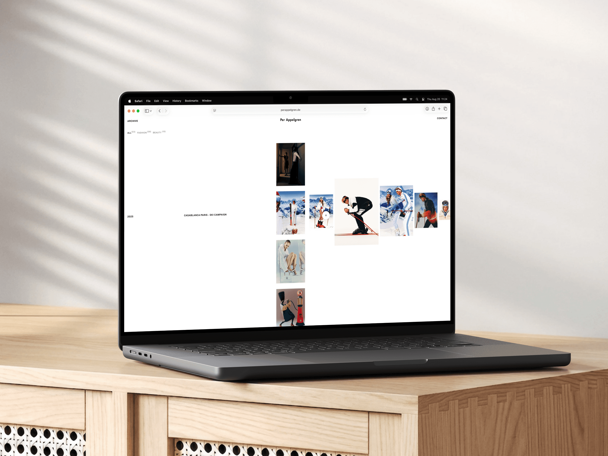
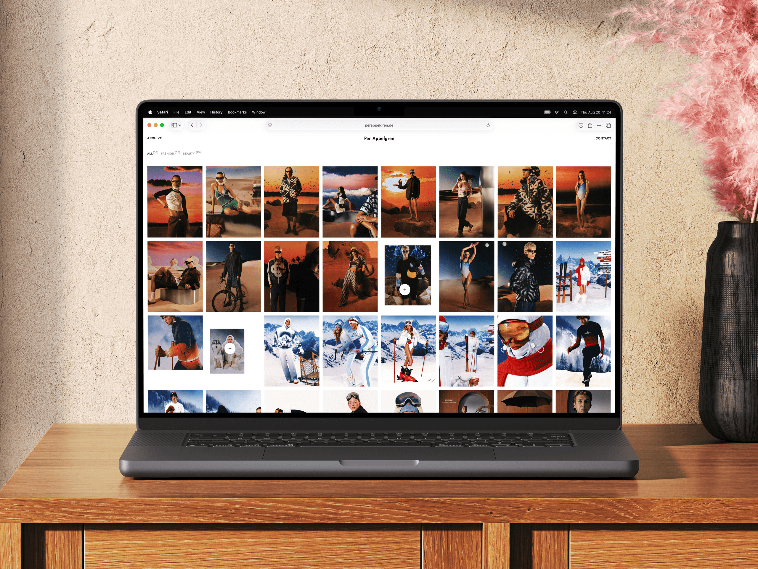
The Archive turns a large collection of projects into an open browsing experience.
Visitors can choose between three modes: Board, Stack, and Grid. They can explore freely, follow projects in sequence, or scan the collection at a glance. Each mode offers a different way to experience the same body of work.
Mobile
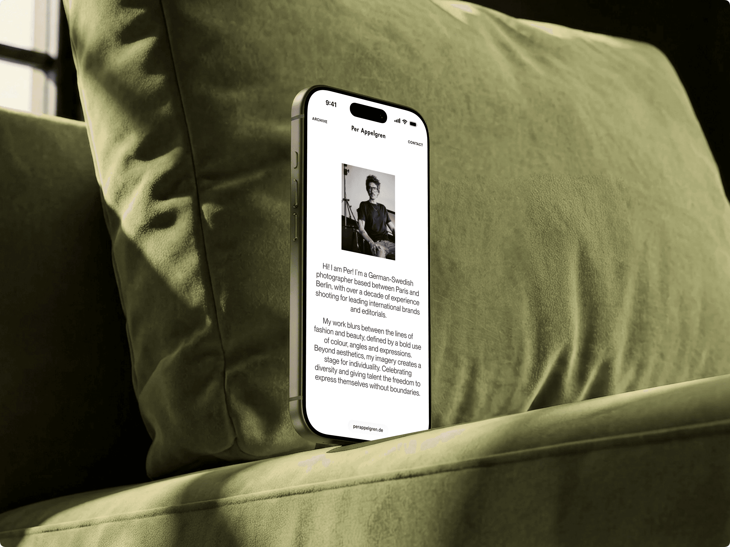
Rather than simply scaling down the desktop layouts, we adapted the compositions, interactions, and motion for touch and smaller screens. The mobile experience keeps the same visual rhythm and sense of discovery while making navigation and project browsing feel natural on the go.
Creative development
The portfolio is built as a static website, but behaves more like an interactive editorial application.
WebGL, custom shaders, virtualized rendering, and a controlled texture pipeline power the archive, galleries, and transitions. This setup keeps the experience visually rich without placing unnecessary weight on the browser.
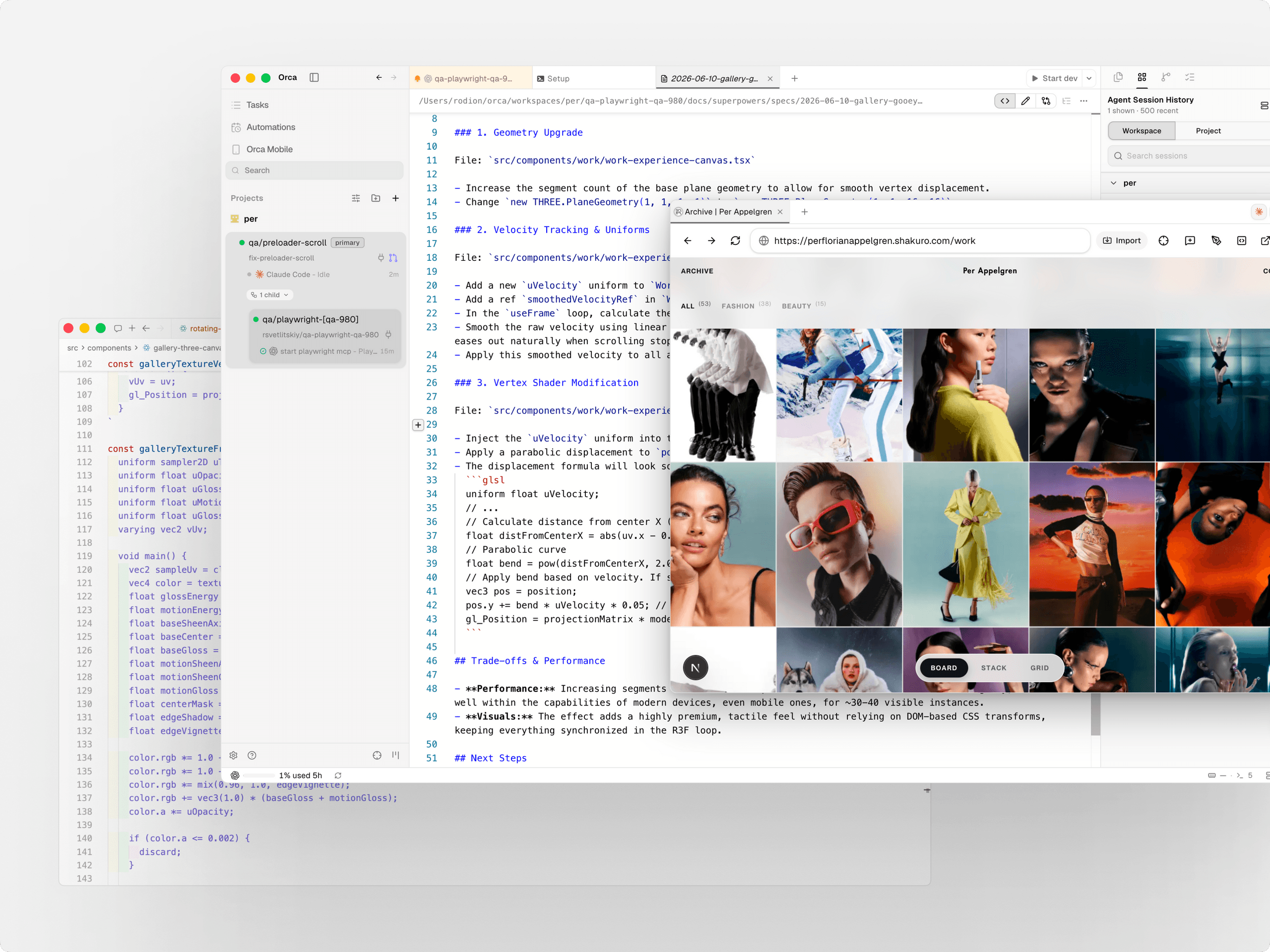
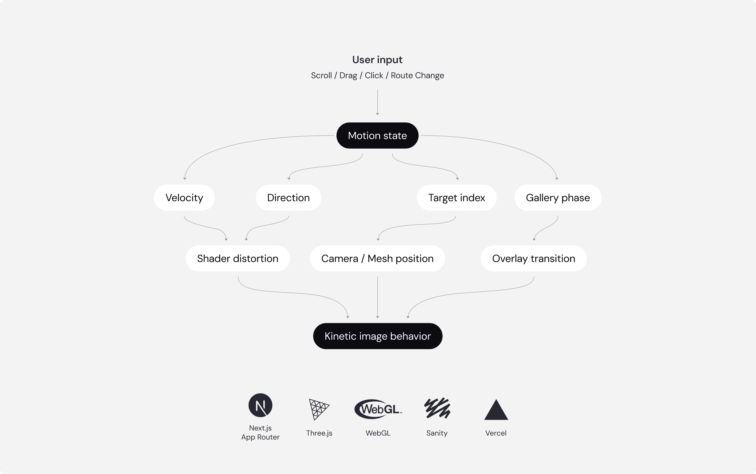
The core idea: Motion is the product.
We didn't build a portfolio. We built a visual system, where every image behaves like a physical card in space.
- Render only what's visible or about to become visible.
- Pause background texture loading during active scrolling.
- Reuse WebGL meshes instead of constantly creating new ones.
- Cap the pixel ratio on weaker devices to protect the frame rate.
- Keep the site static, but make it feel like an interactive app.
- Wire Sanity CMS at build time with local fallback data.
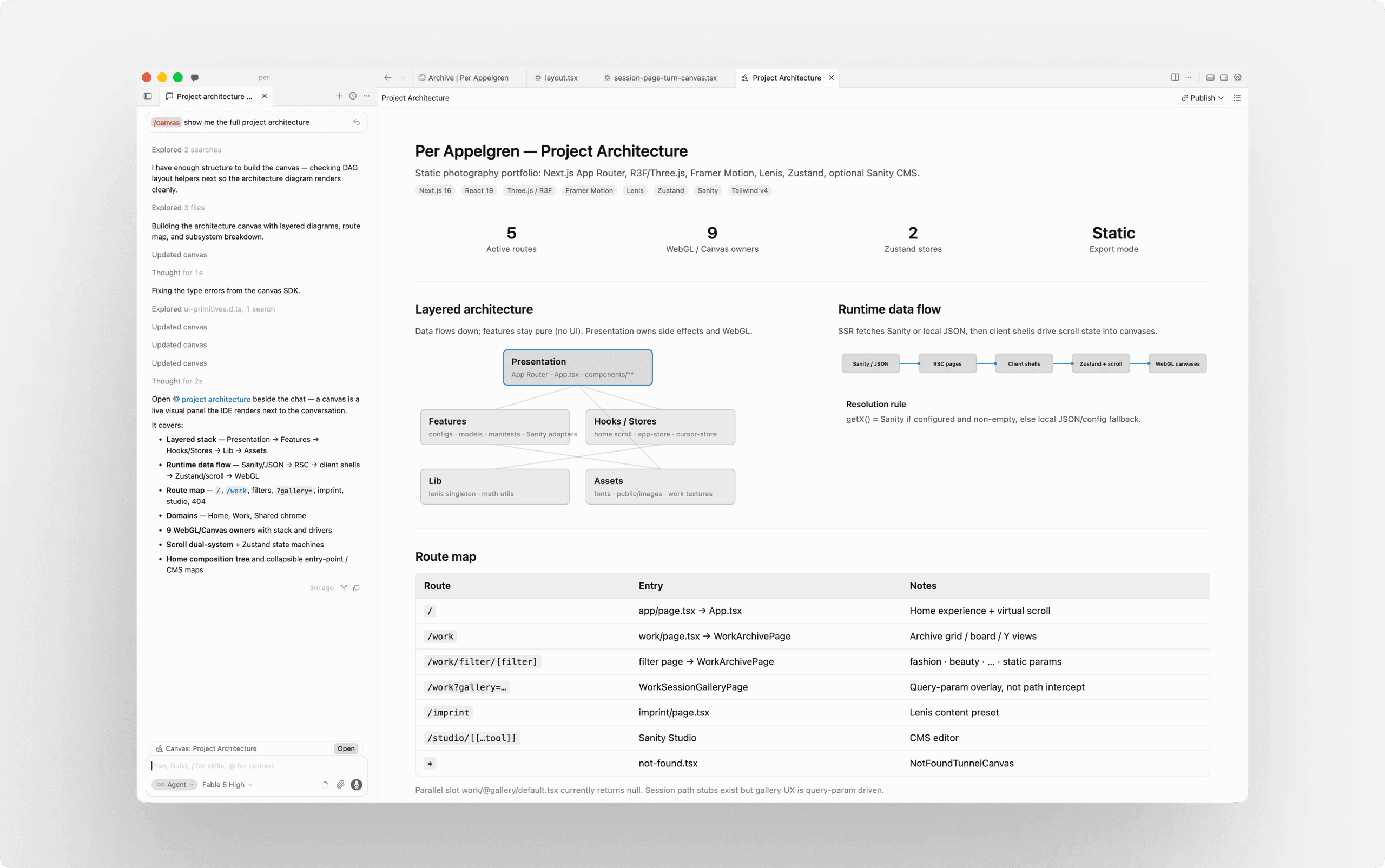
AI-assisted development
AI supported the development team as an engineering tool. We used it to explore interaction models, prototype WebGL behavior, review performance constraints, and speed up iteration on shaders, scroll logic, texture loading, and Playwright tests. Per and the project team remained responsible for the creative direction, interface behavior, and every production decision.
Outcome
We created a complete digital portfolio that brings Per’s work and personality together in one cohesive experience. It gives his photography space to lead while providing a flexible way for presenting projects across different formats and styles.
The result is a contemporary portfolio that gives his work a strong digital presence while remaining personal, memorable, and easy to explore across devices.