Mobile and website applications have taken deep roots in our lives. We do almost everything with their help: get food, do sports, find friends, have fun, order a taxi, etc. We’d rather make a few taps than go to a place in person.
Contents:
According to the latest research, people use approximately ten apps per day and almost thirty of them each month. They spent more than 80% of their time within mobile apps. Therefore, a well-thought UI/UX design is crucial for a project’s success.
Without convenient workflow, people will have a hard time dealing with an app, and some of them may get irritated, uninstall it and give negative reviews. In the end, a project will have low user acquisition or retention, and its development will become cost-prohibitive. If you somehow ended up in this situation, there is a thing you can do to save the project.
Redesign your web or mobile app. Taking modern approaches and redefining UI/UX can give it a second wind. New clients might come, while the old ones can reconsider and hit download. However, there is a thin line between cases when changing looks is required and when it should be postponed.
To do or not to do?
Consider an application overhaul in case of:
1. Negative feedback
If the user retention rating is low and your support is piled up with negative reviews, consider the mobile app redesign. Low market ratings push back clients and cut off a considerable part of your revenue.
2. Low conversion rates
There is undoubtedly a problem when people download your application but avoid purchasing a subscription or placing an order. In this case, it’s better to perform an analysis first and then start working on an overhaul.
3. Outdated design
Retro style is trendy only in fashion shows. Outdated looks won’t win the people’s hearts. Technologies make a leap each year, so stay up to date with the latest news and implement modern ideas in your project. Around 73% of web designers consider a non-responsive UI the main cause for visitors to leave a website.
4. Rebranding
If you are in the process of rebranding your company, changing the mobile app or web page design according to the overall style is a must. The update can include not just enhanced graphics but an improved user experience as well.
5. Migrating between platforms
One of the ways to expand a business is to start releasing projects for other platforms. In this case, you need to change the looks to fit them into different technical requirements. For example, when you transfer an Android app to iOS, you must substitute interface components with new ones.
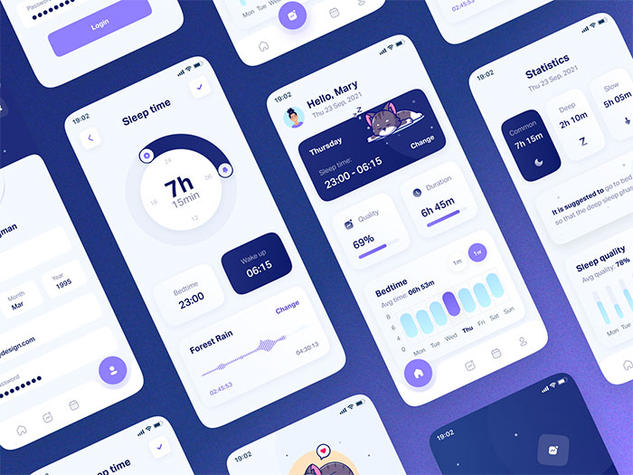
Leepy mobile app by Layo
Avoid redesigning your apps when:
1.High popularity
If your project is already popular, changing the looks completely may push them back. Even if the new UI is amazing, there is a chance many old users will abandon your application.
2. Negative feedback
When people dislike the website or mobile application redesign, it’s better to roll the changes back before the rating drops completely. Your clients may not be professional artists, but they for sure know what works for them.
3. Current layout works fine
Does your creation have positive feedback on the current UI/UX? No need to tweak something that already works — you might break it. Then it will be tough to gain the clients’ trust back.
How to redesign mobile apps or websites
If a complete overhaul is a go-to option, publishing it immediately is still not the best decision. Without a proper analysis, there can be mistakes in defining the target audience, performing UX audits, testing beta versions, etc. It’s better to analyze the situation beforehand and then add changes in baby steps. Start with:
Analyzing key metrics and reports
When revamping mobile apps, use Google Analytics to gather statistics. In its reports, look at the key metrics like app activation and drop-off rates. They show how many people are still using your project and how many have given up. The fluctuations of the active user ratio represent the number of clients attracted to the app each day or month.
Keeping an eye on your competitors
There are many popular apps or websites on various themes. If you are looking to improve your creation, it’s wise to research your competitors’ creations. What layout do they choose? What features are there in their toolkit?
After finding a few cool-looking solutions, try to implement them in your own way. However, be sure that they fit into your technology stack and that people need these features.
Also, it’s worth paying attention to features on demand that are carried out poorly in the competing applications. With enough resources, you can add them in a better way to get an advantage.
Researching your target audience
For a successful web or mobile app redesign, you need to understand your clients. How do they navigate your application? What are their difficulties? What do they like or dislike? These aspects should be crystal clear to your team.
Running a few surveys via newsletter or directly in the app is a great way to get on with your clients. For in-depth feedback, find time to hold UX interviews focusing on the most problematic features.
Checking out the reviews
Read through the reviews in the app store regularly, especially after releasing a major update. If the feedback is negative, analyze it and leave a reply. Communicating with unsatisfied customers via social media will help you find the main pain and later fix it. Some people can even suggest a viable solution. By considering or adding these suggestions, you can gain more loyalty among your clients.
Building a redesign strategy
After conducting all the research and gathering potential improvements, you need a well-thought strategy to revamp a mobile app or a website.
First, create a to-do list for each improvement and assign them to your team members. To make the looks consistent, prepare style guides and a brand new UI kit. The surveys conducted before will help you make the right decisions.
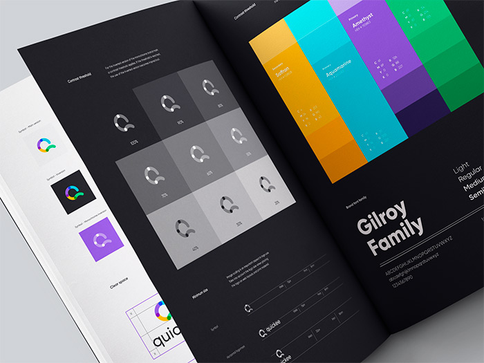
Quickee style guide by Shakuro
Performing A/B tests
Even with all preparations, there is no 100% guarantee the new design will be successful. Early QA testing eliminates programming errors but is powerless against the users’ tastes.
In this case, it’s better to launch A/B testing first, where variant A is the old design and variant B is the new one. Compare the statistics in a few days to see which is more viable. However, if it’s a complete overhaul, try beta-testing instead of releasing two variants. The test groups will provide high-quality feedback for larger amounts of new elements.
Examples of successful web and mobile app redesign
Not only can your competitors hint at excellent solutions. You can find design case studies on platforms like Dribble or Behance.
Shakuro’s team has several examples of viable mobile applications and website revamps. They have really turned the tables in terms of user acquisition and retention.
Let’s take a look at each of them and see why companies decided to change the looks, what the initial problems were, and the final result. While business owners might find some tips for their projects here, the designers can discover inspiration and mindful solutions.
1. Select — a mobile app for a VIP club
Select is a private community with a VIP membership for people in business, travelers, fine cuisine connoisseurs, and proactive people that like attending various events.
The Select company decided to change the app looks because of the rebranding. The company wanted to dive into the bank card business without losing its initial audience.
While redesigning a mobile app, the Shakuro team members found a bunch of other problems. They were:
– outdated visuals and UI/UX
– underrepresented aspects of the brand
– lack of user involvement
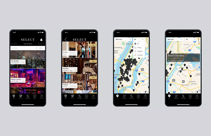
The Select app before the redesign
The main challenge was feature visualization, so the new looks would not push away any existing users. Also, the application supported a considerable variability of devices, meaning differences in frame size, hardware, and system.
Since Select is a VIP club, the designers took inspiration from natural shapes like Icelandic sands and sea foam, then spiced the concepts up with high-tech vibes. In the end, the mobile redesign included a nice-looking dark theme, a new icon set, a convenient map based on geolocation, and an updated concierge feature. Setting the dark mode as the main one is not a whim: almost 82% of users opt for the dark theme.
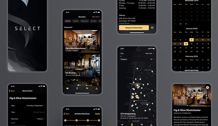
The Select app after the redesign
These solutions were carefully carried out during the mobile app development for Android. Currently, the app has a 5-star rating on both platforms with a very low bounce rate. So the UI/UX overhaul turned out to be successful.
2. Blackthorn — an all-round banking application
Blackthorn is a banking ecosystem that allows small and medium-sized companies to manage their finances.
The Blackthorn team wanted to redesign the app to provide convenient online payments on Android and iOS platforms. It should be a place where clients can access their accounts and all services without visiting a local office.
After the analysis, the following problems emerged:
– features stacked on top of each other
– no conceptual understanding of scalability
– complicated information architecture
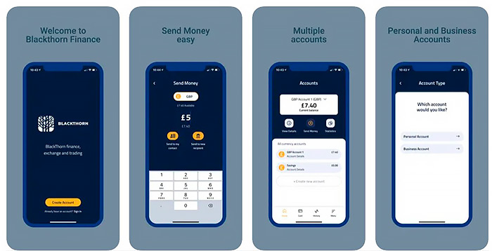
The Blackthorn app before
First of all, the designers changed the overall structure for a better user experience. Since it was a banking app, all user interactions should be optimized. Otherwise, people might get confused and even lose their money.
Once features were easy to access, the team added a simple dark theme with bright accents to reduce the visual load and highlight only crucial info. The Blackthorn company had plans to scale the business, so the team provided a solid methodology for further expansion. In the end, the mobile application turned out to be extremely user-friendly, with a clean layout and simple workflow.
3. Beanstalk — a website for a design studio
Beanstalk is a web design company from St. Louis. They provide digital marketing, design, and application development services. For them, the primary way of attracting and communicating with clients is the website. At that time, its redesign was necessary for further expansion and small business growth.
The initial problems were the following:
– work examples didn’t demonstrate the company’s potency
– layouts were outdated
– design expertise was not seen
– visual assets didn’t complement the company services
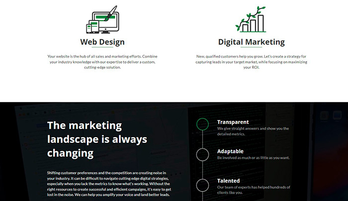
Beanstalk’s old website
The work started with defining the portrait of the average user: their story, goals, and needs. Since the studio already had a particular reputation and brand, the team studied its tone of voice and main attributes. Business growth means more big clients, and the new looks should be able to capture their attention.
The team built website designs around growing plants, with bright green as an accent color. This solution perfectly aligned with the logo and brand. Interactive elements, videos, and leaf-like buttons represented the company’s creativity.
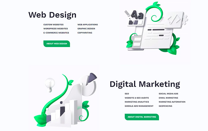
New design for the Beanstalk services
To showcase the Beanstalk skill, the team added a storytelling section and revamped the About page. Now clients could discover details on past projects and see the level of expertise with their own eyes. Moreover, the company’s development and web design services got equal attention, and the chances of getting new projects skyrocketed.
In the end, the redesign brought the Beanstalk website to new heights: more and more clients hired them for their projects.
4. Symbolik — a cloud-based application
The Symbolik is a web-based financial service that helps pro-level financial companies, funds, and traders analyze the global markets. It provides all necessary tools for better risk management, trading, and investments, allowing users to expand their portfolios.
For sure, the financial topic is extremely complex. The Symbolik tool was no exception. It suffered from:
– technical complexity
– lack of intuitive UX
– outdated looks
– difficulty upselling to the existing customers
– difficulty onboarding new customers
To redesign this web tool, the team started by introducing user-friendly mechanics for the existing functionality. There were dozens of descriptions for each feature, and together with outdated visuals, they overwhelmed new users. New intuitive layouts helped to retain the beginners and urge them to discover more about the Symbolik mechanics.
The existing assets and color scheme gave more of an IT vibe than a financial one. A new palette with a soft black as a primary color changed the perception, making the service look like a ground-breaking financial tool.
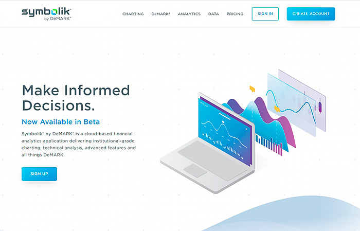
Old looks of the Symbolik website
Once the structure and materials became more appealing, it was easier for the team to set up a subscription strategy and start upselling to the old customers.
The product’s new design is not yet complete. However, the Symbolik team has already received good feedback on the new looks. This means — another successful case in Shakuro’s portfolio.
5. Bar Poker Open — a web platform for playing poker
Bar Poker Open is a poker league with tournaments held in local bars all over the U.S. It’s open to anyone who is into playing poker and wants to show off their skills.
Registering on their website is the easiest way to enroll in a local tournament. The company decided to redesign it due to several problems:
– underwhelming visual experience
– dated brand assets
– absence of essential tools
– weak interactive experience
– data is presented in an unusable format
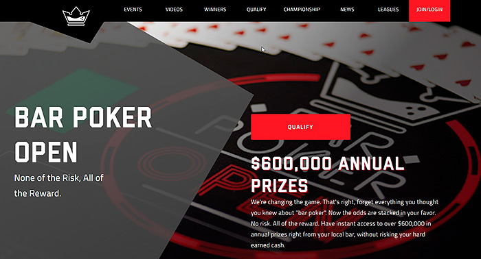
The old design of the Bar Poker Open league
The old web design was too dark, full of hard edges, and had an inconsistent structure. It was hard to find the tournament schedule, bar addresses, and read additional info. Moreover, the style was closer to cybersport rather than poker. Such a mixture pushed new users away, cutting the participants’ number for future tournaments.
When revamping a website, the Shakuro team redefined the initial message. They wanted to create an atmosphere of a local bar where one could play poker with friends over a drink. It would be familiar to beginners and professionals. The such style would urge more people to sign up for a match and experience the excitement. The warmer visuals made gambling look less dangerous and the bars more attractive.
After the redesign, the website gained a clear structure, where the newbies could follow specific steps for finding an offline or online game. With schedules and maps, pro-level players could track the championships, see winners, find a local league, etc.
In conclusion
Indeed, a mobile app or website overhaul can give the service a boost. However, one should conduct in-depth research before getting started. Also, an experienced team of UI/UX designers is a must-have to make the new visuals look consistent. After the initial concept is ready, it should be appropriately tested by QA engineers and beta version participants.
Has this article shown you that your app or website needs a redesign too? Contact us, and we will give outdated visuals a brand new life.
