
Web design is a complex subject where every element should work like a clock. People pay close attention to colors, typography, readability, high-quality pictures, composition, etc. Together, these things create an impression of the brand and evoke certain emotions.
Contents:
Around 38% of people will close a website which design they don’t like. By creating the right mixture, one can establish a steel-strong connection between the company and its customers. However, there is one element that is often overlooked by junior specialists. These are textures.
A texture used for web design is usually an image resembling some kind of surface from the real world: dirt, stains, old paper, metal, etc. The key advantage is replicating our sensations like touching or seeing. People notice such images and have an instant association with the material and its qualities. That’s why textures are great means to add real-life looks to logos, backgrounds, and other items. This design method will make them stand out in front of plain colors, bringing a pinch of unique personality.
What is the difference between web textures and patterns?
When working with designs, one can often see patterns. They look similar to the textures. However, there are differences in terms of websites.
Patterns are small images that resemble a ‘tile’ covering a page. They are rather simple and endlessly repeat on the X and Y axes. Generally speaking, they can be generated in any way with a certain repeating algorithm. Designers can create patterns from just a couple of pixels, that’s why this element is very lightweight in size. The viewer’s eye will notice the tiles. However, it won’t be very distracting from the content.
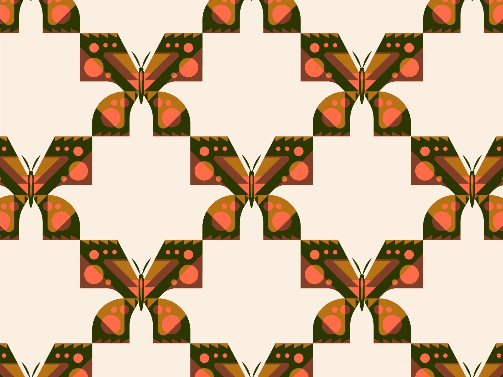
Pattern by Jordon Cheung
Textures are more complex than patterns. Although they can be tiled too, it’s harder to see separate parts because of the high level of detail. Especially if the designer took a realistic photo as a base. Sometimes the element consists of one single image without any repeats.
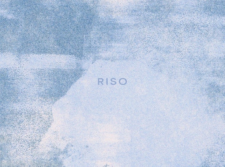
Risograph Textures by Ekaterina Novikova
While working, you can use either pattern of textures, depending on the company’s message and marketing goals.
Why use textures in web design?
There are several reasons why you should consider adding this element to your work. Some of them are connected with human psychology, emotions, style, etc.
Evoke certain feelings
Since textures replicate physical sensations, they can make users feel specific emotions and tie them to your brand. This will create connections between your company and the customers, increasing loyalty. Especially if you add unique textures for web design. Each time people will see similar elements or experience these emotions, they might think of your brand.
However, if you want to create a certain context, then it’s better to use images related to the business field. For example, water drops for swimming pool services, grunge or dirt for a gym, and abstract textures for an IT company. There are, of course, neutral images like soft noise that can be applied in any sphere. This type of picture adds a cozy feeling and pleases the eyes.
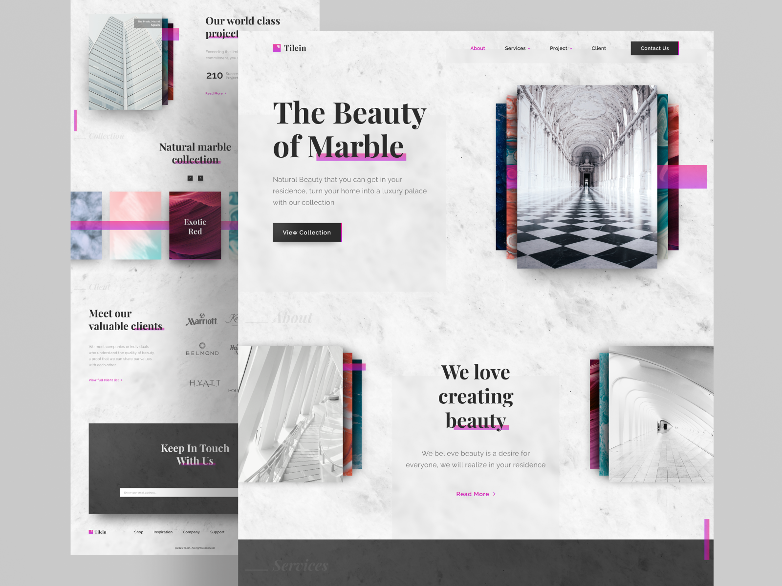
Interior design landing page by Adhiari Subekti
Guide the users’ attention
Just like any other image, web textures attract a person’s gaze and direct it to specific spots on the page. Thanks to high contrast with surrounding elements, they influence the user experience in a subtle way. That’s why a UI/UX designer can implement textures to guide the eyes around the page. People will instinctively look at the desired content.
It’s better to place the textures on vital sections like titles, buttons, CTA, headers, descriptions, etc. This way, you can create a path for a user where they discover necessary information and take action. In the case of branding, it can be a textured logo on a clean background or vice versa.
Alternatively, one can use a background texture for web design to separate the content. It will work as effectively as lines, contrasting colors, or boxes. In this case, the images should be applied in a minimalistic way.
Create excitement above the ‘fold’
The idea of the “fold” goes back to the era of newspaper publishing when digital technologies were unavailable. The newspapers were usually folded in half so that people could see only a part of the front page. The information there had to grab the attention at once. Otherwise, there wouldn’t be any revenue. That’s why publishers used catchy headlines on the front page to attract potential customers.
A texture for web design placed above the ‘digital’ fold can draw the users’ attention, so they want to find out more information and start scrolling down the page. Adding an intriguing header with an easy-to-read typeface will increase the chance of luring the person. However, one should be careful to keep enough white space and contrast. Otherwise, the website will only push people away because of a visual mess. What’s more, it should look good on all resolutions and devices.
Immerse into the atmosphere
Apart from hinting at the business sphere, a texture can also help you create the desired immersion effect. For example, sand and noise overlays on a traveling company website will make people feel as if they are already on a beach. Clean lines and tech elements increase concentration and assist visitors in studying. If you use unique web textures, then people might start associating the feelings they get with your brand. This fact will strengthen the connection between them and your company.
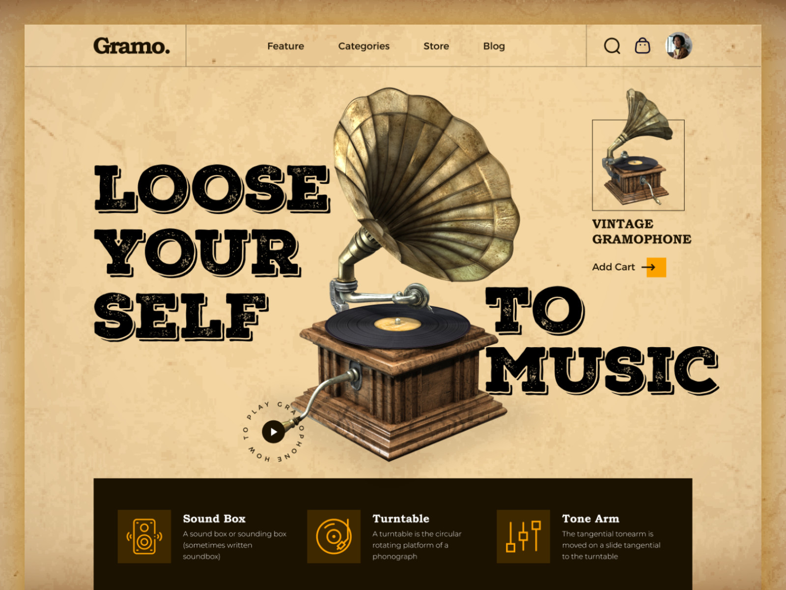
Vintage Gramophone Shop Landing Page
How to use textures in web design?
Although textures have lots of advantages, they are heavy visual elements. That’s why it is wise to follow several rules then using them.
- Find the balance
Less is more, and this phrase works for website design. Do not overuse textures and place them in every page section. Add these elements only to the essential parts to enhance the visuals.
Create a certain strategy for using the decoration. Do you want to attract the attention below the fold? Or perhaps to the buttons? With an aim, the composition will look solid and create a stylish design. If you are just starting the website, it is better to pick a pair of subtle textures and test the concept.
- Keep high readability
People visit websites to get information or order a service. There will be little use for a vibrant design if people won’t able to read the text. This fact will push them away, just like the bad looks. That’s why you should be careful applying the decorations to text elements. Sometimes you will have to work with typography as well to get the best result.
If the combination works well for you, remember that there are people with special mental or physical powers. So checking the design for good contrast or color blindness is a must. This way, all users will enjoy using the website.
- Stick to a certain style
When picking web textures, stick to one style that suits your brand. Images may be amazing, but if they do not go well together, the website will look odd. Started with noisy pictures and bright colors? Keep adding decorations with the same characteristics.
It only takes 50 milliseconds for users to form an opinion of your web page. Wrong style choices also lead to a lot of confusion. People won’t be able to understand the company’s message or perceive the emotions you want to convey. They will think the same about your business: mediocre, indecisive, and not worth the attention.
The best way to avoid it is by inviting the users and testing the design on the field. If they experience the emotions you aimed at — then it’s a success.
- Focus on the target audience
Each product is meant for a specific audience. It has its own preferences, needs, and pains. To cater to potential customers, do market research. What do people like and dislike? How do the competitors’ websites look? This information will help you create a relevant design that corresponds to the target audience’s needs. They will see familiar things or experience familiar emotions, so there are higher chances of staying longer on the page.
- Remember about the page load speed
Web textures are heavy in size, especially when you use real-life photos as a base. People with a slow internet connection might have problems accessing your website. This fact will influence user experience in a bad way. Nearly 40% of people will stop engaging with a slow page — nobody wants to wait or look at blurred textures.
Therefore, keep a balance between the size of the high-quality images and page load speed. It requires size optimization and perhaps web development services to achieve the goal.
In conclusion
Textures are just a part of the website design. They can enhance or ruin the looks, depending on how you implement them. If you follow all the rules and pay attention to the colors, trends, and development, then the created website will have a high chance of winning a place under the sun. People will enjoy visiting it, and thus your product will become even more popular.
Do you need a creative design with wise use of all elements? Contact us, and we will build a website with stunning looks and convenient UI/UX.