Website header design is the work on the top section of a web page, which in modern design often takes the whole space above the homepage fold. A good header tells visitors which brand they are dealing with, what it offers, and where to go next, using a logo, navigation, a call to action, contacts, and sometimes a search field.
It is also the first thing people see. According to Google, it takes only 50 ms to form an opinion about a website, and sometimes even less, around 17 ms. That is why teams offering web design services put so much effort into this part: the header sets the quality standard for the rest of the content and represents the brand.
Below, we cover what a website header is, why a well-designed header matters, what it should include, and the best website header design practices, from size, visual hierarchy, and sticky headers to fonts, hamburger menus, and mobile headers.
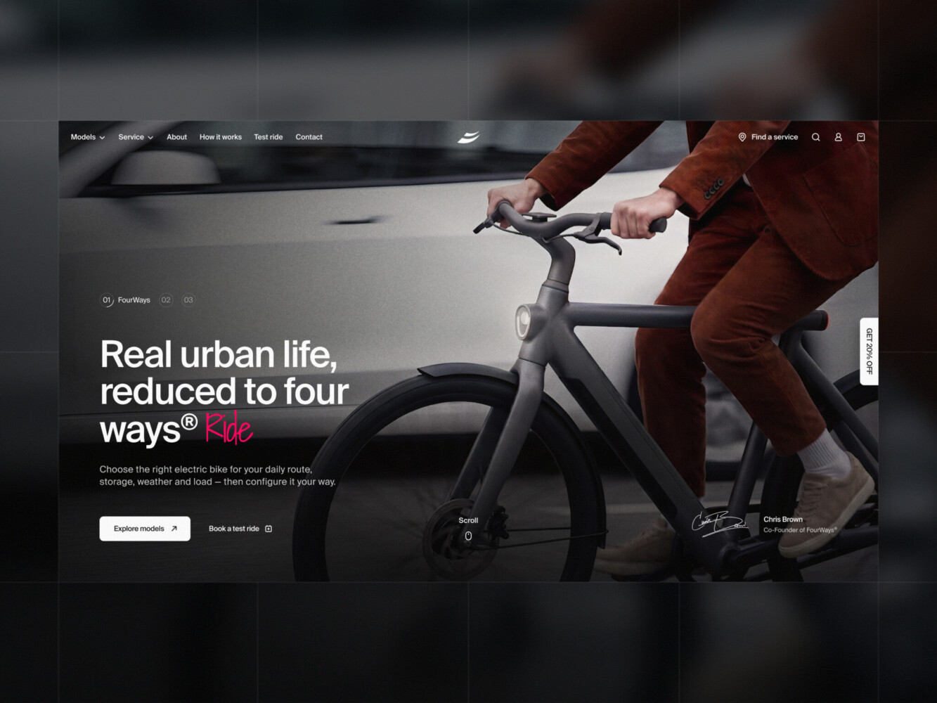
E-commerce Website Design by Shakuro
What is a website header?
A website header is the top section of the web page. Back in the day, people created narrow headers that contained a logo, a call to action, and contact information. But in modern design, the whole space above the homepage fold is considered a header.
Being the strategic part of the page people see in the first seconds of loading a website, a header acts as an invitation. It should provide basic information about a site so that users can quickly understand what it offers.
Some designers make separate headers for various sections of the site. For example, make a large header for a homepage and leave a small strip for other pages. But it should be consistent. A good website design practice is to make the header on the inner page an abbreviated version of the main page header.
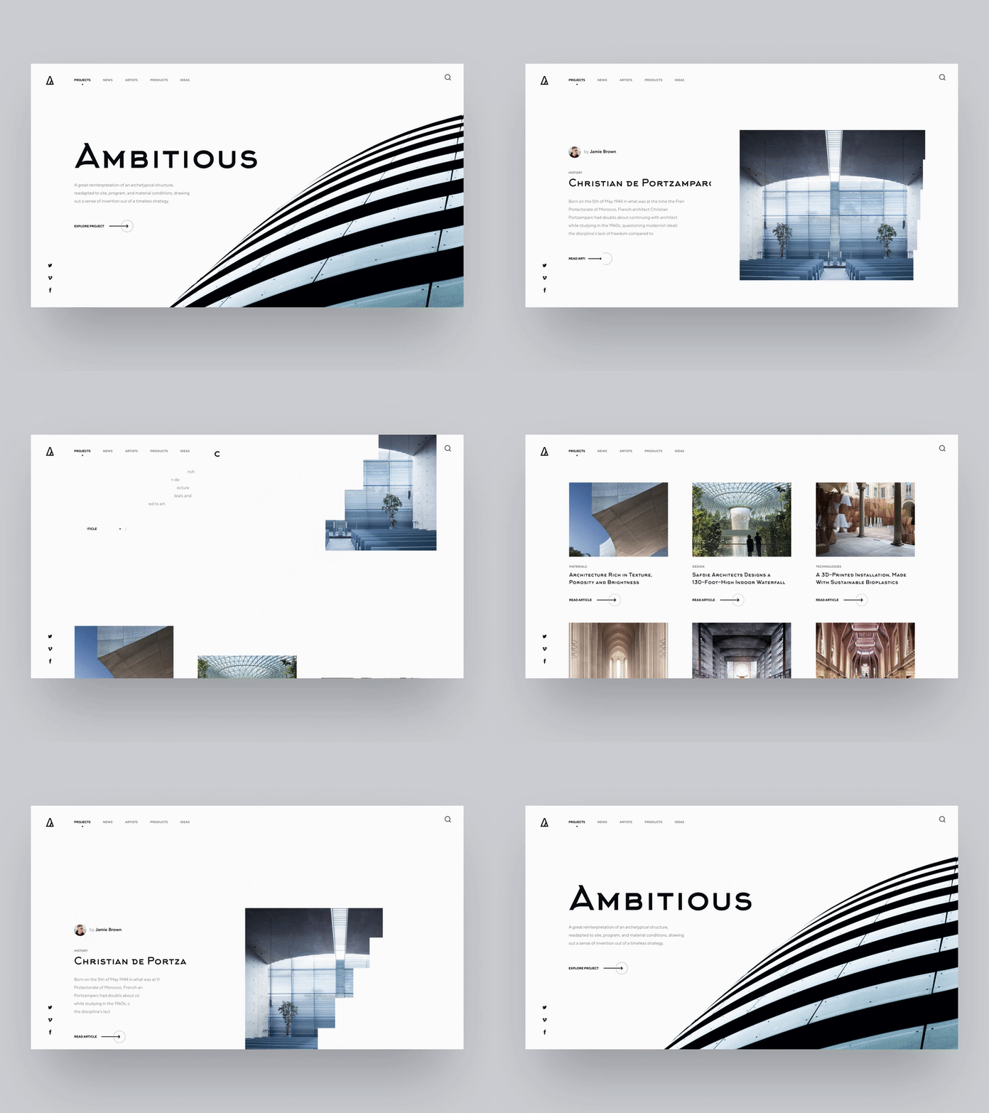
Architectural Platform Home by Shakuro
Website header vs website hero
Why is a well-designed website header essential?
People who find themselves on a new, unfamiliar site follow similar scanning patterns. The Nielsen Norman Group widely supported this hypothesis. In 2006, they first formulated the theory of the F-shaped reading pattern on the web.
Based on this pattern, users don’t just wander on the website — they scan its contents until they find something interesting that catches their attention. Usually, people read horizontally, starting from the upper left corner of the screen. This is where the website header is. Then the eye moves a bit lower and draws another horizontal line. Finally, people scroll and grab some info from down below. In the end, the eye tracking map forms an F shape we mentioned before.
For web and UI/UX designers, remembering the F patterns is crucial. The website header design should represent the company brand and give users all essential information without breaking the pattern. If the header stimulates people to scroll down, read additional information and click interactive elements, then it’s ideally designed.
“Life is the first impression. You get one shot at it. Make it everlasting.”
― J.R. Rim
What should a website header include?
The task of the header is to give users answers to the fundamental questions: what brand is represented, what goods and services are offered, how to get in touch with the company’s employees, and so on.
Apart from that, it also represents the quality and even identity of a website. If the header evokes a good emotional response, and the viewer feels that it has something of value, then you’ve passed the initial test.
The main elements of a website header usually are:
- Logo or brand identifier
- Call to action
- Text or headline
- Contacts
- Social network links
- Navigational elements
- Search field
You don’t have to add all of them at once. Finding a balance between the abundance of information and its harmonious arrangement is necessary. Use only the data you need. Overloading a header would not prove beneficial, however important all the links seem. Leaving the header empty is not a good idea either. A user who cannot figure out your interface in a few seconds will most likely leave and not return. So a bad header can push visitors away to another site with inferior content.
Minimalistic headers’ designs have only the company logo and links to the major sections of the website. This technique is beneficial when creating landing pages.
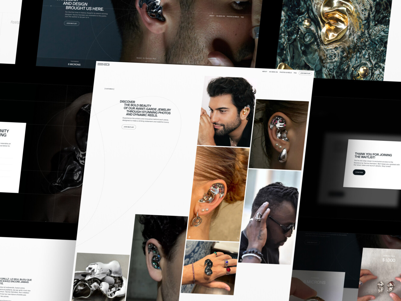
Landing Page for Avant-Garde Jewelry Product by Shakuro
Best website header design practices
Nothing limits your creativity when it comes to designing the header section. The site’s heading is an area open for a wide field of creative design decisions, which should be memorable, concise, and valuable.
Let’s go over the main points.
Header size
There is no definite answer to the question of what size a website header image should be. Some resources try to provide sets of accurate figures, but it doesn’t really matter. One of the most difficult aspects of web development is ensuring every screen size’s effectiveness. And even if two screens are of the same size, the device resolution might be different, so the users still won’t see the same thing.
That’s why it’s wise to avoid fixating on the exact pixel concept. Follow simple rules of common sense. The header should be of such height that it does not interfere with the perception of content. A small header would be an excellent choice for informational resources, whereas the header for landings may be larger.
In the case of voluminous headers, it’s better to leave some space under the fold so that a user can glimpse what’s next on the page and start to scroll.

E-Commerce Website Design by Shakuro
Visual hierarchy
Since people tend to follow specific eye-scanning patterns when visiting websites, the digital content should support natural behavior. In terms of the header design, one should place its elements according to the F shape:
Logo. Another study by the Nielsen Norman Group found that users would much easier remember brands whose logos are placed on the left compared to the center or the proper part placement.
If you have a round-shaped logo, then it’s acceptable to place it in the center of the screen, though its effectiveness will still be lower compared to the ones placed on the left.
Navigation. Pay close attention not to clutter this section of a website. Too many links overwhelm visitors. Sometimes a whole makeover of a website’s structure might be to clear some space for the most critical categories.
Make visitors understand where they are and how to find their way further. Use hover effects to guide users as they navigate.
Call to action. Implement the principles of visual hierarchy to naturally highlight a CTA.
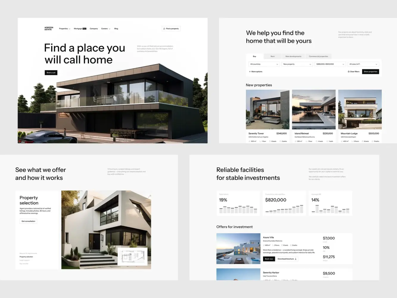
Real Estate Website Design by Shakuro
Fixed (sticky) header
Persistent navigation bars, or in other words, “sticky headers,” mean that the navigation follows you around the page while you scroll. This is now a web design standard.
Make the header fixed if it doesn’t violate your overall design concept. It’s a good idea for both desktop and mobile designs:
- E-commerce websites – the cart is always in front of the user.
- Service websites – the phone number or a CTA are constantly on display
Fixed headers improve the customer experience, keeping users oriented and giving them more control.
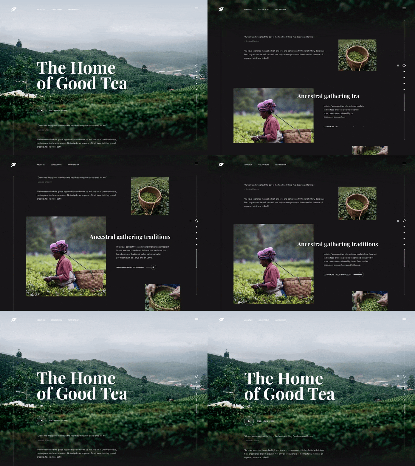
Tea Manufacturer Website by Shakuro featuring a fixed header
The message conveyed by a header
Before designing a header, consider the overall style of the website and its primary purpose.
If it’s a promotional website intended for the presentation of a product, the design of the header may contain links to the main sections, combined with a large hero image on the first screen since the main purpose of such a website is to effectively present the product.
In the case of e-commerce or business websites, the situation might be different. A user needs to easily navigate, know about the latest deals, how to contact the manager quickly, and where to see the orders they’ve already made. In this case, the header may be more concise giving way to other categories.
There are several possible messages a header can convey:
- urge a consumer to do something
- work on trust-building
- encourage a visitor to know more
- be amusing, etc.
The choice depends on a particular website’s aim.
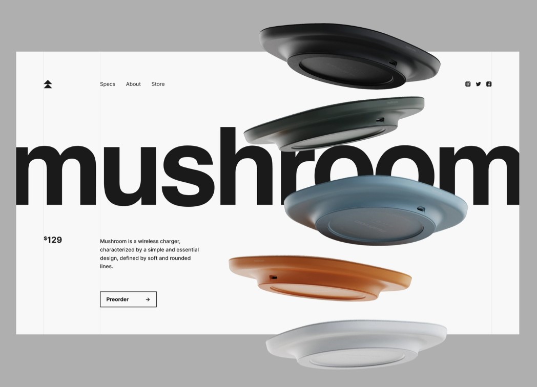
Wireless charger landing page by Conceptzilla
Relevant images
The picture in the header should directly convey information about the business. For example, if it represents the food delivery service, the image might depict a neat courier with aesthetically attractive food. Generally speaking, the visitor, having seen your site, should want to buy something from you.
High-quality photos. Photography is a powerful tool for web designers. It can tell a story, evoke emotion and motivate your visitors to scroll further. For sites with powerfully striking images, try making a transparent header. It better displays the images, retaining the main links.
Sliding images. If you have several great photos representing the website’s business, go ahead! Users can scroll through a set of exquisite high-resolution photos.
Illustrations. Website header images must strike the right chord and establish a personal connection. Better if an image is distinct and easily recognizable even if cut out from the website header. You can achieve it by capitalizing on today’s trend for illustrations.
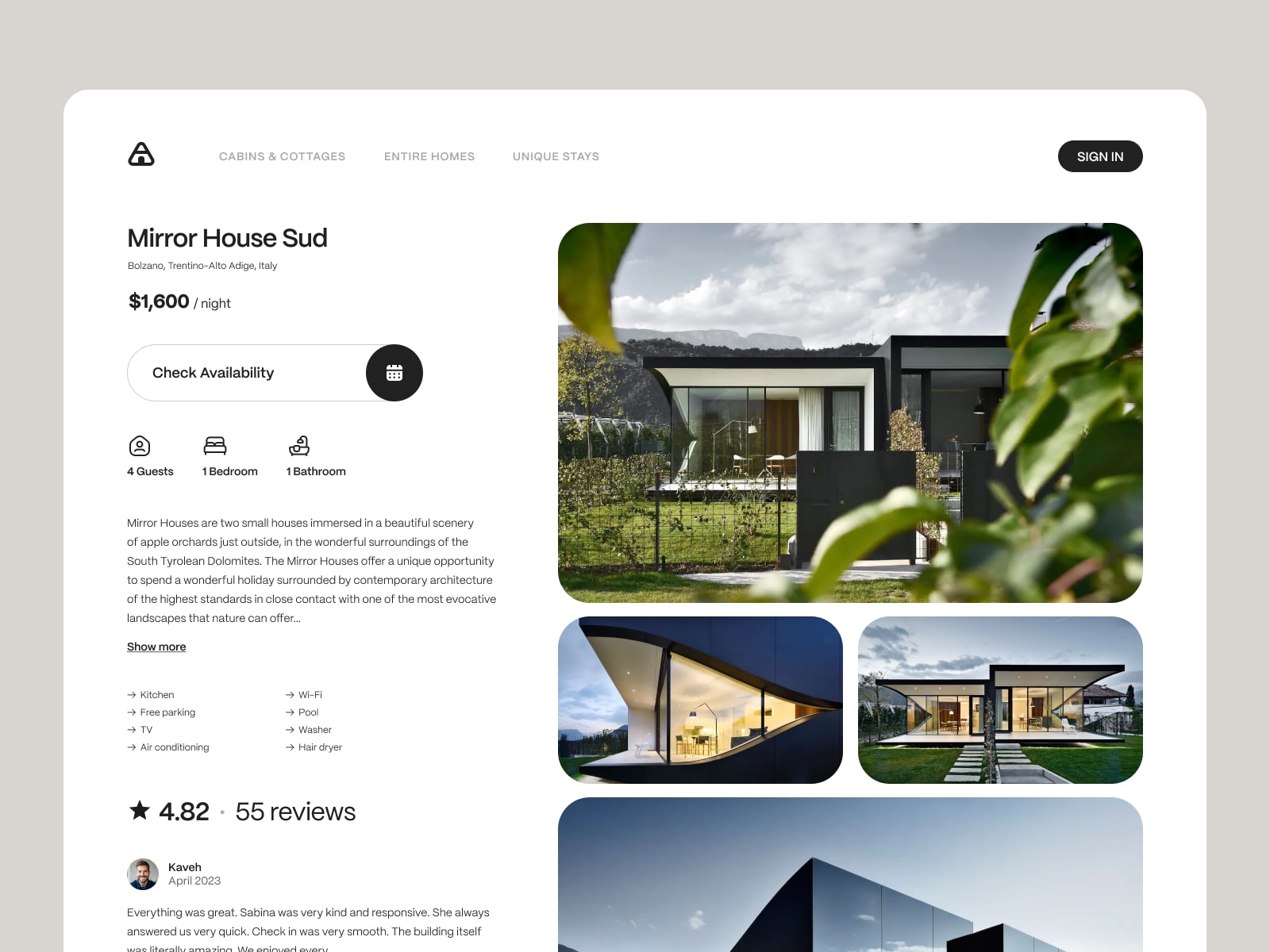
Rental Booking Service Website Design by Conceptzilla
Video or animation
Don’t focus your attention on static images only. Adding video is among the most efficient website header ideas. If possible, try to add thematic video material into a header. Many websites use it to captivate the audience while presenting their company or product in the best way possible.
Another way to make your design even more attractive, vivid, and memorable is to add animation. It can make really cool website headers. Animation is an excellent alternative if you’re looking for an interactive webpage that engages viewers.
A well-designed call to action
While designing a web header, the designer adds some call-to-action elements there like “log-in,” “sign-in,” “get in touch,” etc. The button should contain an inscription understandable for the customer and be noticeable among other content. Otherwise, it won’t attract the user’s attention, so they take the necessary action.
A call-to-action placement in a strategically significant location is a perfect opportunity to urge users to take action right in the beginning, thus boosting your conversion rate. Some CTAs can be used for a period to promote special deals, and others have a long-term presence.
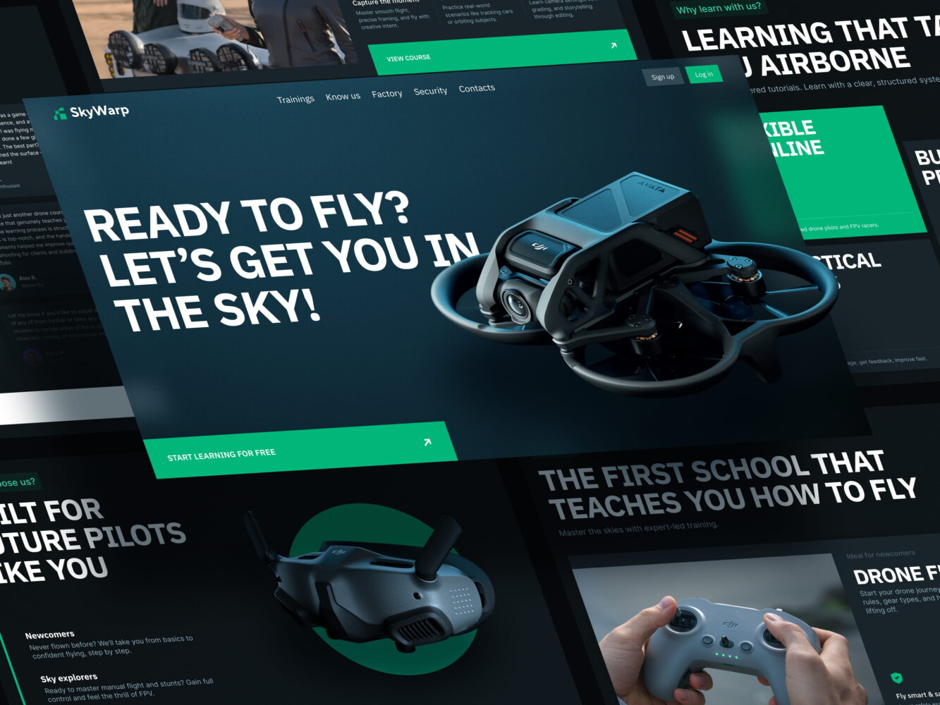
Drone academy website by Shakuro
Best fonts for website headers
The content includes many texts: contact details, interesting offers, links, and banners. Therefore, you must choose clear, readable fonts that don’t impair perception and could be comprehended at first sight. If your target audience is seniors, they will probably have weak eyesight, so keep that in mind when selecting fonts.
One can use handwritten or intricate typefaces for the logo, but it’s better to avoid them anywhere else in the header. Regarding text links or info, pick Serif or Sans Serif fonts: they will have high readability in small spaces like a header. The minimum size of the header should be around 16 pixels together with any bars or elements.
Even if a designer selects a good-looking font, insufficient color contrast can wipe out all the efforts. Stick to the 4.5:1 ratio between the header font and background color.
For large homepage headers, you can use bold typography and imaginative elements to catch users’ attention, otherwise, it’s best not to choose fancy fonts that can prove hard to read.
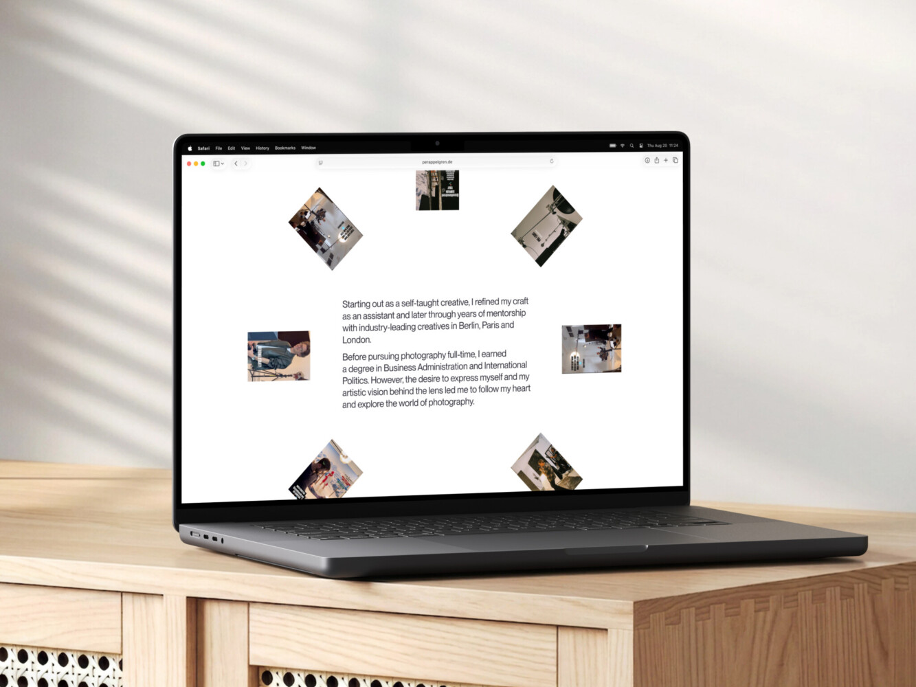
Website design for Per Appelgren
Simple header design
Keeping a header well-defined and neat makes your visitors feel like you don’t try to burden them with your offers. A creative website header can have a very simple look.
Here is where a white space concept comes in handy. In design, white space equals empty space free of elements or icons. It brings “air” to the idea, making the visual hierarchy more prominent. White space also reduces design noise, eliminates overloading with elements, and helps navigation.
One can implement the same rules to website headers. If a header has a company logo and navigation bar, there should be a substantial distance between the buttons and the image, especially if there is a sign-in button. Otherwise, people will keep clicking the wrong elements.
A search bar is a must-have when websites belong to enterprise or e-commerce companies. This element is simple. However, it should also obey the white space law. The header design must be wide enough to include the search field with inquiries of various lengths: no cutting, cluttering, or overlapping. A good idea to include a CTA as a placeholder in the field.
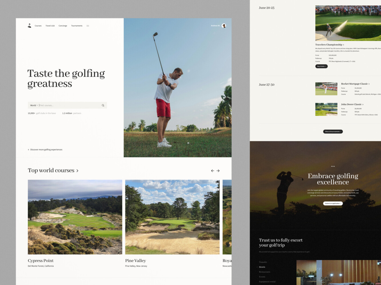
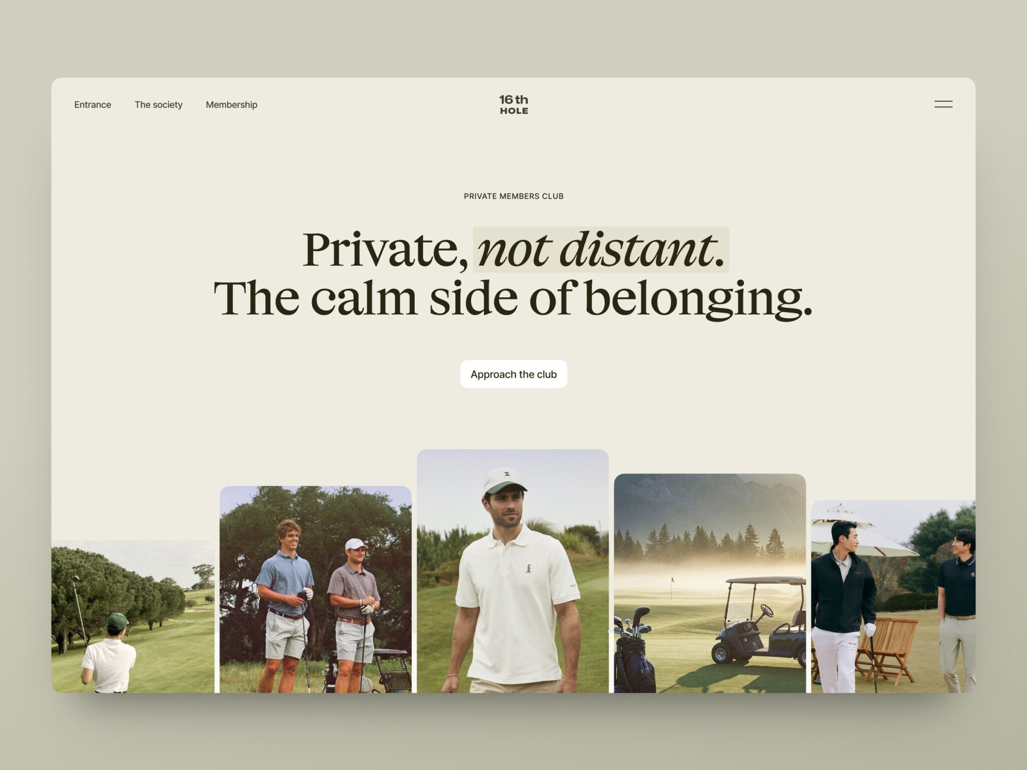
Golf Website Design Concept by Shakuro
Hidden navigation (hamburger menu)
This is a solution increasingly used for website design. The hamburger menu is a small icon of three stripes that displays the full menu when clicked. This technique is used by designers when they need to focus on the main screen.
From the point of site usability, this is a good option. Such a menu came from mobile design and is already familiar to users. The hamburger is suitable for promotional sites, where the main emphasis is on the high-quality presentation of the product using photos or videos. This option might be less suitable for online stores since the customer needs to have a basket, selected products, and a search field in quick access.
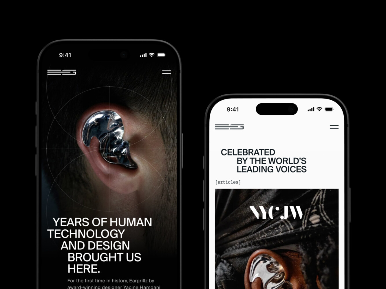
Hamburger navigation
Mobile header design
The header should be correctly displayed not only on the desktop version of the website but also on the mobile one. So it has to be responsive and adjust well to a smaller resolution.
Since the available space is significantly smaller, the drawer or a hamburger menu is a must. There, one can place links, contacts, and additional information. Special offers, logos, and sign-in buttons should remain in the top bar since they are crucial elements for the clients’ interaction.
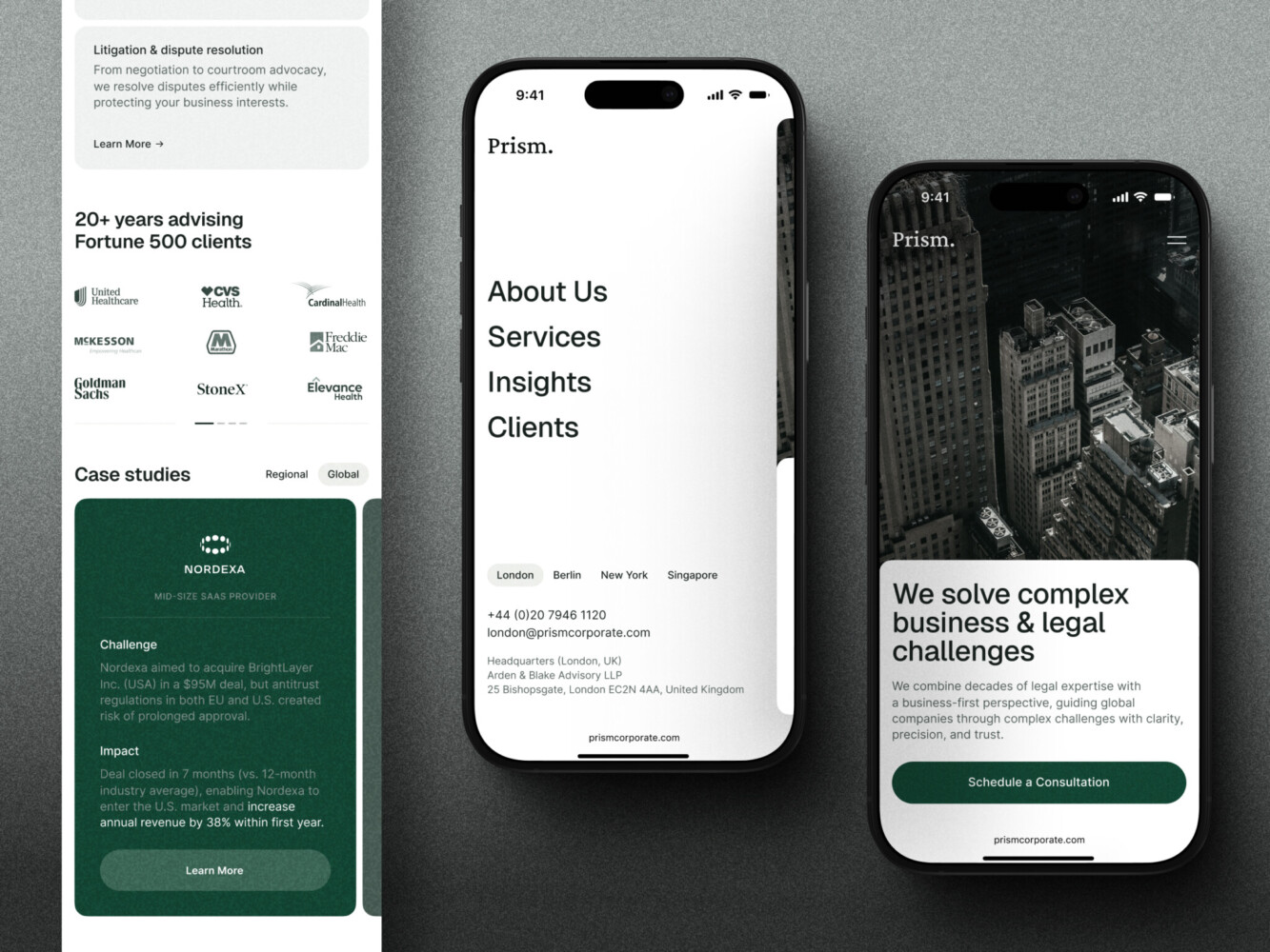
Mobile navigation
Another thing to remember is that mobile websites have a vertical hierarchy, meaning one must rearrange all wide and horizontal content to fit it into a new pattern.
Mobile traffic has significantly increased and reached 58% in 2022. This fact has given rise to website designs that look mobile-oriented even in their desktop incarnations. For example, the implementation of large hero images and hamburger menus originates in mobile design.
Mobile header best practices
You might have already noticed that website header design on mobile is different from the desktop version.
- Keep the main items between 3 and 5. Seriously. Any more than that and it looks like a cluttered desk. You want people to scan and pick, not study.
- Use labels with icons. I know, minimalism is cool. But does everyone know what that squiggly line means? Probably not. Just write “Profile” or “Settings.” It saves brain power.
- Make touch targets big enough. Apple says 44×44 points, Google says 48×48 dp. Just make them fat. If I have to tap twice because my thumb slipped, I’m annoyed. Simple as that.
- Put key actions in the “thumb zone.” The bottom of the screen is prime real estate. The top corners? That’s hard mode. Save the tricky spots for secondary stuff.
- Give immediate feedback. Did I tap it? Did it work? Show me something. A color shift, a tiny vibration, whatever. Don’t leave me hanging wondering if the app froze.
- Stick to standard patterns. Hamburger menus for drawers, tabs for main sections. Don’t reinvent the wheel unless you have a really good reason. Users already know how these work. Let them use that muscle memory.
- Test on actual devices. Simulators are fine, but try using your app while holding a coffee or walking. You’ll quickly see what’s awkward. It’s humbling, honestly.
Accessibility guidelines
<h1>. It’s the main point of the page, right? So it should be the H1. And please, make sure it’s actual text, not part of a background image. If it’s an image, screen readers just skip over it or read some weird filename like hero_final_v2.jpg. Not helpful.alt="") so screen readers skip it. No need to hear “smiling business team shaking hands” if the headline says “Partner with Us.” Redundancy is annoying.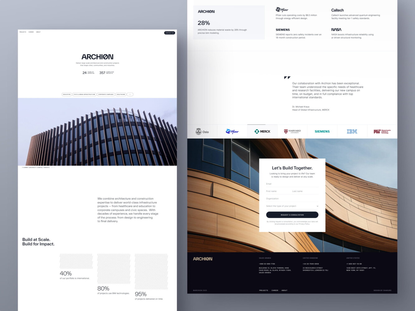
Web Design for Architectural Company by Conceptzilla
FAQ
What is a website header?
A website header is the top section of a web page. Headers are narrow strips with a logo, a call to action, and contact information. In modern design, the whole space above the homepage fold quite often is considered a header too. It should quickly tell users what the site offers. On inner pages, a good practice is an abbreviated version of the main page header.
What should a website header include?
The main elements of a website header are a logo or brand identifier, a call to action, a text or headline, contacts, social network links, navigational elements, and a search field. You don’t have to add all of them at once. Use only what visitors need: an overloaded header confuses them, while an empty one leaves them without direction. Minimal headers work well for landing pages.
What size should a website header be?
There is no single correct size for a website header, because screen sizes and resolutions differ even between similar devices. Follow common sense instead of exact pixels: the header should not interfere with the perception of content. A small header suits informational resources, while landing pages can use a larger one. With a big header, leave some space under the fold so users see there is more to scroll.
Should a website header be sticky?
In most cases, yes. Fixed (sticky) headers that follow the user while they scroll are now a web design standard for both desktop and mobile. On e-commerce websites, a sticky header keeps the cart in front of the user; on service websites, it keeps the phone number or call to action on display. Use one if it doesn’t break the overall design concept.
What font size and contrast work best for a header?
Pick clear Serif or Sans Serif fonts for text links and information, since they stay readable in small spaces. The minimum size should be around 16 pixels, and the contrast between the header font and the background should be at least 4.5:1. Keep handwritten or intricate typefaces for the logo, and remember that older audiences may need larger, simpler text.
How should a header look on mobile?
A mobile header has to be responsive and adjust to a smaller screen. Since there is much less space, a drawer or hamburger menu becomes a must for links, contacts, and additional information, while special offers, the logo, and sign-in buttons stay in the top bar. Mobile websites also have a vertical hierarchy, so wide horizontal content needs to be rearranged.
In conclusion
Summing it up, a header is like a business card for a website. It should be unique, easy to read, and grab attention immediately. Therefore, when designing a website, follow different tips from this article to get a perfectly-looking header.
Moreover, it’s essential to make regular alterations to keep a website fresh and up-to-date. The website header design can look fantastic. However, it won’t matter if it’s outdated.
Do you think your website needs an overhaul? Do you require a web design for a new product? Contact us to get a stylish concept corresponding to the company brand.
Related reading
- When and Why Use Textures for Web Design?
- How to Improve Website Readability: 7 UX and Web Design Tips
- 404 Page: Design Not Found. How to Create Great Error Pages
- The DIY Website Design: When It’s Time To Flip The Script
This article was originally published in February, 2020 and was updated in October, 2026 to make it more relevant and comprehensive.