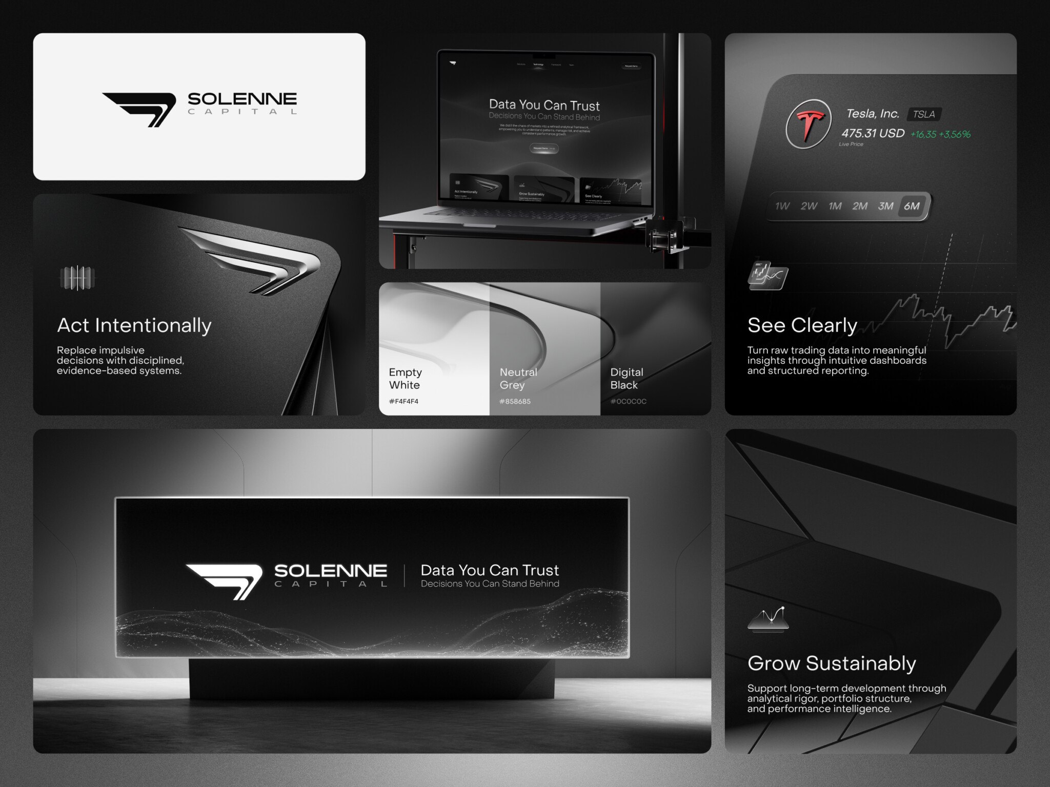
The design system approach means building a product from one set of reusable components and rules for their use, such as UI kits, typography guidelines, states and behaviors, animation, and UX writing rules, instead of designing every screen from scratch.
Most articles about design systems explain how to create one. We share our experience of applying these principles as a design and development outsourcing company, not a product one: we build a lighter system for each product and treat it as the shared language of the team. The systematic approach to UI/UX design helps us create better websites and apps in many ways, and speed is only the beginning.
Below, we cover what design systems are and what they are made of, the benefits of the design system approach, from faster design and lower costs to consistency, quality, teamwork, and easier maintenance, and its challenges.
What design systems are and what they are made of
A design system is a set of design components and rules that regulate their usage and define the product’s philosophy. It may sound like a style guide but the difference is that a style guide is a static document that has a very definite aim — to accurately tell about the uses of design elements in various environments, cases, and mediums. There’s also a concept of a pattern library which is technically a simple collection of UI components.
The ways different designers understand and define design systems can vary. The main idea is that a design system is something that encompasses both the pattern library of a project and its style guide into one entity, holding everything together and making it easier to scale.
A product’s design system includes several large sections. Their number and content depend on a company and/or a product.
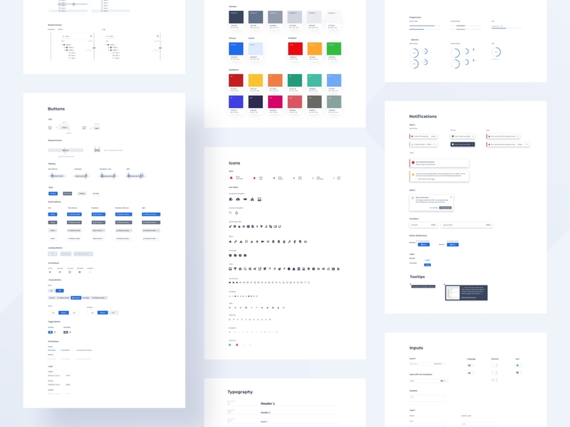
PSIM – Design system by Iga Kucharska
The list of possible components that make up a design system includes:
- Sets of reusable interface components (in other words, UI kits) like icons, buttons, illustrations, etc.
- Formalized rules for using these components.
- Typography guidelines.
- States and behaviors on different types of devices.
- Guidelines on animation and sound design.
- Rules for UX writing and brand presentation like an outline of a company’s mission and personality.
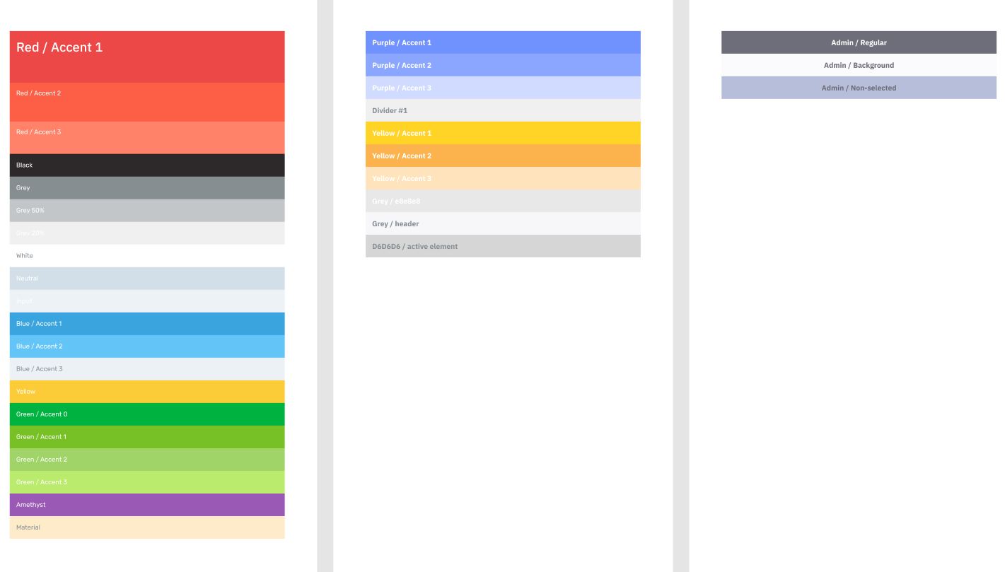
It’s important to note that the purpose of a design system is to form a comprehensive picture of a product design so even if you use the actual white #FFFFFF color for white spaces and the actual black #000000 color is used for texts, they get noted in the documentation all the same. Allowing leniency in a design system defeats its whole purpose.
Take a look at the color section of the design system of our Akeptus project:
The concept of design systems in the current understanding of the word was born in the middle of the 20th century but if you look at it more broadly, you could even trace its origins way back to the medieval cathedrals. In relation to digital design, the first meaningful attempt at massive web unification was made by Google with its Material Design. They started working on the idea in 2011, and in 2014 they presented a ready-made design system. Since then, the subject of design systems started to become an especially popular topic for design-related discussions.
Moreover, you can notice that this systematic concept makes special sense with the component approach used when implementing the front end and the UI in general. React, Vue, Angular, and other popular front-end frameworks use the component-based paradigm. So even small project teams think about creating limited design systems, let alone big companies like Airbnb, Uber, and IBM who make their own large systems to reinforce and maintain their brand identities.
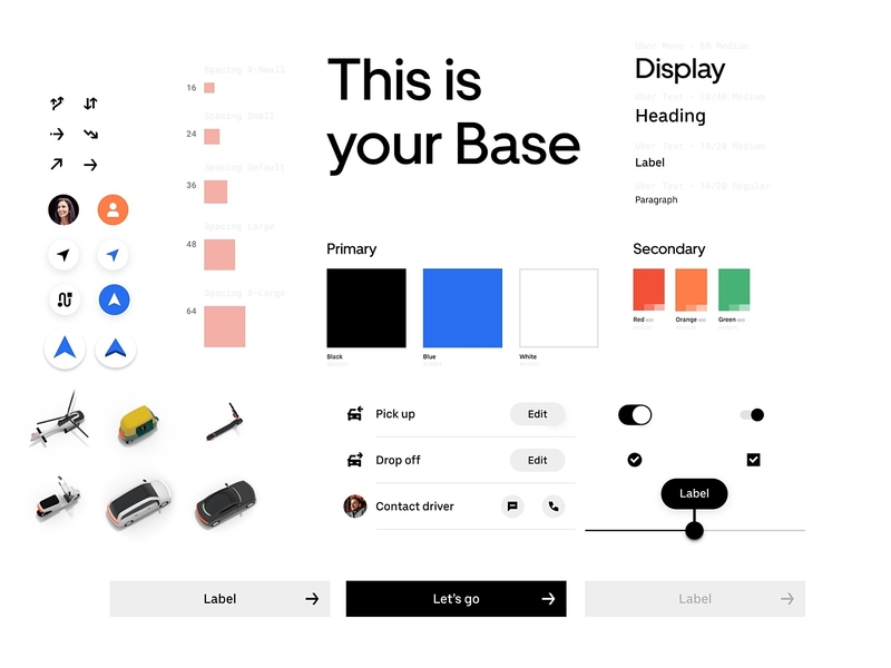
Uber’s Design System: Base by Uber
How to implement a design system in an existing product
An existing product already has a design system of sorts: repeated decisions about colors, spacing, controls, and interactions. The problem is that those decisions may be inconsistent, undocumented, or implemented differently across screens.
Start by understanding what is already there. Then introduce shared foundations and components gradually, using real product work to validate them.
1. Audit existing components before creating new ones
Review the live product, design files, and frontend code together. A tidy design library does not necessarily reflect what users experience in production.
Group components by purpose, such as navigation, data entry, feedback, and actions. Record where each appears, its variants and states, accessibility issues, and differences between design and implementation.
Decide what to keep, merge, redesign, or retire. Prioritize components that appear frequently, affect important workflows, or cause recurring problems. Do not merge controls simply because they look similar: their behavior may serve different needs.
The output should be an inventory and a prioritized backlog, not an immediate redesign of every screen.
2. Establish tokens with clear responsibilities
Design tokens give reusable names to decisions such as colors, spacing, typography, and motion. Separate raw values from their intended use.
For example, color.blue.600 might supply the value for color.action.primary.background. Components can then refer to the purpose-based token instead of choosing a color independently. Add component-specific tokens only when they solve a genuine need.
Define naming, aliases, supported themes, and ownership. Choose a canonical source and document how changes reach design tools and code. The Design Tokens Community Group format provides a specification for exchanging tokens between tools, but a working pipeline still requires implementation and validation.
Test the foundations on representative screens before applying them everywhere.
3. Specify states and behavior
A component needs more than a default appearance. Distinguish variants, such as size or visual emphasis, from states, such as focus, loading, or selection.
Document the states relevant to each component. An input may need validation errors and read-only behavior; a disclosure control needs expanded and collapsed states. A data-loading pattern needs loading, empty, success, and failure experiences.
Explain transitions, keyboard interaction, responsive behavior, long content, and feedback messages. For example, a save action should communicate progress and failure without leaving the user uncertain about whether their changes were stored.
These rules become a shared contract for design, development, and testing.
4. Validate accessibility in the implementation
Include accessibility in component acceptance criteria. Check semantics, accessible names, keyboard operation, focus management, contrast, and how errors or dynamic updates are communicated.
Use agreed WCAG 2.2 criteria and relevant ARIA Authoring Practices to guide implementation. Combine automated checks with manual keyboard and assistive-technology testing.
Test components in context, too. A control that works independently can still become inaccessible through incorrect labels, layout, or focus handling in a complete workflow. Record known limitations rather than describing the entire system as automatically accessible.
5. Connect the library to production code
Map design components to their actual implementations. Align property names, variants, states, and token usage, and provide working examples with clear usage guidance.
Tools such as Storybook can make implementations inspectable. Figma Code Connect can link design components to code references, but neither replaces engineering review or maintains every relationship automatically.
Pilot the library in a representative workflow, such as account settings. Include validation, permissions, asynchronous actions, and error recovery. Agree how new and legacy components coexist during migration, including how to prevent conflicting styles.
Publish versioned releases and migrate incrementally rather than rebuilding the entire interface at once.
6. Assign ownership and support adoption
Name the people responsible for design decisions, code quality, accessibility review, and releases. A small team can combine responsibilities, but ownership should remain explicit.
Define how teams request changes, propose components, report defects, and document justified exceptions. Check for existing solutions before adding another component. When changes affect consumers, provide release notes, migration instructions, and a deprecation path.
For client projects, include repositories, design libraries, documentation, access permissions, and maintenance responsibilities in the handover.
Finally, measure adoption in both design and production. Track recurring inconsistencies, defects, migration effort, and the time required to deliver comparable workflows. A growing component count is not the goal. The system should make everyday product work clearer and easier to maintain.
Design sytem benefits
Once again, if you get interested in how it looks in real life, you will most likely find lists of design systems examples that feature product companies like the ones mentioned above plus others like Atlassian, Shopify, Spotify, and Starbucks. The purpose of a design system in a product company is to ensure that one product is similar to another. As a service company that designs and develops for many different clients, we use a different approach that draws the best from design systems while being somewhat smaller in size. Unlike large enterprises that may have teams of 10-20 people managing each of their systems full-time, we design a system for each product, creating a kind of mini-product team. A design system, in this case, becomes more of a set of rules and systemic reuse of elements than a full-fledged case with a super-deep approach, as product teams usually do. At the same time, we keep the main features of design systems and use their main advantages to save time and reduce the number of errors.
Today, any website or app is a solution to a business problem that needs a methodical approach. So the systematic approach is able to give us the following:
Faster design (and development) process
According to research conducted by the Figma team, when its participants (designers, developers, etc.) had access to a design system they completed their objectives 34% faster. We can confirm this by our own experience. By building a system of reusable components for a project and defining the rules for their usage, we make it easier for the whole team to (re)use them in the future. For example, when later on we need to expand a project with a new feature or scale it, we can quickly build what we need from blocks that are already there.
There is the widely-used Atomic Methodology devised by designer Brad Frost which is essentially a breakdown of the website composition into the simplest components that are used in the design of an entire website. The idea is that you start designing not with page layouts, but with smaller objects — fonts, padding, input fields, animations, etc. that you later use to build progressively more complex entities until you get to constructing entire pages.
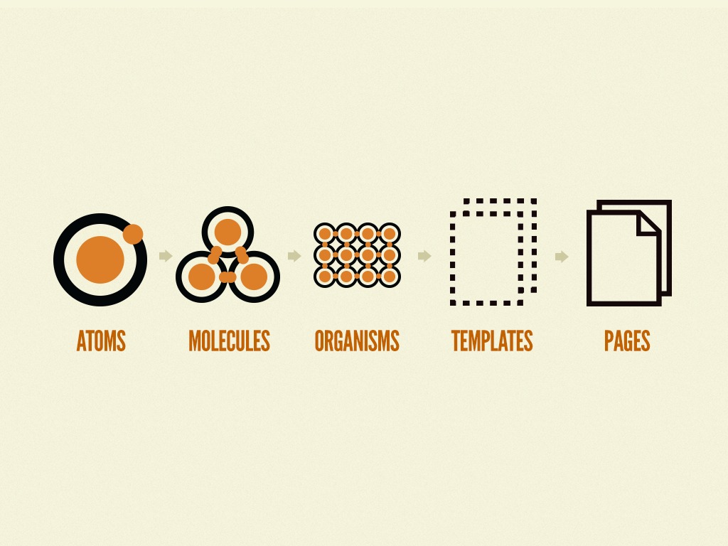
Image: bradfrost.com
Apart from forming a clear structure that everybody can understand and rely on, it helps to perceive a product design as one entity or, rather, an organism. The idea came before Material Design and influenced it as well as the heritage of various pattern libraries of other companies.
In practice it means that we collect atoms (i.e. the smallest design elements) and determine their behavior, connecting them into a system using Figma’s capabilities (Auto Layout, Components, and Variables). We became particularly aware of the possible benefits that a design system could give when working on one of our largest web design projects — an educational platform for CGMA.
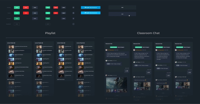
Being a kind of universal language of a project, design systems also help to minimize the time needed for onboarding new designers and developers. New members get to know the ropes and perform meaningful tasks quicker, without wasting much time on the buildup.
Cost reduction
When you discuss design systems with someone outside the team (especially a person not acquainted with the details and realities of design-making), the subject may not sound very exciting with all its strict rules and collections of neatly organized and kept components. What is exciting though is that it follows from the previous point that we now can design faster which ultimately means more affordable apps and websites without compromising on their quality (you actually end up enhancing it). It is especially remarkable and beneficial with larger projects that take years of making.
What’s more, not only designers enjoy the benefits and easier workflow that design systems provide. It also means that other costly team members — developers — also have small parts of code ready-made and waiting and have fewer menial tasks to do. Using the system approach helps to streamline the design process for all its participants, making it more predictable, and thus, more efficient.
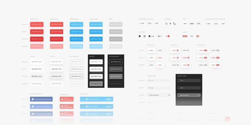
Proko is another one of our long-term website design projects that benefited from having a design system implemented:
Better consistency
One of the design system benefits is consistency. Consistency in design means that all the elements in projects have visual and functional similarities. In other words, they mostly look and work the same. Fonts, colors, buttons, grids, sizes, and margins must be similar throughout a project and make up a single coherent system. Following very definite rules on how elements should look and behave, it becomes much easier to create consistent experiences across different platforms and make users feel comfortable.
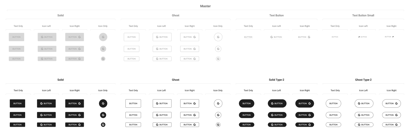
To illustrate the point, let’s take an element like a button. Its every property like size, radius, color, typography details, and other stuff is clearly set and defined making it harder for a designer to make a mistake and trigger user confusion.
Here’s a part of the button section in the design system of our ChannelD project:
Better quality
With millions of websites and mobile applications out there, the process of making a new website or app needs to be as much efficient as possible. You have to find every opportunity that could provide you with an additional edge to make your project stand out among others.
An end-user won’t think about how consistent a design is, but they will feel it. When every element in a product design is harmoniously connected to others, when interactions are predictable, and new features are easy to master, the user experience becomes more satisfying.
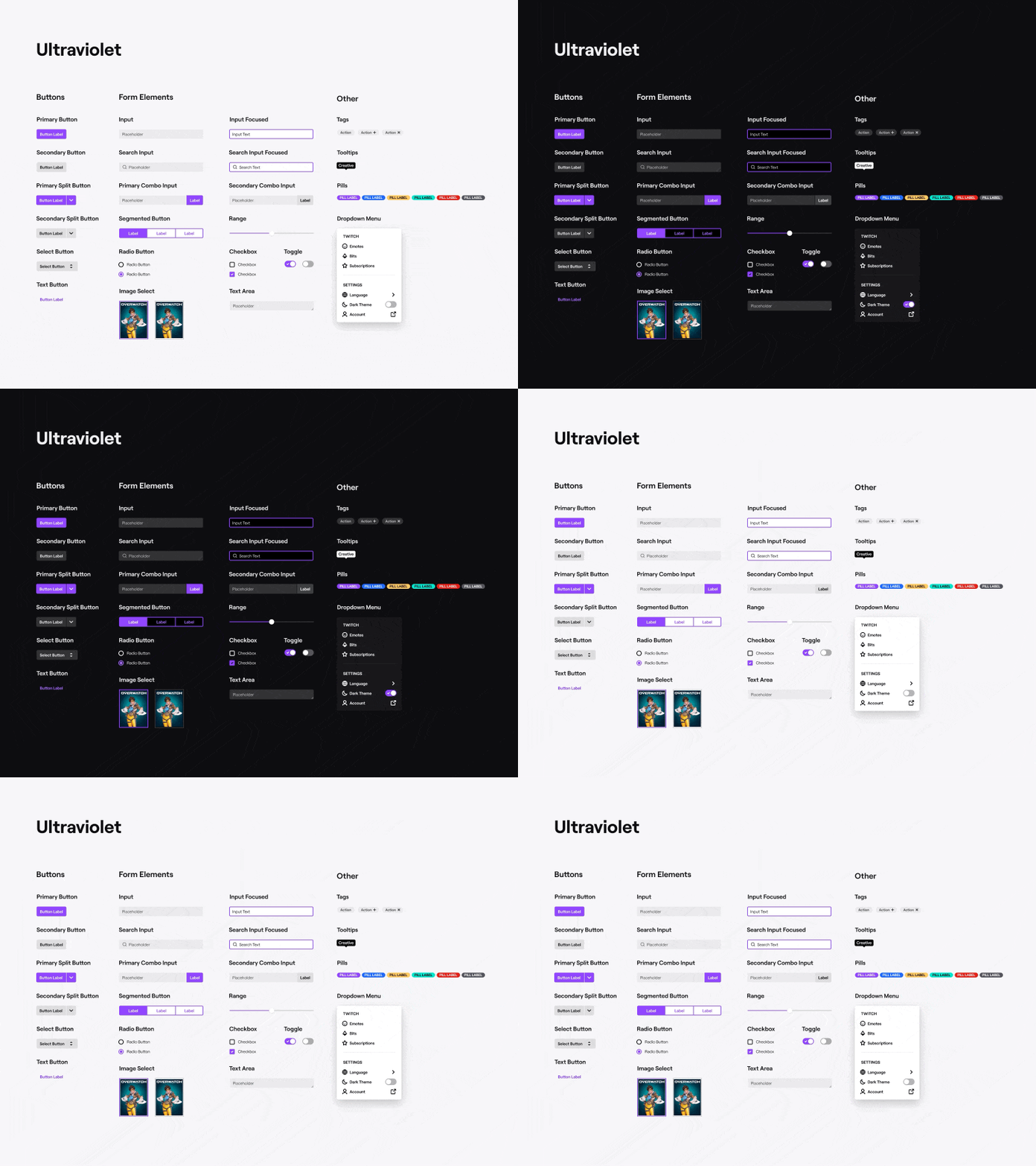
Twitch Ultraviolet UI Kit by John Ellenich
Ability to spend more time on complex problems
Having their time spared by the benefits of the system approach, and without the need to reinvent things each time, designers now have more time for other, more complex activities like creating superior user flows.
In the end, it benefits the client, the users, and the designers themselves. At first, it seems that the amount of time spent on constructing the system does nothing but affect the team’s productivity, but later on, developing a product further, designers pay less and less time to simple visual aspects and spend more time on devising the better UX. The larger the project the more impressive the effect.
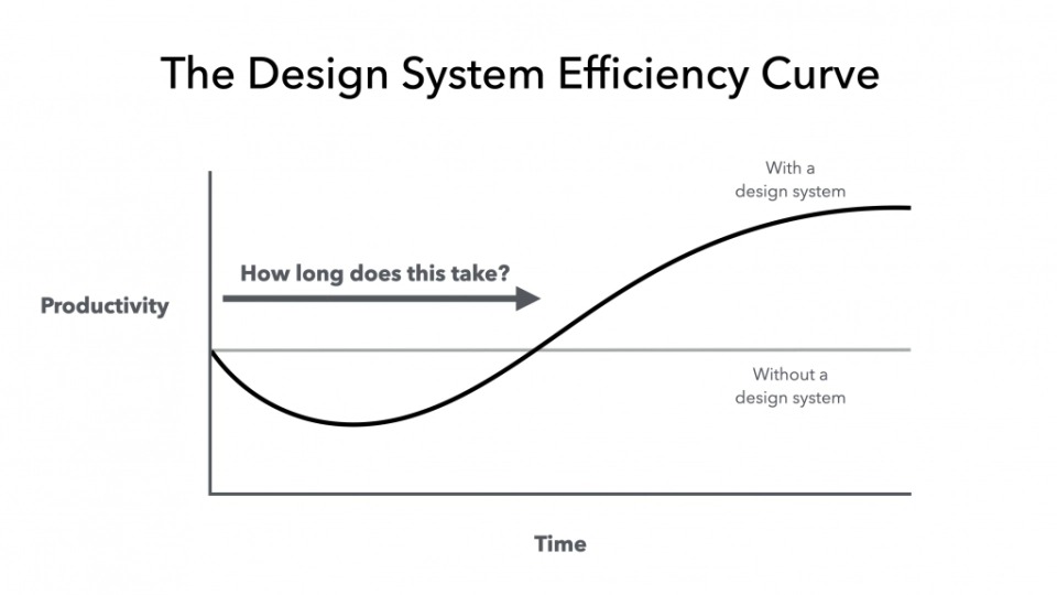
Image by Ben Callahan
A universal language for more coordinated teamwork
In current circumstances, when there are more and more distributed design and development teams, we need better communication between different team members. Having a project with a design system implemented that everyone can refer to, saves a lot of time that would otherwise be wasted on miscommunication. When every aspect is defined, there’s much less room for possible mistakes and misunderstandings.
Look at how they do it at Atlassian, with a design system where every element is very well covered including looks, examples, code snippets, and a detailed description of how it all fits together:
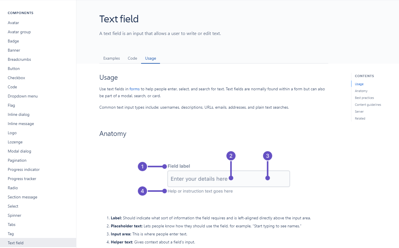
Image: atlassian.design
Solving the problem of delivering design to code
Designers and front-end developers work in tandem, taking full advantage of the design system for hypothesis testing and product development. For example, designers are able to create a library of components in Figma and apply them in all the necessary layouts. Developers, in turn, simply use previously implemented components from the framework.
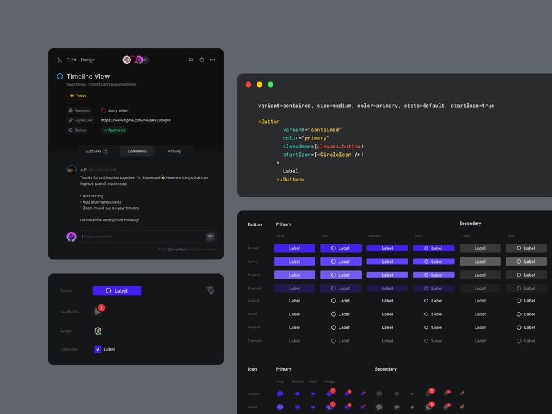
Visual System 2 Variants by Wojciech Zieliński
Easier maintenance
A design system lets you easily implement cosmetic or even major edits in one go and in one place meaning simpler project support, the possibility of quick updates, etc. Having discovered new features, we expand its system, helping it to evolve. As long as a project lives, so lives and evolves its design system. For that reason, some experts name the whole concept “a living document” as a design system, by its definition, needs to be maintained throughout the entire lifecycle of the product. You spend time on it, especially in the beginning, but it pays in the long run. As a result, the overall quality of the final product is improved. Without using the systematic approach, the whole business starts to look more like art. To remain efficient, the design process has to follow a set of certain rules and constraints.
Challenges of using the design system approach
It’s important to note that a design system is not a panacea ready to solve every issue there is and not every project altogether needs one. It’s the designer’s job as a professional to analyze a project’s current (and future) size and decide to what degree and to what extent it needs to be maintained without violating the budget. For example, you don’t need to build any kind of complex system for a landing page, a simple UI kit would be enough for this purpose. At the same time, without a clear structure, a larger project would end up slow, inconsistent, and difficult to maintain chaos. What’s more, a certain skill is needed to handle the systematic approach without turning a new product (or its part) into a patchy and confusing mess that can only hamper the development process.
* * *
Design systems are a logical development of the entire digital design, they can yield truly impressive results. Design systems greatly simplify the work on large products, allowing us to update them faster, make the user experience smoother, and the development process, in general, less expensive. Design systems help to create interfaces that are understandable to users, are logically arranged, and are decorated in the same style.
Want to know more about how we design apps and websites? Or do you have a project that lacks proper structure and consistency? Contact us to know more about how our system approach can benefit your future or existing project.
FAQ
What is a design system?
A design system is a set of design components and rules that regulate their usage and define the product’s philosophy. It usually includes reusable interface components like icons and buttons, formal rules for using them, typography guidelines, states and behaviors on different devices, animation and sound guidelines, and rules for UX writing and brand presentation. It holds everything together and makes a product easier to scale.
What is the difference between a design system and a style guide?
A style guide is a static document with a definite aim: to describe how design elements are used in various environments and mediums. A pattern library is simply a collection of UI components. A design system combines the pattern library and the style guide into one living entity with rules and a product philosophy, and it keeps evolving throughout the product’s lifecycle.
What are the benefits of a design system?
A design system speeds up design and development: in research by the Figma team, participants with a design system completed their objectives 34% faster. It reduces costs, keeps fonts, colors, buttons, and margins consistent, improves the quality users feel, frees designers for complex UX problems, gives teams a common language, simplifies handing design over to code, and makes maintenance easier.
Does every project need a design system?
No. A design system is not a panacea, and the designer has to judge a project’s current and future size and how much of a system the budget allows. A landing page doesn’t need a complex system; a simple UI kit is enough. A larger project without a clear structure, on the other hand, ends up slow, inconsistent, and difficult to maintain.
What is atomic design?
Atomic design is a methodology devised by designer Brad Frost. It breaks a website down into its simplest components, such as fonts, padding, input fields, and animations, and uses them to build progressively more complex elements until whole pages are assembled. Designers start with these small objects instead of page layouts, which gives the product a clear structure that the whole team can rely on.
***
This article was originally published in April 2021 and was updated in October 2026 to make it more relevant and comprehensive.
Related reading