
For those who prefer to listen rather than read, this article is also available as a podcast on Spotify.
Contents:
How many times have you downloaded an app, opened it once, and never touched it again? Too clunky, asks for too much too soon, too complex, etc. People need mere seconds to form an impression about a product.
If you’re part of a product team, a UX/UI designer, or a business owner trying to figure out why your mobile app isn’t sticking, this is probably familiar territory. You’ve poured time, money, and energy into building something useful, but users bounce faster than a rubber ball on concrete. And sure, analytics might tell you what’s happening but not always why.
So if you’re tired of guessing what users want, stick around. I’ll explain what user-centric mobile app design really looks like in practice, why it drives better retention, and how to start shifting your team’s mindset from “build it and they will come” to “build it for them, and they’ll stay.”
Why User-Centric Mobile App Design Is Critical for Success
The Importance of Designing for Users, Not Features
A lot of mobile apps feel like a Swiss Army knife with 47 tools, where the one thing users actually care about gets buried under layers of “innovation.” Their development teams get excited about a cool new API, a slick animation library, or some AI-powered widget, and suddenly, the roadmap fills up with technical checkboxes instead of real human problems. Before you know it, you’ve built something impressive on paper that nobody uses beyond the first screen.
Well, features don’t retain users. Experiences do.
And experiences only work when they’re rooted in what people actually need. Sure, it’s tempting to chase specs, such as faster load times, more integrations, and richer functionality, but if those things don’t solve a genuine pain point, they’re just noise.
Just an example: Instagram’s early days. It didn’t launch with filters, stories, reels, shopping, and DMs all at once. It started with one clear job: make mobile photos look less terrible, fast. Everything else came later, after they understood how people used the core experience.
That’s why the genuine question when building apps for users should be: are you building what people say they want or what they show they need through their behavior? The gap between those two is where good apps go to die. The bridge across it is a user-centric design.
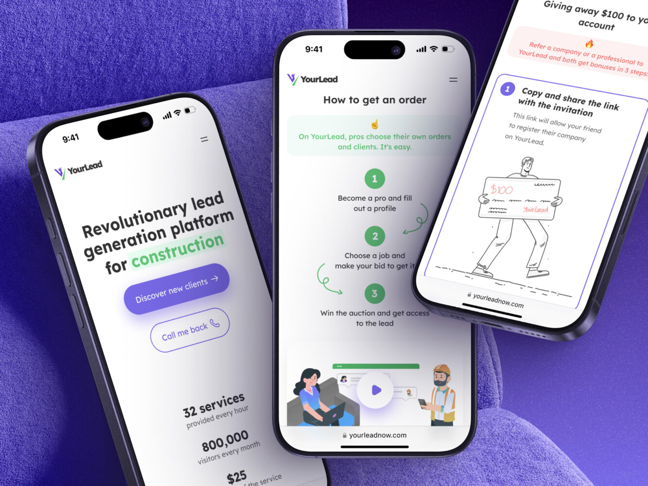
Mobile App for Construction Lead Generation Platform by Shakuro
Key Principles of User-Focused Mobile App Design
Understand Your Users’ Needs, Pain Points, and Behaviors
You can’t design for people you don’t really know. Sounds obvious, right? Yet so many teams skip proper user research because “we already know our audience” or “we’re moving too fast to do interviews.” I get it, but that shortcut almost always costs you later.
Real user insight comes from watching someone fumble through your onboarding at 11 p.m., hearing them say, “Wait, why do I need to give my email again?” or noticing how they instinctively swipe left when you expected a tap. Those little moments reveal more than any feature request spreadsheet ever could.
Personas are anchors. When you’ve got “Maria, the time-crunched nurse who checks the app between patient rounds” in your head, it’s harder to justify adding a three-step verification flow just because it’s “secure.” You start asking: Would this actually help Maria or just slow her down?
Even lightweight research like five user interviews, a quick diary study, or observing usability tests with real devices can uncover patterns that reshape your whole approach.
Simplify User Flows for Maximum Efficiency
Apart from having smaller screens, mobiles have a different context entirely. People use apps while walking, cooking, waiting in line, or half-asleep. They’re not sitting at a desk with full attention.
So every extra tap, every confusing label, every unnecessary confirmation dialog is friction. And it is where engagement goes to die. Simplifying flows in mobile app UX/UI design means removing what doesn’t earn its place. Ask yourself: does this step move the user closer to their goal, or just satisfy a business rule? Can we pre-fill this field? Can we delay this permission until it actually matters?
The best mobile experiences feel effortless because someone fought hard to make them that way. They anticipate needs, cut dead weight, and respect the user’s time like it’s gold because on mobile, it really is.
Consistent and Intuitive UX/UI Design
Buttons that look tappable but aren’t. Icons that mean something totally different here than they do everywhere else. A back gesture that closes the app instead of going to the previous screen. Ugh.
One of the mobile app design principles is consistency, when you build trust through predictability. When your navigation works like other iOS or Android apps, when icons follow platform conventions, and when spacing and typography signal hierarchy clearly, you’re reducing cognitive load.
Users shouldn’t have to learn your app’s secret language. They should be able to rely on instincts they’ve built from years of using other apps. That’s why sticking to system guidelines, like Apple’s HIG or Google’s Material, is considerate.
By the way, consistency includes micro-interactions too. If a button gives haptic feedback in one place, it should elsewhere. If swiping deletes an item in one list, don’t make it archive in another. These details might seem small, but they add up to a feeling: “This app gets me.” Or, worse: “This app doesn’t care.”
In short, don’t make users think harder than they have to. Make the interface disappear so the task shines.
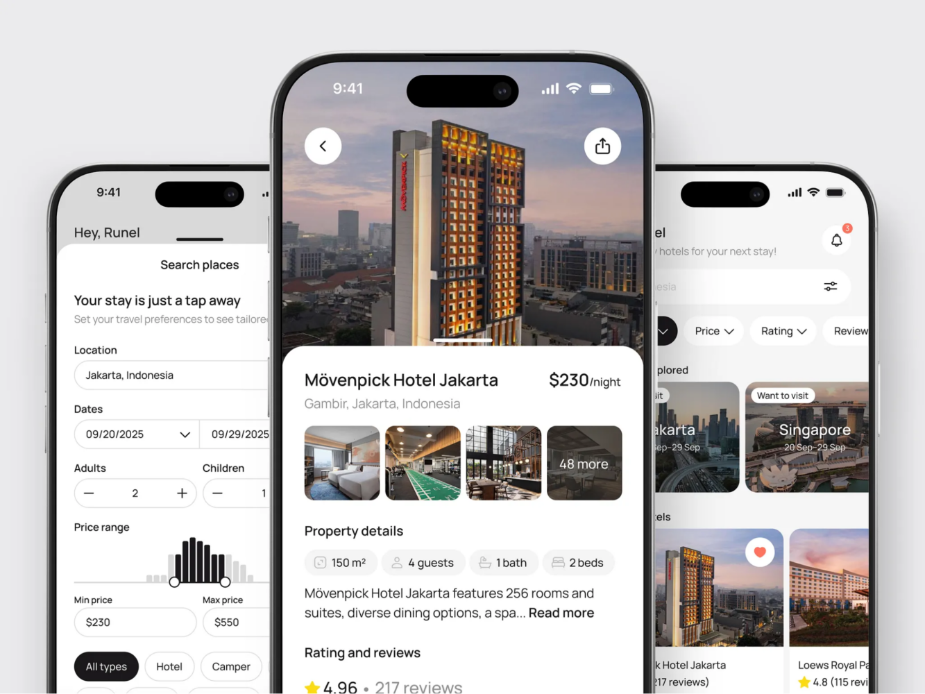
Hotel Booking Mobile App Concept by Shakuro
Designing for Mobile: How UX Differs From Desktop Design
Mobile First: Prioritizing Key Actions in a Small Screen Space
Mobile screens are tiny. You’ve got maybe 5–6 inches of real estate, half of which is often taken up by your thumb, a status bar, or some notch-shaped distraction. There’s no room for “nice-to-haves” or secondary menus that unfold into three sub-layers. On mobile, you don’t get to show everything. You have to choose what matters most.
That’s the core idea behind “mobile first”: rethinking the experience from the ground up with constraints as your guide. What’s the one thing your user came here to do? Pay a bill? Check a delivery status? Snap a quick note? That action should be front and center, ideally reachable with one hand, in under three seconds.
For instance, in a finance app, you might have ten charts, five account tabs, news feeds—you name it. Users will be overwhelmed if they want to just send money.
User-centric mobile app design forces ruthless prioritization. It pushes you to clarify your product’s true value instead of hiding behind feature bloat.
Touch Interactions and Gestures
People forget: fingers aren’t cursors. They’re fat, imprecise, and often in a hurry. A 10-pixel clickable area that works fine on desktop is a frustration magnet on a mobile.
Designing for touch means thinking in terms of targets. Apple recommends at least 44×44 pt; Google says 48×48 dp. But beyond size, it’s about spacing too. Ever accidentally liked a post because the heart icon was too close to the comment button? Yeah. That’s poor touch target planning.
Then there are gestures: swipes, long presses, pinches, etc. They can make an app feel fluid and modern, but only if they’re discoverable and consistent. Hidden gestures, such as swiping left to archive, are great for power users but dangerous if new users have no clue they exist. You need to always pair them with visible alternatives, like a trash icon next to the swipe action, or use subtle cues like a slight drag hint on first launch.
Also, there is no need to override system gestures unless you absolutely have to. If your app hijacks the back swipe or the home indicator, you’re breaking muscle memory. People rely on those patterns across every app they use. Mess with them, and you’ll pay in confusion.
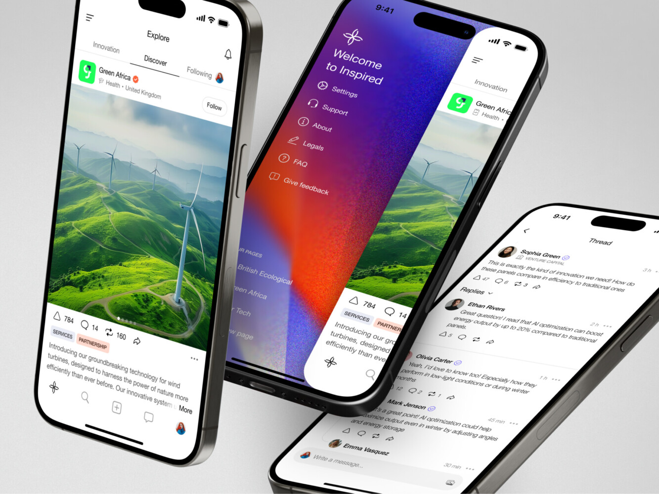
Mobile app for Inspired by Shakuro
How Shakuro Creates User-Centric Mobile Apps
User Research and Iterative Design Process
User-focused mobile app design is one of our main approaches. Apart from your business goals, we also pay attention to the target audience’s needs. To find them out, the team conducts thorough market research, exploring what could work as a solution to popular demands. Our designers create user personas to put themselves in the audience’s shoes. What are their pains and desires? How can your product improve their lives?
The hypotheses are checked in various user tests, for example, usability, A/B, cards, tree, omnichannel, competitive, etc. They are conducted more than once, especially in the beginning. In fact, we repeat the tests and iterate the designs based on the feedback. This allows us to avoid costly changes later on.
We also follow mobile app design principles and best industry practices to meet the highest standards of Apple and Android. Combining them with custom-made tools, our team delivers functional, responsive, and reliable apps that help people achieve their goals.
Real-World Examples: Apps That Users Love
An iOS mobile app for Lonely Walls aims to help artists sell their works, connecting them with collectors and businesses. They can display art pieces and set up exhibitions safely where artists can track changes. The complexity of UI/UX design was in catering to three different target audiences from various industries while highlighting the beauty of art. It had to remain at the center of attention. In the end, we’ve created a convenient art marketplace with local maps and exhibition setup.
GuitarTuner is an instrument tuning app. Apart from implementing professional-grade note detection, we had to deliver value to both aspiring and pro-level musicians. In the beginning, we spend some time researching the competitors and understanding the target audience expectations. The team also added a lot of personalization, especially for calibration—a nice bonus for professionals. The app got more than a thousand positive reviews in just 3 months.
Redesign of the Select app is a great example, too. We revamped all the visuals, simplified user flows, and updated features like user concierge. Since it was a redesign, the app had to attract new users and retain the existing ones. The team incorporated new branding and balanced the visuals, keeping them familiar still. Our solution delivered 96% user satisfaction and shot up the rating to a 4.8.
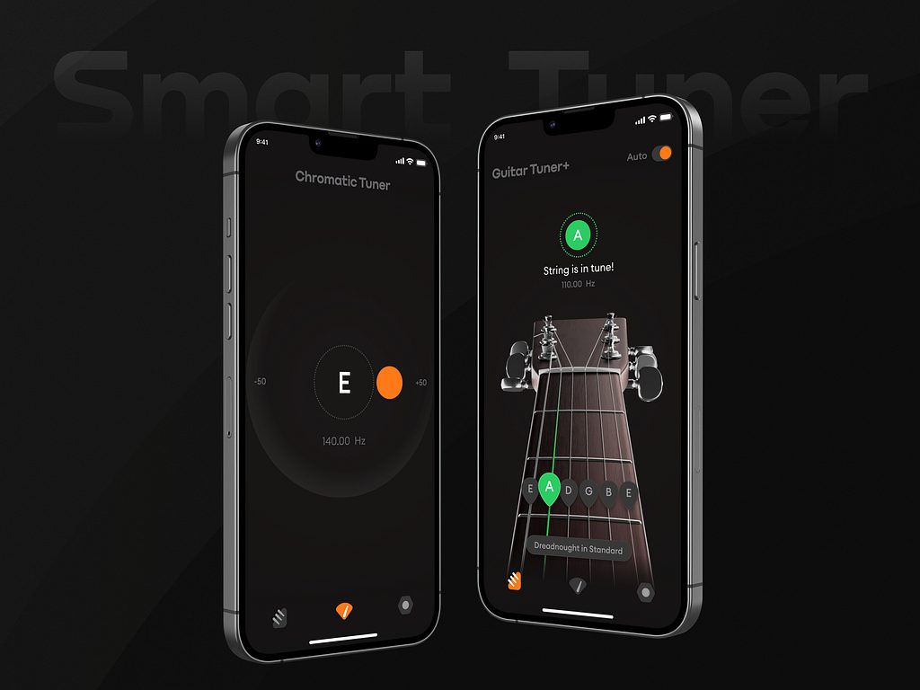
Guitar Tuner+ by Conceptzilla
Best Practices for Building Apps That Users Love
Prioritize Usability, Accessibility, and Performance
A beautiful app that stutters, crashes, or locks out users with disabilities is broken. No amount of micro-animations or gradient overlays can fix that.
Mobile app usability means people can actually do what they came for without wrestling your interface. As for accessibility, it means they can do it regardless of how they see, hear, move, or think. And performance is the silent dealbreaker. If your app takes more than two seconds to load meaningful content, half your users are already gone, especially on spotty connections or older devices.
So bake these in from day one:
- Test with a real device on slow networks.
- Use semantic headings, proper contrast ratios, and dynamic type support.
- Make interactive elements large enough and spaced well.
- Lazy-load images, cache smartly, and avoid blocking the main thread.
So turn on your phone’s accessibility features for a day, like VoiceOver on iOS, TalkBack on Android, and try using your own app. When usability, accessibility, and performance work together, you get a functional mobile app UX/UI design, and people notice that.
Keep It Simple: Eliminate Unnecessary Complexity
Simplicity is removing anything that gets between the user and their goal.
Too many apps try to be everything to everyone. They cram in settings, toggles, secondary actions, “just in case” features until the interface feels like a cluttered kitchen drawer you’re scared to open. Everything gets jammed or bursts out. But simplicity is clarity.
When building apps for users, ask this before adding anything new: Does this help the user complete their core task faster, easier, or with less stress? If the answer is “maybe” or “it looks cool,” leave it out.
That level of simplicity applies to language as well. Ditch jargon like “leverage,” “optimize,” or “seamless ecosystem.” Say “save,” “find,” or “send.” Real words for real people.
And, actually, empty space isn’t wasted space. It’s breathing room that guides attention. It reduces panic when someone’s already stressed. Your eyes can rest a little and focus on points with crucial content. Decorations or features that clatter in white space make the user jump here and there, unable to notice what truly matters.
How Good UX Increases User Engagement and Retention
Obviously, people don’t stick around apps out of loyalty. They stay because it works for them. And “works” means smooth, predictable, and even a little satisfying to use.
Quite often teams obsess over onboarding completion rates, only to ignore what happens on day three. Well, first impressions matter, sure, but long-term retention is won in the quiet moments: the 2 a.m. check-in, the rushed lunchtime task, and the “can I do this one thing without fighting the app?” test. If your UX stumbles there, users ghost you faster than a bad date.
Good mobile app UX/UI design removes friction so consistently that using your app becomes habitual. Just like WhatsApp or Google Maps: they’re not flashy, but they’re reliable. You know exactly where things are, how they’ll respond, and that they won’t waste your time. This reliability builds trust, and trust keeps people coming back.
Engagement skyrockets when users aren’t constantly second-guessing themselves. Fewer support tickets. Less rage-tapping. More organic exploration. When flows feel intuitive, people naturally dig deeper and try new features, invite friends, spend more time in-app, etc.
The ROI of User-Centric Mobile Design
If you’re a founder, product lead, or stakeholder, money is what ultimately matters.
User-centric mobile app design directly impacts your bottom line. Every tap you eliminate, every confusing label you clarify, every crash you prevent—that’s a user who might convert instead of bouncing.
Consider e-commerce: Baymard Institute found that nearly 18% of abandoned carts happen because the checkout process is too long or complicated. Fix that flow with auto-fill addresses, show progress indicators, allow guest checkout—and you’re literally recovering lost revenue. For example, when designing mobile layouts for Proko, we paid close attention to planning user flows and integrating payment systems. As a result, it was convenient to search, watch, and purchase learning courses on both mobile and web.
And don’t forget support costs. High mobile app usability reduces customer service load dramatically. Fewer confused users = fewer tickets = lower operational overhead. That’s savings you can reinvest.
So yes, doing user research, testing prototypes, and iterating based on feedback take time upfront. But the payoff is higher conversion rates, stronger retention, lower churn, and yes, more revenue.
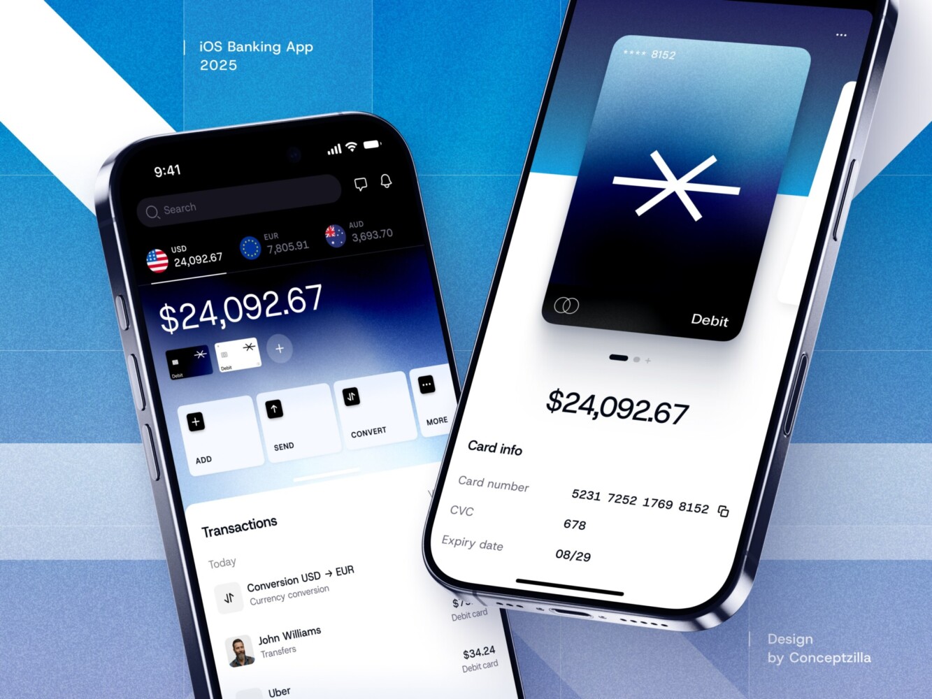
Fintech Mobile Banking App by Conceptzilla
How to Evaluate Your Mobile App’s User Experience
Tools to Measure User Engagement and Feedback
You can’t improve what you don’t measure, but measuring the right things is half the battle. Too many teams drown in vanity metrics while ignoring the signals that actually matter: Are people using the app? Are they getting stuck? Do they come back?
To avoid that, follow mobile app design principles. Start with behavioral analytics, using tools like Mixpanel, Amplitude, or Firebase. Track key flows: onboarding completion, core action frequency, session length, and retention curves. But don’t just watch the averages. Slice the data: How do new users behave vs. power users? Where do people drop off consistently?
Then layer in qualitative insights. Heatmaps, like those from Hotjar or UXCam, show where people tap, scroll, or rage-click, revealing mismatches between what you think is obvious and what users actually do. For instance, a “primary” CTA can be ignored because users keep tapping a nearby icon that looks interactive but isn’t. No survey can catch that.
Also, don’t skip direct feedback. In-app micro-surveys or short NPS prompts can uncover sentiment without overwhelming users. Just keep them contextual and rare because nobody likes a pop-up ambush.
The magic happens when you combine these: quantitative data tells you what’s happening; qualitative tools and feedback tell you why. Together, they turn guesswork into direction.
Usability Testing and Iteration
Analytics might tell you that 60% of users abandon your checkout flow, but only usability testing shows you why. Maybe the address auto-fill fails on Android, or the “Continue” button blends into the background, or users don’t trust entering card details on a screen that looks sketchy. If you’re not testing with real humans regularly, you’re designing blind.
Usability testing doesn’t need to be fancy. Grab five real users, give them a realistic task (“Book a ride for tomorrow morning”), and watch without helping. You’ll be shocked how fast you spot recurring hiccups. And honestly, even remote, unmoderated tests via Lookback or UserTesting beat designing in a vacuum.
The key for mobile app usability is iteration. Fix the biggest pain point, ship it, and test again. Small, frequent cycles beat one massive “perfect” redesign that misses the mark.
Stop thinking of usability testing as a phase before launch. Make it part of your rhythm, like code reviews or stand-ups. User needs evolve, devices change, and what worked last year might feel clunky today.
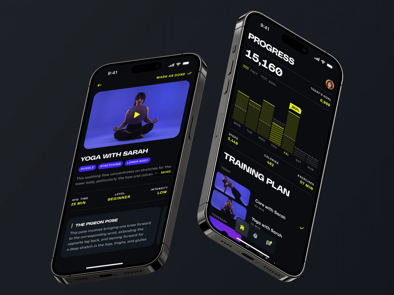
Mobile App for an Adaptive Fitness Guide by Shakuro
Final Takeaway: Why User-Centric Design Is Key to Mobile App Success
Build with the User in Mind, and the Business Will Follow
At the end of the day, a technical edge or pro-level features do not guarantee success. Apps succeed because real people find them useful, trustworthy, and maybe even a little enjoyable to use.
When you design with genuine empathy and prioritize what users actually need over what’s easiest to build or flashiest to demo, you’re laying the foundation for everything that matters to your business: retention, word-of-mouth growth, lower support costs, higher conversions, and yes, revenue.
Users reward thoughtfulness. They stick around when an app feels like it was made for them, not at them. And that loyalty compounds into reviews, referrals, repeat usage, and resilience during tough quarters.
So don’t treat user-centric mobile app design as a “UX phase” or a box to tick. Make it your default mindset. Ask “Who is this really for?” before writing a single line of code. Watch real people use your app, even when it’s uncomfortable. Cut features that don’t serve the core need. Protect simplicity like it’s your job.
Do that consistently, and the business outcomes will accelerate. If you’re looking for an experienced design agency to partner with, reach out to us. Let’s create a mobile app that delivers value to users.