Welcome to the world of numerous apps for every occasion! Thanks to the ubiquity of mobile applications, today a smartphone is an office, entertainment center, library, and supermarket – all at once in your pocket. In this overwhelming abundance of applications, it’s increasingly difficult to design an app that would stay on people’s phones. User interface design is an intricate process. To build an effective mobile UI, a designer must consider many things.
Contents:
Functionality and user experience are not everything. The first impressions are 94% design related. What’s the first thing that a person sees in an app? The interface. So, a designer needs to choose among the different types of user interfaces that would ensure that a user sticks by and enjoys browsing the app.
That said, it can be difficult to come up with a good app design on the spot. I’ve gathered the top 13 most basic mobile screen types and some practical recommendations for mobile UI that can be taken as an inspiration to design an app UI that works and looks flawless.
Common screens
Splash screen
A splash screen is the first screen you see when you launch a mobile application. Basically, they were invented to conceal the loading process that software performs before getting fully ready, like with computer games intros. A perfect splash screen design attracts the user’s interest with impressive illustrations, intriguing headlines, and additional components of an app UI just as the application silently gets ready behind this scene. Other popular functions of splash screens are all about marketing: to say hello and establish the atmosphere for the in-app UX while promoting a brand.
There are several details for designers to take into account to make a lasting impression:
- strive for simplicity – a great splash screen consists of an application’s name, logo, and some background image, nothing more
- show it for no more than 3 seconds. If an app uses a lot of hardware and takes more time to load, add a progress bar.
Alternatively, you can skip the splash screen especially if users are supposed to work with your app frequently. Experts say the advancement of mobile technologies allows modern apps to load in a flash making splash screens unnecessary. If your mobile app doesn’t need to reinforce its brand identity you can show its skeleton instead.
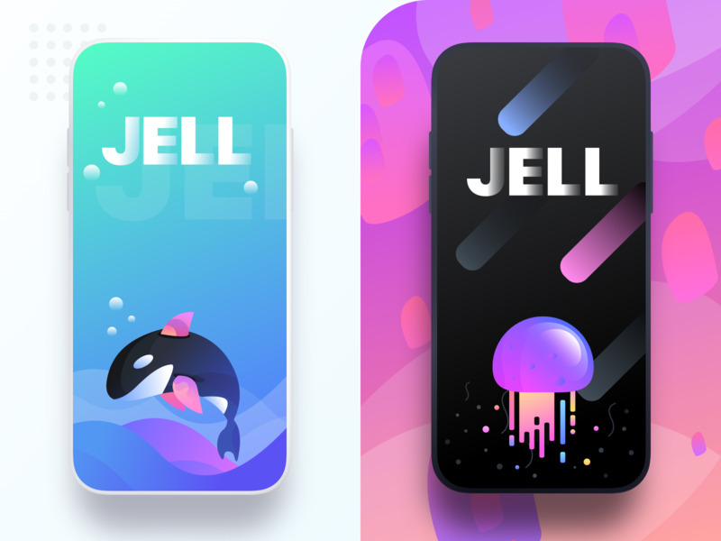
JELL splash screens by Prakhar Neel Sharma
Onboarding tutorial screen
The onboarding screens are a collection of screens with the purpose to demonstrate a mobile app’s main features and benefits and lead users through its interface. Like with splash screens, some UI/UX designers question the necessity of the onboarding, though, in reality, it might prove tricky for new users to straightaway correctly guess how to find their way through a new app, particularly if the interface is unfamiliar to them. Though the form and text of an app onboarding depend on its purpose, all onboarding screens have some basic practices. Andrew Gazdecki in his article on the onboarding screens points out 3 major purposes:
- familiarize a user with the app’s major functions and what they are needed for
- give the opportunity to make a registration
- collect that information to improve personalization.
Use custom graphics to make the UI/UX design easily recognizable and pay close attention to copy: make it clear, concise, and easily readable. And, it goes without saying, show onboarding to first-time users, not to the returning ones.
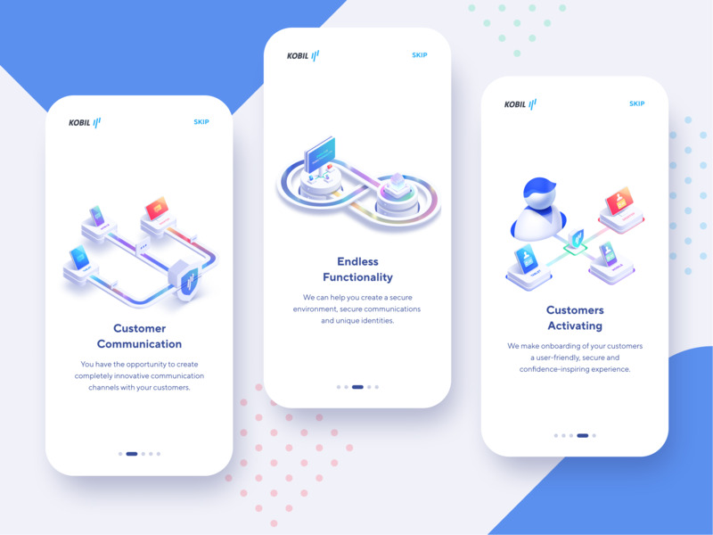
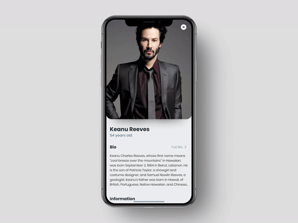
Secure Data App Concept
Home screens
The home screen is the main component of a mobile application presenting its menu and key features. An accessible and functional mobile menu is among the things that make me want to keep an app in the first place. It’s imperative for designers to make an effort to present users with an understandable and functional main screen design. The composition of home screens is highly dependable on the app’s purpose and may vary a lot because a home screen should present the most frequently used features. However, there are some common features. Since the home screen contains the major mobile app’s options it usually presents an app’s key navigation elements like a search field. It’s great if the screen features basic colors and sometimes, even doodles, depending upon the type of app. Icons should be easily visible and have an obvious meaning.
Once again, in some cases you can dispose even of the home screen and go straight to business, that is, to an app’s functions.
Log-in and profile screens
The majority of modern mobile applications need registration. People usually encounter log-in screens just once while registering or at least quite rarely if your app involves re-logging for security reasons. All the same, as we discussed in one of our previous articles, filling in the form is not an activity that most users normally find very appealing. So it’s up to the designer to make this experience quick and smooth with a clean-cut log-in and profile screen design to make user interaction easier and reduce the rate of app abandonment.
Consider the following suggestions:
- get rid of all the unnecessary distractions
- limit the number of form fields to a couple or better offer one-click logins via Google or Facebook
- provide clear error messages.
As for the profile screen design, the main point is to provide strong UI/UX and maximum personalization and customization. What does it mean? Prior to creating the profile UI design, it’s important to conduct a number of research and surveys to better understand your audience and give your users exactly what they need. For example, it might be important for some users to be shown their recent activity, display the bookmarks, etc. Try to avoid unnecessary complexity, and make everything as clear as possible.
Stats screen
Many mobile applications contain statistical information on various user activities, based on the app’s purpose. Making good stats screen design can be a harder task than it seems simply due to the existence of the information overload problem rooted in the dominance of digital technologies when people get overwhelmed with loads of data on a daily basis.
So it’s a designer’s task to present the mobile app’s statistical information in the clearest and most usable way without any excess data. Make the stats screen look appealing with a clear layout where all the charts and graphs are neatly arranged with distinct icons and easily deciphered typography.
Calendar screen
Calendars simplify our lives and help people manage their numerous engagements. A well-made calendar remembers its users and protects them from troubles. That is why the calendar is so popular a feature in many types of mobile applications, not only event or to-do list apps but also health and fitness, educational or social apps. A calendar should have a convenient interface with a visual style matching the overall design of a mobile app. Put an emphasis on the UI/UX design, and rely on a simple and uncomplicated mobile application design to let users concentrate on the main functions of your app. Expect that they will want to sync it with their accounts in Google, iCloud, etc.
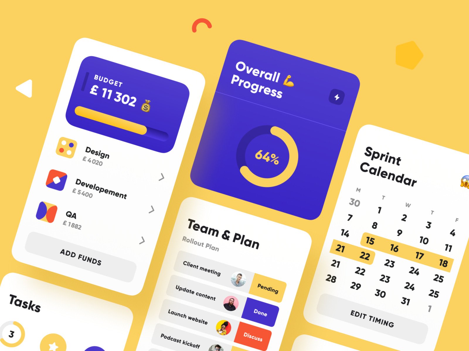
Project Management Blocks by Yury Gok
E-commerce Screens
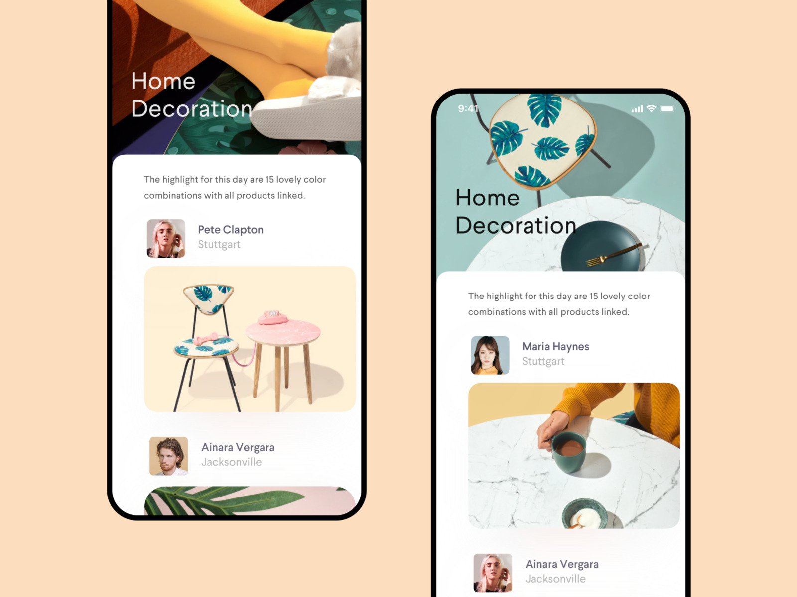
Catalog screen
Visual presentation plays a particularly important role in e-commerce apps. The best of them showcase the goods in a way to turn people’s heads and boost conversion rates, so high-res photos are a must. Catalog screens act as shop windows (you can even borrow some of the best off-line ideas to use in your app).
The better the product list is presented the more disposed users would be to purchase the products. I’m speaking not only about the amazing mobile UI design (this is compulsory) but also about an app’s UX. For example, many successful e-commerce apps provide a very profit-making feature of presenting the products in a specific order depending on users’ activities and preferences.
In fact, due to the rising popularity of e-commerce mobile apps, more and more business owners are turning their e-commerce websites into apps or keeping both.
The number of products in a row depends on the screen’s width. It’s important that your catalog screen fits any screen size. There’s no place for such kinds of oversights when it comes to the business of… Business. In most cases, products on catalog screens are organized in columns to scroll through. Alternatively, you can showcase items horizontally for users to swipe. The designer’s duty is to decide which variant to choose to prioritize some pieces and provide an easy way for users to maneuver through multiple products.
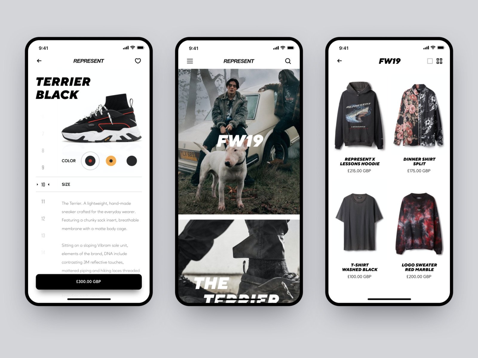
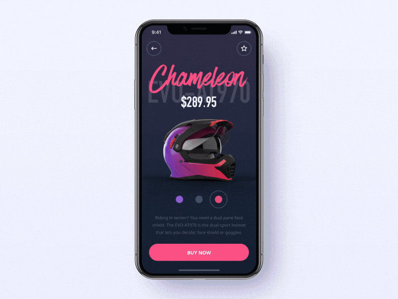
Product card screen
After browsing through the catalog, a user chooses a particular item to their liking and proceeds to the product page. This is the step when they have a certain mental image of what they want to buy so they are interested in precise and clear product information to help them make a final decision. So it’s best for designers to remember that this is when a detailed specification of the product is needed, and provide enough space for it. The central part of the product card screen is most often a product image. Below comes the additional data about the product specifications, better presented in groups like size, style, or country of origin.
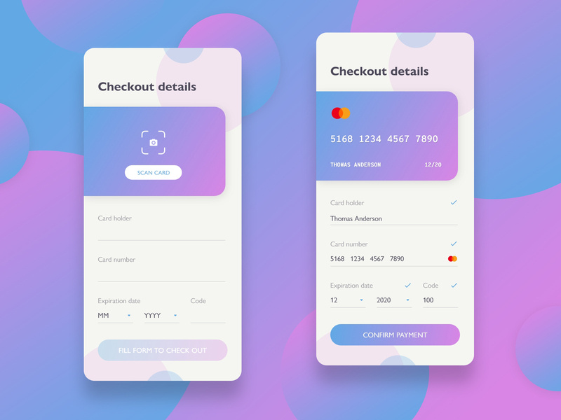
Checkout screen
Checkout screens usually contain a form where users fill in all the necessary data like name and credit card number. It’s essential for designers to know how to create a solid checkout screen design so that users would feel relaxed while performing this last step in their mobile shopping experience. According to Baymard, about a quarter of US citizens have left the order in the middle of the checkout process because it felt too long or confusing for them. To prevent form abandonment and make the checkout process smooth a designer should reflect on the following suggestions:
- all the possible methods of payment should be clearly presented with the help of icons or other visual elements. A user mustn’t speculate on whether they can use a certain method or not
- make sure users are aware that the personal data they provide you with is secure. A powerful copy can help you with that.
DailyUI challenge #002 by Dušan Ďurajka
Social Screens
Feed screen
Social network apps are useful communication services for people with common interests. According to studies, smartphone owners on average actively use 9 applications on their devices, launching them up to 300 times a day. The ranking is dominated by instant messengers, games, and online cards. In the social app feed is the constantly updated list of news and activities by the users you follow. People often quickly scroll feeds during brief breaks so the best option is to create a design without too much overloading visual details.
Some guidelines for these:
- remove any redundancies
- improve feed typography. Readability is of prime importance in feeds
- don’t encumber each entry with too many UI controls (like, save, follow, etc.).
Inspiration Feed by Semas
Contacts screen
Communication involves users wanting to keep track of their friends and acquaintances within the app along with having their key contact data close at hand. Great contacts screen design lets users spend less time looking for their contacts and more time actually connecting with them. Usually, the lists in mobile apps are alphabetically ordered. Each separate contact is accompanied by a small photo and upon clicking leads to detailed information with email, phone number, etc.
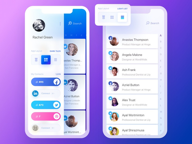
Rolodex. Dark Tiles & Light List Views by Yaroslav Zubko
Music Screens
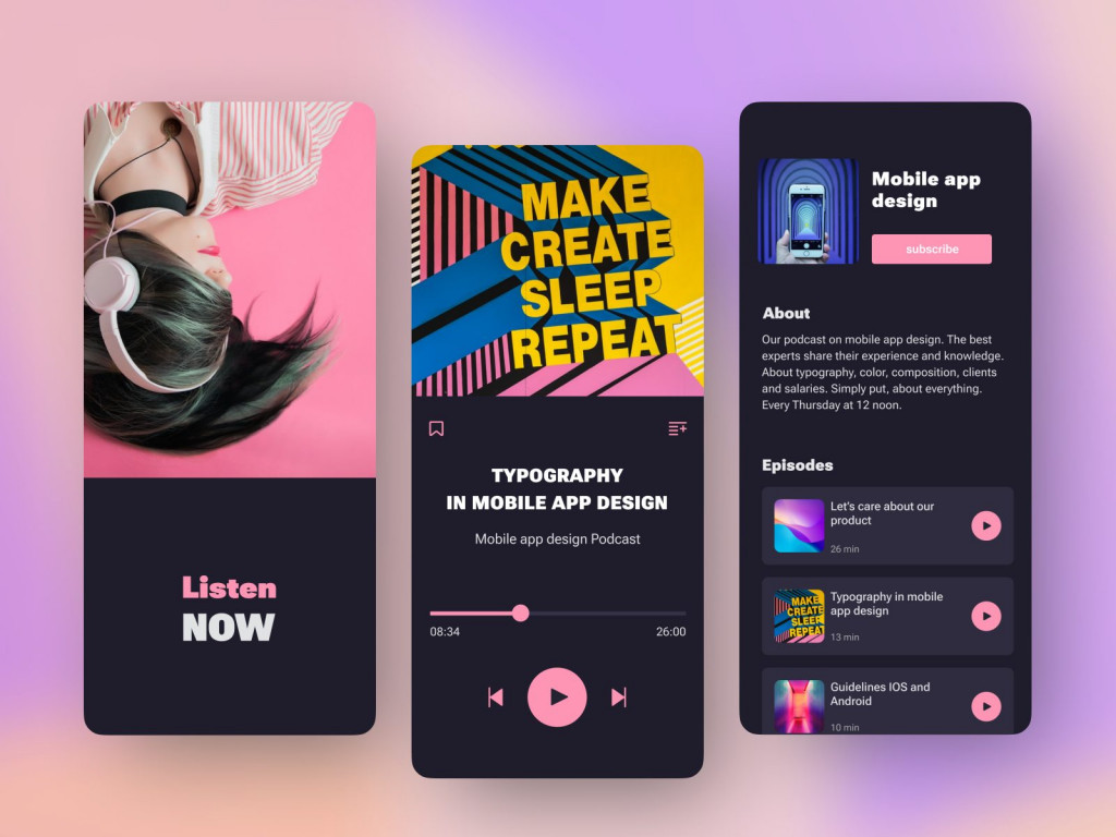
Playlist screen
The integral feature of any music app is, of course, the ability to create custom playlists. The UI of playlist screens is usually similar on various apps, and rightfully so. Users expect certain features to work a certain way. So it might be best to follow the latest trends as well as the guidelines other designers have already formulated. A music app playlist is a list of tracks showing detailed data on the track. A small image representing the album can be added to each track.
Podcast Mobile App by Conceptzilla
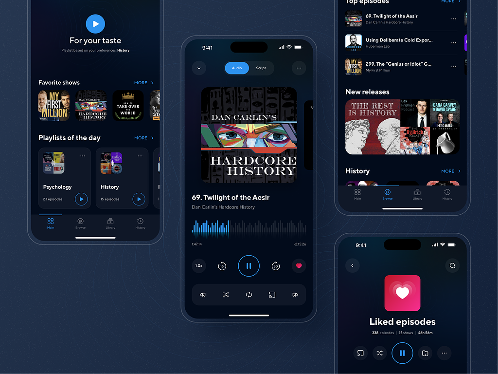
Player screen
A music app needs a player function with a standard and easily recognizable set of play, stop, and switch buttons that are normally presented at the bottom of the screen. The central part is usually occupied with an album image or some sort of music visualizer. In my experience as a user, it’s great when the design of the player screen is light and transparent with contrasting and large icons. Sometimes designers add color gradients to some buttons and smaller sections. It makes people focus on these special parts and gives a sense of hierarchy.
Podcast mobile app by Marina Abramova
What is a good mobile UI design? Apart from distinct visuals, in my opinion, the best mobile app designs let users immediately orientate themselves in an app, and understand the interface without experiencing any difficulty. A user-friendly interface is the foundation of a mobile application’s popularity, a guarantee of its relevance and payback. Approximately 90 thousand mobile applications were launched through the Google Play Store in June 2023, and this figure is expanding month by month. So the number of mobile UI variations is staggering and it’s easy for a designer to get lost in all this exuberance. Fortunately, there are only so many basic types of mobile screens used in the majority of mobile apps, and every designer can profit firstly by exploring how to deal with the most common ones to save time and money.
Do you want to create a mobile app with a convenient and eye-catching UI? Contact us and let’s build a versatile project together.