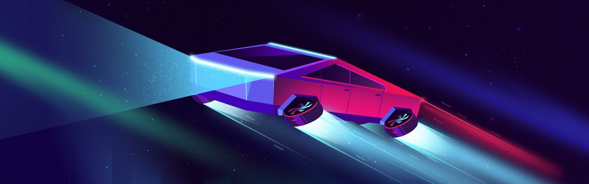
I was fascinated by Elon Musk’s Tesla’s Cybertruck unveiling on November 21st. It turned a lot of heads for its unapologetically brutalist design, with sharp edges and minimalist stainless steel cladding.
I’ve always been a fan of the cyberpunk genre. I don’t know exactly when it started but I can say that growing up in the ’90s/early 2000s might be the reason for it (and possibly the fact that I was the one responsible for the proper work of household electronics).
The genre’s origins are rooted in the ‘60s-’70s with its popularity climaxing in the early ‘80s. But for me getting familiar with the classics came later, I was most impressed as a kid by the cyberpunk-related movies from The Lawnmower Man (1992) to The Matrix (1999). The overall computerization was happening around me. Cyberpunk with its raw and dark beauty captivated me along with futuristic settings and focusing on human nature.
Visually cyberpunk is about dark, metallic and neon colors, using angular geometric forms, and straight lines. These individual elements have also been popular among web designers for the last several years. In other words, brutalism and geometric web design.
Contents:
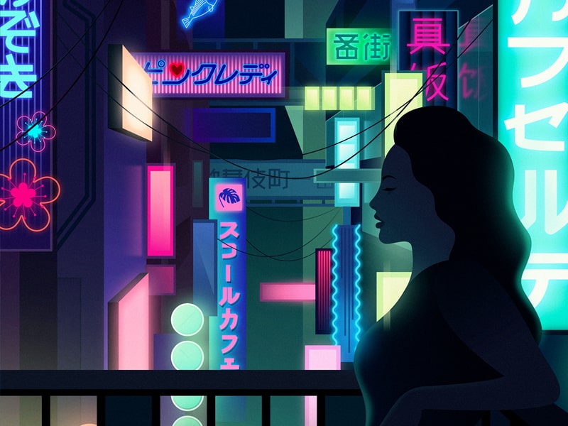
Night in Tokyo by Fill Ryabchikov
And here comes the Cybertruck
However strange it looked for me for the first few seconds I then realized how impressed I was by this cross between a pickup truck and a stealth fighter jet with outrun aesthetics. And I wasn’t alone. It seems that Cybertruck’s appeal is polarizing society with 52% of US Twitter posters hating the vehicle and 48% loving it. It’s reminding me of the Blade Runner, Total Recall and Back to the Future at the same time. According to Forbes, Musk has called his vehicle the “Blade Runner truck” on several occasions. The raw unedited and unrefined brutalism of it speaks to me. Finally, a car that looks like it’s from the year 2020! Very cool.
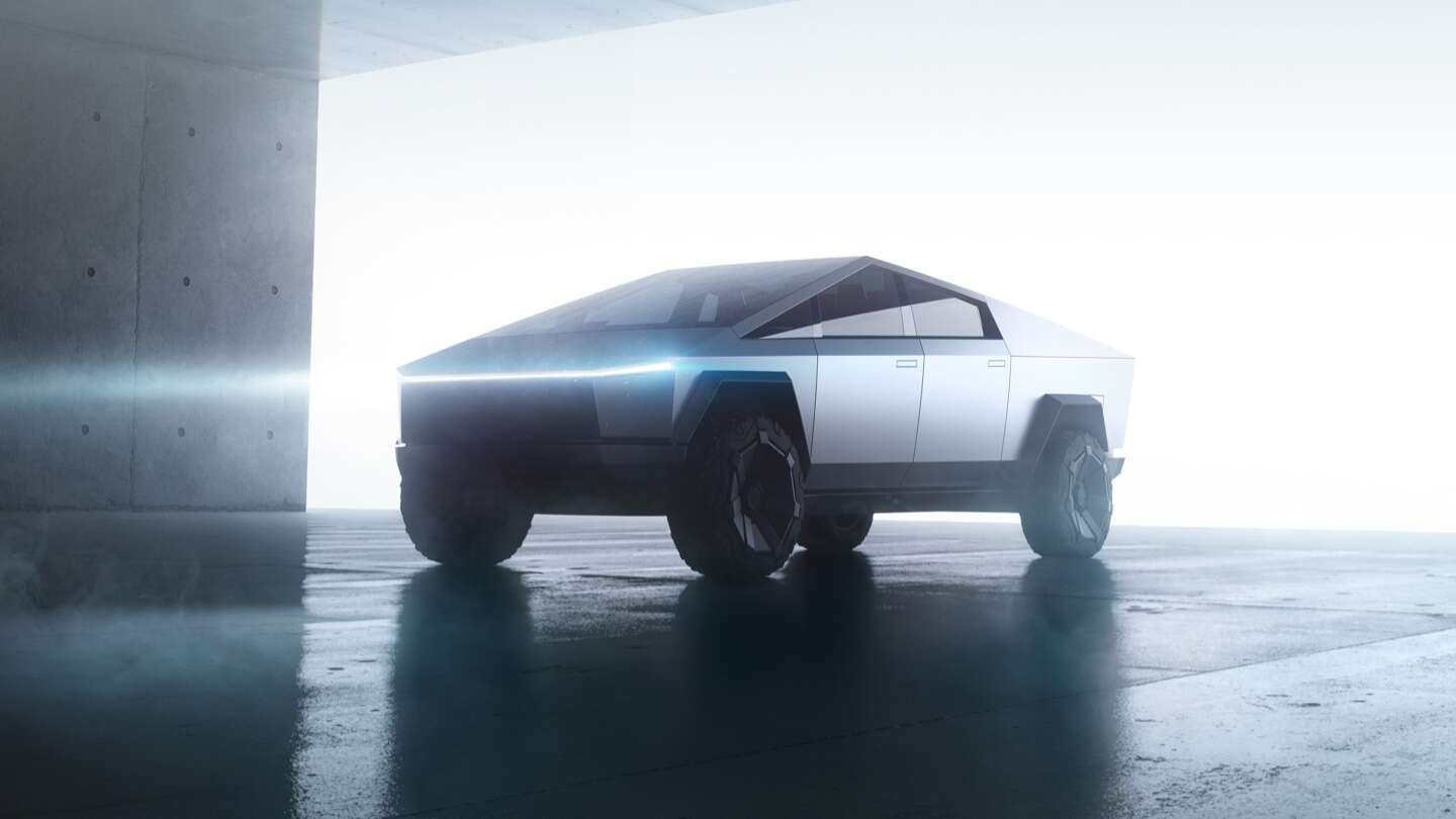
Image: Tesla
It might look weird and straight-out-of-the kids’ drawings at first. The internet at once produced hundreds of memes ridiculing its supposed goofiness. Well, that’s what it does.
This is because it’s unusual. But actually, a lot of technologies are goofy until they become ubiquitous. People ridiculed the new iOS design some years ago and now the simplified flat-shaded high contrast UI design is everywhere. AirPods were regarded as ugly and that nobody would wear something so ridiculous and now they’re everywhere (and people are making fun of the new AirPods Pro). It seems that it doesn’t matter how funny a gadget looks as soon as it’s useful.
Same Energy #CyberTruck pic.twitter.com/jlEjxRBzSZ
— King’s Letter (@TheKingsletter) November 22, 2019
The new AirPods Pro design is going to be great for killing zombies. pic.twitter.com/A9qhoGcEn3
— Stephen “Porter” Ford (@StephenSeanFord) October 28, 2019
Stylistic elements can guide a user’s mind to a certain framing. Cybertruck is reminiscent of the past and acting as an icon of the future at the same time. For some people, the Cybertruck’s hard geometric curves evoke the polygonal graphics of fifth-generation gaming. Others are reminded of the DeLorean from Back to the Future they saw when they were kids and the good moments they associate it with. The car’s design may seem like it was made in two minutes using Microsoft Paint, but in reality, it couldn’t be farther from the truth. As said by Donald A. Norman in his wonderful book on the emotional design,
“Experience is more based upon memory than reality. If your memory of the product is wonderful, you will excuse all sorts of incidental things.”
In case of functionality, I think that the point was to make the most durable and damage resistant truck with the best specs possible. No paint to scratch. No dents to worry about. Very little maintenance. Loads of power and speed.
However, experts’ opinions should be taken into account before pre-ordering the car. Here’s Motor Trend focusing on its potential functionality problems.
Cybertruck but in matte black 🖤 pic.twitter.com/h8ny2nEp9X
— Billionaires (@BiIlionaires) December 4, 2019
But most importantly, looking at the Cybertruck made me think about the popularity and use of the angular elements and geometry in general in web design, along with brutalism.
Today the UX/UI world is dominated by the guidelines and style of companies like Apple or Google. Maybe the desire to oppose it can explain the geometric and brutalist design trend that emerged several years ago and continued onwards. It was among web design trends for some time, but it seemed like it was starting to lose ground entirely to the soft rounded 3D shapes like these:
Home by Peter Tarka
But it looks like geometric web design elements and rough styles have yet something to say. Let’s explore what they mean in web design and where they might prove useful.
Geometry in web design
Merriam-Webster dictionary defines geometry as a
“branch of mathematics that deals with the measurement, properties, and relationships of points, lines, angles, surfaces, and solids”.
A web designer deals with these too, right?
Geometry, in general, has never stopped being appropriate and popular in web design. Geometric web design is a trend that mounted several years ago and has been holding up ever since. Web design studios have been using them to develop a more fresh, high-tech, simple and attractive look with a bit of energy and straightforwardness.
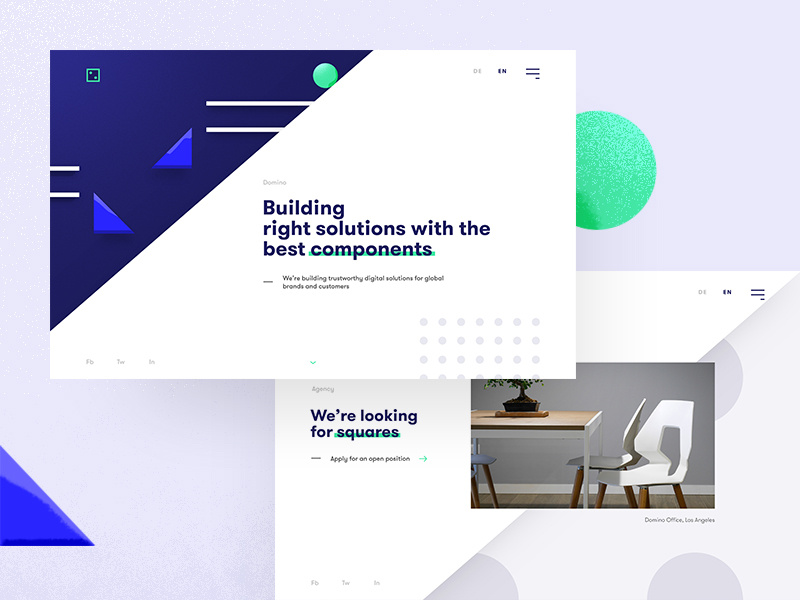
Domino by Sebastian Jungbluth
What it looks like
Well, geometry is all around us. Everywhere we look we can spot squares, lines, points, triangles, circles, rectangles. These are all geometry.
In contrast to them are organic shapes that have been gaining increasing popularity. They have uneven and asymmetrical curves, as do the majority of objects found in nature like ocean waves of snow-covered hills. By contrast, geometric shapes are homogeneous and steady. They are made up of symmetrical lines and angles.
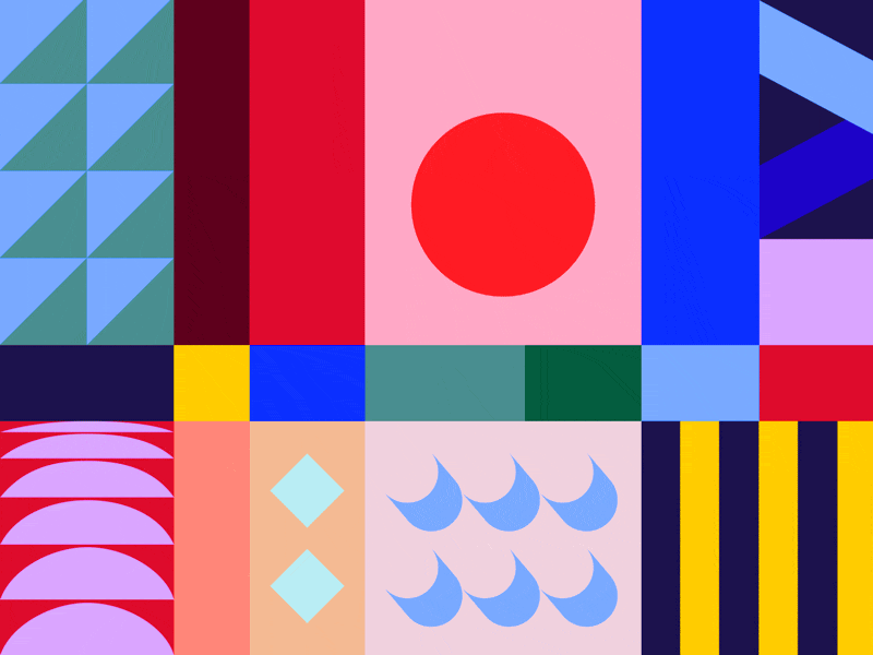
Weaving my allegorical elegy (part.II) by Lorena G
Why it is popular
Geometric patterns are adjustable, powerful and practical and have two major uses: to serve as a base for geometric website backgrounds or as the central feature with an attention-drawing function.
Geometric web design elements dispel a website’s visual regularity and attract attention to a particular section of a site, thus stimulating a user to take action.
Geometric patterns are highly scalable, so you have fewer reasons to worry about how they are displayed on small and large screens.
When to use it
Geometric website design works well for any website, especially:
- blogs
- e-commerce sites
- artists’, museums’, etc. websites
- companies’ sites
- high-tech websites, etc.
Infinite variations of shapes and patterns can help to create an individual web design for each type of business. They are especially great for the effective presentation of digital or architectural products.
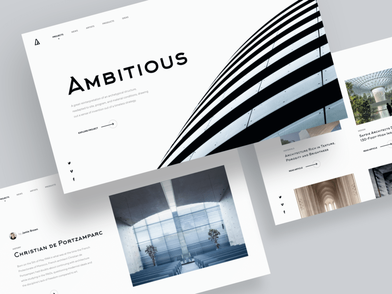
Minimalistic Architectural Website Concept by Shakuro. A website on architecture is a natural fit for using the geometric website design.
There are several major ways to implement geometric website design:
- Wayfinding: Various shapes and components gently show users the way around a website. For instance, triangles acting as indicators or call-to-action buttons.
- Arrangement: A geometric shape is a great instrument to highlight to users some important elements like text or an image.
- Impression: Any clear shape enhances a website’s look, without overwhelming the website in general.
Shapes overall have associated meanings. For example, people associate squares with honesty, trust, and reliability. Circles symbolize security and eternity. Triangles are mainly associated with movement, progress, and growth. Hexagons communicate unity, and high-tech, etc.
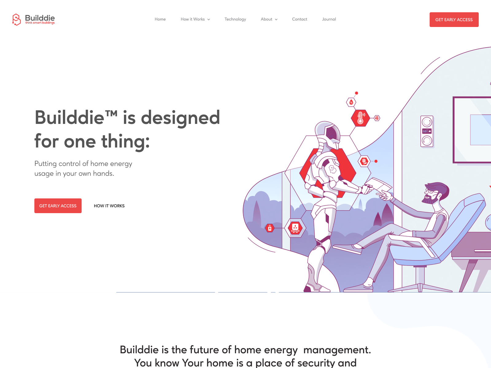
Builddie Website Homepage Design by Shakuro. With hexagons, designers tried to communicate the theme of technology.
When not to use it
Use only those geometric shapes that naturally represent a brand. Sometimes hard shapes are not the best choice. For example, if your task is to make a website for a toy store, then the soft rounded 3D or organic ones are more suitable.
It’s also a good idea to keep it minimal and not overload a user with a mass of shapes and patterns. Too many small details may worsen a website’s usability. Experts at Nielsen Norman Group advise on minimizing cognitive load to maximize a website’s UX.
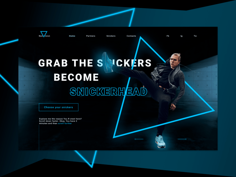
Snickers shop promo concept by Sam Tipikin
Brutalism in web design
Brutalism was born as an architectural style. The name doesn’t derive from the English “brutal”, but, most likely, from the French “béton brut”, which roughly means “raw concrete”.
The style has developed in the ‘50s-’70s in the UK and brought in its full glory by Swiss-French architect Le Corbusier. Even though its name mentions concrete, it can be applied to any material that’s presented as-is, including the stainless steel used in the making of the Cybertruck.
Well hello B R U T A L I S M.#brutalism #Cybertruck #architecture #webdesign pic.twitter.com/l9GgqPBqzH
— Aprajit (@aprajit_kar) December 4, 2019
What does it look like
The brutalism style in web design still doesn’t have a clear definition. As an American film director Sydney Pollack once said about his definition of film noir,
“I can tell you I know it when I see it but I don’t know how to define it.”
Still, it has some common features like:
- Solid background, frequently just simple black or white
- Fewer shadows or gradients
- Monospaced typography, or the use of a single font
- Clattered design, with letters sticking to each other, or voluminous elements
- No visual hierarchy
- Lack of symmetry or spacing
- Lack of a reach color palette – the most common colors are red and green
- A design looks as if it has some errors
- Lack of animation
- Images are either missing or monochrome
- Navigation is either basic or absent. Brutalist websites oftentimes consist of a single page.
Fashion Promo Site Figma Smart Animate by Nerdfox
Why it is popular
One of the reasons is posted on the Brutalist Websites’ main page:
“In its ruggedness and lack of concern to look comfortable or easy, Brutalism can be seen as a reaction by a younger generation to the lightness, optimism, and frivolity of today’s web design.”
This style is like a web subculture. In fact, due to its severity and indifference to looking warm and simple, brutalism does look like a response to the airiness and cheerfulness of modern website design.
Secondly, people’s widespread suspicions about corporate interests play their role. Many are concerned about the amount of personal data collected by Google and Facebook.
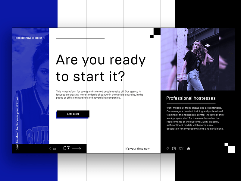
This is your chance by Kate
When to use it
The first case is when the content is primary, not the design. Hacker News and craigslist are some examples, with Motherfucking Website as an extreme one, coarse language warning.
Secondly, it’s useful when your aim is to impress. It also depends on the target audience: young people are apt to appreciating something new and non-standard. Some people will add up to a website’s virality, others won’t understand it. But no one will remain indifferent. And hype boosts sales and popularity.
Brutalism can also reduce the time taken to create a website and have a beneficial effect on conversion. After all, sites with a minimum of images and the absence of animation load quickly and easily, which has a beneficial effect on a website’s performance.
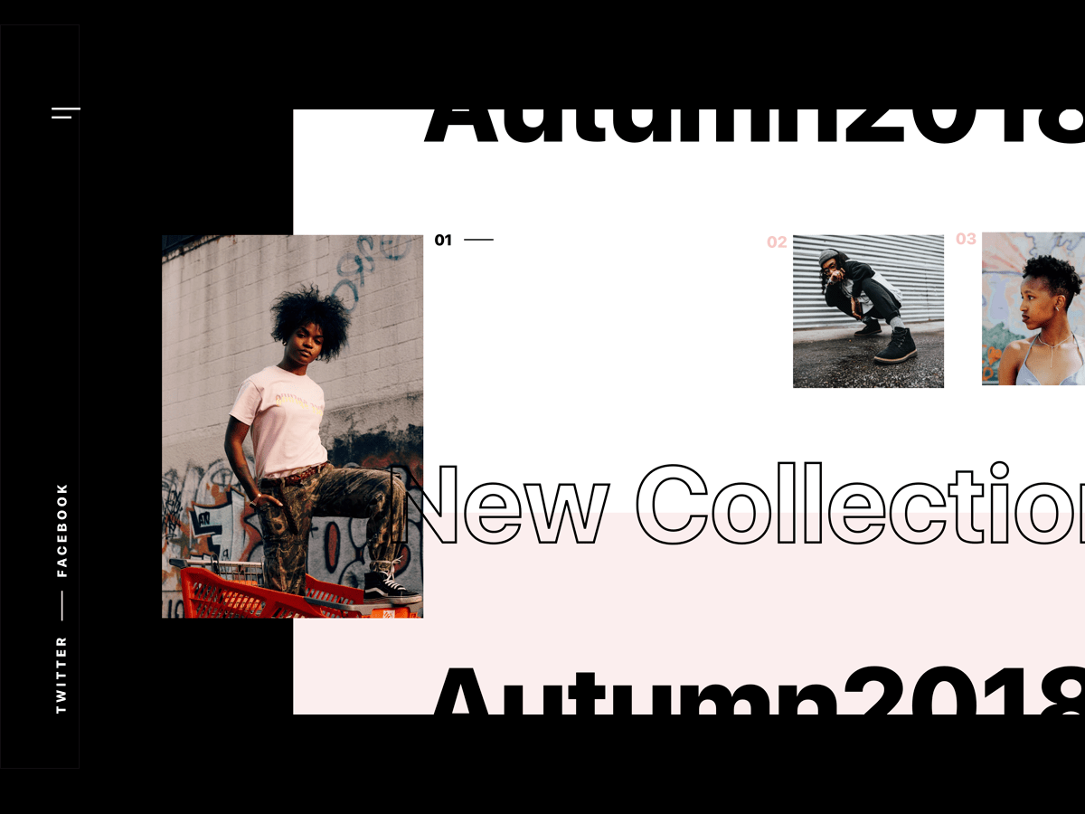
Fashion web site by Mila Hvostovskaya
When not to use it
Brutalist web design is not often used for commercial projects because it needs to be appropriate. A user doesn’t need to spend much time getting used to a website’s design and understanding how it works.
What’s more, it’s a risk: the designer takes the risk, proposing an idea, the client risks that the audience will not understand it and he will lose potential buyers. Familiar and proven solutions are the best in the majority of cases.
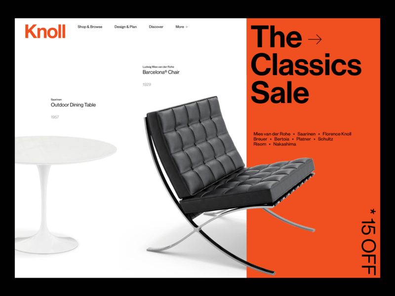
Knoll – redesign concept by Damian Skotzke
To conclude
For me, Tesla Cybertruck’s appearance proved that cyberpunk and its incorporated elements as the abundance of geometric motifs and brutalism will still be used for web design inspiration in 2020.
The point is to recognize the best way to apply these bold styles to a website and a client’s advantage. Don’t mindlessly copy trendy styles, analyze.
Such sites are rarely created for commercial purposes because most people love the traditional aesthetics and it’s normal. Many factors should be taken into account to put a brutalist web design on commercial footing: the right audience, the product, the business owner’s personality.
I don’t think that these styles will become widely popular, it will contradict their very ideas. Having become more widespread, they will lose their charm. This is especially true for the brutalism.
Meanwhile, check on some beautiful examples: Kenzo, Nike, Brute.