
For those who prefer to listen rather than read, this article is also available as a podcast on Spotify.
Contents:
Quite often startuppers run several A/B Tests and consider optimization done. Change button colors, tweak headlines, and even play around with emoji placement. However, the test results are still underwhelming.
The reason is, Conversion Rate Optimization in web design should start with the whole flow. The entire user journey from landing to checkout. If your design isn’t clear, trustworthy, and easy to use, no amount of button-tweaking is going to fix that.
Nevertheless, you should run your tests. They’re useful. But don’t treat them like the starting point. Optimization is based on empathy baked into every element.
Read on, and I will explain what CRO UX design is, how you can create one, differences between industries, etc. So, stick around if you want to make an efficient web design.
Why Most CRO Efforts Fail Before Testing Even Starts
Most CRO efforts are doomed before the first test even loads.
Some hypotheses may be weak, yes. But teams often skip the part that actually matters: building a website that works for humans in the first place. They jump straight into tweaking, testing, and optimizing a foundation that’s already leaking.
They spend weeks running A/B tests on pages where the real problem isn’t the CTA color. Visitors have no idea what the product does by the time they scroll past the hero section. Or worse, they do understand it and immediately sense it isn’t for them, because the messaging is trying to please everyone and lands with no one.
You can’t optimize confusion. You can’t A/B test your way out of a broken value proposition or a navigation structure that feels like a maze designed by someone who’s never used a website before. And yet, that’s exactly what happens, over and over. If your design isn’t already doing the heavy lifting, like clarifying, guiding, and reducing friction, then your “optimization” is just rearranging deck chairs on the Titanic.
That’s why conversion-focused web design is the bedrock. It shapes how users feel, what they believe, and whether they stick around long enough to even consider converting.
So before you queue up another test, ask yourself: are you optimizing a path or just polishing a dead end?
The Biggest CRO Myth: “Just Test More Variants”
Again, running more A/B tests won’t save you if your UX is fundamentally broken.
Testing amplifies what’s already there. If your page confuses people, A/B testing will just help you find the most confusing version that still gets a few clicks. When your flow feels sketchy or rushed, you’ll optimize for short-term conversions at the cost of trust and churn later.
Why You Can’t Optimize a Broken UX
You can’t test an unclear value prop, an inconsistent visual hierarchy, or a checkout process that asks for a credit card before explaining what you’re even buying. Those are foundational flaws. No amount of button-tweaking fixes a user experience that leaves people thinking, “Wait, what am I supposed to do here?”
Apart from killing conversions, bad UX also erodes trust. People remember how a site felt. Clunky, pushy, vague? They’ll bounce now and avoid you later. Maybe even tell a friend.
CRO as a System, Not a Tactic
Conversion Rate Optimization web design is a system built on four quiet pillars most teams ignore until it’s too late:
- Design that guides, not distracts
- Structure that mirrors how people actually think
- Intent that’s clear within three seconds
- Trust that’s earned through consistency, not pop-ups
When these are in place, testing becomes powerful because you’re refining something that already works. Without them, you’re just guessing louder. So yeah, test but only after you’ve asked the harder questions: Does this page make sense? Does it feel human? Would I trust it? If the answer’s “meh,” no variant will save you.
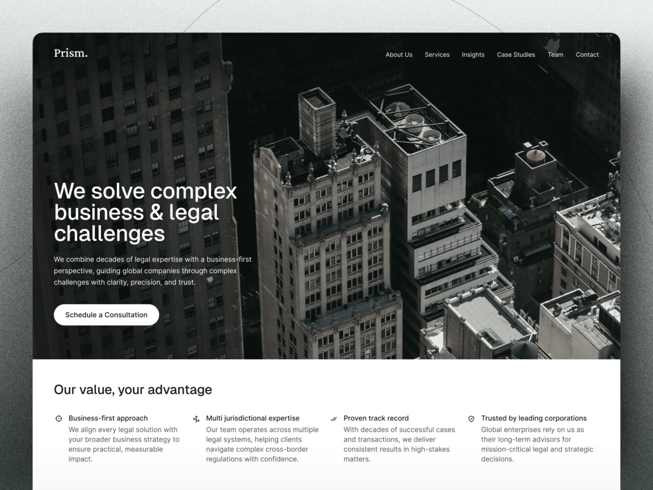
Website Design for Consulting Firm by Conceptzilla
What Conversion-Focused Web Design Actually Includes
Clear Value Hierarchy
People scan websites instead of reading them. And if they can’t grasp what you offer and why it matters to them in under five seconds, you’ve already lost.
That means your headline should be clear and explanatory. Visual weight, spacing, typography point to one thing: the core value. No “innovative synergistic solutions.” Just: This is what we do. This is who it’s for. This is why you care.
In my experience, the highest-converting pages feel almost boringly obvious. Because they’re trying to communicate.
Intent-Based Page Structure
Every page should have a certain intent. A homepage isn’t a pricing page. A feature deep dive isn’t a sign-up flow. Yet so many sites treat them like interchangeable templates.
Website conversion optimization design starts by asking, “What should the user do here?”
- On a landing page? Understand and believe.
- On a pricing page? Compare and choose.
- On a checkout? Complete and feel safe.
Each goal demands a different structure, different content rhythm, and different emotional tone. You wouldn’t use a sledgehammer to hang a picture, and you shouldn’t use a blog-style layout for a high-stakes SaaS trial signup. Match the structure to the intent, and the conversions follow.
Friction Removal by Design
Every extra decision is a potential drop-off point. Do I need to create an account before seeing pricing? Do I have to scroll past three carousels to find the damn form? Is it clear what happens after I click “Get Started”?
CRO web design removes these micro-hesitations before they happen. It reduces cognitive load by limiting choices, even if marketing wants 12 CTAs. The approach preempts objections with smart placement of trust signals. It uses progressive disclosure, only showing what’s needed when it’s needed.
However, the goal is to make the right action feel effortless, obvious, and safe.
Why A/B Tests Fail Without Strong Design Foundations
As I said, most A/B tests fail because they’re trying to measure causality in a system that’s already broken.
You can’t isolate the impact of a button color if the page it lives on confuses users, misaligns with their intent, or feels like it was assembled by a committee during a 2 a.m. Zoom call. In those cases, your test just adds noise to an already messy signal.
Testing Cosmetic Changes Instead of Structural Problems
Sometimes a color tweak helps. But only after you’ve nailed the fundamentals: Does the user understand what this button does? Do they trust what happens next? Is this even the right action for them at this moment?
If the answer to any of those is “no,” then you’re not optimizing, you’re rearranging furniture in a room with no door.
Web design for CRO depends on cause and effect. When your design foundation is shaky, you lose the ability to see true causality. Was it the green button? Or was it that users finally understood the offer because the headline above it got clearer in the same variant? You’ll never know.
When CRO Data Becomes Noise
Ever run a test where both variants perform almost identically, and you walk away with zero actionable insight? That’s low-signal experimentation.
It happens when you test changes that don’t actually move the psychological needle. Tiny copy tweaks on a page that’s already unclear. Minor layout shifts on a flow that’s fundamentally misaligned with user intent. Just wasted cycles.
Worse, they create false confidence. “We tested it!” people say, as if activity equals progress. But if your experiment doesn’t touch the real barriers, such as trust gaps, cognitive overload, mismatched expectations, then the data you collect is just statistical static.
Instead of “What should we test?”, you should ask, “What’s actually stopping people from converting?” More often than not, the answer lives in your design structure rather than the button palette.
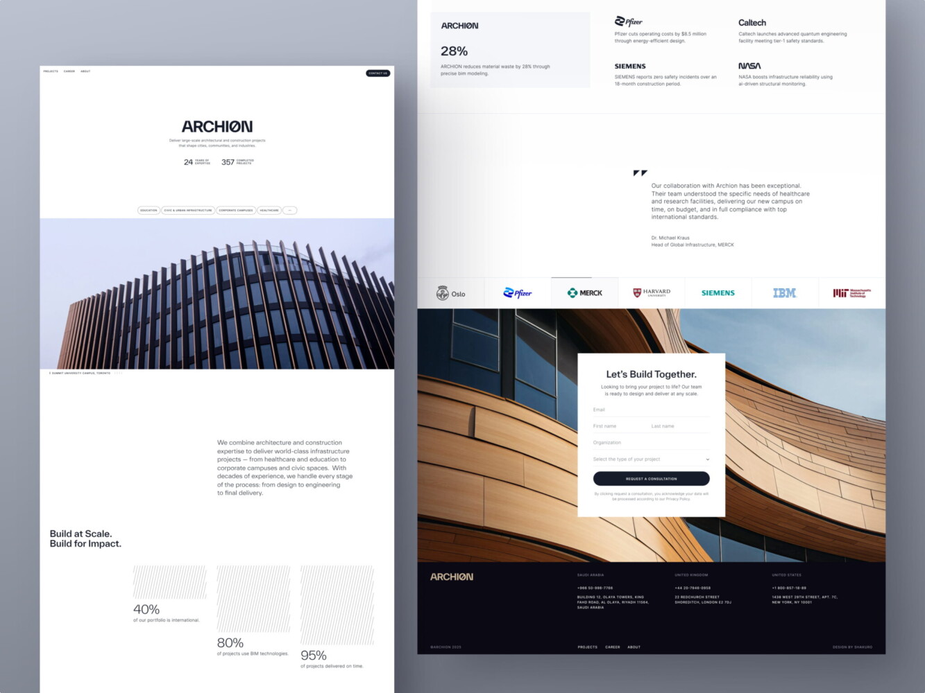
Web Design for Architectural Company by Conceptzilla
CRO Starts Before the First Click
CRO without A/B testing starts the moment people hear your name.
The first real impression is a tweet, a podcast mention, a LinkedIn post, or a friend saying, “You should check out [your startup].” In case your brand feels vague, inconsistent, or unprofessional, people won’t even click. Or if they do, they’ll arrive already skeptical.
Many startups pour thousands into performance ads to send traffic to a site that looks like it was built in 2012 with stock photos and jargon-heavy copy. The disconnect is jarring and costly. No amount of clever targeting fixes a broken handoff between promise and reality.
Pre-Conversion Trust Signals
Before anyone even scrolls, they’re making snap judgments. Is this legit? Do these people know what they’re doing? Can I trust them with my time or money?
In this case, we are speaking about brand coherence:
- Does your messaging sound like it’s from the same company across channels?
- Does your visual language feel intentional?
- Is your value clear in under five seconds, even to someone who’s never heard of you?
These are conversion prerequisites. If someone doubts your credibility before they click, your landing page has to work twice as hard just to get back to neutral.
Post-Click Experience and Consistency
What happens after the click? This part is also crucial for conversion rate optimization web design.
For example, an ad says, “Finally, project management that doesn’t suck.” User clicks, expecting a clean, opinionated tool. But the landing page is generic, saying, “Empowering teams worldwide with scalable solutions.” Wait, what? Where’s the personality? Where’s the clarity?
That mismatch kills conversions faster than a slow load time. People feel betrayed, like the ad was bait and the page is the switch.
Consistency depends on delivering on the promise made upstream. Same tone. Same level of specificity. Same energy. If your ad speaks human, your page better not suddenly turn into a corporate brochure.
This is why CRO can’t live in a silo. It’s a whole-funnel design problem that starts with the first whisper of your brand and drags to the final thank-you screen.
To create CRO web design, you have to figure out where to focus your budget and energy. You don’t need to micromanage every pixel, but you do need to own the core narrative and trust signals. Because they’re converting before your code even loads.
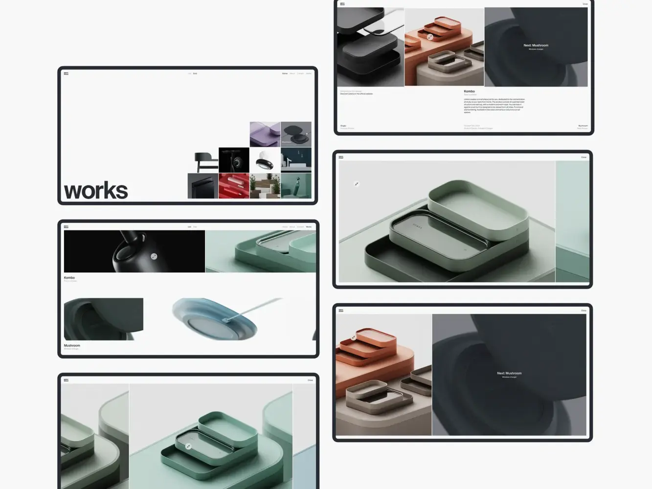
Website Design for Mirko Romanelli by Shakuro
Conversion-Focused Web Design Across Industries
This approach is never one-size-fits-all. What convinces someone to buy socks online is wildly different from what makes them trust a platform with their medical records or hand over $50K to an investment tool. If you treat every website like it’s selling the same thing, you’ll miss the real levers that move people to act.
Fintech and Investment Products
Trust, compliance, risk clarity.
In fintech, people are handing over something deeply personal: their money, their data, and sometimes their future. So flashy animations or aggressive CTAs backfire. What works is calm confidence: clear disclosures, regulatory cues (like licenses or security badges), and language that doesn’t sugarcoat risk.
Instead of saying, “Get rich fast,” you say, “Here’s how it works, here’s what’s protected, and here’s what you’re responsible for.” That honesty builds trust faster than any pop-up ever could. And trust is the conversion driver here.
For example, when designing Owari website, we focused on delivering those top three qualities. Step by step explanations, brand story, clear text copy—these elements helped us provide clarity and gain trust. Despite large amounts of financial data, there was no confusion.
Healthcare and Medical Platforms
Credibility, accessibility, emotional clarity.
Healthcare decisions are loaded with fear, urgency, and high stakes. A confused user isn’t just bouncing; they might delay care. So web design for CRO here has to be accessible first and persuasive second.
That means plain language with no jargon, a strong visual hierarchy for critical info (like symptoms or appointment steps), and inclusive design. Color contrast, screen reader compatibility, and font sizes that don’t assume perfect eyesight. Emotionally, tone matters. Reassurance over hype. Clarity over cleverness.
You see, when someone’s searching for help at 2 a.m., they don’t need “innovative solutions”, they need to know, fast, that you can actually help them.
Bless You, one of our healthcare projects, has that high level of clarity and accessibility. Lots of white space, clear user flows, no distractions. Since the project has two versions—English and Arabic—we’ve paid close attention to cultural differences, increasing emotional bond with potential users.
E-Commerce and Marketplaces
Speed, frictionless checkout, visual hierarchy.
Shoppers compare, scroll, abandon—all in seconds. So conversion hinges on removing doubt, not adding features. Hesitation is the enemy.
High-quality images play a crucial role in CRO UX design for e-commerce. But clear pricing (no hidden fees), size guides that prevent returns, shipping info above the fold, and a checkout that remembers past choices also impact the result. It should be mobile-first, because that’s where most carts get filled.
The e-commerce design should feel like a helpful assistant who already know what you need. For Lonely Walls, we made art the central part of the web design, both on desktop and mobile. So they could easily catch an eye of potential buyers. No long text copies or distractions, just art pieces. At the same time, our team optimized the layout for mobiles too, as lots of people browse websites from their smartphones.
SaaS and Subscription Products
Trials, demos, onboarding expectations.
SaaS buyers are usually committing to a workflow. That’s why they need to see themselves using it successfully before they even sign up.
Top-performing SaaS sites focus less on features and more on outcomes: “Here’s how your team saves 10 hours/week,” rather than “Our API supports 127 integrations.” They offer low-risk entry points, such as live demos, sandbox trials, interactive walkthroughs, and set clear expectations about onboarding time, setup effort, and support.
So yeah, website conversion optimization design is deeply contextual. It feels right for the industry, the user, and the moment they’re in.
TraderTale can be a relevant example, where we optimized the layout and web UI to make interactions with the platform smooth. Together with easy navigation, it allowed the users to track their stats effortlessly. And thus, subscribe.
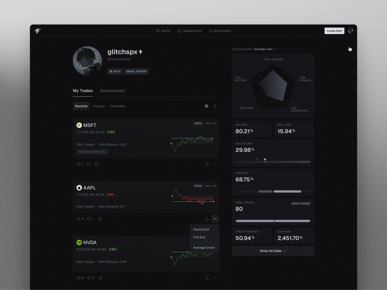
TraderTale: Social Platform for Traders by Shakuro
When A/B Testing Actually Makes Sense
A/B testing should be the refinement stage.
You shouldn’t be running multivariate tests on a page where users can’t even tell what you sell. Yet that’s exactly what happens when teams treat testing like a magic wand instead of a precision tool.
Often companies burn months in “growth sprints” testing button copy while their core value proposition was buried under three layers of jargon. Meanwhile, a simple redesign based on actual user behavior would’ve moved the needle 10x more.
So when does A/B testing actually make sense? Only after you’ve done the unsexy foundational work. Only when your design is already clear, your UX is aligned with user intent, and your data shows consistent patterns.
CRO Stack Maturity Model
Web design for CRO has a solid structure, that you build step by step:
✅Design foundation first
Is your layout clear? Does your messaging instantly communicate value? Is the visual hierarchy guiding attention where it should go? If not, stop. No test will fix this.
✅ UX architecture
Are flows logical? Is friction removed by design? Do pages match the user’s mental model? This is where you solve structural issues, like asking for payment before explaining benefits, or hiding pricing behind a demo request.
✅ Data-informed understanding
Now you layer in analytics, session recordings, heatmaps to uncover real drop-off points. Instead of asking, “What should we test?”, you ask, “Why are people leaving here?”
✅ Testing
Only now does A/B testing become powerful. At this stage, you’re not guessing but validating hypotheses grounded in design clarity, user behavior, and observed pain points. You’re optimizing a system that already works.
In practice, this means:
- Test after you’ve validated your core message with real users.
- Test after your checkout flow has been stress-tested on mobile, slow networks, and tired eyes at 11 p.m.
- Test after you know which metrics actually correlate with long-term retention.
The goal of conversion rate optimization web design is to build something so clear, so trustworthy, and so easy to use that testing becomes the final polish.
How to Evaluate Whether Your Website Is CRO-Ready
Before you even think about launching your next A/B test, ask yourself this: Is your website actually ready to be optimized?
Testing a broken foundation just gives you data about how broken it is. Almost every time, the issue isn’t the lack of tests but the site just fails basic conversion hygiene. Here’s a practical, no-fluff checklist to see if you have a CRO web design. If you can’t confidently say “yes” to most of these, pause the experiments and fix the fundamentals first.
✅ Is the value proposition instantly clear?
Could someone understand what you offer and why it matters to them in under 5 seconds? Not “We empower digital transformation through synergistic platforms.” But: “Save 10 hours a week on payroll with one-click approvals.”
If your headline requires a dictionary or an MBA to decode, you’re already losing people before they scroll.
✅ Is there one primary action per page?
Every page should have a job. The homepage? Explain and invite. Pricing? Help users choose. Feature page? Show relevance. If you’ve got three CTAs competing for attention, for example, “Start Free Trial,” “Book a Demo,” “Download Guide”, with no visual hierarchy, you’re forcing visitors to decide what you want them to do.
✅ Is trust established before asking for commitment?
You wouldn’t ask someone to marry you on the first date. So, don’t ask for a credit card before proving you’re worth it.
Look at your flow: Are you showing social proof, security cues, or real outcomes before the signup form? In fintech or healthcare, this is table stakes. Even in e-commerce, a tiny “free returns” badge above the CTA can slash hesitation.
✅ Does design support intent, not distract from it?
Clutter kills conversion because it forces cognitive load. Every extra button, animation, or sidebar widget competes for attention.
Ask: Does this element help the user move toward the goal or just make the page feel “complete”? Conversion rate optimization web design feels almost invisible. It doesn’t shout, guiding users to crucial points. If you’re nodding along thinking, “Hmm, we’re shaky on two of these,” that’s okay. Most sites are, but don’t throw more tests at it.
Fix the clarity. Simplify the path. Earn trust early. Then start testing.
E-Commerce Website Design by Shakuro
Final Takeaway: CRO Is a Design Discipline First
CRO is a design discipline.
You don’t “add” conversion optimization at the end like sprinkles on a cupcake. You bake it into every decision: your headline hierarchy, footer links, etc. If your design doesn’t guide, clarify, and earn trust, no amount of A/B testing will save you.
Teams waste months chasing 3% lifts while their homepage still leaves visitors wondering, “Wait, what do they even do?” That’s rearranging deck chairs while the ship leaks.
Fix the Design, Then Optimize
Again, here’s the sequence that actually works for conversion rate optimization web design:
- Get the foundation right—clear value, focused intent, honest messaging.
- Remove friction by design.
- Establish trust before you ask for anything, especially in high-stakes industries.
- Then start testing.
Testing amplifies what’s already there. If your design is strong, tests refine and accelerate. If it’s weak, they just expose the cracks faster.
So stop treating CRO like a growth hack. Start treating it like what it really is: human-centered design with a business outcome. A human-centered web design is one of our main approaches. So contact us and let’s build a functional CRO web design.