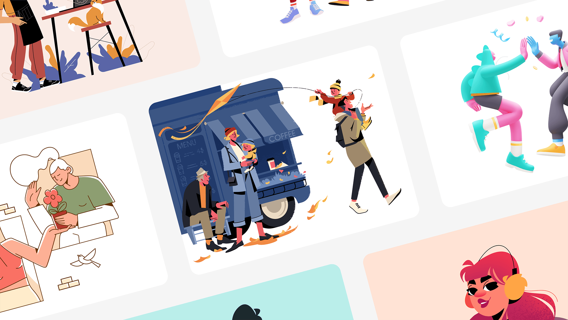
Are you tired of battling the constant struggle to make your interfaces stand out, engage users effectively, and communicate your brand’s story? Do you find yourself seeking that missing element that could take your designs to the next level and create a lasting impact on your audience?
Contents:
In this article, we delve into the incredible power of illustration in UI design and why incorporating it into your design arsenal is an absolute game-changer. Get ready to discover how art can breathe life into your designs, captivate users, and transform mundane interfaces into visually stunning experiences that leave a lasting impression. Let’s dive in!
What is illustration?
The Merriam-Webster dictionary defines illustration as
“something that serves to illustrate: such as
a: a picture or diagram that helps make something clear or attractive
b: an example or instance that helps make something clear”
and to illustrate as
“to provide with visual features intended to explain or decorate”
A “picture” is a very broad term as illustrations are used in a variety of places from books and textbooks to ads and video games. From many faces and many facets of Illustration, we are going to talk about digital ones used in designing the interfaces of business-related entities like websites, mobile applications, logos, social media assets, various marketing collateral, etc.
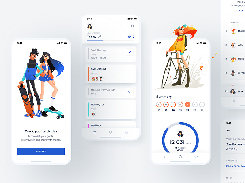
Healthy Habits App by Shakuro
Sometimes, illustrations and graphic design get mixed up. The difference is that illustration may be a part of graphic design and the latter is a much broader concept that involves different aspects of marketing, art, and technology. Graphic designers use illustration in UI design to communicate a company’s ideas in visual forms wherever this company is visually present. They work with fonts, shapes, colors, images, print design, photography, animation, logos, billboards, etc.
Another difference is that illustrations can be used for artistic purposes and serve as decoration whereas graphic design is always commercially-oriented and is known as “commercial art”. Over the years, it evolved to become the rich and powerful tool it is today.
“Content precedes design. Design in the absence of content is not design, it’s decoration.”
– Jeffrey Zeldman
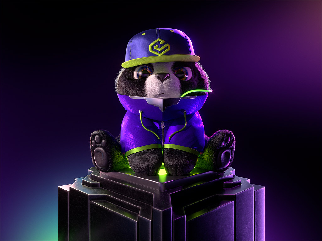
Panda 3D Illustration by Shakuro
What illustrations mean for business
Illustrations in UI are often considered adornments. But going beyond beauty, what is “beautiful” in terms of benefits for businesses? That’s what many entrepreneurs want to find out and what many creatives are used to explain daily. If you come down to it, art is just another design technique that helps you improve marketing. Here are some interesting statistics:
- Content with relevant images gets 94% more views.
- Information with images is remembered 55% better.
- Posts on social media with illustrations tend to get 650% more interaction than text-only posts.
For your illustration design, you have to choose between photos and digital art (unless you decide to use both, but their proper combination is another business). There are more photo-based websites and apps than ones with custom illustrations.
Design is the heart of any successful business endeavor and we are happy to live in times when this idea is getting its recognition. More and more companies, big tech ones among them, pay more attention to design and make use of custom illustration services. Having had more experience with them during the last couple of years, we know that illustrations are indeed a powerful tool for generating interest in your products or services that can make a real difference to your business.
The booming popularity of illustrations may even make them look superior to photos. The point is though is that instead of making a cargo cult out of them and using custom graphics blindly just for the sake of them, it’s better to understand what they are capable of, what they can and cannot do in business. The point is not where to find illustrators, but how to find those who understand the work you do and have skills for it.
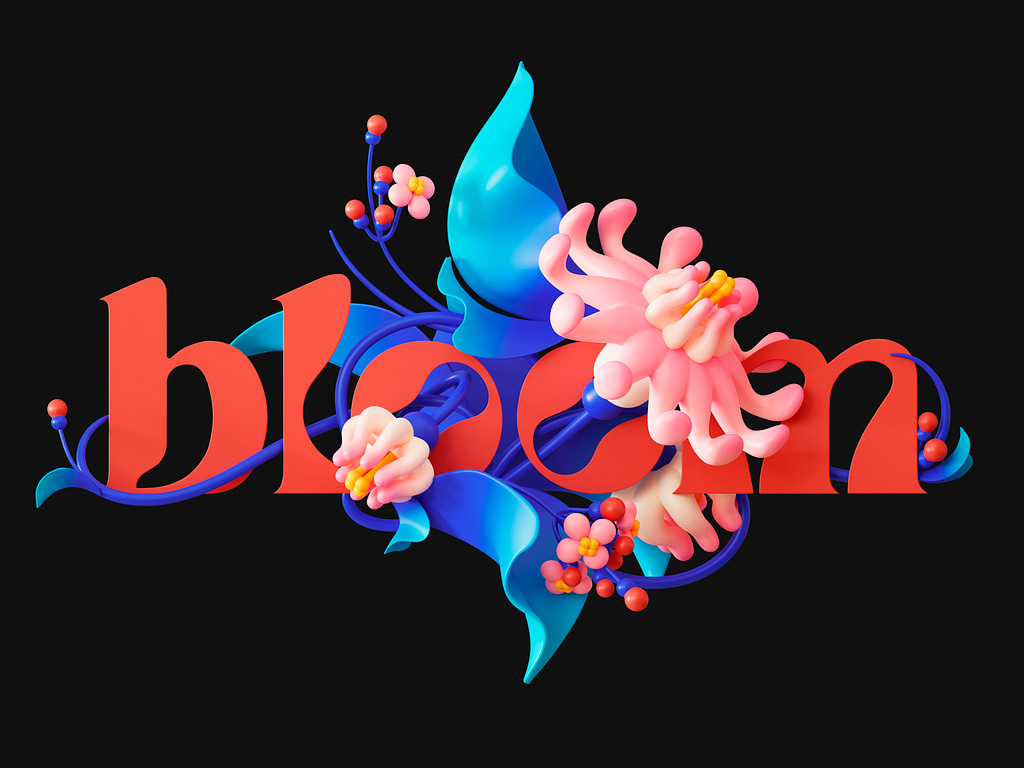
Illustration for a coffee package design by Shakuro
“Design used to be the seasoning you’d sprinkle on for taste; now it’s the flour you need at the start of the recipe.”
— John Maeda
6 Reasons to add illustration in UI/UX design
If you’re strong at explaining things with words, a powerful word message might be enough. Humans are visual creatures though. Approximately 65% of the population are visual learners.
You might be an auditory or kinesthetic one, but some researchers still claim that over 90% of the information an average person processes is visual regardless of their predisposition. Visuals are processed insane 60,000 times faster than text by the human brain. In other words, pictures are much easier to digest than written words however short a message and can express your idea more vividly.
Why use UI illustration?
Enhanced user engagement
It is a key reason to incorporate art in UI/UX design. It is visually appealing and can capture the user’s attention more effectively than plain text or generic images. Their colors, shapes, and styles draw users in, making them more likely to engage with the content.
Improved content visualization
Infographics and data visualizations are powerful tools for presenting complex data or statistics in a visually appealing and digestible format.
With illustration in UI design, you can take an abstract idea and express it imaginatively, making your message sound more powerful and concise. You can portray literally whatever you like, regardless of style and concept. With photos, you could struggle too much and in vain to be able to represent some concept excitingly and convincingly. Moreover, photos are too accurate and precise for some purposes.
You visually represent complex concepts, processes, or data clearly and concisely. With visuals to complement textual content, your target audience can better understand and retain information, leading to improved comprehension and engagement.
Stronger brand identity
Custom illustrations help reinforce your brand identity and showcase your brand’s personality. By incorporating art that aligns with your brand’s values, tone, and style, you can create a more cohesive and engaging user experience that resonates with your target audience.
Meaningful UX illustration influences the audience’s mind and psyche creating a positive brand image unobtrusively, managing customers’ expectations. If you don’t shape your image, your customers will do it and you might not like the result.
That is why it’s so important for a company owner to convey the meaning and vibe of their brand to an illustrator or graphic designer.
Increased emotional connection
What makes us human is the ability to feel a wide spectrum of emotions — love, admiration, happiness, fear, joy, anger. We love to feel and love when somebody makes us feel. Illustrations act as mood-setters, affecting us on a visceral level.
By incorporating illustration in UI design that triggers positive emotions or convey relatable scenarios, you can create a more emotional connection with users, enhancing their overall engagement with the interface.
Guided user flow
Art can strategically guide users’ attention and emphasize key information or call-to-action buttons. Integrate illustrations that direct users’ focus and create a visual hierarchy within the interface to enhance engagement and facilitate a smoother journey.
When you need users to do something, you can add reassuring pictures that could act as motivations, giving people an appealing feeling of success, and a pleasant sensation of doing the proper thing. It might look like it’s a small thing but it’s small things that matter.
More effective storytelling
Illustrations in UI tell a story or convey a message more engagingly and memorably. By using art to visualize concepts or scenarios, users can better understand and connect with the content, leading to heightened engagement.
Use cases of illustrations in interface design
Sometimes, the solid and reliable feeling that photos give makes them a more suitable candidate for a particular type of website or app. Take a website dedicated to HVAC services. The photos of real-life devices and people tending to them are the first things that come to mind (though illustrations can also be present there in the form of schemes). Photos seem more suitable in FMCG and retail.
Other times, the subject is less tangible and requires a more abstract and creative approach that only illustrations can give. It all comes down to a brand and its goals. We at Shakuro start working on a project by finding out what tasks a client has and what messages and ideas they need to communicate. And only then the search for solutions begins.
So when to use illustrations in design? There are dozens of suitable places and instances:
- A hero section is a great place for character illustrations.
- Emails, especially when celebrating a holiday or user achievement or in a marketing campaign.
- Onboardings, reference materials, and anywhere where a user might feel lost and confused and you feel the navigation system needs help and you want to highlight important elements that get passed by. A little bit of extra help in the form of reassuring and explanatory pictures is always welcome.
- Anywhere with large amounts of text. Illustrations and graphic elements in general act like water helping a user to digest their “digital food” easier.
- When you want to picture a reward — badges, medals, stickers, etc. — and motivate a user for further action.
- Branding — mascots are a great example.
- Notifications and alerts.
- Stickers, don’t forget about stickers.
UI illustration can be used in any type of digital media. This incredible versatility is what makes them so popular and loved by designers and users alike. Digital illustrations have been a trend every year. They evolve along with technology, business needs, and people’s preferences and expectations.
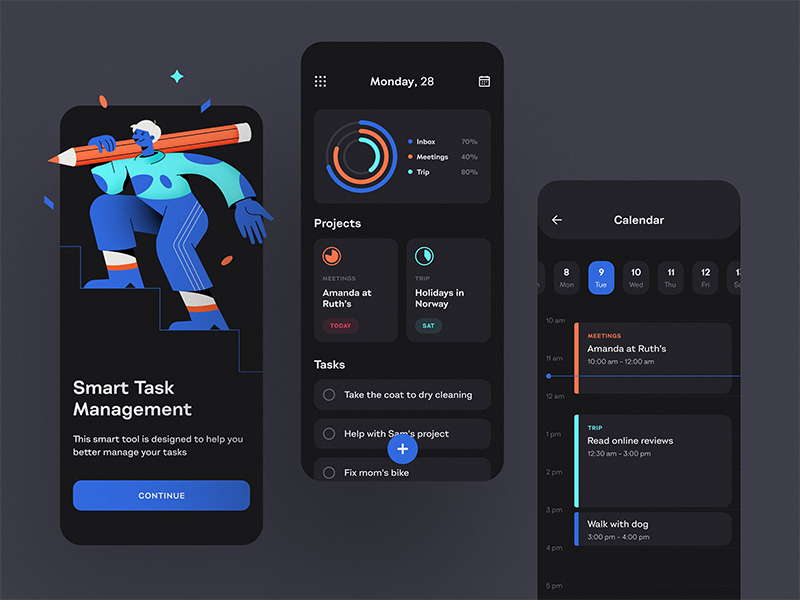
To-Do List App — Dark Theme by Shakuro
Popular illustration design for commercial projects
Let’s look at what’s trending today in graphic design illustrations.
After photos, especially stock ones, started to fail in creating the right kind of impact, illustrations stole the show to such a degree that today it’s hard to dispute their popularity. Some design critics even say that there is too much good stuff even and things started to look the same. Whatever your opinion is, if you take a commercial product with an illustration, it is likely to be done in one of the following styles:
Line art
This style includes everything that is drawn with lines, without shadows, colors, gradients, and semitones. A line becomes the only means of visual expression. In 2020, line art became an absolute hit, a faithful friend and partner to minimalism.
This illustration in UI design is simple in form and content, and conveys the brand message, so it can be safely called universal. In the ocean of eye-catching graphics with every pixel striving for attention, its calm and elegant appeal may even look refreshing.
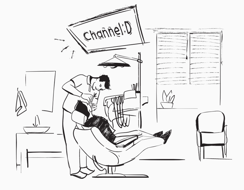
ChannelD Illustration by Shakuro Graphics
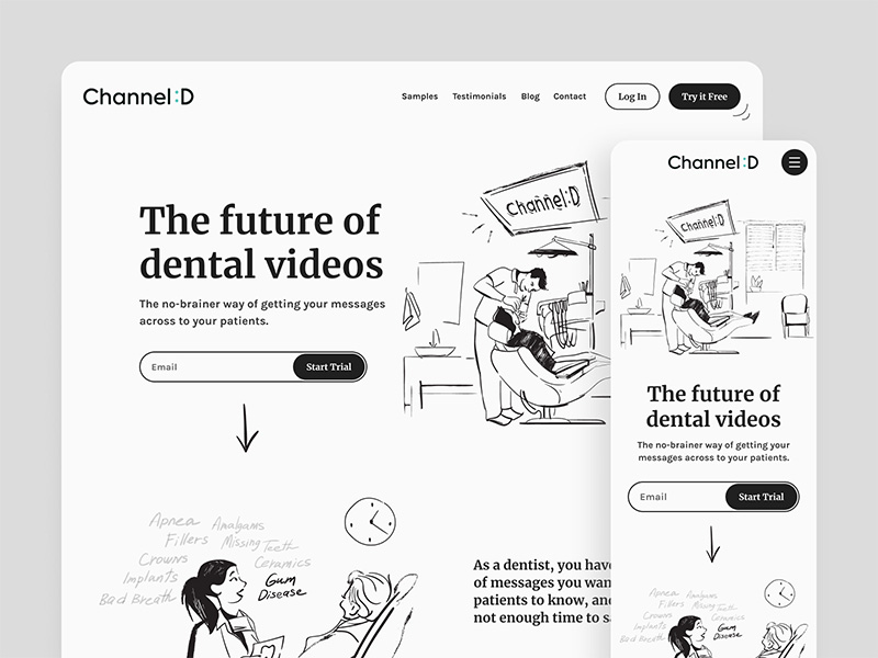
Channel D Website Design by Shakuro
Flat
If you take a general look at the modern digital illustrations, you can see that many of them are, so to speak, “flat”.
You can identify flat-style pictures by a minimal number of used forms and colors and the absence of elaborate decorative details like complex shadows and textures. Flat illustration design is a part of the major trend characterized by simple shapes with 2D images, simple and intuitive interfaces, well-chosen fonts, and pleasant and minimal color palettes. It became popular in the 2010s when Microsoft released a new system with a minimalist style, as opposed to Apple’s skeuomorphism, a design dominated by realistic effects.

Medical Characters: Medical workers by Shakuro Graphics
Thanks to its features, the flat style helps to keep illustrations focused on the point and creates the feeling of a stylish and modern digital resource, making the content easier to perceive. There are different variations of flat style. Sometimes you can see little “complexities” present like granular gradients:
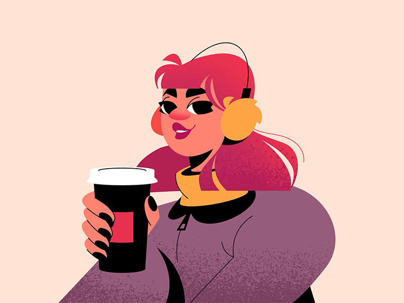
Winter Girl by Shakuro Graphics
Semi-flat
Also called semi-realism, it is a part of flat UI illustration that you could place in a separate category. It became popular several years ago, influenced by Google’s Material Design. Light shadows make flat pictures a little more spatial.

Summer Surf by Shakuro Graphics
Pseudo 3D
It refers to a technique that creates the illusion of depth and three-dimensionality in a two-dimensional design. This style uses shading, perspective, and shadows to give flat graphics a sense of depth and realism, without the need for true 3D modeling. Pseudo 3D illustrations in UI enhance user interface elements, making them more visually engaging and interactive. By incorporating this style, you can add depth to buttons, icons, and graphics, making them more visually appealing and intuitive for users to interact with.
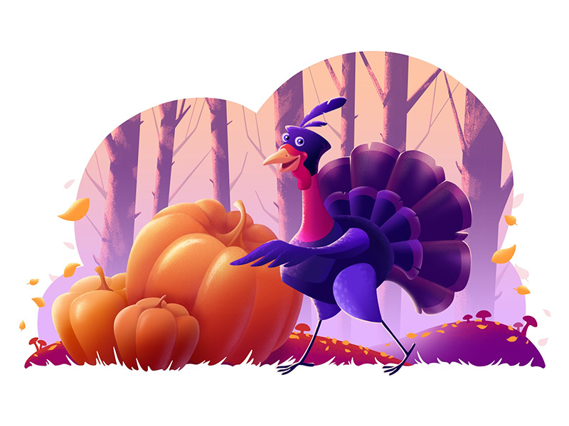
Thanksgiving Illustration by Shakuro Graphics
3D
And finally, full 3D, as opposed to flat design. This is one of the most promising trends that is gaining more and more popularity thanks to technological advancements. It uses old, skeuomorphic design techniques, and new ones based on the latest tech achievements. 3D illustrations look rich and attract the attention of users.
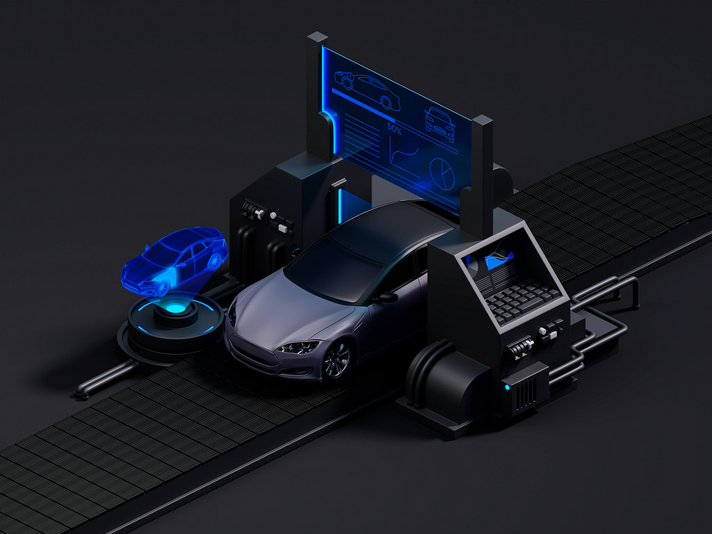
Car Scaner 3D Illustration by Shakuro
What illustrators (and designers) do to make their works effective
There is no universal methodology that can be applied to any given project. Even when it doesn’t involve and needs a particularly high level of artistic creativity, a lot depends on a designer’s gut feeling (and years of experience that make this feeling exist).
However, certain principles might be useful for capitalizing on UI illustration effects and exploring their full potential. When designing a website or an app, all the tasks that illustrations perform are usually combined with other design aspects to achieve higher efficiency.
Think about how to make your work:
- Useful. Whereas many pictures are created just for the pleasure of it, at the foundation of every commercial work lies the concept of its usefulness. When exploring ideas for their next UI illustration, you and your project managers set a concrete goal regarding what task a particular picture will solve — explain, delight, attract, etc. It may also be decorative, but it should never distract a visitor from a product. A good illustrator has the imagination of the artist and the ability to stay firmly on the ground when there is a need to create something that is not only beautiful but also functional.
- Captivating. Beauty is a matter of taste, but there are things that can be outlined more accurately like elegance and a positive, inspirational attitude.
- Strong. A product needs a strong message and visuals. For this reason, designers don’t put too many pictures in one interface to avoid oversaturation. A picture in an interface is not for fancying it up.
- Original. There are certainly popular styles of illustrations that we’ve outlined above, that seem to be preferred by many and produce desired effects. A piece of graphics still needs to be original enough to not merge too much with others. Every creator has mastery over some set of styles and a natural inclination towards choosing some of them. We make sure to pick an illustrator with the ability to match their skills with the needs and vibe of a project.
- Suitable. For instance, the choice of colors can make a huge difference.
An ideal UX illustration is one that conceptually accurately works with a creative idea while complementing rather than repeating the message. It is visually prominent, while not overloaded. It conveys reality while doing it interestingly.
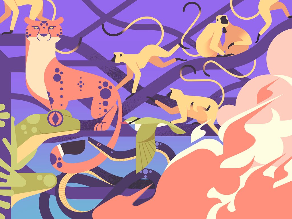
Wildlife Protection 2D Illustration by Shakuro
Why choose professional illustration services
Unless you have some working experience in graphic design, creating something fresh your audience could interact with is going to be hard. Art that lies at the heart of illustration as a grand notion that tells us how fine and subtle the creating process can be and how surprising the audience’s reaction can sometimes be also. Quick and sloppy options won’t do, and we’re not trying to disfavor the appeal of doodly-style graphics. Take a look at this picture that Mailchimp used as part of their famous new brand to represent automation features:
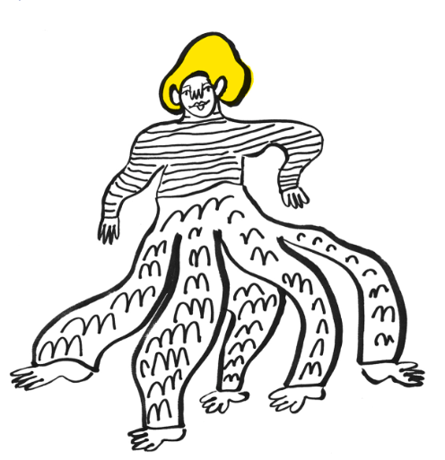
Image: mailchimp.com
Looks like a job for a couple of minutes. Does it?
Success is never easy. This illustration design is just the tip of the tip of iceberg which is their rebranding strategy that involved an illustration system and the work of six professionals.
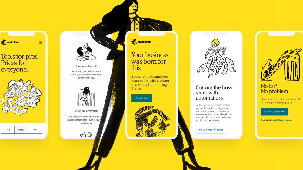
Image: mailchimp.com
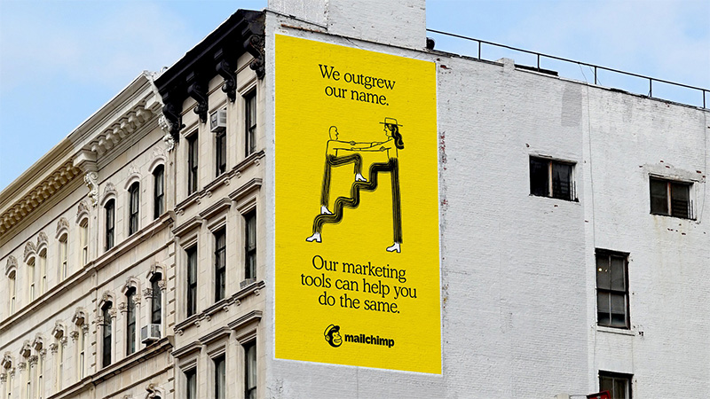
Image: mailchimp.com
Look at how beautifully they conveyed the idea of help and progress. Could they have reached the same result with the help of some other medium? They could’ve, but not quite the same. Without this whimsical abstract style, they would not have been able to appear just this fresh, fun, creative, and human-oriented.
That took months of work by people with years of experience of being able to see various options, choose the most suitable one for a particular project, and implement it, telling the story of a brand. Without this level of expertise, it’s hard to orientate in the vast and spectacular world of graphic design. To avoid wandering in the dark, reach out to a guy with a lamp.
If you’re just getting off your feet and are at the beginning of your journey and not sure that you want such a comprehensive approach just yet, you can still try it out and order several separate illustrations.
How much does it cost to hire an illustrator? What you need to know is that an average illustration takes 8-16 hours to make. The hourly rate for custom illustration services mainly depends on an illustrator’s geographical location and expertise. We charge from $50/hour and up for our outsourced illustration services.
There’s still one more option. You can buy illustrations that are ready-made, like the ones we have on Lottie, have them customized and use them commercially. The only drawback is that they are not custom. Otherwise, they are high-quality illustrations that are royalty-free and can even be fully customized to match your business’s style including colors and everything.
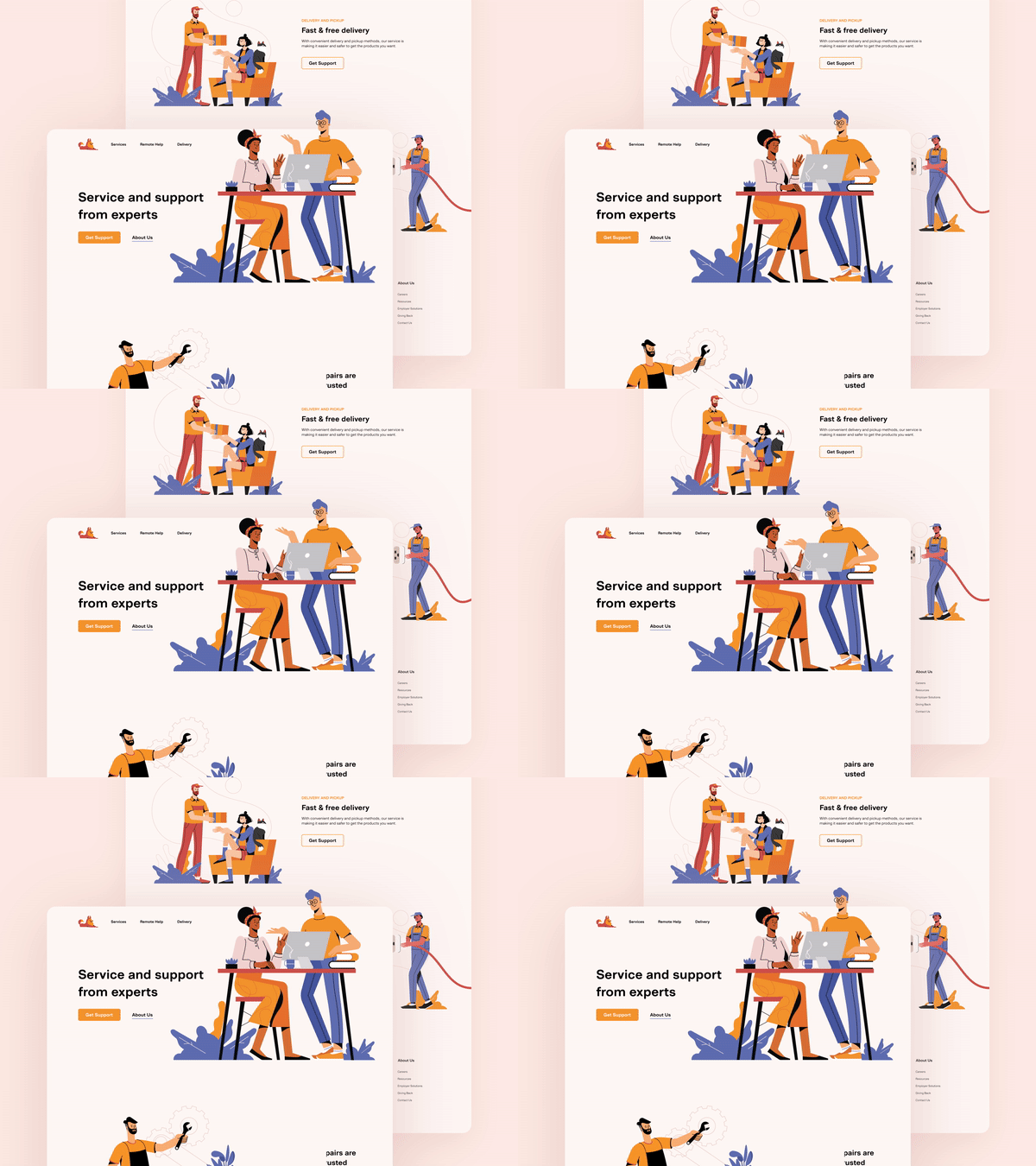
Animated Character Illustration Pack by Shakuro
In closing
So what are the takeaways?
The recent years brought illustrations to the forefront of design and content marketing. They are more than pretty pictures that grab your attention. They do that and many other things like informing, explaining, motivating. Various surveys and studies show that humans tend to absorb more information and do it easier if they are stimulated by graphics. Based on our experience, our team continually tests the effectiveness of the illustrations, just as we test the effectiveness of every other element of projects we undertake. Each stage of the illustrative work is consulted and reviewed by other team members: designers, developers, project managers, and creative producers.
If you want to hire an illustrator and illustrations are a new medium for you, contact us to help you explore them. We’ll ask you a lot of questions, define your values and goals to come up with the most suitable way to express what you are trying to say.
Meanwhile, take a look at more examples of illustrations on our graphics page on Dribbble, in Behance, and read some stories in our portfolio where we tell how we used illustrations in commercial projects. Good luck and make the most of it!
* * *
This article was originally published in March 2021 and was updated in July 2024 to make it more relevant and comprehensive.
