When browsing through web designs on Behance and Awwwards, you need to be patient to find a site without animations. The creation of animation is one of the main stages of web development to consider because it boosts interest to any website.
Contents:
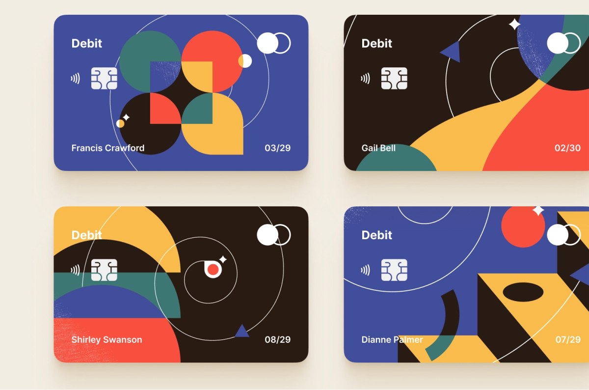
Landing page animation by Shakuro
These moving graphics create the illusion of life. Many designers believe that animation can liven up websites, making them attractive and easy to use. But how do you create animations, and which illustrations are born to be animated? In this article, we’re looking closely at the web animation process. This is a step-by-step tutorial of illustration animation by a motion designer who has been inspired by our credit card design.
The motion designer inspired by Shakuro illustrations
Tom Miller is an unusual member of the Dribbble community. He is a talented, active, and inspired motion designer who took the initiative and decided to animate one of our illustrations. And you know what? The animation turned out to be so excellent that we are eager to share the result:
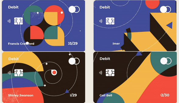
Credit card design by Shakuro animated by Tom Miller
Without the insights of the creator, the story and secrets of this animation would be incomplete. So we interviewed Tom, and he shared his steps to create a vibrant and catchy animation based on Shakuro’s credit card illustration. In this article, you’ll read lots of quotes from Tom’s interview.
Animation is a technique that was originally created to “revive” sites. We recently wrote that GreenSock (GSAP) is a great script animation library that supports JavaScript. In this article, we will show the basics of working with GSAP on the example of Miller’s animation.
Why this library is great:
- It has a friendly interface.
- It solves not only the problem of animations but many others as well.
- It works in all browsers.
- There are many extensions and plugins for it.
- There is a large community where you can find help in case you’re stuck.
Tom worked in the CodePen editor.
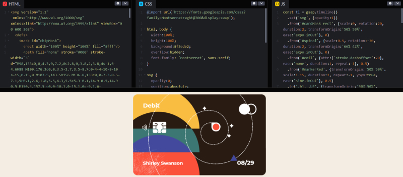
Codepen view of Tom’s animation
A step-by-step animation tutorial from a motion designer
We’ve been publishing all our illustrations, branding, and app and web designs on Dribbble. This is a place where we meet lots of interesting people and professionals in the design industry. Tom found us here, and this story started like this.
The idea of animating Shakuro illustrations
“Earlier this month I came across Shakuro’s beautiful credit card illustrations on Dribbble’s Instagram feed. They immediately struck me as the perfect fodder for some playful SVG animation. I’m fairly active on Codepen.io, and when I want to create something but don’t have any specific direction, I often look for inspiration on Dribbble.
A good design for creative coding is like a coloring book page; most of the decisions have been made, but there’s still space for the animator/developer to fill in some of their own ideas.”
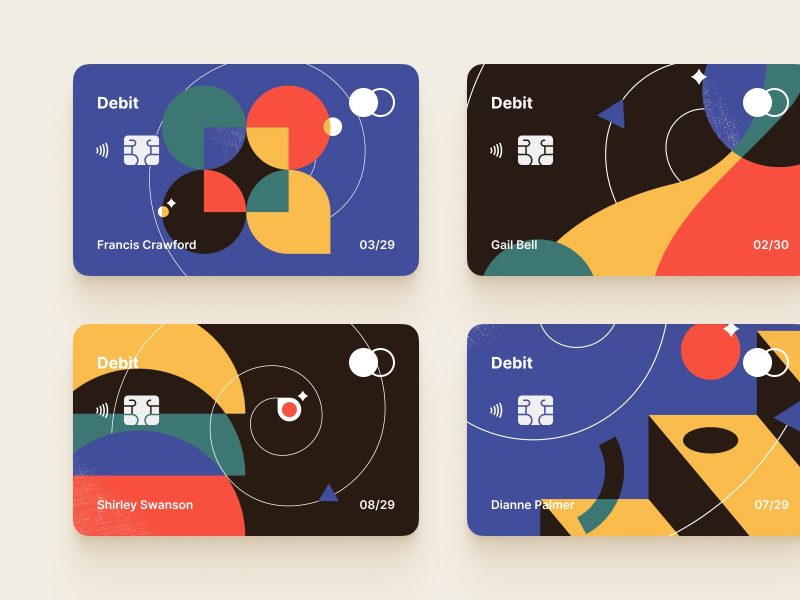
Credit card designs by Shakuro
The process of web animation
For anyone interested in web animation, here are a few notes about the process. To start, Tom had no design files beyond the static image that we’d posted on Dribbble. So he used Adobe Illustrator to trace each card and export everything as SVG.
“A strong understanding of SVG is such a valuable skill for this type of work. I learned through years of building HTML5 banner ads, frequently referencing Mozilla’s developer docs and a lot of community support. If you’re looking for a good learning resource, I highly recommend tutorials and classes by Cassie Evans. In addition to SVG, she also uses a lot of GSAP.js, which stands for Green Sock Animation Platform. If you’re doing any advanced/custom animation on the web, GSAP has been the industry standard for years. It’s a mostly free JavaScript library (there are some premium plugins for stuff like splitting text or morphing), and if you don’t know about it, you need to check it out.”

Animation by Tom Miller
Elements and tags of web animation
Getting back to the specific steps Tom took to bring these credit cards to life, he brought only the important SVG shape/path data exported from Illustrator into his HTML. Illustrator generates extraneous code, but Tom only used the necessary parts, so his code stayed light and legible. Tom gave a class/id name to any DOM element that would need to move. He used <mask> and <clipPath> tags to create the different color intersections, and the <use> tag to limit repetition as much as possible. For the text portions, he decided that the Google web-font Montserrat was suitable enough.
That’s how Tom describes the path from an illustration found on Dribbble to an energizing and fresh animation:
HTML and CSS
All the vector art was drawn in Illustrator, and then I output as SVG, pasting only the necessary data into the HTML. Much of the final SVG structure I coded by hand.

Tom Miller animation of a Shakuro design
In order to get each movement to look natural or feel smooth/snappy/interesting, you need to control the easing. GSAP.js includes a lot of easing options by default, plus there’s an option for custom easing so that you can define anything imaginable. In several places, the loop doesn’t just play infinitely forward, but actually yo-yos backward and forwards. In these cases, it’s important to consider what else will look like when playing in reverse, and overwrite with a different yoyoEase, if necessary.
The CSS styling is intentionally limited, as the appearance/styling/behavior of various elements all gets defined in JavaScript.
JavaScript
Once all the separate SVG elements were in my HTML, I got to the really fun part — animating in JavaScript! Each card animation has a GSAP timeline consisting of various tweens. Timelines let you sequence tweens, which manage all the different presentation properties. Some tweens play once, as the text mask reveals. Some loop infinitely. The key to a seamless loop is to end on something that looks exactly like where it started. So for waves, you need your shape to repeat at the start and end. Or for steps, each part tweens to where the next step began. You just need those parts that don’t have a previous/next step, to happen out of sight (outside the card mask).
Each card has a main timeline. Timelines are an essential part of the GreenSock API. They allow you to sequence a series of tweens. Tweens define object properties over time. Within each tween, any visual property/attribute can be manipulated, along with many settings (like duration, ease, repeat, stagger, etc.), that control the tween’s playback.

Credit card design animation by Tom Miller
GSAP.js is a mature and robust library that has a very legible, logical syntax. You can learn the basics rather quickly… and spend a lifetime mastering it. Some of the animation techniques used for these cards include:
- mask reveal
- motion along a path (requires the MotionPathPlugin)
- animating the stroke-dashoffset attribute
- seamless looping of shapes
- yoyo loops
- group staggers
Here’s a code excerpt that tweens dashoffset (dotted path):
const tl = gsap.timeline()
  .set('svg', {opacity:1})
  .from('#cardMask rect', {scale:0, rotation:20, duration:2, transformOrigin:'50% 50%', ease:'expo.inOut'}, 0)
  .from('#spiral', {scale:0.5, rotation:-30, duration:2, transformOrigin:'66% 42%', ease:'expo.inOut'}, 0)
  .from('#coil', {attr:{'stroke-dashoffset':20}, ease:'none', duration:1, repeat:-1}, 0.5)
  .from('#markerRed', {transformOrigin:'50% 50%', scale:1.15, duration:2, repeat:-1, yoyo:true, ease:'sine.inOut'}, 0.5)
With this input, it animates the stroke-dashoffset attribute of all paths with a class name of “coil” over one second and repeats infinitely. Because there are multiple paths with the class name of “coil,” we can use a function that will iterate over each instance within the group, and return different starting values. In this case, the sum of all the spaces and dashes in the paths’ stroke-dasharray adds up to 28, so we’ll get a seamless loop by offsetting the dasharray by that amount. By varying the positive/negative value, we’re able to alternate the direction of the movement.
By combining separate tweens of the same target element, we can create a more detailed and interesting movement. A star shine, for example, may rotate evenly (ease: “none”) while it’s a scale. These two property tweens are defined separately but executed simultaneously.

Tom Miller animation of a Shakuro design
GSAP.js is a ton of fun once you get the hang of it. You can achieve After Effects-level animations entirely through code and often with relative ease. Plus, the result is rendered in a browser, so your work can respond to the mouse position, scroll position, touch events, time of day, mic/camera input, device orientation, or any other interactive inputs you like!
Why Tom decided to make an animation from our design
“Shakuro’s card designs are instantly attractive because of their balance. There’s a thoughtful selection of color, texture, and shapes – some abstract and more obviously representational. Each composition has moments of simplicity and detail. But it wasn’t until I’d spent time tracing elements in Illustrator that initially abstract parts became more specific and clear in their implied behavior.
Those little aha moments are fun. And converting those realizations into motion is even more fun. I’ve enjoyed the positive response to my animations – which stood on the shoulders of a (design) giant. But in the end, I realized my favorite part was the build process because I was bummed to be out of coloring book pages once the fourth card was finished.”
We could have done animation of these credit card designs ourselves, but to get an animation from a follower of our design community is so pleasant and exciting! Thank you, Tom!
Why do we need animation on websites?
First, animations are eye-catching, even more than excellent web illustrations: you are more likely to notice a moving picture than a static one. Secondly, it makes interaction with a site or app more enjoyable for the user.
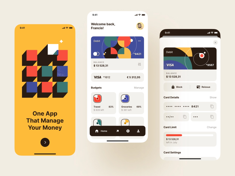
Banking app design by Shakuro
The animations by Tom turned out to be juicy and fresh and perfectly reflected the bold – and at the same time strict – design of bank cards we’ve made. The elements are unobtrusively animated with light, pleasing-to-the-eye impulses, and movements.
If you’re excited to implement an animation into your project — website or app? — we’re ready to do this for you. Just get in touch.