
We are surrounded by visual information. Dashboards are everywhere, whether it’s a phone screen or a car speed counter, or even a coffee maker at a mall. For some reason, when it comes to information visualization and dashboards, designers go bananas. Some sacrifice usability for the sake of drama, others are way too unique to let users feel like home with them. Yet, there is something about visual information that drags us into it – some weird fetishistic mix of aesthetic pleasure and quiver before the unappealable truth.
Dashboards can replace a lot of the UI. For the past two years, we’ve been disciplining our designers to make meaningful dashboards and make every element tell.
Here, we’ll take a look at the history of information visualization, go over the concept of functional art and the science behind it, study the insights from two of the greatest modern specialists, and study the dashboard mantra. If you are nerding out – buckle up. We’ll see how dashboards work and what are the ways to improve them to reach the most impact. Finally, we’ll go through the types of data and the types of visualization that work best for that data.
Contents:
Effective graphs can cure ignorance but they can’t cure stupidity. – Michael Friendly
The roots of data visualization
Statistics is a powerful thing. Statisticians can operate huge amounts of data and they don’t really need a pretty way to display that data. But when it comes to presenting and explaining things through stats, all one can see is a visual part of it. Once the data become visual, its impact grows stronger. Through stats, people can predict the future and that’s a pot of gold for every business.
The proto charts are known from as early as the 10th century when someone tried to graphically represent changeable values. But it was not until William Playfair, an original British badass, that visual charts became a powerful political tool allowing Britain to take specific measures and secure its maritime dominance.
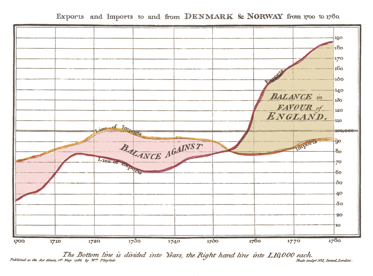
Michael Friendly describes the 19th century as a golden age of information visualization. It’s about that time that graphs evolved from being just a representation of life facts to becoming one of the main tools of scientific discovery.
After the devastating Napoleonic wars of the early 1800s, unemployment and crime rates spiked in all the major cities of France. The two approaches dominating public opinion at that time were:
- the philanthropic movement standing for better education, better prison conditions and diet including bread and soup, and more religious guidance to reduce the rate of violent crimes.
- the conservative movement advocating more prisons and harsher conditions to reduce the amount of backsliding.
The problem with the potential to break the society apart received an unexpected solution after André-Michel Guerry, a French lawyer and amateur statistician stepped in. Guerry created a chart of crimes, with severity, rates, and location to answer a simple question: do facts of moral order depend on social laws? If so, education could really fix the crime.
The results were staggering. Turned out, each recent year had had the same number of crimes of the same degree in the same regions, thus, meaning that facts of moral order are subject to invariable laws. The Statistique morale de l’Angleterre comparée avec la statistique morale de la France, written by Guerry was illustrated by charts comparing the data on the map.
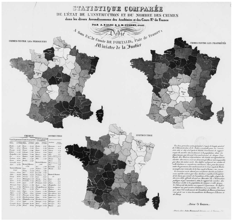
Guerry’s discovery was one of the earliest uses of data and its visual depiction to make social changes and impact the society on a national scale.
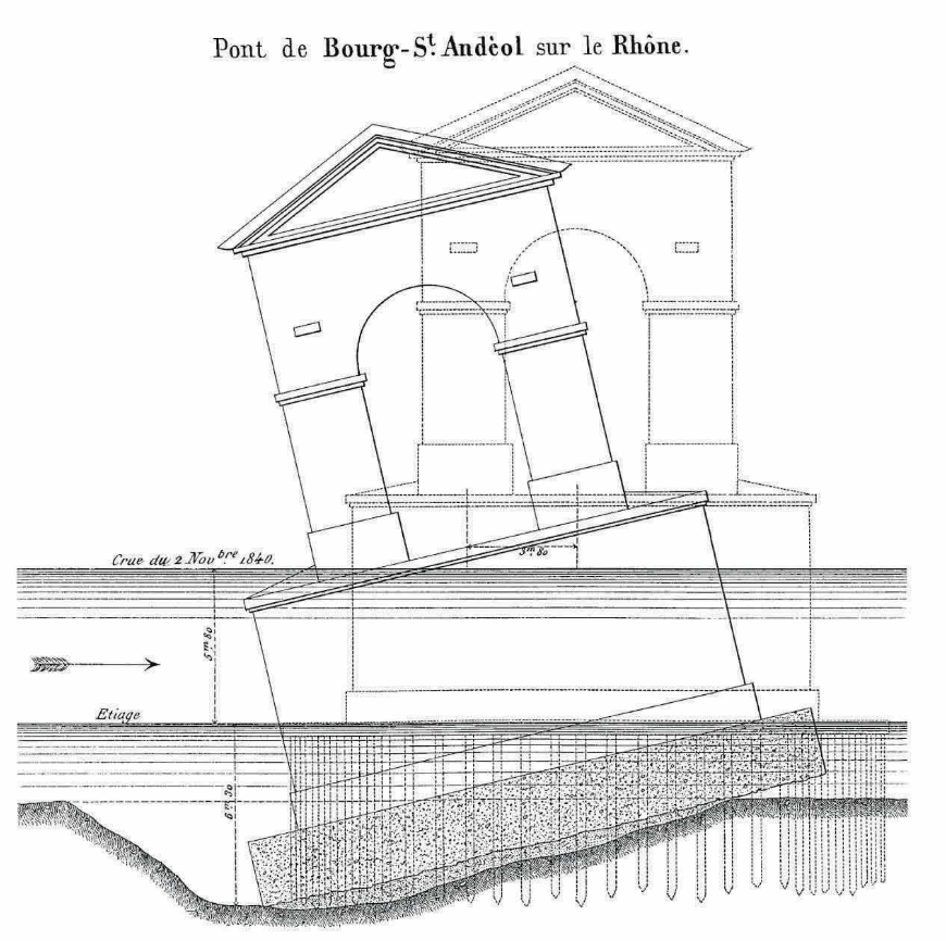
Charles Joseph Minard, an engineer and one of the earliest data visualizers used only one chart to report the investigation of a collapsed bridge:
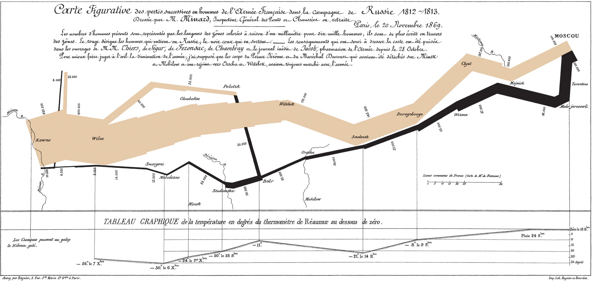
Later, he flexed his dashboard muscle on visualizing the Napoleon’s invasion of Russia and the dynamic of his defeat:
In 1854, doctor John Snow developed a map of London cholera outbreak. It was noted that some areas of the city had a lot more people dying from cholera than other places. The contamination mechanism of cholera was unknown at a time, making it hard to take action against. John Snow took the data in bodily counts of critical areas and put them on the map. He then used different variables to find dependencies. One of them shone through:
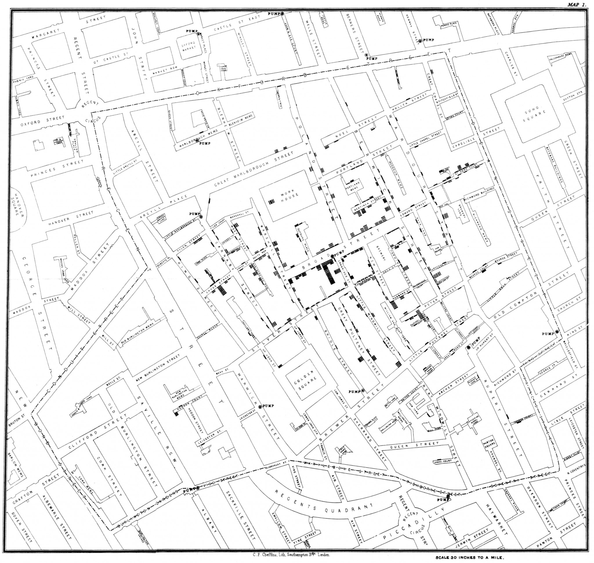
It was the Broad Street public well with a set of pumps around the area that was the main drinking-water source and a source of cholera infection. With no medical proof for this theory, Snow’s assumption repeated results in other cities and managed to anticipate the cure.
The true statistics and data visualization genius came in Émile Cheysson. His 1880s’ graphs showcase all the modern techniques:
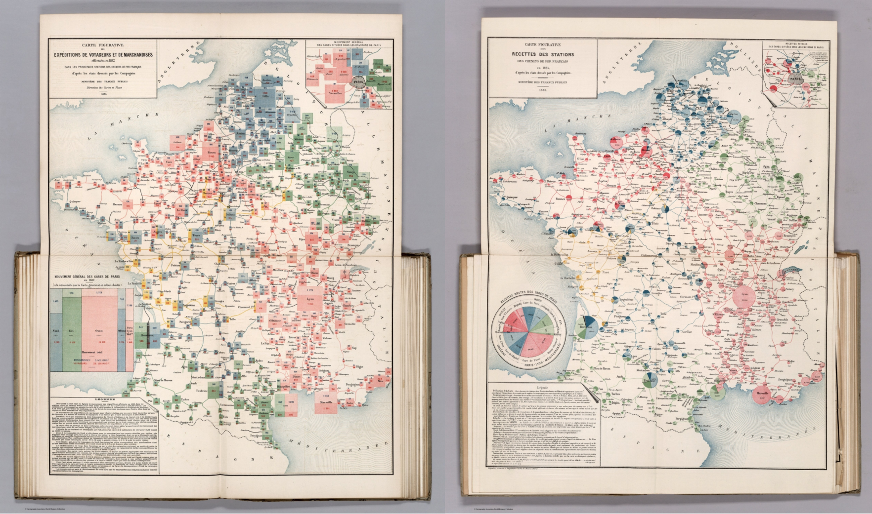
Cheysson developed a wide variety of recursive multi-mosaic maps that those who could appreciate the data science immediately jumped on.
All these historic charts have two gigantic commonalities that modern data designers can learn from:
- They focus on the phenomena, not the numbers. Whether it’s fixing the minds of the criminals or protecting the city from a deadly epidemic, the most impactful charts come from the problem. If we focus on aesthetic and treat dashboards as an art object, they won’t work.
- They are interocular. “A good graph hits you in between the eyes” – Michael Friendly. If you have to explain the graph and it doesn’t speak up at first glance, it is weak and worthless.
The functional art
“Our fantasy self tends to be very visual, whereas our actual experiences are corporeal.” – Yuval Noah Harari, Sapiens: A Brief History of Humankind
For a human, to see means to understand. Not only do we visualize what we want, but we also create our own symbols in line with our inner language, as well as adopt the common symbolism. This mechanism helped us survive as species and also developed our ingenuity.
With time, we faced a new challenge – surviving what Richard Saul Wurman called the “tsunami” of bits of information that was “cresting the horizon”. He also introduced the concept of the “black hole between data and knowledge.” The more knowledge we discover, the wider the gap between what we know and what we think we should know.
Alberto Cairo, a Spanish information designer, professor, and author of The Functional Art: An Introduction to Information Graphics and Visualization uses the term “wisdom” as the final point of the transformation of reality into knowledge:
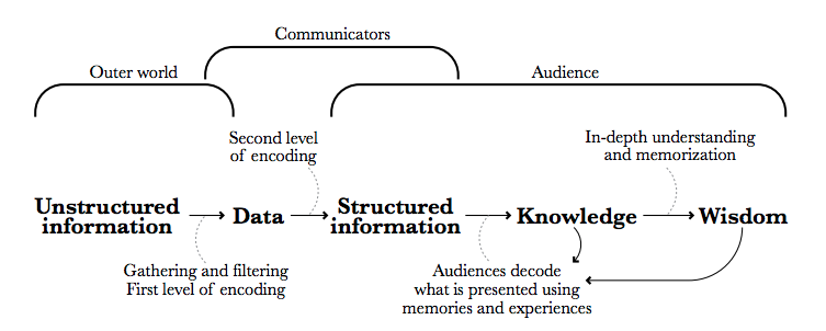
“We reach wisdom when we achieve a deep understanding of acquired knowledge, when we not only “get it,” but when new information blends with prior experience so completely that it makes us better at knowing what to do in other situations, even if they are only loosely related to the information from which our original knowledge came” – Alberto Cairo.
To make this transformation, words are not enough. We have to rely on the effective visuals. What we recognize as effective and functional automatically becomes beautiful as well. This has brought us to a fine line between aesthetic value and actual problem-solving.
On the forefront of the functional and truthful data visualization is a group of designers with science degrees. The principles they follow are as close to those of Guerry, Minard, and Snow. They visualize data to squeeze the signal out of the complicated matters. They are solving problems of human well-being. It is our visual nature that also sees beauty in the graphs they create.
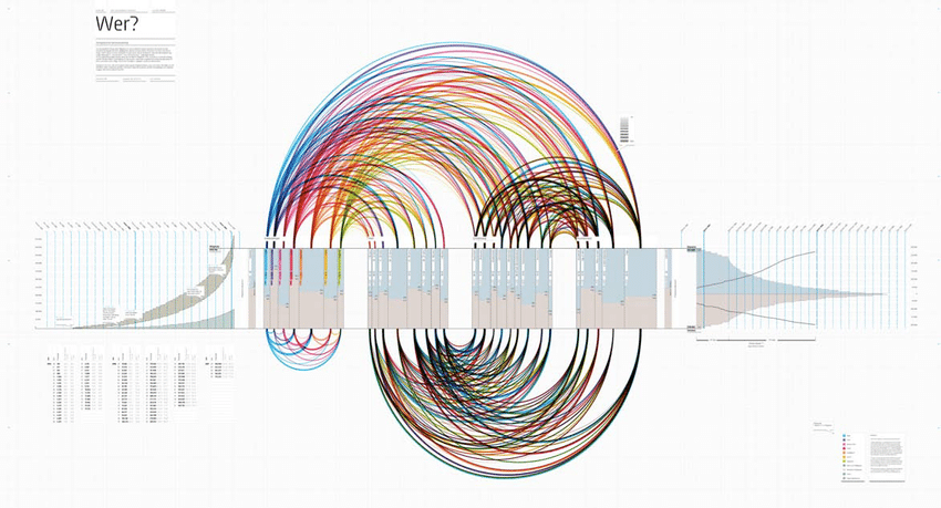
13 years ago Manuel Lima founded VisualComplexity.com, a resource space for anyone interested in the visualization of complex networks. Today, it indexes over 1000 projects depicting the diffusion of information regardless of the industry and the field of knowledge. What Lima managed to create is as fascinating as the discoveries he made about the principles of visualization. Manuel points out these visualization insights:
Nature
Using nature for inspiration to construct visuals of data can bring outstanding results.
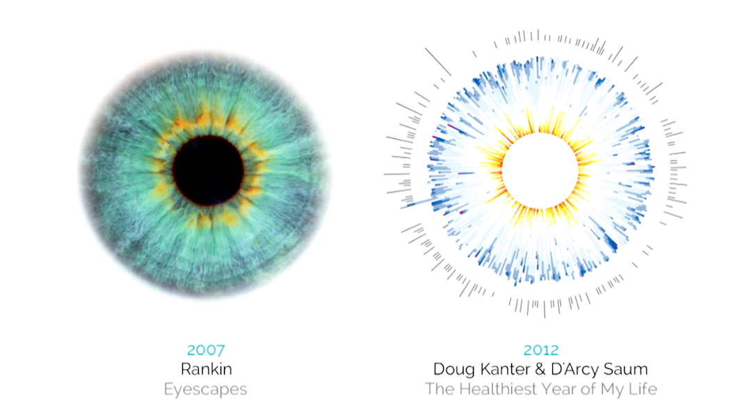
On the left is a human eye. On the right is the circle visualizing a year of human life with healthy levels of blood sugar and insulin.
“All art is but imitation of nature.” – Lucius Annaeus Seneca
Genuine metaphors
Most of the visualization techniques known today are a reinvented wheel. As Lima points out, the forgotten metaphors are on par with those that go back not decades but millenniums.
This is a visual analysis of member profiles of an Internet community, created by Felix Heinen.
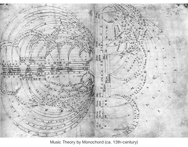
This is a visualization of Music Theory by Monochord. From the 13th century.
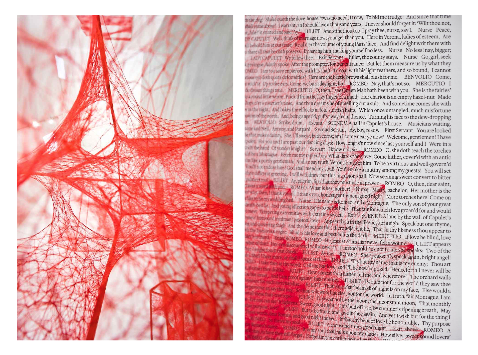
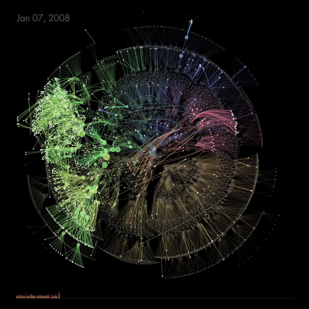
Networkism
We not only find inspiration for data visualization in nature but give it back as an artform. Networkism is an artistic movement deriving from the principles of visualization. Because the connections are so natural, it’s easy to find correlations and understand visualization on a deeper level. On the left is a red thread art installation by Chiharu Shiota and on the right is the Beetroot Design group poster which illustrates the connections between the occurrences of the Romeo and Juliet names in the Shakespeare’s play with 55,440 red lines.
The visual gimmick
Because we are a visual species, we are easily manipulated. When visualization becomes nothing but a tool to draw attention and make an impression, it’s a gimmick. Everyone is used to the complex simplicity of Hollywood UI. This is how to tell a real data visualization from an agenda-driven trumpery according to Alberto Cairo:
Proud stats
When the graph is representing one clear-cut assumption, it is orchestrated. Non-data journalists simplify the information and add validity by putting it in charts. People unfamiliar with the theory of probability get easily misinformed because we are not used to checking the information we get. Data is all around us we are only learning to work with it properly.
One of the ways to fix this is to add explanatory notes to the graph and let the people figure things out on their own.
Shameful falsehood
Words like ‘everyone’, ‘all’, ‘proven’ if not followed by proof are there to falsify truth and trick you into believing a lie. People twist the data and only display a part of it to make up facts confirming their agenda. Visual complexity only adds up to it. The more you are confused, the more you trust confident guidance no matter where it’s from.
Keeping the data back is no different from lying. What’s worse is this can be unintentional and due to the lack of data. For that reason, research is as important as is the visualization itself.
Less public – more honest
A common trap to fall into when dealing with data visualization is a truth bias. When the data confirms our own beliefs, we tend to trust it more. However, we must check not only our own data but also the data we use to confirm or dismiss assumptions. Before quoting something, it’s better to do the math and not quote it if it confirms your falsehood.
Being truthful is bigger than being right.
Ironically, the most truthful data is often the hardest to find.
The dashboard mantra
Behind every visual graph, there is a principle that has to tell. We want the image to express what otherwise can’t be expressed in the same fashion. The core of every dashboard or a chart is the contrived impact. In other words,
Squeeze the signal out of the data.
The least impact comes from pointing out what people are already thinking. It might seem to be a safe choice to use visual data to confirm what people know, but in reality, it’s a waste. As we said, it has to be about the phenomena and the impact it makes on people rather than another angle of the same problem.
1. Ostensiveness
Even though representing data to its fullest makes charts and dashboards look complex, the purpose of the chart has to be obvious within the first five seconds. This might contradict a lot of what’s been said above but bear with me. The first five seconds is what we need to get familiar with a visual piece in front. This is the time to grab their attention and motivate people to study further.
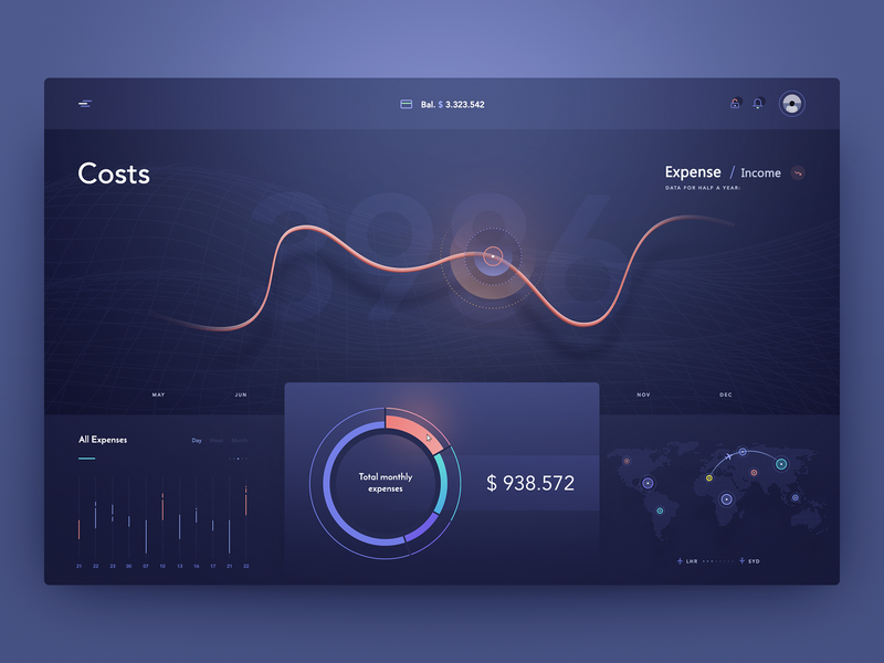
Dashboard by uixNinja
2. The inverted pyramid logic
In order to speak within the first five seconds, the graph has to showcase a strong logic. We’ve spoken about the inverted pyramid model before. It came from journalism where attention scarcity is a real issue.
The first thing to notice has to be the most substantial and bear the most of the information people came for. The second layer is details confirming the first part and adding to the general understanding of it. At the bottom is all the background details taking the problem of the graph to a deeper level of understanding.
Health Tracker by Cuberto
This one screams something is not alright. Shows the graphic with a critical issue, then presents the data to prove that, and then adds the details to complete the picture.
3. Choosing the right type of visualization
The choice of visualization type depends on the type of information to be shown. This is where beginner-level designers studying information visualization mess up. Starting from the looks here is wrong. Depending on the type of impact you are looking to make with your data, you have to consider the specific types of graphs to go with.
Confuse and mislead are the worst two things visualized data can cause apart from the blatant lie serving someone’s interests. The best way to avoid these is to research which type of data visualization works best for your type of data.
Geospatial data
- Choropleth map
- Cartogram
- Dot distribution map
- Dasymetric map
- Contour line
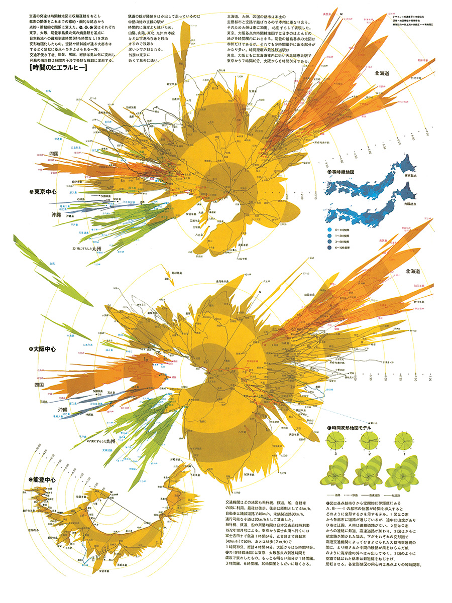
Travel time map by Kohei Sugiura
Temporal data
- Timeline
- Gantt chart
- ThemeRiver
- Pie chart
- Sankey diagram
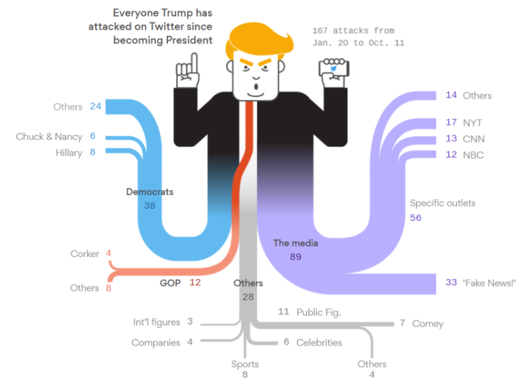
Sankey diagram by datavizblog.com
Multidimensional data
- Histogram
- Tree map
- Scatter plot
- Heat map
- Spider chart
- Marimekko chart
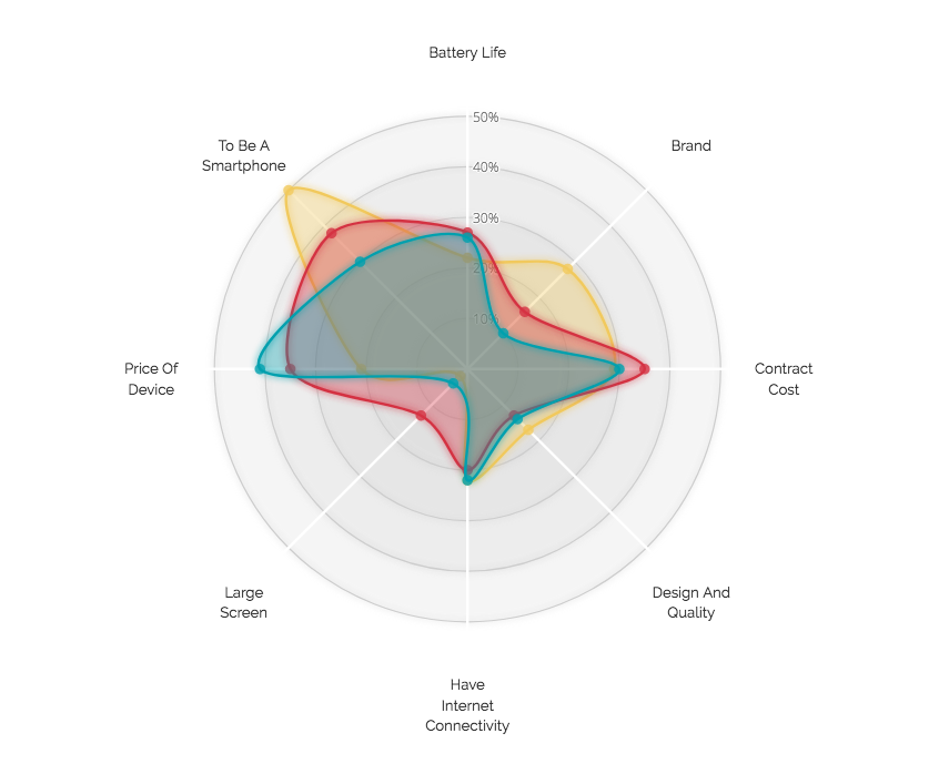
Nadieh Bremer’s Radar Chart Redesign
Hierarchical data
- Dendrogram
- Radial tree
- Hyperbolic tree
- Wedge stack graph
- Icicle chart
OrgOrgChart: The Evolution of an Organization
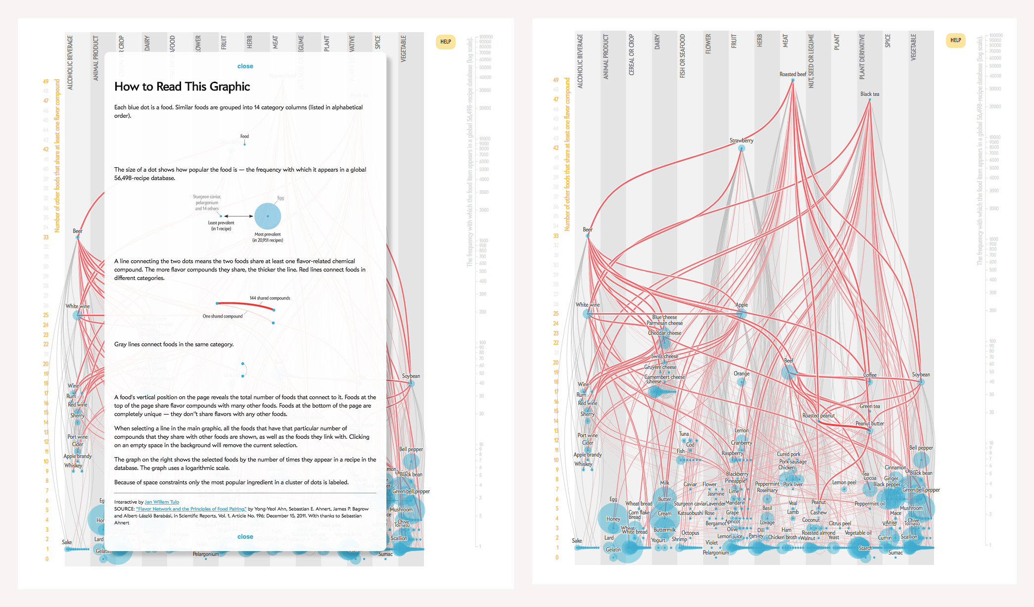
Network data
- Matrix
- Node-link diagram
- Dependency graph
- Alluvial diagram
- Tube map
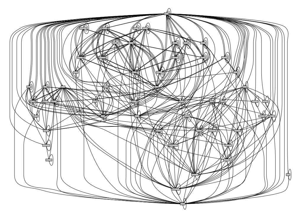
The dependency hell: the runtime dependency graph of Mozilla Firefox
For further exploration, check out the Visual Complexity website and the books by Manuel Lima, Alberto Cairo, and Michael Friendly.
A lot of modern designers get into data visualization in their dashboard designs. Most of them apply the principles of ostensiveness, inverted pyramid logic, and select the appropriate data visualization types for specific data. Some still see dashboards as a purely artistic means.
We believe the power of data is worth trying to combine the two approaches and promote truth and objectivity as well as an aesthetic pleasure.