Etsy online marketplace could have been an average giant online store, but it’s not. Etsy app, website development, and UI features make an experience from the shopping much more captivating.
Close your eyes and imagine Etsy’s website or app. What do you see? No matter you’re a buyer or seller. Burnt orange logo, embarrassment of riches, and lovely illustrated characters accompanying every step.
Contents:
Etsy slogan
And if its UX features are already widespread as lots of developers create sites like Etsy, its design makes it an exceptional marketplace platform. If you’ve ever been inside an Etsy shop, you know what we mean. Let’s uncover the secret to the success of Etsy website illustrations and the underlying logic in this case study.
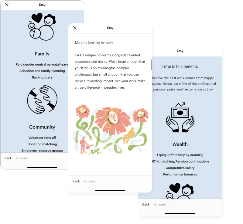
Etsy app illustrations
What is the Etsy e-commerce marketplace in 2021?
We know this online marketplace as the world’s largest flea market – a gigantic virtual bazaar. This is an extraordinary platform for selling hand-crafted goods online. Etsy is absolutely in love with each of its sellers and their creativity, as well as with each of its customers. And this love is spreading everywhere through illustrations they use in web design. Even though Etsy’s product line includes over one million types of goods in 2021, this doesn’t at all prevent the site from maintaining its attitude and transferring this attitude to all participants.
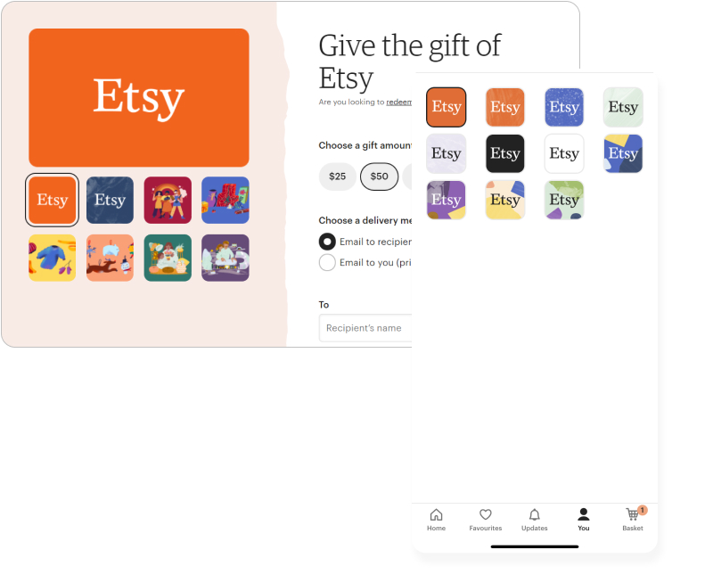
Etsy custom gift card and icon design
“Keep commerce human” — they say.
This is the concept that reflects the worldwide mission and impact of this custom marketplace website. The use of the word “keep” reminds us that all commerce began from a human relationship of trust between the seller and the buyer. And Etsy stands for the centrality of people in commerce. They revive the importance of people in their business model idea. It evokes the feeling of an era when sellers produced the products themselves and sold them to buyers with a few of their souls folded into the goods. This made commerce human back then.
That has changed in the 21st century. Commerce has wildly increased its momentum and turned into a crazy fast click-and-buy monster.
It’s destroying human relations during a transaction. It’s destroying sellers’ and buyers’ personalities. We no longer have the opportunity to meet the seller face to face, and we can only buy from a huge number of retailers. The way Etsy deals with this situation is by creating a platform where the seller and the buyer meet face-to-face and can discuss the product. They can improve it together and can give a lot of positive emotions to each other, creating a pleasant sense of community around commerce.
Why does Etsy use illustrations on its website?
The Etsy online store began in 2005 when a small business called iospace developed and designed it. The company’s founders were Robert Kalin, Chris Maguire, and Haim Schoppik. More people came on board later. Etsy created not only a great website, but two stunning apps for sellers and buyers. And this is an amazing idea for an online marketplace that continues it in seller and buyer customized apps. If you’re planning to create your e-commerce app head to our other article – mobile development costs.
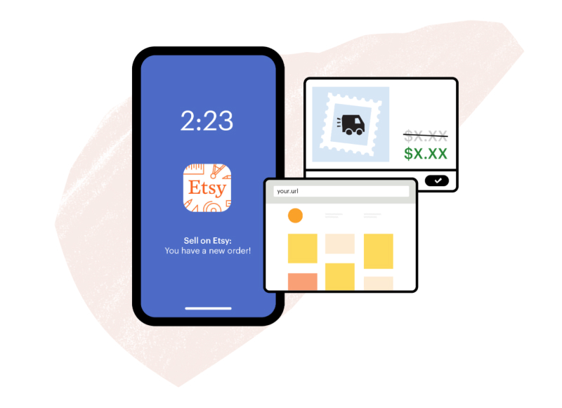
Etsy website illustration
Etsy takes a strong place among other huge marketplaces like eBay or Amazon. Even though it is the only one in the list of top sellers, where you can buy handmade. And now it is a leading online marketplace in the world by Statista.com data:
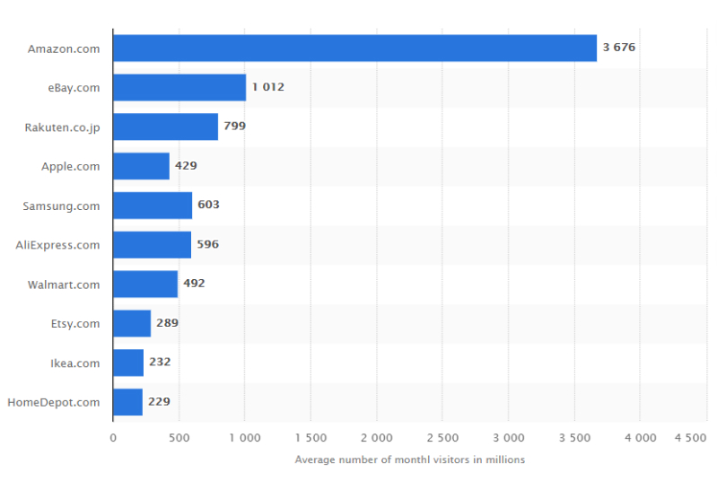
Fastest-growing online marketplaces worldwide from 2019 to 2021
Some categories that are listed on the site include clothing and shoes, home and living, jewelry and accessories, housewares and party supplies, art and collectibles, and vintage and craft supplies. Some products you can buy include photography, clothing, jewelry, furniture, food, beauty products, quilts, craft supplies, and jewelry tools.
Well, the day these entrepreneurs opened their site to the first buyers and sellers, it featured small illustrations already. Of course, a small company did not have many resources to design a website as they imagined it. And in 2006 there was not the worldwide obsession with a design that we see today.
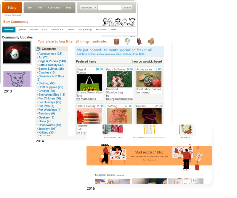
Etsy website look at various times
They tried to invest feelings into every section of their site from the very beginning. We can assume that they knew they were going to attract mostly adult people to sell on Etsy. In the early 2000s, it was not so popular to have a full-time handmade business. So Etsy was mainly engaging people making handmade goods as a side job. Etsy’s creators’ major task was to make the site as clear as possible for adults. They used illustrations for their first and primary purpose: to explain. If you’re going to create a website like Etsy, you need to understand that illustrations need to be helpful at first. They enable people who are not too strong with technology to understand quickly and easily the features that the site offers. And later Etsy illustrations became their corporate style.
How illustrations reveal Etsy’s brand power
Etsy sellers offer something different from mass-produced retail products. And while most marketplace sellers are anonymous, Etsy sellers show their real names and photographs of their shops. So each Esty illustration for website and app conducts its main role for an artisan platform market: to keep commerce human. Here are three key characteristics of Etsy illustrations:
Uniqueness. When you buy from Etsy, you know you’re getting the highest quality and unique handmade items for your home, lifestyle, or look. The platform works in a tight partnership with creators to help them turn their handmade goods into businesses. They work to help their sellers continue to run handmade full-time. They guarantee every listing you see is unique and available for a limited time, so you can find truly one-of-a-kind treasures and discover creative folks who are passionate about what they create. And this is a key factor of using illustrations to reveal its brand power, as hand-drawn things enhance the feel of uniqueness the platform brings. In this website illustrations case for the digital service company, you can see how another company reaches the same goal with the help of illustrations. We can find out how the company’s powerful uniqueness gets transmitted through illustrations.
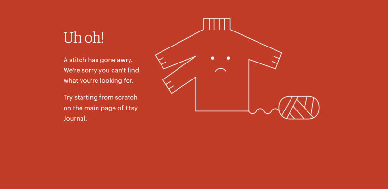
Etsy 404 not found page
Focus on women. The majority of Etsy’s marketplace shops is run by women (the third column):
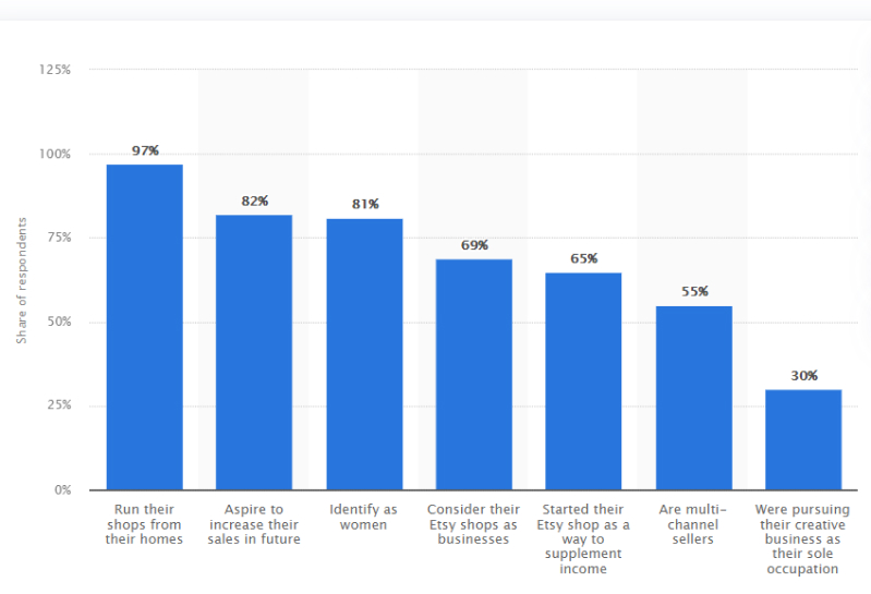
Whether they are selling their finished products or sharing a hobby, they offer an array of creative and affordable goods. Women are the main power of Etsy now. And women love coziness. That’s why Etsy made a bet on designing their marketplaces like a cozy home or local market.
Offline feeling. And of course, Etsy has stepped far beyond the digital space. They have been organizing real physical events for a long time with the participation of their sellers and buyers. It helps and supports local crafters all over the world offline.
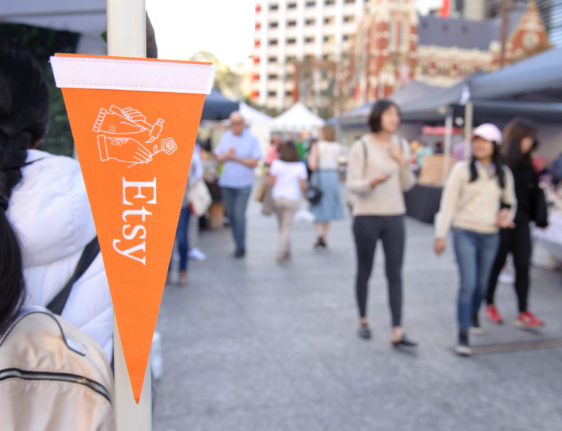
Etsy offline craft market
They arrange and conduct workshops for local artists. They even provide small loans. And illustrations on the website call up a feeling of an offline craft market where every piece is made with love and attention.
What makes this site different from hundreds of other handmade marketplaces? It has its unique style that is identified through Etsy’s branding power. On this site, you can find tons of unique amazing products crafted by people without machine labor. Thanks to the illustrations, the site has an amazing charisma and character, which manifests itself in every detail.
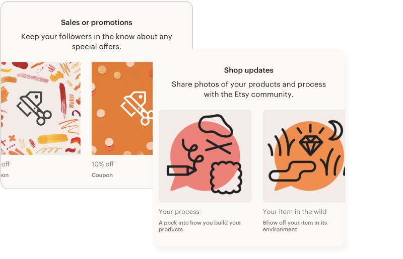
Etsy seller app illustrations
Plus, illustrations are a key to successful marketing. Drawn pieces prevent people’s “banner blindness” and get into the memory of the viewer fast. Illustrations accompany the user from the moment of registration to the last step of the purchase. They seem to accompany and help the user to navigate, creating the feeling of real human-like help.
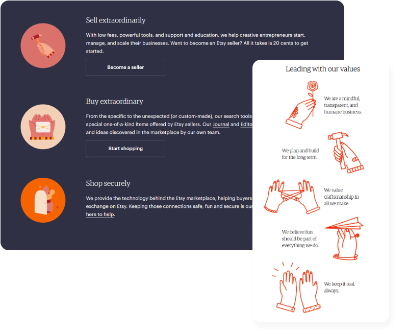
Etsy website and app illustrations
Somewhere these characters explain the rules on the site, elsewhere these heroes report if the payment was unsuccessful. At some points, these heroes report the success of an operation or its next step.
There’s no life without human participation, they say. And this is the truth that Etsy embodies in its “keep commerce human” ethos.
Etsy website illustrations close up: styles they use
The first type of illustration that is probably the most memorable and the most loved among all the others is the characters of Etsy.
And these characters are just people. Without any superpowers or fantastic features. They are simply people, like you and me. They are slightly naive, slightly ridiculous, but charming. Each of them has its character. Etsy doesn’t show perfect people from glossy magazines, social media, fashion shows, or red carpet in their illustrations. They show ordinary real people who are not ideal, each with their problems and beliefs, but still passionate and fascinated by their unique businesses and communities around them. Very little attention is paid to their figures, clothing, and other details that could be drawn more accurately. The focus is on their pose, emotions, and actions that make up a large part of the lifestyle on this site.
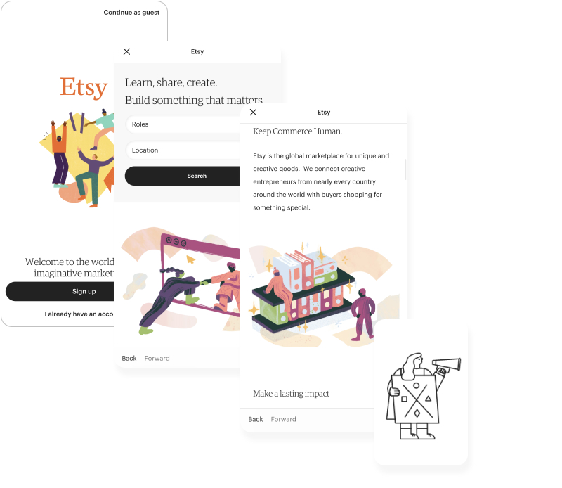
The second popular illustration style is the classic explanatory drawings created to guide the user through the website. These illustrations are like road signs pointing in the right direction. Most often, website designers buy such illustrations on stocks and you see the same ones repeated on various sites. Designers pay little attention to their uniqueness. Etsy’s illustrations are customized specifically for the branding of the entire site.
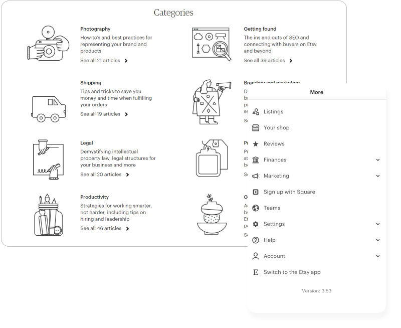
The third type of illustration the website uses is background illustrations. They set the general mood of the store and allow the buyer and seller to feel at home here. They even give a feeling of physical presence. Cute style without many details shows intermediate stages of handmade work.
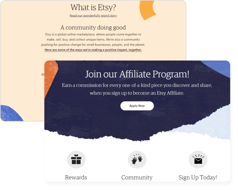
Etsy’s illustrations change through the years
The Etsy community focused on local, handmade products from the very beginning. Therefore, initially, the creators approached the development and design of the site with great love and attention to detail. And look how this approach succeeded. The URL creation that means both website users amount and their activity is enormous from the moment of Etsy launch:
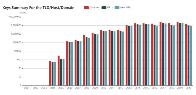
They have been using the illustrations prominently as the design technology allows now. That’s why the users were surrounded by the love of the site’s creators. Illustrations made them feel like the site was created especially for them and to feel relaxed and cozy.
We can see the active use of illustrations from the very beginning of the site. It was not because of trends. Etsy uses illustrations natively, absolutely naturally, and this is one of the best examples of how illustrations are part of the context and not just an imposed trend.
How to win hearts with website and app illustrations
So why do users love illustrations on the Etsy website and application?
The key and most important task for any business is not only to attract new clients. But their hearts, and make them keep coming back again. And we can achieve all of that with the help of illustrations.
Thanks to these drawings, the site remains fresh and cozy, helping people to express themselves.
As a team that creates customized illustrations for any online business, we can feel what role illustrations fulfill. We’ve made hundreds of graphics in the same style that Etsy uses. Read how we made illustrations for a German medical school to create an appropriate atmosphere on the website, or take a look at this one, for instance:
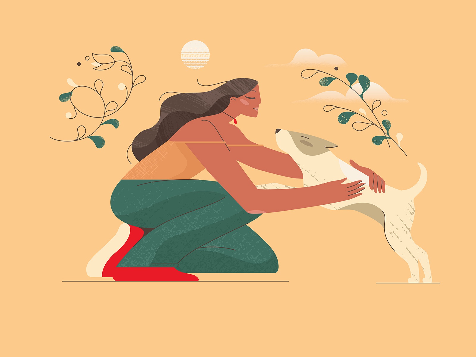
So Etsy is using the illustration power to its fullest. And illustrations are one of the best branding tools for e-commerce. Creating an impression with them is difficult, but an Etsy team has mastered this art.
It is one of the most inspiring examples of using illustration in business! They implement illustrations in their company strategy to increase the turnover by gaining the trust and respect of the audience. They planted the image of the brand in the hearts of users forever.
Get inspired to create illustrations for a successful business website
Design influences the success of a platform. Just imagine how the Etsy story could have been different: What if they made their website on a super-high technological level, making it super convenient to use, but forgot to put a spoonful of the soul into it? What makes Etsy the coolest handmade online selling platform?
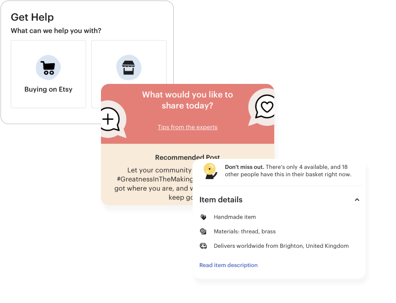
Explanatory Etsy illustrations
They transmit the soul through design. To know more about costs to design a website to win people’s hearts head to our other blog article. If you’re ready to fill up your website with illustrations that your potential clients will love and remember, then contact us – we can help.
