Design itself is a persuasive technique. So there should be no surprise when some of us go over the board with the intensity of persuasion we are ready to throw at people. Dark patterns are just an implication of the reality of the design job. Dark patterns are a shame but they are there for a reason. To get rid of dark UX, we need to eradicate that reason first.
We’ll go through the most notable types of dark patterns, break them down and take a look at the ways ethical design principles guard us against a total dark pattern bacchanalia.
Contents:
Value-based design frameworks
Design frameworks define the direction the whole schools of design take when creating products. Since design is a highly-emotive practice, it deals with ethics on a level deeper than production. Ethical design frameworks bridge the gap between the need and the want. One of these fundamental frameworks is called Value-Sensitive Design (VSD) which according to Batya Friedman is “a theoretically grounded approach to the design of technology that accounts for human values in a principled and comprehensive manner throughout the design process”.
The problem is when you think about values and decide to design a product based on those, which values do you apply? Your personal? Societal? Christian? VSD looks good on paper but is empty in terms of real practice.
Another value-based design framework is called Values at Play and it’s a step further in VSD because it’s about identifying values of a specific project before it starts. This approach puts values within margins of a specific context. For example, careful attitude towards the environment in a video game. This set of values puts ecological constraints on the design which have to result in minimal plastic reference and maximum sustainability.
A bigger shot at value-based design was taken by Katie Shilton in what she called Value Layers – a means of connecting different value-related insights with design action. In a nutshell, this framework challenges the static and formalized value systems and works with the specific data reflecting values and employing it in design.
Seven persuasive design techniques
The lack of dynamic changes and impact of value-sensitive design lead to the new phenomenon – Persuasive Design which means if there is no way to tune in for the values, we can create them. In this case, the product gets to influence the way it will be perceived by a user.
All of a sudden the value-dictated boundaries that design was supposed to follow get diluted and distorted.
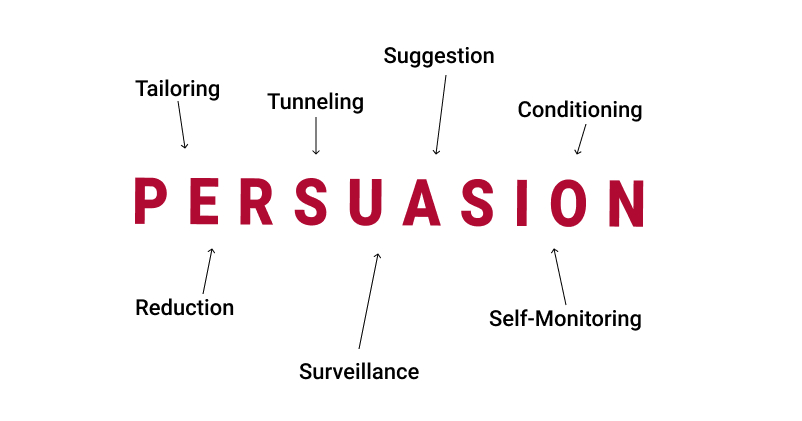
Persuasive design brings to the forefront the role of motivation and intent behind the product. If it’s the profit, the values can be tailored to fit that objective. In other words, a product can shape the way people see it by using seven persuasive design techniques:

Tailoring visual information through design is a way to highlight the points that lead to persuasion.
Tunneling is a way of capturing an idea and using design to blur the variables around it.
Suggestion helps introduce new points without forcing them which helps avoid rejection.
Conditioning is a way to twist and bend the design context in favor of a specific feature.
Reduction helps get rid of unnecessary or undesirable details.
Surveillance on the brink of privacy violation is a scary and disturbingly easy way of collecting data and using it for persuasion on multiple levels.
Self-Monitoring is perhaps the most genuine persuasive technique based on empathy.
All of these techniques are predominantly dark and extremely powerful. All of them have cheaper versions and mostly, those are the ones we are likely to meet in UI/UX design of our everyday products. Those cheaper shallow versions of persuasive design techniques are the ones we call Dark Patterns.
Types of dark patterns
The term belongs to a cognitive scientist Harry Brignull who in 2010 defined dark patterns as the interface features that has been carefully crafted with a solid understanding of human psychology, but without user’s interests in mind.
In a broader sense, dark patterns serve business interests and neglect the way users feel about it. Dark patterns are not arrogant but because they are a design product, they are clever and disguised behind good intention. With that said, they have nothing to do with the genuine value-based design and that’s how they get exposed. The biggest adversary of dark patterns is honest and caring UX design which has ethics in its core.
But let’s leave users alone for a second. In 2019, most of them have a pretty decent bullshit-meter already. The real danger of the dark side UX mindset is it can permeate a designer’s mind without them even knowing.
For a designer, the biggest danger of dark patterns is becoming contaminated with them and reusing them in own work.
Some of the dark patterns below are almost becoming a norm and that’s another evidence that values change and stretch.
The Bait-and-Switch
This is when the UI promises you one thing but after you take cation, something different happens instead. It includes placing elements in a counter-intuitive way, clickbait, and misleading links to the pages you were not going to visit.

The Hidden Cost
The additional costs have existed long before the hidden ones. They are not the same. You might want to pay a little extra for something extra. But when a product is worthless without these additional costs, it’s a different shade of darkness.
For example, the declared price for a camera is $99.99 (which itself is a dark pattern). You add it to cart and proceed to checkout. Then a pop-up pops up and says you only added the body and you also need a lens. And a battery. And a cable. Oh, and a memory card. Altogether it makes $249.99. What does this number have to do with the initial declared price?
The worst part is people are getting used to this shitshow and so are the designers. A milder version of this turned into from $99.99. From what to what? Is $99.99 the minimal working option? This is a flaccid dark pattern which is even worse. If you’re going to do it, at least be bold.
The Roach Motel
This one is big. When the opt-in button is a fat one but the opt-out option is hidden deep in the recess of the interface. When the service never asks you if you are sure you want to enter/browse/stay/pay but will ask you twice if you want to leave.
For example, when you install a program on a PC, it will ask for your permission to do everything – create a desktop shortcut, or add an icon to the quick access panel, update DirectX, and make changes in your FAT32 file system. But it will only add a 5pt checkbox (already checked by default) that will also install a partner software or a browser extension that you won’t be able to uninstall unless clean out the Registry.
Subtle roach motel is when a designer loves one element more than the equal other while there are no objective reasons for that.
The Covert Ad
This is when you think you are seeing a piece of website content but it’s a banner. As you are reading through a page illustrated with some artworks or infographics and click to enlarge but a new browser tab opens in the back redirecting you to a place you’d never go.
For example, there is a sports website I go to to read some TMZ-like gossip but always end up on their store page where they are selling instructional videos from athletes. Not that I would never buy but don’t make me click on banners while in the middle of an article.
The Guilt Tripper
This is when you make up your mind to do something but the website starts nagging or shaming you for that. Most people have developed a thick skin for that but there are vulnerable categories of users like the elderly or kids.
There’s a website and someone thought it would be a good idea to use their mascot as your website companion which is cool but that same mascot will turn into a snappy condescending dude once you decide to reject the newsletter or cancel a subscription, or just block notifications. “No, I don’t want a discount and I hate cats” is what they make you click.
In some cases, guilt might be a motivator but you need to have strong evidence that it is fair. When you are shaming people with single-use plastic pollution, you are likely to be right, we are all using it and it’s a shame. But designers should never consider their product a necessity.
The Golden Snitch
This is kind of new. It creates the urge to buy because a website might run out of product in stock or it creates a false sense of missing out. But it does it in a sneaky and harmless way by being just an impartial mediator.
For example, you are browsing products and in the bottom left corner a notification pops up – “George from NY just bought a pack” or “Mindy from GA just purchased this, this, and this”. All of a sudden you know there are people on the same website buying stuff.
But there is no way you can check if this is really happening. Might be true. Might be the slightly exaggerated truth. This state of limbo is a dark pattern. However, this is a step further from the down counter or another lie.
The Zuck
Privacy Zuckering is named after Mark Zuckerberg and the famous facebook data brokage. Once facebook tricked people into giving out their personal information in order to connect with other people, that data became a commodity. Despite facebook’s attempt to fix the bad rep, this dark pattern got quickly picked up by smaller services.
For example, you visit an online foreign language school website, look through their thing and leave. Two days later you AND your friends start getting calls from that language school while you did not leave any numbers. When asked, they say the number was given by their information partner. Who that partner is they won’t tell. Could be the pizza place you ordered at and left feedback via facebook or yelp.
This is pretty dark. If someone can get your details for business, the other can for their personal matter. That casts a shadow over design in general where you might genuinely need the data for the users’ own good. Now we have to learn to present that ‘good’ before the action is even taken.
Five dark pattern principles
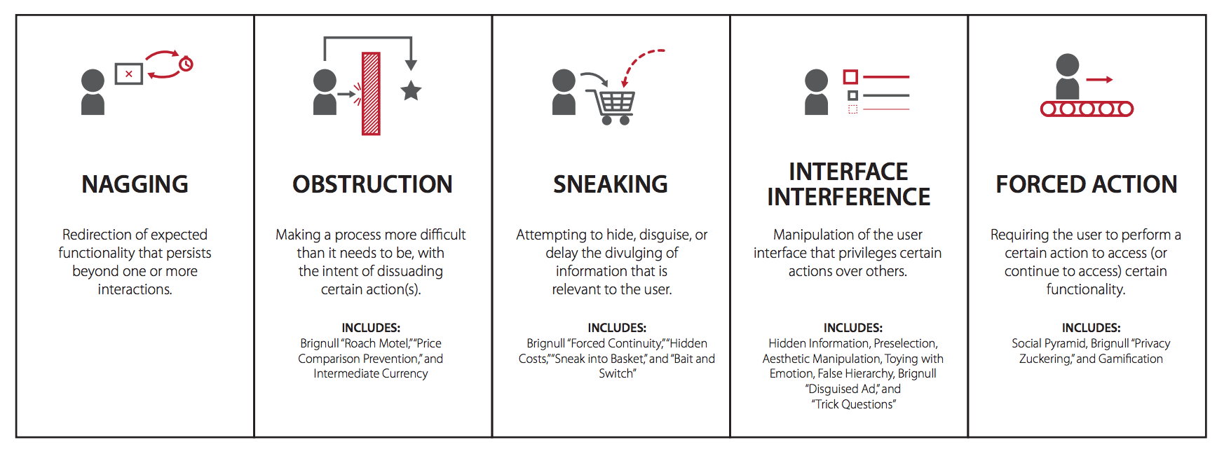
The dark pattern research done at Purdue University draws out five unethical design strategies that cover all the existing dark patterns. They are nagging, obstruction, sneaking, interface interference, and forced action.

All of them use some sort of manipulation to trick a user into action. The specter of tools is immense. You can start by toying with emotion and finish by taking advantage of someone’s insecurities and disabilities.
Dark pattern design is persiasive design on steroids.
Some people call it Asshole Design and you can’t blame them. For some reason, everybody understands what asshole design is while there are no specific rules defining it. We just know. Perhaps, value-sensitive design went a little overboard trying to put a label on each value instead of just accepting them as an axiom.
The term ethics covers a lot of notions and none in particular. It relies on common sense and our genetically conditioned perception of justice and what’s right.
UX design ethics
Design is not a solitary endeavor, it’s an entanglement of business pressures, prioritizing profit over social value, UX principles putting user needs first, and neoliberal values politicizing every design decision made. All of these shape what is called design responsibilities.
First, time is a factor in design as our perception of things changes proportionately to the depth of our knowledge. What might seem like a dark pattern today was just a witty joke yesterday. Hanlon’s Razor demonstrates this by urging to “never attribute to malice that which is adequately explained by stupidity”. It’s a design responsibility to follow the zeitgeist of the time it exists in.
Second, since design is a personal practice, it has to translate humane values and deliver a certain character. An average person has their philosophical beliefs and a code of ethics of a healthy member of society. In that regard, a design responsibility is to introduce more details about the complexity and the impact of design actions.
Last but not least, a design responsibility is to educate the general public and business owners about the principles and consequences of design decisions. After all, the maker culture is based on products and the people making them, not the intent behind it, as the value will ultimately shine through in its true colors.
Ethical persuasion
Persuasion is defined as pleading and urging. Persuasion is based on intent. In contrast, convincing is based on empathy. To persuade a person means to make them accept your point. To convince means to give them insights which benefit them.
Manipulation stems from persuasion while convincing produces cognitive elaboration.
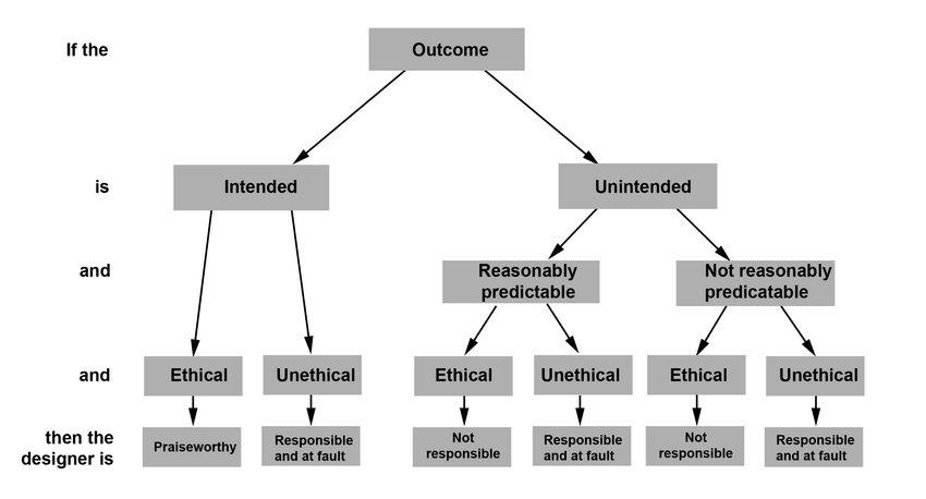
The golden rule of persuasion formulated by Berdichevsky & Neuenschwander makes the conceptually and ethically important distinction between designer motivations, methods, and outcomes of technological persuasion. It introduces the central role of the outcome in every design intent.

The ethical evaluation of a design’s persuasive technique depends on asking questions on three levels, whether the outcome was:
- Intended or not
- Reasonably predictable or not
- Ethical or unethical
If all the three are yes, the design will result in a positive outcome. The more you move towards the targeted outcome, the more honest and ethical are the techniques you use. To avoid being contaminated by dark patterns, designers could follow this principle among many others.
