
Typography is what connects people to designers and writers. It is in between users and products. It transfers the information but also drives aesthetic. Typography is a wrap of a word and as much as it can emphasize certain meaning, it can also confuse the hell out of a reader. Mastering typography is impossible without some design knowledge. And typesetting is fatuous unless representing a worthwhile meaning.
We’ll go through some of the practical points a writer might utilize to make an expressive and clear copy and some writing bits that might help a designer take full advantage of a good type.
First, we have to get the nomenclature out of the way. A typeface is a family of symbols for the alphabet. They are designed in one style but vary in weight. A font is a typeface family member. They are set in weight and other specific parameters.
Contents:
Expressive & functional type
Expressive typography is an art form that values the visual characteristics of a font more than legibility. Technically, expressive typography shouldn’t be called font as it’s not the same throughout various media.
An expressive type is perceived as an image and unveils its meaning in a combination of the word semantics and the artistic value.
The art of typography uses the hereditary letter elements like shapes and visual elements of graphic design. Because of that, there is an infinite number of artistic typography styles and techniques. It’s about exploring letter elements, combining and arranging them in a way that serves an artistic purpose.
To create expressive typography, illustrators can utilize several methods like:
- enduing a typeface with certain traits to support a concept or attitude.
- using type as shapes or background images.
- using artistic exaggeration and stylization of certain elements of the type.
- illustrating the idea with a mixed metaphor, synecdoche, personification, and so on.
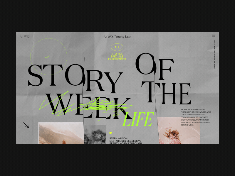
A+WQ/ Young Lab Page Story Of The Week Alternative Version by Zhenya Rynzhuk
Expressive typography is a massive design discipline that has to follow design principles but to be more than just a decoration, it has to maintain a meaningful aspect to justify its significance.
The goal of functional typography is more about whether the message is delivered than how it’s done.
Functional type is a legible one. It cares about the meaning and the action it provokes. Being an information transport, functional typography also exists in a designed environment, so depending on the design knowledge, writers use typography to attribute some of their ideas. Sometimes wrongfully.
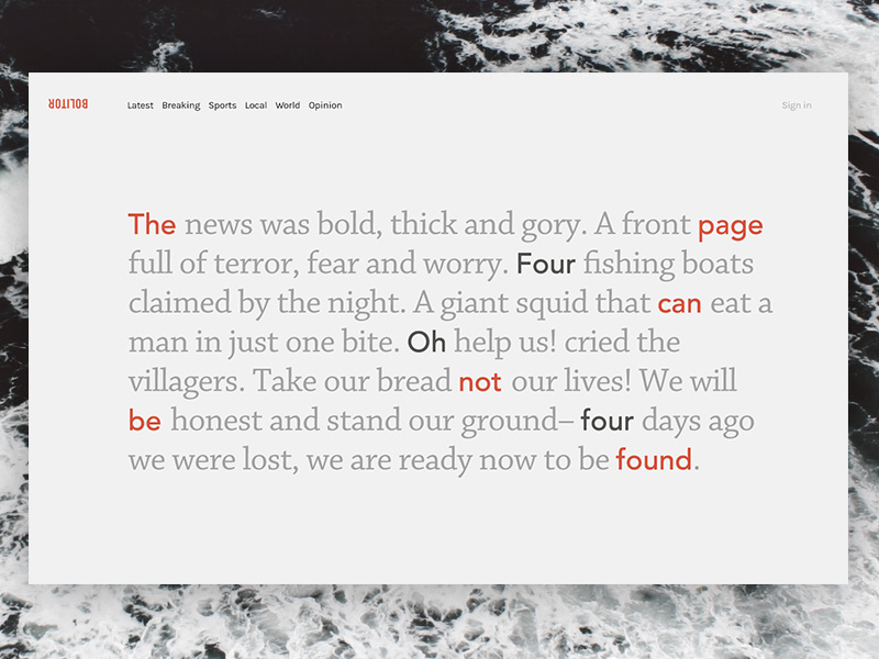
That’s why writers should be educated about typography to make sometimes unobvious edits but for the greater good. Same way, designers need to be good with the words enough to tell MASSAGE THERAPIST from MASSAGE THE RAPIST and MEGAFLICKS FROM MEGAFUCKS. Now, these are anecdotal but the problem is out there.
Daily UI #008 404 Page by Richard Smith
Typographic alignment
A writer should be able to design their writing. No one knows better which parts of a sentence should never be broken or when it’s better to maintain indentation. To understand how the reader goes through a text, we should know people’s reading habits.
In most European languages, words are written left-to-right and so the text is aligned “flush left” with the right-hand side “ragged”. Arabic and Hebrew have words written right-to-left, so the body of text is aligned right. To make specific parts of the text like titles, quotes, and subscripts stand out, we can use the opposing alignments and centered text.
As the language of the internet is English and most people feel comfortable finding the top-left edge of the text as a starting point, a common rule for typography on the web is:
Flush left, rag right, don’t indent the first paragraph, don’t justify.
Feels weird centering this sentence but that’s what you do to make a middle piece stand out and have a visual anchor that won’t be skipped when skimming.
Typeface selection
A copy may feature several semantic blocks urging us to use different typefaces to highlight the contrast. However, a set of even two typefaces used in one text requires a writer’s understanding of the fonts and how they play together.
There are several basic typeface categories drawing a visual distinction between the fonts. Goggle’s classification is quite clear: Serif, Sans Serif, Display, Writing, and Monospace. Each of these categories has a bunch of specific typefaces and typeface families. A safer choice for a writer would be:
Use one typeface family and avoid using two typefaces of the same category.
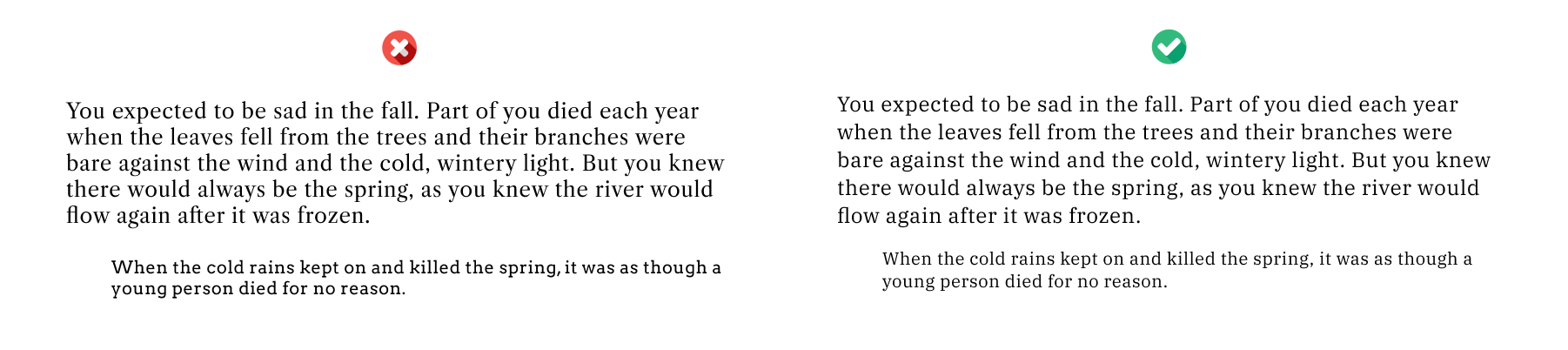
For example, below is the Serif text in three typefaces. The one on the left is Libre Caslon Text with an Arvo subscript, which are not complementary to each other. They break the paragraph and separate the semantics into two chunks, seemingly unrelated or with an incorrect hierarchy. The one on the right is IBM Plex Serif for both parts with a circumstantiation given in a smaller size. This keeps the paragraph connected and has the right kind of contrast to maintain the intended hierarchy.
Same with the Sans Serif typefaces: Monserrat and Work Sans on the left and Quicksand on the right.
There is a wide variety of font families available, however, it’s important for a writer to create or adopt a system of using different typefaces in order not to get buried under a mass of faces of a family like The Guardian.
Font weight & type size
We need a different thickness of the font to showcase the contrasting ideas, make emphasis, and give a text or a paragraph a definitive name. Regardless of the intensity of the headings, we should use contrasting weights.
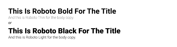
The contrasting set types are the clearest in terms of a hierarchy you are creating. They can emphasize certain parts of a copy and it’s a powerful tool to use when structuring the copy. Make sure you deliver that thought to a designer if someone else arranges your copy on a page.
Go with contrasting weights of one type to highlight the copy structure.
Depending on the aspects of the copy, you might require a more dramatic set of headings to illustrate an effect. According to Chris Do, a good rule of thumb is to double or half the type size.
If you are using 12 pt. type for the body, use 24 pt. type for the second-level heading and consequently bigger for the first-level heading.
Use 2x type size for a heading, 3x for a heading’s heading, and 4x for something even more dramatic.
Ideally, you want a copy to give a reader something like this right of the bat:
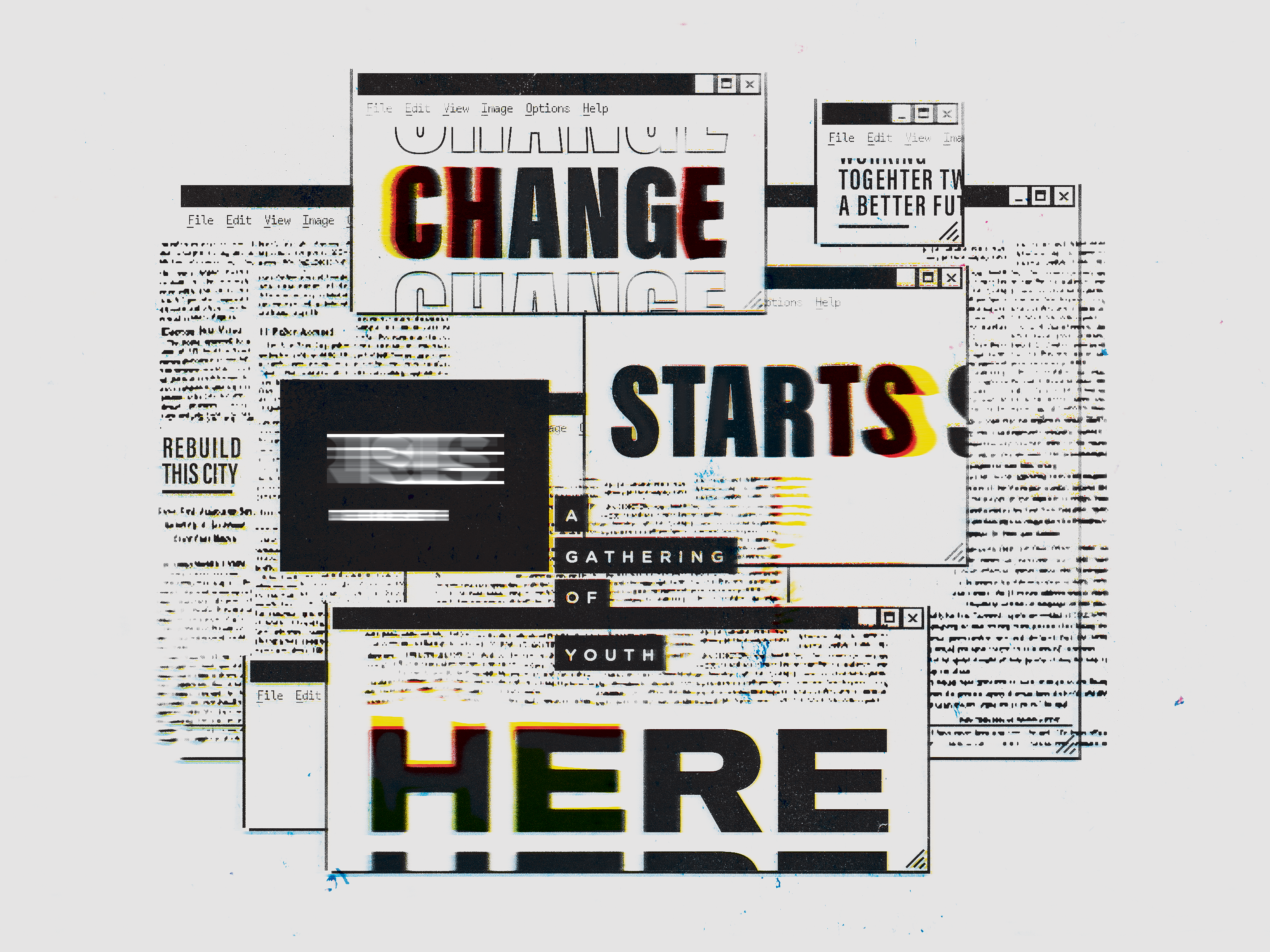
Change Starts Here by VISU∆L jams
Type alignment & distribution
As a writer, you have to able to handle your text regardless of the toolset. Design tools like Figma and professional typesetting tools like Adobe InDesign need you to understand alignment. Designers use grids and vertical and horizontal axes to build the type along.
For vertical axis, use the left-edge alignment and for horizontal axis, align type on the baseline, not cap height or x-height.
This will help avoid problems with page design and alignment with artworks and further CSS hassle.
Murphy’s Law at play by Akshar Pathak
Also, you can use rules and lines to align related pieces of information even if they come in different shapes like a factoid bold number and a subscript.

Typefaces to use in 2020
Might be biased but here’s a set of design-tested and battle-proven typefaces:
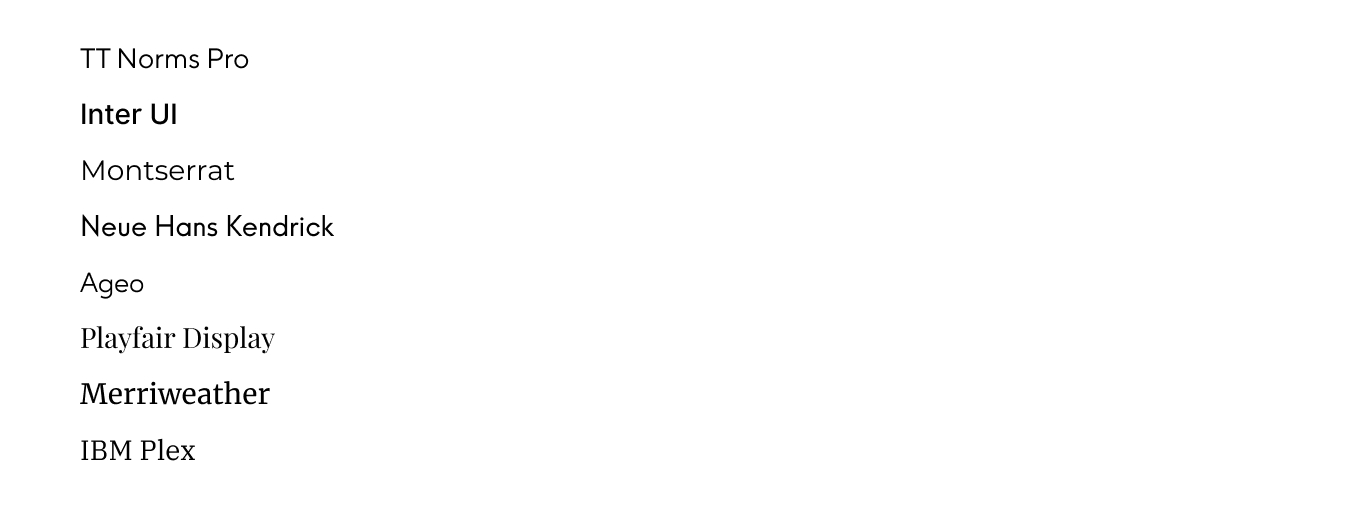
These are a safe choice for UI-based writing and a designer won’t be pissed with your choice if you go with one of these.
Negative space
A writer might feel tempted to place as much text on a page or in a box as possible. This results in text getting squeezed close to the corners. Unless text is a design element that gets intentionally scaled and cropped, we should avoid placing it along the edges and corners of a page.
The white space surrounding the text is called negative space and it allows text to stand out better.
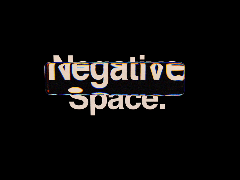
Negative Space. by MadeByStudioJQ
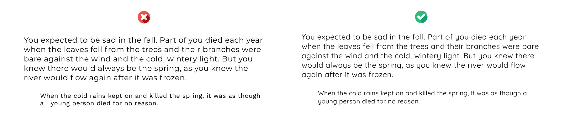
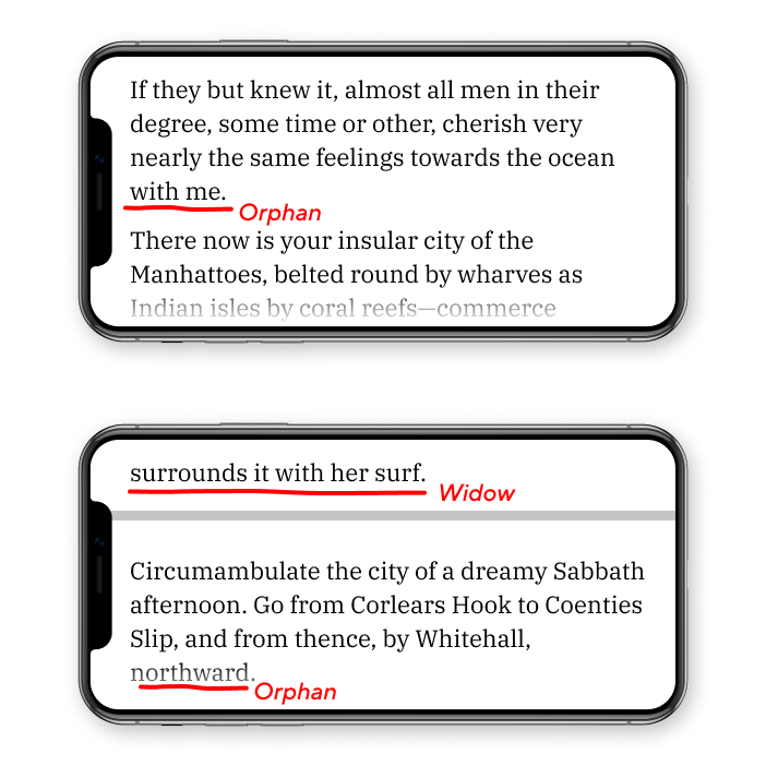
No widows & orphans
A writer can be protective over their text spacing because of the meaning and the effect of the copy. But a designer might force justification because the text needs to be a part of a bigger design. Sometimes the text will be bent and twisted or turned into a shape. It’s a writer’s job to defend the text from these kinds of fuckery.
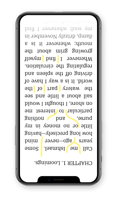
Coincidental alignment of words in a line may result in what they call “rivers of white”, which are basically gaps that don’t belong there. To identify a river, turn the page upside down and check out the patterns for irrational blank spots.
What justification does is leave out single words on the last line of a paragraph – “widows” or a set of words on the last line of a paragraph that is situated at the start of a column or on a different page to the rest of the paragraph – “orphans”.
Both are a no-no from a typography design point of view and can be fixed in several ways like:
- Manual line breaks. This is a visual method of fixing the paragraph by going through the lines and removing breaks by hitting alt + space or shift + return. Doesn’t work with lengthy texts so make sure you are breaking lines as they go.
- Letter spacing. In some cases, when the typeface is settled and a text box is defined, you can play with letter spacing or tracking. Keep within the range of -25 to +25 depending on the font. Make sure the paragraphs don’t look different from those on other pages.
- Word spacing. Some fonts have condensed letter spacing so you can only reduce or increase the spacing between the words within the paragraph. There should be no extremes and only minor adjustments are acceptable.
Avoid rivers of white, unintentional text edge shapes, widows, and orphans. Place line breaks strategically.
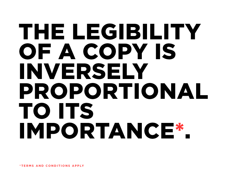
Lastly
There’s a famous statement that 95% of web design is typography. That was in 2006. The pre-iPhone era. Pre-animation and pre-everything we are used to today. However, what Oliver Reichenstein has said about typography, still rings truth:
“A printed work which cannot be read becomes a product without purpose.” Same applies to the digital type. If it can’t be read on any given device, it’s useless. A writer is the main advocate of the text, so make sure you have a say in text design and production.
“Choosing a typeface is not typography”. Typography is more than just picking the available fonts. It’s about finding and tuning the specific fonts to satisfy the purpose of writing.
“Treat text as a user interface”. I take time arranging my draft docs, set the spacing, observe the contrast in headings and the body but then I ship it and it gets totally destroyed by a web layout. Make sure you know what you are writing for and take into account their limitations and features.
“Typography in practice is not choosing fonts or making fonts, it’s about shaping text for optimal user experience.”
For a lot of writers, the ability to design their own text is beyond reach. It’s just too much work already to learn how to write to add design skills as well. Mastering typography is kind of an in-between practice any writer can get into to extend their skill set.