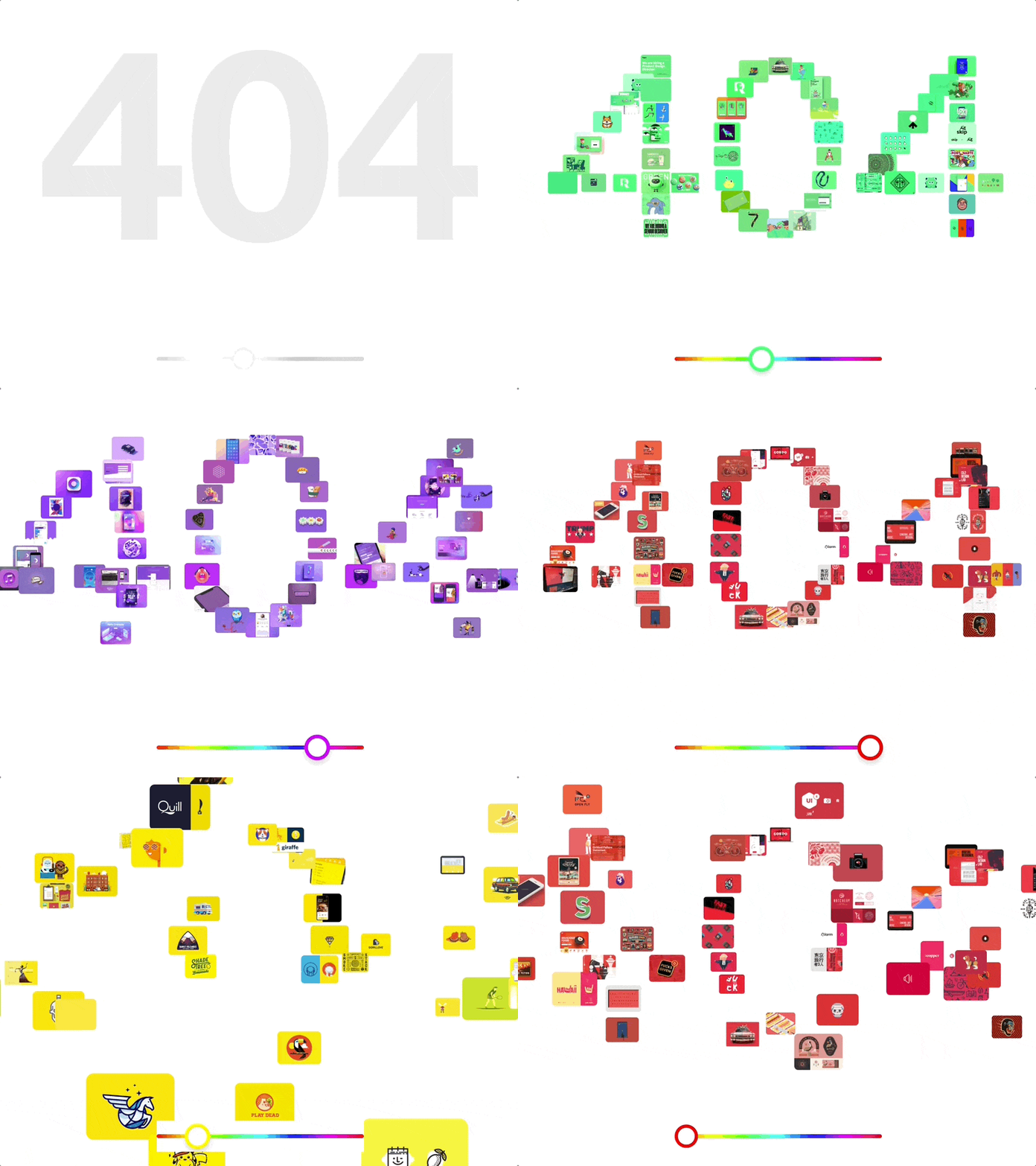
What’s an error page for you? A reason for feeling confused and annoyed? A bit of a bother? Nothing at all? Having users stumbling upon a 404 page is equally frustrating for the site owners. However, there can be a 404 page design for a business to capitalize on.
You have the power to choose what it would feel like for your user.
A designer is able to produce a creative 404 error page to raise your conversion rate and increase traffic, turning passers-by into leads. If you’re on the lookout for some inspiration on how to improve your website’s 404 page (with examples), then read on!
Contents:
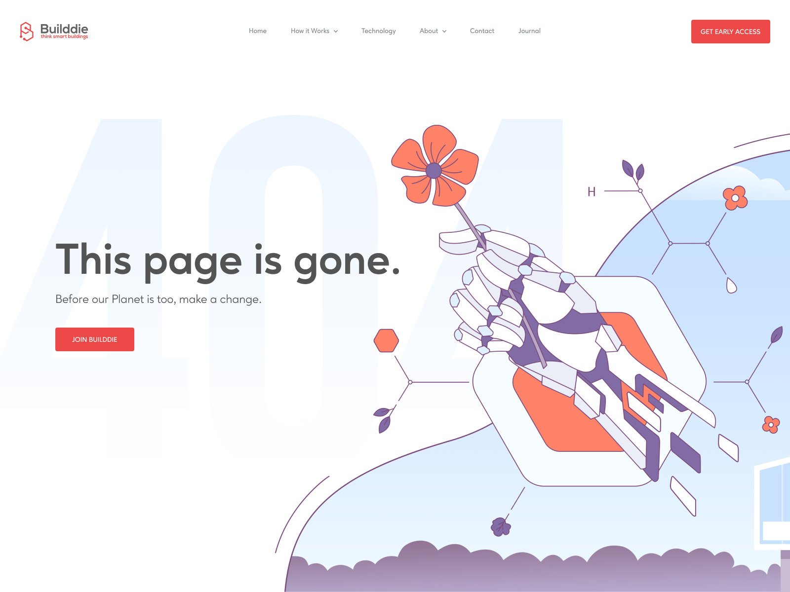
404 Page Design by Alex Kalinichenko for Shakuro
What is a 404 error page?
A 404 page is an online page where you find yourself after clicking on a link that is broken and therefore no longer available.
There are two main reasons why a visitor might end up on a 404 error page:
- a company has removed a certain content from their website or changed its URL
- a person mistyped the URL which is not uncommon in our mobile era.
So the 404 error means someone has messed up.
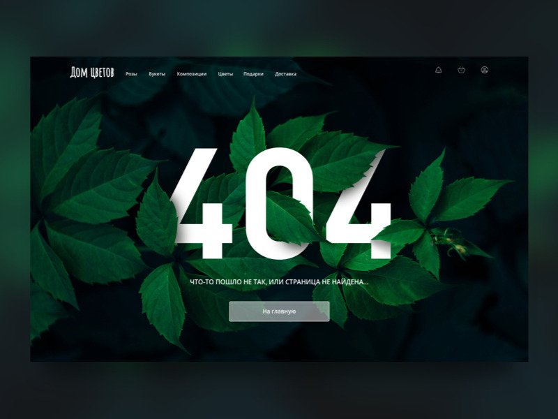
404 Page by OSCAR
Why is a 404 page important?
Mistakes are a part of our lives, that’s for sure. Ideally, the users aren’t supposed to see the 404 page altogether, but in the real world websites regularly get updated, some links no longer apply. You’ll never entirely remove the need for a 404 page. But better be proactive.
A solid 404 error page is able to transform poor customer experience into a pleasant one.
Don’t rely on the 404 provided by browsers.
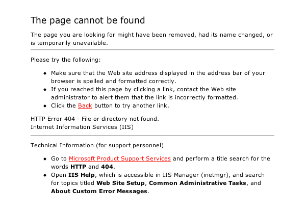
Ugh! It’s so stiff and difficult to comprehend. Too much text and technical jargon. It does nothing to help the visitors.
A custom 404 page is much better:
- Branding. It strengthens your brand image and increases the probability for visitors to continue with your site and not abandon it forever.
- Trust building. A serviceable 404 page acts as a reliable method of establishing a certain level of trust between a consumer and a company.
- SEO. It provides further links to the important parts of your site to ensure that the search engines can reach its complete structure.
- Fun. Funny 404 pages play on creativity and soften the blow of users’ failed expectations.
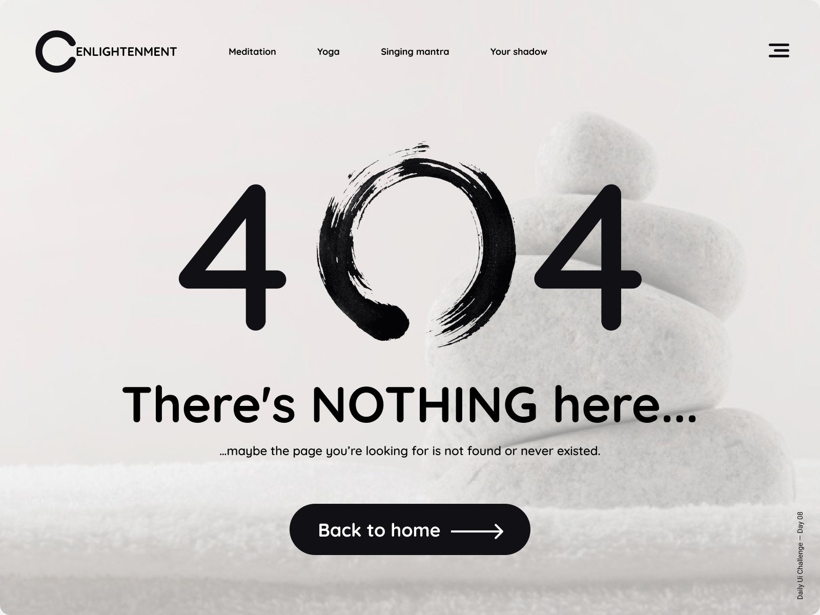
Daily UI Challenge Day 08 – 404 Page by Sergey Semenov
Error 404 page design best practices
404 page is a page that can take thousands of dollars to be produced while hoping no one will ever see it.
A 404 page design is probably not the first thing in a designer’s or a website owner’s mind, but it is vital all the same. Error page design best practices will ensure that yours is top-notch and serves its purposes well.
Maintain design and branding consistency
When you create a custom 404 error page, it is still a page within your website, so it should retain the same branding and visual elements as every other page like fonts, colors, header, logo, and preserve the overall distinct style and brand identity.
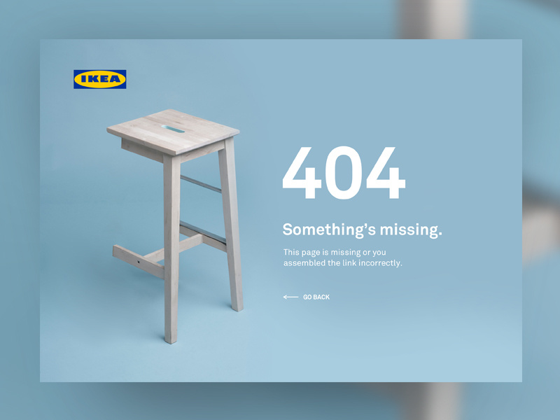
404 Page — UI Weekly Challenges-Season 02 / W [2/10] by Ana Rumenović
Make it functional
The main purpose of a 404 page is to be functional and quickly point users in the right direction. When designing a 404 page think about incorporating the following components:
- A homepage link
The basic element. But, actually, if you followed the advice from the previous point, you might not need it because all the necessary links will be there.
- A search field
A search field on a 404 page design layout gives the user an opportunity to go on with searching for whatever page they had in mind thus making them remain where they are.
- A few links to the most popular pages
Here you can try to make some predictions and rely on the laws of probability. If a user was after a popular page, you can promptly point them in the right direction.
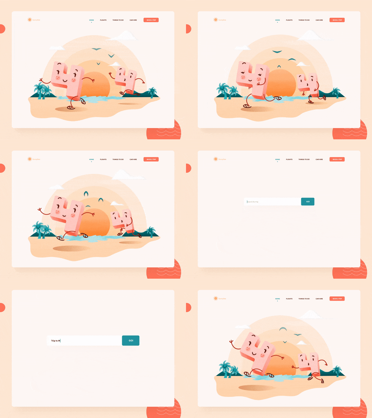
404 Not found error interaction illustration for web page by Taras Migulko. A search field is very conveniently offered after the engaging animation.
But keep it simple
Presenting the user with a 404 page filled to the brim with links to every single page of your website is a certain way to test the limits of patience of an already frustrated user.
A minimalistic 404 error page design can end up serving its purposes in the most efficient manner. The best design is able to achieve its goals in the simplest means. It is the height of design sophistication.
The best design is the simplest one that works.
– Albert Einstein
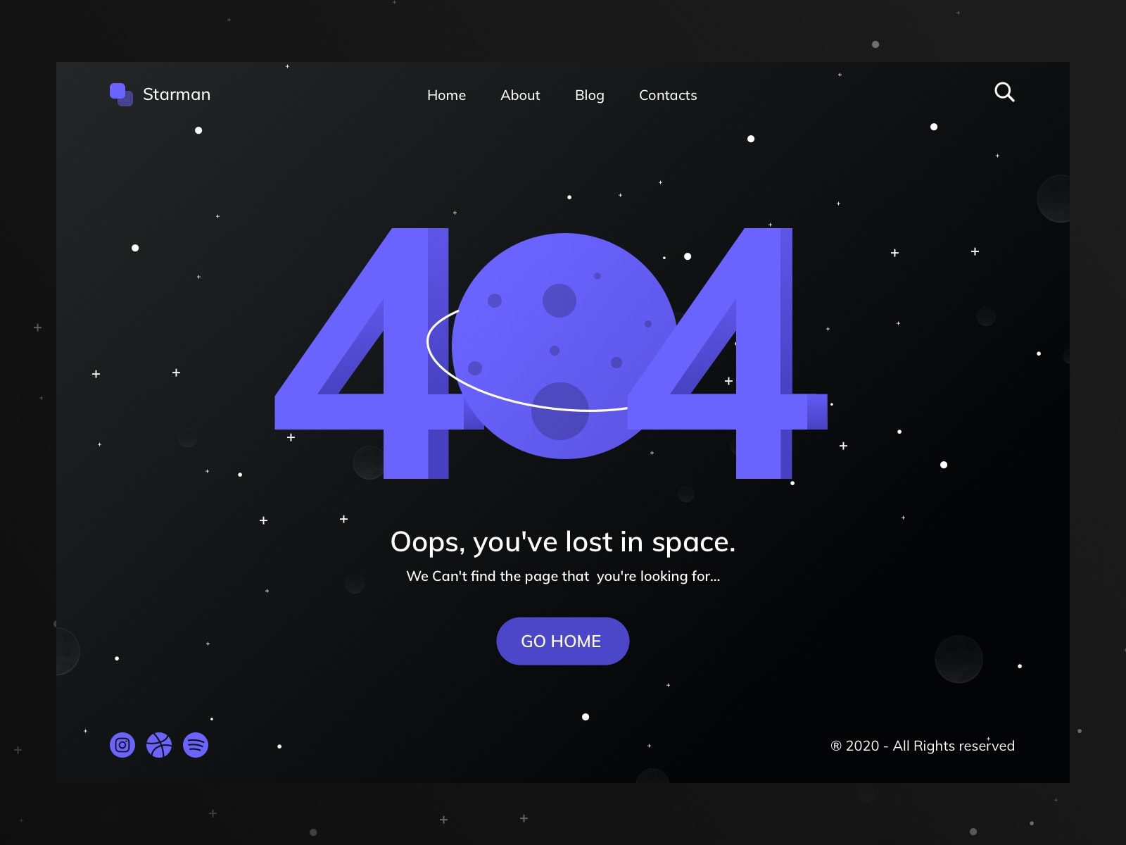
404 Page – DailyUI #008 by Hendrik S.
Convey a clear message
However digitalized today’s society is, it would be a mistake to think that everyone is aware of the meaning behind a 404 error. After all, this is not a sort of page people are accustomed to. It’s more effective to clarify what the issue is in a helpful and clear way.
Pay attention to the 404 page text and choice of words. It’s more effective to choose a “Sorry! We couldn’t find that page” classic over a machine-like “404 Error: Page Not Found” like in the old days.
Say sorry. It might not even be your fault, but it’ll show the user that you care.
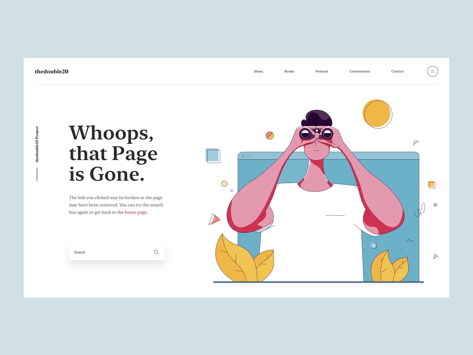
Page Not Found by Tran Mau Tri Tam
Make it funny
Many websites take a funny approach and make their page entertaining, like GitHub or Pixar.
Creating a funny and remarkable 404 page design can produce a surprisingly strong effect on making visitors stay on your website longer. People could even tell about your especially amusing 404 page their friends.
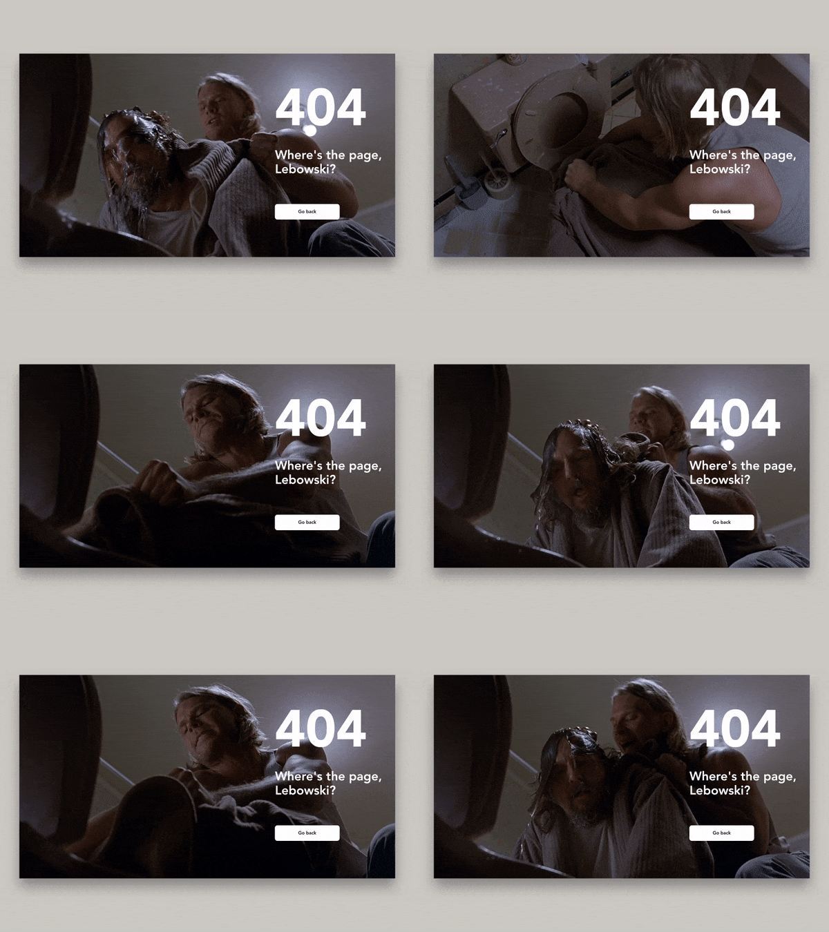
404. Where’s the page, Lebowski? by Dmitry Z.. Hilarious 404 design referencing the Coen Brothers’ “The Big Lebowski”
Give special deals
Offering some special deal like a 10% discount on your 404 page has the potential to reduce the disappointment of your visitors and urge them to go on with your website and even profit from this situation. Use something on the lines of “We are sorry for this inconvenience. Let us give you something back by giving a special deal”. It’s a powerful incentive to continue and make a purchase.
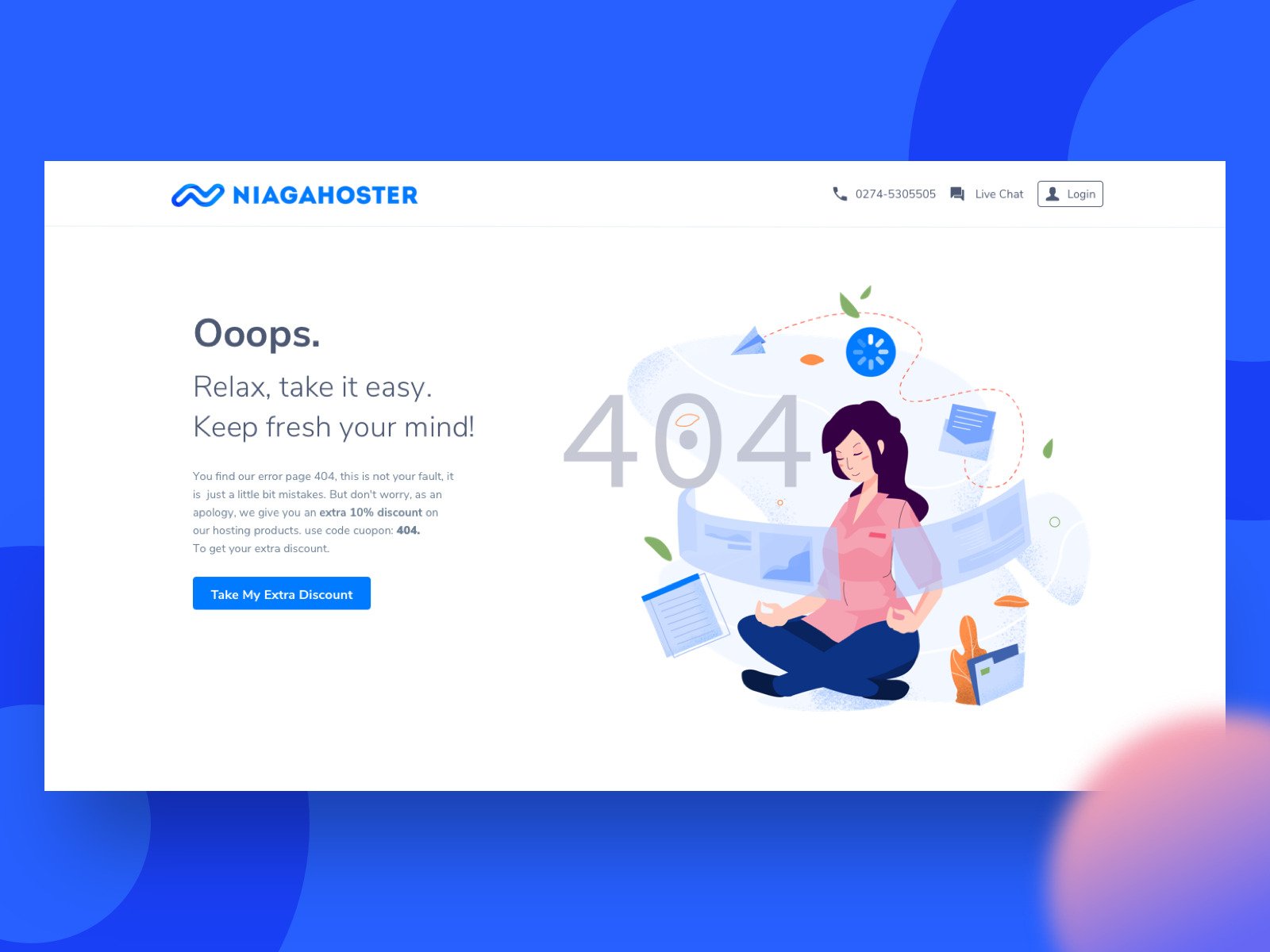
Empty State – Error Page 404 by Rudityas W Anggoro
* * *
What’s your take on custom 404 page design? Go head over heels creative or stick to a simple design? Maybe this collection of 15 neat 404 page designs will help you decide.

