
There is no secret mobile domination means global tech leadership. Oddly enough, the game with stakes as high as today, still heavily relies on the independent contributors – mobile designers and developers. Their performance using the technology given is what establishes the domination.
So it’s October that I’m typing these words in and iPhone X is expected to be available later this month, however, the soonest we can get our hands-on is November-ish at best which means we can really start designing and developing apps for it early into 2018. Not the kind of scenario I appreciate due to the multitude of questions and “what-ifs” we have NOW.
I already did elaborate on what it’s like to adjust designs for iPhone X. But what if there is little to none time for adjustments? Can there be effective workarounds or spontaneous discoveries as to how designers and developers can handle the new reality without losing all the buzz-wordy findings out there?
Embrace The Notch To Build Apps For iPhone X
Building apps for iPhone X will become a tough test for all the specialists involved. As a mobile design & dev team, we feel like it’s a great opportunity to step our game up and go beyond the familiar UX that a generation of users has already grown up on.
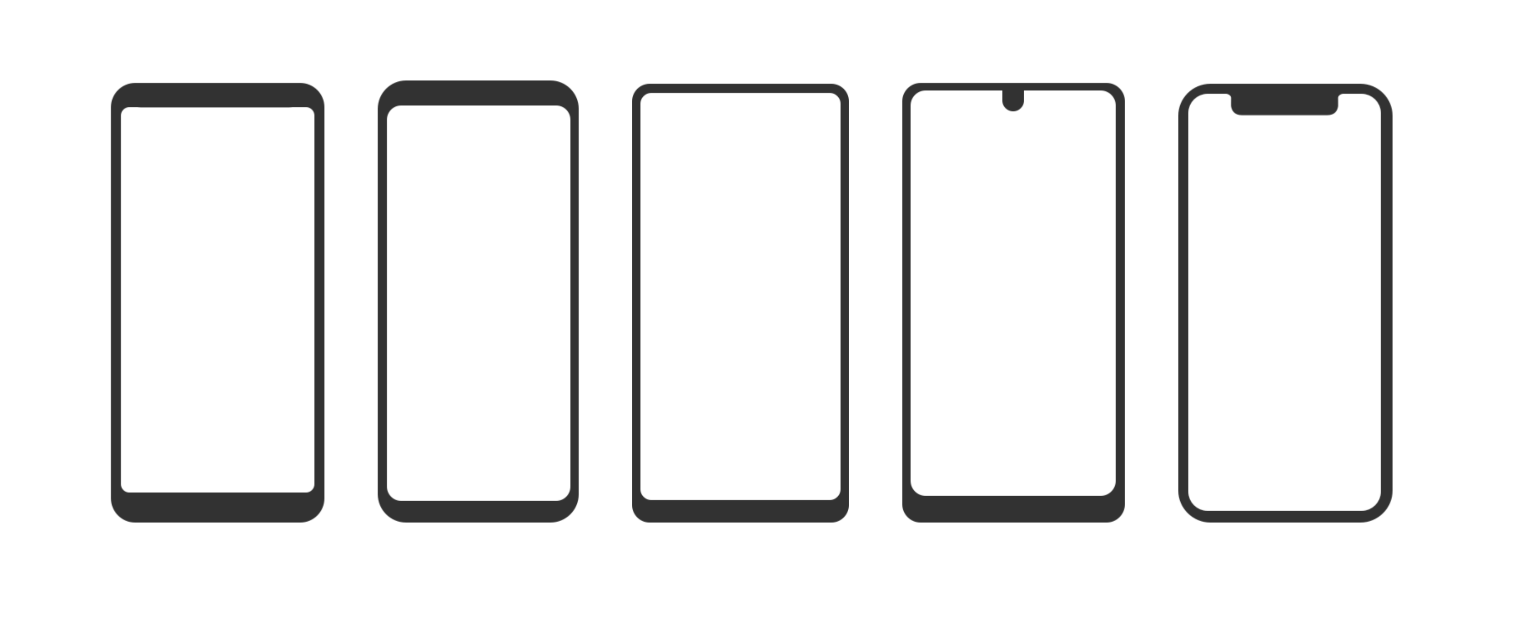
The main concern, of course, is the notch. As the initial dust has settled, people began to realize that Apple once again outwitted everybody. Can you picture the Samsung S8, Essential, LG G6, and a bunch of other phones with no bezel? What do you see? Basically a rectangle. Can you recognize what is what by an icon representing the shape? I can’t really. The X, however, is easily distinguishable.
Say whatever you want about the utility or the UX everybody is accustomed to, there is so much more to the mobile phenomenon than that. One of them is the signature style. When Apple invaded the MP3 player market in 2001 with the first iPod, folks just lost it. What seemed to be a handy shape (a bar, a box, etc) for a music player was completely overturned by the canonic white rectangle with a scroll wheel bigger than the size of the screen. Or the white earbuds that became a cultural staple.
Now back to the X. I believe part of the form factor evaluation process Apple did was customizing the all-screen trend. Influencing the industry takes a lot from the branding perspective and Apple is certainly not new at this. If you can create the totally new visual experience and use the estate to hide the sensors and introduce the revolutionary technology in face recognition, that’s a definite win. Even though it might take time for people to tune into the vibe.
There is no way you will ever take this form factor for anything other than iPhone X. Mission accomplished. Add to that the viral nature of hype and you’ll have people working as your marketers without even knowing they are. “The unibrow, the horns, the ears”, all these nicknames are adding to the uniqueness of the X helping it become a historic event. Do you like the notch now?
Designers and developers should view the opportunity to contribute to the history of a redefined smartphone as a chance to inherit the impact. At the end of the day, it’s up to us to fill this shape with content.
Screen Optimization For iPhone X
So if we keep an open mind and try to associate applications with iPhone X, where do we start? One of the recently leaked videos with a hands-on iPhone X experience shows a user open Instagram on iPhone X. There is no information on what version of an app they have, but it doesn’t really look like it has been iPhone X-optimized. Of course, the biggest issue is the top of the screen.
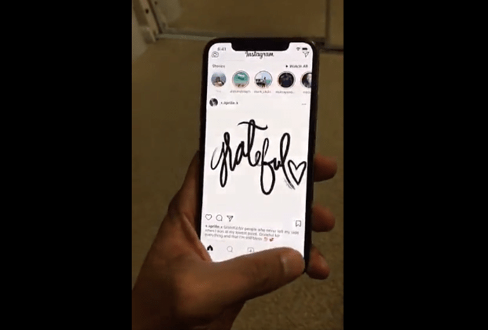
After Instagram inherited the all-white UI emphasizing the content, integrating the notch becomes a challenge. As long as the top of the screen has two buttons substituting the left and right swipes, the elements have to be preserved, luckily the current Instagram logic allows that.
Image credit: Behance
There is, however, a sense of detachment between the “ears” and the top panel of the app. Same applies to the bottom of the screen where you have a bar in the middle of a generous pane. This is a good workaround, but not quite an all-screen experience.
Truth is, you can’t really go about the new shape without a new logic as well. If we accept the fact that iPhone X is a different animal, it has to have the apps designed specifically for it. Even if it means moving beyond the regular experience that brought you 10% of the Earth’s population and millions of dollars in revenue.
Image credit: Dribbble
This is an example of a whole new UX with a strong all-screen emphasis. Anticipating some skepticism, yes Instagram is a user-driven CMS which means the app can’t regulate the content upload. However, this form factor is an opportunity for users to approach something as simple as posting a picture from a whole new perspective:
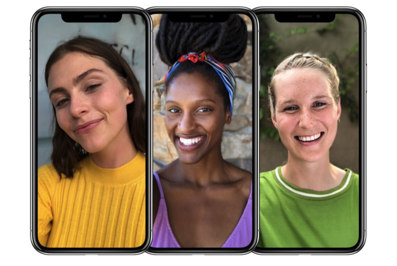
Obviously, you will have to take the shape of the screen into account when positioning your photos, but it’s a matter of time that it becomes completely natural. I love how the girl’s in the middle hair blends with the notch and makes her dreadlock knot pop out of the picture.
?Fun fact: the “notch” pronounced in Russian as [noch’] means “night”. So with iPhone X, you always have a slice of night on your screen.
No doubt, we’ll be seeing more and more interesting ideas of how the notch can be used to create a unique experience, something we were limited in since the birth of the rectangular screens.
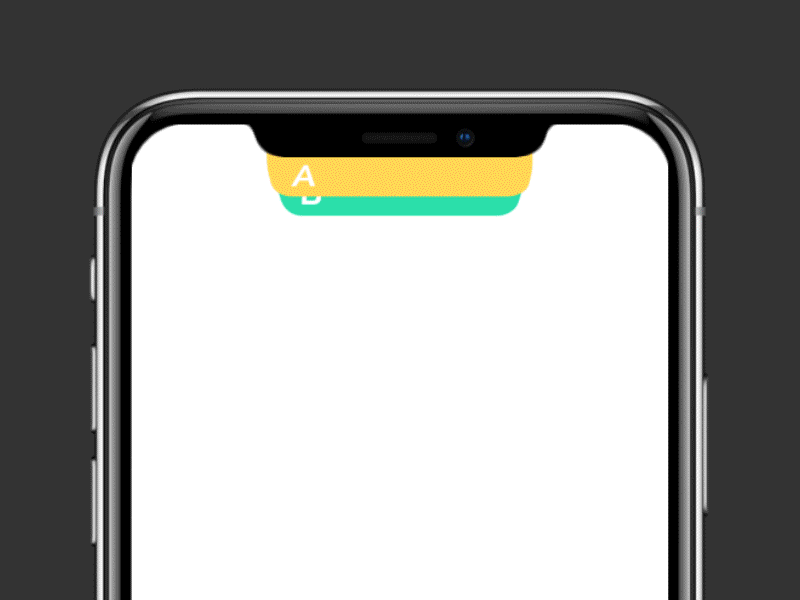
Image credit: Dribbble
So we’ve covered the top but what’s with the bottom? Feels like designers will naturally be encouraged to use more and more rounded edges in UI screens. I see how this can potentially help the content be in chime with the device itself.
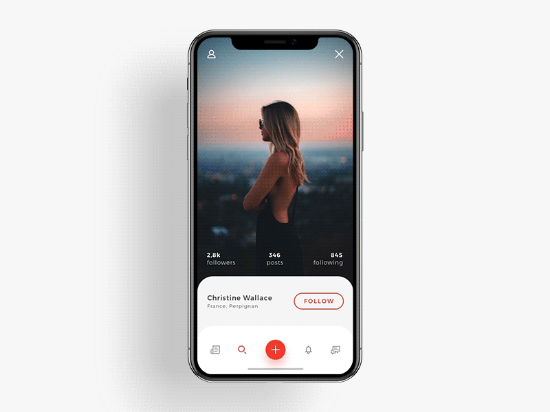
Image credit: Dribbble
The All-Screen In Action
To get a little bit of the mediated and plastic feel of what using iPhone X will be like, I used an Xcode emulator to launch some of the apps I had the source code of. First off, it felt like using an iPhone for the first time. The feeling I get when trying to solve a task on an unknown Android phone.
Gestures
It’s hard to grasp how much the Home button on the previous iPhones matters until you are deprived of one. I didn’t even realize I’ve been barely using the Lock button on my iPhone 7 and how much I am accustomed to keeping close the apps and not have them running in the back. Not even mentioning the Touch ID.
Of course, you can’t test FaceID along with a bunch of other features, what you can do though is swipe. Swiping becomes the only option in the situation with zero controls.
“UI on iPhone X is should be as invisible as the iPhone itself, the content should be the main interaction point.”
Image credit: Dribbble
What the controlless screen does to the mobile UX is set the highest bar for the self-explanatory and intuitive content behavior. The original iPhone presentation quotes Steve Jobs saying, “For the first time ever, you not only get to see the software but touch it”.
iPhone X elevates the touch to the whole new level, basically killing off any UI element that is not clickable.
Does Face ID Really Work?
Replacing Touch ID with Face ID is supposed to give more security with less effort (can you call putting your thumb on the sensor ‘effort’?). So now machine learning allows your iPhone X to recognize your face comparing it to the image of you it has in its memory. If the images match iPhone X unlocks, Apple Pay works and everything’s fine. We have questions though… But before that, let’s look into how Face ID works.
Lighting
The innovative camera system called ‘TrueDepth’ is supposedly capable of recognizing faces by creating in-depth 3D maps of facial features that only this type of technology can process. If you are worried about the lighting you are trying to unlock your phone in or if you think the angle and the setting your face was scanned in are the factors of successful recognition, you don’t have to. iPhone X has an infrared (IR) sensor indifferent to the lighting as it uses ‘waves of electromagnetic radiation’ invisible to the eye, to create a digital imprint of your face regardless of the day/night time. So yes, iPhone X can be unlocked in the darkness or in the bright sunlight.
Facial Features
Using biometric features is one of the most secure methods of authentication. iPhone X’s ‘Neural Engine’ creates reference patterns of your face and stores them as biometric data unique only for you. However, it uses a score from 0 to 1 to rate the level of the match between the actual face and the stored image, and depending on that score, Face ID either unlocks the phone (0,5 to 1) or denies (0 to 0,4). For some operations, the match level has to be 0,999 to confirm.
Some of the recent experiments show that iPhone X has a weakness in differentiating identical twins. Face ID being a new technology does have the opportunities for growth and as it evolves, we can expect the process to become more intricate and polished. Yet, if you are that paranoid, use the passcode.
Augmented Reality
The neural engine in the A11 iPhone X Bionic chip is purpose-built for machine learning, augmented reality apps and immersive 3D games. This means for the first time in history, the intersection of consumer electronics intersects with augmented reality. In terms of UX, this opens an entirely new world of interaction and makes it mainstream!
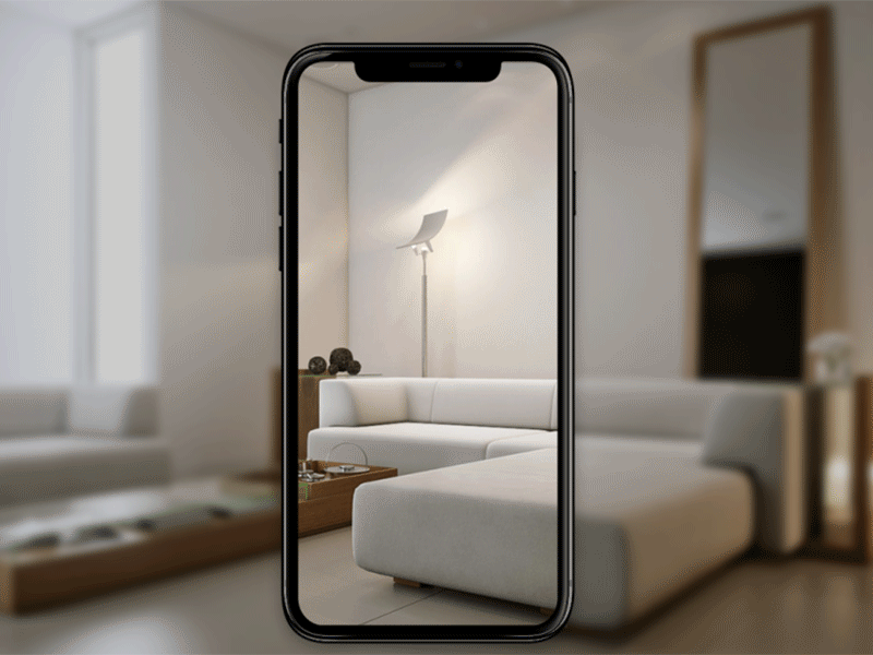
Image credit: Dribbble
There are multiple complicated industries where the process is operated by humans. Those industries might benefit greatly from the usage of the AR features, but they have never been likely to hit the mass introduction. The world’s most popular device in a smartphone, can change that.
As a UX designer, your biggest effort in mainstream AR so far will be in finding value the technology can bring while providing an off-the-charts experience along the way. The screen-only interaction is the best environment for that.
The days of circus-like AR are gone. Now let’s put some functional muscle on it. iPhone X can be the exact instrument for it.
The Takeaways ?
It is weird really: designers scratching their head over grids and margins, developers getting deep with the capabilities of A11, marketers looking for ways to sell the compatibility, startup owners carving out a budget to redesign their apps for iPhone X – all before it is even out.
The least we can say now is iPhone X is a cultural event. Targeted as the future of smartphones, it has all the attributes of it, including the nay-sayers, the preachers, and the bystanders. One thing is clear almost 2 months into the X reveal: this will be the dawn of the 2007 iPhone UX staple and the beginning of a new exciting journey towards the ultimate immersiveness.
We are proud and happy not only to see it unfold but to contribute to it as well. As our first iPhone X-native app project is yet to come, we stay open to ideas and will keep on drilling the art of UI and the science of UX.
