Finding a unique idea for an IT startup that will pay off and keep bringing money is as hard as picking a needle out of the haystack. The need to discover a successful niche haunts you night and day: what will be profitable? What small businesses will be in high demand for the upcoming years?
Contents:
To win this daunting challenge, explore the latest IT startup trends in 2024. In this article, we will discover the most impactful tendencies shaping the future business landscape, providing you with insights and strategies to navigate the ever-changing terrain of the tech industry.
Generative AI
Generative AI, a subset of artificial intelligence, has recently become a fundamental startup trend. With its help, you can autonomously produce content, such as images, music, text, and even videos, that closely mimic human-created content. This capability has vast potential across various industries, including creative arts, marketing, and design.
Smart algorithms quickly become a part of our everyday lives too. Many people use ChatGPT for work or education. Recently, Samsung released a smartphone with a built-in AI assistant. It can translate calls on the go, enhance video framerate, generate wallpapers, answer questions, and whatnot. These features open vast opportunities for startups in IT.
One of the largest companies that leverages smart algorithms is Open AI. It offers prebuilt AI solutions, API, and development support for companies who want to use its models as baselines.
Neural network design concept by Shakuro
Climate tech and agriculture
Over the last 19 years, multiple independent studies have concluded that humans are to blame for climate change. Since more and more people are trying to reverse or at least minimize the changes, eco-friendly and sustainable technology solutions are a snowballing startup trend. With emerging techs such as renewable energy, waste management, and carbon footprint reduction, you can make useful products for your target audience.
The realm of agriculture also offers your IT startup a plethora of possibilities. You can revolutionize traditional farming practices, enhance food production, minimize resource consumption, and address the challenges of changing climate patterns. Harness the power of data analytics, IoT, and AI to develop predictive analytics tools, farm management platforms, and crop monitoring systems that enable more efficient and sustainable agricultural practices.
As for the companies in this field that leverage the green tech trend, take a look at the Crop Project. The company gets kelp from the farmers, then dries and mills it to produce food, fertilizers, and biomaterials.
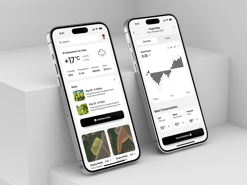
Agriculture Assistant Mobile App by Conceptzilla
Electronic vehicles
As a complement to green tech, electric vehicles are rapidly gaining popularity. So the demand for infrastructure and support services in the startup market is on the rise.
You can capitalize on the growing demand for charging stations, battery technology, and maintenance services. With advancements in automation, there is also a need for innovative solutions in areas such as software development, energy management, and data analytics.
Moreover, your IT startup can be a pioneer in a holistic approach to environmental stewardship. Follow the trend and prioritize lifecycle sustainability, eco-friendly manufacturing processes, and responsible sourcing of materials to be ahead of your competitors.
The major player in this market is of course Tesla, however, there are a couple of others worth your attention. Rivian produces EVs and has also provided Amazon with thousands of electric delivery vans. Lucid Motors is developing a battery-powered sedan for the luxury sector that can drive more than 500 miles on a single charge.
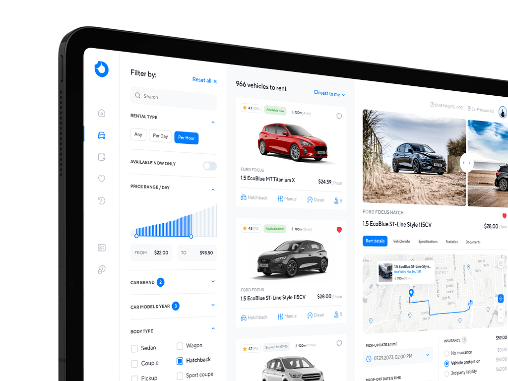
Car Rental Dashboard by Conceptzilla
Healthcare
After the COVID-19 pandemic, healthcare became a trend in startups. People strive to prevent diseases, discover new, more effective drugs, personalize treatment, minimize side effects, etc.
By partnering with scientists and doctors, you can address global health challenges like infectious diseases, oncology, neurodegenerative disorders, and rare genetic conditions. If you prefer a more personalized approach, launch an IT startup to tailor treatments and interventions to individual patient profiles. For example, through the integration of genomic sequencing, biomarker identification, and therapeutic modeling.
In healthcare app development, you can take advantage of generative AI to accelerate the discovery of new medications and treatments by predicting molecular structures and simulating drug interactions.

There are a dozen of key players in the mHealth market. For instance, Headspace is a wellness app that offers guided meditations and tools for better sleep. The startup uses the latest trends to help people fight insomnia and fatigue.
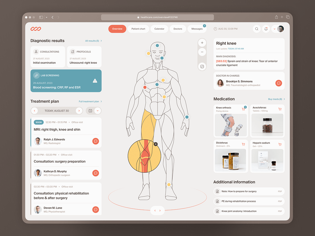
Medical Check-In Web Dashboard by Shakuro
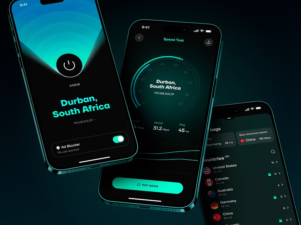
Web 3.0 & cryptocurrency
One of the key developments within the Web 3.0 landscape is the rise of cryptocurrency. If you plan to start entrepreneurship in this market, consider leveraging blockchain technology, such as decentralized finance (DeFi) platforms, non-fungible tokens (NFTs), and blockchain-based identity verification systems. Additionally, IT startup business ideas include creating new cryptocurrencies or developing branch projects.
Binance is one of the top Web 3.0 startups. It provides a wide range of tools, including NFTs, decentralized exchanges, and trading laws. Another famous one is OpenSea — it’s an NFT market, that allows metaverse fans to buy, sell, and trade non-fungible tokens across a variety of categories like gaming, photography, music, and art.
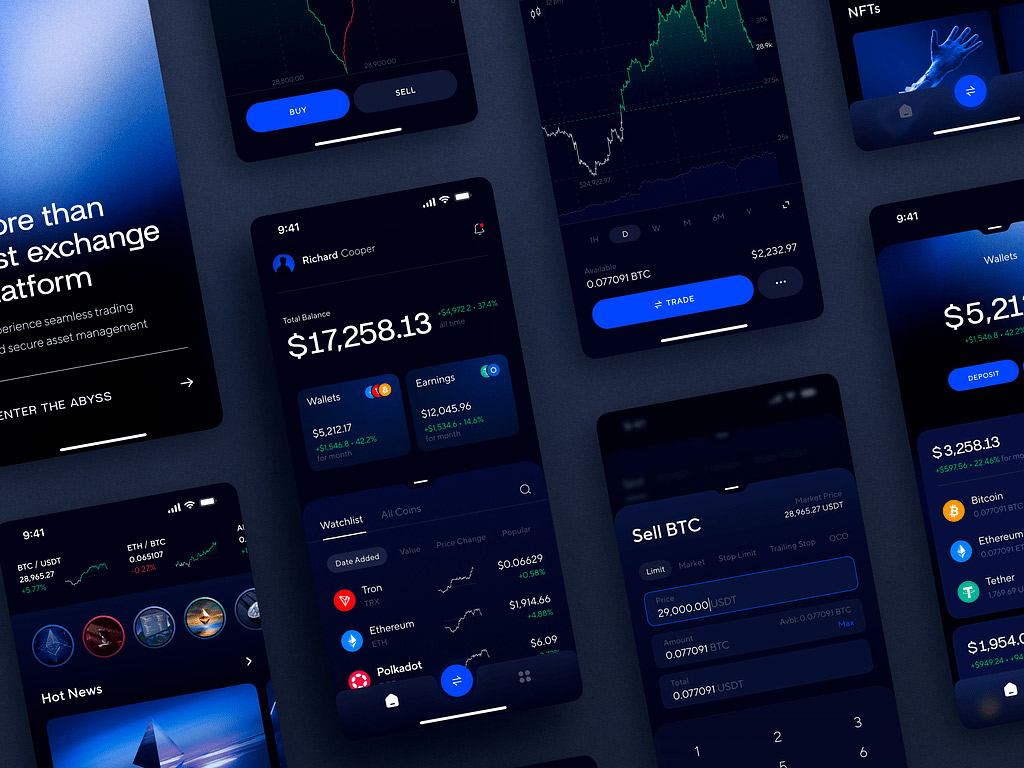
Abyss Mobile App by Conceptzilla
Virtual and Augmented Reality
VR and AR have been up and down for quite some time. Recently, Apple released the Apple Pro set which received a warm welcome from the first testers and reporters. So we can expect a rising demand for VR and AR applications.
As an IT startup specializing in this field, you can develop interactive learning experiences, virtual field trips, and skill training for educational institutions. In healthcare, you can provide technologies for medical training, pain management, and therapy. As for retail, VR and AR allow you to offer immersive shopping experiences, virtual try-ons, and interactive product demonstrations.
Before trying this startup trend, take a look at the potential competitors. VRChat is a social platform for VR users where they can interact and talk to each other in a digital environment. It’s a great product if you have a young audience.
Apple Vision Pro Spatial Design Exploration by Shakuro
General tendencies in the startup market
Apart from the main trends, other tendencies shape the industries in 2024 and upcoming years. Here are some of them:
Work-life balance
Many companies have recognized the importance of ensuring their employees have a healthy balance between their professional and personal lives. There is a reason: the millennial and Gen Z workforce, which makes up a significant portion of IT startups, places a high value on work-life balance. They seek out employers who offer flexibility, remote work options, and opportunities for personal development.
Post-pandemic layoffs
The COVID-19 pandemic caused a spike in hiring various specialists, including remote workers. Now, the need for this workforce has faded, and many companies started to lay people off. For example, Amazon, Google, Microsoft, and other tech giants have laid off more than 30,000 people. This wave was also influenced by the AI expansion, where individual workers were replaced by smart algorithms.
When starting your entrepreneurship, be sure to avoid getting into this tendency.
Inclusivity
Inclusivity has become an increasingly important startup trend in recent years. As the technology industry continues to grow and diversify, companies are recognizing the value of creating inclusive and diverse work environments.
Inclusivity as a trend in startups is not only a matter of social responsibility but also a strategic advantage. By embracing diversity and creating an inclusive environment, you can strengthen your brand, attract top talents, and ultimately drive business success. Moreover, diverse teams are more innovative and better equipped to solve complex problems, leading to more creative solutions and product development.
Exploring the IT startup trends
The trends in the industry are continuously evolving, driven by technological advancements and changing consumer demands. The rise of AI, blockchain, and cybersecurity, along with the increasing adoption of remote work and digital transformation, are shaping the future of the startup market. Additionally, collaboration, flexibility, and adaptability will be key to navigating the competitive landscape and staying relevant in the neverending competition.
Do you want to develop an app or create branding for your future IT startup? Contact us and let’s build a product that will catch your target audience’s attention.