Delivering personalized content is a safe way to sell products in entertainment but it’s harder when it comes to physical products like clothes. That’s because people associate the brand with the products it makes. That’s the reason automobile giants launch side projects that represent a different set of values and traits than the original brand. We are about to see how variable identity can serve different contexts without multiplication of brands.
Contents:
What if a brand could have enough flexibility to fit every specific user at any given time?
Ubiquity →
News feed was initially a workaround on facebook. An infinite stream of user-generated content. The feed then became a standard practice of delivering personalized content. Every website or app we use has some type of personalization.
Apple music will pitch you the albums you’d probably like, the Instagram feed will introduce you to the new folks you’d probably follow, Netflix will bring you the shows you’re likely to watch, YouTube will generate an endless feed of videos related to your taste.
Personalization makes everywhere feel like home.
What makes it work is our own addiction to sharing. We voluntarily give out volumes of information to see what happens. Data is a commodity and personalization’s main asset.
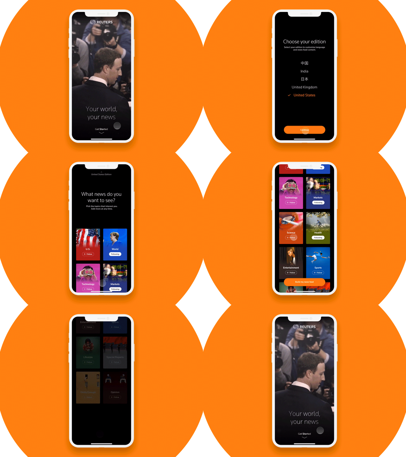
Reuters Onboarding by Steph Jeong
Because of the amount of data available, we needed proper technology to handle it. So appeared the automated attribution and optimization, tags became a big thing. Personalization is a reactive process that takes data from first- and third-party sources analyzes it, creates patterns and uses it for future deployment.
Content is specifically tailored for certain types of users. It’s only a matter of technicality how deep personalization can go.
Similarity →
If we can create a private space for every user on a website, why can’t the brand itself change in order to be appropriate for any and every context? That’s been happening for a while now. Only it’s not the branding that changes, but it’s about every context fitting the logo. It’s all at once: playful and respectful, simple and sophisticated, fresh and seasoned. Faceless.
The best case for this is tech companies which cater to millions of different people and have to be appropriate for everyone. Whether it’s Silicon Valley design or natural progress, but they all look the same. Uber, Google, Airbnb, Spotify, Pinterest and many more have given up their intrinsic logos and switched to sans-serif wordmarks.

Oh no Type Co nailed it and all of a sudden it became clear there we are on to something bigger than just simplification. It’s unification. To be successful, everything about the company has to be safe and equal. The UI has to be accessible and allow no custom and non-traditional patterns. The same look and feel spread across the entire product, office, company.
It’s no longer about being unique. It’s about being relevant and how do you become relevant for everyone? – By being relevant for particularly no one.
Who’s your average Google user? It’s impossible to create a persona anymore. Everyone is a Google user. Everyone has to recognize how to use Google and everyone must feel at home. Personified experience. But how do you personify something so common and shared? You simplify it, you reduce complexity and with it, you reduce what makes you you.
This leads to companies not being defined by their logos anymore. Recognizing the brands now is recognizing the powers they give you and the pains they rid you of. Soon enough the logo will become a rudimentary feature.
Logos will eventually become just words. A verb that feels natural, clear and does not belong to anyone in particular.
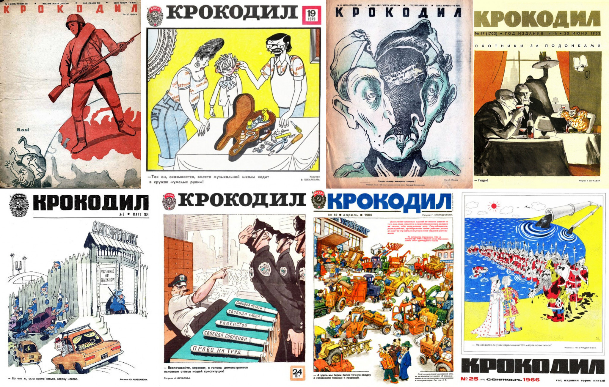
A Soviet satirical magazine called Крокодил did not have a flashy logo and not even a consistent wordmark. It made its name the most recognizable part. Of course, at that time there was no such thing as knock off, and the magazine was safe in terms of identity. This is a classic example of a neutral logo with the content in the first place.
Variability.
For decades brands have battled for recognizability and consistency. They poured billions of dollars into sponsorships, product placements, campaigns, and influencers. This was a textbook strategy for physical products.
Marlboro wasn’t associated with cowboys or smoking. It was the most noticeable word on the Ferrari team F-1 race car in the 90s when I’d religiously watch every Grand Prix I could find on tv.
It all makes sense when multiple similar products are laid out on a shelf and silently fighting for customer’s attention. When it comes to digital products, it’s different because they exist in an isolated ecosystem with one person in mind – the owner of the device. Everything on that device is already sold to me. So it makes sense for a logo to be designed exclusively for me.
What a brand means for one might be alien to the other. It’s a brand’s problem to be there for both of them. If a brand is different for different people, why does it have to look the same for everyone? It’s because of that, that brands are getting rid of their uniqueness and slowly killing the significance of the logo.
Idiosyncratic logo → Homogeneous logo → Variable logo
The success of a brand lies in its intimate interaction with every single customer. Plau Type & Design called this strategy and the corporate voice based on it, Variable Brand Voice®. Every business owner knows how long it takes to establish a brand voice. Once established, companies avoid straying from that path which leads to more refinement and sameness.
Another approach to take is to let the identity loose. Not a lot of businesses can indulge in experiments with their identity. It still requires a lot of consistency on top of a contrasting visual appeal.
A Brazilian jiu-jitsu uniform maker Shoyoroll made it their schtick. They constantly work with different designers and companies out of the martial arts world and don’t really have a fixed identity. Every line of products they call ‘batch’ has its own branding and the only thing they have in common is the name and sleeve embroidery.
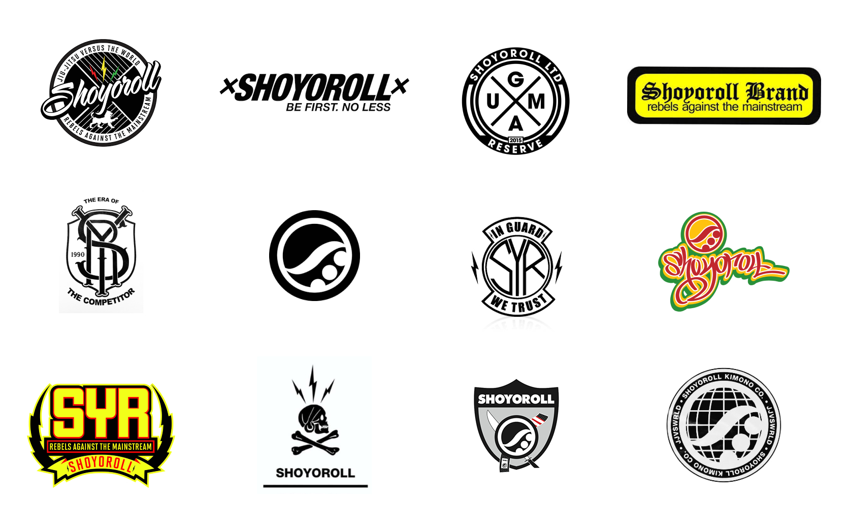
With that, there is some sort of consistency that BJJ players appreciate, making Shoyoroll most wanted gear in the community.
This approach allows the brand to speak to all types of customers without being associated with a specific style.
Call a batch one-off and you’ll end up with an instant collectible selling on eBay three times its price.
This is variability put on top of the recognizability that an established brand has. Now the question is how do you program that type of variability for different purposes and audiences? To grasp it, we need to know how variable fonts work.
We wrote about variable fonts as one of the promising trends in typography-based design some time ago. Variable logos are a part of variable brand voice and work on the same principles of adapting to any usage context in a way that does not negatively impact the UX. A variable font has an unlimited number of variations between two extremes. Those variations don’t just mean different height and weight but all sorts of parameters like stroke angle, kerning, even some physical features like softness.
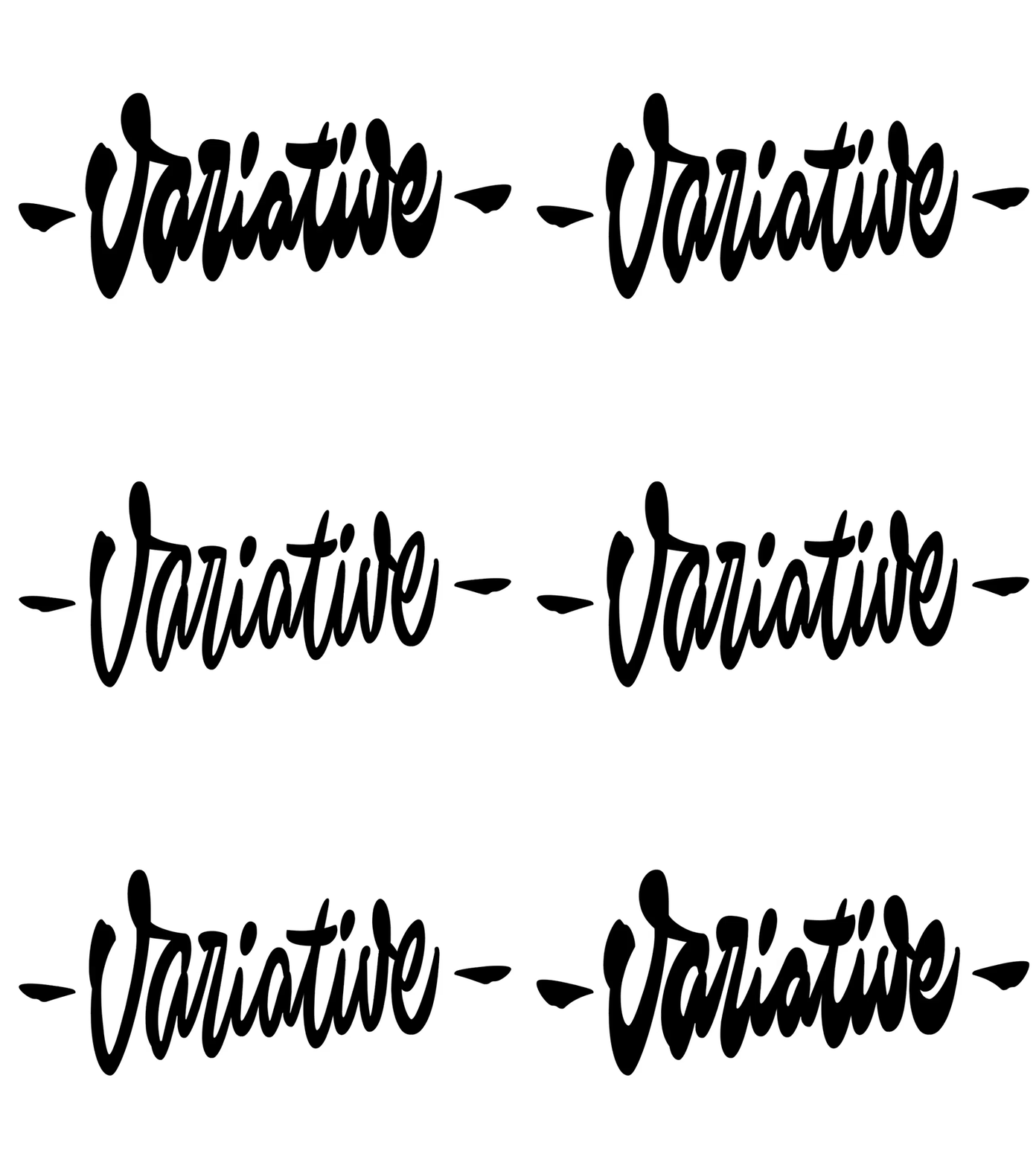
Variable Script by Typemate
The only problem with implementation is the lack of a comprehensible UI to control variable fonts. The existing ones give the user the freedom to play with the font and only have automation when it comes to the screen size difference.
Variable logos might just work the same way. A personalized experience will eventually be everywhere and designers will have freedom interpreting brand identities for different contexts of use, moods, seasons, ages, political views, and so on.
Variable identity is responsive to a user’s behavior and knows how to recognize when it’s the right time to be there and say something and when it’s better to stay out.
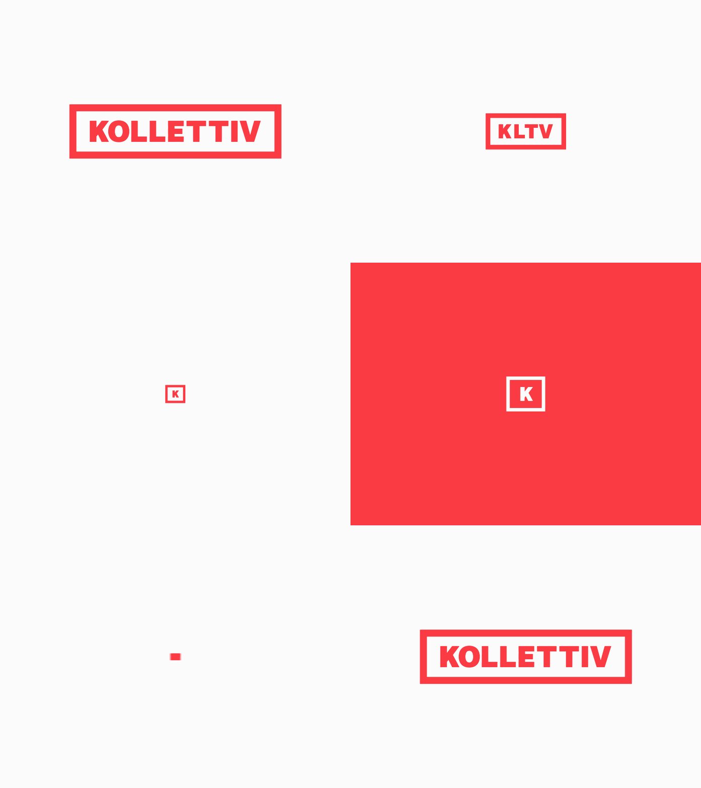
Kollettiv logo animation by Ricardo Aum for Kollettiv
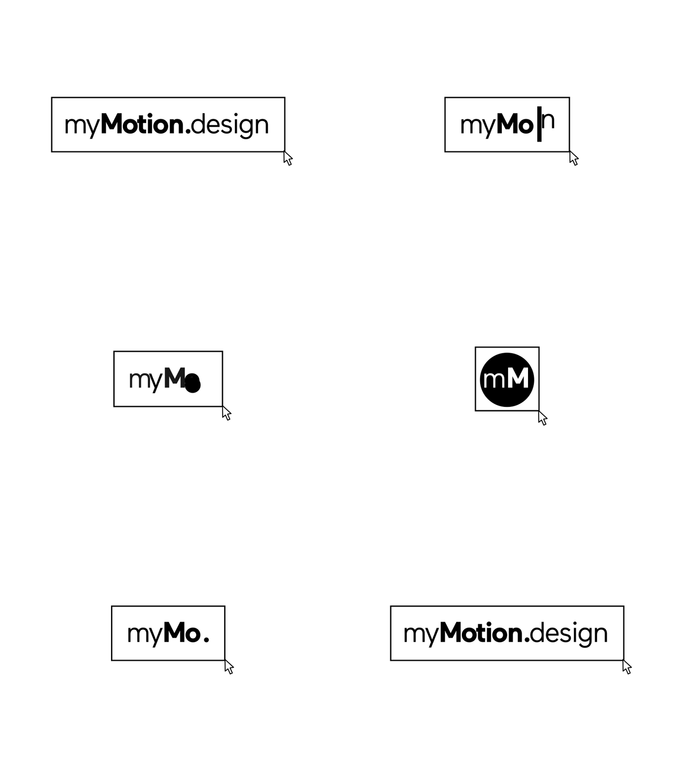
myMotion.design – responsive motion logo by Gabriel Picard

Songbird – Full Responsive Brand Identity by Emir Ayouni for Forefathers in Songbird
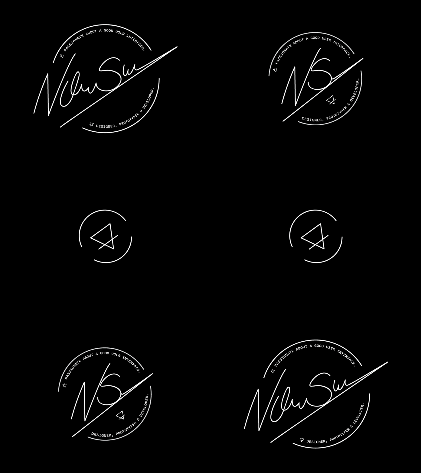
My Responsive Logo by Nicolas Suarez
