
Introduction: Why Frontend Architecture Decides How Fast Your Product Can Grow
A frontend can look perfectly fine from the outside and still be a headache inside. The buttons work. The pages load. The dashboard has charts. Everyone breathes out and says, “Good, we shipped.”
Contents:
Then a few months pass.
A new feature takes two weeks instead of two days. A small UI change breaks three unrelated screens. One team uses one state management approach; another uses something else. You know the feeling.
Frontend architecture matters. Not as a fancy technical diagram that sits in a folder nobody opens, but as the actual structure that helps a product keep moving. It affects how fast a team ships, how easily a new frontend developer can join, how stable the interface feels, and how painful future changes become.
In my experience, frontend problems build up quietly. A shortcut here, a duplicate component there, one “temporary” global state decision that somehow becomes permanent. And then, one day, the product is not slow because of one bad choice. It is slow because the structure never had a chance.
So let’s talk about how to design an architecture in a way that feels practical, not academic.
What is Frontend Architecture?
It is the way a client-side application is organized. It covers components, pages, routing, state, API calls, styling, testing, build tools, deployment, and team ownership.
That sounds like a lot. And honestly, it is.
But the simple version is: this type of architecture decides where things live, how they talk to each other, and how safely people can change them.
A good frontend setup answers questions like:
- Where should a new feature go?
- Which components are reusable?
- How do we fetch and cache data?
- Who owns shared UI?
- What happens when the backend returns an error?
- How do we keep performance from slowly getting worse?
- How do we stop every page from becoming its own little universe?
For a frontend developer, this is daily life. Architecture is not something that only senior engineers discuss in long meetings. It shows up when you decide whether a button belongs in the design system, whether a form should manage its own state, or whether a dashboard needs server-side rendering.
Good architecture does not remove all difficult decisions. That would be nice, wouldn’t it? But it does make the usual decisions clearer.
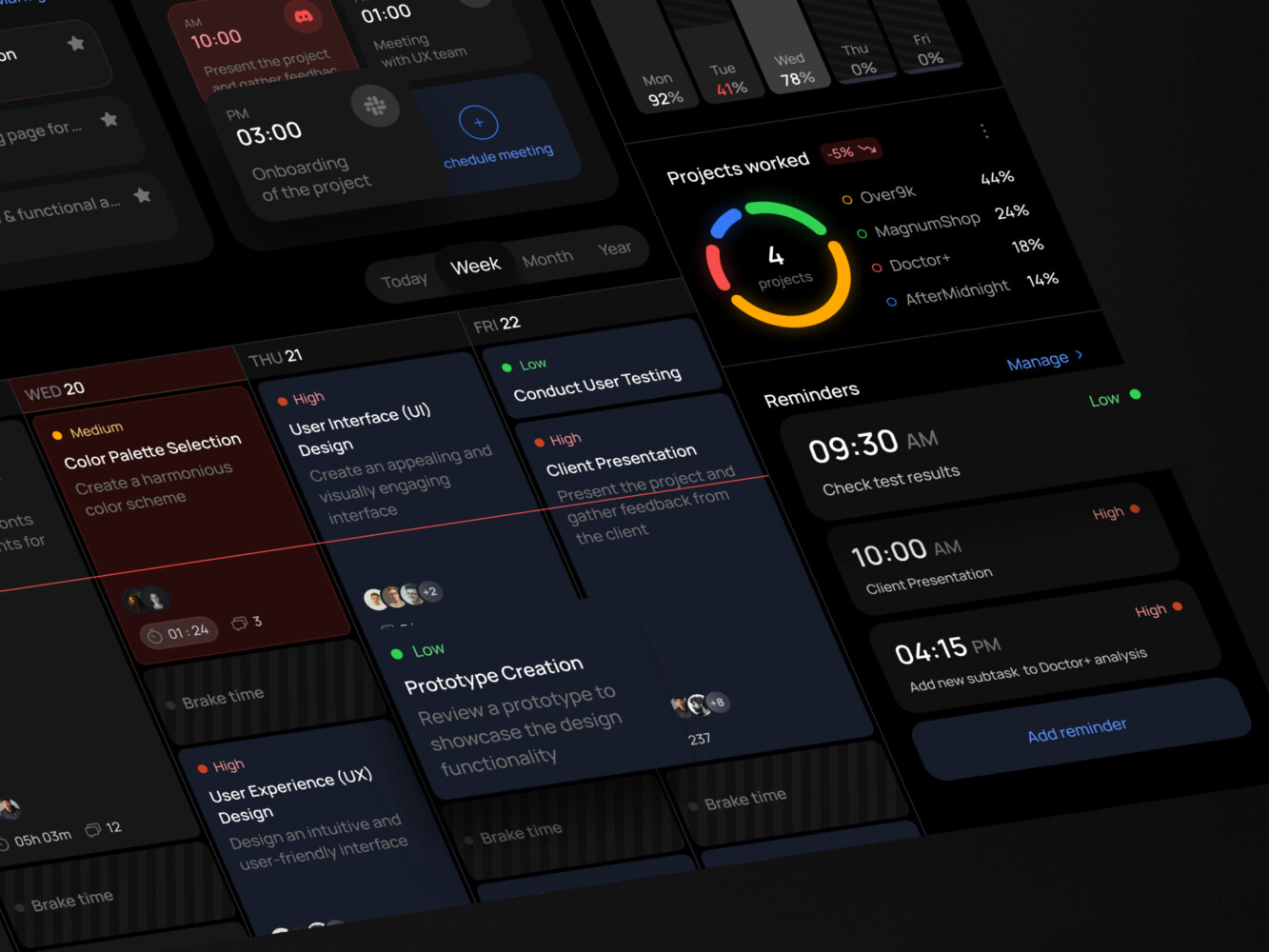
Task management dashboard by Shakuro
Core Parts of a Strong Frontend Architecture
Component Structure
Components are the obvious starting point. Most modern frontend work is component-based, whether the team uses React, Vue, Angular, Svelte, or something else.
The trap is thinking that component-based automatically means organized. It does not. You can have 600 components and still no clear system.
A healthier structure usually separates:
- shared UI components, like buttons, inputs, modals, tabs
- feature components, like payment forms or analytics filters
- layout components, like sidebars and page shells
- domain-specific widgets, like trading charts or course cards
In frontend development, the goal is not to make everything reusable. That can get silly fast. The goal is to make the reusable things truly reliable and keep feature-specific things close to where they are used.
State Management
State is where many frontend apps become awkward.
Some state belongs inside a component. Some belong to a form. Some comes from the server and should be cached. Some is global, like user permissions or theme settings. If a team throws all of it into one global store, the app may work, but it often becomes hard to reason about.
A clean frontend architecture usually separates:
- local UI state
- form state
- server state
- global app state
- URL state, like filters and pagination
This is a small detail that really helps. I’ve seen teams fix a surprising amount of confusion just by admitting that “state” is not one thing.
Routing and Navigation
Routing is not only about URLs. It describes how users move through the product.
In a simple marketing site, routing may be straightforward. In a SaaS platform, it can include user roles, nested sections, private pages, onboarding flows, dashboards, settings, billing, and admin areas.
If routing grows without structure, the app becomes hard to scan. A good setup groups routes by product domain and keeps permissions visible. Nobody enjoys hunting through a routing file at 7 p.m. trying to figure out why a user can open a page they should not see.
API and Data Layer
The data layer is where frontend architecture meets backend reality.
A frontend needs to handle loading states, empty states, retries, permissions, validation, optimistic updates, and errors that are not always polite. APIs change. Some return too much data. Some return too little. Some return something surprising on Fridays, somehow.
A good frontend data layer gives the team a consistent way to:
- fetch data
- cache it
- update it
- handle errors
- show loading and empty states
- keep business logic out of random UI components
This is not glamorous work, but users feel it. A slow or confusing data flow makes the whole product feel weaker.
Styling System
Styling is another place where small decisions grow into big ones.
Some teams use Tailwind. Some use CSS modules. Some prefer CSS-in-JS. Some rely on a component library. The tool matters less than the rules around it.
A strong styling system includes:
- design tokens
- consistent spacing
- typography rules
- responsive behavior
- reusable patterns
- accessibility basics
- clear ownership of shared components
When design and frontend work closely together, this part gets much easier. When they do not, everyone starts patching layouts screen by screen. It works for a while. Then it gets annoying.
Testing and Quality Gates
Frontend testing is not just unit tests. It can include visual tests, accessibility checks, integration tests, end-to-end flows, and performance budgets.
The main idea is simple: protect the parts of the product that users rely on most.
Not every tiny component needs a wall of tests. But checkout, onboarding, login, dashboards, subscriptions, payments, and role-based flows deserve attention. Bugs there feel expensive.

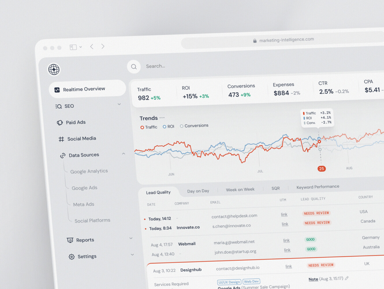
Marketing analytics dashboard by Shakuro
Common Frontend Architecture Patterns
There are many frontend architecture patterns, and no single one wins every time. The best choice depends on product size, team structure, release process, and how much change you expect.
Component-Based Architecture
This is the default for modern frontend development. The app is built from reusable components, and those components form larger pages and flows.
It works well for almost everything, but only if the team defines what “reusable” means. Otherwise, the shared folder becomes a storage room where nobody knows what is still useful.
Feature-Based Architecture
In a feature-based setup, files are grouped by product area. For example:
features/
billing/
dashboard/
onboarding/
settings/
This often feels more natural than grouping by technical type. Instead of putting all components in one folder, all hooks in another, and all utilities somewhere else, the feature owns its own pieces.
It is one of the popular approaches for growing products because it matches how people talk about the app. “Work on billing” is clearer than “go touch components, hooks, routes, and services in four different places.”
Atomic Design
Atomic design breaks UI into small pieces: atoms, molecules, organisms, templates, and pages.
It can be useful for design systems and component libraries. But in product code, teams sometimes overdo it. You end up debating whether something is a molecule or an organism instead of shipping the screen.
Used lightly, it helps. Used too strictly, it gets a bit theatrical.
Layered Architecture
A layered frontend separates responsibilities. UI components stay in one layer, business rules in another, data access somewhere else.
This works well in complex products, especially when domain logic matters. Fintech, healthcare, analytics, logistics, and enterprise tools often benefit from this separation.
The downside? It can feel heavy if the product is still small.
Modular Monolith Frontend
A modular monolith is one app, one deployment pipeline, but divided into clear modules.
This is a very sensible middle ground. You get structure without the operational complexity of micro frontends. For many teams, this is the best option for a long time.
Micro Frontend Architecture
Micro frontends split the app into independently owned and sometimes independently deployed parts. We will go deeper on that in a moment.
They can be powerful. They can also be too much. Both things are true.
Server-Driven UI
Server-driven UI lets the backend control parts of the interface structure. It can be useful for products with many configurations, experiments, or platform-specific views.
The risk is that frontend flexibility may suffer if the schema is not carefully designed.
Static-First or Jamstack Architecture
Static-first architecture works well for content-heavy sites, documentation, landing pages, and some e-commerce experiences. It can be fast and reliable.
But highly interactive products usually need more client-side or server-side application logic.
Owari platform by Shakuro
Frontend Architecture Diagram: What Should it Show?
A frontend architecture diagram should make the system easier to understand. That is its job. If it looks impressive but nobody can use it, it is decoration.
A useful diagram usually shows:
- pages and routes
- shared UI library
- feature modules
- state and data layer
- backend APIs
- authentication
- third-party services
- analytics and monitoring
- build and deployment flow
- team or domain ownership
Here is a simple version:
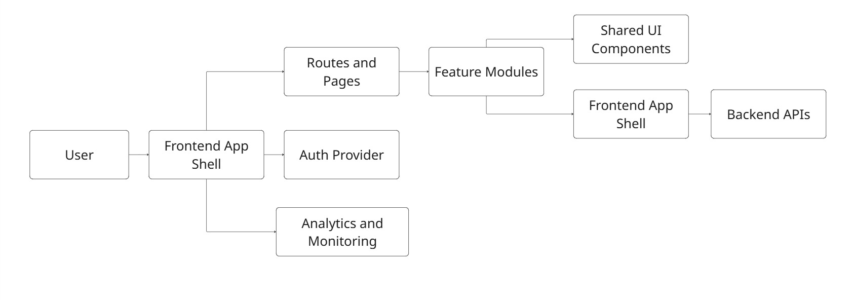
This is not a complete enterprise diagram. That is fine. Sometimes the best diagram is the one people actually understand.
When sketching architecture with teams, you can start with ugly boxes. Really. No polished visuals at first. Just routes, features, data, and dependencies. Once the shape is clear, then it can become a proper diagram.
What is Micro-Frontend Architecture?
It is an approach where a large frontend application is split into smaller frontend apps or modules. Each part can be owned by a separate team and, depending on the setup, deployed independently.
Example:
Imagine a large SaaS product with billing, analytics, admin settings, user management, reporting, and a marketplace. If every team works inside one huge frontend codebase, coordination can become slow. A change in one domain may block another. Releases become tense. People start saying, “Please don’t touch that area before launch.”
Micro frontends try to solve this by creating stronger boundaries.
A typical setup includes:
- an app shell
- independently built feature modules
- shared design system components
- shared authentication
- shared routing rules
- dependency management
- monitoring across modules
The benefit is team independence. The cost is complexity.
And that cost is real. You need stronger standards, careful dependency sharing, good testing, and clear rules about design consistency. Otherwise, the product starts to feel like several apps wearing the same logo.
React Micro-Frontend Architecture: When React Teams Use It
A React micro-frontend architecture usually appears when a React product has grown beyond one team’s comfortable ownership.
Common approaches include:
- Module Federation
- single-spa
- monorepo-based micro frontends
- build-time composition
- runtime composition
- shared React component libraries
Module Federation is popular because it allows separate builds to share code at runtime. Single-spa is useful when teams need to combine several frameworks or apps. A monorepo setup can work nicely when the organization wants boundaries but still prefers shared tooling and one repository.
React teams should be careful with shared dependencies. Two versions of React, mismatched routing libraries, or inconsistent UI packages can create strange bugs. Not always dramatic bugs. Sometimes just tiny, irritating problems that take half a day to track down.
A micro frontend setup can work well when:
- multiple teams own different product domains
- releases need to happen independently
- the app is already large and hard to coordinate
- domain boundaries are clear
- design system governance is mature
It is less useful when:
- the product is small
- the team is still discovering the core feature set
- shared UI is not stable
- nobody has time to maintain integration rules
- the goal is mostly “because big companies do it”
That last one happens more often than people admit.
Modular Frontend vs Micro Frontend: How to Choose
Before choosing micro frontends, it is worth asking whether a modular frontend would solve the same pain with less overhead.
| Factor | Modular frontend | Micro frontend |
| Best for | Small to mid-sized teams | Larger teams with separate domains |
| Deployment | Usually one release pipeline | Independent releases |
| Complexity | Lower | Higher |
| Governance | Easier to manage | Needs stronger standards |
| Performance risk | Easier to control | Needs careful dependency strategy |
| Team ownership | Clear, but inside one app | Stronger separation |
| Best starting point | Most products | Products already feeling coordination pain |
For many teams, a modular monolith is not a compromise. It is just the best option. You can still organize by feature, enforce boundaries, create shared UI, and keep the release process simple.
Micro frontends are better when team coordination is the bottleneck, not when code organization is merely untidy.
That distinction matters.
Frontend Development Workflow Inside a Good Architecture
Solid architecture changes the daily rhythm of frontend development.
A developer can open the codebase and understand where a feature belongs. A designer can rely on shared components instead of wondering why every dropdown looks slightly different. QA can test stable flows. Product managers can ask for changes without triggering quiet panic.
In a healthy frontend workflow:
- features live in predictable places
- shared components have clear rules
- API calls are consistent
- errors and loading states are not improvised
- tests protect important user paths
- design tokens reduce visual drift
- performance is measured, not guessed
When architecture feels boring in the best possible way, that’s good. You make a new page, you know where it goes. You add a new form, you know how validation works. You need a modal, you do not build the ninth modal in the app. Boring can be wonderful.
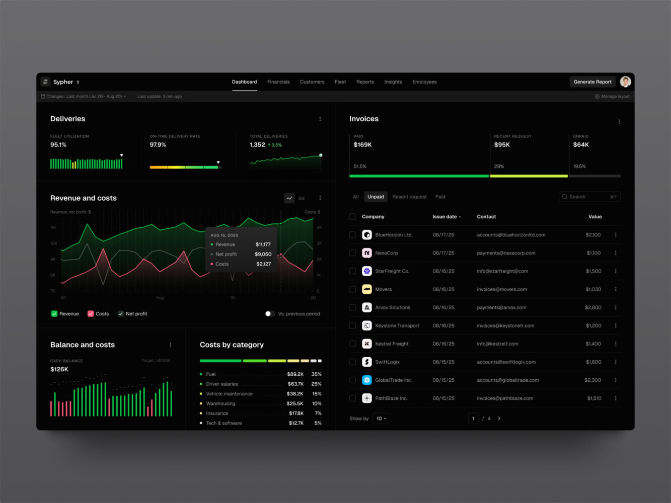
SaaS analytics platform by Shakuro
What a Frontend Developer Should Own in Architecture Decisions
A developer should have a real voice in architecture decisions. Not just “implement this plan,” but actual input.
Why? Because frontend engineers see the friction up close.
They know when a design system component is too rigid. They know when the data model makes a simple UI painful. They notice when one page has five loading states and another has none. They can tell when a library looks nice in a demo but feels awkward in production.
Frontend developers should help decide:
- component boundaries
- state management rules
- design system structure
- routing organization
- accessibility standards
- testing strategy
- performance budgets
- build and deployment setup
Architecture made without the people who build inside it often looks good on paper and feels odd in real work. Like a kitchen designed by someone who never cooks. Looks clean, but where do you put the cutting board?
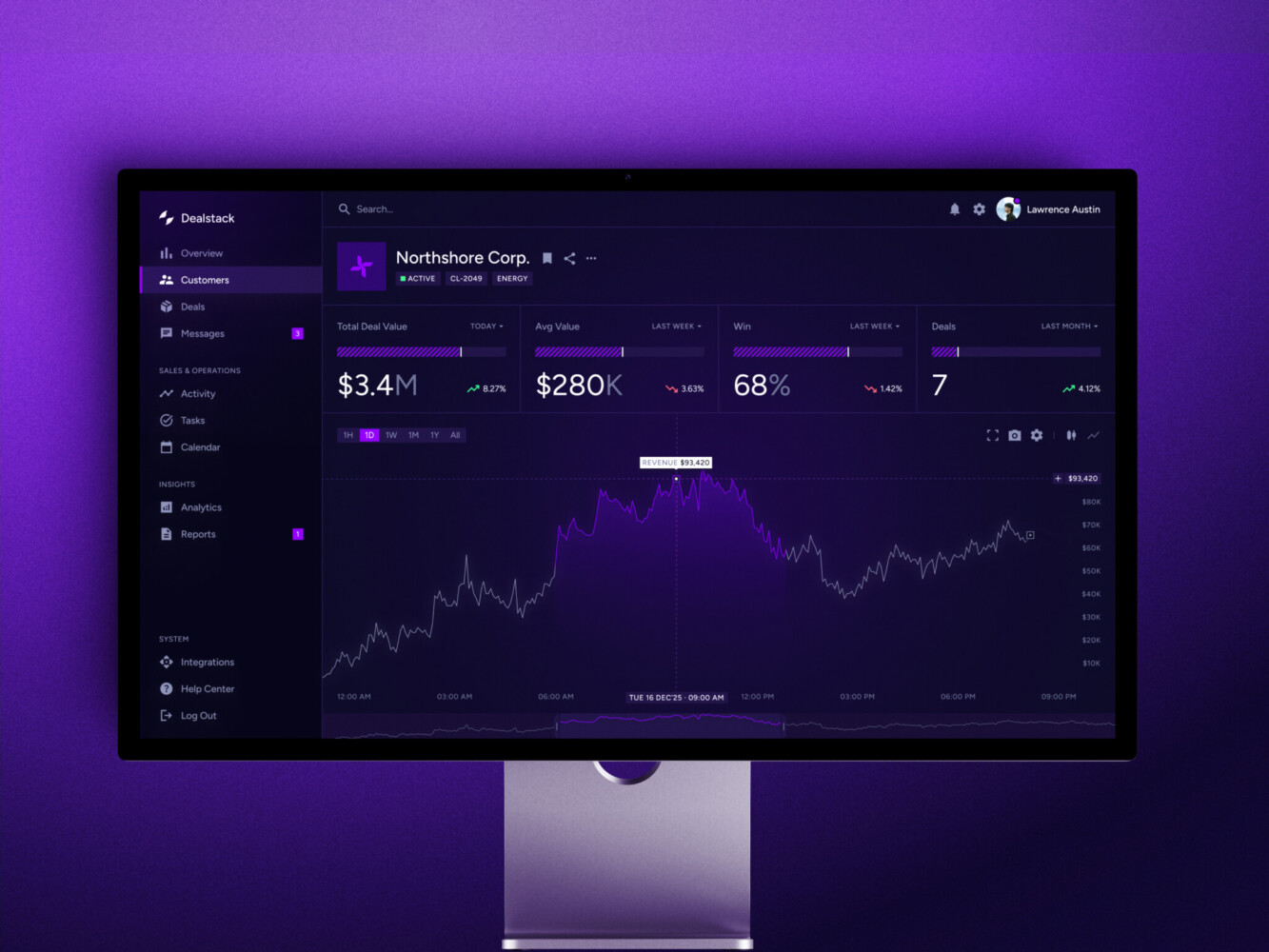
SaaS marketing dashboard by Conceptzilla
Our Experience With Solid Frontend Architectures
Frontend architecture can sound abstract until you see it inside a real product. Shakuro has several projects where the frontend is a serious part of the product logic.
Symbolik Social: Create Structure for Financial Conversations
Symbolik Social is a financial community platform for market professionals. It includes discussions, watchlists, financial analytics, and real-time collaboration.
The frontend stack is a good architecture example: Next.js, React, TypeScript, Tailwind CSS, and Radix UI. That combination points to a few important frontend choices. Next.js helps with application structure and rendering options. TypeScript adds safety in a feature-heavy product. Tailwind and Radix UI support a responsive, accessible design system. And because the platform uses real-time updates through WebSockets, the frontend has to deal with changing data in a way that still feels clear to users.
This case shows why modular structure matters. A social-financial product has posts, groups, analytics, user profiles, permissions, and live updates. If everything is mixed together, the app becomes fragile fast.
Real-time interfaces need more than pretty screens. They need careful loading states, update rules, and clear UI feedback.
Proko: Build Social Features for an E-Learning Platform
Proko is an art education platform that grew from a simpler video-based site into a larger e-learning and communication platform. The frontend side is interesting because the product is not only about watching lessons. It includes comments, following, feeds, tagging, assignments, gamification, mobile views, and improved search.
The technology stack includes Angular, TypeScript, NgRx Store, Angular Universal, and Material. So the interface needs structure for state, rendering, responsiveness, and long-term growth.
Proko is a good answer for the “how to improve an existing frontend architecture” question. The product had to move beyond a limited old setup and become more social, more interactive, and more scalable. That is a very common product moment. The business grows, the audience grows, and suddenly the frontend has to support more than the original idea.
There is also a nice human detail here. Art students are not opening the platform to admire architectural decisions. They want to learn, find lessons, talk to instructors, and continue where they left off. Good frontend decisions disappear into that experience.
CGMA: Craft Reliable Frontend for Virtual Learning
CGMA is a virtual classroom platform for online digital art education. The tech stack includes React on the frontend and a lot of product logic around lessons, homework, instructor communication, payments, video processing, and integrations.
Students need to watch lectures, upload homework, communicate with instructors, and sometimes deal with weaker internet connections. Administrators need payment and notification tools. So the frontend architecture has to support different user roles without turning the app into a maze.
The video detail is worth mentioning too. CGMA processes uploaded videos for different screen resolutions so students can work with lectures even when the connection is not great. That is partly backend and infrastructure, yes, but the frontend still has to present the experience clearly. Users need to understand what is ready, what is loading, and what they can do next.
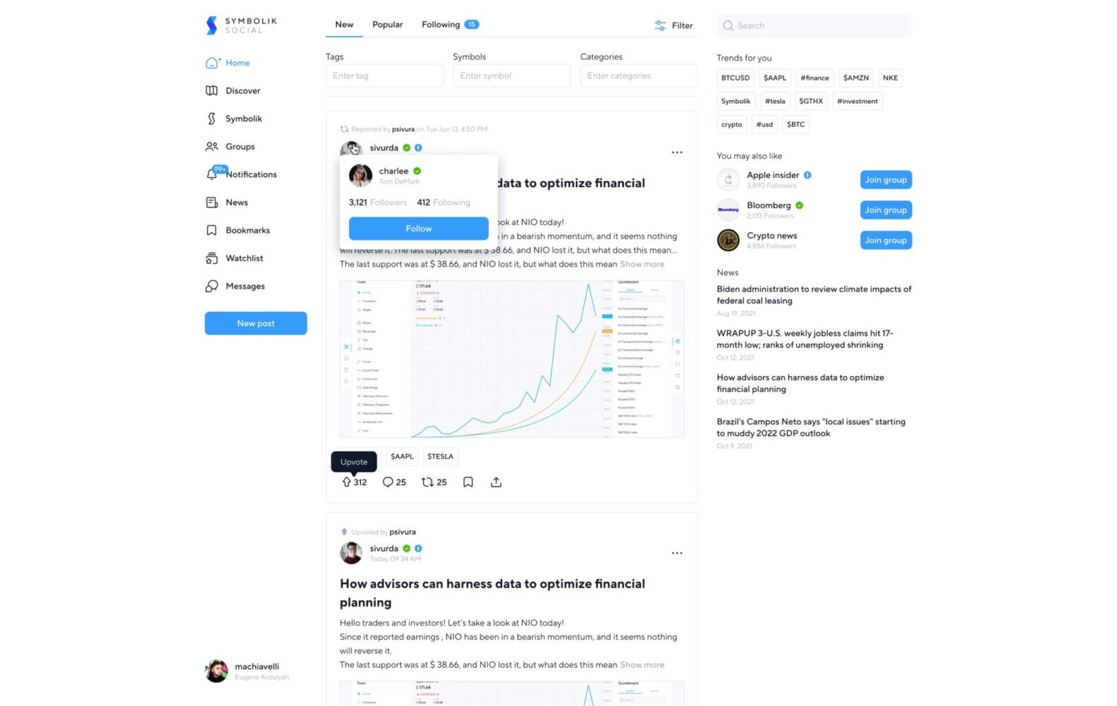
Symbolik Social by Shakuro
Common Frontend Architecture Mistakes
Choosing Micro Frontends too Early
Micro frontends can sound attractive. Independent teams, independent releases, clean boundaries. Sounds good, right?
But if the product is still small, the team may spend more time managing architecture than building useful features. It is a little annoying, but true: sometimes the “simpler” architecture is the more mature choice.
Mixing Too Many State Management Styles
One page uses Redux. Another uses Zustand. Another uses React Query for everything. A fourth has custom context providers nested like a strange little tower.
This happens gradually. The fix is not always a full rewrite. Often, it starts with rules: what counts as server state, what stays local, what is allowed to be global.
Weak Design System Rules
A design system is not just a Figma file and a component folder. It needs ownership.
Who updates components? Who approves variants? When can a team create a custom control? What accessibility rules are required? Without answers, the product drifts.
No Ownership Boundaries
If everyone owns everything, nobody owns anything. Shared areas especially need clear responsibility. Otherwise, people avoid touching them or, worse, change them casually and break other teams’ work.
Ignoring Performance Budgets
Frontend performance can degrade quietly. More scripts, heavier images, larger bundles, extra tracking, complicated charts. Each addition seems fine. Together, they make the app feel tired.
Performance needs regular checks. Not panic. Just attention.
Treating Diagrams as Theater
Some architecture diagrams look like they were made to impress executives. Lots of boxes. Many arrows. A mysterious cloud shape.
A useful diagram should help a developer make decisions. If it does not, simplify it.
Sales Analytics Dashboard by Shakuro
How to Improve an Existing Frontend Architecture
You do not always need a rewrite. Actually, most teams do not.
Start with an audit. Look at routes, feature folders, shared components, state management, API calls, and build output. Then find the most painful parts. Is the problem release speed? Duplicate UI? Slow dashboards? Confusing permissions? Fragile forms?
From there, improve in steps:
- Create a simple frontend architecture diagram.
- Group code by feature or domain.
- Define shared component rules.
- Standardize data fetching and error handling.
- Reduce unnecessary global state.
- Add tests around risky user flows.
- Introduce performance checks.
- Split modules only where ownership or scale justifies it.
The small steps matter. A team can make a codebase much easier to work with without stopping product development for three months.
And one more point: architecture work should be visible to product people. Not every technical detail, of course. But the reason behind it should be clear. “We are cleaning the data layer so dashboard changes stop breaking reports” is easier to support than “we are refactoring.”
Final Thoughts
Frontend architecture is not about choosing the trendiest pattern. It is about helping people build and change a product without fear.
A modular frontend might be enough. A micro frontend setup might be the right move later. A React app might need stronger component boundaries before it needs independent deployments. A frontend architecture diagram might reveal that the real problem is not technology at all, but ownership.
That is the funny thing about architecture. It looks technical, but it is also about people. How teams communicate. How decisions get repeated. How much confidence everyone has when touching the product.
The app has rules. The team knows them. Users get a product that behaves as expected.
Need a reliable frontend architecture? Reach out to us and let’s build a reliable structure for your product.
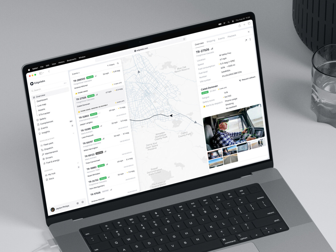
Telematics Dashboard by Shakuro
FAQ
What is Frontend Architecture?
Frontend architecture is the structure of a frontend application. It covers components, routing, state, data fetching, styling, testing, performance, and deployment. In plain words, it decides how the frontend is built and how safely it can grow.
What Are The Most Common Frontend Architecture Patterns?
Common patterns include component-based architecture, feature-based architecture, atomic design, layered architecture, modular monoliths, server-driven UI, static-first architecture, and micro frontend architecture.
When Should a Team Use Micro-Frontend Architecture?
A team should consider micro-frontend architecture when the product is large, multiple teams own separate domains, releases need to happen independently, and the organization can maintain shared standards. For smaller teams, a modular frontend is often the better first step.
What Should a Frontend Architecture Diagram Include?
A frontend architecture diagram should show routes, feature modules, shared UI components, state and data layers, API connections, authentication, third-party services, monitoring, deployment flow, and ownership boundaries.
Is React Micro-Frontend Architecture Worth it for Small Teams?
Usually, no. A react micro frontend architecture can help large teams, but it adds setup and maintenance work. Small teams often move faster with a well-organized React app, clear modules, and a strong shared component system.
How Does Frontend Development Change With Better Architecture?
Frontend development becomes more predictable. Developers know where code belongs, shared components are easier to reuse, tests protect important flows, and new features do not require digging through unrelated parts of the app.
What Architecture Skills Should a Frontend Developer Learn?
A Frontend developer should understand component design, state management, routing, accessibility, performance, API integration, testing, design systems, and basic deployment concepts. They do not need to know everything at once, but these areas come up again and again.