iPhone X UI Specifics
Here’s what we could think of redefining our app UI design approach for the TEN:
Contents:
Super Retina Display
Of course, the elephant in the room is the 2436 x 1125 OLED Super Retina display. Which is the-never-seen-before on an iPhone display. At the resolution of 458 px/inch, this is the highest pixel density ever on an iPhone, with HDR, and 1 000 000:1 contrast ratio.
New Artboard Size
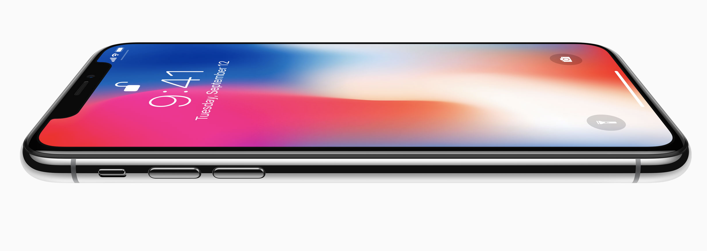
The display ratio is entirely new, being the same as iPhone 6, 7, and 8 across the width, but 145 pt. (around 20%) taller vertically due to the Home button removal. Consequently, designing for iPhone X will require a Sketch/PS artboard at the 375 x 812 px resolution.
Insane Pixel Density
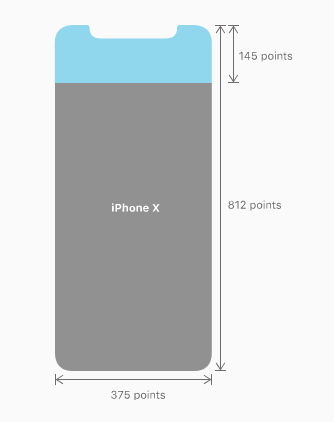
The staggering 2436 x 1125 px resolution on iPhone X is again, punched into the 5.8-inch display making it of 458 px/inch in density. So the images for iPhone X will be shipped at 3x like for the Plus devices and in the screen size traditionally exported at 2x.
Weird Form Factor
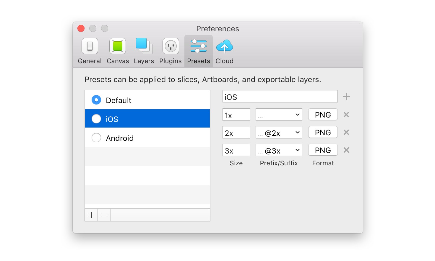
The X iPhone showcases new shape features like rounded corners, sensor housing, and the indicator for accessing the Home screen (the thin line at the bottom of the screen). The split status bar is 44pt tall with margins cropping the rounded corners. The cut-out notch creates a dedicated status bar space that most users will be likely to unhide.
The overall new display dictates a new approach to design, urging UI/UX designers not to draw attention to the display irregularities, instead integrate them naturally, for example, not filling the status bar black to reshape the screen back to the rectangle, a title bar doesn’t have to end at the notch and separate the status bar, if it’s full-screen, then go fullscreen. The screen now has a safe area in the center, where the important content has been aligned.
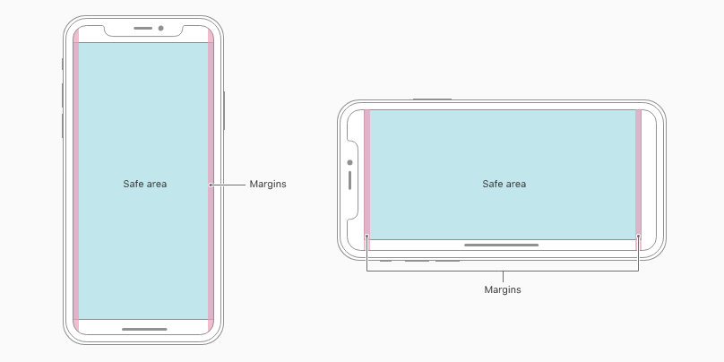
Image Aspect Ratio
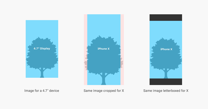
The new screen ratio means some of the older designs that will automatically scale to fit iPhone X, might get compromised by either letterboxing images or cropping them. Both options contradict the full-screen experience. So a good thing to do is create the separate X-specific images occupying the estate without weird workarounds.
iPhone X UX Specifics
All the new and revolutionary features of iPhone X are bound to change the way we interact with our phones. Being the biggest step up since the original iPhone, the X introduces the brand new UX and sets the highest bar for us as application designers and developers.
New Gestures
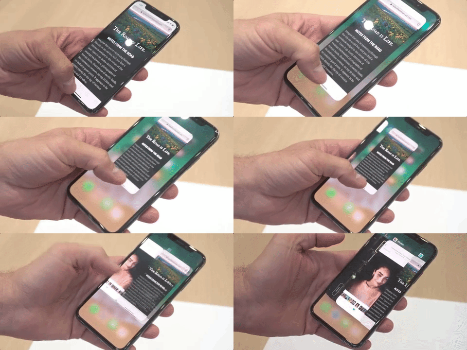
Ridding of the Home button made Apple reconsider the widely accepted and already intuitive logic of gestures. Redesigning the device control with no hardware buttons involved shifts the burden of system-wide gestures on the Home indicator, which will now be your new neighbor sitting on the bottom of the screen. As it sits there, you can’t cover it or approach with your objects too close, otherwise, it’ll flip out.
An upward swipe is an incredibly habitual gesture, so in order to avoid confusion, Apple introduced the “Edge Protect” feature which defines the hierarchy of the swipe.
Face ID
The missing Home button seems to have been the ultimate solution for a bunch of tasks, however, is a thing of the past, it compromised the sole idea of an all-screen phone. So, the Touch ID hidden in the button had to be replaced by a similar effortless, secure, and natural experience. What can be more secure than scanning a fingerprint? An eye scanner? How about a face scanner?
iPhone X became the first ever digital device that knows your face and can differentiate it from others. This opens a window of opportunities for app developers to utilize the technology as intimate as that. I mean how far can they take it? Can the X know your mood from your facial expressions and act accordingly? Where will it take us?
Biggest Issues
Thus far, the most heated arguments concern the iPhone X’s notch and the ways it compromises design. Even though everybody seems to agree upon the all-screen front phones dominating the industry years to come. On the other hand, the usability of an oddly-shaped screen is questionable. Or does it take some time to get used to it and fully embrace the irregular shape of your screen? After all, nature is mostly ungeometrical and we learn to navigate its beautiful distortion. But as of now, these are the commonly addressed issues with the notch:
Landscape White Bars
Due to the aspect ratio or the notch, that Apple encourages designers to use, they don’t seem too fond of it yet either ?♂️ When using the Safari browser in the landscape mode, the software does not occupy the entire estate, instead leaves two ugly white bars on the sides, literally eating up the all-screen experience:
ICYMI: iPhone X literally renders white bars on Safari content when in landscape mode. How is that not hilariously bad? pic.twitter.com/xmRBO0LBK3
— Quinn Nelson (@SnazzyQ) October 2, 2017
Scroll Bar Disappearance
Another example of the iPhone X notch workaround is the way it gets absolutely ignored by the scroll bar in Safari. The notch feels like a sticker and makes you want to peel it off. Not exactly the immersive experience:
Don’t worry, the hiding scroll bar is even grosser (top-right corner). pic.twitter.com/6ImBLI9TdM
— Ben Packard (@BenPackard) September 13, 2017
Notch (Dis)Integration
If we are going to live with that neighbor or the scar, call it whatever, doesn’t it have to be the reality? There can be no integration unless we come to terms with it completely. The internet characteristically exploded with brilliant solutions:
Scroll bar for the iPhone X pic.twitter.com/uAsaql3HZs
— Product Hunt (@ProductHunt) September 15, 2017
Another thing is the iPhone X screenshot output, so after all the pains of getting used to the notch, you take a screenshot …and the notch is nowhere to be found. Instead of it enter the Holy Whitespace ?
Screen shot of #iPhoneX pic.twitter.com/izajSa4Bqt
— FabienW (@FabienWannerOFF) October 9, 2017
The iPhone X App Design Afterword
Apple’s excelsior with iPhone X is beyond dispute. There are not a lot of companies left today that can influence the global industry and make historic shifts the way one Cupertino-based Colossus does. Like any revolutionary idea, a lot of it is going to meet resistance, criticism, and sarcasm. But when the dust settles, guess what we are going to see. People holding their $ 999 iPhone Xs with a stupid notch in its gorgeous screen.
So, as an iOS development company, we will dedicate a lot of our effort to finding the way to deal with this new reality, embrace the imperfections and make it work to the best of our abilities. We are slowly beginning to redesign some of our apps for iPhone X and some practical experience and case studies are to come.
