I was already being an avid visitor of Awwwards and thought I’d use descriptive principles to help bind the experiences together into a perfect blend of visual beauty, smart copy, and hopefully, impeccable implementation. That never really happened (yet) but I’ve learned so much along the way, it made me rethink the entire process. So without too much prehistory, this is how it all unfolded.
Why wireframe ?
A typical project scenario is a client pitching an idea, a project manager structuring business logic, a designer creating the visual part and the context of use, and later on, a developer putting together the digital product – a mobile app, a website, or a software.
At some point, the client enters a phase where the shaping product meets the concept and the narrative they’ve initially plotted.
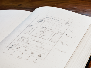
Image credit: ali griffin
This is where most of the friction starts happening. Often by that time, the client might have invested a bunch of money, the design team has put in quite some time, and the entire project seems to be on a stage where it’s too late to start over and yet, the product design is far from being done.
The idea of a digital product brews in a client’s mind for months before it starts gaining a viable tangible form. The problem with this is you can convey your idea conceptually, but you can’t share your thinking and create a carbon copy of your assumption in the mind of a designer whose task is to create a form for that assumption.
No wonder the client is willing to see something material as fast as possible and the designer is willing to hit the spot right away and stick to that direction.
For a client, every dollar spent on “beating around the bush” is wasted. Fair enough, you are the one paying and you want to see what you are paying for. For a designer, finding an idea that even remotely resonates with the client’s vision means the right framework. We do want to deliver an adequate output and it’s natural that we don’t subject the client to changing their mind too much. This leads to an almost nominal phase of exploration and a rapid transition to the phase of design itself. However, this may result in taking a totally wrong path.
How tension occurs⚡️
A lot of designers who may lack experience, tend to stick to the visual aspect more than they do to the operational one. Functionality can’t be felt on Dribbble, Behance, and UI8. It’s all visual there and it either takes years of experience or a rare natural talent to learn how to feel usability different visual elements create. And more times than not, they pull the client into their vision rather than work out a balanced decision by trying out everything that comes to their mind.
A beautifully designed wrong idea, to an unsuspecting public, might pass for the right one.
The first manifestations of the choice issues occur much later, either at the development stage or when the business logic becomes evidently compromised. Often times, the project is far too deep into production to be U-turned and this is where we start putting thumbs in the dike. Needless to say, this serves to no one’s benefit.
It doesn’t necessarily mean you can’t hit the bull’s eye from the start. Instead, a diligent wireframing stage can help solidify the direction chosen.
At the same time, experience works magic for designers as, by the patterns they recognize, they can project the directions they might take and where it will lead them. They can terminate ideas without compromising functionality, they don’t stick to the visual beauty that much because they know the ins and outs of implementation and won’t waste time on stunning visuals with no chance to ever be realized in code.
Image credit: Jordan Cullen
All of these come from experience and one of the few ways to get experience is grind it out. So how do you figure out which path is the right one and which will lead you to a wrong place ultimately resulting in the redesign of the whole thing? How do you generate ideas that might question your choice or validate it? How do we do it so that almost always, we nail the result without losing uniqueness and appeal?
Where wireframing shines?
As a writer, I’ve developed a thick skin for multiple edits, corrections, striking-throughs, and iterations. In fact, I usually come up with 2 to 3 titles of an article before I pass it on to proofreading. I can come up with several narratives as well as different styles of narration to see where it might lead me. I can then adopt a specific standpoint to write from but it only becomes evident once I explore different directions. Stories. Plots. Turns. Sometimes unfamiliar grounds, other times near and dear topics, all flavored with a bit of unseasonable humor, but every time writing is different with relatively similar structure.
Stories are writer’s wireframes.
With design, it gets more complicated. In order to protect themselves from going deep into design, UI/UX designers take all the visually distracting elements out of the equation. To make it time-efficient, designers have to investigate multiple directions without overextending, so their decision-making skills have to be on point.
As I’ve learned, wireframes help designers be reinforced in their view of the options chosen or change directions before it’s too late.
Image credit: Derek Clark
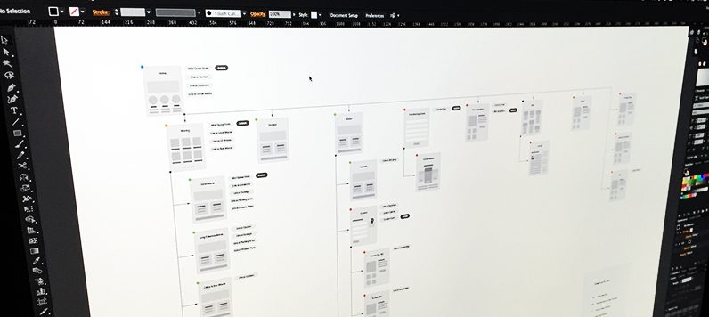
Wireframes reflect the infrastructure of the product, regulate the navigation and the hierarchy between different functional parts of the product. They also help address the problems with all of these early.
So here are the main features of a generic wireframe:
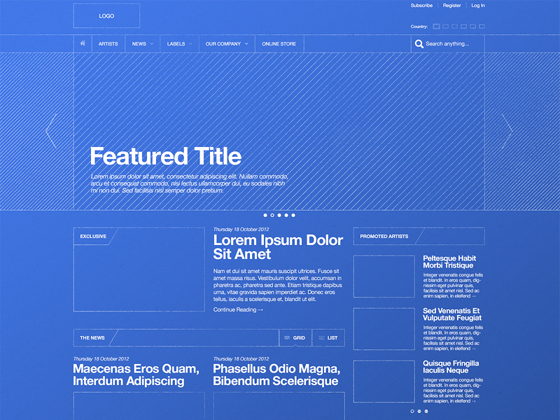
- Technical document with blocks, lines, and captions.
- Not a napkin sketch. Wireframes are serious.
- No visual design elements. Not even a logo is necessary.
- As elaborate as it gets in terms of features covered.
How to wireframe ?
It all starts with a problem. Some of the most obvious solutions need to be mapped out first in order to help address the later problems. Often times the client/product owner is able to point out the core functionality of the product.
This is their comfort zone — structuring the ideas they think will become the generating force of the product. But what about the unknown aspects?
The goal of wireframing is to get it all out there. This includes even the UX features that are more of a necessity than the planned capabilities. So, burying yourself in the refined ideas of what you like and know won’t get you far. More importantly, this will turn the wireframing stage into a formality. Due to the lack of conceptual understanding, some entrepreneurs hire UI/UX professionals and later, tailor their workflow by cropping what they consider to be not essential for the product.
“We don’t need a wireframe, I can describe the project myself, you just make it a lil bit more UXish…”
Bet every designer heard this at least a couple times in their career. Sometime this might work. You start designing right away. But other times, your designed screens might uncover some of the problems that had better been addressed beforehand. And guess who’ll be responsible for the bad behavior of the product? Well… who drew this?
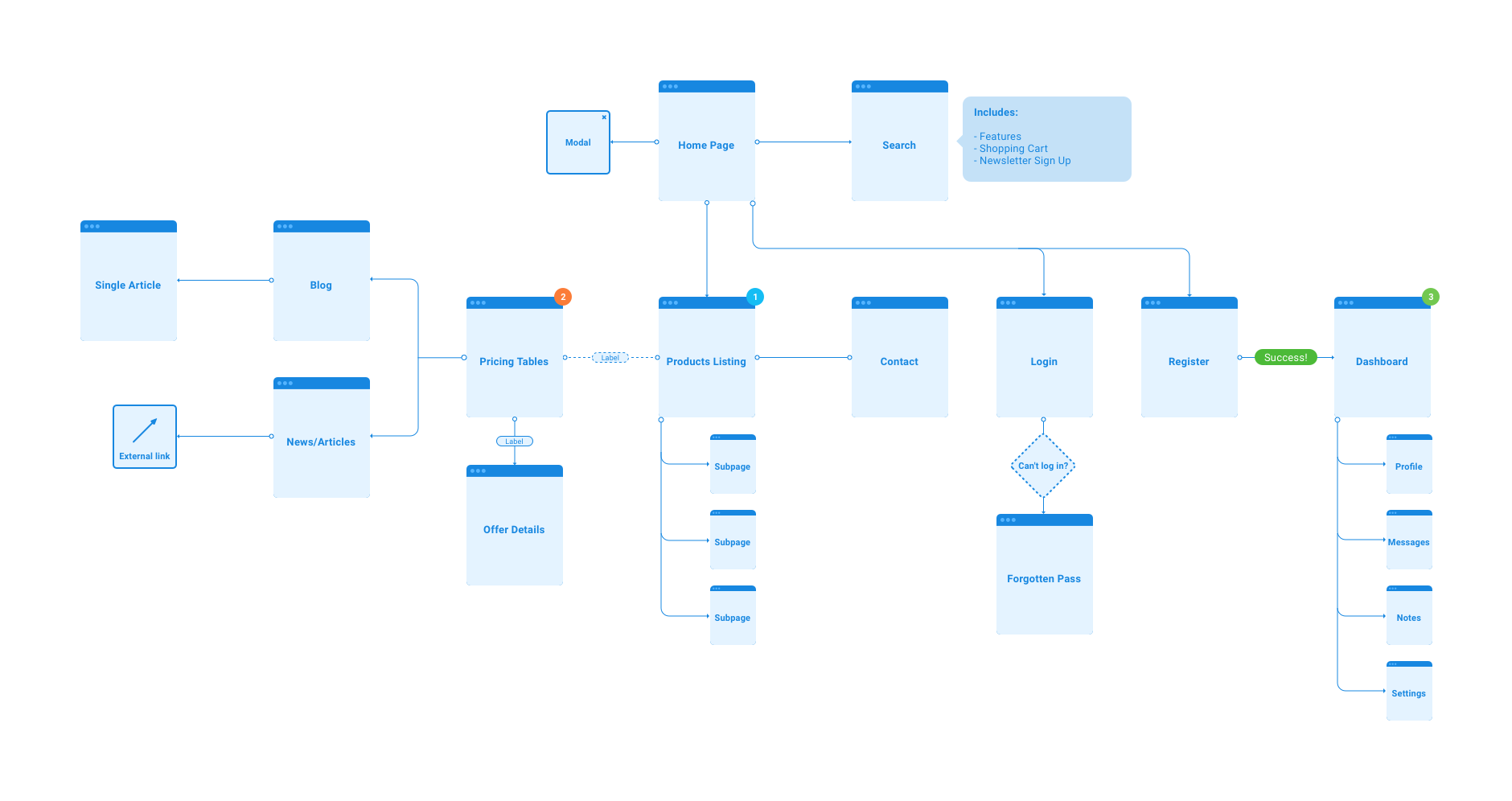
Image credit: Greg Dlubacz
That’s why forcing a client to entertain the idea that there might be something missing in their mental wireframe is important; moreover, there aren’t too many ways to share that mental wireframe rather than laying it out.
Step 1. Design presentation style
This means, get inspiration for how you are going to have your information distributed. The design is a visual language. Make your language distinct and beautiful.
Step 2. Design the workflow
Wireframing will leave you with a profound technical document but what’s next? Wireframing is more than just the description of the in-product functionality. It is also the high-level process simulation, namely how the product will move through the stages.
Step 3. Select the tools
A lot of specific tools offer a diverse functionality for wireframing. Designers have their own toolkits as well as a set of best practices they use for multiple products.
Step 4. Grid it out
The elements placed on the layout have to be adjustable, interchangeable, and easily scalable according to the new discoveries, ideas and needs popping up. Using a grid is a perfect way to wireframe fast with a further smooth adaptation to the prototype.
Step 5. Move placeholders
This is not an obvious part, as it is extremely hard to come up with a variability of placeholders and boxes when you don’t have any content. You will have to force yourself to come up with as much of these as possible in order to create a flexible layout.
Step 5. Add typography
The text will be the primary information delivery medium. Depending on the visual hierarchy in typography, the users will define what’s important. Legibility is a significant factor. More on that here.
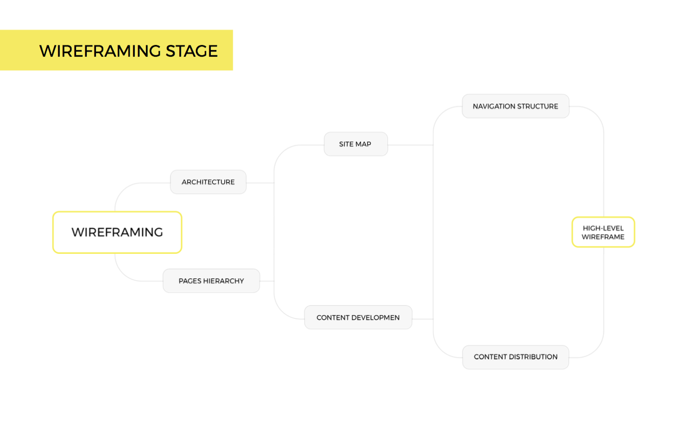
Image credit: Slideshare
The pitfalls of wireframing ?
One of the problems of wireframing gone wrong is whenever the client has a firm and unconditional concept of what they want their product to be. Taking into account the time and effort they’ve invested in their product idea, it makes some sense. However, we encourage our clients to pitch us the problems they are trying to solve instead of their creative ideas they want to implement.
When a client comes up with a napkin wireframe saying it’s basically done and you only need to make it implementable, they have the right to do so. In fact, they are the ones that pay. With that said, if we focus on the success of the product more than the satisfaction of the client at the interim stage, we can’t accept such a wireframe.
Before we even start, the deliverables that come with a product from the earlier stages are not what we need. It doesn’t mean they necessarily suck, but they limit the designer’s creativity and guide them the wrong way. That’s why,
A designer has to evolve through a number of stages working on the product, mature their ideas, and ultimately, come up with a thought out solution.
I’m not saying “throw your progress out of the window”. Instead, help the designer get to where you are in terms of your understanding of the product. Have them involved in the user research process, provide as much insight as possible, talk about the goals and the accomplishments you see your product reaching within time. In other words, let a designer evolve through the various stages gradually and if necessary, be the part of that evolution.
In that case, you’ll be able to iterate your concepts once again and with a help of a complete and unbiased wireframe, sort the wheat from the chaff.
